 The New Year is a time for reflection and prediction. What will the New Year bring? What does the longer-term future hold? Here are two articles from The Guardian that look into the future.
The first, by Larry Elliott, considers a number of scenarios and policy options. Although not totally doom laden, the article is not exactly cheery in its predictions. Perhaps ‘life will go on’ and the global economy will muddle through. But perhaps a new recession is around the corner or, even worse, the world is at a tipping point when things are fundamentally changing. Unless policy-makers are careful, clever and co-ordinated, perhaps a new dark age may be looming. But who knows?
Which brings us to the second article, by Gaby Hinsliff. This argues that people are pretty hopeless at predicting. “History is littered with supposed dead certs that didn’t happen – Greece leaving the euro, the premature collapse of the coalition – and wholly unimagined events that came to pass.” And economists and financial experts are little better.
Two years ago, The Observer challenged a panel of City investors to pick a portfolio of stocks and rated their performance against that of Orlando, a ginger cat who selected his portfolio by tossing a toy mouse at a sheet of paper. Inevitably, the cat triumphed.
But is this fair? If capital markets are relatively efficient, stock prices today already reflect knowable information about the future, but clearly not unknowable information.
It’s the same with economies. When information is already to hand, such as a pre-announced tax change, then its effects, ceteris paribus, can be estimated – at least roughly.
 But it’s the ‘ceteris paribus‘ assumption that’s the problem. Other things are not equal. The world is constantly changing and there are all sorts of unpredictable events that will influence the outcomes of economic policy and of economic decisions more generally. And central to the problem are people’s attitudes and confidence. Mood can swing quite dramatically, from irrational exuberance to deep pessimism. And such mood changes – often triggered by some exogenous factor, such as an international dispute, an election or unexpected economic news – can rapidly gather momentum and have significant effects.
Predicting the long-term future is both easier and more difficult: easier, in that short-term cyclical effects are less relevant; more difficult in that changes that have not yet happened, such as technological changes or changes in working practices, may themselves be key determinants of the future global economy.
One of the most salutary lessons is to look at predictions made in the past about the world today and at just how wrong they have proved to be. Perhaps we need to call on Orlando more frequently.
Why ‘life will go on’ thesis about global economy might not pass muster in 2015 The Guardian, Larry Elliott (28/12/14)
Who knows what the new year holds? Certainly none of us The Guardian, Gaby Hinsliff (26/12/14)
Questions
- Give some examples of factors that could have a major influence on the global economy, but which are unpredictable.
- Is economic forecasting still worthwhile? Explain.
- Look at some macroeconomic forecasts made in the past about the world today. You might want to look at forecasts of agencies such as the IMF, the OECD, the World Bank and the European Commission. You can find links in the Economics Network’s Economic Data freely available online. Explain why such forecasts have differed from the actual outcome.
- Why, if capital markets were perfect, might Orlando be just as good as a top investment manager at predicting the future course of share prices?
- In what ways is economic forecasting similar to and different from weather forecasting in its methods, its use of data and its reliability?
 As we saw in Part 1 of this blog, oil prices have fallen by some 46% in the past five months. In that blog we looked at the implications for fuel prices. Here we look at the broader implications for the global economy? Is it good or bad news – or both?
First we’ll look at the oil-importing countries. To some extent the lower oil price is a reflection of weak global demand as many countries still struggle to recover from recession. If the lower price boosts demand, this may then cause the oil price to rise again. At first sight, this might seem merely to return the world economy to the position before the oil price started falling: a leftward shift in the demand for oil curve, followed by a rightward shift back to where it was. However, the boost to demand in the short term may act as a ‘pump primer’.  The higher aggregate demand may result in a multiplier effect and cause a sustained increase in output, especially if it stimulates a rise in investment through rising confidence and the accelerator, and thereby increases capacity and hence potential GDP.
But the fall in the oil price is only partly the result of weak demand. It is mainly the result of increased supply as new sources of oil come on stream, and especially shale oil from the USA. Given that OPEC has stated that it will not cut its production, even if the crude price falls to $40 per barrel, the effect has been a shift in the oil supply curve to the right that will remain for some time.
So even if the leftward shift in demand is soon reversed so that there is then some rise in oil prices again, it is unlikely that prices will rise back to where they were. Perhaps, as the diagram illustrates, the price will rise to around $70 per barrel. It could be higher if world demand grows very rapidly, or if some sources of supply go off stream because at such prices they are unprofitable.
The effect on oil exporting countries has been negative. The most extreme case is Russia, where for each $10 fall in the price of oil, its growth rate falls by around 1.4 percentage points (see). Although the overall effect on global growth is still likely to be positive, the lower oil price could lead to a significant cut in investment in new oil wells. North sea producers are predicting a substantial cut in investment. Even shale oil producers in the USA, where the marginal cost of extracting oil from existing sources is only around $10 to £20 per barrel, need a price of around $70 or more to make investment in new sources profitable. What is more, typical shale wells have a life of only two or three years and so lack of investment would relatively quickly lead to shale oil production drying up.
The implication of this is that although there has been a rightward shift in the short-run supply curve, if price remains low the curve could shift back again, meaning that the long-run supply curve is much more elastic. This could push prices back up towards $100 if global demand continues to expand.
 This can be illustrated in the diagram. The starting point is mid-2014. Global demand and supply are D1 and S1; price is $112 per barrel and output is Q1. Demand now shifts to the left and supply to the right to D2 and S2 respectively. Price falls to $60 per barrel and, given the bigger shift in supply than demand, output rises to Q2. At $60 per barrel, however, output of Q2 cannot be sustained. Thus at $60, long-run supply (shown by SL) is only Q4.
But assuming the global economy grows over the coming months, demand shifts to the right: say, to D3. Assume that it pushes price up to $100 per barrel. This gives a short-run output of Q3, but at that price it is likely that supply will be sustainable in the long run as it makes investment sufficiently profitable. Thus curve D3 intersects with both S2 and SL at this price and quantity.
The articles below look at the gainers and losers and at the longer-term effects.
Articles
Where will the oil price settle? BBC News, Robert Peston (22/12/14)
Falling oil prices: Who are the winners and losers? BBC News, Tim Bowler (16/12/14)
Why the oil price is falling The Economist (8/12/14)
The new economics of oil: Sheikhs v shale The Economist (6/12/14)
Shale oil: In a bind The Economist (6/12/14)
Falling Oil Price slows US Fracking Oil-price.net, Steve Austin (8/12/14)
Oil Price Drop Highlights Need for Diversity in Gulf Economies IMF Survey (23/12/14)
Lower oil prices boosting global economy: IMF Argus Media (23/12/14)
Collapse in oil prices: producers howl, consumers cheer, economists fret The Guardian (16/12/14)
North Sea oilfields ‘near collapse’ after price nosedive The Telegraph, Andrew Critchlow (18/12/14)
How oil price fall will affect crude exporters – and the rest of us The Observer, Phillip Inman (21/12/14)
Cheaper oil could damage renewable energies, says Richard Branson The Guardian,
Richard Branson: ‘Governments are going to have to think hard how to adapt to low oil prices.’ John Vidal (16/12/14)
Data
Brent crude prices U.S. Energy Information Administration (select daily, weekly, monthly or annual data and then download to Excel)
Brent Oil Historical Data Investing.com (select daily, weekly, or monthly data and time period)
Questions
- What would determine the size of the global multiplier effect from the cut in oil prices?
- Where is the oil price likely to settle in (a) six months’ time; (b) two years’ time? What factors are you taking into account in deciding your answer?
- Why, if the average cost of producing oil from a given well is $70, might it still be worth pumping oil and selling it at a price of $30?
- How does speculation affect oil prices?
- Why has OPEC decided not to cut oil production even though this is likely to drive the price lower?
- With Brent crude at around $60 per barrel, what should North Sea oil producers do?
- If falling oil prices lead some oil-importing countries into deflation, what will be the likely macroeconomic impacts?
 The eurozone is made up of 18 countries (19 in January) and, besides sharing a common currency, they also seem to be sharing the trait of weak economic performance. The key macroeconomic variables across the eurozone nations have all seemingly been moving in the wrong direction and this is causing a lot of concern for policy-makers.
Some of the biggest players in the eurozone have seen economic growth on the down-turn, unemployment rising and consumer and business confidence falling once again. Germany’s economic growth has been revised down and in Italy, unemployment rose to a record of 13.2% in September and around 25% of the workforce remains out of work in Spain and Greece. A significant consequence of the sluggish growth across this 18-nation bloc of countries is the growing risk of deflation.
 Whilst low and stable inflation is a macroeconomic objective across nations, there is such a thing as inflation that is too low. When inflation approaches 0%, the spectre of deflation looms large (see the blog post Deflation danger). The problem of deflation is that when people expect prices to fall, they stop spending. As such, consumption falls and this puts downward pressure on aggregate demand. After all, if you think prices will be lower next week, then you are likely to wait until next week. This decision by consumers will cause aggregate demand to shift to the left, thus pushing national income down, creating higher unemployment. If this expectation continues, then so will the inward shifts in AD. This is the problem facing the eurozone. In November, the inflation rate fell to 0.3%. One of the key causes is falling energy prices – normally good news, but not if inflation is already too low.
 Jonathan Loynes, Chief European Economist at Capital Economics said:
“[the inflation and jobless data] gives the ECB yet another nudge to take urgent further action to revive the recovery and tackle the threat of deflation…We now expect the headline inflation rate to drop below zero at least briefly over the next six months and there is a clear danger of a more prolonged bout of falling prices.”
Some may see the lower prices as a positive change, with less household income being needed to buy the same basket of goods. However, the key question will be whether such low prices are seen as a temporary change or an indication of a longer-term trend. The answer to the question will have a significant effect on business decisions about investment and on the next steps to be taken by the ECB. It also has big consequences for other countries, in particular the UK. The data over the coming months across a range of macroeconomic variables may tell us a lot about what is to come throughout 2015. The following articles consider the eurozone data.
Euro area annual inflation down to 0.3% EuroStat News Release (28/11/14)
Eurozone inflation weakens again, adding pressure on ECB Nasdaq, Brian Blackstone (28/11/14)
Eurozone inflation rate falls in October BBC News (28/11/14)
Eurozone recovery fears weigh on UK plc, says report Financial Times, Alison Smith (30/11/14)
€300bn Jean-Claude Juncker Eurozone kickstarter sounds too good to be true The Guardian, Larry Elliott (26/11/14)
Eurozone area may be in ‘persistent stagnation trap’ says OECD BBC News (25/11/14)
Euro area ‘major risk to world growth’: OECD CNBC, Katy Barnato (25/11/14)
OECD sees gradual world recovery, urges ECB to do more Reuters, Ingrid Melander (25/11/14)
Questions
- What is deflation and why is it such a concern?
- Illustrate the impact of falling consumer demand in an AD/AS diagram.
- What policies are available to the ECB to tackle the problem of deflation? How successful are they likely to be and which factors will determine this?
- To what extent is the economic stagnation in the Eurozone a cause for concern to countries such as the UK and US? Explain your answer.
- How effective would quantitative easing be in combating the problem of deflation?
 Figures for employment and unemployment give an incomplete picture of the state of the labour market. Just because a person is employed, that does not mean that they are working the number of hours they would like.
Some people would like to work more hours, either by working more hours in their current job, or by switching to an alternative job with more hours or by taking on an additional part-time job. Such people are classed as ‘underemployed’. On average, underemployed workers wanted to work an additional 11.3 hours per week in 2014 Q2. Underemployment is a measure of slack in the labour market, but it is not picked up in the unemployment statistics.
Other people would like to work fewer hours (at the same hourly rate), but feel they have no choice – usually because their employer demands that they work long hours. Some, however, would like to change to another job with fewer hours even if it involved less pay. People willing to sacrifice pay in order to work fewer hours are classed as ‘overemployed’.
Statistics released by the Office for National Statistics show that, in April to June 2014, 9.9%, or 3.0 million, workers in the UK were underemployed; and 9.7%, or 2.9 million, were overemployed.
The figures for underemployment vary between different groups:
|
|
| • |
11.0% of female workers |
8.9% of male workers |
| • |
19.6% of 16-24 year olds |
9.9% of all workers |
| • |
21.1% of people in elementary occupations (e.g. cleaners, shop assistants and security guards) |
5.4% of people in professional occupations (e.g. doctors, teachers and accountants) |
| • |
11.5% of people in the North East of England (in 2013) |
9.2% of people in the East of England (in 2013) |
| • |
22.1% of part-time workers |
5.4% of full-time workers |
As far as the overemployed are concerned, professional people and older people are more likely want shorter hours
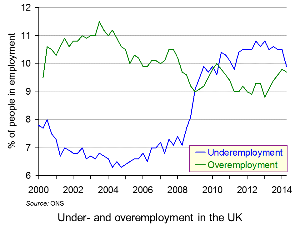
 The ONS data also show how under- and overemployment have changed over time: see chart (click here for a PowerPoint). Before the financial crisis and recession, overemployment exceeded underemployment. After the crisis, the position reversed: underemployment rose from 6.8% in 2007 to a peak of 10.8% in mid-2012; while overemployment fell from 10.5% in 2007 to a trough of 8.8% in early 2013.
More recently, as the economy has grown more strongly, underemployment has fallen back to 9.9% (in 2014 Q2) and overemployment has risen to 9.7%, virtually closing the gap between the two.
The fact that there is still significant underemployment suggests that there is still considerable slack in the labour market and that this may be acting as a brake on wage increases. On the other hand, the large numbers of people who consider themselves overemployed, especially among the professions and older workers, suggests that many people feel that they have not got the right work–life balance and many may be suffering consequent high levels of stress.
Articles
Rise in number of UK workers who want to cut back hours, ONS says The Guardian, Phillip Inman (25/11/14)
Data reveal slack and stretch in UK workforce Financial Times, Sarah O’Connor (25/11/14)
Will you graduate into underemployment? The Guardian, Jade Grassby (30/9/14)
Three million people would take pay cut to work shorter hours: Number who say they feel overworked rises by 10 per cent in one year Mail Online, Louise Eccles (26/11/14)
ONS: Rate of under-employment in Scotland lower than UK average Daily Record, Scott McCulloch (25/11/14)
ONS Release
Underemployment and Overemployment in the UK, 2014 ONS (25/11/14)
Questions
- Distinguish between unemployment (labour force survey (LFS) measure), unemployment (claimant count measure), underemployment (UK measure), underemployment (Eurostat measure) and disguised unemployment.
- Why is underemployment much higher amongst part-time workers than full-time workers?
- How do (a) underemployment and (b) overemployment vary according to the type of occupation? What explanations are there for the differences?
- Is the percentage of underemployment a good indicator of the degree of slack in the economy? Explain.
- How is the rise in zero hours contracts likely to have affected underemployment?
- How could the problem of overemployment be tackled? Would it be a good idea to pass a law setting a maximum number of hours per week that people can be required to do in a job?
- Would flexible working rights be a good idea?
 The articles linked below look at the dangers of deflation and policies of central banks to counter it.
Deflation in economics has three meanings. The first is falling prices: i.e. negative inflation. The second, more traditional meaning, is a fall in real aggregate demand, resulting in lower output, higher unemployment and lower inflation – and quite possibly an actual fall in the price level. These first two definitions describe what is generally seen as an undesirable situation. The third is a slowing down in the growth of real aggregate demand, perhaps as a result of a deliberate act of fiscal and/or monetary policy. This third meaning could describe a desirable situation, where unsustainable growth is reduced and inflation is reduced from an above-target level.
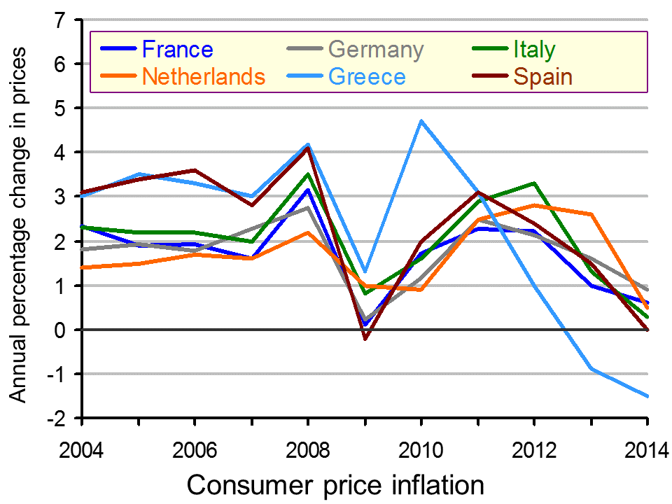
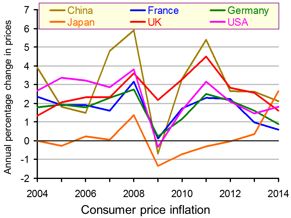
Here we focus on the first definition. The first two articles look at the dangers of a fall in the price level. The chart below shows falling inflation, although not actually deflation, in China, France, Germany and the UK (click here for a PowerPoint). Several European countries, however, are experiencing actual deflation. These include: Greece, Spain, Hungary, Poland and Sweden. Inflation in the eurozone for 2014 is expected to be a mere 0.5%.
The most obvious danger of deflation (or expected deflation) is that people will delay spending on durable goods, such as cars, furniture and equipment, hoping to buy the items cheaper later.  The result could be a fall in aggregate demand and a fall in output and employment.
For retailers, this is all spelling Christmas doom. Already the runup to the most crucial time of the year for shops is being characterised by a game of chicken. Shoppers are wondering how long they can leave their festive buying in the hope of late bargains.
Interest rates may be low, but for people with debts, this is being offset by the fact that inflation is no longer reducing the real value of that debt. For people with credit card debt, personal loans and most mortgages, the interest rate they pay is significantly above the rate of inflation. In other words, the real interest rate on their debt is still significantly positive. This may well discourage people from borrowing and spending, further dampening aggregate demand. And, with a Bank Rate of just 0.5%, there is virtually no scope for lowering the official interest rate further.
At least in the UK, economic growth is now positive – for the time being at any rate. The danger is becoming more serious, however, in many eurozone countries, which are already back in recession or close to being so. The ECB, despite its tentative steps to ease credit conditions, it moving closer to the day when it announces full-blown quantitative easing and buys sovereign bonds of eurozone countries. The Bank of Japan has already announced that it is stepping up it QE programme – a vital ingredient in getting Abenomics back on track and pulling Japan out of its latest recession.
In the USA, by contrast, there is little danger of deflation, as the US economy continues to grow strongly. The downside of this, has been a large rise in consumer debt (but not mortgages) – the ingredients of a possible future bubble and even a new financial crisis.
Forget what central bankers say: deflation is the real monster The Observer, Katie Allen (23/11/14)
Why Deflation Is Such A Big Worry For Europe NPR, Jim Zarroli (31/10/14)
Exclusive: China ready to cut rates again on fears of deflation – sources Reuters, Kevin Yao (23/11/14)
Central Banks in New Push to Prime Pump Wall Street Journal Jon Hilsenrath, Brian Blackstone and Lingling Wei (21/11/14)
Are Central Banks Panicking? Seeking Alpha, Leo Kolivakis (21/11/14)
Questions
- What are (a) the desirable and (b) the undesirable consequences of deflation? Does the answer depend on how deflation is defined?
- What is meant by a ‘deflationary gap’? In what sense is ‘deflationary’ being used in this term?
- Why have oil prices been falling? How desirable are these falls for the global economy?
- Is there an optimal rate of inflation? If so, how would this rate be determined?
- The chart shows that inflation in Japan is likely to have risen in 2014. This in large part is the result to a rise in the sales tax earlier this year. If there is no further rise in the sales tax, which there will probably not be if Mr Abe’s party wins the recently called election, what is likely to be the effect of the 2014 tax rise on inflation in 2015?
- If the Bank Rate is below the rate of inflation, why are people facing a positive real rate of interest? Does this apply equally to borrowers and savers?
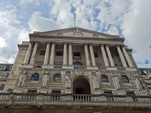
- In what sense is there a cultural revolution at the Bank of England?
 The New Year is a time for reflection and prediction. What will the New Year bring? What does the longer-term future hold? Here are two articles from The Guardian that look into the future.
 But it’s the ‘ceteris paribus‘ assumption that’s the problem. Other things are not equal. The world is constantly changing and there are all sorts of unpredictable events that will influence the outcomes of economic policy and of economic decisions more generally. And central to the problem are people’s attitudes and confidence. Mood can swing quite dramatically, from irrational exuberance to deep pessimism. And such mood changes – often triggered by some exogenous factor, such as an international dispute, an election or unexpected economic news – can rapidly gather momentum and have significant effects.


