 It doesn’t seem long ago that we were looking at the prospects of Brazil for hosting the Football World Cup. Now, we turn to the same economy, but this time for the Olympics. It is often the case that hosting big global sporting events can give a boost to the host nation, but is Brazil prepared for it? Did the World Cup bring the expected economic boosts? Some argue that the Olympics is just what Brazil needs, but others suggest it will only worsen the economic situation in the world’s seventh largest economy.
Brazil’s economic performance in the past year was not good. In fact, it was one of the worst performing nations of any major economy, with GDP falling by 3%. This is a very different country from the one that was awarded this biggest of sporting events. Despite these difficult times, Brazil’s government maintains that the country is ready and that the games will be ‘spectacular’.
Key to hosting a sporting event such as the Olympics is the infrastructure investment and as a key component of aggregate demand, this should be a stimulant for growth and job creation. However, with the economy still struggling, many are concerned that the infrastructure won’t be in place in time.
Other benefits from this should be the boost to growth driven by athletes and spectators coming from around the globe, buying tickets, memorabilia, accommodation, food and other items that tourists tend to buy. A multiplier effect should be seen and according to research has the potential to create significant benefits for the whole economy and not just the local regions where events take place. You can look at similar analysis in blogs written about Tokyo: 2020 Tokyo Olympics and London: The London Olympics legacy: a cost–benefit analysis and Does hosting the Olympics Games increase economic growth?
But, is this really likely to happen, especially given the somewhat lacklustre boost that the Brazil World Cup gave to the economy? The following articles consider this.
Rio 2016: Can Games bounce back from Brazil economic woes? BBC News, Bill Wilson (11/03/16)
Does hosting the Olympics actually pay off? It’s the economy, Binyamin Applebaum (5/08/14)
Rio Olympics no help to Brazil economy based on World Cup Bloomberg, Raymond Colitt (16/01/15)
The economic impact of Brazil’s 2014 World Cup and 2016 Olympics Saxo Group, Trading Floor, Sverrir Sverrisson (27/08/12)
Special Interview: Cost–benefit analysis of hosting the World Cup, Olympics Al Arabiya, Ricardo Guerra (3/7/14)
Questions
- How might you carry out a cost–benefit analysis to decide whether to host a big sporting event?
- Are there any externalities that might result from hosting the Olympics? How easy is it to estimate their monetary value? Should this be taken into account by a country when making a decision?
- Why might there be a boost to aggregate demand prior to the Olympics?
- Why might there be a multiplier effect when a nation hosts the Olympics or another sporting event?
- Might there be benefits to Brazil’s neighbours from its hosting the Olympics?
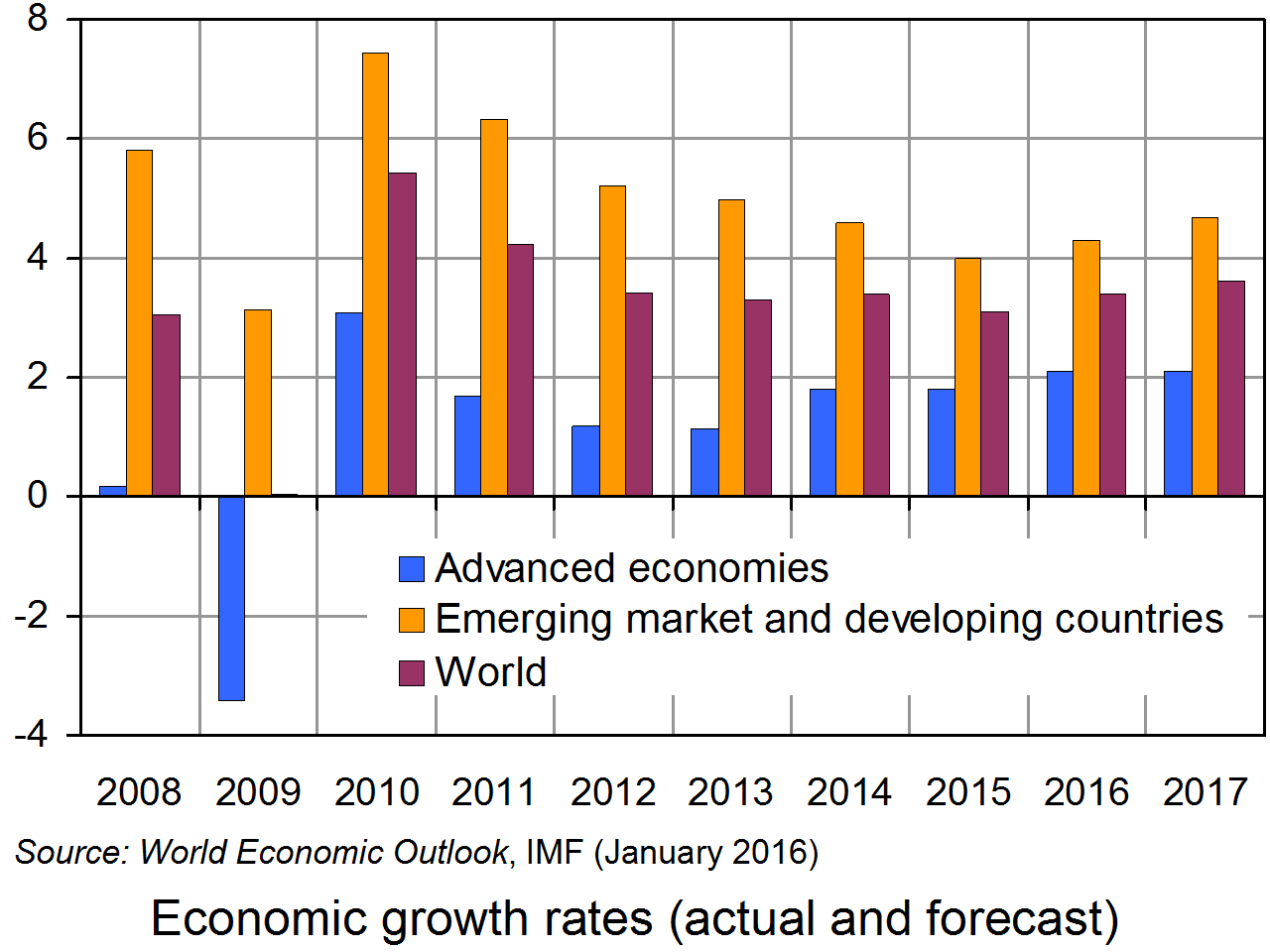
 There is a lot of pessimism around about the state of the global economy and the prospects for more sustained growth. Stock markets have been turbulent; oil and other commodity prices have fallen; inflation has been below central bank targets in most countries; and growth has declined in many countries, most worryingly in China.
The latest worry, expressed by finance ministers at the G20 conference in Shanghai, is that UK exit from the EU could have a negative impact on economic growth, not just for the UK, but for the global economy generally.
But is this pessimism justified? In an interesting article in the Independent, Hamish McRae argues that there are five signs that the world economy is not doomed yet! These are:
|
|
| • |
There are more monetary and fiscal measures that can still be taken to boost aggregate demand. |
| • |
Despite some slowing of economic growth, there is no sign of a global recession in the offing. |
|
|
| • |
US and UK growth are relatively buoyant, with consumer demand ‘driving the economy forward’. |
| • |
Deflation worries are too great, especially when lower prices are caused by lower commodity prices. These lower costs should act to stimulate demand as consumers have more real purchasing power. |
| • |
Inflation may start to edge upwards over the coming months and this will help to increase confidence as it will be taken as a sign that demand is recovering. |
So, according to McRae, there are five things we should look for to check on whether the global economy is recovering. He itemises these at the end of the article. But are these the only things we should look for?
Five signs that the world economy is not doomed yet Independent, Hamish McRae (27/2/15)
Questions
- What reasons are there to think that the world will grow more strongly in 2016 than in 2015?
- What reasons are there to think that the world will grow less strongly in 2016 than in 2015?
- Distinguish between leading and lagging indicators of economic growth.
- Do you agree with McRae’s choice of five indicators of whether the world economy is likely to grow more strongly?
- What indicators would you add to his list?
- Give some examples of ‘economic shocks’ that could upset predictions of economic growth rates. Explain their effect.
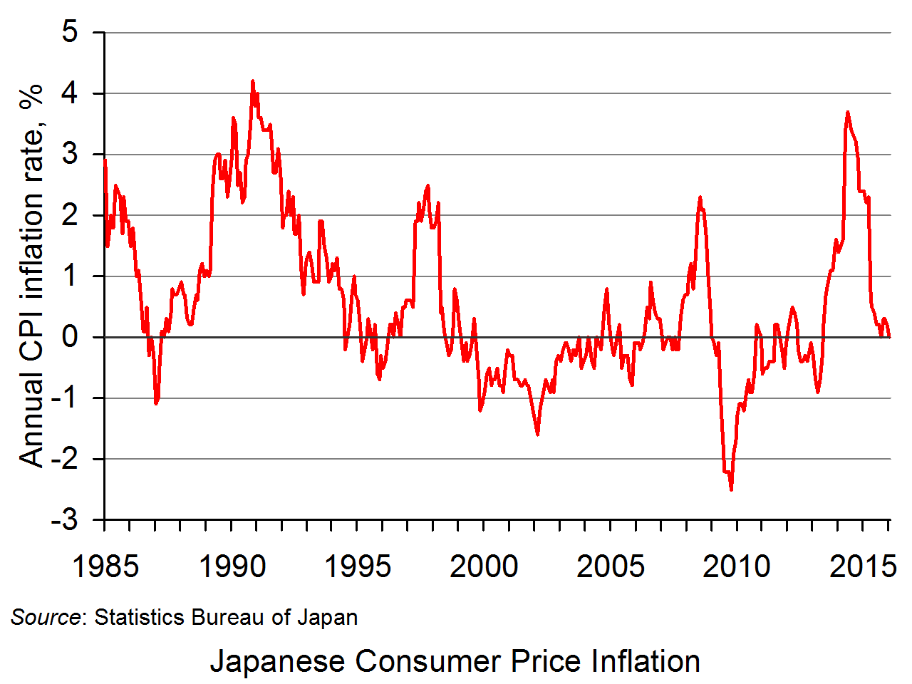
 In the blog Japan’s interesting monetary policy as deflation fears grow we detailed the aggressive monetary measures of Japan’s central bank to prevent a deflationary mindset becoming again established. In January it introduced a negative interest rate on some deposits placed with it by commercial banks. This is in addition to it massive quantitative easing programme to boost the country’s money supply. Despite this, the latest consumer price inflation data show inflation now running at zero per cent.
 As the chart shows, since the mid 1990s there have been protracted periods of Japanese price deflation (click here to download a PowerPoint file of the chart). In January 2013 Japan introduced a 2 per cent CPI inflation target. This was accompanied by a massive expansion of its quantitative easing programme, through purchases of government bonds from investors.
Following this substantial monetary loosening, buoyed too by a loosening of fiscal policy, the rate of inflation rose. It reached 3.7 per cent in May 2014.
However, through 2015 the rate of inflation began to fall sharply, partly the result of falling commodity prices, especially oil. The latest inflation data show that the annual rate of CPI inflation in January 2016 fell to zero percent. In other words, consumer prices were on average at the levels seen in January 2015.
 The latest inflation numbers appear give further credence to the fear of the Bank of Japan that deflation is set to return. The introduction of a negative deposit rate was the latest move to prevent deflation. As well as encouraging banks to lend, the move is intended to affect expectations of inflation. By adopting such an aggressive monetary stance the central bank is looking to prevent a deflationary mindset becoming re-established. Hence, by increasing the expectations of the inflation rate and by raising wage demands the inflation rate will rise.
The loosening of monetary policy through a negative interest rate follows the acceleration of the quantitative easing programme announced in October 2015 to conduct Open Market Operations so as to increase the monetary base annually by ¥80 trillion.
The decline of Japan’s inflation rate to zero may yet mean that further monetary loosening might be called for. Eradicating a deflationary mindset is proving incredibly difficult. Where next for Japan’s monetary authorities?
Data
Consumer Price Index Statistics Bureau of Japan
New Articles
Japan’s inflation drops to zero in January MarketWatch, Takashi Nakamichi (25/2/16)
Japan inflation falls back to zero in January: govt AFP (26/2/16)
With pause in inflation, many brace for retreat Nikkei Asian Review (27/2/16)
Japan’s inflation rate has fallen again – to 0% Business Insider Australia, David Scutt (26/2/16)
Previous Articles
Bank of Japan adopts negative interest rate policy CNBC, Nyshka Chandran (29/1/16)
Japan adopts negative interest rate in surprise move BBC News (29/1/16)
Bank of Japan shocks markets by adopting negative interest rates The Guardian, Justin McCurry (29/1/16)
Japan stuns markets by slashing interests rates into negative territory The Telegraph, Mehreen Khan (29/1/16)
Japan introduces negative interest rate to boost economy The Herald, (29/1/16)
Questions
- What is deflation?
- What are the dangers of deflation? Why is the Bank of Japan keen to avoid expectations of deflation becoming re-established?
- To what extent are national policy-makers able to exert pressure over the rate of inflation?
- What does a negative interest rate on deposits mean for depositors?
- What effect is the Bank of Japan hoping that a negative deposit rate will have on the Japanese economy? How would such effects be expected to occur?
- What effect might the Bank of Japan’s actions be expected to have on the structure of interest rates in the economy?
- How might the negative interest rate effect how people wish to hold their wealth?
 As most developed countries continue to experience relatively low rates of economic growth by historical standards, governments and central banks struggle to find means of stimulating aggregate demand.
One explanation of sluggish growth in demand is that people on higher incomes have enough of most things. They have reached ‘peak stuff’. As the Will Hutton article linked below states:
Around the developed world consumers seem to be losing their appetite for more. Even goods for which there once seemed insatiable demand seem to be losing their lustre. Last week, mighty Apple reported that in the last three months of 2015 global sales of the iPhone stagnated, while sales of iPads tumbled from 21m units in 2014 to 16m in the same three months of 2015. In the more prosaic parts of the economy – from cars to home furnishings – there are other warnings that demand is saturated.
People on lower incomes may still want more, but with income inequality growing in most countries, they don’t have the means of buying more. Indeed, a redistribution from rich to poor may be an effective means of increasing aggregate demand and stimulating economic growth.
 It’s important to clarify what is meant by peak demand for such products. It is not being said that people will stop buying them – that future demand will be zero. People will continue to buy such products. In the case of durables, people will buy replacements when products such as furniture, fridges and cars wear out; or upgraded versions as new models of televisions, smartphones or, again, cars come out; or new music tracks or films as they become available for download, or clothing as new fashions appear in shops. In the case of foodstuffs, concerts, football matches and other consumables, they too will continue to be purchased. The point is, in the case of peak demand, the demand per period of time is not going to grow. And the more products there are that reach peak demand, the harder it will be for companies and economies to grow.
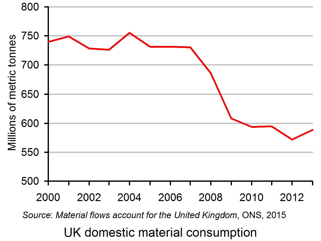
 If peak demand has generally been reached, it is likely that the demand for material resources will also have peaked. Indeed, we could expect the demand for material resources to be declining as (a) there has also been an increase in the efficiency of production, so that a lower volume of material inputs is required to produce any given level of output and (b) there has been a general switch towards services and away from physical goods. The graph shows domestic material consumption in the UK in millions of metric tonnes. Domestic material consumption is defined as domestic extraction of resources minus exports of resources plus imports of resources. As you can see, domestic material consumption peaked in 2004.
But, although peak demand may have been reached in some markets, there are others where there is still the potential for growth. To understand this and identify where such markets may be, it is important to step back from simple notions of consumption to satisfy materialistic demand and focus on the choices people might make to increase their happiness or wellbeing or sense of self worth in society. Thus while we might have reached peak red meat, peak sugar, peak cars, peak furniture and even peak electronic gadgets, we have not reached peak demand for more satisfying experiences. The demand for education, health, social activities, environmental conservation and a range of fulfilling experiences may have considerable potential for growth.
There are business opportunities here, whether in the leisure industry, in building networks of like-minded people or in producing niche goods that satisfy the demands of people with specific interests. But without greater equality there may be many fewer business opportunities in the mass production industries producing standardised goods.
This is not a world in which goods and services are produced at scale as conventionally measured, but a honeycomb economy of niches and information networks whose new dynamics we barely understand, even if we have a better grasp of its values.
Articles
- If having more no longer satisfies us, perhaps we’ve reached ‘peak stuff’
The Guardian, Will Hutton (31/1/16)
- Steve Howard, Ikea Exec, Says The World Has Hit ‘Peak Stuff’
Huffington Post, Zi-Ann Lum (20/1/16)
- We’ve hit peak home furnishings, says Ikea boss
The Guardian, Sean Farrell (18/1/16)
- Peak stuff: the ‘growth’ party is over. So what next?
The Ecologist, Bennet Francis and Rupert Read (22/1/16)
- Have we reached peak ‘stuff’?
The Mancunion, Tristan Parsons (22/2/16)
- Ikea senses room to grow amid ‘peak stuff’
Financial Times, Aliya Ram and Richard Milne (18/1/16)
- Peak Stuff
ifs insights, Janet Hontoir (21/2/16)
- UK retail sales soar as Brits splash their cash on ‘fun stuff’
The Telegraph, Szu Ping Chan (19/2/16)
- How less stuff could make us happier – and fix stagnation
The Guardian, Katie Allen (26/4/16)
Questions
- What are the implications of countries reaching ‘peak stuff’ for (a) the marginal utility of mass produced goods; (b) the marginal propensity to consume and the multiplier?
- Give some examples of goods or services where peak stuff has not been reached.
- If peak stuff has only been reached for certain products, does this mean that there may still be considerable potential for stimulating aggregate demand without a redistribution of income?
- Would it be in the interests of companies such as Asda to make a unilateral decision to pay their workers more? Explain why or why not.
- Why may we be a long way from reaching peak demand for housing, even without a redistribution of income?
- Make out a case for and against tax cuts as a way of stimulating (a) economic growth and (b) a growth in wellbeing? Do your arguments depend on which taxes are cut? Explain.
- The Ecologist article states that “Attaining one-planet living will probably involve in due course achieving degrowth in countries such as ours: building down our economy to a safe level.” Could such an objective be achieved through a mixed market economy? If so, how? If not, why not?
- Does the Telegraph article suggest that peak stuff has not yet been reached as far as most UK consumers are concerned?
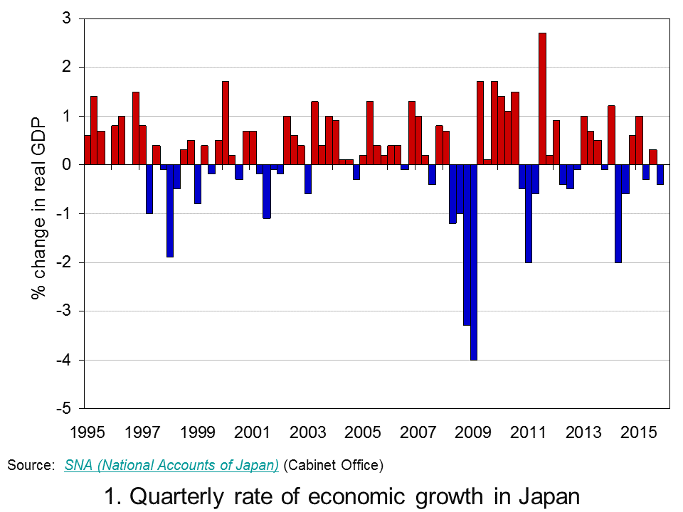
 Sustained economic growth in Japan remains elusive. Preliminary Quarterly Estimates of GDP point to the Japanese economy having contracted by 0.4 per cent in the final quarter of 2015. This follows on from growth of 0.3 per cent in the third quarter, a contraction of 0.3 per cent in the second and growth of 1 per cent in the first quarter. Taken as a whole output in 2015 rose by 0.4 per cent compared to zero growth in 2014. The fragility of growth means that over the past 20 years the average annual rate of growth in Japan is a mere 0.8 per cent.
 Chart 1 shows the quarter-to-quarter change in real GDP in Japan since the mid 1990s (Click here to download a PowerPoint of the chart). While economies are known to be inherently volatile the Japanese growth story over the past twenty or years so is one both of exceptional volatility and of repeated bouts of recession. Since the mid 1990s Japan has experienced 6 recessions, four since 2008.
Of the four recessions since 2008, the deepest was that from 2008 Q2 to 2009 Q1 which saw the economy shrink by 9.2 per cent. This was followed by a recession from 2010 Q4 to 2011 Q2 when the economy shrunk by 3.1 per cent, then from 2012 Q2 to 2012 Q4 when the economy shrunk by 0.9 per cent and from 2014 Q2 to 2014 Q3 when output fell another 2.7 per cent. As a result of these four recessionary periods the economy’s output in 2015 Q4 was actually 0.4 per cent less than in 2008 Q1.
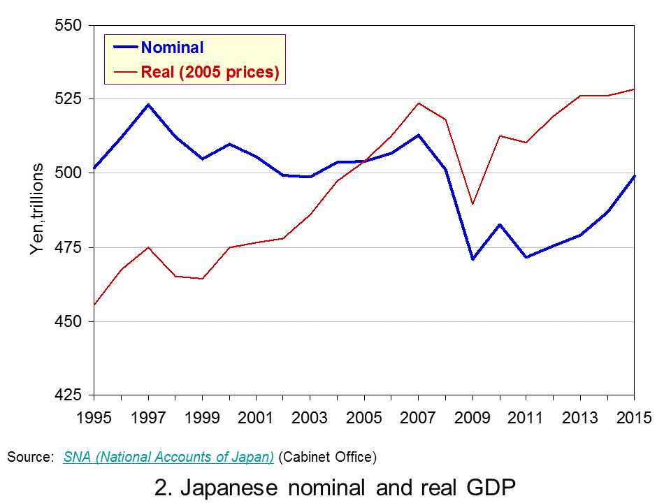
 Chart 2 shows the annual levels of nominal (actual) and real (constant-price) GDP in trillions of Yen (¥) since 1995. (Click here to download a PowerPoint of the chart). Over the period actual GDP has fallen from ¥502 trillion to ¥499 trillion (about £3 trillion at the current exchange rate) while GDP at constant 2005 prices has risen from ¥455 trillion to ¥528 trillion.
Chart 2 reveals an interesting phenomenon: the growth in real GDP at the same time as a fall in nominal GDP. So why has the actual value of GDP fallen slightly between 1995 and 2005? The answer is quite simple: deflation.
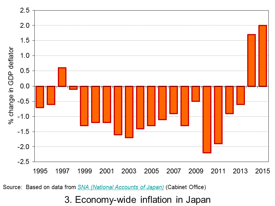
 Chart 3 shows a protracted period of economy-wide deflation from 1999 to 2013. (Click here to download a PowerPoint of the chart). Over this period the GDP deflator fell each year by an average of 1.0 per cent. 2014 and 2015 saw a pick up in economy-wide inflation. However, the quarterly profile through 2015 shows the pace of inflation falling quite markedly. As we saw in Japan’s interesting monetary stance as deflation fears grow, policymakers are again concerned about the possibility of deflation and the risks that poses for growth.
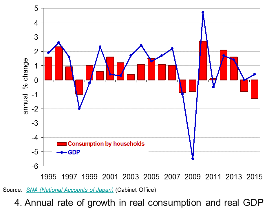
 As Chart 4 helps to demonstrate, a significant factor behind the latest slowdown in Japan’s growth is household spending. (Click here to download a PowerPoint of the chart). In 2015 household spending accounted for about 57 per cent by value of GDP in Japan. In the last quarter of 2015 real household spending fell by 0.9 per cent while across 2015 as a whole real household spending fell by 1.3 per cent. This follows on from a 0.8 per cent decrease in spending by households in 2014.
The recent marked weakening of household spending is a significant concern for the short term growth prospects of the Japanese economy. The roller coaster ride continues, unfortunately it appears that the ride is again downwards.
Data
Quarterly Estimates of GDP Japanese Cabinet Office
Japan and the IMF IMF Country Reports
Economic Outlook Annex Tables OECD
Articles
Japan’s economy contracts in fourth quarter BBC News, (15/2/16)
Japanese economy shrinks again, raising expectations of more stimulus Telegraph, Szu Ping Chan (15/2/16)
Japan’s economy shrinks again as Abenomics is blown off course Guardian, Justin McCurry (15/2/16)
Japan’s economy contracts in latest setback for Abe policies New Zealand Herald, (15/2/16)
Japan’s ‘Abenomics’ on the ropes as yen soars, markets plunge Daily Mail, (15/2/16)
Japan economy shrinks more than expected, highlights lack of policy options CNBC, Leika Kihara and Tetsushi Kajimoto (15/2/16)
Questions
- Why is the distinction between nominal and real important in analysing economic growth?
- How do we define a recession?
- Of what importance is aggregate demand to the volatility of economies?
- Why are Japanese policymakers concerned about the prospects of deflation?
- What policy options are available to policymakers trying to combat deflation?
- Why is the strength of household consumption important in affecting the path of an economy?
- Why has Japan experienced an increase in real GDP but a fall in nominal GDP between 1995 and 2015?
 It doesn’t seem long ago that we were looking at the prospects of Brazil for hosting the Football World Cup. Now, we turn to the same economy, but this time for the Olympics. It is often the case that hosting big global sporting events can give a boost to the host nation, but is Brazil prepared for it? Did the World Cup bring the expected economic boosts? Some argue that the Olympics is just what Brazil needs, but others suggest it will only worsen the economic situation in the world’s seventh largest economy.
