 UK house prices are incredibly volatile. This helps to explain the fascination that many of us have with the British housing market. According to the latest ONS house Price Index, the average UK house price in August 2013 was 3.8 per cent higher than 12 months earlier. The rates varied across the home nations: 4.1 per cent in England, 1.1 per cent in Northern Ireland, 1 per cent in Wales and -0.7 per cent in Scotland. Here we take a look at international house price inflation rates. Is the British housing market as unique as we think it is?
Let’s begin at home (excuse the pun). If we take the period from 1970 Q1 to 2013 Q2, the average annual rate of house price inflation across the UK is 9.7 per cent. The average rate in England is 9.8 per cent, as it is in Wales too, while in Scotland it is 9.0 per cent and in Northern Ireland it is 8.8 per cent. While the long-term averages of the UK nations are rather more similar than perhaps we might expect, what is quite interesting is the differences that emerge in more recent times. If we take the period from July 2008 to August 2013, the average annual rate of house price inflation in the UK is -0.2 per cent, in England it is 0.1 per cent, in both Wales and Scotland it is -1.0 per cent, while in Northern Ireland it is -11 per cent.
The recent English average is heavily distorted by London and to a lesser extent the rest of the South East. In London and the South East the average annual house price inflation rates since July 2008 have been 2.6 per cent and 0.2 per cent respectively. In all the other English regions the average rate has been negative. In my own region of the East Midlands the average rate has been -1.2 per cent – this is exactly the UK average if both London and the South East are removed from the figures.
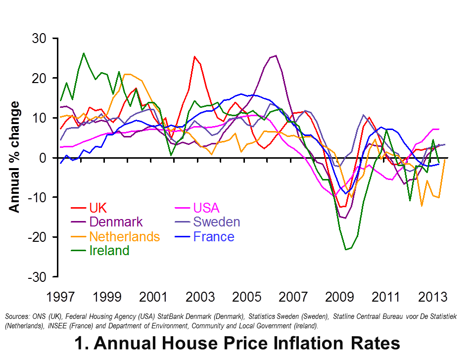 Now let’s go international. Chart 1 shows annual house price inflation rates for the UK and six other countries since 1997. Interestingly, it shows that house price volatility is a common feature of housing markets. It is not a uniquely British thing. It also shows that the USA is notable for its relatively robust house price inflation rates of late. In the first half of 2013 annual house price inflation has been running at 7 per cent in America, compared with 2 to 3 per cent here in the UK. In contrast, the Netherlands has seen near-double digit rates of house price deflation over the past year, albeit with a rebound in the third quarter of this year. (Click here to download a PowerPoint of the chart.)
The chart captures very nicely the effect of the financial crisis and subsequent economic downturn on global house prices. Ireland saw annual rates of house price deflation touch 23 per cent in 2009 compared with rates of deflation of 12 per cent in the UK. Denmark too suffered significant house price deflation with prices falling at an annual rate of 15 per cent in 2009.
House price volatility appears to be an inherent characteristic of housing markets worldwide. Let’s now consider the extent to which house prices rise over the longer term. In doing so, we consider real house price growth after having stripped out the effect of consumer price inflation. Real house price growth measures the growth of house prices relative to consumer prices.
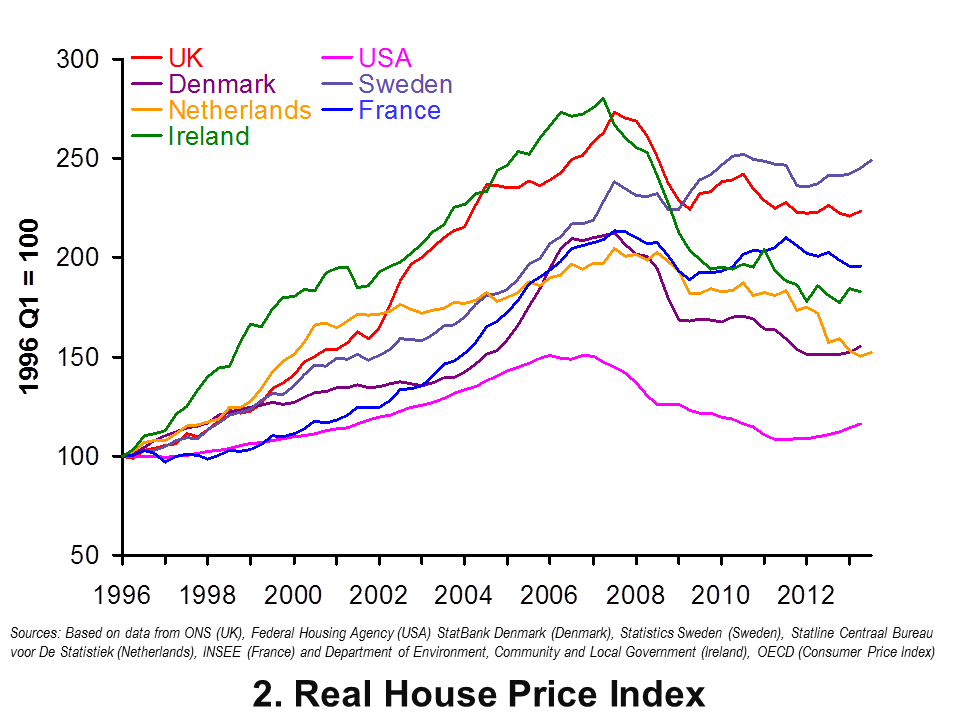 Chart 2 shows real house prices since 1996 Q1. (Click here to download a PowerPoint of the chart.) It shows that up to 2013 Q2, real house prices in the UK have risen by a factor of 2.24, i.e. they are two and a quarter times higher. This is a little less than in Sweden where prices are 2.5 times higher.
Chart 2 shows that the increase in real house prices in the UK and Sweden is significantly higher than in the other countries in the sample. In particular, in the USA real house prices in 2013 Q2 are only 1.16 times higher than in 1996 Q1. In the US actual house prices, when viewed over the past 17 years or so, have grown only a little more quickly than consumer prices.
The latest data on house prices suggest that house price volatility is not unique to the UK. However the rate of growth over the longer term relative to consumer prices is markedly quicker than in many other countries. It is this which helps to explain the amount of attention paid to the UK housing market – and not least by policy-makers.
Data
House Price Indices: Data Tables Office for National Statistics
Articles
First time buyers in race to beat house price rises Telegraph, Nicole Blackmore (8/11/13)
House prices soar by £13,000: Values rise at fastest rate for 3 years Express, Sarah O’Grady (7/11/13)
House prices: ‘south-east set to outpace London’ for first time in a decade Guardian, Jennifer Rankin (6/11/13)
UK house prices hit record level, says ONS BBC News, (15/10/13)
UK house prices rise at fastest pace in three years in October – Nationwide Reuter (31/11/13)
 Jonathan Portes: UK house prices a ‘force of evil’ BBC News, (5/11/13)
Questions
- What is meant by the annual rate of house price inflation? What about the annual rate of house price deflation?
- What factors are likely to affect housing demand?
- What factors are likely to affect housing supply?
- Explain the difference between nominal and real house prices. What does a real increase in house prices mean?
- How might we explain the recent differences between house price inflation rates in London and the South East relative to the rest of the UK?
- What might explain the very different long-term growth rates in real house prices in the USA and the UK?
- Why were house prices so affected by the financial crisis?
- What factors help explain the volatility in house prices?
 Compared with pre-financial crisis levels, the British pound is significantly weaker when measured against a basket of foreign currencies. In this blog we provide a further update of Appreciating a depreciating pound which was published back in early December 2012. The significance of the depreciation should be seen in the context of the UK as an open, island-economy where the ratio of exports to GDP in 2012 was close to 32%.
The competitiveness of our exports is, in part, affected by the exchange rate. Floating exchange rates are notoriously volatile. For example, some of the articles below show how sensitive the British pound can be latest news on the economy. However, since the autumn of 2007 we have observed a significant depreciation of the UK exchange rate. A depreciation helps to make our exports more competitive abroad and can potentially boost aggregate demand.
Rather than simply focus on bilateral exchange rates and so at the British pound separately against other foreign currencies, we can estimate an average exchange rate against a whole bundle of currencies. The average rate is calculated by weighting the individual exchange rates by the amount of trade between Britain and the other countries. This trade-weighted exchange rate is known as the effective exchange rate.
In analysing the competitiveness of the exchange rate, we can go one step further and adjust for the average (domestic currency) price of our exports relative to the average (foreign currency) price of those goods we import. Therefore, as well as the nominal (actual) effective exchange rate we can calculate a real effective exchange rate. If the average price of our exports rises relative to the average price of imports, the real effective exchange rate rises relative to the nominal rate. It means that we are able to obtain a larger volume of imports from selling a given volume of exports.
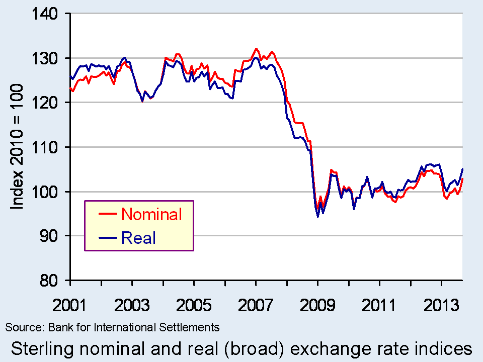
 The chart shows the nominal (actual) and real effective exchange rate for the British pound since 2001. The chart shows clearly how from the autumn of 2007 the effective exchange rate fell sharply both in nominal and real terms.
Over the period from July 2007 to January 2009 the nominal effective exchange rate fell by 26.8 per cent while the real effective exchange rate fell by 26.6 per cent. In other words, the British pound depreciated more than one-quarter over an 18-month period. In comparison, the American dollar rose by 5.3 per cent in nominal terms and by 1.9 per cent in real terms. (Click here to download a PowerPoint of the chart.)
If we move the clock forward, we observe an appreciation of the British pound between July 2011 and September 2012. Over this period, the British pound appreciated by 7.0 per cent in nominal terms and by 7.3 per cent in real terms. However, this appreciation had effectively been wiped-out when by March 2013 the nominal rate had depreciated by 6.1 per cent and by 5.6 per cent in real terms. Subsequently, there has been a slight appreciation once more. As of September, the nominal rate had risen by 4.5 per cent and the real rate by 4.8 per cent.
While, as recent figures help to demonstrate, the British pound continues on its roller-coaster ride, there has been a very marked depreciation since the giddy-days prior to the financial crisis. The facts show that when comparing the effective exchange rate in September 2013 with July 2007 the British pound was 21.8 per cent lower in nominal terms and 18.3 per cent in real terms. Over the same period, the US dollar, for example, was only 1.3 per cent lower in nominal terms and 6.1 per cent in real terms. This constitutes a major competitive boost for our exporters. Nonetheless, there remain uncertainty about just how much British exporters can take advantage of this, the amount that it will boost British growth and the impact it will make on the country’s chronic balance of trade deficit in goods which was close to 7 per cent of GDP in 2012.
Data
Statistical Interactive Database – interest and exchange rate rates data Bank of England
BIS effective exchange rate indices Bank for International Settlements
Market Data: Currencies BBC News
Recent Articles
Unexpected drop in factory output dents sterling Reuters UK, Jessica Mortimer (9/10/13)
Pound Forecasts Soar as BOE’s Carney Signals Shift: Currencies Bloombeg, Lukanyo Mnyanda and Emma Charlton (19/10/13)
Pound Advances as U.K. Financial Optimism Improves; Gilts Rise Bloombeg, Emma Charlton (7/10/13)
Re-balancing and the re-industrialisation of Britain BBC News, Linda Yueh (13/10/13)
Signs of recovery abound but with little consensus on future course Financial Times, Chris Giles and Sarah O’Connor (31/10/13)
Previous Articles
Pound depreciates Vs dollar to lowest level since Aug 16 Bloomberg, Emma Charlton (5/2/13)
Pound advances against euro on Italy speculation; Gilts decline Bloomberg, Lucy Meakin and David Goodman Alice Ross (4/3/13)
Pounding of sterling risks a currency war Scotland on Sunday, Bill Jamieson (17/2/13)
Credit ratings, the pound, currency movements and you BBC News, Kevin Peachey (25/2/13)
The Bank of England can’t just go on doing down the pound Telegraph, Jeremy Warner (21/2/13)
 Sterling will continue to go down BBC News, Jim Rogers (25/2/13)
Questions
- Explain how the foreign demand for goods and assets generates a demand for British pounds. How will this demand be affected by the foreign currency price of the British pound, i.e. the number of foreign currency units per £1?
- Explain how the demand by British residents for foreign goods and assets generates a supply of British pounds. How will this supply be affected by the foreign currency price of the British pound, i.e. the number of foreign currency units per £1?
- What factors are likely to shift the demand and supply curves for British pounds on the foreign exchange markets?
- Illustrate the effect of a decrease in the demand for British goods and assets on the exchange rate (i.e. the foreign currency price of the British pound) using a demand-supply diagram.
- What is the difference between a nominal and a real effective exchange rate? Which of these is a better indicator of the competitiveness of our country’s exports?
- What factors are likely to have caused the depreciation of the British pound since 2007?
- What is meant by a deficit on the balance of trade in goods?
- What relationship exists between the demand and supply of currencies on the foreign exchange markets and the balance of payments?
 The latest preliminary GDP estimates for 2013 Q3 suggest that the economy’s output (real GDP) expanded by 0.8 per cent following on the back of a 0.7 per cent increase in Q2. Growth was observed across the main industrial sectors with the important service sector growing by 0.7 per cent. While the output of the service sector is now 0.5 per cent higher than its 2008 Q1 peak, the total output of the economy remains 2.6 per cent below its 2008 Q1 peak.
The volatility of growth underpins the idea of business cycles and on occasions results in recessions. Today’s release needs to be set in the context of this volatility and in the context of 2008/9 recession which saw output fall by 7.2 per cent. UK output peaked in 2008 Q1 (£392.786 billion at 2010 prices). There then followed 6 quarters during which output declined.
Output declined again in 2010 Q4 (–0.2% growth) and again in 2011 Q4 (–0.1% growth). The estimates of real GDP for 2011 Q4 and 2012 Q1 are identical at £376.462 billion (at 2010 prices). Previous revisions have seen the 2012 Q1 growth number revised up so that a further recession resulting in a double-dip recession no longer appears in the figures.
While output is now portrayed as (very) flat in 2012 Q1, it did fall again in 2012 Q2 (–0.5 per cent growth) and in 2012 Q4 (–0.3 per cent growth). Moving forward in time, the latest ONS numbers show an economy that grew by 0.4 per cent in 2013 Q1 (to £377.301 billion at 2010 prices), by 0.7 per cent in 2013 Q2 (to £379.780 billion at 2010 prices) and by 0.8 per cent in 2013 Q3 billion (to £382.818 billion at 2010 prices). Compared with 2012 Q3, the output of the UK economy in 2013 Q2 is 1.5 per cent higher.
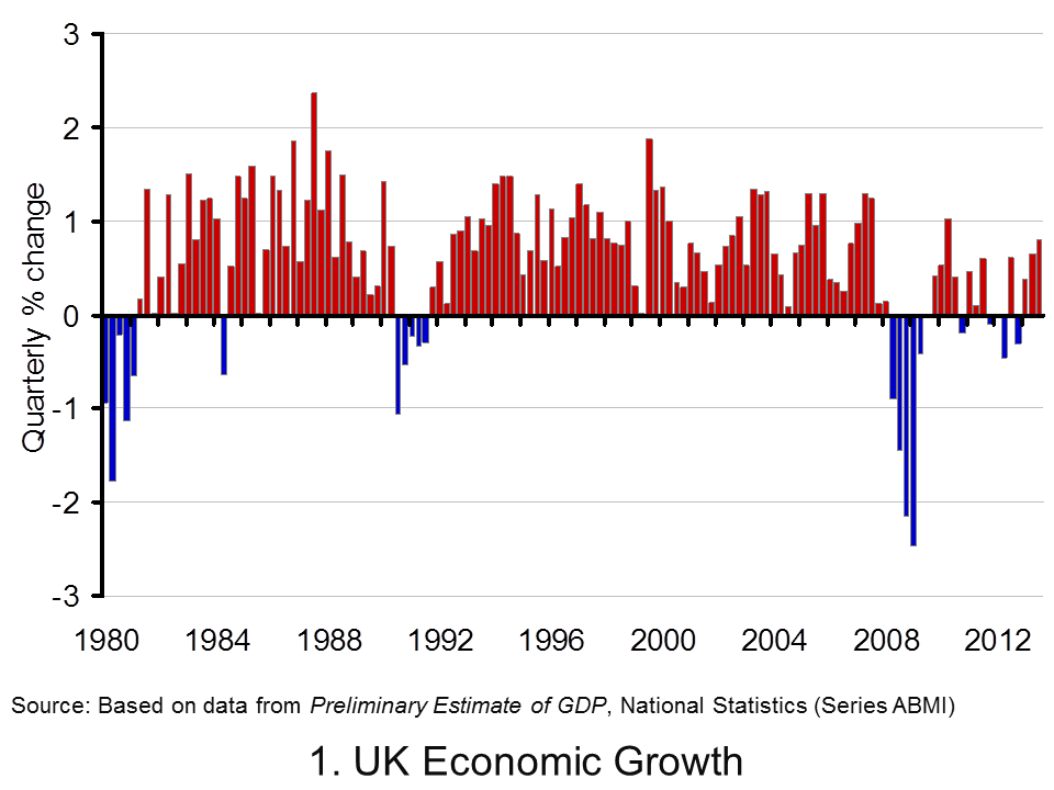
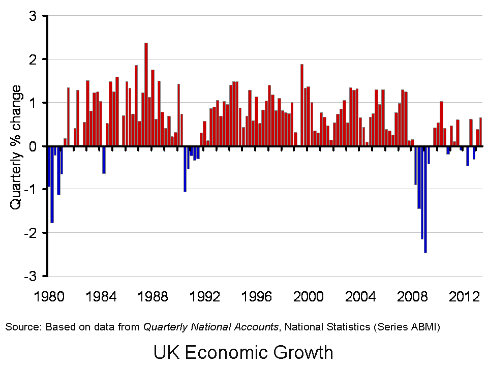
 Chart 1 helps to put the recent growth numbers into an historical context. It shows the quarterly change in real GDP since the 1980s. From it, we can see the 5-quarter recession that commenced in 1980 Q1 when output shrunk by 4.6 per cent, the 5-quarter recession that commenced in 1990 Q3 when output shrank by 2.4 per cent and the 6-quarter recession that commenced in 2008 Q2 when output shrank by 7.2 per cent. (Click here to download a PowerPoint of the chart.)
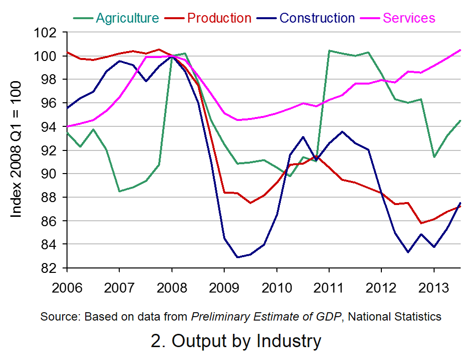
 Chart 2 scratches a little below the surface by looking at output by the four principal industrial types. The interesting finding is that the output of the service sector has now risen above its 2008 Q1 peak. In 2013 Q3 output is 0.5 per cent larger. By contrast, the other three sectors remain smaller than in 2008 Q1. Agriculture, forestry and fisheries is 5.9 per cent smaller, construction 14.3 per cent smaller and production (including manufacturing) is 14.6 per cent smaller. (Click here to download a PowerPoint of the chart.)
With today’s release, quarterly growth now averages –0.11 per cent since 2008 Q2. If we take the series back to the mid 1950s when it began, the average quarterly rate of growth is 0.64 per cent which is equivalent to an annual rate of increase of 2.57 per cent. While today’s news is encouraging it remains important to keep it in perspective and to ensure that growth is sustainable and built on firm foundations.
Data
Preliminary Estimate of GDP – Time Series Dataset Q3 2013 Office for National StatisticsGross Domestic Product Preliminary Estimate, Q3 2013 Office for National Statistics
New Articles
UK economy grows by 0.8% – the fastest pace in three years Guardian, Larry Elliott (25/10/13)
UK economy grew by 0.8% in third quarter Independent, Nick Renaud-Komiya (25/10/13)
UK GDP: fastest growth for three years BBC News (25/10/13)
UK economy grows by 0.8pc in third quarter Telegraph, Szu Ping Chu (25/10/13)
UK Economy: GDP Growth Accelerates To 0.8% Sky News (25/10/13)
Previous Articles
GDP grows 0.7% as UK economy shows steady recovery Guardian, Phillip Inman (26/9/13)
Hopes of economic recovery take double blow as GDP remains at 0.7% Independent, Russell Lynch (26/9/13)
UK economic growth confirmed at 0.7% BBC News (26/9/13)
IMF cuts global growth outlook but raises UK forecast BBC News (9/10/13)
Good news as IMF upgrades UK’s growth forecast Independent, Ben Chu (8/10/13)
Economy: IMF Makes UK Growth Forecast U-Turn Sky News (8/10/13)
Questions
- What is the difference between nominal and real GDP? Which of these helps to track changes in economic output?
- Looking at Chart 1 above, summarise the key patterns in real GDP since the 1980s.
- What is a recession? What is a double-dip recession?
- What are some of the problems with the traditional definition of a recession?
- Explain the arguments for and against the proposition that the UK has recently experienced a double-dip recession.
- Can a recession occur if nominal GDP is actually rising? Explain your answer.
- What factors might result in economic growth being so variable?
- What factors might explain the very different patterns seen since the late 2000s in the volume of output of the 4 main industrial sectors?
- Produce a short briefing paper exploring the prospects for economic growth in the UK over the next 12 to 18 months.
 One very important characteristic of economic growth is its short-term volatility. The volatility of growth underpins the idea of business cycles and on occasions results in recessions. The traditional definition is where real GDP (output) declines for 2 or more consecutive quarters. Interestingly, the latest GDP numbers contained in the Quarterly National Accounts mean that the recession previously evidenced from 2011 Q4 to 2012 Q2 has effectively disappeared. Nonetheless, output today is still 3.3 per cent lower than before the 2008 economic downturn.
The ONS’s latest output numbers raise some interesting questions around our understanding of what constitutes a recession. Should, for instance, we define it solely in terms of real GDP and, even if we do, is a strict statistical definition based around two consecutive quarterly falls appropriate? The recent estimates from the ONS show that the 2008/9 recession saw output fall by 7.2 per cent. They show that UK output peaked in 2008Q1 (£392.786 billion at 2010 prices). There then followed 6 quarters during which output declined.
Output declined again in 2010 Q4 (-0.2% growth) and again in 2011 Q4 (-0.1% growth). The new estimates of real GDP for 2011 Q4 and 2012 Q1 are now identical at £376,462 billion (at 2010 prices). Previous revisions have also seen the 2012 Q1 growth number revised up and, hence, a further recession resulting in a double-dip recession has effectively now been statistically removed. The 2013 Q1 Quarterly National Accounts revised growth up so that 2012 Q1 only saw a percentage fall when measured to the third decimal place (–0.007% growth).
While output is now portrayed as (very) flat in 2012 Q1, it did fall again in 2012 Q2 (-0.5 per cent growth) and in 2012 Q4 (-0.3 per cent growth). Moving forward in time, the latest ONS numbers show that the economy grew by 0.4 per cent in 2013 Q1 (to £377,301 billion at 2010 prices) and by 0.7 per cent in 2013 Q2 (to £379,780 billion at 2010 prices). Despite this, output remains 3.3 per cent below its 2008 Q1 peak. A more positive spin on the numbers would be to point out that output is up 4.2 per cent from its 2009 Q3 trough (£364,557 billion at 2010 prices).
Perhaps the debate around the appearance and disappearance of recessions in official data strengthen the argument for a more holistic and considered view of what constitutes a recession. In the USA the wonderfully-named Business Cycle Dating Committee takes a less fixed view of economic activity and, hence, of recessions. Its website argues:
It (the Committee) examines and compares the behavior of various measures of broad activity: real GDP measured on the product and income sides, economy-wide employment, and real income. The Committee also may consider indicators that do not cover the entire economy, such as real sales and the Federal Reserve’s index of industrial production (IP).
 Of course, the advantage of focusing on real GDP alone in measuring activity and in determining recessions is that it is usually very straightforward to interpret. Regardless of whether the UK did or did not experience a recession at the end of 2011 and into 2012, the chart helps to put the recent growth numbers into an historical context. It shows the quarterly change in real GDP since the 1980s.
From the chart, we can see the 5-quarter recession that commenced in 1980 Q1 when output shrunk by 4.6 per cent, the 5-quarter recession that commenced in 1990 Q3 when output shrank by 2.4 per cent and the 6-quarter recession that commenced in 2008 Q2 when output shrank by 7.2 per cent. (Click here to download a PowerPoint version of the chart.)
The chart allows to see the other characteristic of growth too: over the long run growth is positive. Since 1980, the average rate of growth per quarter has been 0.57 per cent. This is equivalent to an average rate of growth of 2.3 per cent per year.
Since 2008 Q2, quarterly growth has averaged -0.16 per cent which is equivalent to an annual rate of growth of -0.63 per cent! In any language these are extraordinary numbers and certainly help to put the recent rebound in growth into context.
Data
Quarterly National Accounts Time Series Dataset Q2 2013 Office for National StatisticsStatistical Bulletin: Quarterly National Accounts Q2 2013 Office for National Statistics
New Articles
GDP grows 0.7% as UK economy shows steady recovery Guardian, Phillip Inman (26/9/13)
Hopes of economic recovery take double blow as GDP remains at 0.7% Independent, Russell Lynch (26/9/13)
UK economic growth confirmed at 0.7% BBC News (26/9/13)
IMF cuts global growth outlook but raises UK forecast BBC News (9/10/13)
Good news as IMF upgrades UK’s growth forecast Independent, Ben Chu (8/10/13)
Economy: IMF Makes UK Growth Forecast U-Turn Sky News (8/10/13)
Previous Articles
UK avoided double-dip recession in 2011, revised official data shows Guardian, Phillip Inman (27/6/13)
Britain’s double dip recession revised away, but picture still grim Reuters, David Milliken and William Schomberg (27/6/13)
UK double-dip recession revised away BBC News (27/6/13)
IMF raises UK economic growth forecast BBC News (9/7/13)
IMF raises UK economic growth forecast to 0.9% but cuts prediction for global growth Independent, Holly Williams (9/7/13)
IMF Upgrades UK Growth Forecast For 2013 Sky News (9/7/13)
Questions
- What is the difference between nominal and real GDP? Which of these helps to track changes in economic output?
- Looking at the chart above, summarise the key patterns in real GDP since the 1980s.
- What is a recession? What is a double-dip recession?
- What are some of the problems with the traditional definition of a recession?
- Explain the arguments for and against the proposition that the UK has recently experienced a double-dip recession.
- Can a recession occur if nominal GDP is actually rising? Explain your answer.
- What factors might result in economic growth being so variable?
- Produce a short briefing paper exploring the prospects for economic growth in the UK over the next 12 to 18 months.
 First the good news. Employment is rising and unemployment is falling. Both claimant count rates and Labour Force Survey rates are down. Compared with a year ago, employment is up 279,092 to 29,869,489; LFS unemployment is down from 7.87% to 7.69%; and the claimant count rate is down from 4.7% to 4.0%.
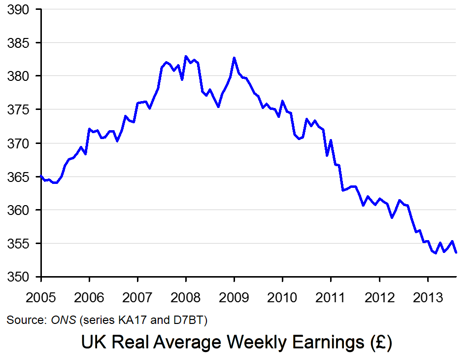
Now the bad news. Even though more people are in employment, real wages have fallen. In other words, nominal wages have risen less fast than prices. Since 2009, real wages have fallen by 7.6% and have continued to fall throughout this period. The first chart illustrates this. It shows average weekly wage rates in 2005 prices. (Click here for a PowerPoint of the chart.)
The fall in real wages is an average for the whole country. Many people, especially those on low incomes, have seen their real wages fall much faster than the average. For many there is a real ‘cost of living’ crisis.
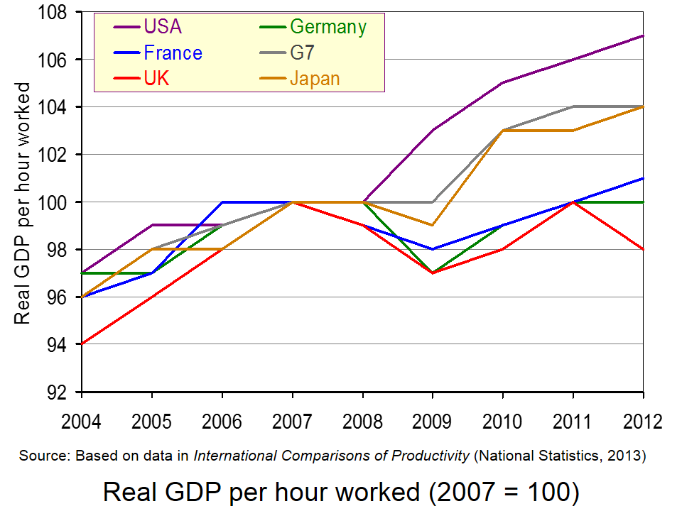
But why have real wages fallen despite the rise in employment? The answer is that output per hour worked has declined. This is illustrated in the second chart, which compares UK output per worker with that of other G7 countries. UK productivity has fallen both absolutely and relative to other G7 countries, most of which have had higher rates of investment.
 The falling productivity in the UK requires more people to be employed to produce the same level of output. Part of what seems to be happening is that many employers have been prepared to keep workers on in return for lower real wages, even if demand from their customers is falling. And many workers have been prepared to accept real wage cuts in return for keeping their jobs.
Another part of the explanation is that the jobs that have been created have been largely in low-skilled, low-wage sectors of the economy, such as retailing and other parts of the service sector.
But falling productivity is only part of the reason for falling real wages. The other part is rising prices. A number of factors have contributed to this. These include a depreciation of the exchange rate back in 2008, the effects of which took some time to filter through into higher prices in the shops; a large rise in various commodity prices; and a rise in VAT and various other administered prices.
So what is the answer to falling real wages? The articles below consider the problem and some of the possible policy alternatives.
Articles
Inflation, unemployment and UK ‘misery’ BBC News, Linda Yueh (16/10/13)
Employment is growing, but so are the wage slaves The Guardian, Larry Elliott (16/10/13)
Living standards – going down and, er, up BBC News, Nick Robinson (26/7/13)
Revealed: The cost of living is rising faster in the UK than anywhere in Europe, with soaring food and energy bills blamed Mail Online, Matt Chorley (16/10/13)
Cutting prices to raise living standards is just a waste of energy The Telegraph, Roger Bootle (6/10/13)
Downturn sees average real wages collapse to a record low Independent, Ben Chu (17/10/13)
Why living standards and public finances matter Financial Times, Gavin Kelly (29/9/13)
Social Mobility Tsar Alan Milburn Calls on Government to Boost Wages to End UK Child Poverty International Business Times, Ian Silvera (17/10/13)
Do incorrect employment growth figures explain low UK productivity? The Guardian, Katie Allen (23/10/13)
Data
Unemployment data ONS
Average Weekly Earnings dataset ONS
Consumer Prices Index ONS
International Comparison of Productivity ONS
Questions
- How are real wages measured?
- Why have real wage rates fallen in the UK since 2009?
- What factors should be included when measuring living standards?
- Why has employment risen and unemployment fallen over the past two years?
- What factors could lead to a rise in real wages in the future?
- What government policies could be adopted to raise real wages?
- Assess these policies in terms of their likely short-term success and long-term sustainability.
 UK house prices are incredibly volatile. This helps to explain the fascination that many of us have with the British housing market. According to the latest ONS house Price Index, the average UK house price in August 2013 was 3.8 per cent higher than 12 months earlier. The rates varied across the home nations: 4.1 per cent in England, 1.1 per cent in Northern Ireland, 1 per cent in Wales and -0.7 per cent in Scotland. Here we take a look at international house price inflation rates. Is the British housing market as unique as we think it is?
  Now let’s go international. Chart 1 shows annual house price inflation rates for the UK and six other countries since 1997. Interestingly, it shows that house price volatility is a common feature of housing markets. It is not a uniquely British thing. It also shows that the USA is notable for its relatively robust house price inflation rates of late. In the first half of 2013 annual house price inflation has been running at 7 per cent in America, compared with 2 to 3 per cent here in the UK. In contrast, the Netherlands has seen near-double digit rates of house price deflation over the past year, albeit with a rebound in the third quarter of this year. (Click here to download a PowerPoint of the chart.)
 Chart 2 shows real house prices since 1996 Q1. (Click here to download a PowerPoint of the chart.) It shows that up to 2013 Q2, real house prices in the UK have risen by a factor of 2.24, i.e. they are two and a quarter times higher. This is a little less than in Sweden where prices are 2.5 times higher.
 Jonathan Portes: UK house prices a ‘force of evil’ BBC News, (5/11/13)