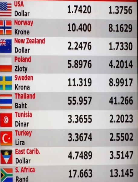
 According to latest evidence from the Bank for International Settlements, in April 2013 some £3.2 trillion ($5.3 trillion) of foreign exchange was traded daily on global foreign exchange (forex) markets. About 40% of forex dealing goes through trading rooms in London. This market is highly profitable for the UK economy. But all is not well with the way people trade. There is a scandal about rate fixing.
Exchange rates on the forex market are freely determined by demand and supply and fluctuate second by second, 24 hours a day, except for weekends. Nevertheless, once a day rates are fixed for certain trades. At 4pm GMT a set of reference rates is set for corporate customers by banks and other traders. The rates are set at the free market average over the one minute from 16:00 to 16:01. The allegation is that banks have been colluding, through text messaging and chat rooms, to manipulate the market over that one minute.
Since the early summer of 2013, the Financial Conduct Authority (FCA) in the UK, along with counterparts in the USA, Switzerland, Hong Kong and elsewhere, has been looking into these allegations. Last week (4/3/14), the Bank of England suspended a member of its staff as part of its own investigation into potential rigging of the foreign exchange market. The allegation is not that the staff member(s) were involved in the rigging but that they might have known about it.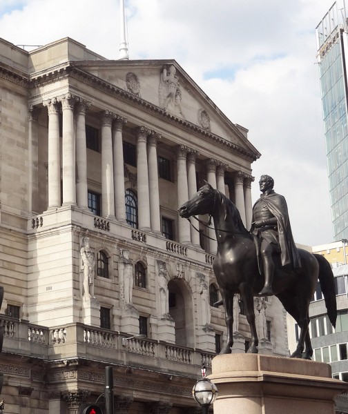 The Bank said that, “An oversight committee will lead further investigations into whether bank officials were involved in forex market manipulation or were aware of manipulation, or at least the potential for such manipulation.”
Meanwhile, the House of Commons Treasury Select Committee has been questioning Bank of England staff, including the governor, Mark Carney, about the scandal. Speaking to the Committee, Martin Wheatley, head of the FCA said that the investigation over rigging had been extended to 10 banks and that the allegations are every bit as bad as they have been with Libor.
Forex rigging ‘as serious as’ Libor scandal: Carney Yahoo News, Roland Jackson (11/2/14)
Forex manipulation: How it worked HITC (Here Is The City), Catherine Boyle (11/3/14)
Bank of England Chief Grilled Over Forex Scandal ABC News, Danica Kirka (11/3/14)
Carney Faces Grilling as Currency Scandal Snares BOE Bloomberg, Scott Hamilton and Suzi Ring (10/3/14)
UK financial body urges quick action over foreign exchange ‘fixing’ Reuters, Huw Jones (11/3/14)
Timeline -The FX “fixing” scandal Reuters, Jamie McGeever (11/3/14)
Forex in the spotlight Financial Times (16/2/14)
Forex scandal: What is that all about? BBC News (11/3/14)
 Bank of England in shake-up after rate manipulation criticism BBC News (11/3/14)
 Mark Carney faces Forex questions from MPs BBC News, Hugh Pym (11/3/14)
Bank of England’s Paul Fisher: ‘It’s not our job to go hunting for market wrongdoing’ Independent, Russell Lynch , Ben Chu (11/3/14)
Questions
- For what reasons would sterling appreciate against the dollar?
- Most of forex trading is for speculative purposes, rather than for financing trade or investment. Why is this and does it benefit international trade?
- If foreign exchange rates fluctuate, is it not a good thing that banks collude to agree the 4pm fixed rate? Explain.
- What was the Libor scandal? Why are some people arguing that the current forex scandal is worse?
- What can the FCA do to prevent collusion over exchange rates?
 It is rising inflation that typically causes problems for countries, whether it is demand-pull or cost-push. However, one country that has not been subject to problems of rising prices is Japan. Instead, this economy has been suffering from the gloom of deflation for many years and many argue that this is worse than high inflation.
Falling prices are popular among consumers. If you see a product whose price has fallen from one day to the next, you can use your income to buy more goods. What’s the problem with this? The Japanese economy has experienced largely stagnant growth for two decades and a key cause has been falling prices. When the prices of goods begin to fall over and over again, people start to form expectations about the future direction of prices. If I expect the price of a good to fall next week, then why would I buy now, if I can buy the same good next week at a lower price?  But, when next week arrives and the price has fallen as expected, why would I purchase the product, if I think that the price fall is set to continue? The problem of deflation is that with continuously falling prices, consumers stop spending. Aggregate demand therefore declines and economic growth all but disappears. This is the problem that the Japanese economy has been faced with for more than 20 years.
However, the latest data from Japan shows core consumer prices growing faster than expected in December 2013, compared to the previous year. This figure was above market forecasts and was the fastest rate of growth in the past 5 years. These data, together with those on unemployment have given the economy a much needed boost.
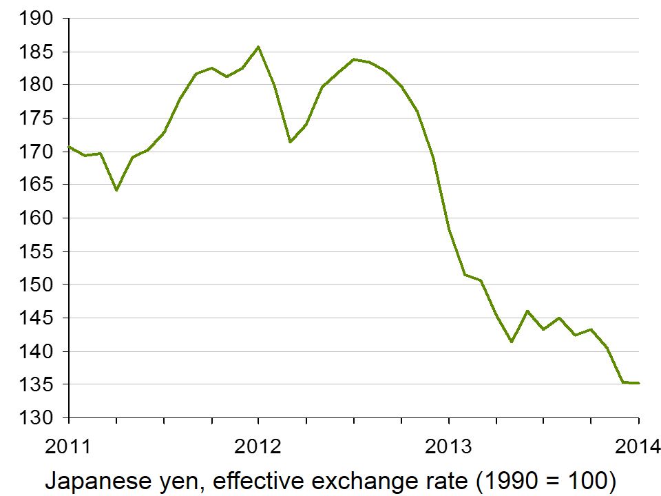
 Recent government policy has been focused on boosts in government spending, with an aim of reducing the value of the currency (click here for a PowerPoint of the chart). Such policies will directly target aggregate demand and this in turn should help to generate an increase in national output and push up prices. If the price trend does begin to reverse, consumers will start to spend and again aggregate demand will be stimulated.
The future of the economy remains uncertain, though the same can be said of many Western economies. However, the signs are good for Japan and if the recovery of other economies continues and gathers pace, Japan’s export market will be a big contributor to recovery. The following articles consider the Japanese economy.
Japan inflation rises at fastest pace in over five years BBC News (31/1/14)
Benchmark Japan inflation rate hits 1.3% Financial Times, Jonathan Soble (31/1/14)
Japan’s inflation accelerates as Abe seeks wage gains Bloomberg, Chikako Mogi, Masahiro Hidaka and James Mayger (31/1/14)
Japan inflation quickens to over 5-year high, output rebounds Reuters, Leika Kihara and Stanley White (31/1/14)
Japaense inflation rises at fastest pace in over five years at 1.3% in December 2013 Independent, Russel Lynch (31/1/14)
 Why Abenomics holds lessons for the West BBC News, Linda Yueh (18/12/13)
Questions
- Why is deflation a problem?
- Using an AD/AS diagram, illustrate the problem of expectations and how this contributes to stagnant growth.
- How will a lower currency help Japan?
- What is the likely effect of a sales tax being imposed?
- Does the fact that unemployment has declined support the fact that consumer prices are beginning to rise?
- What government policies would you recommend to a government faced with stagnant growth and falling prices?
- How important are expectations in creating the problem of deflation?
 World markets were taken by surprise by a large rise in Turkish interest rates on 28/1/14. In an attempt to combat a falling lira and rising inflation, the Turkish central bank raised its overnight lending rate from 7.75% to 12%. Following the decision, the lira appreciated by over 3%.
Since the start of this year, the Turkish lira had depreciated by 7.1% and since the start of 2013 by 22.8%. Along with the currencies of several other emerging economies, such as India and Brazil, speculators had been selling the Turkish currency. This has been triggered by worries that the Fed’s tapering off its quantitative easing programme would lead to a fall, and perhaps reversal, of the inflow of finance into these countries; in the worst-case scenario it could lead to substantial capital flight.
Consumer price inflation in Turkey is currently 7.4%, up from 6.2% a year ago. The central bank, in a statement issued alongside the interest rate rise, said that it would continue with a tight monetary policy until the inflation outlook showed a clear improvement.
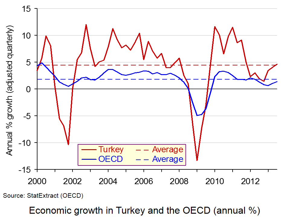
The Turkish Prime Minister, Tayyip Erdogan, has been opposed to rises in interest rates, fearing that the dampening effect on aggregate demand would reduce economic growth, which, as the chart shows, has been recovering recently (click here for a PowerPoint of the chart). A slowing of growth could damage his prospects in forthcoming elections.
World stock markets, however, rallied on the news, seeing the rise in interest rates as a symbolic step in emerging countries stemming outflows of capital.
Articles
Turkey raises interest from 7.75pc to 12pc The Telegraph (28/1/14)
Emerging markets forced to tighten by US and Chinese monetary superpowers The Telegraph, Ambrose Evans-Pritchard (28/1/14)
Turkey Gets Aggressive on Rates The Wall Street Journal, Joe Parkinson (28/1/14)
Turkish central bank raises lending rate to 12% BBC News (28/1/14)
Asian stock markets stage relief rally after Turkey rate rise BBC news (29/1/14)
Turkey raises rates to halt lira’s slide Financial Times, Daniel Dombey (29/1/14)
Turkey Rate Increase Stems Lira Drop as Basci Defies Erdogan Bloomberg Businessweek, Onur Ant and Taylan Bilgic (29/1/14)
Fragile economies under pressure as recovery prompts capital flight The Observer, Angela Monaghan (2/2/14)
Data
Main Economic Indicators (including Turkish data) OECD
Data on Turkey, World Economic Outlook database IMF
Turkey price indices Central Bank of the Republic of Turkey
Questions
- Why did the Turkish central bank decide to raise interest rates by such a large amount?
- Why has the Turkish lira been depreciating so much over the past few months? How has this been linked to changes in Turkey’s balance of payments and what parts of the balance of payments account have been affected?
- Why did global stock markets rally on the news from Turkey?
- What will be the impact of the central bank’s actions on (a) inflation; (b) economic growth?
- How has the USA’s quantitative easing programme affected developing countries?
 Politicians often make use of economic statistics to promote their point of view. A good example is a claim made by the UK Prime Minister on 23 January 2014. According to the latest statistics, he said, most British workers have seen their take-home pay rise in real terms. The Labour party countered this by arguing that incomes are not keeping up with prices.
So who is right? Studying economics and being familiar with analysing economic data should help you answer this question. Not surprisingly, the answer depends on just how you define the issue and what datasets you use.
The Prime Minister was referring to National Statistics’ Annual Survey of Hours and Earnings (ASHE). This shows that in April 2013 median gross weekly earnings for full-time employees were £517.5, up 2.25% from £506.10 in 2012, and mean gross weekly earnings for full-time employees were £620.30, up 2.06% from £607.80 in 2012 (see Table 1.1a in the dataset). CPI inflation over this period was 2.4%, representing a real fall in median gross weekly earnings of 0.15% and mean gross weekly earnings of 0.34%.
But when adjustments are made for increases in personal income tax allowances, then, according to the government, except for the richest 10% of the working population, people had an average increase in real take-home pay of 1.1%.
But does this paint the complete picture? Critics of the government’s claim that people are ‘better off’, make the following points.
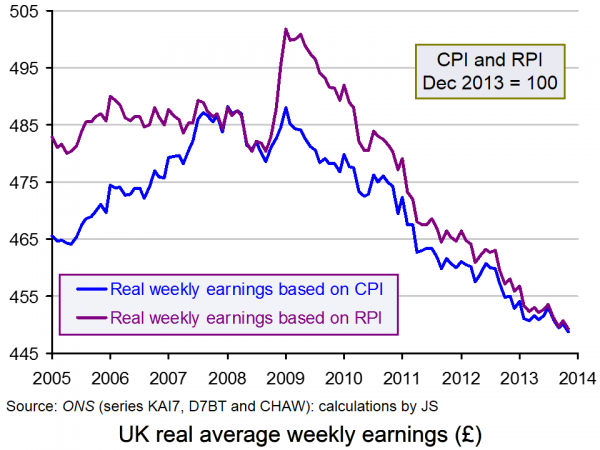
First, the ASHE dataset is for the year ending April 2013. The ONS publishes other datasets that show that real wages have fallen faster since then. The Earnings and Working Hours datasets, published monthly, currently go up to November 2013.  The chart shows real wages from January 2005 to November 2013 (with CPI = 100 in December 2013). You can see that the downward trend resumed after mid 2013. In the year to November 2013, nominal average weekly earnings rose by 0.9%, while CPI inflation was 2.1%. Thus real weekly earnings fell by 1.2% over the period (click here for a PowerPoint of the chart).
Second, there is the question of whether CPI or RPI inflation should be used in calculating real wages. RPI inflation was 2.9% (compared to CPI inflation of 2.4%) in the year to April 2013. The chart shows weekly earnings adjusted for both CPI and RPI.
Third, if, instead of looking at gross real wages, the effect of income tax and national insurance changes are taken into account, then benefit changes ought also to be taken into account. Some benefits, such as tax credits and child benefit were cut in the year to April 2013.
Fourth, looking at just one year (and not even the latest 12 months) gives a very partial picture. It is better to look at a longer period and see what the trends are. The chart shows the period from 2005. Real wages (CPI adjusted) are 8.0% lower than at the peak (at the beginning of 2009) and 5.0% lower than at the time of the election in 2010. The differences are even greater if RPI-adjusted wages are used.
But even if the claim that real incomes are rising is open to a number of objections, it may be that as the recovery begins to gather pace, real incomes will indeed begin to rise. But to assess whether this is so will require a careful analysis of the statistics when they become available.
Articles
UK pay rising in real terms, says coalition BBC News (24/1/14)
Are we really any better off than we were? BBC News, Brian Milligan (24/1/14)
 Government take-home pay figures ‘perfectly sensible’ BBC Today Programme, Paul Johnson (24/1/14)
Take-Home Pay ‘Rising Faster Than Prices’ Sky News, Darren McCaffrey (25/1/14)
David Cameron hails the start of ‘recovery for all’ The Telegraph, Peter Dominiczak (23/1/14)
Is take-home pay improving? The answer is anything but simple The Guardian, Phillip Inman and Katie Allen (24/1/14)
Cameron’s ‘good news’ about rising incomes is misleading says Labour The Guardian, Rowena Mason (24/1/14)
The Tories’ claim that living standards have risen is nonsense on stilts New Statesman, George Eaton (24/1/14)
FactCheck: Conservative claims on rising living standards Channel 4 News, Patrick Worrall (25/1/14)
Living standards squeeze continues in UK, says IFS BBC News (31/1/14)
Richest have seen biggest cash income squeeze but poorest have faced higher inflation IFS Press Release (31/1/14)
Data
Average Weekly Earnings dataset ONS (22/1/14)
Annual Survey of Hours and Earnings, 2013 Provisional Results ONS (12/12/13)
Consumer Price Inflation, December 2013 ONS (14/1/14)
Inequality and Poverty Spreadsheet Institute for Fiscal Studies
An Examination of Falling Real Wages, 2010 to 2013 ONS (31/1/14)
Questions
- Why are mean weekly earnings higher than median weekly earnings?
- Explain the difference between RPI and CPI. Which is the more appropriate index for determining changes in real incomes?
- Find out what benefit changes have taken place over the past two years and how they have affected household incomes.
- How have gross weekly earnings changed for the different income groups? (The ASHE gives figures for decile groups.)
- Which is better for assessing changes in incomes: weekly earnings or hourly earnings?
- How would you define a change in living standards? What data would you need to be able to assess whether living standards have increased or decreased?
 World leaders are meeting at the World Economic Forum in Davos, in the Swiss Alps. This annual conference is an opportunity for politicans, economists and businesspeople from around the world to discuss the state of the world economy and to consider policy options.
To coincide with the conference, the BBC’s Newsnight has produced the following slide show, which presents some economic facts about the world economy. The slide show provides no commentary and there is no commentary either in this blog – just some questions for you to ponder.
Using the economics you’ve learned so far, try answering these questions, which focus on the reasons for the patterns in the figures, the likely future patterns and the policy implications.
Slide show
 Davos: 22 facts people should know BBC Newsnight (23/1/14)
Data
For additional international data to help you answer the questions, see:
Economic Data freely available online Economics Network
Questions
- Go through each of the slides in the Newsnight presentation and select the ones of most interest to you. Then, as an economist, provide an explanation for them.
- Identify some patterns over time in the statistics. Then project forward 20 years and discuss whether the patterns are likely to have changed and, if so, why.
- What policies could governments adopt to reverse any undesirable trends you have identified? How likely are these policies to be implemented and how successful are they likely to be?
 According to latest evidence from the Bank for International Settlements, in April 2013 some £3.2 trillion ($5.3 trillion) of foreign exchange was traded daily on global foreign exchange (forex) markets. About 40% of forex dealing goes through trading rooms in London. This market is highly profitable for the UK economy. But all is not well with the way people trade. There is a scandal about rate fixing.
 The Bank said that, “An oversight committee will lead further investigations into whether bank officials were involved in forex market manipulation or were aware of manipulation, or at least the potential for such manipulation.”
 Bank of England in shake-up after rate manipulation criticism BBC News (11/3/14)
 Mark Carney faces Forex questions from MPs BBC News, Hugh Pym (11/3/14)

