 An article in the February 2015 issue of the Economic Journal, ‘Intergenerational Wealth Mobility in England, 1858–2012: Surnames and Social Mobility’ by Gregory Clark and Neil Cummins, looks at the persistence of wealth within British families across the generations. The article shows, ‘using rare surnames to track families, that wealth is much more persistent than standard one-generation estimates would suggest. There is still a significant correlation between the wealth of families five generations apart’.
It concludes that down the generations the main determinant of wealth is inheritance, despite all efforts to improve social mobility. The intergenerational elasticity of wealth inheritance is found to be 0.70–0.75 throughout the years 1858–2012. In other words, people’s wealth on average will be between 70% and 75% of that of their parents. Thus a large proportion of each person’s wealth depends on the wealth of their parents and a relatively small amount depends on other factors. As Clark and Cummins conclude:
The implications of this model are that wealth will be surprisingly persistent in families across multiple generations. This is what allows rich rare surnames to still remain rich on average even four generations later. It also implies that wealth differences between racial, religious and ethnic groups will also be highly persistent across generations.
So it is just inherited wealth in terms of money or property that gets passed from generation to generation? Or are their other factors, such as education, social class and social contacts, that cause  people’s wealth to depend heavily on that of their parents? Clark and Cummins consider this question.
What is the latent variable that underlies the inheritance of wealth? Evidence in other work we have done on the inheritance of education status in England suggests that families can be conceived of as having an underlying social competence, which is highly persistent across generations. This social competence generates their outcomes on all dimensions of social status but with random components on each one. In this case, social mobility between generations measured on any single aspect of status will be much greater than mobility on a more general ranking of families’ overall social status, that averages earnings, wealth, occupation, education, health and longevity.
So does this mean that attempts to create greater social mobility and greater equality are futile? The authors maintain that although it is difficult to achieve greater social mobility, income and wealth can nevertheless be redistributed through the tax and benefits system.
News articles
Inheritance: how Britain’s wealthy still keep it in the family The Observer, Jamie Doward (1/2/15)
How the rich stay rich: social status is more inheritable than height ZME Science (25/11/14)
This is the proof that the 1% have been running the show for 800 years Quartz (23/11/14)
Journal article
Intergenerational Wealth Mobility in England, 1858–2012: Surnames and Social Mobility The Economic Journal, Gregory Clark and Neil Cummins (February 2015) (To read this article you will need to log in via Shibboleth using your university username and password.)
Questions
- What would be the implication of an intergenerational wealth elasticity (a) of 1; (b) of 0; (c) >1; (d) <0?
- For what reasons might there be a high intergenerational wealth elasticity?
- What is the likely relationship between the intergenerational distribution of wealth and the intergenerational distribution of income?
- What difficulties are there is using rare surnames as a means of establishing the intergenerational distribution of wealth?
- Discuss the advantages and disadvantages of (a) a much higher rate of inheritance tax (in the UK it’s currently 40% on the value of a person’s estate above £325,000 when they die); (b) capping the amount that can be left to any individual from an estate, with anything above this taxed at 100%; (c) capping the total amount that can be left (other than to charity), with the rest taxed at 100%.
- What measures could be adopted to increase social mobility?
- What problems would arise from using the tax and benefit system to reduce inequality? (In 2012/13 the gini coefficient of original income was 0.52 and that of both gross income (i.e. income after benefits but before tax) and post-tax-and-benefit income in the UK was 0.37: see Table 27 of The Effects of Taxes and Benefits on Household Income, 2012/13.)
 One effect of an expansionary monetary policy is a depreciation of the exchange rate. Take the case of countries using a combination of a reduction in central bank interest rates and quantitative easing (QE). A fall in interest rates will encourage an outflow of finance; and part of the money created through quantitative easing will be used to purchase foreign assets. Both create an increased demand for foreign currencies and drive down the exchange rate.
The latest case of expansionary monetary policy is that employed by the ECB. After months of promising to ‘do whatever it takes’ and taking various steps towards full QE, the ECB finally announced a large-scale QE programme on 22 January 2015.
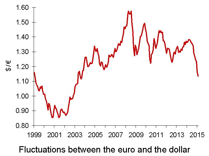
 With people increasingly predicting QE and with the ECB reducing interest rates, so the euro depreciated. Between March 2014 and 21 January 2015, the euro depreciated by 20.2% against the dollar and the euro exchange rate index depreciated by 9.7%. With the announced programme of QE being somewhat larger than markets expected, in the week following the announcement the euro fell a further 2.3% against the dollar, and the euro exchange rate index also fell by 2.3%. The euro is now at its lowest level against the US dollar since April 2003 (see chart).
The depreciation of the euro will be welcome news for eurozone exporters. It makes their exports cheaper in foreign currency terms and thus makes their exports more competitive.  Similarly Japanese exporters were helped by the depreciation of the yen following the announcement on 31 October 2014 by the Bank of Japan of an increase in its own QE programme. The yen has depreciated by 7.7% against the dollar since then.
But every currency cannot depreciate against other currencies simultaneously. With any bilateral exchange rate, the depreciation of one currency represents an appreciation of the other. So just as the euro and yen have depreciated against the dollar, the dollar has appreciated against the euro and yen. This has made US goods less competitive relative to eurozone and Japanese goods.
The danger is that currency wars will result, with monetary policy being used in various countries to achieve competitive depreciations. Already, the Swiss have been forced, on 15 January, to remove the cap with the euro at SF1 – €0.833. Since then the Swiss franc has appreciated by some 15% to around SF1 – €0.96. Will the Swiss now be forced to relax their monetary policy?
The Danish and Canadian central banks have cut their interest rates, hoping to stem an appreciation of their currencies. On 28 January, the Monetary Authority of Singapore sold Singapore dollars to engineer a depreciation. The Singapore dollar duly fell by the most in over four years.
But are these policies simply beggar-my-neighbour policies? Is it a zero-sum game, where the gains to the countries with depreciating currencies are exactly offset by losses to the those with appreciating ones? Or is there a net gain from overall looser monetary policy at a time of sluggish growth? Or is there a net loss from greater currency volatility, which will create greater uncertainty and dampen cross-border investment? The following article explore the issues.
Articles
Massive Devaluation of the Euro Seeking Alpha, Sagar Joshi (26/1/15)
Devaluation and discord as the world’s currencies quietly go to war The Observer (25/1/15)
Why is dollar strong vs. 18 trillion of USA’s debt? Pravda, Lyuba Lulko (26/1/15)
Central Bankers Ramp Up Currency Wars Wall Street Journal, Anjani Trivedi, Josie Cox and Carolyn Cui (28/1/15)
The Raging Currency Wars Across Europe The Market Oracle, Gary_Dorsch (29/1/15)
Why ECB action is likely to stoke global currency wars Financial Times, Ralph Atkins (22/1/15)
Euro slides as ECB launches QE Financial Times (22/1/15)
Will Australia join the Currency Wars? The Daily Reckoning, Australia, Greg Canavan (23/1/15)
Australia’s central bank cuts rates to record low; currency plunges and stocks spike The Telegraph (3/2/15)
Singapore loosens monetary policy Financial Times, Jeremy Grant (28/1/15)
Currency Wars Have a Nuclear Option Bloomberg, Mark Gilbert (12/2/15)
Questions
- Explain how quantitative easing results in depreciation. What determines the size of the depreciation?
- How is the USA likely to react to an appreciation of the dollar?
- In the UK, who will benefit and who will lose from the depreciation of the euro?
- What are the global benefits and costs of a round of competitive depreciations?
- How does the size of the financial account of the balance of payments affect the size of a depreciation resulting from QE?
- What determines a country’s exchange-rate elasticity of demand for exports? How does this elasticity of demand affect the size of changes in the current account of the balance of payments following a depreciation?
- Might depreciation of their currencies reduce countries’ commitment to achieving structural reforms? Or might it ‘buy them time’ to allow them to introduce such reforms in a more carefully planned way and for such reforms to take effect? Discuss.
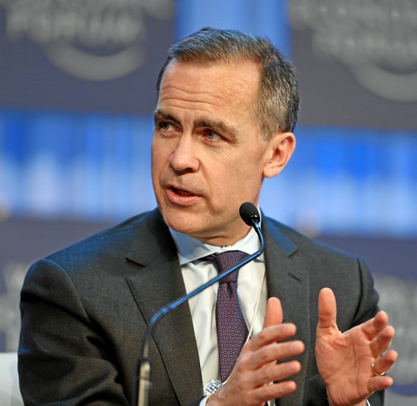
 In a speech in Dublin on 28 January 2015, titled ‘Fortune favours the bold‘, Mark Carney, the Governor of the Bank of England, compared the UK economy to that of the 19-nation eurozone. While he welcomed the ECB’s recently announced quantitative easing programme, he argued that the current construction of the eurozone is unfinished and still has two fundamental weaknesses that have not been addressed.
The first is the fragmented nature of banking:
With limited cross-border banking in the euro area, savings don’t flow to potential investments. Euro-area corporates’ cash balances have risen to the tune of €420 billion, or 3% of GDP, since the crisis, for example. Modest cross-border equity flows mean inadequate risk sharing.
The second is the lack of an integrated fiscal policy.
For complete solutions to both current and potential future problems, the sharing of fiscal risks is required.
It is no coincidence that effective currency unions tend to have centralised fiscal authorities whose spending is a sizeable share of GDP – averaging over a quarter of GDP for advanced countries outside the euro area.
… If the eurozone were a country, fiscal policy would be substantially more supportive. However, it is tighter than in the UK, even though Europe still lacks other effective risk sharing mechanisms and is relatively inflexible. A more constructive fiscal policy would help recycle surplus private savings and mitigate the tail risk of stagnation. It would also bridge the drag from structural reforms on nominal spending and would be consistent with the longer term direction of travel towards greater integration.
But fiscal integration requires a political will to transfer fiscal surpluses from the stronger countries, such as Germany, to the weaker countries, such as those in southern Europe.
Overall, the financial and fiscal position in the eurozone is strong:
Gross general government debt in the euro area is roughly the same as in the UK and below the average of advanced economies. The weighted average yield on 10-year euro area sovereign debt is around 1%, compared to 1½% in the UK. And yet, the euro area’s fiscal deficit is half that in the UK. Its structural deficit, according to the IMF, is less than one third as large.
But, unlike the UK, where, despite the rhetoric of austerity, automatic fiscal stabilisers have been allowed to work and the government has accepted a much slower than planned reduction in the deficit, in the eurozone fiscal policy remains tight. Yet unemployment, at 11½%, is twice the rate in the UK and economic growth, at around 0.7% is only one-quarter of that in the UK.
Without a eurozone-wide fiscal policy the problem of slow growth is likely to persist for some time. Monetary policy in the form of QE will help and structural reforms will help to stimulate potential output and long-term growth, but these policies could be much more effective if backed up by fiscal policy.
Whether they will be any time soon is a political question.
Speech
Fortune favours the bold Bank of England. Mark Carney (29/1/15)
Articles
Bank of England’s Carney urges Europe to take plunge on fiscal union Reuters, Padraic Halpin (28/1/15)
Bank Of England’s Mark Carney Attacks ‘Timid’ Eurozone Recovery Attempts Huffington Post, Jack Sommers (29/1/15)
BoE’s Mark Carney calls for common eurozone fiscal policies Financial Times, Ferdinando Giugliano (28/1/15)
Carney attacks German austerity BBC News, Robert Peston (28/1/15)
Bank of England governor attacks eurozone austerity The Guardian, Larry Elliott (28/1/15)
Questions
- Compare the financial and fiscal positions of the UK and the eurozone.
- In what way is there a ‘debt trap’ in the eurozone?
- What did Mark Carney mean when he said, ‘Cross-border risk-sharing through the financial system has slid backwards.’?
- What options are there for the eurozone sharing fiscal risks?
- What would a ‘more constructive’ fiscal policy, as advocated by Mark Carney, look like?
- How do the fiscal policies of other currency unions, such as the UK (union of the four nations of the UK) or the USA (union of the 50 states) or Canada (union of the 10 provinces and three territories), differ from that of the eurozone?
 After Syriza’s dramatic victory in the Greek election, it is now seeking to pursue its manifesto promises of renegotiating the terms of Greece’s bailout and bringing an end to austerity policies.
The bailout of €240bn largely involved debt restructuring to give Greeks more time to pay. A ‘haircut’ (reduction) on privately held bonds, estimated to be somewhere between €50bn and €110bn, was more than offset by an increase of €130bn in loans granted by official creditors.
The terms of the bailout negotiated with the ‘Troika’ of the EU Commission, the ECB and the IMF, had forced the previous Greek government to make substantial fiscal adjustments. These have included large-scale cuts in government expenditure (including public-sector wages), increases in taxes, charges and fares, and selling state assets through an extensive programme of privatisation.
Although Greece is now regarded as having achieved a structural budget surplus (a surplus when the economy is operating at potential output: i.e. with a zero output gap),  the austerity policies and a decline in inward investment have dampened the economy so much that, until last year, the actual budget deficit and public-sector debt continued to rise as tax revenues plummeted.
Since 2007, GDP has fallen by nearly 27% and the unemployment rate is around 26%. The fall in GDP has made the achievement of a reduction in the debt/GDP ratio that much harder. General government debt has risen from 103% of GDP in 2007 to 176% in 2014, and the budget deficit, although having peaked at 12.2% of GDP in 2013, has only been brought down through huge cuts.
As a report to the European Parliament from the Economic Governance Support Unit argues on page 27:
With less front-loaded fiscal adjustment, the EU-IMF financing envelope for Greece would have needed to expand, in what is already the largest financial assistance programme in percent of GDP in recent global history. On the other hand, a less rapid fiscal adjustment may have helped to preserve some of the productive capacity that, in the course of the adjustment, was destroyed.
The new government, although pledging not to default on debt, is insistent on renegotiating the debt and wants to achieve a high level of rescheduling and debt forgiveness. As the new Prime Minister, Alexis Tsipras, says:
On existing loans, we demand repayment terms that do not cause recession and do not push the people to more despair and poverty. We are not asking for new loans; we cannot keep adding debt to the mountain.
But, just as the Greek government is insistent on renegotiating its debt, so the German government and others in the EU are insisting that Greece sticks to the terms of the bailout and carries on with its current programme of debt reduction. Another haircut, they maintain, is out of the question.
We must wait to see how the negotiations play out. We are in the realms of game theory with various possible threats and promises on either side. It will be interesting to how these threats and promises are deployed.
New Leader in Greece Now Faces Creditors New York Times, Liz Alderman (26/1/15)
Syriza’s historic win puts Greece on collision course with Europe The Guardian, Ian Traynor and Helena Smith (26/1/15)
Greece Q&A: what now for Syriza and EU austerity? The Guardian, Phillip Inman (26/1/15)
Greek elections: Syriza gives eurozone economic headache BBC News, Prof Dimitri Mardas (26/1/15)
How a Syriza government would approach the eurozone The Telegraph, Andrew Lilico (19/1/15)
Australian economists urge Greek debt forgiveness as Syriza election win looks likely ABC News, Michael Janda (26/1/15)
Will Syriza win rock the global economy? CBS News, Nick Barnets (26/1/15)
Syriza should ignore calls to be responsible Irish Times. Paul Krugman (27/1/15)
Syriza Victory in Greek Election Roils European Debate Over Austerity Wall Street Journal, Marcus Walker (25/1/14)
Greece markets hit by debt default fears BBC News (28/1/15)
Why Europe Will Cave to Greece Bloomberg, Clive Crook (29/1/15)
Greece and the euro: Take the money and run The Economist, Buttonwood (28/1/15)
Tanking markets send dire warning to Greece’s new government Fortune, Geoffrey Smith (28/1/15)
The biggest debt write-offs in the history of the world The Telegraph, Mehreen Khan (2/2/15)
Questions
- Why has Greek debt continued to rise despite extremely tight fiscal policy?
- How is the structural deficit defined? What difficulties arise in trying to measure its size?
- Would there have been any way of substantially reducing the Greek budget deficit without driving Greece into a deep recession?
- What are the arguments for and against cancelling a large proportion of Greek debt? Is there a moral hazard involved here?
- Will the recently announced ECB quantitative easing programme help to reduce Greece’s debt?
- Are negotiations about debt forgiveness a zero sum game? Explain.
- What are the likely impacts of the Syriza victory on the global economy?

The World Economic Forum has been holding its annual meeting in the up-market Swiss ski resort of Davos. Many of the world’s richest and most powerful people attend these meetings, including political leaders, business leaders and representatives of various interest groups.
This year, one of the major topics has been the growth in inequality across the globe and how to reverse it. According to a report by Oxfam, Wealth: Having it all and wanting more:
The richest 1 per cent have seen their share of global wealth increase from 44 per cent in 2009 to 48 per cent in 2014 and at this rate will be more than 50 per cent in 2016. Members of this global elite had an average wealth of $2.7m per adult in 2014.
Of the remaining 52 per cent of global wealth, almost all (46 per cent) is owned by the rest of the richest fifth of the world’s population. The other 80 per cent share just 5.5 per cent and had an average wealth of $3851 per adult – that’s 1/700th of the average wealth of the 1 per cent.
Currently, the richest 85 people in the world have the same amount of wealth as the poorest 50% of the world’s population. It might seem odd that those with the wealth are talking about the problem of inequality.  Indeed, some of those 85 richest people were at the conference: a conference that boasts extremely luxurious conditions. What is more, many delegates flew into the conference in private jets (at least 850 jets) to discuss not just poverty but also climate change!
Yet if the problem of global inequality is to be tackled, much of the power to do so lies in the hands of these rich and powerful people. They are largely the ones who will have to implement policies that will help to raise living standards of the poor.
But why should they want to? Part of the reason is a genuine concern to address the issues of increasingly divided societies. But part is the growing evidence that greater inequality reduces economic growth by reducing the development of skills of the lower income groups and reducing social mobility. We discussed this topic in the blog, Inequality and economic growth.
So what policies could be adopted to tackle the problem. Oxfam identifies a seven-point plan:
|
|
| • |
Clamp down on tax dodging by corporations and rich individuals; |
| • |
Invest in universal, free public services such as health and education; |
| • |
Share the tax burden fairly, shifting taxation from labour and consumption towards capital and wealth; |
| • |
Introduce minimum wages and move towards a living wage for all workers; |
| • |
Ensure adequate safety-nets for the poorest, including a minimum income guarantee; |
| • |
Introduce equal pay legislation and promote economic policies to give women a fair deal; |
| • |
Agree a global goal to tackle inequality. |
But how realistic are these policies? Is it really in the interests of governments to reduce inequality? Indeed, some of the policies that have been adopted since 2008, such as bailing out the banks and quantitative easing, have had the effect of worsening inequality. QE drives up asset prices, particularly bond, share and property prices. This has provided a windfall to the rich: the more of such assets you own, the greater the absolute gain.
The following videos and articles look at the problem of growing inequality and how realistic it is to expect leaders to do anything significant about it.
Videos and podcasts
 Income inequality is ‘brake on growth’, Oxfam chief warns Davos France 24, Winnie Byanyima (22/1/15)
 Davos dilemma: Can the 1% cure income inequality? Yahoo Finance, Lizzie O’Leary and Shawna Ohm (21/1/15)
 Richest 1% ‘Will Own Half The World’s Wealth By 2016’ ITN on YouTube, Sarah Kerr (19/1/15)
 The Price of Inequality BBC Radio 4, Robert Peston (3/2/15 and 10/2/15)
Articles
Richest 1% will own more than all the rest by 2016 Oxfam blogs, Jon Slater (19/1/15)
Global tax system can cut inequality The Scotsman, Jamie Livingstone (23/1/15)
A new framework for a new age Financial Times, Tony Elumelu (23/1/15)
The global elite in Davos must give the world a pay rise New Statesman, Frances O’Grady (22/1/15)
New Oxfam report says half of global wealth held by the 1% The Guardian, Larry Elliott and Ed Pilkington (19/1/15)
Davos is starting to get it – inequality is the root cause of stagnation The Guardian, Larry Elliott (25/1/15)
Inequality isn’t inevitable, it’s engineered. That’s how the 1% have taken over The Guardian, Suzanne Moore (19/1/15)
Why extreme inequality hurts the rich BBC News, Robert Peston (19/1/15)
Eurozone stimulus ‘reinforces inequality’, warns Soros BBC News, Joe Miller (22/1/15)
Hot topic for the 1 percent at Davos: Inequality CNBC, Lawrence Delevingne (21/1/15)
Global inequality: The wrong yardstick The Economist (24/1/15)
A Richer World (a compendium of articles) BBC News (27/1/15)
Data
OECD Income Distribution Database: Gini, poverty, income, Methods and Concepts OECD
The effects of taxes and benefits on household income ONS
Questions
- Why has inequality increased in most countries in recent years?
- For what reasons might it be difficult to measure the distribution of wealth?
- Which gives a better indication of differences in living standards: the distribution of wealth or the distribution of income?
- Discuss the benefits and costs of using the tax system to redistribute (a) income and (b) wealth from rich to poor
- Go through each of the seven policies advocated by Oxfam and consider how practical they are and what possible objections to them might be raised by political leaders.
- Why is tax avoidance/tax evasion by multinational companies difficult to tackle?
- Does universal access to education provide the key to reducing income inequality within and between countries?
 An article in the February 2015 issue of the Economic Journal, ‘Intergenerational Wealth Mobility in England, 1858–2012: Surnames and Social Mobility’ by Gregory Clark and Neil Cummins, looks at the persistence of wealth within British families across the generations. The article shows, ‘using rare surnames to track families, that wealth is much more persistent than standard one-generation estimates would suggest. There is still a significant correlation between the wealth of families five generations apart’.
 people’s wealth to depend heavily on that of their parents? Clark and Cummins consider this question.