 When you look at the linked articles below, I’m sure many of you will be thinking that this is an odd choice for an economics blog! However, part of the economic relevance of ‘cyber-crime fighters’ relates to the relative skills of workers and the gap that exists between the most and least skilled workers in the UK.
Crime has always existed, but as technology has developed the types of crime committed have grown along with the complexity of them. For certain crimes, a very skilled individual is needed. With this emergence of technologically advanced crimes, those fighting crimes have also had to improve their skills and techniques. Thus crime-fighters have become more technologically advanced as well.
The problem is that the number of skilled workers able to deal with things like cyber crime has not kept pace with the demand for them and thus we have a skills gap. Usage of the Internet has continued to grow, creating more and more opportunities for cyber crime. However, the UK supply of IT and cyber-security professionals has not been able to keep pace. Therefore, we have a shortage of skilled labour in this area.
 More investment into research and education is occurring, with the aim of addressing this shortage, but it is expected to take many years before supply catches up to demand. In particular, more investment is needed in the sciences and technology subjects at school to create the supply at university level. The NAO said that:
‘The current pipeline of graduates and practitioners are unable to meet demand.’
A second area of relevance to economics is the cost of cyber crime. The NAO estimated that the cost is somewhere between £18bn and £27bn per annum. However, on the other side, is there a case that crime actually benefits the macroeconomy by requiring government investment. As cyber crime has grown, so has the demand for cyber-crime fighters and this has created more jobs. With more jobs comes increased spending and the benefits of the multiplier. The following articles consider cyber crime and the impact it is having.
National Audit Office warns UK needs more skilled cyber crime fighters BBC News (12/2/13)
IT staff shortages raise cyber crime risk Sky News (12/2/13)
UK planning ‘Cyber Reserve’ defence force BBC News (3/12/12)
Britain vulnerable from cyber attacks for at least 20 years The Telegraph, Tom Whitehead (12/2/13)
Britain targeted by 120,000 every DAY with cost to country thought to total £27billion Mail Online, Jack Doyle (12/2/13)
Questions
- Illustrate the demand for and supply of labour curves in the market for cyber crime fighters. How is the equilibrium wage determined?
- If there is increased investment in education, how would this affect the shape and position of the MRP curve and what impact would this have on your diagram?
- If there is a shortage of cyber crime fighters, what does that suggest about the position of the two curves? Illustrate this situation and explain why it is a problem.
- Which factors would be considered by NAO in estimating the costs of cyber crime?
- Explain why crime can pay.
- How does the macroeconomy benefit from increased crime? Illustrate this on a diagram.
- Does your answer to question 5 above suggest anything about the effectiveness of using GDP as a measure of welfare?
- How is the multiplier effect relevant?
 According to the first estimate by the Office for National Statistics, the UK economy shrank by 0.3% in the final three months of 2012. This means that over the whole year growth was flat.
The biggest contributor to the fall in GDP in Q4 was the production industries, which include manufacturing. Output of the production sector fell by 1.8% in Q4. Construction sector output, by contrast, was estimated to have increased by 0.3%. Service sector output was flat. The chart below shows quarterly and annual growth in the UK from 2007 to 2012. (Click here for a PowerPoint.)
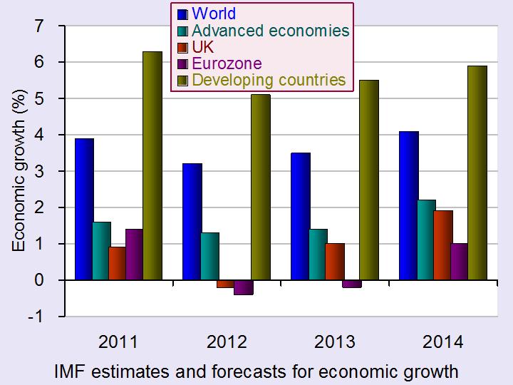
Latest estimates by the IMF are that the UK economy will grow by 1.0% in 2013 – well below the long-term growth in potential output (see also the last blog, High hopes in the Alps). But some forecasters are predicting that real GDP will continue to fall for at least one more quarter, which means that the economy would then be in a ‘triple-dip recession’.
 Not surprisingly politicians have interpreted the statistics very differently, as have economists. The government, while recognising that the UK faces a ‘very difficult economic situation’, argues that now is not the time to change course and that by continuing with policies to reduce the deficit the economy will be placed on a firmer footing for sustained long-term growth
The opposition claims that the latest figures prove that the government’s policies are not working and that continuing attempts to bear down on the deficit are depressing aggregate demand and thereby keeping the economy depressed.
The following webcasts, podcasts and articles expand on these arguments. Try to be dispassionate in using economic analysis and evidence to assess the arguments.
Webcasts and podcasts
 Video Summary: Gross Domestic Product Preliminary Estimate, Q4 2012 Media Briefing (Click here for the following Q&A) ONS (25/1/13)
 Triple dip on the menu? Channel 4 News, Siobhan Kennedy and Faisal Islam (25/1/13)
 Getting and spending – the key to recovery Channel 4 News, Cathy Newman (25/1/13)
 UK economy shrinks by 0.3% in the last three months of 2012 BBC News, Hugh Pym (25/1/13)
 Danny Alexander on GDP figures and economic plans BBC Daily Politics (25/1/13)
 Osborne defends government’s deficit reduction plan BBC News (25/1/13)
 Ed Balls: UK economy urgently needs a ‘Plan B’ BBC News (25/1/13)
 UK heads for triple dip as GDP contracts 0.3pc The Telegraph, Philip Aldrick (25/1/13)
 Economist: Government may need to rethink its fiscal policy The Telegraph, Jim O’Neill (25/1/13)
 Has austerity really been tried in Britain? BBC Today Programme, Jonathan Portes and Andrew Lilico (29/1/13)
Articles
UK GDP: Economy shrank at end of 2012 BBC News (25/1/13)
UK GDP shrinks by 0.3% in fourth quarter: what the economists say The Guardian (25/1/13)
New Bank of England head Mark Carney hints at big shift in policy The Guardian (26/1/13)
The Bank of England, the chancellor, and the target BBC News. Stephanie Flanders (29/1/13)
The Entire World Of Economics Is Secretly Thankful To The UK Right Now Business Insider, Joe Weisenthal (26/1/13)
Data
Gross Domestic Product: Preliminary Estimate, Q4 2012 ONS (25/1/13)
 Video Summary: Gross Domestic Product Preliminary Estimate, Q4 2012 ONS (25/1/13)
Preliminary Estimate of GDP – Time Series Dataset 2012 Q4 ONS (25/1/13)
Business and Consumer Surveys DG ECFIN
Questions
- What are the reasons for the decline in GDP in 2012 Q4??
- Examine how likely it is that the UK will experience a triple-dip recession.
- What measures could be adopted to increase consumer and business confidence?
- If there is substantial spare capacity, is expansionary fiscal policy the best means of achieving economic growth?
- What additional monetary policy measures could be adopted to stimulate economic growth?
- Find out what has happened to the UK’s public-sector deficit and debt over the past three years. Explain what has happened.
 Each year world political and business leaders meet at the World Economic Forum in the Swiss resort of Davos. The aim is to assess the progress of the global economy and to look at challenges ahead and what can be done about them.
Cynics claim that the round of presentations, discussions, Champagne receptions and fine dining rarely leads to anything concrete. Those who are less cynical argue that the Forum gives a unique opportunity for considering policy options and helping to shape a global consensus.
This year the mood was more optimistic. Many believe that the worst of the financial crisis is behind us. Stock markets are buoyant; the banking system seems more secure; the eurozone has not collapsed; growth prospects seem a little brighter.
 But perhaps ‘optimistic’ is an overstatement. ‘Less pessimistic’ might be a better description. As Christine Lagarde, head of the IMF, pointed out in her speech:
The recovery is still weak, and uncertainty is still high. As the IMF announced just a few hours ago in our World Economic Outlook, we expect global growth of only 3½ percent this year, not much higher than last year. The short-term pressures might have alleviated, but the longer-term pressures are still with us. (Click here for transcript).
In both her speech and her press conference, she went on to outline the policies the IMF feels should be adopted to achieve sustained global growth.
The articles below summarise the outcomes of the Forum and some of the views expressed.
Articles
Too soon for sighs of relief Deutsche Welle, Andreas Becker (27/1/13)
Davos 2013: The icy economic chill begins to thaw The Telegraph, Louise Armitstead (26/1/13)
 IMF Projects Modest Pick-up in Economic Growth in 2013 IMF videos, Olivier Blanchard, IMF Chief Economist (23/1/13)
 Managing Director’s New Year Press Briefing IMF videos, Christine Lagarde, IMF Managing Director
Mark Carney in Davos: what’s up next for the global economy Maclean’s (Canada), Erica Alini (26/1/13)
World Economic Forum ends on warning note over ‘complacency’ The Guardian, Graeme Wearden (26/1/13)
Angela Merkel tells Davos austerity must continue The Guardian, Graeme Wearden and Larry Elliott (24/1/13)
Davos 2013: A ‘sigh of relief’ at the World Economic Forum BBC News, Stephanie Flanders (27/1/13)
Happy talk The Economist (27/1/13)
Davos Man and his defects The Economist, Schumpeter (26/1/13)
Davos: are the captains of capitalism finally paying attention? The Observer (27/1/13)
Official site
The Global Agenda 2013 The World Economic Forum
IMF projections
Modest Growth Pickup in 2013, Projects IMF IMF Survey Magazine: In the News (23/1/13)
World Economic Outlook Update IMF (23/1/13)
Questions
- Why was the mood at the WEF less pessimistic than in 2012?
- What threats remain to sustained global recovery?
- What policies are being recommended by Christine Lagarde of the IMF? Explain the reasoning behind the recommendations.
- What disagreements are there between global leaders on the scope for fiscal and monetary policies to stimulate economic growth?
- In her press conference, Christine Lagarde stated that “the teams here have concluded that the fiscal multipliers were higher in the context of that unbelievable international crisis”. Do you agree with this statement? Explain.
 What lies ahead for economic growth in 2013 and beyond? And what policies should governments adopt to aid recovery? These are questions examined in four very different articles from The Guardian.
The first is by Nouriel Roubini, Professor of Economics at New York University’s Stern School of Business. He was one of the few economists to predict the collapse of the housing market in the USA in 2007 and the credit crunch and global recession that followed. He argues that continuing attempts by banks, governments and individuals to reduce debt and leverage will mean that the advanced economies will struggle to achieve an average rate of economic growth of 1%. He also identifies a number of other risks to the global economy.
 In contrast to Roubini, who predicts that ‘stagnation and outright recession – exacerbated by front-loaded fiscal austerity, a strong euro and an ongoing credit crunch – remain Europe’s norm’, Christine Lagarde, head of the IMF and former French Finance Minister, predicts that the eurozone will return to growth. ‘It’s clearly the case’, she says, ‘that investors are returning to the eurozone, and resuming confidence in that market.’ Her views are echoed by world leaders meeting at the World Economic Forum in Davos, Switzerland, who are generally optimistic about prospects for economic recovery in the eurozone.
The third article, by Aditya Chakrabortty, economics leader writer for The Guardian, looks at the policies advocated at the end of World War II by the Polish economist, Michael Kalecki and argues that such policies are relevant today. Rather than responding to high deficits and debt by adopting tough fiscal austerity measures, governments should adopt expansionary fiscal policy, targeted at expanding infrastructure and increasing capacity in the economy. That would have an expansionary effect on both aggregate demand and aggregate supply. Sticking with austerity will result in continuing recession and the ‘the transfer of wealth and power into ever fewer hands.’
 But while in the UK and the eurozone austerity policies are taking hold, the new government in Japan is adopting a sharply expansionary mix of fiscal and monetary policies – much as Kalecki would have advocated. The Bank of Japan will engage in large-scale quantitative easing, which will become an open-ended commitment in 2014, and is raising its inflation target from 1% to 2%. Meanwhile the Japanese government has decided to raise government spending on infrastructure and other government projects.
So – a range of analyses and policies for you to think about!
Risks lie ahead for the global economy The Guardian, Nouriel Roubini (21/1/13)
Eurozone showing signs of recovery, says IMF chief The Guardian, Graeme Wearden (14/1/13)
Austerity? Call it class war – and heed this 1944 warning from a Polish economist The Guardian, Aditya Chakrabortty (14/1/13)
Bank of Japan bows to pressure with ‘epoch-making’ financial stimulus The Guardian, Phillip Inman (22/1/13)
Questions
- What are the dangers facing the global economy in 2013?
- Make out a case for sticking with fiscal austerity measures.
- Make out a case for adopting expansionary fiscal policies alongside even more expansionary monetary policies.
- Is is possible for banks to increase their capital-asset and liquidity ratios, while at the same time increasing lending to business and individuals? Explain.
- What are the implications of attempts to reduce public-sector deficits and debt on the distribution of income? Would it be possible to devise austerity policies that did not have the effect you have identified?
- What will be the effect of the Japanese policies on the exchange rate of the yen with other currencies? Will this be beneficial for the Japanese economy?
 Consumer spending is crucial to an economy. In the UK total consumer spending is equivalent to almost two-thirds of the value of country’s GDP. Understanding its determinants is therefore crucial in attempting to forecast the short-term path of the economy. In other words, the growth of the economy in 2013 will depend on our inclination to spend.
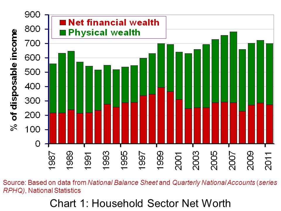
While the amount of disposable income (post-tax income) will be one factor influencing our spending, other factors matter too. Amongst these ‘other factors’ is the stock of wealth of households. Here we look at the latest available figures on the net worth of the UK household sector. Will our stock of wealth help to underpin spending or will it act to constrain spending?
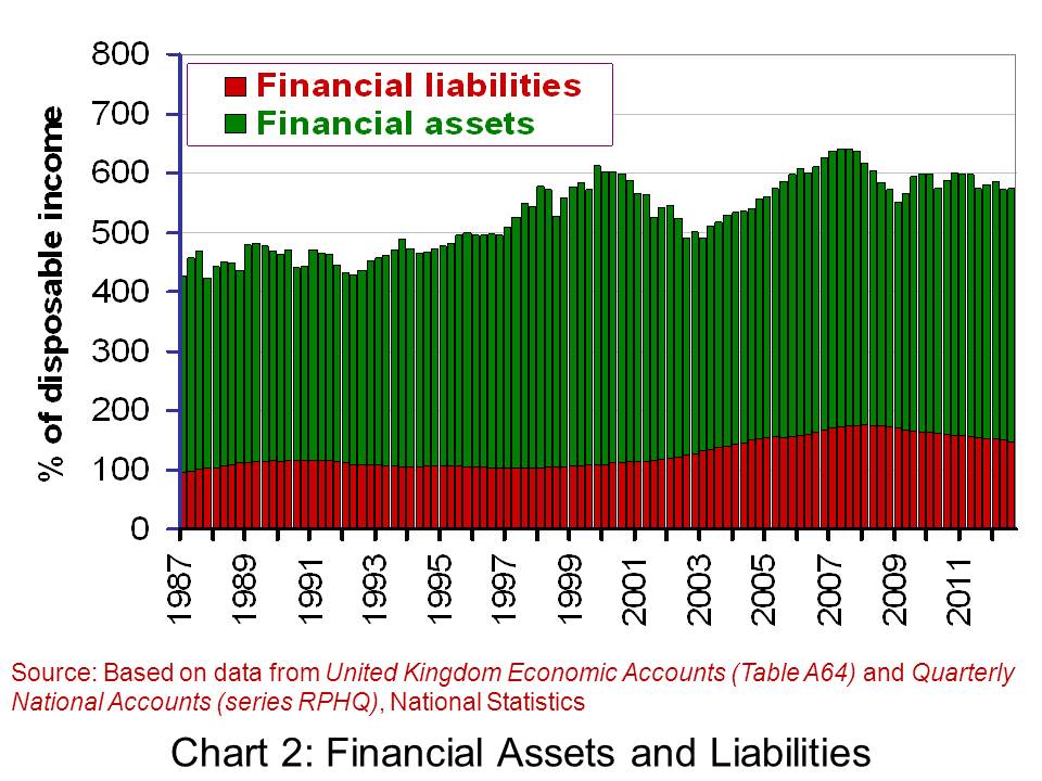
The household sector’s net worth is the sum of its net financial wealth and non-financial (physical) wealth. Net financial wealth is the balance of financial assets over financial liabilities. Financial assets include funds in savings accounts, shares and pension funds. Financial liabilities include debts secured against property, largely residential mortgages, and unsecured debts, such as overdrafts and unpaid balances on credit cards. Non-financial wealth largely includes the value of the sector’s holdings of property and buildings.
The following table summarises the net worth of the UK household sector at the end of 2011 and 2010. The figures are taken from the Office for National Statistics release, National Balance Sheet. They show that at the end of 2011, the household sector had a net worth of £7.04 trillion. This was up just 0.1 per cent up 2010. At the end of 2011, the stock of net worth of the household sector was 7 times the amount of disposable income earned by the sector in 2011.
The Household Sector Balance Sheet
| Component |
2010 (£bn) |
2011 (£bn) |
| Financial assets |
4,302.8 |
4,283.7 |
| Financial liabilities |
1,540.7 |
1,541.3 |
| Net financial wealth |
2,762.1 |
2,742.4 |
| Non-financial (physical) wealth |
4,272.2 |
4,302.1 |
| Net worth |
7,034.3 |
7,044.5 |
 When you look at the linked articles below, I’m sure many of you will be thinking that this is an odd choice for an economics blog! However, part of the economic relevance of ‘cyber-crime fighters’ relates to the relative skills of workers and the gap that exists between the most and least skilled workers in the UK.
 More investment into research and education is occurring, with the aim of addressing this shortage, but it is expected to take many years before supply catches up to demand. In particular, more investment is needed in the sciences and technology subjects at school to create the supply at university level. The NAO said that:


