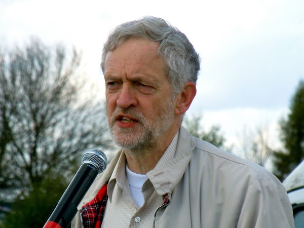
 Jeremy Corbyn, the newly elected leader of the Labour Party, is proposing a number of radical economic policies. One that has attracted considerable attention is for a new form of QE, which has been dubbed ‘people’s quantitative easing’.
This would involve newly created money by the Bank of England being directly used to fund spending on large-scale housing, energy, transport and digital projects. Rather than the new money being used to purchase assets, as has been the case up to now, with the effect filtering only indirectly into aggregate demand and even more indirectly into aggregate supply, under the proposed scheme, both aggregate demand and aggregate supply would be directly boosted.
Although ‘conventional’ QE has worked to some extent, the effects have been uneven. Asset holders and those with large debts, such as mortgages, have made large gains from higher asset prices and lower interest rates. By contrast, savers in bank and building society accounts have seen the income from their savings decline dramatically. What is more, the indirect nature of the effects has meant time lags and uncertainty over the magnitude of the effects.
But despite the obvious attractiveness of the proposals, they have attracted considerable criticism. Some of these are from a political perspective, with commentators from the right arguing against an expansion of the state. Other criticisms focus on the operation and magnitude of the proposals
 One is that it would change the relationship between the Bank of England and the government. If the Bank of England created money to fund government projects, that would reduce or even eliminate the independence of the Bank. Independence has generally been seen as desirable to prevent manipulation of the central bank by the government for short-term political gain. Those in favour of people’s QE argue that the money would be directed into a National Investment Bank, which would then make the investment allocation decisions. The central bank would still be independent in deciding the amount of QE.
This leads to the second criticism and that is about whether further QE is necessary at the current time. Critics argue that while QE of whatever type was justified when the economy was in recession and struggling to recover, now would be the wrong time for further stimulus. Indeed, it could be highly inflationary. The economy is currently expanding. If banks respond by increasing credit, the velocity of circulation of narrow money could rise and broad money supply grow, providing enough money to underpin a growing economy.
Many advocates of people’s QE accept this second point and see it as a contingency plan in case the economy fails to recover and further monetary stimulus is deemed necessary. If further QE is not felt necessary by the Bank of England, then the National Investment Bank could fund investment through conventional borrowing.
The following articles examine people’s QE and look at its merits and dangers. Given the proposal’s political context, several of the articles approach the issue from a very specific political perspective. Try to separate the economic analysis in the articles from their political bias.
Jeremy Corbyn’s proposal
The Economy in 2020 Jeremy Corbyn (22/7/15)
Articles
People’s quantitative easing — no magic Financial Times, Chris Giles (13/8/15)
How Green Infrastructure Quantitative Easing would work Tax Research UK, Richard Murphy (12/3/15)
What is QE for the people? Money Week, Simon Wilson (22/8/15)
QE or not QE? A slippery slope to breaking the Bank EconomicsUK.com, David Smith (23/8/15)
We don’t need “People’s QE”, basic economic literacy is enough Red Box, Jonathan Portes (13/8/15)
Is Jeremy Corbyn’s policy of ‘quantitative easing for people’ feasible? The Guardian, Larry Elliott (14/8/15)
Corbynomics: Quantitative Easing for People (PQE) Huffington Post, Adnan Al-Daini (7/9/15)
Corbyn’s “People’s QE” could actually be a decent idea FT Alphaville, Matthew C. Klein (6/8/15)
Jeremy Corbyn’s ‘People’s QE’ would force Britain into three-year battle with the EU The Telegraph, Peter Spence (15/8/15)
Would Corbyn’s ‘QE for people’ float or sink Britain? BBC News, Robert Peston (12/8/15)
Strategic Quantitative Easing – public money for public benefit New Economics Foundation blog, Josh Ryan-Collins (12/8/15)
People’s QE and Corbyn’s QE Mainly Macro blog, Simon Wren-Lewis
You can print money, so long as it’s not for the people The Guardian, Zoe Williams (4/10/15)
Questions
- What is meant by ‘helicopter money’? How does it differ from quantitative easing as practised up to now?
- Is people’s QE the same as helicopter money?
- Can people’s QE take place alongside an independent Bank of England?
- What is meant by the velocity of circulation of money? What happened to the velocity of circulation following the financial crisis?
- How does conventional QE feed through into aggregate demand?
- Under what circumstances would people’s QE be inflationary?
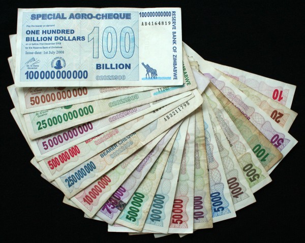
 In the late 2000s, Zimbabwe experienced hyperinflation. As a post on this site in January 2009 said, two estimates of the inflation rate were made: one of 5 sextillion per cent (5 and 21 zeros); the other of 6.5 quindecillion novemdecillion per cent (65 and 107 zeros). In January 2009, in a last attempt to save the Zimbabwean currency, a new series of banknotes was issued, including a Z$100 trillion note.
Prices were typically being adjusted at least twice a day and people had to carry large bags of money around even to buy a couple of simple items. The currency was virtually worthless. As the Guardian article below states:
Hyperinflation in Zimbabwe left pensions, wages and investments worthless and spread poverty as everyday items became unaffordable. It also caused severe cash shortages, because the government could not afford to print bank notes to keep pace with inflation.
The solution was to allow other currencies, mainly the US dollar and the South African rand, to be used alongside the local currency. Although the Zimbabwean currency was still legal tender, it effectively went out of use. Prices stabilised and since then inflation has been in single figures.
 But many people still have stocks of the virtually worthless old currency, either in cash or in savings accounts. The Zimbabwean government has now said that it will exchange Zimbabwean dollar notes for US dollars at the rate of US$1 = Z$250tn (250,000,000,000). People have until September to do so. Up to now, they have mainly been used to sell as souvenirs to tourists! For people with Zimbabwean dollars in their bank accounts, they will get a minimum of US$5. For amounts beyond Z$175,000tn they will get an additional US dollar for each Z$35,000tn.
Historical examples of hyperinflation
As case study 15.5 in Economics 9e’s MyEconLab points out, several countries experienced hyperinflation after the First World War. In Austria and Hungary prices were several thousand times their pre-war level. In Poland they were over 2 million times higher, and in the USSR several billion times higher.
Germany in the 1920s
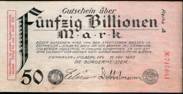
But even these staggering rates of inflation seem insignificant beside those of Germany. Following the chaos of the war, the German government resorted to printing money, not only to meet its domestic spending requirements in rebuilding a war-ravaged economy, but also to finance the crippling war reparations imposed on it by the allies in the Treaty of Versailles.
 From mid 1921 the rate of monetary increase soared and inflation soared with it. By autumn 1923 the annual rate of inflation had reached a mind-boggling 7,000,000,000,000 per cent! As price increases accelerated, people became reluctant to accept money: before they knew it, the money would be worthless. People thus rushed to spend their money as quickly as possible. But this in turn further drove up prices. (The note shown above is in old billions, where a billion was a million million. So the note was for 50,000,000,000,000 marks.)
For many Germans the effect was devastating. People’s life savings were wiped out. Others whose wages were not quickly adjusted found their real incomes plummeting. Many were thrown out of work as businesses, especially those with money assets, went bankrupt. Poverty and destitution were widespread.
By the end of 1923 the German currency was literally worthless. In 1924, therefore, it was replaced by a new currency – one whose supply was kept tightly controlled by the government.
Serbia and Montenegro 1993–5
After the break-up of Yugoslavia in 1992, the economy of the remaining part of Yugoslavia (Serbia and Montenegro) collapsed. The government relied more and more on printing money to finance public expenditure. Prices soared.
 The government attempted to control the inflation by imposing price controls. But these simply made production unprofitable and output fell further. The economy nosedived. Unemployment exceeded 30 per cent.
In October 1993, the government created a new currency, the new dinar, worth one million old dinars. In other words, six zeros were knocked off the currency. But this did not solve the problem. Between October 1993 and January 1994, prices rose by 5 quadrillion per cent (5 and fifteen zeros). Normal life could not function. Shops ran out of produce; savings were wiped out; barter replaced normal market activity.
At the beginning of January 1994 a ‘new new dinar’ was introduced, worth 1 billion new dinars. On 24 January this was replaced by a ‘novi dinar’ pegged 1 to 1 against the Deutsche Mark. This was worth approximately 13 million new new dinars. The novi dinar remained pegged to the Deutsche Mark and inflation was quickly eliminated.
Articles
Zimbabweans get chance to swap ‘quadrillions’ for a few US dollars The Guardian (13/6/15)
 175 Quadrillion Zimbabwean Dollars Are Now Worth $5 Bloomberg, Godfrey Marawanyika and Paul Wallace (11/6/15)
Zimbabwe is paying people $5 for 175 quadrillion Zimbabwe dollars Washington Post, Matt O’Brien (12/6/15)
Zimbabwe dollars phased out BBC News Africa (12/6/15)
Zimbabwe ditches its all but worthless currency Financial Times (12/6/15)
Zeroing in Thomson Reuters, Breaking News, Edward Hadas (12/6/15)
Old articles
Could inflation fell Mugabe? BBC News (28/7/08)
ZIMBABWE: Inflation at 6.5 quindecillion novemdecillion percent IRIN (21/1/09)
The Worst Episode of Hyperinflation in History: Yugoslavia 1993-94 Roger Sherman Society, Thayer Watkins (31/7/08)
Questions
- Why have several governments in the past been prepared to allow hyperinflation to develop?
- Itemise the types of cost imposed on people by hyperinflation.
- Does anyone gain from hyperinflation?
- What are the solutions to hyperinflation?
- What difficulties are there in eliminating hyperinflation? What costs are imposed on people in the process?
- Why might the causes of hyperinflation be described as always political?
 The eurozone has been suffering from deflation: that is, negative inflation. But, the latest data show an increase in the rate of inflation in April from 0% to 0.3%. This is still a very low rate, with a return to deflation remaining a possibility (though perhaps unlikely); but certainly an improvement.
The eurozone economy has been stagnant for some time but the actions of the European Central Bank (ECB) finally appear to be working. Prices across the eurozone have risen, including services up by 1.3%, food and drink up by 1.2% and energy prices, albeit still falling, but at a slower rate. All of this has helped to push the annual inflation rate above 0%. For many, this increase was bigger than expected. Howard Archer, Chief European Economist at HIS Global Insight said:
“Renewed dips into deflation for the eurozone are looking increasingly unlikely with the risks diluted by a firming in oil prices from their January lows, the weakness of the euro and improved eurozone economic activity.”
Economic policy in the eurozone has focused on stimulating the economy, with interest rates remaining low and a €1.1 trillion bond-buying programme by the ECB. But, why is deflation such a concern? We know that one of the main macroeconomic objectives of a nation is low and stable inflation. If prices are low (or even falling) is it really as bad as economists and policy-makers suggest?
The problem of deflation occurs when people expect prices to continue falling and thus delay spending on durables, hoping to get the products cheaper later on. As such, consumption falls and this puts downward pressure on aggregate demand. This decision by consumers to put off spending will cause aggregate demand to shift to the left, thus pushing national income down, creating higher unemployment and adding to problems of economic stagnation. If this expectation continues, then so will the inward shifts in AD. In the eurozone, this has been a key problem, but it now appears that aggregate demand has stopped falling and is now slowly recovering, together with the economy.
 It is important to note how interdependent all aspects of an economy are. The euro responded as news of better inflation data emerged, together with expectations of a Greek deal being reached. Enrique Diaz-Alvarez, chief risk officer at Ebury said:
“The move [rise in euro] got going with the big upside surprise in eurozone inflation data — especially core inflation, which bounced up from 0.6 per cent to 0.9 per cent. This is exactly what the ECB wants to see, as it is proof that QE is having the desired effect and removes the threat of deflation in the eurozone from the foreseeable future.”
One of the key factors that has kept inflation down in the eurozone (and also the UK) is falling oil prices. It is for this reason that many have been suggesting that this type of deflation is not bad deflation. With oil prices recovering, the general price level will also recover and so economies will follow suit. The following articles consider the fortunes of the eurozone.
Eurozone inflation shouldn’t shift ECB’s QE focus Wall Street Journal, Richard Barley (2/6/15)
Eurozone deflation threat recedes Financial Times, Claire Jones (2/6/15)
Eurozone inflation rate rises to 0.3% in May BBC News (2/6/15)
Eurozone back to inflation as May prices beat forecast Reuters, Jan Strupczewski (2/6/15)
Boost for ECB as Eurozone prices turn positive in May Guardian, Phillip Inman (2/6/15)
Eurozone inflation higher than expected due to quantitative easing International Business Times, Bauke Schram (2/6/15)
Euro lifted by Greek deal hopes and firmer inflation data Financial Times, Roger Blitz and Michael Hunter (2/6/15)
Questions
- What is the difference between the 0.3% and 0.9% figures quoted for inflation in the eurozone?
- What is deflation and why is it such a concern?
- Illustrate the impact of falling consumer demand in an AD/AS diagram.
- How has the ECB’s QE policy helped to tackle the problem of deflation? Do you think that this programme needs to continue or now the economy has begun to improve, should the programme end?
- To what extent is the economic stagnation in the eurozone a cause for concern to countries such as the UK and USA? Explain your answer.
- Why has the euro risen, following news of this positive inflation data?
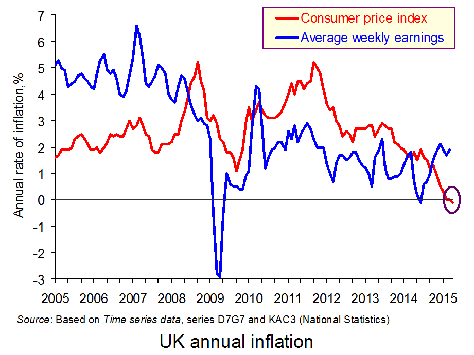
 The CPI index fell by 0.1% in the 12 months to April 2015. This is partly the result of lower air and sea fares, as the upward ‘blip’ in these fares at Easter last year was not present in mid-April this year as Easter fell outside the period when the statistics are collected. What is more significant is that fuel, commodity and retail food prices have fallen over the past 12 months, and the exchange rate has risen, especially against the euro.
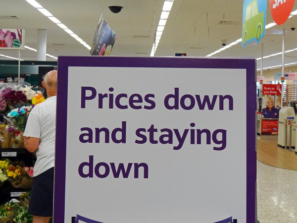
But how do we define what’s happened and how significant is it? It might seem highly significant as it’s the first time in 55 years that the CPI has fallen over a 12-month period. In fact, the effect is likely to be temporary, as fuel prices are now rising again and commodity prices generally are beginning to rise too. What is more, the pound seems to have peaked against the euro. Thus although aggregate demand remains relatively dampened, the main causes of falling prices and potential rises in the coming months are largely to be found on the cost side. This then brings us on to the definition of a falling CPI.
 A falling CPI over a 12-month period can be defined as negative inflation. This is unambiguous. But is this ‘deflation’? The problem with the term ‘deflation’ is that it is ambiguous. On the one hand it can be defined simply as negative inflation. In that case, by definition, the UK has experienced deflation. But on the other, it is used to describe a situation of persistent falling prices as a result of declining aggregate demand.
If an economy suffers from deflation in this second sense, the problem can be very serious. Persistent falling prices are likely to discourage consumers from spending on durables (such as fridges, TVs, cars and furniture) and firms from buying capital equipment. After all, why buy an item now if, by waiting, you can get it cheaper later on? This mentality of waiting to spend leads to falling aggregate demand and hence falling output. It also leads to even lower prices. In other words deflation can get worse: a deflationary spiral.
If we define deflation in this second, much more serious sense, then the UK is not suffering deflation – merely temporary negative inflation. In fact, with prices now falling (slightly) and wages rising at around 2% per year, there should be an increase in aggregate demand, which will help to drive the recovery.
Videos
 Should Britain Panic Over Negative Inflation? Sky News, Ed Conway (20/5/15)
 UK inflation negative for first time since 1960; BoE says temporary Reuters, Andy Bruce and William Schomberg (19/5/15)
 UK inflation negative for the first time since 1960 CNBC, Dhara Ranasinghe (19/5/15)
Articles
UK inflation rate turns negative BBC News (19/5/15)
Why there’s little to fear as the spectre of deflation descends on UK The Telegraph, Szu Ping Chan (19/5/15)
UK inflation turns negative The Guardian, Katie Allen (19/5/15)
Is the UK in the early stages of deflation? The Guardian, Larry Elliott (19/5/15)
Is the UK in deflation or negative inflation? Q&A The Guardian, Katie Allen and Patrick Collinson (19/5/15)
Market View: Economists unconcerned on temporary deflation FT Adviser, Peter Walker (19/5/15)
Questions
- Is negative inflation ever a ‘bad thing’?
- Explain the movement in UK inflation rates over the past five years.
- How do changes in exchange rates impact on (a) inflation; (b) aggregate demand? Does it depend on what caused the changes in exchange rates in the first place?
- Why is the current period of negative inflation likely to be short-lived?
- Would you describe the negative inflation as negative cost-push inflation?
- What factors could change that might make negative inflation more persistent and raise the spectre of deflation (in its bad sense)?
- If inflation remains persistently below 2%, what can the Bank of England do, given current interest rates, to bring inflation back to the 2% target?
- What is meant by ‘core inflation’ and what has been happening to it in recent months?
- What global factors are likely to have (a) an upward; (b) a downward effect on UK inflation?
 Insolvencies in England and Wales have fallen to their lowest level since 2005, official records show. The Insolvency Service indicates that bankruptcy, individual voluntary arrangements and debt relief orders have fallen, with the largest and worst form of bankruptcy falling by 22.5 per cent compared to the same period in 2014. There has also been a fall in corporate insolvencies back to pre-crisis levels.
The British economy is recovering and despite an increase in consumer borrowing of £1.2 billion from February to March, which is the biggest since the onset of the credit crunch, the number of people in financial difficulty and living beyond their means has fallen. However, there are also suggestions that the number could begin to creep up in the future and we are still seeing a divide between the north and south of England in terms of the number of insolvencies.
There are many factors that could explain such a decline in insolvencies. Perhaps it is the growth in wages, in part due the recovery of the economy, which has enabled more people to forgo borrowing or enabled them to repay any loan more comfortably. Lower inflation has helped to reduce the cost of living, thereby increasing the available income to repay any loans. Interest rates have also remained low, thus cutting the cost of borrowing and the repayments due.
But, another factor may simply be that lending is now more closely regulated. Prior to the financial crisis, huge amounts of money were being lent out, often to those who had no chance of making the repayments. More stringent affordability checks by lenders may have a large part to play in reducing the number of insolvencies. President of R3, the insolvency practitioner body, Phillip Sykes said:
“It may be too early to draw conclusions but demand could be falling as a result of low interest rates, low inflation and tighter regulation. This trend is worth watching.”
Mark Sands, from Baker Tilly added to this, noting that fewer people were now in financial difficulty.
“As well as this, we are seeing lower levels of personal debt and fewer people borrowing outside of their means due to more stringent affordability checks by creditors.”
Whatever the main reason behind the data, it is certainly a positive indicator, perhaps of economic recovery, or that at least some have learned the lessons of the financial crisis. The following articles consider this topic.
Personal insolvencies fall to 10-year low Financial Times, James Pickford (1/5/15)
Personal insolvencies at lowest level since 2005 BBC News (29/4/15)
Personal insolvencies drop to lowest level in a decade The Guardian, Press Association (29/4/15)
Corporate insolvencies at lowest level since 2007 The Telegraph, Elizabeth Anderson (30/4/15)
Interview: R3 President Phillip Sykes Accountancy Age, Richard Crump (1/5/15)
North-South gap widens in personal insolvencies Independent, Ben Chu (27/4/15)
Insolvency rates show ‘stark’ north-south divide Financial Times, James Pickford (27/4/15)
Questions
- What is meant by insolvency?
- There are many factors that might explain why the number of insolvencies has fallen. Explain the economic theory behind a lower inflation rate and why this might have contributed to fewer insolvencies.
- How might lower interest rates affect both the number of personal and corporate insolvencies?
- Why has there been a growth in the north-south divide in terms of the number of insolvencies?
- Do you think this data does suggest that lessons have been learned from the Credit Crunch?
 Jeremy Corbyn, the newly elected leader of the Labour Party, is proposing a number of radical economic policies. One that has attracted considerable attention is for a new form of QE, which has been dubbed ‘people’s quantitative easing’.
 One is that it would change the relationship between the Bank of England and the government. If the Bank of England created money to fund government projects, that would reduce or even eliminate the independence of the Bank. Independence has generally been seen as desirable to prevent manipulation of the central bank by the government for short-term political gain. Those in favour of people’s QE argue that the money would be directed into a National Investment Bank, which would then make the investment allocation decisions. The central bank would still be independent in deciding the amount of QE.