The latest inflation figures, as detailed in February’s Consumer Price Inflation Statistical Bulletin, show that the annual rate of CPI inflation hit zero in February. This is down from 0.3 per cent in January. While inflation is now well outside the 1-3 per cent target range that the Bank of England is charged with meeting, perhaps a more pertinent question is whether the UK is teetering on the brink of deflation – and the risks that may carry.
To get a better sense of the latest inflation picture we need to delve deeper into the numbers and look at the patterns in the prices that make up the overall Consumer Price Index. Interestingly, these shows that five of the 12 principal product groups that make up the index are currently experiencing price deflation.
As explained in Consumer Price Inflation: The 2015 Basket of Goods and Services, produced by the ONS, around 180,000 prices quotations are collected each month for around 700 representative items. These goods and services fall into one of 12 broad product groups. These include, for example, food and non-alcoholic beverages and transport.
The items included in each of the 12 product groups are reviewed once a year so that the chosen items remain representative of today’s spending patterns. A monthly price index is calculated for these 12 broad groupings, known as divisions, and for sub-categories of these. For example meat is a category within food and non-alcoholic beverages. The overall CPI is a weighted average of the 12 broad groupings.
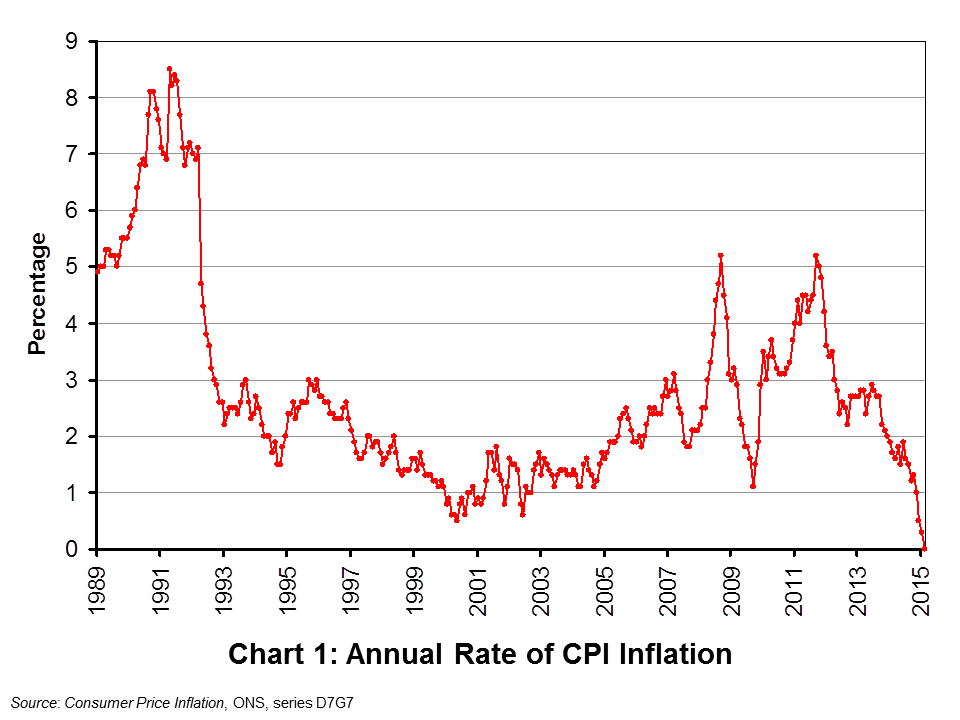 The annual rate of CPI inflation in February 2015 was zero. This means that the price of the representative basket of goods and services was unchanged from its level in February 2014. As Chart 1 shows (click here for a PowerPoint of the chart), the annual rate of CPI inflation series goes back to January 1989 and this is the first time it has fallen to zero. Its average over this period is in fact 2.7 per cent. The recent fall is quite stark with the rate of CPI inflation in June 2013 close to the top-end of the Bank of England’s target range at 2.9 per cent.
 Of the 12 product groups, five constitute 10 per cent or more of the overall weight of the CPI index. These weights are dependent on the relative level of expenditure comprised by each division.
Chart 2 shows the annual rates of inflation for these five groups (click here for a PowerPoint of the chart). The most heavily-weighted component is transport (14.9%), which includes the price of fuel and passenger transport. Here we observe deflation with prices 2.7 per cent lower year-on-year in February. This is the fourth consecutive month where its annual rate of price inflation has been negative.
The second most heavily-weighted component within the CPI index is recreation and culture (14.7%), which includes games, toys and audio-visual equipment. Here too we see the emergence of deflation. In February 2015 prices were 0.8 per cent lower than in February 2014. Deflation is most prevalent in the fifth most heavily-weighted component (11.0%): food and non-alcoholic drinks. The price for this division of the CPI was 3.3 per cent lower in February 2015 as compared with February 2014. In nine of the last ten months the price of food and non-alcoholic drinks, helped by aggressive price competition in the grocery sector, has been lower year-on-year.
February also saw a negative annual rate of inflation emerge for the first time in the CPI division capturing furniture and household equipment and appliances (-0.3 per cent). Further, miscellaneous services, which include personal care and personal effects (e.g. jewellery) saw an annual rate of deflation for the eight consecutive month. The annual rate of inflation for miscellaneous services stood at -0.4 per cent in February. However, February did see an upturn in price inflation for clothing and footwear with prices 1.7 per cent higher than a year earlier while the price of alcohol and tobacco was 3.8 per cent higher year-on-year.
The detailed inflation numbers do reveal the extent to which many CPI divisions are already characterised by deflation. It is interesting to note that in A Comparison of Independent Forecasts published monthly by HM Treasury, the forecast for the final quarter of 2015 is for the annual rate of CPI inflation to be running at 0.8 per cent. An important reason for this is that the effect of falling fuel prices from November 2014 will begin to drop out of the year-on-year inflation rate calculations. The removal of this effect should help to prevent the specter of deflation provided that peoples’ inflationary expectations remain anchored, i.e. exhibit stickiness. If these were to be revised down, however, this would further contribute to downward pressure on prices since input price inflation – including wage inflation – would again be expected to fall.
Articles
U.K. on Brink of Falling Prices as Inflation Rate Drops to Zero Bloomberg, Tom Beardsworth (24/3/15)
UK inflation rate falls to zero in February BBC News (24/3/15)
Britain sees no inflation in February for first time on record Reuters, David Milliken and Andy Bruce (24/3/15)
Inflation hits a record zero boosting household incomes Independent, Clare Hutchinson (24/3/15)
Inflation Hits 0% As Food Costs Fall Further Sky News (24/3/15)
Inflation falls to zero in February as Britain heads to deflation Telegraph, Szu Ping Chan (24/3/15)
UK inflation hits zero for the first time on record Guardian, Angela Monaghan (24/3/15)
Data
Consumer Price Inflation, February 2015 Office for National Statistics
Consumer Price Indices, Time Series Data Office for National Statistics
Questions
- Explain the difference between a decrease in the level of prices and a decrease in the rate of price inflation. Can the rate of price inflation rise even if price levels are falling? Explain your answer
- Explain what is meant by deflation.
- In what ways might deflation affect the behaviour of people? What effect could this have on the macroeconomy?
- Why do you think policy-makers, such as the Monetary Policy Committee, would be interested in the inflation rates within the overall CPI inflation rate?
- What factors do you think lie behind the fall in the transport component of the CPI?
- Explain why the rate of inflation would be expected to rise in the late autumn, a year on from when the transport component of the CPI began falling.
- Does the possibility of deflation mean that inflation rate targeting has failed?
 In recent times the notion that the financial sytem can be destabilising seems blindingly obvious. And, yet, for some time macroeconomic models of the economy tended to regard the financial system as benevolent. It served our interests. We were the masters; it was our servant. Now of course we accept that credit cycles can be destabilising. Policymakers, especially central banks, follow keenly the latest private-sector credit data. Here we look back at previous patterns in private-sector debt and crucially at what patterns are currently emerging.
First a bit of theory. The idea of credit cycles is not new. But the financial crisis of the late 2000s has helped to reignite analysis and interest. Economists are trying to gain a better understanding of the relationship between flows of credit and the state of the economy and, in particular, why might flows increase as the level of real GDP rises – why might they be endogenous variables in models of the determination of GDP. One possibility is the financial accelerator. This is the idea that as real GDP rises banks perceive lending to be less risky. After all, real incomes will tend to rise and collateral values (against which borrowing can be secured) are likely to be rising too.
Another possibility is growing exuberance as the economy grows. This has gained in popularity as an idea, with economists revisiting the work of Hyman Minsky (1919–96), an American economist. Here success breeds failure as the balance sheets of people and businesses deteriorate as they become increasingly burdened with debt. The balance sheets are said to be congested leading to a point when a deleveraging starts. A balance sheet recession then follows.
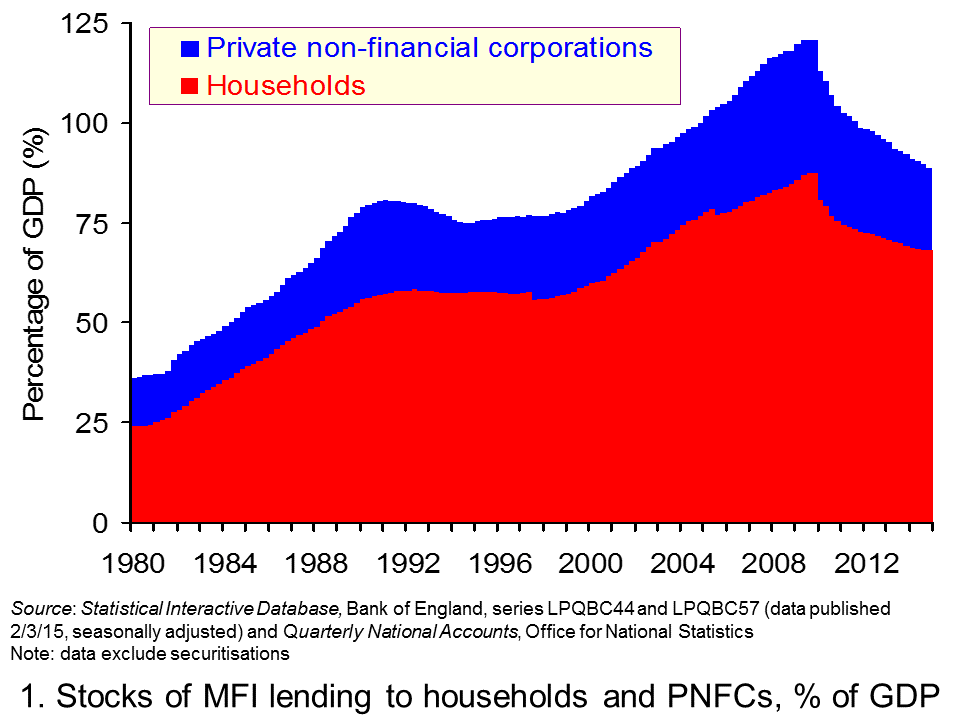
 Now for the data. Consider first the stocks of debt acquired by households and private non-financial corporations from MFIs (Monetary Financial Institutions). The first chart shows debt stocks as a percentage of GDP. It illustrates nicely the phenomenon of financialisation. In essence, this is the increasing importance of MFIs to the economy. At the end of 2014, these two sectors had debt stocks outstanding equivalent to 90 per cent of GDP. In fact, this is down from a peak of 129 per cent in September 2009. (Click here for a PowerPoint of the chart.)
The growth in debt, especially in the 1990s and for much of the 2000s, was through financial innovation. In particular, the bundling of assets, such as mortgages, to form financial instruments which could then be purchased by investors helped to provide financial institutions with further funds for lending. This is the process of securitisation. Some argue that this was part of a super-cycle which works alongside the normal credit cycle, albeit over a much lengthier period. It can be argued that these cycles coincided during the 1990s and for much of the 2000s until financial distress hit. The distress was hastened by central banks raising interest rates to dampen the rising rate of inflation, partly attributable to rising global commodity prices, including oil.
Some refer to 2008 as a Minsky moment. Overstretched balance sheets needed repairing. But, the collective act of repair actually caused financial well-being to worsen as asset prices and aggregate demand fell.
The global response to the events of the financial crisis has been for policy-makers to pay more attention to the aggregate level of credit provision. The Bank of England’s Financial Policy Committee (FPC) has responsibility for monitoring and helping to ensure the soundness of the UK financial system.
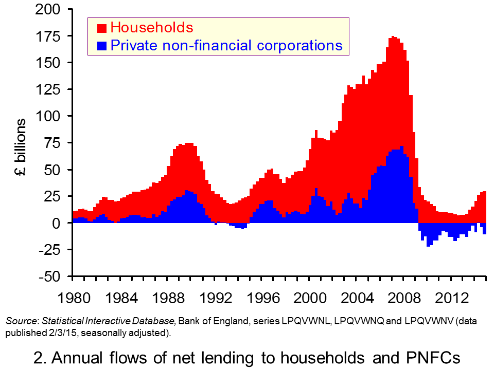
 Undoubtedly, the FPC will have constructed a chart similar to our second chart. (Click here for a PowerPoint of the chart). This chart suggests some caution: the need for casting a ‘Minsky eye’ on lending patterns. Over 2014, the UK household sector undertook net lending (i.e. after deducting repayments) of £30 billion. While nothing like the £100 billion or so in 2007, this does mark something of a step up. Indeed it is almost exactly double the flow in 2013. In the months ahead we will continue to monitor the credit data. You can bet that the FPC will do too!
Articles
Comment: Household debt threatens return to spending Herald Scotland, Bill Jamieson (2/3/15)
Household debt rising at fastest rate for 10yrs moneyfacts.co.uk (10/2/15)
Housing starting to rally after home loan approvals rise in January London Evening Standard, Ben Chu (2/3/15)
Data
Bankstats (Monetary and Financial Statistics) – Latest Tables Bank of England
Statistical Interactive Database Bank of England
Questions
- What is meant by the term the business cycle?
- What does it mean for the determinants of the business cycle to be endogenous? What about if they are exogenous?
- Outline the ways in which the financial system can impact on the spending behaviour of households. Repeat the exercise for businesses.
- How might uncertainty affect spending and saving by households and businesses?
- What does it mean if bank lending is pro-cyclical?
- Why might lending be pro-cyclical?
- How might the differential between borrowing and saving interest rates vary over the business cycle?
- Explain what you understand by net lending to households or firms. How does net lending affect their stock of debt?
 As we reported in New Build: Foundations for a successful housing policy? the Autumn Statement heralded significant reforms to Stamp Duty – the UK tax on house purchases. The result is the introduction of a graduated system of tax, along the lines of the income tax system. A similar regime will continue to operate in Scotland when the Land and Buildings Transactions Tax replaces Stamp Duty next April. Here we consider the impact on the effective rates of tax following the changes to Stamp Duty.
Under the old system any house purchase involving a property whose value was £125,000 or less incurred no Stamp Duty liability. Thereafter, one of five tax rates applied: 1% above £125,000 to £250,000, 3% above £250,000 to £500,000, 4% above £500,000 to £1m, 5% above £1m to £2m and 7 per cent for properties over £2m. The important point was that the whole of the purchase price was subject to one of these five progressively higher tax rates.
The new system sees the introduction of a graduated system of tax which means that the amount paid by house purchasers will be dependent upon the proportion of the value of the property that falls in each of the tax bands. Again, for properties up to £125,000 there will be no liability. There will then be four bands: 1% above £125,000 to £250,000, 5% above £250,000 up to £925,000, 10% above £925,000 up to £150,000 and 12% above £150,000.
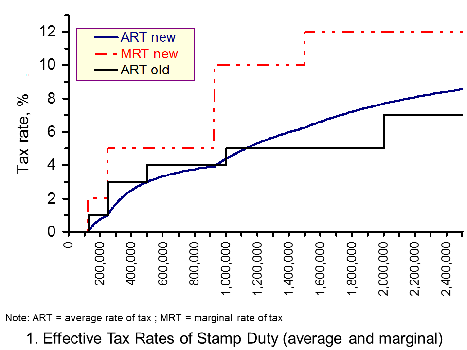
One significant impact of the changes is that the liability will be more proportionate to the value of the property. To see this we can compare the average rate of tax under the new and old tax system. The average rate of tax is simply the amount of the tax liability relative to the price of the property.
 From Chart 1 we can see how the new average rate of tax under rises progressively with the price of the property. (Click here to download a PowerPoint of the chart). Under the old system, the profile of the average rate of tax looks like a series of steps with a slab at each tax rate. Unsurprisingly, the system was sometimes referred as the ‘slab system’.
A second significant change will be the removal of the significant spikes in the marginal rate of tax around each of the tax bands. For example, the tax liability on a property costing £125,001 was £1,250.01 compared with a zero liability on a property costing £125,000. Therefore, a £1 rise in the price of property was accompanied by a £1,250.01 rise in the purchase tax. In percentage terms this is a marginal rate of tax of 125,001. Chart 1 shows how the marginal rates now match the progressively higher tax rates that become payable between each threshold.
The principle of removing the significant distortions to pricing created by the old system of Stamp Duty is likely to receive general approval. However, there may be some unease around the short-term implications for house prices of the bands and rates under the new system. This is largely because nobody purchasing a property at £937,000 or less will see their tax liability rise. The reduction in the liability raises concerns about a potential boost to house prices.
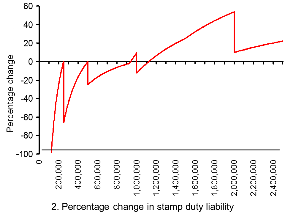
 Chart 2 show the percentage change in the Stamp Duty liability for properties of up to £2.5 million. (Click here to download a PowerPoint of the chart.) The average UK house price, excluding London, is currently £235,000. The stamp duty saving in this case is £150 or 6.4 per cent.
But there are more significant savings than this from the reforms, including in London where inflationary pressures in the housing market have been more significant. Here annual price inflation ran at close to 20 per cent in the second and third quarters of the year. Given that the average house price in London is currently £510,000, this means a Stamp Duty saving of £4,900 or 24 per cent. Of course, for premium London markets (and other similar markets elsewhere) a quite different effect could arise. The liability on a £2m property rises by 53.75 per cent. Nonetheless, for most markets it is the boost to prices that is most concerning.
In the East Midlands, which is a good barometer of the market in the rest of the country, there will be a saving of £610 or 32 per cent on the current average property purchase of £189,000. Therefore, even in markets where house price inflation is more subdued there is the potential that the changes to the Stamp Duty system will, in the short term at least, boost housing demand and fuel house price growth.
Stamp Duty/Land and Buildings Transactions Tax
Rates and allowances: Stamp Duty Land Tax Gov.UKLand and Buildings Transaction Tax Revenue Scotland
Autumn Statement
Autumn Statement: documents Gov.UK
Articles
The home owners cashing in on stamp duty reforms Telegraph, Dan Hyde (2/12/14)
Christmas comes early for estate agents after stamp duty changes Guardian, Nigel Bunyan (7/12/14)
Stamp duty: House price boom and mansion bust Telegraph, Anna White (6/12/14)
£200m house deal stampede by wealthy to beat stamp duty hike: Reforms spark one of busiest periods for estate agents in 25 years Daily Mail Online, Louise Eccles and Ruth Lythe (5/12/14)
Stamp duty changes boost housing market and push up prices Guardian, Hilary Osborne (5/12/14)
Stamp Duty revamp blow to SNP property tax reforms Scotsman, Tom Peterkin and Jane Bradley (4/12/14)
 Autumn Statement: What do stamp duty changes mean? BBC News, (3/12/14)
Data
House Price Indices: Data Tables Office for National Statistics
Questions
- What is the tax base of Stamp Duty and the Land and Buildings Transaction Tax?
- How does Stamp Duty distort choices?
- Under the old Stamp Duty system, why might a seller be reluctant to put their property on the market at £251,000?
- What is meant by the average and marginal rates of tax?
- What is meant by a progressive tax?
- What is the connection between the average rate of tax and how progressive a tax is?
- Calculate the marginal rates of tax (in percentage terms) under the old Stamp Duty system following a £1 rise which results in a property’s value moving into the next tax band (start with a £1 rise from £125,000 to £125,001).
- Using a demand-supply diagram show the effect of the Stamp Duty reforms on house prices in most UK housing markets. What characteristics of supply would make the change in price particularly large?
- Are there any housing markets where demand could fall following the introduction of the reforms to Stamp Duty? Illustrate the possible effects using a demand-supply diagram.
- How might an economist go about evaluating the Stamp Duty reforms? What factors will affect the judgement formed?
 The housing market was at the heart of the 2014 Autumn Statement. Perhaps most eyecatching were the reforms to stamp duty. Stamp Duty is a tax on house purchases. Overnight we have seen the introduction of a graduated system of tax, along the lines of the income tax system – similar to the model to be adopted in Scotland from next April under the Land and Buildings Transactions Tax. For the rest of the UK, there will be five tax bands, including a zero rate band for property values up to £125,000. The total tax liability will be dependent upon the proportion of the value of the property that falls in each taxable band.
But, alongside the Stamp Duty announcement, the Autumn Statement was noteworthy for its references to new build. New build is clearly central to UK housing policy.
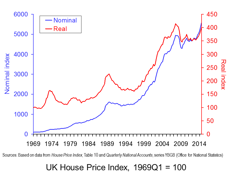
The Autumn Statement reaffirmed the government’s wish to see house building play a central role in easing pressures on the housing market. Over the past 40 years or more UK house prices have been characterised by considerable volatility and by a significant real increase. This can be seen clearly in the chart.  Actual (nominal) house prices across the UK have grown an average rate of 10 per cent per year. Even if we strip out the effect of economy-wide inflation, we are still left with an increase of around 3.5 per cent per year. (Click here to download a PowerPoint of the chart).
The economics point to supply-side problems that mean demand pressures feed directly into house prices. The commitment to build has now seen the announcement of a new garden city near Bicester in Oxfordshire. This is set to provide 13,000 or more new homes. The government has also pledged £100 million to the Ebbsfleet Garden City project to provide the infrastructure and land remediation necessary to bring in more private-sector developers to help deliver an expected 15,000 new homes.
 An interesting development in housing policy is the willingness of government to consider being more actively involved itself in house building. The development of former barracks at Northstowe in Cambridgeshire will be spearheaded by the Homes and Communities Agency which will lead on the planning and construction of up to 10,000 new homes. This signals, at least on paper, that government is prepared to think more broadly about the way in which it works with the private sector in helping to deliver new homes.
The desire to facilitate new build appears to make some economic sense. But, the politics of delivering on new homes is considerably more difficult since the prospect of new developments naturally raises considerable local concerns. Furthermore, it does not deal with fundamental questions around the existing housing market stock. In particular, how we can further increase investment in our existing housing stock, especially given the significant land constraints that face a country like the UK. As yet, the debate around how to improve what we already have has not really taken place.
Autumn Statement
Autumn Statement: documents Gov.UK
Articles
Autumn Statement: Government will build tens of thousands of new homes Independent, Nigel Morris (2/12/14)
Government could build and sell new homes on public sector land Guardian, Patrick Wintour (2/12/14)
Bicester chosen as new garden city with 13,000 homes BBC News, (2/12/14)
Nick Clegg reveals coalition plan for new garden city in Oxfordshire Guardian, (2/12/14)
State to build new homes for first time in generation Telegraph, Steven Swinford (2/12/14)
Data
House Price Indices: Data Tables Office for National Statistics
Questions
- Explain the distinction between real and nominal house prices.
- Would you expect real house price inflation to always be less than nominal house price inflation?
- What factors are likely to affect housing demand?
- What factors are likely to affect housing supply?
- Show using a demand-supply diagram the impact of rising incomes on the demand for a particular housing market characterised by a price inelastic supply.
- Would we expect all housing markets to exhibit similar characteristics of housing demand and supply?
- What is the economic rationale for the government’s new build policy?
- What other measures could be introduced to try and alleviate the long-term pressure on real house prices?
- How might we go about assessing the affordability of housing?
- Would a policy which reduced for the stamp duty payment of most buyers help to curb inflationary pressures in the housing market? Explain your answer using a demand-supply diagram.
 The spectre of debt has awoken many of us in the night. Indebtedness is a key economic issue in the 2010s. Economists are devoting ever increasing amounts of research time trying to understand its impact on economic behaviour. This will not surprise you when you learn that the debt owed by the UK non-bank private sector to banks stood at £2.17 trillion at the end of September. This is the equivalent to 150% of annual GDP.
 Chart 1 shows the stock of outstanding lending by Monetary Financial Institutions (banks and building societies) to the non-bank private sector bank since 1979. Back then the non-bank private sector had bank debt to the tune of around £70 billion or 10 per cent of GDP. Today’s figure is nearly 3000 per cent higher! Of this debt, around about 55 per cent is currently held by the household sector, 27 per cent by Other Financial Corporations (such as insurance companies and pension funds) and 18 per cent by private non-financial corporations. (Click here for a PowerPoint of the chart.)
 Chart 2 shows the stocks of debt as percentages of annual GDP. We can infer from it that there are waves of growth in bank debt. Two notable periods are during the 1980s and again from the late 1990s up to the financial crisis of the late 2000s. During the early and mid 1990s the relative size of debt stocks tended to stabilise while in the early 2010s the actual stocks of debt, as well as relative to GDP, declined. A credit binge seems to be followed by a period of consolidation. (Click here for a PowerPoint of the chart.)
It is important that we understand the drivers of the growth of debt. The impact of debt on the balance sheets of the non-bank private sector and on banks themselves has implications for economic behaviour. In the early 2010s this has been to markedly slow the pace of growth through its impact on aggregate demand. Economic agents have, in general, looked to consolidate. There is no doubt that this partly reflects a precautionary motive. An important means by which debt and the balance sheets on which it is recorded affect behaviour is through a precautionary mechanism. This is difficult to accurately quantify because it represents a psychological influence on spending. Furthermore, it is affected by the prevailing circumstances of the time.
In looking to understand the factors that affect the growth of debt we may, as a result, learn more about the framework within which we may want banks and their customers to operate. Consequently, we may be in a better position to ensure sustainable longer-term growth and development. If there are cycles in credit it is important that we understand why they arise and whether, as some have suggested, they are an inherent part of the financialised economy in which we live. If they are, can we mitigate their potentially destabilising effects?
Articles
Retail shares facing nightmare before Christmas The Telegraph, John Ficenec (9/11/14)
Growing wealth inequality in the UK is a ticking timebomb The Guardian, Danny Dorling (15/10/14)
Richest 10% of Britons now control more than half the country’s wealth: Nation is only member of G7 where inequality between rich and poor has increased this century Mail Online, Mark Duell and Corey Charlton, (15/11/14)
Household debt is growing as families struggle Yorkshire Evening Post (31/10/14)
Consumer spending forecast to be the highest for four years The Telegraph, Ashley Armstrong (10/11/14)
Data
Statistical Interactive Database Bank of England
Quarterly National Accounts, Q2 2014 Dataset Office for National Statistics
Questions
- What is the non-bank private sector?
- What factors might affect the rate at which non-bank private sector debt stocks grow?
- How might we go about assessing whether the aggregate level of lending by financial institutions to the non-bank private sector is sustainable?
- How might we go about assessing whether the level of lending by individual financial institutions to the non-bank private sector is sustainable?
- What information is conveyed in the balance sheets of economic agents, such as households and private non-financial corporations
- What is meant by precautionary saving?
- Can precautionary saving occur when the economy is growing strongly?
- What are the mechanisms by which non-bank private sector debt could impact on economic behaviour?
 The annual rate of CPI inflation in February 2015 was zero. This means that the price of the representative basket of goods and services was unchanged from its level in February 2014. As Chart 1 shows (click here for a PowerPoint of the chart), the annual rate of CPI inflation series goes back to January 1989 and this is the first time it has fallen to zero. Its average over this period is in fact 2.7 per cent. The recent fall is quite stark with the rate of CPI inflation in June 2013 close to the top-end of the Bank of England’s target range at 2.9 per cent.
  Of the 12 product groups, five constitute 10 per cent or more of the overall weight of the CPI index. These weights are dependent on the relative level of expenditure comprised by each division.