 In our recent blog constructing growth without production: The UK growth paradox we saw that the provisional estimate of economic growth in the UK in the final quarter of 2015 was 0.5 per cent. This was buoyed by service sector growth of 0.7 per cent. Meanwhile, construction sector output was estimated to have fallen by 0.1 per cent and production in the production industries by 0.2 per cent. The ONS Index of Production released on 11 February suggests the decline in production activity in the final quarter might have been has much as 0.5 per cent further pointing to unbalanced industrial growth.
 The production industries today account for about 15 per cent of UK output which is small in comparison to the roughly 79 per cent from service-sector industries. Chart 1 shows the quarterly rate of growth in UK industrial production since the 1980s. (Click here for a PowerPoint of the chart). Over this period the average quarterly rate of growth in industrial output has been a mere 0.1 per cent compared with 0.5 per cent for total economic output and 0.7 per cent for the service sector. As a result, the importance of the production industries as a driver of economic output has declined.
Across 2015 industrial production rose by 1 per cent while the total output of the economy grew by 2.2 per cent. Industrial output comprises four main components. Of these, output from mining and quarrying grew in 2015 by 6.6 per cent, water, sewerage and waste management by 3.1 per cent, electricity, gas, steam and air conditioning by 0.3 per cent, while manufacturing output contracted by 0.2 per cent.
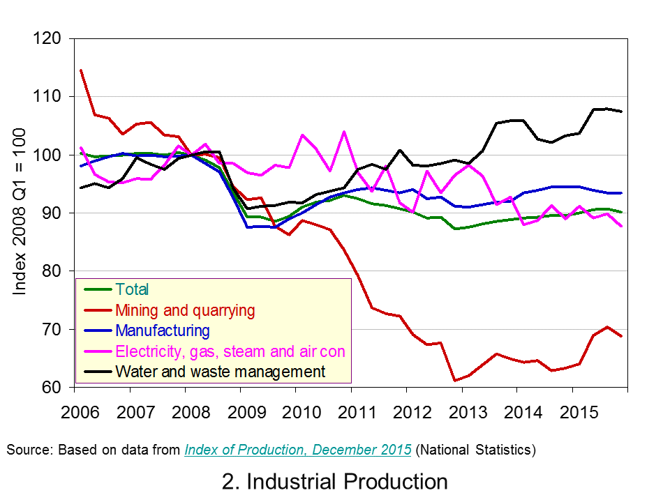 Chart 2 shows the path of industrial output since 2006. (Click here for a PowerPoint of the chart). In particular, it allows us to analyse the effect of the financial crisis and the global economic downturn. Whereas the total output of the economy surpassed its 2008 Q1 peak in 2013 Q2, driven by the service sector, total industrial output in 2015 Q4 remains 9.9 per cent below its 2008 Q1 level. Among its component parts, output in mining and quarrying is 31 per cent lower, electricity, gas, steam and air conditioning output is 12.2 per cent lower and manufacturing 6.5 per cent lower. Only the output of water, sewerage and waste management is greater – some 7.4 per cent higher.
The data point to the industrial composition of UK remaining heavily skewed towards the service sector and, hence, to service-sector industries driving economic growth. A key talking point is the extent to which this matters. On one hand we might point to the deindustrialisation captured by the data. This has had profound implications for certain regions of the United Kingdom and in particular for living standards in certain communities. Industrial change poses challenges for the UK labour force and for policymakers trying to affect the skills of workers needed in a changing economy. It has had a profound impact on the country’s balance of trade in goods: we consistently run a balance of trade deficit in goods. On the other hand we might argue that the UK does services well. We might be said to have a comparative advantage in this area. Whatever, your view point the latest industrial production data show the fragility of UK industrial output.
Data
Index of Production Dataset December 2015 Office for National StatisticsIndex of Production, December 2015 Office for National Statistics
Articles
UK industrial production shrank in 2015 Guardian, Phillip Inman (10/2/16)
December UK industrial output falls sharply BBC News, (10/2/16)
Manufacturing output fall dents UK growth hope Sky News, (10/2/16)
Industrial production’s worst monthly fall since 2012 Belfast Trelegraph, Holly Williams (11/2/16)
GDP growth picks up to 0.5% but only the services sector comes to the party Independent, Ben Chu (29/1/16)
Questions
- What is meant by industrial production? How does it differ from the economy’s total output?
- Would you expect the index of production to be less or more volatile than total output? Explain your answer.
- What factors might explain the volatility of industrial production?
- Do the different rates of growth across the industrial sectors of the UK matter?
- Discuss the economic issues that might arise as the industrial composition of a country changes.
- Why is the distinction between nominal and real important when analysing economic growth?
 The Bank of England’s Money and Credit release on 1 Feb provides us with data up to the end of 2015 on lending by banks and building societies to the rest of the UK private sector. In this post we update our blog of 17 December 2015 – is Minsky right yet again? – to analyse the latest data on lending. The headline numbers show that the flow of lending (net of repayments) by banks and building societies to UK households in 2015 was £40.8 billion up from £29.9 billion in 2014 taking their amount of outstanding lending to households to £1.26 trillion. Was American economist Minsky (1919-1996) right to have argued that cycles in credit are inevitable?
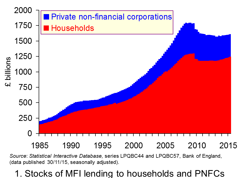
 Chart 1 shows the stocks of debt acquired by both households and private non-financial corporations from MFIs (Monetary Financial Institutions), i.e. deposit-taking institutions. The scale of debt accumulation in the late 1980s and again from the mid 1990s up to the financial crisis of the late 2000s is stark. At the start of 1980 the UK household sector had debts to MFIs of around £53 billion. By the start of 2009 this had hit £1.29 trillion. To put these figures into context this corresponds to an increase in indebtedness to MFIs from 25 per cent of GDP to 86 per cent of GDP.
The chart also shows the increase in indebtedness of private non-financial corporations which are effectively every day businesses. They saw their debts to MFIs rise from around £25 billion to over £500 billion which is equivalent to an increase from 12 per cent of GDP to 33 per cent of GDP. (Click here to download a PowerPoint of Chart 1.)
The path of debt at the start of the 2010s is consistent with a story of consolidation. Although the term is readily used in the context of the public sector and measures to reduce public-sector deficits the term is also relevant for the private sector. Financially-distressed households, private non-financial corporations and MFIs took steps to repair their balance sheets following the financial crisis. Indeed the term is synonymous with the idea of a balance sheet recession which some economists argue describe the late 2000s. The result was that the demand for and supply of additional credit waned. Debt accumulation largely ceased and, as we can see from Chart 1, debt numbers fell.
More recently the indebtedness to MFIs of households has started to edge up again, though, as yet, not for private non-financial corporations. From the end of the first quarter of 2013 to the end of 2015 household indebtedness to MFIs has increased by 7 per cent to £1.26 trillion.
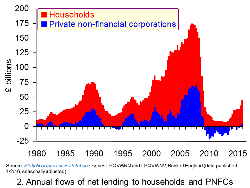
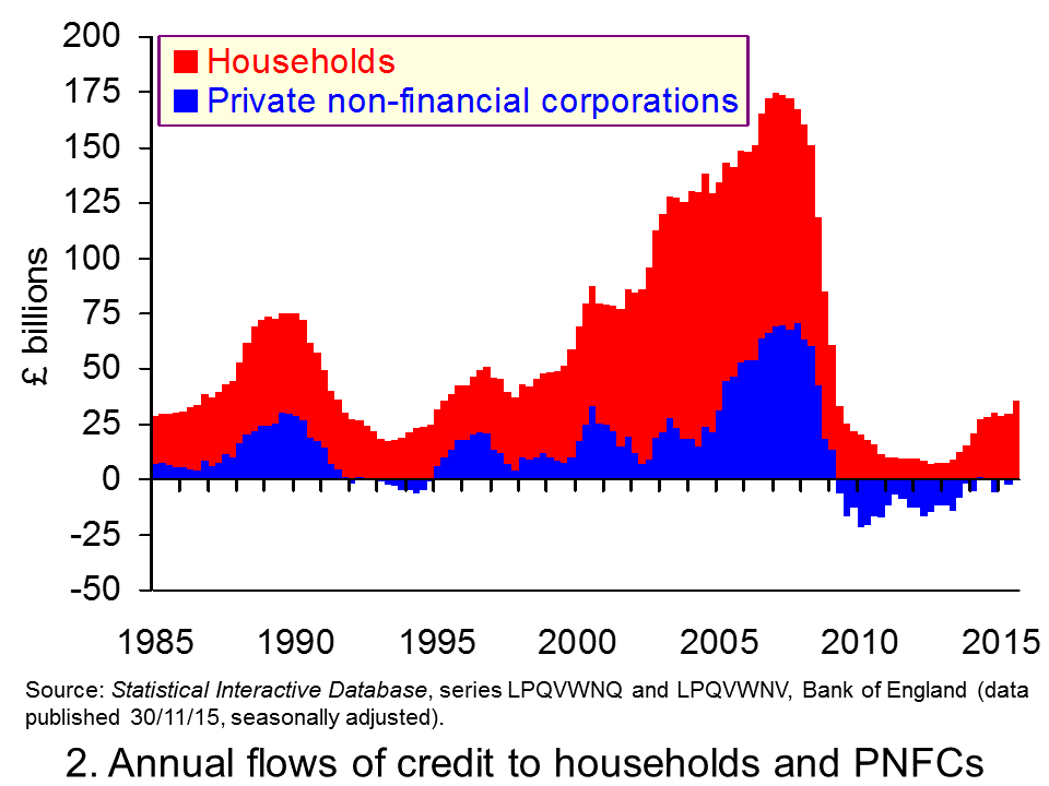
 Chart 2 focuses on flows rather than stocks. (Click here to download a PowerPoint of Chart 2.) It allows us to see the accumulation of new credit (i.e. less repayments of debt). What is even more apparent from this chart is the evidence of cycles in credit. The growth in new credit during the 2000s is stark as is the subsequent squeeze on credit that followed. Across 2006 net flows of credit from MFIs to households reached £106 billion while the peak for PNFCs was across 2007 when they reached £71 billion. Subsequently, net credit numbers crashed with negative numbers for PNFCs indicating net repayments to MFIs.
The size of the credit flows emanating from MFIs and the magnitude of the resulting credit cycles is even more stark when presented as percentages of GDP. The annual flow of credit to households in the late 1980s reached 9.4 per cent of GDP while that to PNFCs peaked at the end of the decade at 5.2 per cent of GDP. Meanwhile, across 2006 net credit to households reached 7.5 per cent of GDP while the peak of lending to PNFCs was in the 12-month period to the end of 2007 Q1 equivalent to 4.8 per cent of GDP. In 2015, credit from MFIs to households reached 2.2 per cent of GDP while that to PNFCs was a mere 0.2 per cent of GDP.
Of course, the key question now is the path of credit. Clearly flows of credit to households are again on the rise. In part, this is driven by the rebound in the UK housing market. But, significantly there has been a significant rise in flows of consumer credit, i.e. unsecured debt.
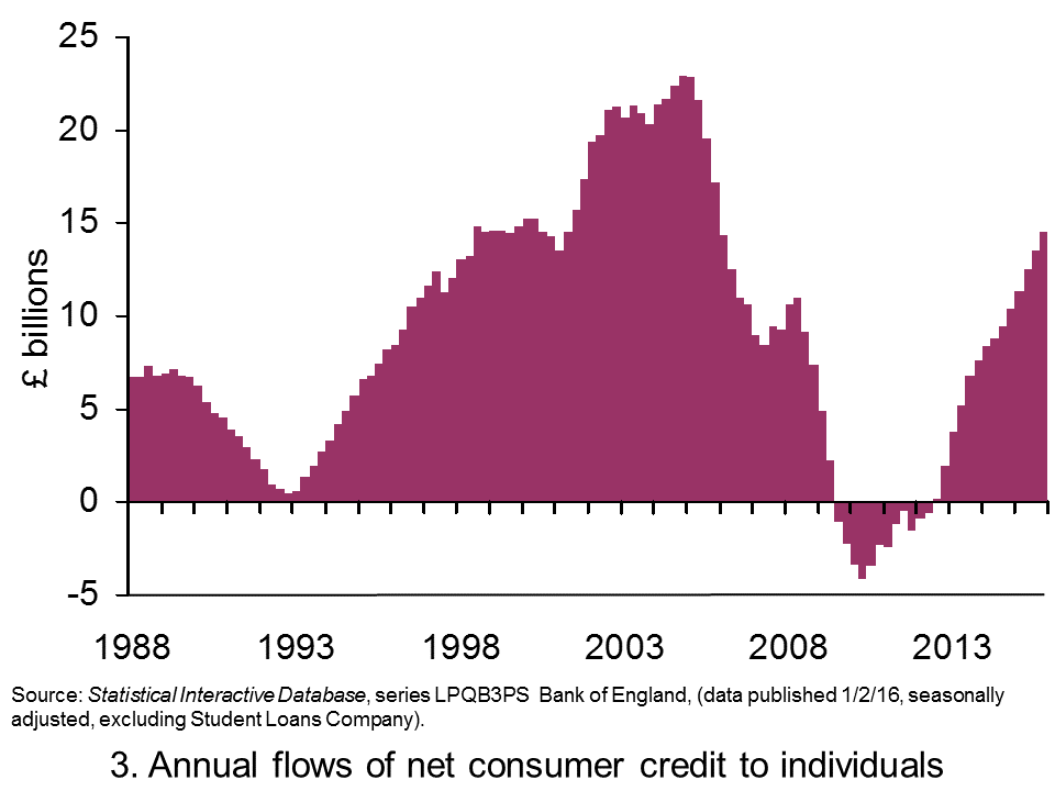
 Chart 3 shows the flows of consumer credit to individuals (excluding student loans involving the Student Loans Company) from MFIs and other credit providers. Again, we see the marked evidence of cycles. Across 2015 these net consumer credit flows amounted to £14.5 billion, the highest annual figure since 2005. (Click here to download a PowerPoint of the chart.)
To put the current rise in consumer credit into context, the net flow of consumer credit to individuals as percentage of GDP across 2015 as a whole amounts to about 0.8 per cent of GDP. This is the highest figure since the second half of 2006. While it might be a little early to say that credit numbers are a cause for concern, they do need to be seen in the context of a still relatively highly indebted household sector. Policymakers will be keeping a keen eye on credit patterns and assessing whether we have again acquired a real appetite for credit.
Articles
Households put another £4.4 billion on credit cards and personal loans in December as debt rises at fastest pace in a decade ThisisMoney.co.uk, Rachel Rickard Straus (1/2/16)
One in four ‘living for the day’ as 700,000 more expected to default on debt Independent, Simon Read (2/1/16)
Surprise mortgage jump confounds expectations Independent, Russell Lynch (1/2/16)
U.K. consumer credit slows; mortgage approvals up MarketWatch, Jon Sindreu (1/2/16)
Family debt continues to rise – report BBC News (13/1/16)
Data
Bankstats (Monetary and Financial Statistics) – Latest Tables Bank of England
Statistical Interactive Database Bank of England
Questions
- How can the financial system affect the economy’s business cycle?
- What does it mean if households or firms are financially distressed? What responses might they take to this distress and what might the economic consequences be?
- How would you measure the net worth (or wealth) of an individual or a firm? What factors might affect their net worth?
- How might uncertainty affect spending and saving by households and businesses?
- What does it mean if bank lending is pro-cyclical?
- Why might lending be pro-cyclical?
- Are there measures that policymakers can take to reduce the likelihood that flows of credit become too excessive?
- What do you understand by a consolidation by the private sector? Discuss the possible macroeconomic effects of such a consolidation.
- What is meant by a balance sheet recession?
- How might the effect of attempts by a large number of individuals to improve their financial well-being differ from those when only a small numbers of individuals do so?
 In the blog the service sector continues to drive the UK business cycle written in October 2014 we observed how UK growth was being driven by the service sector while other industrial sectors struggled. The contrasting performance across UK industry appears now to be even more marked. The latest GDP numbers from the Office for National Statistics contained in Gross Domestic Product: Preliminary Estimate, Quarter 4 (Oct to Dec) 2015 show the economy’s output expanded by 0.5 per cent in the fourth quarter. Yet the construction sector is in recession following contractions of 1.9 per cent (Q3) and 0.1 per cent (Q4). Here we update our earlier blog to evidence the UK’s growth paradox.
Preliminary estimates suggest that the UK economy expanded by 0.5 per cent in the final quarter of 2015 following on from growth of of 0.4 per cent in the third quarter. 2015 as a whole saw output grow by 2.2 per cent, down from 2.9 per cent in 2014 and a little below the average over the past 60 years of around 2.6 per cent.
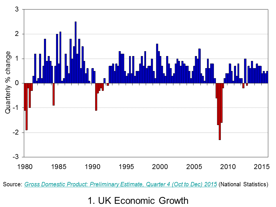
 Chart 1 shows quarterly economic growth since 1980s (Click here for a PowerPoint of the chart). It illustrates nicely the inherent volatility of economies – one of the threshold concepts in economics.The average quarterly rate of growth since 1980 has been 0.5 per cent so on the face of it, a quarterly growth number of 0.5 per cent might seem to paint a picture of sustainable growth. Yet, the industrial make up of growth is far from balanced.
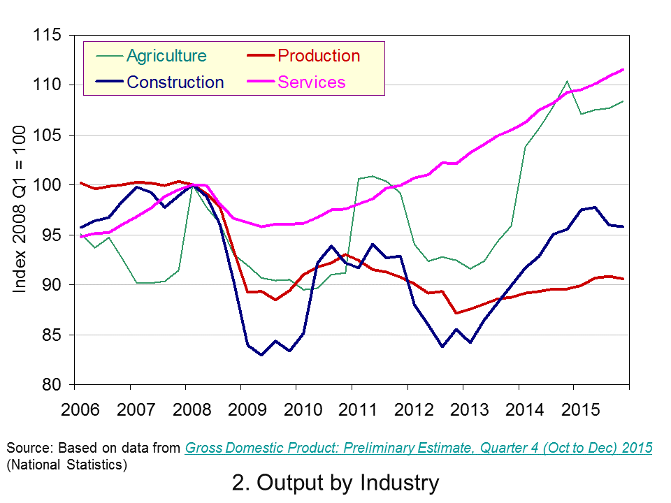
 Consider now Chart 2 (Click here for a PowerPoint of the chart). It allows us to analyse more recent events by tracking how industrial output has evolved since 2006. It suggests an unbalanced recovery following the financial crisis. In 2015 Q4 the economy’s total output was 6.6 per cent higher than in 2008 Q1 with service-sector output 11.6 per cent higher. However, a very different picture emerges for the other principal industrial types.
The economy’s total output surpassed its 2008 Q1 peak in 2013 Q2, but output across the production industries in 2015 Q4 remains 9.4 per cent lower than in 2008 Q1 (and 6.4 per cent lower specifically within manufacturing) and 4.2 per cent lower in the construction sector. However, output in the agricultural sector has rebounded and is now 8.4 per cent higher than in 2008 Q1.
The growth data continue to show the British economy struggling to rebalance its industrial composition. With output in construction in 2015 Q4 2 per cent lower than it was in Q2 and manufacturing output 0.4 per cent lower, UK growth remains stubbornly dependent on the service sector.
Data
Preliminary Estimate of GDP – Time Series Dataset Quarter 4 (Oct to Dec) 2015 Office for National StatisticsGross Domestic Product: Preliminary Estimate, Quarter 4 (Oct to Dec) 2015 Office for National Statistics
Economy tracker: GDP BBC News
Articles
UK economic growth slows in 2015: what the economists are saying Guardian, Katie Allen (28/1/16)
UK economy grows 0.5% in fourth quarter BBC News, (28/1/16)
Bumpy times ahead’ for UK even as fourth quarter growth accelerates Telegraph, Szu Ping Chan (28/1/16)
UK economic growth rises to 0.5% in fourth quarter The Scotsman, Roger Baird (28/1/16)
GDP growth picks up to 0.5% but only the services sector comes to the party Independent, Ben Chu (29/1/16)
Questions
- What is the difference between nominal and real GDP? Which of these helps to track changes in economic output?
- Looking at Chart 1 above, summarise the key patterns in real GDP since the 1980s.
- What is a recession?
- What are some of the problems with the traditional definition of a recession?
- Can a recession occur if nominal GDP is actually rising? Explain your answer.
- What factors lead to economic growth being so variable?
- What factors might explain the very different patterns seen since the late 2000s in the volume of output of the four main industrial sectors?
- What different interpretations could there be of a ‘rebalancing’ of the UK economy?
- What other data might we look at to analyse whether the UK economy is ‘rebalancing’?.
- Do the different rates of growth across the industrial sectors of the UK matter?
- Produce a short briefing paper exploring the prospects for economic growth in the UK over the next 12 to 18 months.
- What is the difference between GVA and GDP?
- Explain the arguments for and against using GDP as a measure of a country’s economic well-being.
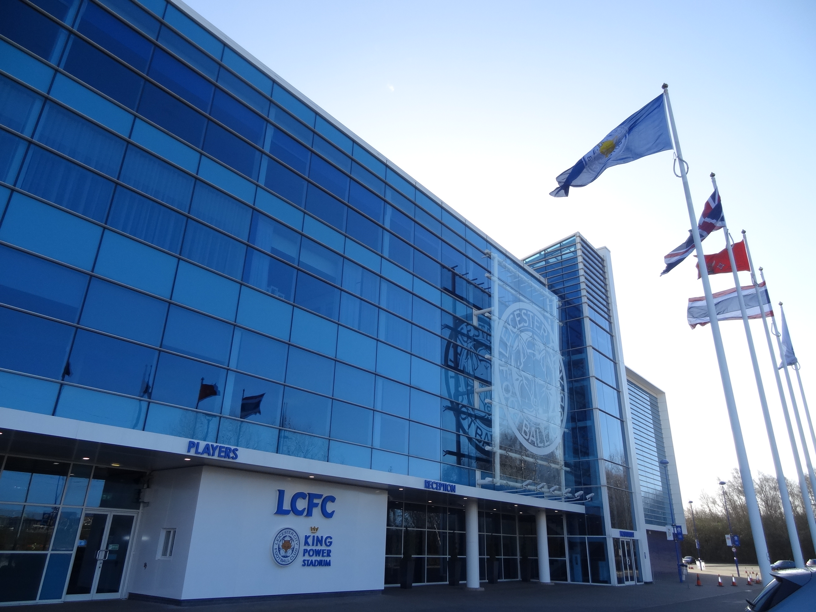
 Saturday night was a happy one. I had got back from the Kingpower Stadium after watching my beloved Leicester City win and climb back to the top of the English Premier League. It does not get much better than this. My levels of satisfaction are off the scale, at least for now. There is an economics angle here: what affects the level of satisfaction people derive from watching live sport, such as football matches? Satisfaction affects peoples’ preparedness to pay. Understanding this is invaluable to all organisations, including football clubs. Is the Leicester effect good for football?
Economists refer to the satisfaction from consuming something as utility. Understanding how supporters like myself derive utility is vital to the success of football clubs and the industry as a whole. It may, for example, help clubs better understand how to price match tickets or club merchandise and better inform important decisions about the structure of leagues and cup competitions.
According to the BBC Price of Football Survey 2015 there appears to be a high preparedness to pay to watch live football. The report shows that the cheapest season ticket at Arsenal for 2015/16 is £1,014, at Tottenham £765 and at Chelsea £750. You could have bought a Leicester season ticket for just £365. Meanwhile the cheapest match day ticket at Arsenal is £27, at Tottenham £32 and at Chelsea £52. The cheapest match day price at Leicester is £22.

So why can football clubs charge what appear to be such high prices? An important part of the story is considering what influences how much fans are willing to pay. Supporting a club for those like me involves an enormous emotional attachment. I derive a lot of my satisfaction from supporting my home-town team. Supporting another club is not alternative. No substitutes will do: it has to be Leicester. The greater the number of people like me, the higher we can expect, other things being equal, prices to be.
Of course, not everyone is like me. Leicester shirts are seen fairly infrequently outside of Leicester and even as I walk through my home city I am likely to see folks adorned, for example, with Arsenal, Chelsea, Liverpool or Man United shirts. Furthermore, most teams have a section of fans whose interest may wane if the team starts losing and dropping down the league. The responsiveness of match-day attendance to the winning percentage of a team is referred to by economists as the win elasticity of demand. The figure is expected to be positive because if a team’s win percentage improves its match-day attendance should increase.
For some supporters who are considering purchasing match-day tickets the issue may simply be who the two teams playing are. This helps to explain why prices for local derbies tend to be higher. It might also be the case that some matches allow supporters to see particular ‘superstars’. More generally, a rise in the quality of player on show will increase the preparedness to pay.
Another factor that can affect preparedness to pay is the perceived closeness of the contest. Many fans gain particular pleasure from watching their club win a game where they believe the two teams are evenly matched: i.e. where the outcome is very unpredictable. This idea is referred to by economists as the uncertainty of outcome.

As well as the uncertainty of the match outcome, interest and preparedness to pay may be affected by intra-seasonal uncertainty. This is highly pertinent in the English Premier League given ‘the Leicester effect’. Longer term, inter-seasonal uncertainty may also be important. If leagues such as the EPL become less predictable then this may further increase interest among fans.
Of course, the benefits from increased uncertainty may not be evenly felt. While this is probably good for the total preparedness to pay across a league like the EPL – and for the rights to broadcast the league – some clubs might have to adapt should interest in them begin to wane.
Article
Price of football: full results 2015 BBC News (24/10/2015)
Questions
- Draw up a list of the characteristics of watching live sport from which people derive utility (satisfaction).
- How might we measure the predictability of leagues like the English Premier League (EPL)?
- How might an increase in the unpredictability of EPL results affect the preparedness to pay to watch EPL matches?
- Is it in the long-term interest of all clubs for total points collected in the EPL to be less concentrated?
- What is a superstar effect? How would this affect preparedness to pay to watch live sport?
- Analyse what you consider to be the relative importance of the superstar effect and the uncertainty of results in affecting preparedness to pay to watch live football or other sporting events.
- Can we describe football clubs as ‘brands’? How does the nature of a brand affect our preparedness to pay for its products and services?
 To what extent does history repeat itself? Minsky’s Financial Instability Hypothesis infers that credit cycles are fairly inevitable. We have seem them in the past and we will see them in the future. Human beings are subject to emotion, to irrational exuberance and to a large dose of forgetfulness! To what extent do the latest UK credit numbers suggest that we might be embarking on another credit binge? Are the credit data consistent with evidence of another credit cycle?
 Chart 1 shows the stocks of debt acquired by households and private non-financial corporations from MFIs (Monetary Financial Institutions). The scale of debt accumulation in the late 1980s and again from the mid 1990s up to the financial crisis of the late 2000s is stark. At the start of 1985 the UK household sector had debts to MFIs of around £140 billion. By the start of 2009 this had hit £1.29 trillion. Meanwhile, private non-financial corporations saw their debts to MFIs rise from around £45 billion to over £500 billion. (Click here to download a PowerPoint of the chart.)
The path of debt at the start of the 2010s is consistent with a story of consolidation. Financially-distressed households, private non-financial corporations and, of course, MFIs themselves meant that corrective action was needed to repair their balance sheets. The demand for and supply of additional credit waned. Debt accumulation largely ceased and, in fact, debt numbers fell. This trend continues today for private non-financial corporations. But, for households debt accumulation resumed in the middle of 2013. At the end of the third quarter of 2015 the household sector had debt obligations to MFIs of £1.246 trillion.
 Chart 2 focuses on flows rather stocks. It allows us to see the accumulation of new credit (i.e. less repayments of debt). What is even more apparent from this chart is the evidence of cycles in credit. The growth in new credit during the 2000s is stark as is the subsequent squeeze on credit that followed.
The question that follows is what path are we now on? Clearly flows of credit to households are again on the rise. In part, this is driven by the rebound in the UK housing market. But, in fact there is a more rapid increase in consumer credit, i.e. unsecured debt. (Click here to download a PowerPoint of the chart.)
 Chart 3 shows the flows of consumer credit from MFIs and other credit providers. Again, we see the marked evidence of cycles. In the year to the end of Q1 of 2015 net consumer credit flows amounted to £22.8 billion, the highest figure since the 12-month period up to the end of Q3 of 2005. Click here to download a PowerPoint of the chart.)
While it might be a little early to say that another Minsky cycle is well under way, policymakers will be keeping a keen eye on credit patterns. Is history repeating itself?
Articles
Average UK mortgage debt rises to £85,000 The Guardian, Phillip Inman (15/12/15)
Consumer spending rise troubles Bank of England The Guardian, Heather Stewart (24/11/15)
Recovery ‘too reliant on consumer debt’ as BCC downgrades forecast The Guardian, Heather Stewart (9/12/15)
BCC: UK Growth Too Reliant On Consumer Debt Sky News (9/12/15)
Interest rates will stay low for longer – but household debt is a worry, says BoE The Telegraph, Szu Ping Chan (24/11/15)
IMF: UK’s economic performance ‘very strong’, but risks remain BBC News (11/12/15)
Data
Bankstats (Monetary and Financial Statistics) – Latest Tables Bank of England
Statistical Interactive Database Bank of England
Questions
- How can the financial system affect the economy’s business cycle?
- What does it mean if households or firms are financially distressed? What responses might they take to this distress and what might the economic consequences be?
- How would you measure the net worth (or wealth) of an individual or a firm? What factors might affect their net worth?
- How might uncertainty affect spending and saving by households and businesses?
- What does it mean if bank lending is pro-cyclical?
- Why might lending be pro-cyclical?
- Are there measures that policymakers can take to reduce the likelihood that flows of credit become too excessive?
 In our recent blog constructing growth without production: The UK growth paradox we saw that the provisional estimate of economic growth in the UK in the final quarter of 2015 was 0.5 per cent. This was buoyed by service sector growth of 0.7 per cent. Meanwhile, construction sector output was estimated to have fallen by 0.1 per cent and production in the production industries by 0.2 per cent. The ONS Index of Production released on 11 February suggests the decline in production activity in the final quarter might have been has much as 0.5 per cent further pointing to unbalanced industrial growth.
 The production industries today account for about 15 per cent of UK output which is small in comparison to the roughly 79 per cent from service-sector industries. Chart 1 shows the quarterly rate of growth in UK industrial production since the 1980s. (Click here for a PowerPoint of the chart). Over this period the average quarterly rate of growth in industrial output has been a mere 0.1 per cent compared with 0.5 per cent for total economic output and 0.7 per cent for the service sector. As a result, the importance of the production industries as a driver of economic output has declined.
  Chart 2 shows the path of industrial output since 2006. (Click here for a PowerPoint of the chart). In particular, it allows us to analyse the effect of the financial crisis and the global economic downturn. Whereas the total output of the economy surpassed its 2008 Q1 peak in 2013 Q2, driven by the service sector, total industrial output in 2015 Q4 remains 9.9 per cent below its 2008 Q1 level. Among its component parts, output in mining and quarrying is 31 per cent lower, electricity, gas, steam and air conditioning output is 12.2 per cent lower and manufacturing 6.5 per cent lower. Only the output of water, sewerage and waste management is greater – some 7.4 per cent higher.

