 The latest GDP numbers from the Office for National Statistics contained in Quarterly National Accounts, Q2 2014 show the economy’s output expanded by 0.9 per cent in the second quarter. This follows on the back of a 0.7 per cent increase in output in Q1 2014. The economy’s output is now thought to be 0.7 per cent above its Q1 2008 peak. Yet, the data show very different profiles for the four principal industrial sectors. The service sector appears to be ploughing ahead while the rest (production, construction and agriculture) lag behind.
 Chart 1 shows quarterly economic growth since 1980s (click here for a PowerPoint of the chart). It illustrates nicely the inherent volatility of economies – one of the threshold concepts in economics. The average quarterly rate of growth since 1980 has been 0.5 per cent. On the face of it, a quarterly growth number of 0.9 per cent would appear very robust. Of course, this has to been set in the context of the 2008/9 recession. UK output peaked in Q1 2008 (£414.424 billion at 2011 prices). The revised data now show that there followed 5 quarters of declining output (previously, data suggested the duration of the recession was 6 quarters). During this period output shrank 6 per cent (GDP at 2011 prices had fallen by Q2 2009 to £389.388 billion ).
Chart 1 highlights two earlier downturns. First, there is the recession of the early 1980s. We can see the 5-quarter recession that commenced in Q1 1980. By the end of this recession output had shrunk by 4.5 per cent. Second, there is the recession of the early 1990s which commenced in Q3 1990. Again, this recession lasted five quarters. By the time the economy had come out of recession it had shrunk 2.2 per cent.
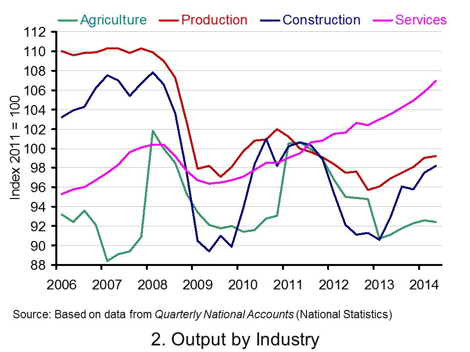 Consider now Chart 2 (click here for a PowerPoint of the chart). It allows us to analyse more recent events by tracking how industrial output has evolved since 2006. It suggests an unbalanced recovery. From it, we observe that in Q2 2014 service-sector output was 6.5 per cent higher than in Q1 2008. However, a very different picture emerges for the other principal industrial types. Output across the production industries remains 9.7 per cent lower, 9.2 per cent lower in agriculture and 8.9 per cent lower in the construction sector.
In short, the British economy continues to struggle to rebalance its industrial base. The business cycle remains heavily dependent on the service sector.
Articles
UK GDP revised up: what the economists say Guardian, Katie Allen (30/9/14)
UK economy grew 0.9% in second quarter, says ONS BBC News, Katie Allen (9/5/14)
UK GDP: Did the UK economy do well after all? Independent, Ben Chu (30/9/14)
UK economy grew 0.9% Herald, Ian McConnell (1/10/14)
Economy tracker: GDP BBC News (30/9/14).
Data
Quarterly National Accounts, Q2 2014 Dataset Office for National StatisticsQuarterly National Accounts, Q2 2014, Statistical Release Office for National Statistics
Questions
- What is the difference between nominal and real GDP? Which of these helps to track changes in economic output?
- Looking at Chart 1 above, summarise the key patterns in real GDP since the 1980s.
- What is a recession?
- What are some of the problems with the traditional definition of a recession?
- Can a recession occur if nominal GDP is actually rising? Explain your answer.
- What factors lead to economic growth being so variable?
- What factors might explain the very different patterns seen since the late 2000s in the volume of output of the four main industrial sectors?
- What different interpretations could there be of a ‘rebalancing’ of the UK economy?
- What other data might we look at to analyse whether the UK economy is ‘rebalancing’?.
- Produce a short briefing paper exploring the prospects for economic growth in the UK over the next 12 to 18 months.
- What is the difference between GVA and GDP?
- Explain the arguments for and against using GDP as a measure of a country’s economic well-being.
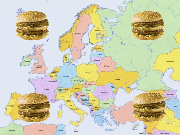
 At least once a year The Economist publishes its ‘hamburger standard’ exchange rates for currencies. It is a light-hearted attempt to see if currencies are exchanging at their purchasing-power parity rates. The test is the price at which a ‘Big Mac’ McDonald’s hamburger sells in different countries!
According to this simplified version of the purchasing-power parity theory, exchange rates should adjust so that a Big Mac costs the same in dollars everywhere (see Economics 8th edition Box 25.4).
These Big Mac exchange rates can be used to compare various prices and incomes between countries. The article linked below from The Guardian compares minimum wages between European countries in Big Mac terms.
There are 25 countries across Europe which have minimum wages. A clear pattern of minimum wage rates can be seen: although actual exchange rates understate the purchasing power of incomes in poorer European countries compared to richer ones, minimum wages, even in purchasing-power standard terms, are still higher in the richer countries.
Luxembourg’s minimum wage buys you just about three Big Macs in an hour, while most of northern Europe (and France) between 2–2.5 Big Macs. Moving south, the minimum wage nets about one Big Mac an hour. As we progress east, it begins to cost more than an hour of work on the minimum wage in order to afford a Big Mac.
Of course, there are other factors determining the dollar price of a Big Mac other than the failure of exchange rates to reflect purchasing-power parities. Nevertheless, using the Big Mac index in this way does give a useful preliminary snap shot of differences in what minimum wages can buy in different countries.
Articles
Comparing the minimum wage across Europe using the price of a Big Mac The Guardian datablog, Alberto Nardelli (25/9/14)
Minimum wage statistics Eurostat (Sept/14)
Data
Earnings Database Eurostat
Questions
- What is meant by ‘purchasing-power parity exchange rates’?
- Why may actual exchange rates not accurately reflect the purchasing power of currencies within countries?
- Using the link to Eurostat article above, compare Big Mac minimum wages with (a) actual minimum wages and (b) minimum wages expressed in purchasing-power standard terms.
- Using the links to the Eurostat article and Eurostat data, describe how the proportion of employees earning minimum wages varies across European countries. What factors determine this proportion?
- Using the same links, describe how the monthly minimum wage as a proportion of average monthly earnings varies across European countries. Explain these differences.
 In an earlier post, Elizabeth looked at oligopolistic competition between supermarkets. Although supermarkets have been accused of tacit price collusion on many occasions in the past, price competition has been growing. And recent developments show that it is likely to get a lot fiercer as the ‘big four’ try to take on the ‘deep discounters’, Aldi and Lidl.
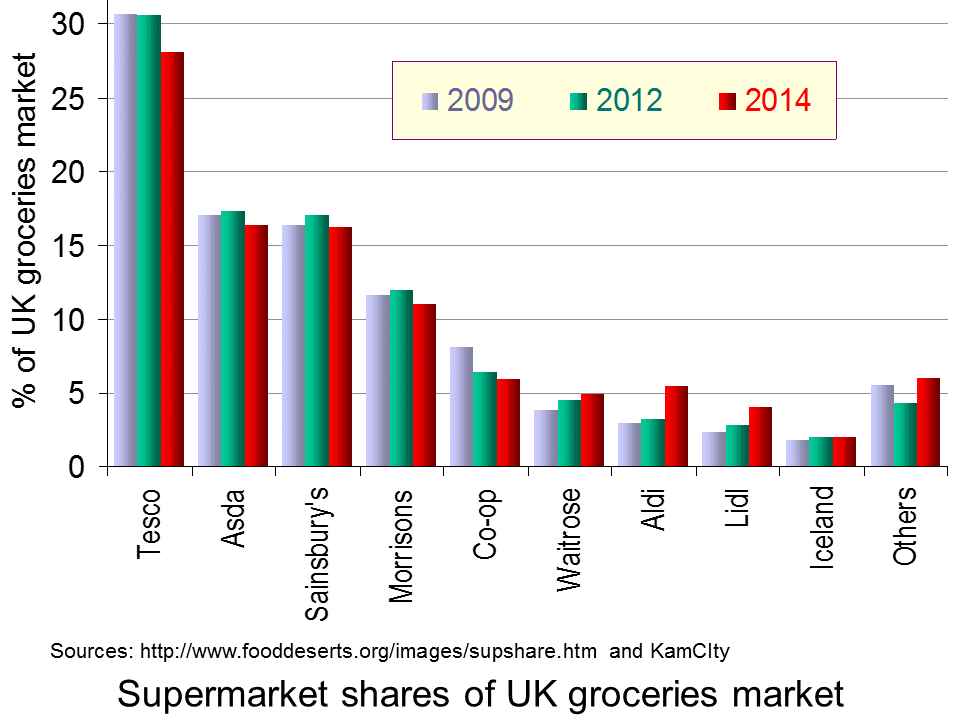
Part of the reason for the growth in price competition has been a change in shopping behaviour. Rather than doing one big shop per week in Tesco, Sainsbury’s, Asda or Morrisons, many consumers are doing smaller shops as they seek to get more for their money. A pattern is emerging for many consumers who are getting their essentials in Aldi or Lidl, their ‘special’ items in more upmarket shops, such as Waitrose, Marks & Spencer or small high street shops (such as bakers and ethnic food shops) and getting much fewer products from the big four. Other consumers, on limited incomes, who have seen their real incomes fall as prices have risen faster than wages, are doing virtually all their shopping in the deep discounters. As the Guardian article below states:
A steely focus on price and simplicity, against a backdrop of falling living standards that has sharpened customers’ eye for a bargain, has seen the discounter grab market share from competitors and transform what we expect from our weekly shop.
The result is that the big four are seeing their market share falling, as the chart shows.  (Click here for a PowerPoint of the chart.) In the past year, Tesco’s market share has fallen from 29.9% to 28.1%, Asda’s from 17.8% to 16.3%, Sainsbury’s from 16.9% to 16.2% and Morrisons’ from 11.7% to 11.0%. By contrast, Aldi’s has risen from 3.9% to 5.4% and Lidl’s from 3.1% to 4.0%, while Waitrose’s has also risen, from 4.7% to 4.9%. And it’s not just market share that has been falling for the big four. Profits have also fallen, as have share prices. Sales revenues in the four weeks to 13 September are down 1.6% on the same period a year ago; sales volumes are down 1.9%.
But can the big four take on the discounters at their own game? Morrison’s has just announced a form of price match scheme called ‘Match & More’. If a shopper finds that a comparable grocery shop is cheaper in not only Tesco, Sainsbury’s or Asda, but also in Aldi or Lidl, then ‘Match & More users will automatically get the difference back in points on their card. Shoppers also will be able to collect extra points on hundreds of featured products and fuel’. When the difference has risen to a total £5 (5000 points), the shopper will get a £5 voucher at the till. The idea is to encourage customers to stay loyal to Morrisons.
 But what if Tesco, Asda and Sainsbury’s do the same? What will be the impact on their prices and profits. Will there be a race to the bottom in prices, or will they be able to keep prices higher than the deep discounters, hoping that many customers will not cash in their vouchers?
But if effectively the big four felt forced to cut their prices to match Aldi and Lidl, could they afford to do so? This depends on their comparative average costs. At first sight, it might be thought that the big four could succeed in profitably matching the discounters, thereby clawing back market share. After all, they are much bigger and it might be thought that they would benefit from greater economies of scale and hence lower costs.
But it is not as simple as this. The discounters have lower costs than the big four. Their shops are typically in areas where rents or land prices are lower; their shops are smaller; they carry many fewer lines and thus gain economies of scale on each line; they have a much higher proportion of own-brand products; products are displayed in the boxes they come in, thus saving on the staff costs of unpacking them and placing them on shelves; they buy what is cheapest and thus do not always display the same brands.
So is Morrison’s a wise strategy? Will other supermarkets be forced to follow? Is there a prisoners’ dilemma here and, if so, is there any form of collusion in which the big four can engage which is not illegal? Can the big four differentiate themselves from the discounters and the up-market supermarkets in ways that will attract back customers?
It is worrying times for the big four.
Articles
- Heavy Discounters Up Pressure On The UK’s Big Four Supermarkets
Alliance News, Rowena Harris-Doughty (3/6/14)
- Tesco loses more market share as supermarket sector slows to record low
CITY A.M., Catherine Neilan (23/9/14)
- Record low for grocery market growth as inflation disappears
Kantar World Panel, Fraser McKevitt (23/9/14)
- How Aldi’s price plan shook up Tesco, Morrison’s, Asda and Sainsbury’s
The Guardian, Sarah Butler (29/9/14)
- Sainsbury’s shares drop 7% on falling sales report
BBC News (1/10/14)
- Sainsbury results: the reaction
Food Manufacture, Mike Stones (3/10/14)
- Morrisons Becomes First Of Big Four Grocers To Price Match Aldi, Lidl
Alliance News, Rowena Harris-Doughty (2/10/14)
- UK: Morrisons Takes On Discounters With Price Match Card
KamCity (3/10/14)
- Morrisons to match the prices of Aldi and Lidl
The Telegraph, Graham Ruddick (2/10/14)
- Three reasons why Morrisons price-matching Aldi and Lidl is not a ‘gamechanger’
The Telegraph, Graham Ruddick (2/10/14)
Questions
- Would it be possible for the big four to price match the deep discounters?
- What is meant by the prisoners’ dilemma? In what ways are the big four in a prisoners’ dilemma situation?
- Assume that you had to advise Tesco on it strategy? What advise would you give it and why?
- Assume that two firms, M and A, are playing the following ‘game’: firm M pledges to match firm A’s prices; and firm A pledges to sell at 2% below M’s price. What will be the outcome of this game?
- Is Morrisons wise to adopt its ‘Match & More’ strategy?
- Why is it difficult for Morrisons to make a like-for-like comparison with Aldi and Lidl in its ‘Match & More’ strategy?
- Why may Aldi and Lidl benefit from Morrisons’ strategy?
 The Scottish debate revolved around a variety of issues and one of the key factors that added weight to the ‘No’ campaign was the idea of being British. But the concept of ‘Britishness’ is not just important to those who live here. It still appears to be a key signal of quality in foreign markets and it is something which foreign consumers are willing to pay a price for.
Barclays Corporate Banking has undertaken research into eight key export markets to determine the value of ‘Britain’. One of the key factors that boost demand for a product is quality and another is the idea of a brand. As quality improves and brands become more recognized, a product’s demand curve will begin to shift to the right, thus pushing up the market price. In other words, with higher quality and brand recognition, an individual’s willingness to pay rises. One brand that foreign consumers seem willing to pay a premium to purchase are those labelled ‘Made in Britain’.
The research indicates that 31% of customers in emerging markets have been prepared to and have purchased products that are from Britain, despite the higher price. Seeing the label ‘Made in Britain’ seems to send the signal of quality and this in turn creates a higher willingness to pay. Furthermore, this willingness to pay, while still good for Scottish, English and Welsh products, is higher for ‘British’ products, perhaps another indication of the truth behind the ‘Better together’ campaign.
The increase in willingness to pay between products with seemingly no country of origin and a British country of origin is 7% and this knowledge should give a confidence boost to the British export market. It should also indicate to exporters in Wales, Scotland and England that they are better to advertise as ‘Made in Britain’ than ‘Made in Wales, Scotland or England’. The expected boost from the 8 key emerging markets is around £2bn. The following articles consider the concept of ‘Brand Britain’.
Good news for exports as Brand Britain is revealed to be valuable concept Small Business, John Bromley (3/11/14)
Britain ‘best brand’ for Welsh exports, survey suggests BBC News (26/11/11)
Overseas consumers 64% more willing to pay premium for ‘Brand Britain’ Marketing Week, Sebastian Joseph (3/11/14)
Report flags up ‘British’ benefit The Courier, James Williamson (3/10/14)
Questions
- Using a diagram, illustrate the effect of a product’s being a well-known brand on its equilibrium price and quantity.
- Why is it that the relative willingness to pay a premium for British products is higher in developing countries than in developed countries?
- Using the concept of marginal utility theory, explain the impact of the ‘Made in Britain’ label.
- The BBC News article suggests, however, that some Welsh companies have not found the brand effect to be the case. What factors might explain this?
- To what extent are the concepts of consumer and producer surplus relevant here?
 A key economic objective of governments around the world is economic growth, where economic growth is taken to mean growth in Gross Domestic Product (GDP). This can be refined as growth in GDP per head or growth in Net National Income (NNY or NNI) – this takes account of depreciation and net flows of income to and from abroad. But is GDP (or NNY) an appropriate measure? There continues to be much debate about this and there is a lot of support for adopting an alternative measure – the Genuine Progress Indicator (GPI) as a target for economic policy.
GDP measures the market value of production and is the value added at each stage of production. If the value of a nation’s production is what you want to measure or target, then GDP is quite a good indicator. Its main drawbacks are that it uses market prices, which may be distorted, and that much of production in the informal sector is not included.

But if GDP growth is taken to be a proxy for development or growth in wellbeing of the residents of a country, then it has serious shortcomings. This is not to say that GDP gives no indication of progress. Generally, countries with higher GDP per head have a better standard of living, but it is not necessarily the case that, if Country A has higher production in the formal sector than Country B, its residents will be happier, more fulfilled and have fewer economic or other problems.
GDP, by focusing on production, ignores many environmental and social costs of that production. Valuable but not tradable resources, such as clean air, rivers and oceans, may be sacrificed for the sake of extra production and this is recorded as a gain in GDP.
Similarly, unless GDP is specifically weighted by income groups, which virtually never happens, it does not take into account income distribution. Much of the growth in production in both rich and poor countries in recent decades has gone to the richest people. Take the case of the USA. In 1944 the share of income going to the top 1% share was 11.3%, while the bottom 90% were receiving 67.5%.  Such levels remained roughly constant for the next three decades. But then things began to change.
Starting in the mid- to late 1970s, the uppermost tier’s income share began rising dramatically, while that of the bottom 90% started to fall. The top 1% took heavy hits from the dot-com crash and the Great Recession but recovered fairly quickly: [preliminary estimates for 2012 by Emmanuel Saez] have that group receiving nearly 22.5% of all pre-tax income, while the bottom 90%’s share is below 50% for the first time ever (49.6%, to be precise).
So what does GPI measure and why may it be a better target for policy-makers than GDP or NNY? The answer is that it includes a number of important items that affect the well-being of a country, such as resource depletion, social activity and income distribution, that are not measured in GDP.  So what would cause GPI to rise? According to The Guardian article below, examples would include:
Getting more energy from renewables; increased energy efficiency; reducing the income gap; putting more reliable, durable products on the market (have you heard of planned obsolescence?); volunteering more for your community; preserving wetlands, forests, and farmland; shorter commutes and transport routes. In fact, there are 26 ways the GPI can go up, all measured in dollars that boil down to a single number.
GPI is being increasingly adopted as a measure of progress. In the USA, it is officially used in Vermont and Maryland and is being considered in other states, such as Hawaii, Washington and Oregon.
And there are other alternatives. For example, since 1990, the United Nations Development Programme (UNDP) has published an annual Human Development Index (HDI) As Box 27.1 in Economics, 8th edition states:
HDI is the average of three indices based on three sets of variables: (i) life expectancy at birth, (ii) education (a weighted average of (a) the mean years that a 25-year-old person or older has spent in school and (b) the number of years of schooling that a 5-year-old child is expected to have over their lifetime) and (iii) real GNY per capita, measured in US dollars at purchasing-power parity exchange rates.
The following articles look at the suitability of GDP and GPI and whether, by targeting growth in GDP, governments are guilty of downplaying the importance of other economic and social objectives.
Beyond GDP: US states have adopted genuine progress indicators The Guardian, Marta Ceroni (23/9/14)
Forget the GDP. Some States Have Found a Better Way to Measure Our Progress. New Republic, Lew Daly and Sean McElwee (3/2/14)
Gross domestic problem Aljazeera, Sean McElwee (6/6/14)
Creating the Circular Economy, Part II Environmental Leader, David Dornfeld (17/9/14)
Development: Time to leave GDP behind Nature, Robert Costanza, Ida Kubiszewski, Enrico Giovannini, Hunter Lovins, Jacqueline McGlade, Kate E. Pickett, Kristín Vala Ragnarsdóttir, Debra Roberts, Roberto De Vogli and Richard Wilkinson (15/1/14)
The Problems With Using GPI Rather Than GDP Forbes, Tim Worstall (5/6/14)
Questions
- What does GDP measure?
- Does GDP of a country equate to the turnover of a firm?
- If growth in NNY is superior to growth in GDP as a measure of economic growth, why are GDP figures more generally used than NNY figures when assessing a country’s economic performance?
- How suitable is using GDP as a measure of a nation’s production?
- What does GPI measure?
- Is GPI superior to GDP as a measure of a nation’s level of development? Explain why or why not.
- Give some examples of where a growth in GDP might correspond to a decline in economic well-being.
- For what reasons could GPI measures be described as subjective?
- Would it be a good idea for a country to target growth in GPI/GDP? Explain your answer.
- In addition to real GNY per capita, the Human Development Index includes measures of education and life expectancy. For what other social objectives might education and life expectancy be useful proxies?
 The latest GDP numbers from the Office for National Statistics contained in Quarterly National Accounts, Q2 2014 show the economy’s output expanded by 0.9 per cent in the second quarter. This follows on the back of a 0.7 per cent increase in output in Q1 2014. The economy’s output is now thought to be 0.7 per cent above its Q1 2008 peak. Yet, the data show very different profiles for the four principal industrial sectors. The service sector appears to be ploughing ahead while the rest (production, construction and agriculture) lag behind.
 Chart 1 shows quarterly economic growth since 1980s (click here for a PowerPoint of the chart). It illustrates nicely the inherent volatility of economies – one of the threshold concepts in economics. The average quarterly rate of growth since 1980 has been 0.5 per cent. On the face of it, a quarterly growth number of 0.9 per cent would appear very robust. Of course, this has to been set in the context of the 2008/9 recession. UK output peaked in Q1 2008 (£414.424 billion at 2011 prices). The revised data now show that there followed 5 quarters of declining output (previously, data suggested the duration of the recession was 6 quarters). During this period output shrank 6 per cent (GDP at 2011 prices had fallen by Q2 2009 to £389.388 billion ).
  Consider now Chart 2 (click here for a PowerPoint of the chart). It allows us to analyse more recent events by tracking how industrial output has evolved since 2006. It suggests an unbalanced recovery. From it, we observe that in Q2 2014 service-sector output was 6.5 per cent higher than in Q1 2008. However, a very different picture emerges for the other principal industrial types. Output across the production industries remains 9.7 per cent lower, 9.2 per cent lower in agriculture and 8.9 per cent lower in the construction sector.