 UK house prices are incredibly volatile. This helps to explain the fascination that many of us have with the British housing market. According to the latest ONS house Price Index, the average UK house price in August 2013 was 3.8 per cent higher than 12 months earlier. The rates varied across the home nations: 4.1 per cent in England, 1.1 per cent in Northern Ireland, 1 per cent in Wales and -0.7 per cent in Scotland. Here we take a look at international house price inflation rates. Is the British housing market as unique as we think it is?
Let’s begin at home (excuse the pun). If we take the period from 1970 Q1 to 2013 Q2, the average annual rate of house price inflation across the UK is 9.7 per cent. The average rate in England is 9.8 per cent, as it is in Wales too, while in Scotland it is 9.0 per cent and in Northern Ireland it is 8.8 per cent. While the long-term averages of the UK nations are rather more similar than perhaps we might expect, what is quite interesting is the differences that emerge in more recent times. If we take the period from July 2008 to August 2013, the average annual rate of house price inflation in the UK is -0.2 per cent, in England it is 0.1 per cent, in both Wales and Scotland it is -1.0 per cent, while in Northern Ireland it is -11 per cent.
The recent English average is heavily distorted by London and to a lesser extent the rest of the South East. In London and the South East the average annual house price inflation rates since July 2008 have been 2.6 per cent and 0.2 per cent respectively. In all the other English regions the average rate has been negative. In my own region of the East Midlands the average rate has been -1.2 per cent – this is exactly the UK average if both London and the South East are removed from the figures.
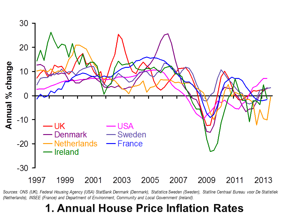 Now let’s go international. Chart 1 shows annual house price inflation rates for the UK and six other countries since 1997. Interestingly, it shows that house price volatility is a common feature of housing markets. It is not a uniquely British thing. It also shows that the USA is notable for its relatively robust house price inflation rates of late. In the first half of 2013 annual house price inflation has been running at 7 per cent in America, compared with 2 to 3 per cent here in the UK. In contrast, the Netherlands has seen near-double digit rates of house price deflation over the past year, albeit with a rebound in the third quarter of this year. (Click here to download a PowerPoint of the chart.)
The chart captures very nicely the effect of the financial crisis and subsequent economic downturn on global house prices. Ireland saw annual rates of house price deflation touch 23 per cent in 2009 compared with rates of deflation of 12 per cent in the UK. Denmark too suffered significant house price deflation with prices falling at an annual rate of 15 per cent in 2009.
House price volatility appears to be an inherent characteristic of housing markets worldwide. Let’s now consider the extent to which house prices rise over the longer term. In doing so, we consider real house price growth after having stripped out the effect of consumer price inflation. Real house price growth measures the growth of house prices relative to consumer prices.
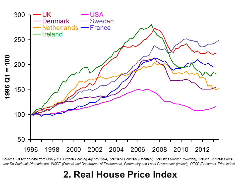 Chart 2 shows real house prices since 1996 Q1. (Click here to download a PowerPoint of the chart.) It shows that up to 2013 Q2, real house prices in the UK have risen by a factor of 2.24, i.e. they are two and a quarter times higher. This is a little less than in Sweden where prices are 2.5 times higher.
Chart 2 shows that the increase in real house prices in the UK and Sweden is significantly higher than in the other countries in the sample. In particular, in the USA real house prices in 2013 Q2 are only 1.16 times higher than in 1996 Q1. In the US actual house prices, when viewed over the past 17 years or so, have grown only a little more quickly than consumer prices.
The latest data on house prices suggest that house price volatility is not unique to the UK. However the rate of growth over the longer term relative to consumer prices is markedly quicker than in many other countries. It is this which helps to explain the amount of attention paid to the UK housing market – and not least by policy-makers.
Data
House Price Indices: Data Tables Office for National Statistics
Articles
First time buyers in race to beat house price rises Telegraph, Nicole Blackmore (8/11/13)
House prices soar by £13,000: Values rise at fastest rate for 3 years Express, Sarah O’Grady (7/11/13)
House prices: ‘south-east set to outpace London’ for first time in a decade Guardian, Jennifer Rankin (6/11/13)
UK house prices hit record level, says ONS BBC News, (15/10/13)
UK house prices rise at fastest pace in three years in October – Nationwide Reuter (31/11/13)
 Jonathan Portes: UK house prices a ‘force of evil’ BBC News, (5/11/13)
Questions
- What is meant by the annual rate of house price inflation? What about the annual rate of house price deflation?
- What factors are likely to affect housing demand?
- What factors are likely to affect housing supply?
- Explain the difference between nominal and real house prices. What does a real increase in house prices mean?
- How might we explain the recent differences between house price inflation rates in London and the South East relative to the rest of the UK?
- What might explain the very different long-term growth rates in real house prices in the USA and the UK?
- Why were house prices so affected by the financial crisis?
- What factors help explain the volatility in house prices?
 The model of demand and supply is one of the first diagrams that any student of Economics will see and it’s a very important model. We can apply it to a multitude of markets and understand how market prices for products and services are determined. One such market is that of wine, where a recent report suggests that wine is in short supply. Bad news for everyone!
The price of wine is set by the interact of demand and supply. As with any market, numerous factors will affect how much wine is demanded at any price. Since 1996, global consumption of wine has been on the increase: for many, wine is a luxury good and thus as income rises, so does consumption. With the emergence of markets, such as China and subsequent income growth, consumption has risen. Furthermore, tastes have changed such that wine is becoming an increasingly desirable drink. So, this has all led to the demand curve shifting to the right.
 However, at the same time, the supply of wine has been falling, largely the result of ‘ongoing vine pull and poor weather’ across Europe. European production has fallen by around 10% over the past year and although production in other countries has been rising, overall production is still not sufficient to match the growth in demand.
So, what’s the result of this high growth in demand combined with the decline in supply? A shortage of wine. A report by analysts at Morgan Stanley suggests that the global wine shortage was some 300m cases in 2012. But, more importantly what is the effect of this shortage? When demand for a product exceeds the supply, the market mechanism will push up the price. As stocks of wine continue to be depleted and consumption of wine keeps rising, the only outcome is a rise in the price of a bottle and a crate of wine.
Concerns are also being raised about the future of prices of some of our other favourite luxury products, such as chocolate, goats cheese and olives. In each case, it’s all about demand and supply and how these curves interact with each other. The following articles consider the prices of some of these products.
Wine shortage: the top five wines to drink – before they run out The Telegraph, Susy Atkins (30/10/13)
World faces global wine shortage – report BBC News (30/10/13)
Luxury food shortage scares – should we believe the warnings? The Guardian, Emine Saner (5/11/13)
The global wine ‘shortage’ Napa Valley, Dan Berger (8/11/13)
Global Shortage of wine beckons Independent, Felicitiy Morse (30/10/13)
The global wine shortage is about to get worse (if you like Bordeaux) TIME World, David Stout (6/11/13)
Have no fears about a world wine shortage – the glass is still half fulll The Telegraph, Victoria Moore (31/10/13)
Drink it while you can, as study points to looming wine shortage Associated Press (31/10/13)
Don’t waste a drop! Wine prices to rise as demand grows Mail Online, Amie Keeley (31/10/13)
Questions
- Use a demand and supply diagram to illustrate how the market price for wine (or any other product) is determined.
- Why does the demand curve for wine slope downwards and the supply curve of wine slope upwards?
- Which factors will affect (a) the demand and (b) the supply of wine?
- One the diagram you drew in question, illustrate a shortage of wine. How will the price mechanism work to restore equilibrium?
- Why does the Morgan Stanley report suggest that a wine shortage might emerge?
- What suggestions are there that there is no wine shortage?
 The Conservatives have pledged that, if they win the next election, they will hold a referendum in 2017 on whether or not the UK should remain in the EU. The Prime Minister has also said that he will renegotiate the terms of UK membership and push for reforms to the EU to cut administrative costs, reduce intervention and make the EU more competitive. We are likely to be bombarded with arguments for and against membership over the coming months.
In a contribution to the debate, the CBI has just published research showing that membership of the EU benefits the UK by up to £78 billion per year – £3000 per household. It also conducted a poll of its members which shows that the vast majority (78%, including 77% of SMEs) want to remain part of the EU, believing that membership brings net benefits to their business and the economy more generally.
However, as the Director-General of the CBI, John Cridland, said:
But the EU isn’t perfect and there is a growing unease about the creeping extension of EU authority. Europe has to become more open, competitive and outward looking if we are to grow and create opportunities and jobs for all our citizens.
The following articles and documents look at the CBI’s arguments.
Articles
Britain must stay in the European Union, says CBI Independent, Margareta Pagano (4/11/13)
Britain must stay in EU, says business lobby group The Guardian, Katie Allen (3/11/13)
EU membership: what the CBI have said The Telegraph, Rebecca Clancy (4/11/13)
CBI says staying in EU ‘overwhelmingly’ best for business BBC News (4/11/13)
CBI documents
In with reform or out with no influence – CBI chief makes case for EU membership CBI Press Release (4/11/13)
Our Global Future: Factsheets CBI
Questions
- Distinguish between a free trade area, a customs union, a common market and a monetary union. Which is the EU?
- Itemise the arguments for and against membership of the EU.
- What types of reform to the EU are being advocated by the CBI?
- What factors will determine the negotiating power of the UK government with other EU governments?
- How is greater fiscal integration in the eurozone likely to affect the case for and against EU membership for the UK?
 A bumper harvest should be good news for farmers – but not if it drives down prices. This is the position facing many Australian farmers. After a relatively wet summer a year ago and a mild winter this year, crop yields have soared. But the prices farmers can get in wholesale markets have been so low that many have resorted to setting up their own farm shops or selling in farmers’ markets or from the backs of ‘utes’ (utility vehicles, i.e. pickup trucks) or at roadside stalls.
And the supply problem is not just one of increased domestic supply: cheap food imports, often of inferior quality, have been flooding into Australia. Increasing food exports,  especially to Asia, would help Australian farmers, but here again there is competition in these markets from other countries.
The problem of increased Australian supply is even more serious for Australian farmers in areas where harvests have not been so good. Australia is a huge country and conditions, although generally favourable this year, have been poor in some areas. Here farmers face the double disaster of low output and low prices.
Australian dairy farmers too are facing problems of falling prices. Price deregulation and the monopsony power of supermarkets have driven down  the price of milk and other dairy products. Since deregulation in 2000, the number of dairy farms has halved, as many smaller family farms go out of business and larger ‘industrial-scale’ farms grow.
So are there any solutions? The BBC article looks at things being done in Tasmania to help small farmers, but questions whether small farmers have much of a future more generally in Australia?
Articles
Australia’s small farmers struggling with low prices BBC News, Phil Mercer (31/10/13)
Commodity prices edge lower in October Sky News Australia (1/11/13)
Low prices spoil perfect season for Australian farmers ABC News, Eric Tlozek and Courtney Wilson (18/9/13)
Agri-businesses taking over the farm The Guardian (Australia) (6/11/13)
Data
Commodity prices Index Mundi
Agriculture in Australia Wikipedia
Farm inputs & costs Dairy Australia
Questions
- How does the fallacy of composition relate to the ‘problem’ of good harvests?
- How price elastic is the demand for specific crops likely to be? Why may individual farmers face an elasticity of demand close to infinity?
- Illustrate the problem for small farmers in Australia with a demand and supply diagram.
- Is there any way in which farmers, either individually or collectively, can make their demand less elastic?
- Comment on the following statement by a sugar cane farmer: “We’ve got that much money tied up (in the business) we just can’t walk away”. Under what circumstances would it make sense to ‘walk away’?
- How does the monopsony power of supermarkets influence the prices farmers receive?
- Discuss ways in which the federal government in Australia could support farmers.
 Each year in November, the Living Wage Foundation publishes figures for the hourly living wage that is necessary for people to meet basic bills. The rate for London is calculated by the Greater London Authority and for the rest of the UK by the Centre for Research in Social Policy at Loughborough University.
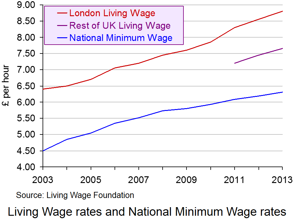
The 2013 update was published on 4 November. The Living Wage was estimated to be £8.80 in London and £7.65 in the rest of the UK.
Two things need to be noted about the Living Wage rate. The first is that the figure is an average and thus does not take into account the circumstances of an individual household. Clearly households differ in terms of their size, the number of wage earners and dependants, the local costs of living, etc. Second, the figures have been reduced from what is regarded as the ‘reference’ living wage, which is estimated to be £9.08 outside London. The reason for this is that people earning higher incomes have seen their living standards squeezed since 2009, with prices rising faster than average post-tax-and-benefit wages. Thus, the Living Wage is capped to reflect the overall decline in living standards. As the Working Paper on rates outside London explains:
From 2012 onwards, two kinds of limit have been put on the amount that the Living Wage as applied can rise in any one year. The first limits the increase in the net income (after taxes and benefits) requirement for each household on which the living wage calculation is based, relative to the rise in net income that would be achieved by someone on average earnings. The second limits the increase in the living wage itself (representing gross income) relative to the increase in average earnings.
 Nevertheless, despite this capping of the living wage, it is still significantly higher than the UK National Minimum Wage, which currently stands at £6.31 for those aged 21 and over. This can be seen from the chart (click here for a PowerPoint).
Paying the Living Wage is voluntary for employers, but as The Guardian reports:
A total of 432 employers are now signed up to the campaign, up from 78 this time last year, including Legal & General, KPMG, Barclays, Oxfam, Pearson, the National Portrait Gallery and First Transpennine Express, as well as many smaller businesses, charities and town halls. Together they employ more than 250,000 workers and also commit to roll out the living wage in their supply chain.
But as The Observer reports:
The number of people who are paid less than a ‘living wage’ has leapt by more than 400,000 in a year to over 5.2 million, amid mounting evidence that the economic recovery is failing to help millions of working families.
A report for the international tax and auditing firm KPMG also shows that nearly three-quarters of 18-to-21-year-olds now earn below this level – a voluntary rate of pay regarded as the minimum to meet the cost of living in the UK. The KPMG findings highlight difficulties for ministers as they try to beat back Labour’s claims of a “cost of living crisis”.
According to the report, women are disproportionately stuck on pay below the living wage rate, currently £8.55 in London and £7.45 elsewhere. Some 27% of women are not paid the living wage, compared with 16% of men. Part-time workers are also far more likely to receive low pay than full-time workers, with 43% paid below living-wage rates compared with 12% of full-timers.
But although paying a living wage may be desirable in terms of equity, many firms, especially in the leisure and retailing sectors, claim that they simply cannot afford to pay the living wage and, if they were forced to, would have to lay off workers.
The point they are making is that it is not economical to pay workers more than their marginal revenue product. But this raises the question of whether a higher wage would encourage people to work more efficiently. If it did, an efficiency wage may be above current rates for many firms. It also raises the question of whether productivity gains could be negotiated in exchange for paying workers a living wage
These arguments are discussed in the following podcast.
Podcast
 Higher ‘productivity’ will increase living wage BBC Today Programme, Priya Kothari and Steve Davies (4/11/13)
Articles
UK living wage rises to £7.65 an hour The Guardian (4/11/13)
More than 5 million people in the UK are paid less than the living wage The Observer, Toby Helm (2/11/13)
Increasing numbers of Scots are paid less than living wage Herald Scotland (2/11/13)
Labour would give tax rebates to firms that pay living wage Independent, Jane Merrick (3/11/13)
Employers praise Ed Miliband’s living wage proposal Independent, Andy McSmith (3/11/13)
Miliband’s living wage tax break will raise prices, warns CBI chief The Telegraph, Tim Ross (3/11/13)
Living Wage rise provides a boost for low paid workers BBC News (4/11/13)
Information and Reports
What is the Living Wage? Living Wage Foundation
The Living Wage Centre for Research in Social Policy, Loughborough University
Living wage Mayor of London
One in five UK workers paid less than the Living Wage KPMG News Release (3/11/13)
Number of workers paid less than the Living Wage passes 5 million KPMG News Release (3/11/13)
Living Wage Research for KPMG Markit (October 2012)
Questions
- How is the Living Wage calculated?
- What are the reasons for announcing a Living Wage figure that is lower than a reference living wage? Assess these reasons.
- If there are two separate figures for the Living Wage for London and the rest of the UK, would it be better to work out a living wage for each part, or even location, of the UK?
- Why might it be in employers’ interests to pay at least the Living Wage? Does this explain why more and more employers are volunteering to pay it?
- Assess the Labour Party’s pledge, if they win the next election, that ‘firms which sign up to the living wage will receive a tax rebate of up to £1000 for every low-paid worker who gets a pay rise, funded by tax and national insurance revenue from the higher wages’.
- Which is fairer: to pay everyone at least the Living Wage or to use tax credits to redistribute incomes to low-income households?
 UK house prices are incredibly volatile. This helps to explain the fascination that many of us have with the British housing market. According to the latest ONS house Price Index, the average UK house price in August 2013 was 3.8 per cent higher than 12 months earlier. The rates varied across the home nations: 4.1 per cent in England, 1.1 per cent in Northern Ireland, 1 per cent in Wales and -0.7 per cent in Scotland. Here we take a look at international house price inflation rates. Is the British housing market as unique as we think it is?
  Now let’s go international. Chart 1 shows annual house price inflation rates for the UK and six other countries since 1997. Interestingly, it shows that house price volatility is a common feature of housing markets. It is not a uniquely British thing. It also shows that the USA is notable for its relatively robust house price inflation rates of late. In the first half of 2013 annual house price inflation has been running at 7 per cent in America, compared with 2 to 3 per cent here in the UK. In contrast, the Netherlands has seen near-double digit rates of house price deflation over the past year, albeit with a rebound in the third quarter of this year. (Click here to download a PowerPoint of the chart.)
 Chart 2 shows real house prices since 1996 Q1. (Click here to download a PowerPoint of the chart.) It shows that up to 2013 Q2, real house prices in the UK have risen by a factor of 2.24, i.e. they are two and a quarter times higher. This is a little less than in Sweden where prices are 2.5 times higher.
 Jonathan Portes: UK house prices a ‘force of evil’ BBC News, (5/11/13)


