 In 2014, 19% of jobs in London and 23% of jobs outside London paid less than the living wage. This is according to figures just published by the Office for National Statistics. The figures compare with 17% and 22% respectively in 2013. The problem is that while the living wage rises with the cost of living, median wages have not kept pace with prices: in other words, in real terms median wages have fallen.
The living wage has been calculated annually since 2003 for London by the London Mayor’s Office and since 2011 for the rest of the UK by the Centre for Research in Social Policy (CRSP) at Loughborough University for the Living Wage Foundation.
According to the London Mayor’s Office:
The London Living Wage is an hourly rate of pay, calculated according to a combination of the costs of living in London and 60% of the median wage. This gives the wage rate needed to give a worker in London enough to provide their family with the essentials of life, including a cushion against unforeseen events. Unlike the compulsory national minimum wage, the London Living Wage is a voluntary commitment made by employers, who can become accredited with the Living Wage Foundation.
As the Chart 1 illustrates, the living wage is above the National Minimum Wage. 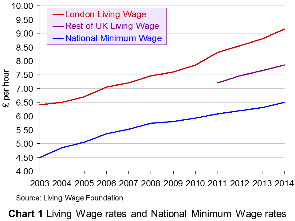 Since November 2014, the living wage in London has been £9.15 in London and £7.85 in the rest of the UK. It is due to be uprated at the beginning of November 2015. From 1 October 2014 to 30 September 2015, the National Minimum Wage (for people aged 21 and over) was £6.50. It rose to £6.70 on 1 October 2015.
Note that the (voluntary) living wage is different from the compulsory ‘National Living Wage’ announced by the Chancellor in his July 2015 Budget, which will come into effect in April 2016 as a top-up to the National Minimum Wage (NLW) for those aged 25 and over. This will be only 50p above the National Minimum Wage and thus considerably below the living wage, 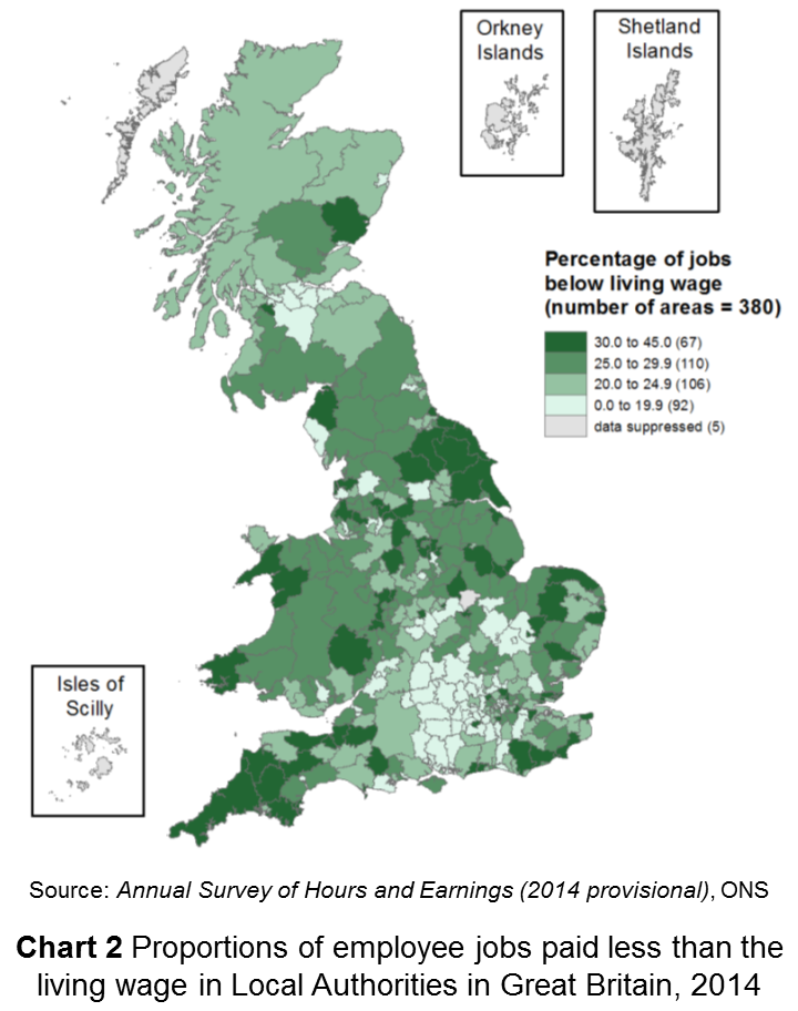 although the Chancellor has pledged to increase the NLW to 60% of median wage rates for those aged 25 and over by 2020. According to the Office for Budget Responsibility, “the NLW will rise from £7.20 in April 2016 (equivalent to around 55 per cent of estimated median hourly earnings for employees aged 25 and over) to around £9.35 in April 2020 (reaching 60 per cent of expected median hourly earnings for that group) in steps that imply the rise relative to median hourly earnings is a straight line.”
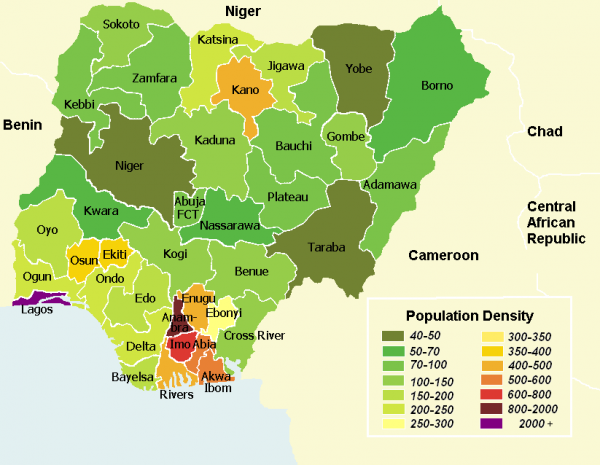
The percentage of people being paid below the living wage varies by occupation, location of jobs (see map in Chart 2 – click to enlarge), sex and age and whether the job is full or part time. For example, in accommodation and food services, in retail and in sales and customer services, more than half the jobs paid less than the living wage. A greater percentage of women than men were paid below the living wage (29% and 18% respectively outside London). As far as young people are concerned, 48% of 18–24 year olds were paid less than the living wage in London and 58% outside London 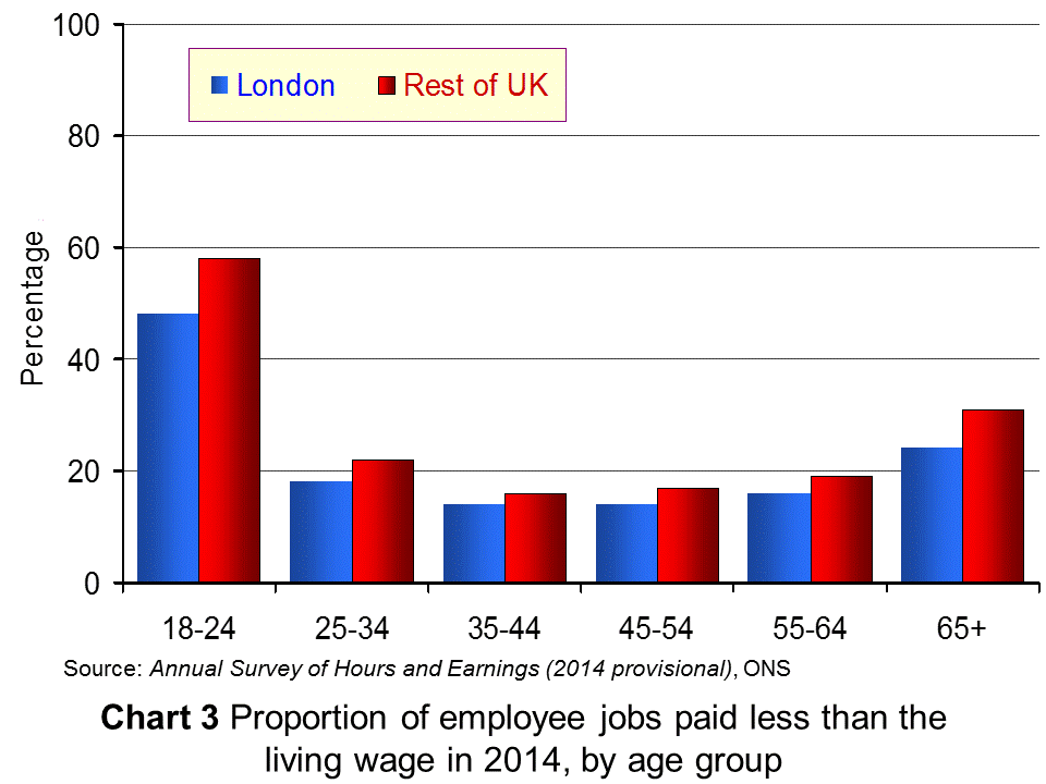 (see Chart 3). In London 45% of part-time jobs paid less than the living wage; in the rest of the UK the figure was 43%.
As The Guardian article linked below reports:
A spokesman for the Living Wage Foundation, which sets the figure each year, said despite ‘significant progress’ in many sectors, more jobs than ever were below the voluntary rates.
“These figures demonstrate that while the economy may be recovering as a whole, there is a real problem with ensuring everyone benefits, and low pay is still prevalent in Britain today,” he said.
The following articles look at the evidence presented by the ONS and examine the incidence of low pay in the UK.
Articles
More jobs paying below living wage BBC News (12/10/15)
A fifth of UK jobs pay less than living wage – ONS Financial Times (12/10/15)
The proportion of workers not being paid the living wage is rising Independent, Jon Stone (12/10/15)
Almost 30 per cent of women are paid below the living wage Independent, Jon Stone (12/10/15)
More UK jobs fail to pay a living wage The Guardian, Hilary Osborne and Damien Gayle (12/10/15)
Six million jobs pay below the living wage Full Fact, Laura O’Brien (19/10/15)
Data and Reports
Estimates of employee jobs paid less than the living wage in London and other parts of the UK ONS (12/10/15)
Annual Survey of Hours and Earnings ONS
Living wage rates: the calculation Living Wage Foundation
National Minimum Wage rates GOV.UK
Questions
- By referring to the Living Wage Foundation site, explain how the living wage is calculated. If you were defining the living wage, would you define it in this way? Explain.
- Distinguish between low pay and poverty. Does pay give a good indication of poverty?
- For what reasons has the number of jobs paying below the living wage increased? Does marginal productivty theory provide an explanation?
- Is it best to base statutory minimum wages on median earnings, mean earnings or the cost of living? Explain.
- If 6 million jobs pay below the living wage, does this mean that 6 million people, more than 6 million people or fewer than 6 million people receive average hourly wages below the living wage? Explain.
- For what reasons might firms volunteer to pay the living wage to their employees? Is doing so consistent with the aim of profit maximisation?
- Why are more women than men paid wage rates below the living wage?
- Why does the proportion of people being paid the living wage vary from one part of the UK to another? Is this likely to be purely a reflection of differences in the cost of living?
 You may be used to these types of blogs by now … On my commute to work on the 18th May, I listened to Start the Week on BBC radio 4 and happened upon a fascinating discussion on inequality.
Of those discussing the issue, one certainly needs no introduction: Joseph Stiglitz, a prominent economist, author and commentator on economics, in particular on inequality. He was joined by Steve Hilton, who has worked for David Cameron for many years in providing advice on a range of issues, including inequality and strategy and has written on existing institutions and their effectiveness. The final panellist was Masha Gessen, who has written extensively on Russia and in particular on the journey of the infamous Boston Bomber.
Though the discussion covers a variety of areas relevant to economics, one key area that is addressed is inequality and the policies that are being used to address the causes and the symptoms. You can access the 45-minute discussion at the link below.
 Joseph Stiglitz and Steve Hilton on inequality BBC Radio 4 (18/5/15)
Questions
- How would you measure inequality?
- Why is it important to distinguish between the causes and symptoms of poverty when designing government policy?
- To what extent do you believe that education is an essential requirement for growth and development?
- Why has inequality grown in some of the most developed nations?
- How is it possible that inequality in the developed world has grown, while global inequality has fallen?
- Why does the report argue that the reforms they suggest would help boost growth?
- Do you agree that existing institutions are not suitable for society today?
 A new group of economies, known as MINT, are seen as strong current and future emerging markets. We’ve had the BRICS (Brazil, Russia, India, China and South Africa) and now we have the MINTs (Mexico, Indonesia, Nigeria and Turkey).
In 2014, Nigeria became Africa’s fastest growing nation. A large part of Nigeria’s success has to do with growth in some of its key industries.
Nigerian’s reliance on the oil and gas industry created an attractive economy for further development and it now has high growth in a diverse range of sectors, including mobile phones, champagne, private jets and ‘Nollywood’. Despite the uncertainty and political unrest caused by Boko Haram, Nigeria is attracting a significant amount of Foreign Direct Investment (FDI) in a range of sectors, indicating its growing diversity and attractiveness to some of the world’s largest multinational companies.
Boko Haram has certainly had a dampening effect on Nigeria’s growth, as has the lower oil price, but this may create opportunities for further diversification. Furthermore there are concerns about how the wealth of the nation is concentrated, given that poverty is still prevalent across the country. However, Nigeria is certainly emerging as a success story of Africa and surely the question that will be asked is will other African nations follow suit?
The following article from BBC News considers the Nigerian economy.
Nigeria’s ‘champagne’ economy bucks Boko Haram effect BBC News, Vishala Sri-Pathma (27/3/15)
Questions
- Is a falling oil price necessarily bad for the Nigerian economy?
- Explain why Boko Haram is likely to have a dampening effect on economic growth in Nigeria.
- Do you think other African nations will be able to replicate the success of Nigeria? Which factors may prevent this?
- If the number of millionaires is increasing significantly, but poverty is persisting, does this tell us anything about what is happening to inequality in Nigeria?
- Is is possible to reduce inequality in Nigeria while maintaining economic growth? Might it even be posible for greater equality to be a driver of economic growth?
- The Nigerian currency is weakening. What has caused this and why may this be a cause for concern?
 What is the relationship between the degree of inequality in a country and the rate of economic growth? The traditional answer is that there is a trade off between the two. Increasing the rewards to those who are more productive or who invest encourages a growth in productivity and capital investment, which, in turn, leads to faster economic growth. Redistribution from the rich to the poor, by contrast, is argued to reduce incentives by reducing the rewards from harder work, education, training and investment. Risk taking, it is claimed, is discouraged.
Recent evidence from the OECD and the IMF, however, suggests that when income inequality rises, economic growth falls. Inequality has grown massively in many countries, with average incomes at the top of the distribution seeing particular gains, while many at the bottom have experienced actual declines in real incomes or, at best, little or no growth.  This growth in inequality can be seen in a rise in countries’ Gini coefficients. The OECD average Gini coefficient rose from 0.29 in the mid-1980s to 0.32 in 2011/12. This, claims the OECD, has led to a loss in economic growth of around 0.35 percentage points per year.
But why should a rise in inequality lead to lower economic growth? According to the OECD, the main reason is that inequality reduces the development of skills of the lower income groups and reduces social mobility.
By hindering human capital accumulation, income inequality undermines education opportunities for disadvantaged individuals, lowering social mobility and hampering skills development.
The lower educational attainment applies both to the length and quality of education: people from poorer backgrounds on average leave school or college earlier and with lower qualifications.
But if greater inequality generally results in lower economic growth, will a redistribution from rich to poor necessarily result in faster economic growth? According to the OECD:
Anti-poverty programmes will not be enough. Not only cash transfers but also increasing access to public services, such as high-quality education, training and healthcare, constitute long-term social investment to create greater equality of opportunities in the long run.
Thus redistribution policies need to be well designed and implemented and focus on raising incomes of the poor through increased opportunities to increase their productivity. Simple transfers from rich to poor via the tax and benefits system may, in fact, undermine economic growth. According to the IMF:
That equality seems to drive higher and more sustainable growth does not in itself support efforts to redistribute. In particular, inequality may impede growth at least in part because it calls forth efforts to redistribute that themselves undercut growth. In such a situation, even if inequality is bad for growth, taxes and transfers may be precisely the wrong remedy.
Articles
Inequality ‘significantly’ curbs economic growth – OECD BBC News (9/12/14)
Is inequality the enemy of growth? BBC News, Robert Peston (6/10/14)
Income inequality damages growth, OECD warns Financial Times, Chris Giles (8/10/14)
OECD finds increasing inequality lowers growth Deutsche Welle, Jasper Sky (10/12/14)
Revealed: how the wealth gap holds back economic growth The Guardian, Larry Elliott (9/12/14)
Inequality Seriously Damages Growth, IMF Seminar Hears IMF Survey Magazine (12/4/14)
Warning! Inequality May Be Hazardous to Your Growth iMFdirect, Andrew G. Berg and Jonathan D. Ostry (8/4/11)
Economic growth more likely when wealth distributed to poor instead of rich The Guardian, Stephen Koukoulas (4/6/15)
So much for trickle down: only bold reforms will tackle inequality The Guardian, Larry Elliott (21/6/15)
Videos
Record inequality between rich and poor OECD on YouTube (5/12/11)
The Price of Inequality The News School on YouTube, Joseph Stiglitz (5/10/12)
Reports and papers
FOCUS on Inequality and Growth OECD, Directorate for Employment, Labour and Social Affairs (December 2014)
Trends in Income Inequality and its Impact on Economic Growth OECD Social, Employment and Migration Working Papers, Federico Cingano (9/12/14)
An Overview of Growing Income Inequalities in OECD Countries: Main Findings OCED (2011)
Redistribution, Inequality, and Growth IMF Staff Discussion Note, Jonathan D. Ostry, Andrew Berg, and Charalambos G. Tsangarides (February 2014)
Measure to Measure Finance and Development, IMF, Jonathan D. Ostry and Andrew G. Berg (Vol. 51, No. 3, September 2014)
Data
OECD Income Distribution Database: Gini, poverty, income, Methods and Concepts OECD
The effects of taxes and benefits on household income ONS
Questions
- Explain what are meant by a Lorenz curve and a Gini coefficient? What is the relationship between the two?
- The Gini coefficient is one way of measuring inequality. What other methods are there? How suitable are they?
- Assume that the government raises taxes to finance higher benefits to the poor. Identify the income and substitution effects of the tax increases and whether the effects are to encourage or discourage work (or investment).
- Distinguish between (a) progressive, (b) regressive and (c) proportional taxes?
- How will the balance of income and substitution effects vary in each of the following cases: (a) a cut in the tax-free allowance; (b) a rise in the basic rate of income tax; (c) a rise in the top rate of income tax? How does the relative size of the two effects depend, in each case, on a person’s current income?
- Identify policy measures that would increase both equality and economic growth.
- Would a shift from direct to indirect taxes tend to increase or decrease inequality? Explain.
- By examining Tables 3, 26 and 27 in The Effects of Taxes and Benefits on Household Income, 2012/13, (a) explain the difference between original income, gross income, disposable income and post-tax income; (b) explain the differences between the Gini coefficients for each of these four categories of income in the UK.
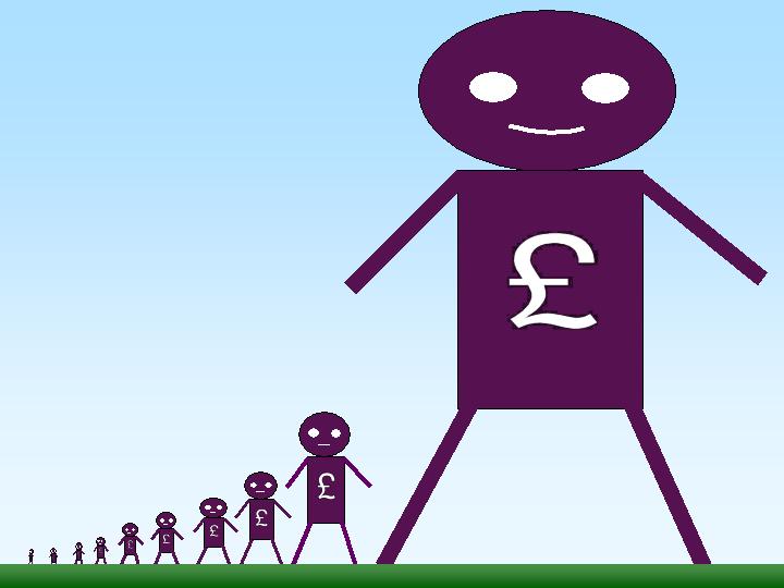
 In his 1971 book, Income Distribution, Jan Pen, a Dutch economist, gave a graphic illustration of inequality in the UK. He described a parade of people marching by. They represent the whole population and the parade takes exactly one hour to pass by. The height of each person represents his or her income. People of average height are the people with average incomes – the observer is of average height. The parade starts with the people on the lowest incomes (the dwarfs), and finishes with those on the highest incomes (the giants).
Because income distribution is unequal, there are many tiny people. Indeed, for the first few minutes of the parade, the marchers are so small they can barely be seen. Even after half an hour, when people on median income pass by, they are barely waist high to the observer.
The height is growing with tantalising slowness, and forty-five minutes have gone by before we see people of our own size arriving. To be somewhat more exact: about twelve minutes before the end the average income recipients pass by.
In the final minutes, giants march past and then in the final seconds:
the scene is dominated by colossal figures: people like tower flats. Most of them prove to be businessmen, managers of large firms and holders of many directorships and also film stars and a few members of the Royal Family.
The rear of the parade is brought up by a few participants who are measured in miles. Indeed they are figures whose height we cannot even estimate: their heads disappear into the clouds and probably they themselves do not even know how tall they are.
Pen’s description could be applied to most countries – some with even more dwarfs and even fewer but taller giants. Generally, over the 43 years since the book was published, countries have become less equal: the giants have become taller and the dwarfs have become smaller.
The 2011 Economist article, linked below, uses changes in Gini coefficients to illustrate the rise in income inequality. A Gini coefficient shows the area between the Lorenz curve and the 45° line. The figure will be between 0 and 1 (or 0% and 100%). a figure of 0 shows total equality; a figure of 1 shows a situation of total inequality, where one person earns all the nation’s income. The higher the figure, the greater the inequality.
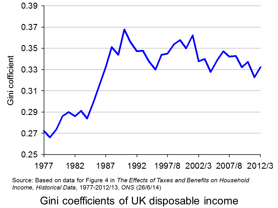
 The chart opposite shows changes in the Gini coefficient in the UK (see Table 27 in the ONS link below for an Excel file of the chart). As this chart and the blog post Rich and poor in the UK show, inequality rose rapidly during the years of the 1979–91 Thatcher government, and especially in the years 1982–90. This was associated with cuts in the top rate of income tax and business deregulation. It fell in the recession of the early 1990s as the rich were affected more than the poor, but rose with the recovery of the mid- to late 1990s. It fell again in the early 2000s as tax credits helped the poor. It fell again following the financial crisis as, once more, the rich were affected proportionately more than the poor.
 The most up-to-date international data for OECD countries can be found on the OECD’s StatExtracts site (see chart opposite: click here for a PowerPoint). The most unequal developed county is the USA, with a Gini coefficient of 0.389 in 2012 (see The end of the American dream?), and US inequality is rising. Today, the top 1% of the US population earns some 24% of national income. This compares with just 9% of national income in 1976.
Many developing countries are even less equal. Turkey has a Gini coefficient of 0.412 and Mexico of 0.482. The figure for South Africa is over 0.6.
When it comes to wealth, distribution is even less equal. The infographic, linked below, illustrates the position today in the USA. It divides the country into 100 equal-sized groups and shows that the top 1% of the population has over 40% of the nation’s wealth, whereas the bottom 80% has only 7%.
So is this inequality of income and wealth desirable? Differences in wages and salaries provide an incentive for people to work harder or more effectively and to gain better qualifications. The possibility of increased wealth provides an incentive for people to invest.
But are the extreme differences in wealth and income found in many countries today necessary to incentivise people to work, train and invest? Could sufficient incentives exist in more equal societies? Are inequalities in part, or even largely, the result of market imperfections and especially of economic power, where those with power and influence are able to use it to increase their own incomes and wealth?
Could it even be the case that excessive inequality actually reduces growth? Are the huge giants that exist today accumulating too much financial wealth and creating too little productive potential? Are they spending too little and thus dampening aggregate demand? These arguments are considered in some of the articles below. Perhaps, by paying a living wage to the ‘tiny’ people on low incomes, productivity could be improved and demand could be stimulated.
Infographic
 Wealth Inequality in America YouTube, Politizane (20/11/12)
Articles
The rise and rise of the cognitive elite The Economist (20/1/11)
Inequality in America: Gini in the bottle The Economist (26/11/13)
Pen’s Parade: do you realize we’re mostly dwarves? LVTFan’s Blog (21/2/11)
Here Are The Most Unequal Countries In The World Business Insider, Andy Kiersz (8/11/14)
Inequality in the World Dollars & Sense, Arthur MacEwan (Nov/Dec 14)
Britain is scared to face the real issue – it’s all about inequality The Observer, Will Hutton (19/1/14)
The tame inequality debate FundWeb, Daniel Ben-Ami (Nov 14)
Is inequality the enemy of growth? BBC News, Robert Peston (6/10/14)
Data
GINI index World Bank data
List of countries by income equality Wikipedia
The Effects of Taxes and Benefits on Household Income, 2012/13 ONS (see table 27)
Income Distribution and Poverty: Gini (disposale income) OECD StatExtract
Questions
- Distinguish between income and wealth. Is each one a stock or a flow?
- Explain how (a) a Lorenz curve and (b) a Gini coefficient are derived.
- What other means are there of measuring inequality of income and wealth other than using Gini coefficients (and giants and dwarfs!)?
- Why has inequality been rising in many countries over the years?
- How do (a) periods of rapid economic growth and (b) recessions affect income distribution?
- Define ‘efficiency wages’. How might an increase in wages to people on low incomes result in increased productivity?
- What is the relationship between the degree of inequality and household debt? What implications might this have for long-term economic growth and future financial crises? Is inequality the ‘enemy of growth’?
 In 2014, 19% of jobs in London and 23% of jobs outside London paid less than the living wage. This is according to figures just published by the Office for National Statistics. The figures compare with 17% and 22% respectively in 2013. The problem is that while the living wage rises with the cost of living, median wages have not kept pace with prices: in other words, in real terms median wages have fallen.
 Since November 2014, the living wage in London has been £9.15 in London and £7.85 in the rest of the UK. It is due to be uprated at the beginning of November 2015. From 1 October 2014 to 30 September 2015, the National Minimum Wage (for people aged 21 and over) was £6.50. It rose to £6.70 on 1 October 2015.
 although the Chancellor has pledged to increase the NLW to 60% of median wage rates for those aged 25 and over by 2020. According to the Office for Budget Responsibility, “the NLW will rise from £7.20 in April 2016 (equivalent to around 55 per cent of estimated median hourly earnings for employees aged 25 and over) to around £9.35 in April 2020 (reaching 60 per cent of expected median hourly earnings for that group) in steps that imply the rise relative to median hourly earnings is a straight line.”
 (see Chart 3). In London 45% of part-time jobs paid less than the living wage; in the rest of the UK the figure was 43%.

