 The ONS has just released its annual publication, The Effects of Taxes and Benefits on Household Income. The report gives data for the financial year 2012/13 and historical data from 1977 to 2012/13.
The publication looks at the distribution of income both before and after taxes and benefits. It divides the population into five and ten equal-sized groups by household income (quintiles and deciles) and shows the distribution of income between these groups. It also looks at distribution within specific categories of the population, such as non-retired and retired households and different types of household composition.
The data show that the richest fifth of households had an average pre-tax-and-benefit income of £81,284 in 2012/13, 14.7 times greater than average of £5536 for the poorest fifth. The richest tenth had an average pre-tax-and-benefit income of £104,940, 27.1 times greater than the average of £3875 for the poorest tenth.
 After the receipt of cash benefits, these gaps narrow to 6.6 and 11.0 times respectively. When the effect of direct taxes are included (giving ‘disposable income’), the gaps narrow further to 5.6 and 9.3 times respectively. However, when indirect taxes are also included, the gaps widen again to 6.9 and 13.6 times.
This shows that although direct taxes are progressive between bottom and top quintiles and deciles, indirect taxes are so regressive that the overall effect of taxes is regressive. In fact, the richest fifth paid 35.1% of their income in tax, whereas the poorest fifth paid 37.4%.
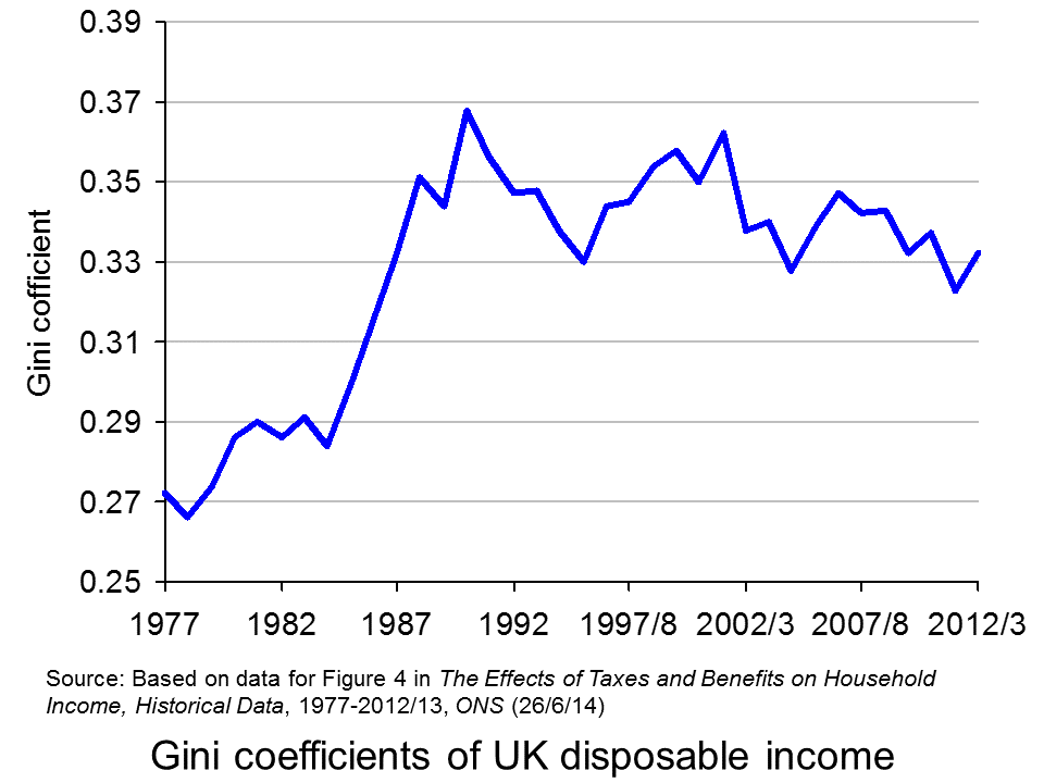 Taking the period from 1977 to 2012/13, inequality of disposable income (i.e. income after direct taxes and cash benefits) increased from 1977 to 1988, especially during the second two Thatcher governments (1983 to 1990) (see chart opposite). But then in the first part of the 1990s inequality fell, only to rise again in the late 1990s and early 2000s. However, with the Labour government giving greater cash benefits for the poor, inequality reduced once more, only to widen again in the boom running up to the banking crisis of 2007/8. But then, with recession taking hold, the incomes of many top earners fell and automatic stabilisers helped protect the incomes of the poor. Inequality consequently fell. But with the capping of benefit increases and a rise in incomes of many top earners as the economy recovers, so inequality is beginning to rise once more – in 2012/13, the Gini coefficient rose to 0.332 from 0.323 the previous year.
As far as income after cash benefits and both direct and indirect taxes is concerned, the average income of the richest quintile relative to that of the poorest quintile rose from 7.2 in 2002/3 to 7.6 in 2007/8 and then fell to 6.9 in 2012/13.
Other headlines in the report include:
Since the start of the economic downturn in 2007/08, the average disposable income has decreased for the richest fifth of households but increased for the poorest fifth.
Cash benefits made up over half (56.4%) of the gross income of the poorest fifth of households, compared with 3.2% of the richest fifth, in 2012/13.
The average disposable income in 2012/13 was unchanged from 2011/12, but it remains lower than at the start of the economic downturn, with equivalised disposable income falling by £1200 since 2007/08 in real terms. The fall in income has been largest for the richest fifth of households (5.2%). In contrast, after accounting for inflation and household composition, the average income for the poorest fifth has grown over this period (3.5%).
This is clearly a mixed picture in terms of whether the UK is becoming more or less equal. Politicians will, no doubt, ‘cherry pick’ the data that suit their political position. In general, the government will present a good news story and the opposition a bad news one. As economists, it is hoped that you can take a dispassionate look at the data and attempt to relate the figures to policies and events.
Report
The Effects of Taxes and Benefits on Household Income, 2012/13 ONS (26/6/14)
Data
Reference tables in The Effects of Taxes and Benefits on Household Income, 2012/13 ONS (26/6/14)
The Effects of Taxes and Benefits on Household Income, Historical Data, 1977-2012/13 ONS (26/6/14)
Rates of Income Tax: 1990-91 to 2014-15 HMRC
Articles
Inequality is on the up again – Osborne’s boast is over New Statesman, George Eaton (26/6/14)
Disposable incomes rise for richest fifth households only Money.com, Lucinda Beeman (26/6/14)
Half of families receive more from the state than they pay in taxes but income equality widens as rich get richer Mail Online, Matt Chorley (26/6/14)
Rich getting richer as everyone else is getting poorer, Government’s own figures reveal Mirror, Mark Ellis (26/6/14)
The Richest Households Got Richer Last Year, While Everyone Else Got Poorer The Economic Voice (27/6/14)
Questions
- Define the following terms: original income, gross income, disposable income, post-tax income, final income.
- How does the receipt of benefits in kind vary across the quintile groups? Explain.
- What are meant by the Lorenz curve and the Gini coefficient and how is the Gini coefficient measured? Is it a good way of measuring inequality?
- Paint a picture of how income distribution has changed over the past 35 years.
- Can changes in tax be a means of helping the poorest in society?
- What types of income tax cuts are progressive and what are regressive?
- Why are taxes in the UK regressive?
- Why has the fall in income been largest for the richest fifth of households since 2007/8? Does this mean that, as the economy recovers, the richest fifth of households are likely to experience the fastest increase in disposable incomes?
 Growing inequality of income and wealth is a common pattern throughout the world. In the boom years up to 2008, the rich got a lot richer, but at least those on low incomes generally saw modest rises in their incomes. Since 2008, however, the continually widening gap between rich and poor has seen the poor and many on middle incomes getting absolutely poorer.
The problem is particularly acute in the USA. Indeed, in his 2012 State of the Union address, President Obama said that it was the ‘defining issue of our time.’
No challenge is more urgent. No debate is more important. We can either settle for a country where a shrinking number of people do really well, while a growing number of Americans barely get by. Or we can restore an economy where everyone gets a fair shot, everyone does their fair share, and everyone plays by the same set of rules.
The good news for the poor in the USA is that at last their incomes have stopped falling, thanks to stronger economic growth. But their share of the growth in GDP is tiny. As The Economist article states:
The main message is a grim one. Most of the growth is going to an extraordinarily small share of the population: 95% of the gains from the recovery have gone to the richest 1% of people, whose share of overall income is once again close to its highest level in a century. The most unequal country in the rich world is thus becoming even more so.
Apart from the ethical question of whether it is desirable for a society, already highly unequal, to become even more so, there is the question of whether this growth in inequality threatens economic recovery. Joseph Stiglitz argues that the rich have a low marginal propensity to consume and that this is threatening recovery.
Then there is the question of investment. Because most Americans have not seen any significant rise in incomes, it is easy for them to believe that the country cannot afford to invest more. And certainly it is difficult to persuade people that higher taxes are warranted to fund education, infrastructure or research.
The following articles consider the problem and its implications and look at various policy alternatives.
Articles and videos
Inequality: Growing apart The Economist (21/9/13)
What is income inequality, anyway? CNN, John D. Sutter (29/10/13)
Inequality is literally killing America Press TV (22/11/13)
It’s Economic Inequality Stupid – What to Do About the Biggest Crisis Facing America Huffington Post, Robert Creamer (14/11/13)
US Inequality Now Literally Off the Chart Truthout, Salvatore Babones (8/6/13)
Inequality moves to the front line of US politics Financial Times, Richard McGregor (20/11/13)
 Is wealth inequality slowing growth? BBC News, Linda Yueh (21/11/13)
American Inequality in Six Charts The New Yorker, John Cassidy (18/11/13)
 Income Inequality ‘Profoundly Corrosive’ Wall Street Journal, Larry Summers (19/11/13)
21 Charts On US Inequality That Everyone Should See Business Insider, Gus Lubin (12/11/13)
Data, information and reports
Income inequality in the United States Wikipedia
Inequality Data & Statistics Inequality.org
Income Main United States Census Bureau
World of Work Report 2013: Snapshot of the United States ILO
World of Work Report 2013 ILO
StatExtracts OECD (Search for Gini)
Questions
- How may income inequality be measured?
- Comment on the Gini coefficients in the above link to the StatExtracts site.
- Why has inequality grown in the USA?
- The Swiss have just voted in a referendum to reject a proposal to limit executive pay to 12 times that of the lowest paid worker in the same company. What are the arguments for and against the proposal?
- What features of an unequal society tend to perpetuate or even deepen that inequality over time?
- What features of a well functioning market economy would help to reduce income inequality?
- Are higher marginal tax rates and higher welfare payments the best way of reducing inequality? What other policy options are there?
- Compare the views of Paul Krugman and Joseph Stiglitz on the effects of growing inequality on economic growth. How significant is the difference in the marginal propensity to consume of the rich and the poor in explaining the relatively low rate of US economic growth?
Divided we stand is the title of a new report by the Organisation for Economic Co-operation and Development (OECD). Its sub-title is “Why inequality keeps rising”. The report shows how the gulf between rich and poor has widened in most countries, both developed and developing. As the introduction states:
In the three decades prior to the recent economic downturn, wage gaps widened and household income inequality increased in a large majority of OECD countries. This occurred even when countries were going through a period of sustained economic and employment growth.
The report analyses the major underlying forces behind these developments. Its conclusion is that inequality looks set to continue widening, especially with the worldwide economic slowdown and rise in unemployment. However, the report says that “there is nothing inevitable about growing inequalities. Globalisation and technological changes offer opportunities but also raise challenges that can be tackled with effective and well-targeted policies.”
So just what is the extent of inequality? How has it changed over time? And what can be done to reduce inequality? The webcast produced by the OECD to accompany the report looks at the problem, and the report and articles look at what can be done about it.
Webcast
 Record inequality between rich and poor OECD (5/12/11)
Articles
Governments need will to fix growing inequality Times Colonist (Canada), Paul Willcocks (8/12/11)
Capitalism defies the laws of gravity Sydney Morning Herald, (7/12/11)
UK pay gap rises faster than any rich nation – OECD The Telegraph, (5/12/11)
The Income Inequality Boom: It’s Real and It’s Everywhere The Atlantic, Derek Thompson (6/12/11)
Income inequality growing faster in UK than any other rich country, says OECD Guardian, Randeep Ramesh (5/12/11)
OECD inequality report: how do different countries compare? Guardian datablog (5/12/11)
Inequality in Britain: faring badly in an unfair world Guardian (5/12/11)
OECD calls time on trickle-down theory Financial Times, Nicholas Timmins (5/12/11)
Wage inequality ‘getting worse’ in leading economies BBC News, Adam Fleming (5/12/11)
OECD Report and Documents
Governments must tackle record gap between rich and poor, says OECD OECD Press Release (5/12/11)
Divided we Stand: Why Inequality Keeps Rising – Introduction by Angel Gurría, OECD Secretary-General, at Press Conference OECD (5/12/11)
Divided we Stand: Why Inequality Keeps Rising – 4-Page Summary of Report (5/12/11)
An Overview of Growing Income Inequalities in OECD Countries: Main Findings OECD (5/12/11)
Questions
- Why may inequality be seen as a ‘bad thing’ for society as a whole and not just the poor?
- Does it matter for the poor if rich people’s incomes grow at a greater rate than those of the poor so long as the incomes of the poor do indeed grow?
- Explain what is meant by the Gini coefficient. What has happened to the Gini coefficient over the past few years across the world?
- Are there any common explanatory features in the economies of those countries where income inequality is growing rapidly? Similarly, are there any common explanatory features in the economies of those countries where income inequality is not growing, or growing only very slowly?
- What are the causes of rising inequality?
- Identify policies that can be adopted to tackle growing inequality.
- What problems arise from policies to reduce inequality by (a) reducing inequalities in disposable income; (b) providing more free services to all, such as healthcare and education? How might these problems be mitigated?
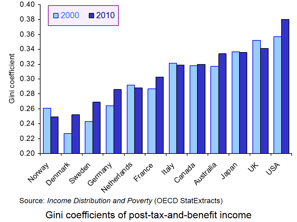
Inequality is growing in most countries. This can be illustrated by examining what has been happening to countries’ Gini coefficient. The Gini coefficient measures income inequality, where 0.00 represents perfect equality, with everyone in the country earning the same, and 1.00 represent perfect inequality, with one person earning all the country’s income. (Note that sometimes it is expressed as the ‘Gini index’, with 100 representing perfect inequality). In virtually all countries, the Gini coefficient has been rising. In the OECD countries it has risen by an average of 0.3% per annum over the past 25 years. The OECD average is now 0.31.
But despite the fact that the Gini coefficient has been rising, its value differs markedly from one country to another, as does its rate of change. For example, Finland’s Gini coefficient, at 0.26, is below the average, but it has been rising by 1.2% per annum. By contrast, Turkey’s Gini coefficient, at 0.41, is above the average and yet has been falling by 0.3% per annum.
The most unequal of the developed countries is the USA. According to OECD data, its Gini coefficient is 0.38, well above the values in the UK (0.34), Japan (0.33), Germany (0.30) France (0.29) and Denmark (0.26). What is more, inequality in the USA has been increasing by an average of 0.5% per annum since the mid 1980s.
According to the United Nations’ Human Development Report 2010, the USA’s Gini coefficient is even higher, at 0.41 (see Table 3 of the report). But this is still below that of Russia, with a figure of 0.44, a figure that has markedly worsened over time, along with those of other former Soviet countries. According to the report (page 72):
The worsening is especially marked in countries that were part of the former Soviet Union – which still have relatively low Gini coefficients because they started with low inequality. Transition has eroded employment guarantees and ended extensive state employment. Before the fall of the Berlin Wall, 9 of 10 people in socialist countries were employed by the state, compared with 2 of 10 in Organisation for Economic Co-operation and Development economies. While the privileged elite (the nomenklatura) often attained higher material well-being, the measured differences in income were narrow.
The Gini coefficient for Russia is the same as the average of the 39 developing countries with the lowest level of human development &nbash; and developing countries are generally much less equal than developed ones. Of course, some developing countries have an even higher Gini coefficient: for Angola the figure is 0.59; for Haiti it is 0.60.
The following three webcasts look at aspects of the growing inequality in Russia.
Webcasts
 Gap between rich and poor widens in Russia BBC News, Jamie Robertson (29/5/11)
 Corruption slows Russian modernisation BBC News, Emma Simpson (29/5/11)
 Corruption and poverty in Russia’s far east Al Jazeera (28/2/11)
Articles
Russia’s rich double their wealth, but poor were better off in 1990s Guardian, Tom Parfitt (11/4/11)
Russia’s growing wealth gap BBC News, Jamie Robertson (28/5/11)
A Country of Beggars and Choosers Russia Profile, Svetlana Kononova (16/5/11)
Rich and poor, growing apart The Economist (3/5/11)
Data
Distribution of family income – Gini Index CIA World Factbook (ranked by country in desending order)
Society at a Glance 2011 – OECD Social Indicators OECD: see particularly the Excel file 6. Equity Indicators: Income inequality (click on No if prompted about a linked workbook)
Russia Distribution of family income – Gini index Index Mundi
Chart of the week: inflation stoking inequality in China and India Financial Times, Andrew Whiffin (24/5/11)
List of countries by income equality Wikipedia
Reports
Growing Income Inequality in OECD Countries: What Drives it and How Can Policy Tackle it? OECD Forum on Tackling Inequality (2/5/11)
Human Development Report 2010 United Nations Development Programme
Questions
- Explain what is meant by the Gini coefficient. How does it relate to the Lorenz curve? What does a figure of 0.31 mean?
- Why has income inequality been growing in most countries of the world? Has the process of globalisation dampened or exacerbated this trend?
- What specific factors in Russia can explain the growing inequality?
- How is privatisation likely to affect income distribution??
- Why is it difficult to quantify the extent of inequality in Russia?
- What maxim of taxation has been used in setting income tax rates in Russia?
- What role does corruption play in determining the degree of inequality in Russia?
- What policy measures, if any, could realistically be adopted in Russia to reduce inequality? What constraints are there on adopting such policies?
Two reports released by Incomes Data Services tell dramatically contrasting stories about pay in the UK. One report focuses on average pay in the public and private sectors, which are both likely to fall in real terms in 2011. Most public-sector workers will see a freeze in their wages and, whilst private-sector workers’ pay could rise by an average of 3%, this will still be below the rate of inflation. The press release Pay awards may rise but will trail inflation (6/1/11) to the report stated that:
Private sector pay settlements in 2011 could well be higher than in 2010, as long as the economic recovery remains on track. But following the latest increase in VAT, they are likely to trail inflation, meaning that the cost of living may be set to rise faster than average pay settlements for the second year running.
However, the press release to an earlier report, FTSE-100 bosses see earnings rise 55% (29/10/10), stated that:
FTSE-100 directors saw their total earnings boosted by an average of 55% while across the FTSE 350 as a whole total board pay went up by an average 45%, according to the latest Directors Pay Report, published by Incomes Data Services. (Year to June 2010)
On the back of these increases FTSE 100 chief executives took home £4.9 million on average in total earnings during the year.
Meanwhile, there is continuing public outcry over the levels of bank pay and bonuses. Despite billions of pounds of public money having been poured into banks to prevent their collapse, bank bosses are set to receive huge remuneration packages worth several million pounds in some cases. And, despite being condemned by the government, it seems there is little it can do to curb them.
So what are the causes of the growing income divide between those at the top and everyone else? And what are the economic consequences? The following articles explore the issues.
Articles: IDS reports
Year of pain predicted for workers.. while bosses’ salaries continue to grow Daily Record, Magnus Gardham (7/1/11)
Another 12 months of pay freeze misery for workers… but bosses enjoy a huge 55% salary increase Daily Mail, Becky Barrow (6/1/11)
Private-sector pay set to trail behind inflation People Management, Michelle Stevens (6/1/11)
Private pay deals to lag behind inflation Financial Times, Brian Groom (6/1/11)
UK boardroom pay rises 55% in an age of austerity Guardian, Simon Goodley and Graeme Wearden (29/10/10)
Private sector pay ‘to trail inflation’ in 2011 BBC News (6/1/11)
Staff morale warning over bosses’ pay rises Independent, Jon Smith (6/1/11)
 ‘Dose of reality’ call over top pay BBC Today Programme, Robert Peston, Brendan Barber and Garry Wilson (6/1/11)
 ‘Severe squeeze’ on average pay BBC Today Programme, Ken Mulkearn (Editor of the Incomes Data Services pay review) (6/1/11)
UK inflation rate rises to 3.7% BBC News , Ian Pollock (18/1/11)
Articles: bankers’ bonuses
Bank bonuses ‘to run to billions in 2011’ BBC News, (7/1/11)
Cameron says banks ‘should pay smaller bonuses’ BBC News, (9/1/11)
David Cameron warns RBS over bonuses Guardian, (9/1/11)
Banks say ‘no’ to bonus backdown Management Today, Andrew Saunders (7/1/11)
Banks to pay out billions in bonuses BBC News blogs: Peston’s Picks, Robert Peston (6/1/11)
Why government can’t stop big bonus payments BBC News blogs: Peston’s Picks, Robert Peston (7/1/11)
Diamond: ‘I am compelled to pay big bonuses’ BBC News blogs: Peston’s Picks, Robert Peston (11/1/11)
Data
Average Weekly Earnings Incomes Data Services
Questions
- Why are average earnings likely to be less than the rate of inflation in 2011?
- Why were the directors of the FTSE 100 companies paid an average 55% pay increase for the year to October 2010?
- To what extent can marginal productivity theory explain the huge increases of bosses of top companies?
- If remuneration committees base executive pay increases on the average of the top 25% of increases of equivalent people in other companies (to stop ‘poaching’), what will be the implications for executive pay rises over time?
- What market failures are there in determining executive pay?
- What will be the implications for staff morale if their earnings are falling in real terms while their bosses are receiving huge pay increases? Should these implications be taken into account when deciding executive remuneration packages?
- Are shareholders in FTSE 100 companies likely to welcome the pay increases of their top executives? If so, why? If not, why not?
 The ONS has just released its annual publication, The Effects of Taxes and Benefits on Household Income. The report gives data for the financial year 2012/13 and historical data from 1977 to 2012/13.
 After the receipt of cash benefits, these gaps narrow to 6.6 and 11.0 times respectively. When the effect of direct taxes are included (giving ‘disposable income’), the gaps narrow further to 5.6 and 9.3 times respectively. However, when indirect taxes are also included, the gaps widen again to 6.9 and 13.6 times.
 Taking the period from 1977 to 2012/13, inequality of disposable income (i.e. income after direct taxes and cash benefits) increased from 1977 to 1988, especially during the second two Thatcher governments (1983 to 1990) (see chart opposite). But then in the first part of the 1990s inequality fell, only to rise again in the late 1990s and early 2000s. However, with the Labour government giving greater cash benefits for the poor, inequality reduced once more, only to widen again in the boom running up to the banking crisis of 2007/8. But then, with recession taking hold, the incomes of many top earners fell and automatic stabilisers helped protect the incomes of the poor. Inequality consequently fell. But with the capping of benefit increases and a rise in incomes of many top earners as the economy recovers, so inequality is beginning to rise once more – in 2012/13, the Gini coefficient rose to 0.332 from 0.323 the previous year.