 The issue of inequality has come into increasing focus over recent years. The impact of the COVID-19 pandemic raises further concerns that these inequalities may be exacerbated further. Here we provide an overview of some of the key patterns in current levels of wealth and income inequality in Britain. They show, for example, the markedly higher degree of inequality in wealth relative to income, the importance of property wealth and private pension wealth in determining levels of wealth, and the considerable variation in average wealth levels of households by age and location.
According to the 6th round of the Wealth and Assets Survey the aggregate wealth of British households was £14.63 trillion in April 2016 to March 2018. This compares with £12.57 trillion in the previous survey which ran from April 2014 to March 2016. This amounts to a 16.3 per cent nominal increase. In real terms, after adjusting for consumer price inflation, the increase was 13.1 per cent. Furthermore, when compared with the first round of the survey in July 2006 to June 2008, there has been a nominal increase in the aggregate wealth of British households of 74 per cent and a real increase of 41 per cent.
What is wealth?
An important question to ask when reflecting on the growth and distribution of wealth across households is what wealth comprises. In fact, it comprises one of four components:
- Net Financial wealth – the value of financial assets (savings and financial investments) less any financial liabilities (loans and arrears)
- Physical wealth – the value of household contents, possessions, valuables and vehicles
- Private pension wealth – the value of private pensions, such as occupational pensions and personal pensions
- Net property wealth – the value of any property owned (including other land/properties owned abroad) less the value of any loans or mortgages secured on these properties.
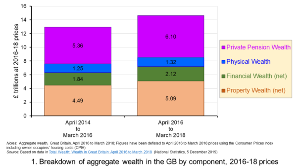 Figure 1 shows the evolution of aggregate wealth over the last two surveys (at constant 2016-18 prices) by the four component parts. Two components dominate the aggregate wealth of British households: property wealth (35 per cent) and private pension wealth (41-42 per cent). Financial wealth is the third largest component (14 per cent), while property wealth is the smallest component (9 to 10 per cent). (Click here for a PowerPoint of the chart.)
Trends in the average wealth of households
To help contextualise the size of wealth and begin to think about its distribution, rather than look at aggregate household wealth we can instead look at the average wealth of British households.
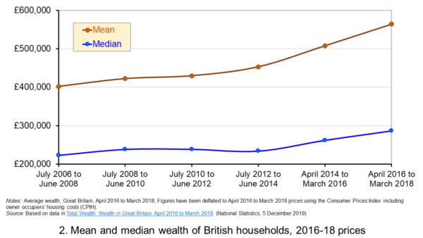 Figure 2 shows the average wealth (at constant 2016-18 prices) as measured by the mean (aggregate divided by the number of households) and the median (the middle household). The mean wealth of households is seen to be greater than their median wealth. In April 2016 to March 2018, average wealth as measured by the mean was £564,300 (an increase of 40.3 per cent over July 2006 to June 2008), whilst the average wealth of each household as measured by the median was £286,600 (an increase of 28.5 per cent over July 2006 to June 2008). (Click here for a PowerPoint of the chart.)
The higher mean value of wealth relative to the median value shows that the distribution of wealth is unequal. Therefore, the mean-to-median ratio is an indicator of inequality. In April 2016 to March 2018 the mean-to-median ratio was 1.97, up from 1.94 in April 2014 to March 2016 and 1.77 in July 2008 to June 2010, and 1.8 in the first survey in July 2006 to June 2008. This metric is therefore consistent with a more unequal distribution of wealth having arisen since the second survey in July 2008 to June 2010, a period during which the UK and global economy was been buffeted by the effects of the financial crisis and the associated economic downturn.
Trends in the average income of households
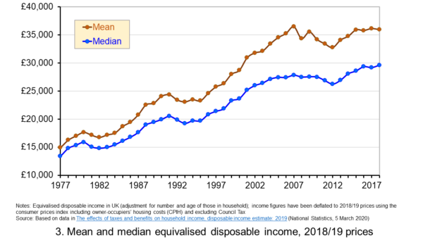 Figure 3 shows the mean and median values of disposable income (adjusted for the number and age of individuals comprising each household). Mean disposable income of UK households in financial year ending (FYE) 2018 was £35,928, a 0.5 per cent real decrease over FYE 2017, whilst median wealth (middle household) was £29,598 in FYE 2018, a 1.5 per cent real increase over FYE 2017. (Click here for a PowerPoint of the chart.)
The higher mean value of disposable income relative to the median value is indicative of inequality in disposable income. In FYE 2018 the mean-to-median ratio for disposable income was 1.21, down from 1.24 in FYE 2017 and a peak of 1.27 in FYE 2014, but higher than the 1.10 in 1978. The longer-term growth in the inequality of income helps to exacerbate existing wealth inequalities.
Comparing the inequality of income and wealth
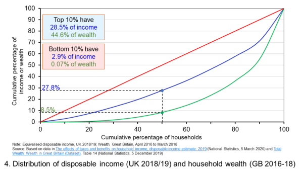 Figure 4 shows starkly the current inequality in wealth as compared to that in income. It does so by plotting their respective Lorenz curves. The curves show the proportion of overall wealth or income attributable to a given proportion of households. For example, 50 per cent of households have close to 28 per cent of total disposable income and a mere 8.5 per cent of aggregate wealth. (Click here for a PowerPoint of the chart.)
The inequality shown by the Lorenz curves is especially startling when we look at the top and bottom deciles. The bottom decile has just 2.9 per cent of income and only 0.07 per cent of wealth. Meanwhile the top 10 per cent of households have 28.5 per cent of income, almost the same as the first 50 percent of households, and some 44.6 per cent of wealth, with the previous 90 per cent of households having 55.4 per cent of wealth.
The Lorenz curves allow for the calculation of the Gini coefficient. It measures the area between the Lorenz curve and the 45 degree line consistent with zero inequality relative to the total area below the 45 degree line. Therefore, the Gini coefficient can take a value of between 0% (no inequality) and 100% (total inequality – where one person has all the wealth). Unsurprisingly whilst the Gini coefficient for disposable income in the UK in FYE 2018 was 34.7 per cent, that for aggregate wealth in Great Britain in April 2016 to March 2018 was significantly higher at 63.3 per cent.
The Gini coefficient for disposable income has risen from 25.5 per cent in 1977 to a peak in FYE 2008 of 38.6 per cent. It has therefore eased during the 2010s, but is nonetheless 13 percentage points higher today than it was four decades ago. Meanwhile, the Gini coefficient for wealth at the time of the first survey from July 2006 to June 2008 was 61 per cent. It has been unchanged at 63 percent over the last three surveys.
Inequality in wealth by component, location and age
It is important to recognise the inequalities in the components of wealth. This has particular importance when we are trying to understand how wealth varies by household characteristics, such as age and location.
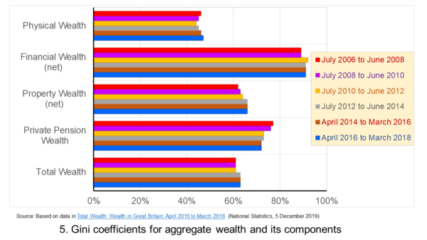 Figure 5 shows that the highest Gini coefficient is for net financial wealth. This stood at 91 per cent in April 2016 to March 2018. This extremely high figure shows the very high levels of inequatity in net financial wealth. This reflects the fact that some households find themselves with negative net financial wealth, such that their debts exceed their assets, whilst, on the other hand, some households can have large sums in financial investments. (Click here for a PowerPoint of the chart.)
We saw at the outset that the largest two components of wealth are property wealth and private pension wealth. The Gini coefficients of these two have in recent times moved in opposite directions by roughly similar magnitudes. This means that their effects on the overall Gini coefficient have offset one another. Perhaps for many people the rise in Gini coeffcient for property from 62 per cent in July 2006 to June 2008 to 66 per cent in April 2016 to March 2018 is the inequality measure that resonates most. This is reflected in regional disparities in wealth.
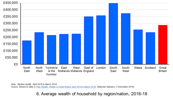 Figure 6 shows the geographical disparity of median household wealth across Britain. The regions with the highest median wealth are the South East, South West, London and the East of England. They have the highest contributions from net property wealth (40.4 per cent, 35.6 per cent, 41.7 per cent and 37.2 per cent respectively). The region with the lowest median total wealth, the North East, has the least total wealth in net property wealth (24.8 per cent). (Click here for a PowerPoint of the chart.)
Property wealth and private pension wealth also contribute to disparities in wealth by the age of the head of the household, also known as the household reference person or HRP. In April 2016 to March 2018 the mean wealth where the HRP is 25-34 was £125,700, rising to £859,200 where the HRP is 55-64 and then falling to £692,300 when the HRP is 65 or over. This is consistent with households accruing wealth over time and the using wealth to help fund retirement.
Where the age of the HRP is 55-64, mean property wealth in April 2016 to March 2018 was £255,800 compared to £53,700 where the HRP is 25-34. Meanwhile, where the age of the HRP is 55-64, mean private pension wealth was £449,100 compared to just £32,300 where the HRP is 25-34. In respect of property wealth, the deterioration in the affordability of owner-occupied housing over many years will impact especially hard on younger households. This will therefore tend to exacerbate inter-generational wealth inequality.
Whilst this briefing provides an overview of recent patterns in income and wealth inequality in Britain, the articles and press releases below consider the impact that the COVID-19 pandemic may have on inequalities.
Articles and Press Releases
- Many better-off households may increase savings as spending on ‘banned’ activities falls. Poorer households spend much more of their income on necessities and will be less resilient to any falls in income
IFS Press Release, Rowena Crawford, Alex Davenport, Robert Joyce and Peter Levell (08/04/20)
- Sector shut-downs during the coronavirus crisis affect the youngest and lowest paid workers, and women, the most
IFS Press Release, Robert Joyce and Xiaowei Xu (06/04/20)
- Coronavirus downturn ‘will exacerbate UK health inequality’
City A.M., James Warrington (09/04/20)
- Coronavirus pandemic exacerbates inequalities for women, UN warns
Guardian, Alexandra Villarreal (11/04/20)
- Inequality doesn’t just make pandemics worse – it could cause them
Guardian, Laura Spinney (12/04/20)
- The Coronavirus Will Be a Catastrophe for the Poor
The Atlantic, Derek Thompson (20/03/20)
- EU-wide inequality is back to pre-crisis levels
Social Europe, Michael Dauderstädt (15/04/20)
- Coronavirus makes inequality a public health issue
World Economic Forum, Alexandre Kalache (President, International Longevity Centre-Brazil) (13/04/20)
- Economist Joseph Stiglitz says coronavirus is ‘exposing’ health inequality in US
- CNBC, Jesse Pound (14/04/20)
ONS Bulletins
Questions
- In what ways can we use statistics to help measure and inform our analysis of inequality?
- In what ways can income inequality impact on wealth inequality?
- How can wealth inequality impact on income inequality?
- What might explain why wealth inequality is greater than income inequality?
- Explain how Lorenz curves help to generate Gini coefficients.
- Why would we expect the wealth of households with a younger household reference person (HRP) to be lower than that of a household with an older HRP? Would we expect this average to rise over all age ranges?
- If you were advising a government on policies to reduce income and wealth inequalities what sort of measures might you suggest?
- What is the difference between original income and disposable income?
- What is the difference between disposable income and equivalised disposable income?
- What role does the housing market play in affecting wealth inequality?
- Why is net financial wealth so unequally distributed?
- What is meant by health inequality? Of what significance is this for income and wealth inequality?
- What is meant by social mobility? Of what significance is this for income and wealth inequality?
 The IFS has launched a major five-year review into all aspects of inequality. The review is led by Sir Angus Deaton, the Scottish-born Professor of Economics and International Affairs at Princeton University. In 2015, he was awarded the Nobel Prize in Economic Sciences for his analysis of consumption, poverty, and welfare. The review will cover all aspects of inequality, including inequality of income, wealth, health, life-span, education, social mobility, housing, opportunity and political access, and by gender, age, ethnicity, family and geography. It will look at trends in and causes of inequality, the impacts of globalisation and political change, barriers to tackling inequality and poverty, and at various policy measures.
Although the published Gini coefficient in England and Wales has not changed much over the past 15 years, largely because of support given to the poor by tax credits, it did rise from 31.7 to 33.2 from 2015/16 to 2017/18 (the latest year for which figures are available). Other measures of inequality, however, have changed more dramatically. There is huge geographical inequality in income in the UK, reflected in inequality in health.  Average weekly earnings in London are 66% higher than in the north east of England. And, according to the IFS, ‘Men in the most affluent areas can expect to live nearly 10 years longer than those in the most deprived areas, and this gap is widening’.
The UK has the greatest inequality of income of developed countries, with the exception of the USA. The IFS warns that the UK could follow the USA:
…where wages for non-college-educated men have not risen for five decades, and where rising mortality for less-educated white men and women in middle age has caused average life expectancy in America to fall for the last three years – something that has not happened for a century. We have not experienced anything similar in the UK but we have now had a decade of stagnant wages and there is recent evidence that ‘deaths of despair’ – deaths from suicide and drug and alcohol abuse – are now rising among middle-aged Britons. Sir Angus will go on to say:
‘I think that people getting rich is a good thing, especially when it brings prosperity to others. But the other kind of getting rich, “taking” rather than “making”, rent-seeking rather than creating, enriching the few at the expense of the many, taking the free out of free markets, is making a mockery of democracy. In that world, inequality and misery are intimate companions.’
The initial report, which introduces the IFS Deaton Review, points to some possible causes of growing inequality, including the dramatic decline in union membership, which now stands at just 13% of private-sector employees, with more flexible labour markets with growing numbers of workers on temporary or zero-hour contracts. Other causes include growing globalisation, rapid technological change making some skills redundant, the power of large companies and their shareholders, large pay rises given to senior executives, growing inequality of access to education and changing family environments with more single parents.
About one in six children in the UK are born to single parents – a phenomenon that is heavily concentrated in low-income and low-educated families, and is significantly less prevalent in continental Europe.
Then there is the huge growth in housing inequality as house prices and rents have risen faster than incomes. Home ownership has increasingly become beyond the reach of many young people, while many older people live in relative housing wealth. Generational inequality is another major factor that the Deaton Review will consider.
Inequalities in different dimensions – income, work, mental and physical health, families and relationships – are likely to reinforce one another. They may result in, and stem from, other inequalities in wealth, cultural capital, social networks and political voice. Inequality cannot be reduced to any one dimension: it is the culmination of myriad forms of privilege and disadvantage.
The review will consider policy alternatives to tackle the various aspects of inequality, from changes to the tax and benefit system, to legislation on corporate behaviour, to investment in various structural resources, such as health and education. As the summary to the initial report states:
The Deaton Review will identify policy responses to the inequalities we face today. It will assess the relative merits of available policy options – taxes and benefits, labour market policies, education, competition policy, ownership structures and regulations – and consider how policies in different spheres can be designed to complement each other and minimise adverse effects. We aim not just to further our understanding of inequalities in the twenty-first century, but to equip policymakers with the knowledge and tools to tackle those inequalities.
Articles
IFS Deaton Review
Questions
- Identify different aspects of inequality. Choose two or three aspects and examine how they are related.
- Why has inequality widened in most developed countries over the past 20 years?
- What is meant by ‘rent seeking’? Why may it be seen as undesirable? Can it be justified and, if so, on what grounds?
- What policies could be adopted to tackle poverty?
- What trade-offs might there be between greater equality and faster economic growth?
- What policies could be adopted that would both reduce inequality and boost long-term economic growth?
 How would your life be without the internet? For many of you, this is a question that may be difficult to answer – as the internet has probably been an integral part of your life, probably since a very young age. We use internet infrastructure (broadband, 4G, 5G) to communicate, to shop, to educate ourselves, to keep in touch with each other, to buy and sell goods and services. We use it to seek and find new information, to learn how to cook, to download music, to watch movies. We also use the internet to make fast payments, transfer money between accounts, manage our ISA or our pension fund, set up direct debits and pay our credit-card bills.
I could spend hours writing about all the things that we do over the internet these days, and I would probably never manage to come up with a complete list. Just think about how many hours you spend online every day. Most likely, much of your waking time is spent using internet-based services one way or another (including apps on your phone, streaming on your phone, tablet or your smart TV and similar). If your access to the internet was disrupted, you would certainly feel the difference. What if you just couldn’t afford to have computer or internet access? What effect would that have on your education, your ability to find a job, and your income?
Martin Jenkins, a former homeless man, now entrepreneur, thinks that the magnitude of this effect is rather significant. In fact, he is so convinced about the importance of bringing the internet to poorer households, that he recently founded a company, Neptune, offering low-income households in the Bronx district of New York free access to online education, healthcare and finance portals. His venture was mentioned in a recent (and very interesting) BBC article – a link to which can be found at the end of this blog. But is internet connectivity really that important when it comes to economic and labour market outcomes? And is there a systematic link between economic growth and internet penetration rates?
These are all questions that have been the subject of intensive debate over the last few years, in the context of both developed and developing economies. Indeed, the ‘digital divide’ as it is known (the economic gap between the internet haves and have nots) is not something that concerns only developing countries. According to a recent policy brief published by the New York City Comptroller:
More than one-third (34 percent) of households in the Bronx lack broadband at home, compared to 30 percent in Brooklyn, 26 percent in Queens, 22 percent in Staten Island, and 21 percent in Manhattan.
The report goes on to present data on the percentage of households with internet connection at home by NYC district, and it does not take advanced econometric skills for one to notice that there is a clear link between median district income and broadband access. Wealthier districts (e.g. Manhattan Community District 1 & 2 – Battery Park City, Greenwich Village & Soho PUMA), tend to have a significantly higher share of households with broadband access, than less affluent ones (e.g. NYC-Brooklyn Community District 13 – Brighton Beach & Coney Island PUMA) – 88% of total households compared with 58%.
But, do these large variations in internet connectivity matter? The evidence is mixed. On the one hand, there are several studies that find a clear, strong link between internet penetration and economic growth. Czernich et al (2011), for instance, using data on OECD countries over the period 1996–2007, find that “a 10 percentage point increase in broadband penetration raised annual per capita growth by 0.9–1.5 percentage points”.
Another study by Koutroumpis (2018) examined the effect of rolling out broadband in the UK.
For the UK, the speed increase contributed 1.71% to GDP in total and 0.12% annually. Combining the effect of the adoption and speed changes increased UK GDP by 6.99% cumulatively and 0.49% annually on average”. (pp.10–11)
The evidence is less clear, however, when one tries to estimate the benefits between different types of workers – low and high skilled. In a recent paper, Atasoy (2013) finds that:
gaining access to broadband services in a county is associated with approximately a 1.8 percentage point increase in the employment rate, with larger effects in rural and isolated areas.
But then he adds:
most of the employment gains result from existing firms increasing the scale of their labor demand and from growth in the labor force. These results are consistent with a theoretical model in which broadband technology is complementary to skilled workers, with larger effects among college-educated workers and in industries and occupations that employ more college-educated workers.
Similarly, Forman et al (2009) analyse the effect of business use of advanced internet technology and local variation in US wage growth, over the period 1995–2000. Their findings show that:
Advanced internet technology is associated with larger wage growth in places that were already well off. These are places with highly educated and large urban populations, and concentration of IT-intensive industry. Overall, advanced internet explains over half of the difference in wage growth between these counties and all others.
How important then is internet access as a determinant of growth and economic activity and what role does it have in bridging economic disparities between communities? The answer to this question is most likely ‘very important’ – but less straightforward than one might have assumed.
Article
References
- Comptroller, New York City, Internet Inequality
- Czernich, N., Falck, O., Kretschmer, T. and Woessmann, L., 2011, Broadband infrastructure and economic growth, The Economic Journal, 121(552), pp.505–32
- Koutroumpis, P., 2018, The economic impact of broadband: evidence from OECD countries, Ofcom
- Atasoy, H., 2013, The effects of broadband internet expansion on labor market outcomes, ILR Review, 66(2), pp.315–45
- Forman, C., Goldfarb, A. and Greenstein, S., 2009, The Internet and Local Wages: Convergence or Divergence? (No. w14750), National Bureau of Economic Research
Questions
- Is there a link between economic growth and internet access? Discuss, using examples.
- Explain the arguments for and against government intervention to subsidise internet access of poorer households.
- How important is the internet to you and your day to day life? Take a day offline (yes, really – a whole day). Then come back and write about it.
 Each January, world political and business leaders gather at the ski resort of Davos in Switzerland for the World Economic Forum. They discuss a range of economic and political issues with the hope of guiding policy.
This year, leaders meet at a time when the global political context has and is changing rapidly. This year the focus is on ‘Creating a Shared Future in a Fractured World’. As the Forum’s website states:
The global context has changed dramatically: geostrategic fissures have re-emerged on multiple fronts with wide-ranging political, economic and social consequences. Realpolitik is no longer just a relic of the Cold War. Economic prosperity and social cohesion are not one and the same. The global commons cannot protect or heal itself.
 One of the main ‘fissures’ which threatens social cohesion is the widening gap between the very rich and the rest of the world. Indeed, inequality and poverty is one of the main agenda items at the Davos meeting and the Forum website includes an article titled, ‘We have built an unequal world. Here’s how we can change it’ (see second link in the Articles below). The article shows how the top 1% captured 27% of GDP growth between 1980 and 2016.
The first Guardian article below identifies seven different policy options to tackle the problem of inequality of income and wealth and asks you to say, using a drop-down menu, which one you think is most important. Perhaps it’s something you would like to do.
Articles
Project Davos: what’s the single best way to close the world’s wealth gap? The Guardian, Aidan Mac Guill (19/1/18)
We have built an unequal world. Here’s how we can change it World Economic Forum, Winnie Byanyima (22/1/18)
Oxfam highlights sharp inequality as Davos elite gathers ABC news, Pan Pylas (21/1/18)
Inequality gap widens as 42 people hold same wealth as 3.7bn poorest The Guardian, Larry Elliott (22/1/18)
There’s a huge gender component to income inequality that we’re ignoring Business Insider, Pedro Nicolaci da Costa (22/1/18)
Ahead of Davos, even the 1 percent worry about inequality Washington Post, Heather Long (22/1/18)
“Fractures, Fears and Failures:” World’s Ruling Elites Stare into the Abyss GlobalResearch, Bill Van Auken (18/1/18)
Why the world isn’t getting a pay raise CNN Money, Patrick Gillespie and Ivana Kottasová (1/11/17)
WEF archive
Articles on Inequality World Economic Forum
Questions
- Distinguish between income and wealth. In global terms, which is distributed more unequally?
- Why has global inequality of both income and wealth grown?
- Explain which of the seven policy options identified by the Guardian you would choose/did choose?
- Go through each one of the seven policy options and identify what costs would be associated with pursuing it.
- Identify any other policy options for tackling the problem.
 Where you live in Great Britain can have a profound effect on your earning potential. According to a report published by the Social Mobility Commission, there is a growing geographical divide, with more affluent areas getting relatively richer, while ‘many other parts of the country are being left behind economically and hollowed out socially’.
The Commission uses a Social Mobility Index to rank the 324 local authorities in England. The index is a measure of the social mobility prospects for people from disadvantaged backgrounds. It is ‘made up of 16 key performance indicators spanning each major life stage’.
The index shows that children from disadvantaged backgrounds have lower educational attainment, poorer initial jobs and poorer prospects for advancement in the labour market. Often they are stuck in low paid jobs with little chance of getting on the housing ladder and fewer chances of moving away from the area.
The problem is not simply one of a North-South divide or one of inner cities versus the suburbs. Many inner-city areas have been regenerated, with high incomes and high social and geographical mobility. Other inner-city areas remain deprived.
The worst performing areas are remote rural or coastal areas and former industrial areas, where industries have closed. As the author of the report states in the Guardian article linked below:
These areas have fewer specialist teachers, fewer good schools, fewer good jobs and worse transport links. … Many of these areas have suffered from a lack of regeneration: few high-paying industries are located there, and they often exhibit relatively limited job opportunities and clusters of low pay.
The problem often exists within areas, with some streets exhibiting growing affluence, where the residents have high levels of social mobility, while other streets have poor  housing and considerable levels of poverty and deprivation. Average incomes for such areas thus mask this type of growing divide within areas. Indeed, some of the richest areas have worse outcomes for disadvantaged children than generally poorer areas.
There are various regional and local multiplier effects that worsen the situation. Where people from disadvantaged backgrounds are successful, they tend to move away from the deprived areas to more affluent ones, thereby boosting the local economy in such areas and providing no stimulus to the deprived areas. And so the divide grows.
Policies, according to the report, need to focus public investment, and incentives for private investment, in deprived areas. They should not focus simply on whole regions. You can read the specific policy recommendations in the articles below.
Articles
Social mobility is a stark postcode lottery. Too many in Britain are being left behind The Guardian, Alan Milburn (28/11/17)
State of the Nation – Sector Response FE News (28/11/17)
Social mobility: the worst places to grow up poor BBC News, Judith Burns and Adina Campbell (28/11/17)
How Britain’s richest regions offer worst prospects for poor young people Independent, May Bulman (28/11/17)
Small Towns Worst Places In Britain For Social Mobility, New ‘State Of The Nation’ Report Reveals Huffington Post, Paul Waugh (28/11/17)
Report
Social mobility in Great Britain: fifth state of the nation report Social Mobility Commission, News (28/11/17)
Fifth State of the Nation Report Social Mobility Commission, News (28/11/17)
Questions
- Explain how local multipliers operate.
- What is the relationship between social immobility as identified in the report and the elasticity of supply of labour in specific jobs?
- What is the link between geographical, occupational and social mobility?
- Explain why, apart from London, English cities are ‘punching below their weight on social mobility outcomes’.
- Go through each of the key policy recommendations of the report and consider the feasibility of introducing them.
- What policies could be adopted to retain good teachers in schools in deprived areas?
- To what extent might an increased provision of training ease the problem of social mobility?
- Investigate policies adopted in other European countries to tackle local deprivation. Are there lessons that can be learned by the UK government, devolved governments, local authorities or other agencies?
 The issue of inequality has come into increasing focus over recent years. The impact of the COVID-19 pandemic raises further concerns that these inequalities may be exacerbated further. Here we provide an overview of some of the key patterns in current levels of wealth and income inequality in Britain. They show, for example, the markedly higher degree of inequality in wealth relative to income, the importance of property wealth and private pension wealth in determining levels of wealth, and the considerable variation in average wealth levels of households by age and location.
 Figure 1 shows the evolution of aggregate wealth over the last two surveys (at constant 2016-18 prices) by the four component parts. Two components dominate the aggregate wealth of British households: property wealth (35 per cent) and private pension wealth (41-42 per cent). Financial wealth is the third largest component (14 per cent), while property wealth is the smallest component (9 to 10 per cent). (Click here for a PowerPoint of the chart.)
 Figure 2 shows the average wealth (at constant 2016-18 prices) as measured by the mean (aggregate divided by the number of households) and the median (the middle household). The mean wealth of households is seen to be greater than their median wealth. In April 2016 to March 2018, average wealth as measured by the mean was £564,300 (an increase of 40.3 per cent over July 2006 to June 2008), whilst the average wealth of each household as measured by the median was £286,600 (an increase of 28.5 per cent over July 2006 to June 2008). (Click here for a PowerPoint of the chart.)
 Figure 3 shows the mean and median values of disposable income (adjusted for the number and age of individuals comprising each household). Mean disposable income of UK households in financial year ending (FYE) 2018 was £35,928, a 0.5 per cent real decrease over FYE 2017, whilst median wealth (middle household) was £29,598 in FYE 2018, a 1.5 per cent real increase over FYE 2017. (Click here for a PowerPoint of the chart.)
 Figure 4 shows starkly the current inequality in wealth as compared to that in income. It does so by plotting their respective Lorenz curves. The curves show the proportion of overall wealth or income attributable to a given proportion of households. For example, 50 per cent of households have close to 28 per cent of total disposable income and a mere 8.5 per cent of aggregate wealth. (Click here for a PowerPoint of the chart.)
 Figure 5 shows that the highest Gini coefficient is for net financial wealth. This stood at 91 per cent in April 2016 to March 2018. This extremely high figure shows the very high levels of inequatity in net financial wealth. This reflects the fact that some households find themselves with negative net financial wealth, such that their debts exceed their assets, whilst, on the other hand, some households can have large sums in financial investments. (Click here for a PowerPoint of the chart.)
  Figure 6 shows the geographical disparity of median household wealth across Britain. The regions with the highest median wealth are the South East, South West, London and the East of England. They have the highest contributions from net property wealth (40.4 per cent, 35.6 per cent, 41.7 per cent and 37.2 per cent respectively). The region with the lowest median total wealth, the North East, has the least total wealth in net property wealth (24.8 per cent). (Click here for a PowerPoint of the chart.)
  The IFS has launched a major

 How would your life be without the internet? For many of you, this is a question that may be difficult to answer – as the internet has probably been an integral part of your life, probably since a very young age. We use internet infrastructure (broadband, 4G, 5G) to communicate, to shop, to educate ourselves, to keep in touch with each other, to buy and sell goods and services. We use it to seek and find new information, to learn how to cook, to download music, to watch movies. We also use the internet to make fast payments, transfer money between accounts, manage our ISA or our pension fund, set up direct debits and pay our credit-card bills.


