 The ONS has just released its annual publication, The Effects of Taxes and Benefits on Household Income. The report gives data for the financial year 2012/13 and historical data from 1977 to 2012/13.
The publication looks at the distribution of income both before and after taxes and benefits. It divides the population into five and ten equal-sized groups by household income (quintiles and deciles) and shows the distribution of income between these groups. It also looks at distribution within specific categories of the population, such as non-retired and retired households and different types of household composition.
The data show that the richest fifth of households had an average pre-tax-and-benefit income of £81,284 in 2012/13, 14.7 times greater than average of £5536 for the poorest fifth. The richest tenth had an average pre-tax-and-benefit income of £104,940, 27.1 times greater than the average of £3875 for the poorest tenth.
 After the receipt of cash benefits, these gaps narrow to 6.6 and 11.0 times respectively. When the effect of direct taxes are included (giving ‘disposable income’), the gaps narrow further to 5.6 and 9.3 times respectively. However, when indirect taxes are also included, the gaps widen again to 6.9 and 13.6 times.
This shows that although direct taxes are progressive between bottom and top quintiles and deciles, indirect taxes are so regressive that the overall effect of taxes is regressive. In fact, the richest fifth paid 35.1% of their income in tax, whereas the poorest fifth paid 37.4%.
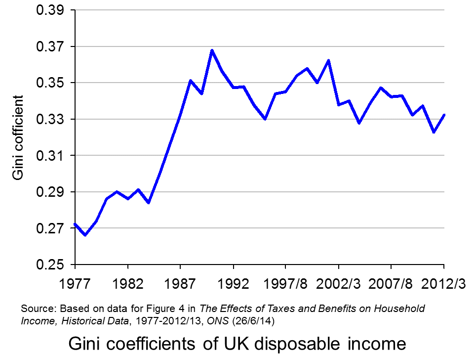 Taking the period from 1977 to 2012/13, inequality of disposable income (i.e. income after direct taxes and cash benefits) increased from 1977 to 1988, especially during the second two Thatcher governments (1983 to 1990) (see chart opposite). But then in the first part of the 1990s inequality fell, only to rise again in the late 1990s and early 2000s. However, with the Labour government giving greater cash benefits for the poor, inequality reduced once more, only to widen again in the boom running up to the banking crisis of 2007/8. But then, with recession taking hold, the incomes of many top earners fell and automatic stabilisers helped protect the incomes of the poor. Inequality consequently fell. But with the capping of benefit increases and a rise in incomes of many top earners as the economy recovers, so inequality is beginning to rise once more – in 2012/13, the Gini coefficient rose to 0.332 from 0.323 the previous year.
As far as income after cash benefits and both direct and indirect taxes is concerned, the average income of the richest quintile relative to that of the poorest quintile rose from 7.2 in 2002/3 to 7.6 in 2007/8 and then fell to 6.9 in 2012/13.
Other headlines in the report include:
Since the start of the economic downturn in 2007/08, the average disposable income has decreased for the richest fifth of households but increased for the poorest fifth.
Cash benefits made up over half (56.4%) of the gross income of the poorest fifth of households, compared with 3.2% of the richest fifth, in 2012/13.
The average disposable income in 2012/13 was unchanged from 2011/12, but it remains lower than at the start of the economic downturn, with equivalised disposable income falling by £1200 since 2007/08 in real terms. The fall in income has been largest for the richest fifth of households (5.2%). In contrast, after accounting for inflation and household composition, the average income for the poorest fifth has grown over this period (3.5%).
This is clearly a mixed picture in terms of whether the UK is becoming more or less equal. Politicians will, no doubt, ‘cherry pick’ the data that suit their political position. In general, the government will present a good news story and the opposition a bad news one. As economists, it is hoped that you can take a dispassionate look at the data and attempt to relate the figures to policies and events.
Report
The Effects of Taxes and Benefits on Household Income, 2012/13 ONS (26/6/14)
Data
Reference tables in The Effects of Taxes and Benefits on Household Income, 2012/13 ONS (26/6/14)
The Effects of Taxes and Benefits on Household Income, Historical Data, 1977-2012/13 ONS (26/6/14)
Rates of Income Tax: 1990-91 to 2014-15 HMRC
Articles
Inequality is on the up again – Osborne’s boast is over New Statesman, George Eaton (26/6/14)
Disposable incomes rise for richest fifth households only Money.com, Lucinda Beeman (26/6/14)
Half of families receive more from the state than they pay in taxes but income equality widens as rich get richer Mail Online, Matt Chorley (26/6/14)
Rich getting richer as everyone else is getting poorer, Government’s own figures reveal Mirror, Mark Ellis (26/6/14)
The Richest Households Got Richer Last Year, While Everyone Else Got Poorer The Economic Voice (27/6/14)
Questions
- Define the following terms: original income, gross income, disposable income, post-tax income, final income.
- How does the receipt of benefits in kind vary across the quintile groups? Explain.
- What are meant by the Lorenz curve and the Gini coefficient and how is the Gini coefficient measured? Is it a good way of measuring inequality?
- Paint a picture of how income distribution has changed over the past 35 years.
- Can changes in tax be a means of helping the poorest in society?
- What types of income tax cuts are progressive and what are regressive?
- Why are taxes in the UK regressive?
- Why has the fall in income been largest for the richest fifth of households since 2007/8? Does this mean that, as the economy recovers, the richest fifth of households are likely to experience the fastest increase in disposable incomes?
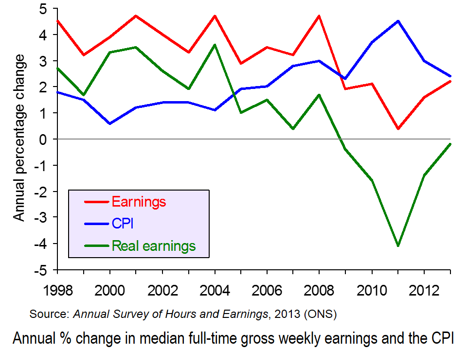
 The ONS has just published two of its major annual publications on income and expenditure in the UK. The first is the Annual Survey of Hours and Earnings (ASHE) and looks at earnings from 1998 to 2013. The second is Family Spending and looks at the level and pattern of household spending each year from 2001 to 2012.
Figures from the two publications show that average real incomes have fallen each year since 2008. This is illustrated in the first chart (click here for a PowerPoint of the chart). They also show that household expenditure in real terms is falling and is at the lowest level since 2006.
Overall picture
In 2012, households’ average weekly disposable income was £597. In 2012 prices, this was down from £621 in 2010 (after the recession) and £659 in 2008 (before the recession).
Household expenditure is at its lowest level in real terms for over a decade. In 2012 households spent on average £489.00 per week. In 2012 prices, this compares with £521.90 in 2001/2 and £533.80 in 2006 (the peak year).
Picture for particular income groups and products
Although average real incomes have fallen, not everyone has been affected the same. For example, not all occupations have seen a fall in incomes (see the table at the end of the BBC article, Earnings rise slower than inflation for fifth year running). Also, as income distribution has become less equal, so those in lower income groups have seen their real incomes fall the fastest. This is partly the result of nominal wages rising less fast for low-paid workers and partly the result of price increases for various essentials, such as food and power being greater than the rate of inflation, and these products constituting a higher proportion of expenditure for poor people than rich people (see Squeezed Britain 2013).
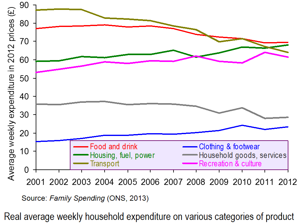
 Likewise expenditure hasn’t fallen on all categories of product. Since 2006, real expenditure on clothing and footwear and on housing, fuel and power has risen. The second chart illustrates expenditure on some of the different categories and how the balance has changed (click here for a PowerPoint). This partly reflects the changes in prices of products, with some items, such as electricity, gas and rent having risen faster than the average, and with the demand for such items being relatively price inelastic.
The changing pattern is also partly the result of different income elasticities of demand for different items. Thus, with falling real incomes, the proportion of income spent on products with a low income elasticity of demand is likely to rise.
 Expenditure also varies by income group. People on higher incomes tend to spend a greater proportion of their income on things such as leisure activities (e.g. eating out and holidays), motoring, and clothing and footwear. Poorer people tend to spend proportionately more on food and drink, and on electricity, gas and rent (even net of housing benefit). These differences are illustrated in the third chart which looks at certain categories of expenditure of three different disposable income groups: the poorest 10% (decile), the richest 10% and the 6th decile (i.e. the 6th group up from the bottom – the group with average or just above average income) (click here for a PowerPoint for the chart). Detailed figures can be found here, which is Table 3.2 from Family Spending.
Just as the time-series data looking at changing income and expenditure over time can illustrate the different income elasticities of demand for different products, so can the cross-sectional data in Tables 3.1 and 3.2 of Family Spending.
Articles
Earnings rise slower than inflation for fifth year running BBC News (12/12/13)
Energy and rent are now the biggest family bills The Telegraph, Steve Hawkes (11/12/13)
Families spend £489 each week – on what? The Guardian, Mona Chalabi (11/12/13)
Cost of energy hits family budgets, says ONS BBC News (11/12/13)
Family spending interactive: how has it changed? The Guardian Datastore, Mona Chalabi (11/12/13)
Data
Annual Survey of Hours and Earnings, 2013 Provisional Results ONS (12/12/13)
Annual Survey of Hours and Earnings, 2013 Provisional Results: Statistical Bulletin ONS (12/12/13)
Family Spending, 2013 Edition ONS (11/12/13)
Family spending in 2012: Infographic ONS (11/12/13)
 Video Summary: Are you an average spender? ONS (11/12/13)
Household expenditure based on COICOP classification, 2001-02 to 2012 at 2012 prices: Table 4.1 of Family Spending ONS (11/12/13)
Detailed household expenditure as a percentage of total expenditure by disposable income decile group, 2012: Table 3.2 of Family Spending ONS (11/12/13)
Questions
- What are the determinants of the price elasticity of demand for a product?
- What are the limitations of using time-series data of prices and expenditure to estimate the price elasticity of demand for particular products?
- What are the determinants of the income elasticity of demand for a product?
- What are the limitations of using time-series data of incomes and expenditure to estimate the income elasticity of demand for particular products?
- What are the limitations of using cross-sectional data of expenditure of different income groups to estimate the income elasticity of demand for particular products?
- How do your answers to the above questions demonstrate the significance of the ceteris paribus (other things being equal) assumption?
- If real earnings are falling, why are people able to spend more in real terms?
- What are the macroeconomic implications of increased consumer spending at a time of falling real incomes?
- How could increased consumer spending help to reverse the fall in real incomes (a) in the short run (b) over a period of a few years? Distinguish between the effects on aggregate demand and aggregate supply.
 The ONS has just released its annual publication, The Effects of Taxes and Benefits on Household Income. The report gives data for the financial year 2012/13 and historical data from 1977 to 2012/13.
 After the receipt of cash benefits, these gaps narrow to 6.6 and 11.0 times respectively. When the effect of direct taxes are included (giving ‘disposable income’), the gaps narrow further to 5.6 and 9.3 times respectively. However, when indirect taxes are also included, the gaps widen again to 6.9 and 13.6 times.
 Taking the period from 1977 to 2012/13, inequality of disposable income (i.e. income after direct taxes and cash benefits) increased from 1977 to 1988, especially during the second two Thatcher governments (1983 to 1990) (see chart opposite). But then in the first part of the 1990s inequality fell, only to rise again in the late 1990s and early 2000s. However, with the Labour government giving greater cash benefits for the poor, inequality reduced once more, only to widen again in the boom running up to the banking crisis of 2007/8. But then, with recession taking hold, the incomes of many top earners fell and automatic stabilisers helped protect the incomes of the poor. Inequality consequently fell. But with the capping of benefit increases and a rise in incomes of many top earners as the economy recovers, so inequality is beginning to rise once more – in 2012/13, the Gini coefficient rose to 0.332 from 0.323 the previous year.