 Each year in November, the Living Wage Foundation publishes figures for the hourly living wage that is necessary for people to meet basic bills. The rate for London is calculated by the Greater London Authority and for the rest of the UK by the Centre for Research in Social Policy at Loughborough University.
The 2013 update was published on 4 November. The Living Wage was estimated to be £8.80 in London and £7.65 in the rest of the UK.
Two things need to be noted about the Living Wage rate. The first is that the figure is an average and thus does not take into account the circumstances of an individual household. Clearly households differ in terms of their size, the number of wage earners and dependants, the local costs of living, etc. Second, the figures have been reduced from what is regarded as the ‘reference’ living wage, which is estimated to be £9.08 outside London. The reason for this is that people earning higher incomes have seen their living standards squeezed since 2009, with prices rising faster than average post-tax-and-benefit wages. Thus, the Living Wage is capped to reflect the overall decline in living standards. As the Working Paper on rates outside London explains:
From 2012 onwards, two kinds of limit have been put on the amount that the Living Wage as applied can rise in any one year. The first limits the increase in the net income (after taxes and benefits) requirement for each household on which the living wage calculation is based, relative to the rise in net income that would be achieved by someone on average earnings. The second limits the increase in the living wage itself (representing gross income) relative to the increase in average earnings.
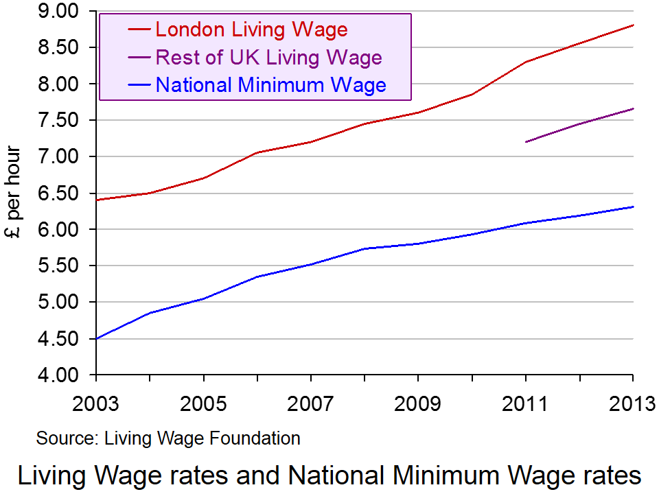 Nevertheless, despite this capping of the living wage, it is still significantly higher than the UK National Minimum Wage, which currently stands at £6.31 for those aged 21 and over. This can be seen from the chart (click here for a PowerPoint).
Paying the Living Wage is voluntary for employers, but as The Guardian reports:
A total of 432 employers are now signed up to the campaign, up from 78 this time last year, including Legal & General, KPMG, Barclays, Oxfam, Pearson, the National Portrait Gallery and First Transpennine Express, as well as many smaller businesses, charities and town halls. Together they employ more than 250,000 workers and also commit to roll out the living wage in their supply chain.
But as The Observer reports:
The number of people who are paid less than a ‘living wage’ has leapt by more than 400,000 in a year to over 5.2 million, amid mounting evidence that the economic recovery is failing to help millions of working families.
A report for the international tax and auditing firm KPMG also shows that nearly three-quarters of 18-to-21-year-olds now earn below this level – a voluntary rate of pay regarded as the minimum to meet the cost of living in the UK. The KPMG findings highlight difficulties for ministers as they try to beat back Labour’s claims of a “cost of living crisis”.
According to the report, women are disproportionately stuck on pay below the living wage rate, currently £8.55 in London and £7.45 elsewhere. Some 27% of women are not paid the living wage, compared with 16% of men. Part-time workers are also far more likely to receive low pay than full-time workers, with 43% paid below living-wage rates compared with 12% of full-timers.
But although paying a living wage may be desirable in terms of equity, many firms, especially in the leisure and retailing sectors, claim that they simply cannot afford to pay the living wage and, if they were forced to, would have to lay off workers.
The point they are making is that it is not economical to pay workers more than their marginal revenue product. But this raises the question of whether a higher wage would encourage people to work more efficiently. If it did, an efficiency wage may be above current rates for many firms. It also raises the question of whether productivity gains could be negotiated in exchange for paying workers a living wage
These arguments are discussed in the following podcast.
Podcast
 Higher ‘productivity’ will increase living wage BBC Today Programme, Priya Kothari and Steve Davies (4/11/13)
Articles
UK living wage rises to £7.65 an hour The Guardian (4/11/13)
More than 5 million people in the UK are paid less than the living wage The Observer, Toby Helm (2/11/13)
Increasing numbers of Scots are paid less than living wage Herald Scotland (2/11/13)
Labour would give tax rebates to firms that pay living wage Independent, Jane Merrick (3/11/13)
Employers praise Ed Miliband’s living wage proposal Independent, Andy McSmith (3/11/13)
Miliband’s living wage tax break will raise prices, warns CBI chief The Telegraph, Tim Ross (3/11/13)
Living Wage rise provides a boost for low paid workers BBC News (4/11/13)
Information and Reports
What is the Living Wage? Living Wage Foundation
The Living Wage Centre for Research in Social Policy, Loughborough University
Living wage Mayor of London
One in five UK workers paid less than the Living Wage KPMG News Release (3/11/13)
Number of workers paid less than the Living Wage passes 5 million KPMG News Release (3/11/13)
Living Wage Research for KPMG Markit (October 2012)
Questions
- How is the Living Wage calculated?
- What are the reasons for announcing a Living Wage figure that is lower than a reference living wage? Assess these reasons.
- If there are two separate figures for the Living Wage for London and the rest of the UK, would it be better to work out a living wage for each part, or even location, of the UK?
- Why might it be in employers’ interests to pay at least the Living Wage? Does this explain why more and more employers are volunteering to pay it?
- Assess the Labour Party’s pledge, if they win the next election, that ‘firms which sign up to the living wage will receive a tax rebate of up to £1000 for every low-paid worker who gets a pay rise, funded by tax and national insurance revenue from the higher wages’.
- Which is fairer: to pay everyone at least the Living Wage or to use tax credits to redistribute incomes to low-income households?
 Compared with pre-financial crisis levels, the British pound is significantly weaker when measured against a basket of foreign currencies. In this blog we provide a further update of Appreciating a depreciating pound which was published back in early December 2012. The significance of the depreciation should be seen in the context of the UK as an open, island-economy where the ratio of exports to GDP in 2012 was close to 32%.
The competitiveness of our exports is, in part, affected by the exchange rate. Floating exchange rates are notoriously volatile. For example, some of the articles below show how sensitive the British pound can be latest news on the economy. However, since the autumn of 2007 we have observed a significant depreciation of the UK exchange rate. A depreciation helps to make our exports more competitive abroad and can potentially boost aggregate demand.
Rather than simply focus on bilateral exchange rates and so at the British pound separately against other foreign currencies, we can estimate an average exchange rate against a whole bundle of currencies. The average rate is calculated by weighting the individual exchange rates by the amount of trade between Britain and the other countries. This trade-weighted exchange rate is known as the effective exchange rate.
In analysing the competitiveness of the exchange rate, we can go one step further and adjust for the average (domestic currency) price of our exports relative to the average (foreign currency) price of those goods we import. Therefore, as well as the nominal (actual) effective exchange rate we can calculate a real effective exchange rate. If the average price of our exports rises relative to the average price of imports, the real effective exchange rate rises relative to the nominal rate. It means that we are able to obtain a larger volume of imports from selling a given volume of exports.
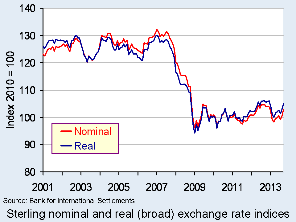
 The chart shows the nominal (actual) and real effective exchange rate for the British pound since 2001. The chart shows clearly how from the autumn of 2007 the effective exchange rate fell sharply both in nominal and real terms.
Over the period from July 2007 to January 2009 the nominal effective exchange rate fell by 26.8 per cent while the real effective exchange rate fell by 26.6 per cent. In other words, the British pound depreciated more than one-quarter over an 18-month period. In comparison, the American dollar rose by 5.3 per cent in nominal terms and by 1.9 per cent in real terms. (Click here to download a PowerPoint of the chart.)
If we move the clock forward, we observe an appreciation of the British pound between July 2011 and September 2012. Over this period, the British pound appreciated by 7.0 per cent in nominal terms and by 7.3 per cent in real terms. However, this appreciation had effectively been wiped-out when by March 2013 the nominal rate had depreciated by 6.1 per cent and by 5.6 per cent in real terms. Subsequently, there has been a slight appreciation once more. As of September, the nominal rate had risen by 4.5 per cent and the real rate by 4.8 per cent.
While, as recent figures help to demonstrate, the British pound continues on its roller-coaster ride, there has been a very marked depreciation since the giddy-days prior to the financial crisis. The facts show that when comparing the effective exchange rate in September 2013 with July 2007 the British pound was 21.8 per cent lower in nominal terms and 18.3 per cent in real terms. Over the same period, the US dollar, for example, was only 1.3 per cent lower in nominal terms and 6.1 per cent in real terms. This constitutes a major competitive boost for our exporters. Nonetheless, there remain uncertainty about just how much British exporters can take advantage of this, the amount that it will boost British growth and the impact it will make on the country’s chronic balance of trade deficit in goods which was close to 7 per cent of GDP in 2012.
Data
Statistical Interactive Database – interest and exchange rate rates data Bank of England
BIS effective exchange rate indices Bank for International Settlements
Market Data: Currencies BBC News
Recent Articles
Unexpected drop in factory output dents sterling Reuters UK, Jessica Mortimer (9/10/13)
Pound Forecasts Soar as BOE’s Carney Signals Shift: Currencies Bloombeg, Lukanyo Mnyanda and Emma Charlton (19/10/13)
Pound Advances as U.K. Financial Optimism Improves; Gilts Rise Bloombeg, Emma Charlton (7/10/13)
Re-balancing and the re-industrialisation of Britain BBC News, Linda Yueh (13/10/13)
Signs of recovery abound but with little consensus on future course Financial Times, Chris Giles and Sarah O’Connor (31/10/13)
Previous Articles
Pound depreciates Vs dollar to lowest level since Aug 16 Bloomberg, Emma Charlton (5/2/13)
Pound advances against euro on Italy speculation; Gilts decline Bloomberg, Lucy Meakin and David Goodman Alice Ross (4/3/13)
Pounding of sterling risks a currency war Scotland on Sunday, Bill Jamieson (17/2/13)
Credit ratings, the pound, currency movements and you BBC News, Kevin Peachey (25/2/13)
The Bank of England can’t just go on doing down the pound Telegraph, Jeremy Warner (21/2/13)
 Sterling will continue to go down BBC News, Jim Rogers (25/2/13)
Questions
- Explain how the foreign demand for goods and assets generates a demand for British pounds. How will this demand be affected by the foreign currency price of the British pound, i.e. the number of foreign currency units per £1?
- Explain how the demand by British residents for foreign goods and assets generates a supply of British pounds. How will this supply be affected by the foreign currency price of the British pound, i.e. the number of foreign currency units per £1?
- What factors are likely to shift the demand and supply curves for British pounds on the foreign exchange markets?
- Illustrate the effect of a decrease in the demand for British goods and assets on the exchange rate (i.e. the foreign currency price of the British pound) using a demand-supply diagram.
- What is the difference between a nominal and a real effective exchange rate? Which of these is a better indicator of the competitiveness of our country’s exports?
- What factors are likely to have caused the depreciation of the British pound since 2007?
- What is meant by a deficit on the balance of trade in goods?
- What relationship exists between the demand and supply of currencies on the foreign exchange markets and the balance of payments?

As Elizabeth noted in Fuelling the Political Playing Field, there has been much debate recently about energy prices in the UK. Four of the ‘Big Six’ energy companies have now announced price rises. They average 9.1% – way above the rate of consumer price inflation and even further above the average rate of wage increases. What is more, they are considerably above the rate of increase in wholesale energy prices, which, according to Ofgem, have risen by just 1.7% in the past year.
The bosses of the energy companies have appeared before the House of Commons Energy and Climate Change Select Committee to answer for their large price increases. The energy companies claim that the increases are necessary to cover not only rising wholesale prices, but also green levies by the government and ‘network charges’ for investments in infrastructure.  However, it is hard to see how, even taking into account all three of these possible sources of cost increases, the scale of price increases can be justified.
Another possible explanation for the price hikes is that they are partly the result of a system of transfer pricing (see). The energy industry is vertically integrated. Energy companies are not only retailers to customers, but also generators of electricity and wholesale shippers of gas. It is possible that, by the producing/shipping arms of these companies charging higher prices to their retailing arms, the retailers’ costs do indeed go up more than the wholesale market cost. The result, however, is higher profits for the producing arms of these businesses. In other words, a higher transfer price allows profits to be diverted from each company’s retailing arm to its producing arm.
 This is an argument for making the wholesale market more competitive and for stopping the by-passing of this market by producing arms of companies selling directly to their retailing arms. What the companies are being accused of is an abuse of market power and possibly of colluding with each other, at least tacitly, to support the continuation of such a practice.
So is the answer a price freeze, as proposed by the Labour Party? Is it an investigation of the energy market by the Competition Commission? Or is it, at least as a first step, much more openness by the energy companies and transparency about their pricing practices? Or is it to encourage consumers to switch between energy companies, including the smaller ones, which at present account for less than 5% of energy supply? The videos, podcasts and articles consider these issues.
Webcasts and Podcasts
 Energy bosses blame high bills on wholesale prices Channel 4 News, Gary Gibbon (29/10/13)
 Why are energy bosses being questioned? BBC News, Stephanie McGovern (29/10/13)
 Key questions Big Six energy companies must answer The Telegraph, Ann Robinson (29/10/13)
 Energy bosses offer excuses for prices rises The Telegraph (29/10/13)
 Energy bosses face MPs over price rises BBC News, John Moylan (29/10/13)
 Energy boss ‘can’t explain’ competitors’ price hikes The Telegraph (29/10/13)
 Ovo boss: Competition Commission would take too long BBC News (30/10/13)
 Dale Vince: Energy market is ‘dysfunctional’ BBC Today Programme (30/10/13)
 Tony Cocker: Public mistrust energy industry BBC Today Programme (30/10/13)
 Ed Davey: Energy deals not just for ‘internet savvy’ BBC Today Programme (31/10/13)
Articles
Energy giants ‘charge as much as they can get away with’ The Telegraph, Peter Dominiczak (29/10/13)
UK energy markets need perestroika Financial Times (27/10/13)
Britain’s energy utilities must embrace glasnost Reuters, John Kemp (29/10/13)
Small energy firms ‘escape levies’ BBC News (30/10/13)
Is the energy market structurally flawed? BBC news, Robert Peston (30/10/13)
The energy market needs a Competition Commission investigation Fingleton Associates, John Fingleton (12/10/13)
Energy firms raised prices despite drop in wholesale costs The Guardian, Rowena Mason (29/10/13)
Only full-scale reform of our energy market will prevent endless price rises The Observer, Phillip Lee (26/10/13)
Energy Giants Blame Rising Bills On Green ‘Stealth Taxes’ Huffington Post, Asa Bennett (29/10/13)
Big Six energy firms ‘like cartel’ Belfast Telegraph (30/10/13)
Energy boss says he hasn’t done sums on green levies The Telegraph, Georgia Graham (30/10/13)
Graphic: How your energy bills have soared in ten years The Telegraph, Matthew Holehouse (30/10/13)
British energy suppliers’ explanations for price hikes just don’t add up The Guardian, Larry Elliott (31/10/13)
The 18th energy market investigation since 2001: Will this one be different? The Carbon Brief, Ros Donald (31/10/13)
Energy: Is there enough competition in the market? BBC News, Hugh Pym (26/11/13)
Information and Reports
Wholesale [electricity] market Ofgem
Wholesale [gas] market Ofgem
Response on wholesale energy costs Ofgem Press Release (29/10/13)
Response to Government’s Annual Energy Statement Ofgem Press Release (31/10/13)
Real Energy Market Reform The Labour Party
Questions
- Why may the costs of energy paid by the energy retailers to energy producers/shippers have risen more than the wholesale price?
- Explain what is meant by transfer pricing. How could transfer pricing be used to divert profits between the different divisions of a business?
- How can transfer pricing be designed by multinational companies to help them minimise their tax bills?
- Why is policing transfer pricing arrangements notoriously difficult?
- What evidence is there to show that switching between retailers by customers can help to drive retail energy prices down?
- How did the old electricity pool system differ from the current wholesale system?
- Should electricity companies be forced to pool the electricity they generate and not sell it to themselves through bilateral deals?
- Comment on the following: “The current electricity trading arrangements ‘create the very special incentive for the oligopolists. …The best of all possible worlds is where nobody invests. As supply and demand close up, the price spikes upwards, and supernormal profits result.'”
 HS2 has been a controversial topic for some time now. Between the disruption it would cause to countless neighbourhoods and the protests that have emerged and the debate about the cost effectiveness of the project, it’s been in the news a fair amount. The transport network in the UK needs improving, not only for businesses located here, but also to encourage more investment into the country. HS2 is one of the solutions offered.
The latest estimate for the cost of HS2 is over £40 billion. However, many suggest that the benefits HS2 will bring do not cover the full costs. Furthermore, as noted above, other concerns include the disruption that it will bring to countless households who will be living along the proposed routes. Cost benefit analysis have been carried out to determine the viability of the project, but they are invariably difficult to do. As they involve determining all of the private and social costs and benefits and putting a monetary estimate onto them, there will inevitably be factors that are over-looked, under-estimated or over-estimated. The suggestions here are that the costs have been under-estimated and the benefits over-estimated.
 In September, KPMG produced a report that estimated the overall benefit to the UK economy would be a boost to growth of 0.8%, which would benefit many businesses and communities. The British Chambers of Commerce said:
Business communities in dozens of cities and towns, from many parts of the UK, remain strongly supportive of HS2.
The railway network is also approaching full capacity and this is one of the reasons why HS2 has been proposed. A government source said:
We need to do something because our railways are nearly full, but the alternative to HS2 is a patch and mend job that would cause 14 years of gridlock, hellish journeys and rail replacement buses … The three main routes to the north would be crippled and the economy would be damaged.
However, this report has faced criticism, in particular because it ignored a variety of supply-side constraints and because they argue it would be more effective to simply update the existing network.  However, a new government-commissioned report has suggested that this alternative to HS2 would involve 14 years of weekend route closures and much longer journey times. However, those in favour of updating existing routes have said that this new report commissioned by the government is ‘a complete fabrication’. Hilary Wharf of the HS2 Action Alliance commented:
This government-funded report is a complete fabrication. The main alternative to HS2 involves longer trains and reduced first-class capacity to provide more standard class seats…No work is required at Euston to deliver the necessary capacity increase. Work is only required at three locations on the WCML [West Coast Main Line], and this is comparable to the work being carried out on the route at present.
The debate regarding HS2 will continue for the time being and it is just another area that is fuelling the political playing field. Whatever is done, the rail network certainly requires investment, whether it is through HS2 or upgrades to the existing routes. The following reports and articles consider the latest developments and controversy regarding HS2.
Reports
HS2 Cost and Risk model Report: A report to Government by HS2 ltd HS2 Ltd March 2012
High Speed 2 (HS2) Limited: HS2 Regional Economic Impacts KPMG September 2013
Draft Environmental Statement: Phase One: Engine for Growth HS2 May 2013
Updated Economic Case for HS2 HS2 August 2012
Articles
HS2 alternative ‘would mean years of rail disruption’ BBC News (28/10/13)
Alternative to HS2 would see Britain suffer 14 years of rail misery, says Coalition Independent, Nigel Morris (28/10/13)
HS2 alternatives could require 14 years of weekend rail closures The Guardian, Rajeev Syal (28/10/13)
Passengers ‘face 14 years of chaos if HS2 is derailed’: ‘Unattractive’ package of closures would be needed to expand capacity if Labour withdraws support Mail Online, Jason Groves (28/10/13)
HS2: Labour to examine cheaper rival plan The Telegraph, Tim Ross and Andrew Gilligan (27/10/13)
Britain’s railways have become mere outposts of other nations’ empires The Guardian, John Harris (28/10/13)
’Years of delays’ if government backs down on HS2 rail project Financial Times, Kiran Stacey and Brian Gloom (28/10/13)
Questions
- What is a cost-benefit analysis? Explain the steps that are involved in any cost-benefit analysis.
- Conduct a cost-benefit analysis for HS2. Ensure that you differentiate between costs and benefits and between private and social concepts.
- How can we measure the costs and benefits of HS2?
- Explain how HS2 is expected to boost economic growth. Use the AD/AS model to illustrate this.
- To what extent is there likely to be a multiplier effect from HS2? Is it likely to benefit the whole economy or just those areas where the route lies?
- Conduct a cost-benefit analysis for the alternative suggestion. Which do you think is likely to be more feasible? Explain your answer.
- How will improvements to the rail network or the investment of HS2 benefit businesses in the UK economy?
 There has been an interesting debate recently about whether the austerity policies being pursued in the UK are the correct ones. What would have happened if the government had pursued a more expansionary policy? Would the increase in borrowing, at least in the short term, have triggered a financial crisis?
Without austerity policies, would the eurozone crisis have led to a collapse in investor confidence in the UK, especially if Greece had been forced out of the euro?
On the one side, Kenneth Rogoff argues that increasing the UK’s budget deficit would have been dangerous and could have led to a flight from the pound. Generally, but with some reservations, he supports the fiscal policies that have been pursued by the Coalition.
I am certainly not arguing that the UK or other advanced countries handled the post-crisis period perfectly. There should have been more infrastructure spending, even more aggressive monetary policy and probably more ruthless bank restructuring. But there has to be a balance between stimulus and stability. To assume we always knew things would calm down, and to retrospectively calibrate policy advice accordingly, is absurd
Paul Krugman and Simon Wren-Lewis challenge Rogoff’s arguments. Paul Krugman uses a version of the IS-LM model to analyse the effect of a loss of international confidence in the UK following problems in the eurozone and worries about excessive UK borrowing.
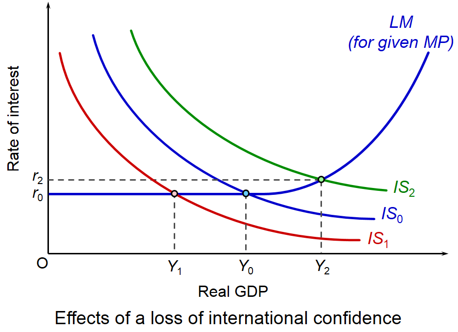
In the model, the LM curve (labelled MP in Krugman’s diagrams) illustrates the effect of an increase in real GDP on interest rates with a particular monetary policy (e.g. an inflation target or a Taylor rule,  which involves a mix of two policy objectives: an inflation target and real GDP). As GDP rises, putting upward pressure on inflation, so the central bank will raise interest rates. Hence, like the traditional LM curve, the monetary-policy related LM curve will slope upwards, as shown in the diagram.
Initial equilibrium GDP is Y0. The rate of interest is at the minimum level, r0 (i.e. the rate of 0.5% that the Monetary Policy Committee has set since January 2009). This, in the model, is the liquidity trap, where any increase in money supply (a rightward shift in the LM curve) will have no effect on interest rates or GDP.
In Rogoff’s analysis of a crisis triggered by excessive borrowing and problems in the eurozone, the IS curve will shift to the left (as illustrated by curve IS1) as capital flows from the UK and confidence collapses. Real GDP will fall to Y1. This will be the outcome of fiscal expansion in the world of the early 2010s.
 Krugman argues that the opposite will occur. The outflow of capital will drive down the exchange rate. This will lead to an increase in exports and a decrease in imports. Aggregate demand thus rises and the IS curve will shift to the right (e.g. to IS2 in the diagram. Real GDP will rise (e.g. to Y2 in the diagram). If the rise in aggregate demand is sufficient, the economy will rise out of the liquidity trap and interest rates will rise (e.g. to r2 in the diagram).
Not surprisingly, Rogoff challenges this analysis, as you will see if you read his second paper below. He doesn’t criticise the model per se, but challenges Krugman’s assumptions. For example, a depreciation of sterling by some 20% since 2008 doesn’t seem to have had a major effect in stimulating exports (see the chart in the news item, A balancing act). And exports could well have declined if the eurozone economy had collapsed, given that exports to the eurozone account for around 44% of total UK exports.
Rogoff’s assumptions in turn can be challenged. Simon Wren-Lewis argues that, provided a credible long-term plan for deficit reduction is in place, maintaining a fiscal stimulus in the short run, to keep the recovery going that was beginning to emerge in 2010, would help to increase investor confidence, not undermine it. And, with a policy of quantitative easing, which involves the Bank of England buying central government debt, there is no problem of a lack of demand for UK gilts by the private sector.
What is clear from this debate is the willingness of both sides to accept points made by the other. It is an extremely civilised debate. In fact, it could be seen as a model of how academic debate should be conducted. There is none of the ‘shouting’ that has charaterised much of the pro- and anti-austerity lobbying since the financial crisis burst onto the world stage.
Britain should not take its credit status for granted Scholars at Harvard from Financial Times, Kenneth Rogoff (3/10/13)
Ken Rogoff on UK austerity mainly macro, Simon Wren-Lewis (3/10/13)
Phantom Crises (Wonkish) The Conscience of a Liberal, Paul Krugman (3/10/13)
Three Wrongs do not make a Right Scholars at Harvard from Financial Times, Kenneth Rogoff (7/10/13)
Is George Osborne really a hero of global finance? The Guardian, Robert Skidelsky (24/10/13)
Questions
- Explain how the policy-dependent LM curve illustrated in the diagram is derived.
- What would cause the policy-dependent LM curve to shift?
- Explain what is meant by the ‘liquidity trap’. Why does being in a liquidity trap make monetary policy ineffective?
- How would you determine whether or not the UK is currently in a liquidity trap?
- How is the level of (a) public-sector debt and (b) private sector debt owed overseas likely to affect the confidence of investors concerning the effects of an expansionary fiscal policy?
- Compare the UK’s total external debt with that of other countries (see the following tables from Principal Global Indicators, hosted by the IMF: External debt and Short-term external debt).
- What insurance policy (if any) does the UK have to protect against market panic about the viability of UK debt?
- What areas of agreement are there between Rogoff on the one side and Krugman and Wren-Lewis on the other?
 Each year in November, the Living Wage Foundation publishes figures for the hourly living wage that is necessary for people to meet basic bills. The rate for London is calculated by the Greater London Authority and for the rest of the UK by the Centre for Research in Social Policy at Loughborough University.
 Nevertheless, despite this capping of the living wage, it is still significantly higher than the UK National Minimum Wage, which currently stands at £6.31 for those aged 21 and over. This can be seen from the chart (click here for a PowerPoint).
 Higher ‘productivity’ will increase living wage BBC Today Programme, Priya Kothari and Steve Davies (4/11/13)


