With Christmas approaching, sales will once again begin to rise and cards will be written. Mail services will be at their busiest as we post millions of cards and parcels every day. But, the question is: will they arrive? Workers in the supply chain at Royal Mail have voted to strike over pay.
Since the part privatisation of Royal Mail, many criticisms have emerged, ranging from the price at which shares were sold, the efficiency of the Royal Mail, suggestions of varying prices for delivery depending on location, and now over pay. As with any labour market, there is a demand and a supply of workers and the intersection of these curves creates our equilibrium wage. If the wage is forced up above the equilibrium wage by the actions of trade unions, then there is the potential for unemployment to be created.
The Communications Workers Union (CWU) feels that their pay is insufficient. Dave Ward, Deputy General Secretary of CWU said:
“Thanks entirely to the unreasonable attitude of Post Office management, a pre-Christmas national strike is looking inevitable…The workforce has made a major contribution to the company’s success and have every right to their fair share.”
However, the head of the supply chain at Royal Mail has responded to the threats of strike, referring to the 5% pay rise promised to its workers over the next three years, saying:
“We are undertaking the biggest modernisation programme in UK retail history to ensure we become commercially viable and reduce our reliance on public money…We urge the CWU to reconsider their unrealistic demands and discuss an affordable pay deal rather than call strike action which can only cost our people money.”
The row over pay is not the only way that job losses could emerge. A major criticism levelled at the Royal Mail is its lack of efficiency, especially in terms of cost reductions and work flexibility.
The Royal Mail has become increasingly concerned by competition, especially as its low-cost competitors can choose to whom they deliver. Those living in built up areas receive mail, but for those living in more rural areas, some of Royal Mail’s competitors will not deliver there, because of the higher costs. Royal Mail does not have this luxury and hence must deliver to loss-making places. Royal Mail says that this is creating unfair pressure to its business and is calling for these competitors to be forced to deliver to rural areas and small businesses. However, one such company, Whistl, has said that the figures from Royal Mail suggest that ‘productivity is not a sufficiently high enough management priority.
If the strike does go ahead in the build up to Christmas, then the management priorities of Royal Mail will certainly be under scrutiny. The following articles consider the current situation.
Articles
- Exclusive: Ofcom to criticise Royal Mail efficiency
- Post Office facing pre-Christmas strike action
- DPD seeks to put Royal Mail under further pressure with hiring
- Royal Mail’s Moya Greene should stop whinging and start delivering
- CWU deem Post Office strike over Christmas ‘inevitable’
Independent, Mark Leftly (24/11/14)
BBC News (18/11/14)
Financial Times, Fill Plimmer (23/11/14)
The Telegraph, Jeremy Warner (22/11/14)
Post&Parcel (19/11/14)
Questions
- If there is strike action in a labour market, what can we conclude about the market in question in terms of how competitive it is?
- Is strike action completely pointless?
- What actions could workers take, other than strike action, to achieve a resolution of their grievances? Discuss what employers could offer in an attempt to resolve the situation?
- What are the arguments for making Royal Mail’s competitors deliver to all places, just as the Royal Mail must do?
- The efficiency of the Royal Mail has been called into question. If efficiency improved, would this mean that pay rises were more or less feasible?
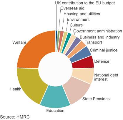
How much does the UK spend on welfare? This is a highly charged political question, with some arguing that benefit claimants are putting great demands on ‘hard-working tax payers’. According to information being sent by the government to all 24 million income tax payers in the UK, the figure of £168bn being spent on welfare is around 24.5% of public spending. But what is included in the total? Before you read on, try writing down the categories of government expenditure included under the heading ‘welfare’.
The heading does not include spending on certain parts of the ‘welfare state’, such as health and education. These are services, the production of which contributes to GDP. The category ‘welfare’ does not include expenditure on produced services, but rather transfer payments. The way the government is using the term, it does not include state pensions either, which account for 11.6% of public expenditure. So does the 24.5% largely consist of payments to the unemployed? The answer is no.
The category ‘welfare’ as used by the government includes the following elements. The percentages are of total managed expenditure (i.e. government spending).
| • | Public service pensions, paid to retired public-sector employees, such as teachers, police officers, doctors and nurses | (2.6%) |
| • | Other support for the elderly, including pension credit, winter fuel allowance, bus passes, etc. | (1.5%) |
| • | Sickness and disability benefits, including long-term care for the elderly, sick and disabled | (6.6%) |
| • | Support for families and children, such as child benefit and child tax credits | (3.4%) |
| • | Social exclusion, including income support and housing benefit | (7.8%) |
| • | Unemployment benefits, including Job Seekers Allowance | (0.7%) |
| • | Other | (1.9%) |
Lumping all these together under a single heading ‘welfare’ can be highly misleading, as many people have strongly held preconceptions about who gets welfare. In fact the term is used pejoratively by many who resent their taxes being given to those who do not work.
But, as you can see from the figures, only a small proportion goes to the unemployed, the majority of whom (around 65%) are unemployed for less than a year as they move between jobs (see). The bulk of benefits goes to children, the retired and the working poor.
Another preconception is that much of welfare spending goes to fraudulent claimants. But, as the article by Professor Hills states:
Just 0.7% of all benefits was over-paid as the result of fraud, less than the amount underpaid as a result of official error. For the main benefit for unemployed people, Jobseeker’s Allowance, estimated fraud was 2.9%, or an annual total of £150million.
It is also important to consider people’s life cycle. The same people receive benefits (via their parents or guardians) as children, pay taxes when they work and receive benefits when they retire or fall sick. Thus you might be a net contributor to public finances at one time and a net beneficiary at another. For example, the majority of pensioners were net contributors when they were younger and are now mainly net beneficiaries. Many unemployed people who rely on benefits now were net contributors when they had a job.
The message is that you should be careful when interpreting statistics, even if these statistics are factually accurate. How figures are grouped together and the labels put on them can give a totally misleading impression. And politicians are always keen to ‘spin’ statistics to their advantage – whether in government or opposition.
Webcast
Annual Tax Summary: TUC and MPs on spending information BBC Daily Politics, Jo Coburn (3/11/14)
Articles
Osborne’s tax summary dismissed as propaganda by the TU BBC News (3/11/14)
The truth about welfare spending: Facts or propaganda? BBC News, Brian Milligan (4/11/14)
Its Cost Is Just One of the Myths Around ‘Welfare’ Huffington Post, John Hills (12/11/14)
Welfare spending summary criticised Express & Star (4/11/14)
Data and Reports
Public Expenditure: Statistical Analyses (PESA) 2014 HM Treasury (see Table 5.2)
DWP annual report and accounts 2013 to 2014 Department of Work and Pensions (see Table 2)
Welfare trends report – October 2014 Office for Budget Responsibility
What is welfare spending? Institute for Fiscal Studies (4/11/14)
Questions
- What benefits do you receive? How would you expect this to change over your lifetime?
- What are the arguments for (a) reducing and (b) increasing welfare payments. In each case, under which categories of welfare would you decrease or increase the level of benefits?
- Referring to Table 5.2 in the PESA data below (the table used for the government’s calculations), which of the categories would be classified as expenditure on goods and services and which as transfer payments?
- Assess the arguments of the IFS for the reclassification of the categories of ‘welfare’ payments.
- Referring to the pie chart above, also in the BBC video and articles and Table 5.2 in the PESA data, assess the arguments about the size of the UK’s contributions to the EU budget.
In his 1971 book, Income Distribution, Jan Pen, a Dutch economist, gave a graphic illustration of inequality in the UK. He described a parade of people marching by. They represent the whole population and the parade takes exactly one hour to pass by. The height of each person represents his or her income. People of average height are the people with average incomes – the observer is of average height. The parade starts with the people on the lowest incomes (the dwarfs), and finishes with those on the highest incomes (the giants).
Because income distribution is unequal, there are many tiny people. Indeed, for the first few minutes of the parade, the marchers are so small they can barely be seen. Even after half an hour, when people on median income pass by, they are barely waist high to the observer.
The height is growing with tantalising slowness, and forty-five minutes have gone by before we see people of our own size arriving. To be somewhat more exact: about twelve minutes before the end the average income recipients pass by.
In the final minutes, giants march past and then in the final seconds:
the scene is dominated by colossal figures: people like tower flats. Most of them prove to be businessmen, managers of large firms and holders of many directorships and also film stars and a few members of the Royal Family.
The rear of the parade is brought up by a few participants who are measured in miles. Indeed they are figures whose height we cannot even estimate: their heads disappear into the clouds and probably they themselves do not even know how tall they are.
Pen’s description could be applied to most countries – some with even more dwarfs and even fewer but taller giants. Generally, over the 43 years since the book was published, countries have become less equal: the giants have become taller and the dwarfs have become smaller.
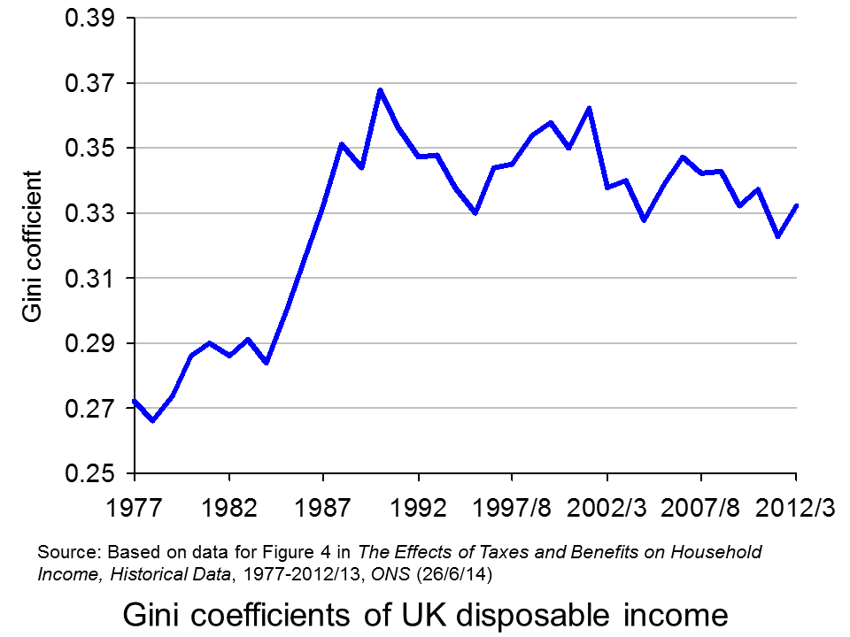
The 2011 Economist article, linked below, uses changes in Gini coefficients to illustrate the rise in income inequality. A Gini coefficient shows the area between the Lorenz curve and the 45° line. The figure will be between 0 and 1 (or 0% and 100%). a figure of 0 shows total equality; a figure of 1 shows a situation of total inequality, where one person earns all the nation’s income. The higher the figure, the greater the inequality.
The chart opposite shows changes in the Gini coefficient in the UK (see Table 27 in the ONS link below for an Excel file of the chart). As this chart and the blog post Rich and poor in the UK show, inequality rose rapidly during the years of the 1979–91 Thatcher government, and especially in the years 1982–90. This was associated with cuts in the top rate of income tax and business deregulation. It fell in the recession of the early 1990s as the rich were affected more than the poor, but rose with the recovery of the mid- to late 1990s. It fell again in the early 2000s as tax credits helped the poor. It fell again following the financial crisis as, once more, the rich were affected proportionately more than the poor.
The most up-to-date international data for OECD countries can be found on the OECD’s StatExtracts site (see chart opposite: click here for a PowerPoint). The most unequal developed county is the USA, with a Gini coefficient of 0.389 in 2012 (see The end of the American dream?), and US inequality is rising. Today, the top 1% of the US population earns some 24% of national income. This compares with just 9% of national income in 1976.
Many developing countries are even less equal. Turkey has a Gini coefficient of 0.412 and Mexico of 0.482. The figure for South Africa is over 0.6.
When it comes to wealth, distribution is even less equal. The infographic, linked below, illustrates the position today in the USA. It divides the country into 100 equal-sized groups and shows that the top 1% of the population has over 40% of the nation’s wealth, whereas the bottom 80% has only 7%.
So is this inequality of income and wealth desirable? Differences in wages and salaries provide an incentive for people to work harder or more effectively and to gain better qualifications. The possibility of increased wealth provides an incentive for people to invest.
But are the extreme differences in wealth and income found in many countries today necessary to incentivise people to work, train and invest? Could sufficient incentives exist in more equal societies? Are inequalities in part, or even largely, the result of market imperfections and especially of economic power, where those with power and influence are able to use it to increase their own incomes and wealth?
Could it even be the case that excessive inequality actually reduces growth? Are the huge giants that exist today accumulating too much financial wealth and creating too little productive potential? Are they spending too little and thus dampening aggregate demand? These arguments are considered in some of the articles below. Perhaps, by paying a living wage to the ‘tiny’ people on low incomes, productivity could be improved and demand could be stimulated.
Infographic
Wealth Inequality in America YouTube, Politizane (20/11/12)
Articles
The rise and rise of the cognitive elite The Economist (20/1/11)
Inequality in America: Gini in the bottle The Economist (26/11/13)
Pen’s Parade: do you realize we’re mostly dwarves? LVTFan’s Blog (21/2/11)
Here Are The Most Unequal Countries In The World Business Insider, Andy Kiersz (8/11/14)
Inequality in the World Dollars & Sense, Arthur MacEwan (Nov/Dec 14)
Britain is scared to face the real issue – it’s all about inequality The Observer, Will Hutton (19/1/14)
The tame inequality debate FundWeb, Daniel Ben-Ami (Nov 14)
Is inequality the enemy of growth? BBC News, Robert Peston (6/10/14)
Data
GINI index World Bank data
List of countries by income equality Wikipedia
The Effects of Taxes and Benefits on Household Income, 2012/13 ONS (see table 27)
Income Distribution and Poverty: Gini (disposale income) OECD StatExtract
Questions
- Distinguish between income and wealth. Is each one a stock or a flow?
- Explain how (a) a Lorenz curve and (b) a Gini coefficient are derived.
- What other means are there of measuring inequality of income and wealth other than using Gini coefficients (and giants and dwarfs!)?
- Why has inequality been rising in many countries over the years?
- How do (a) periods of rapid economic growth and (b) recessions affect income distribution?
- Define ‘efficiency wages’. How might an increase in wages to people on low incomes result in increased productivity?
- What is the relationship between the degree of inequality and household debt? What implications might this have for long-term economic growth and future financial crises? Is inequality the ‘enemy of growth’?
One of the key battle grounds at the next General Election is undoubtedly going to be immigration. A topic that is very closely related to EU membership and what can be done to limit the number of people coming to the UK. One side of the argument is that immigrants coming into the UK boost growth and add to the strength of the economy. The other side is that once in the UK, immigrants don’t move into work and end up taking more from the welfare state than they give to it through taxation.
A new report produced by University College London’s Centre for Research and Analysis of Migration has found that the effect on the UK economy of immigrants from the 10 countries that joined the EU from 2004 has been positive. In the years until 2011, it has been found that these immigrants contributed £4.96 billion more in taxes than they took out in benefits and use of public services. Christian Dustmann, one of the authors of this report said:
“Our new analysis draws a positive picture of the overall fiscal contribution made by recent immigrant cohorts, particularly of immigrants arriving from the EU … European immigrants, particularly, both from the new accession countries and the rest of the European Union, make the most substantial contributions … This is mainly down to their higher average labour market participation compared with natives and their lower receipt of welfare benefits.”
The report also found that in the 11 years to 2011, migrants from these 10 EU countries were 43 per cent less likely than native Britons to receive benefits or tax credits, and 7 per cent less likely to live in social housing. This type of data suggests a positive overall contribution from EU immigration. However, critics have said that it doesn’t paint an accurate picture. Sir Andrew Green, Chairman of Migration Watch commented on the choice of dates, saying:
“If you take all EU migration including those who arrived before 2001 what you find is this: you find by the end of the period they are making a negative contribution and increasingly so … And the reason is that if you take a group of people while they’re young fit and healthy they’re not going to be very expensive but if you take them over a longer period they will be.”
However, the report is not all positive about the effects of immigration. When considering the impact on the economy of migrants from outside of the EEA, the picture is quite different. Over the past 17 years, immigration has cost the UK economy approximately £120bn, through migrant’s greater consumption of public benefits, such as the NHS, compared to their contributions through taxation. The debate is likely to continue and this report will certainly be used by both sides of the argument as evidence that (a) no change in immigration policy is needed and (b) a major change is needed to immigration policy. The following articles consider this report.
Report
The Fiscal effects of immigration to the UK The Economic Journal, University College London’s Centre for Research and Analysis of Migration, Christian Dustmann and Tommaso Frattini (November 2014)
Articles
Immigration from outside Europe ‘cost £120 billion’ The Telegraph, David Barrett (5/11/14)
New EU members add £5bn to UK says Research BBC News (5/11/14)
UK gains £20bn from European migrants, UCL economists reveal The Guardian, Alan Travis (5/11/14)
EU immigrant tax gain revealed Mail Online (5/11/14)
Immigration question still open BBC News, Robert Peston (5/11/14)
EU migrants pay £20bn more in taxes than they receive Financial Times, Helen Warrell (5/11/14)
Questions
- Why is immigration such a political topic?
- How are UK labour markets be affected by immigration? Use a demand and supply diagram to illustrate the effect.
- Based on your answer to question 2, explain why some people are concerned about the impact of immigration on UK jobs.
- What is the economic argument in favour of allowing immigration to continue?
- What policy changes could be recommended to restrict the levels of immigration from outside the EEA, but to continue to allow immigration from EU countries?
- If EU migrants are well educated, does that have a positive or negative impact on UK workers, finances and the economy?
Lloyds Banking Group has announced that it plans to reduce its labour force by 9000. Some of this reduction may be achieved by not replacing staff that leave, but some may have to be achieved through redundancies.
The reasons given for the reduction in jobs are technological change and changes in customer practice. More banking services are available online and customers are making more use of these services and less use of branch banking. Also, the increasingly widespread availability of cash machines (ATMs) means that fewer people withdraw cash from branches.
And it’s not just outside branches that technological change is impacting on bank jobs. Much of the work previously done by humans is now done by software programs.
One result is that many bank branches have closed. Lloyds says that the latest planned changes will see 150 fewer branches – 6.7% of its network of 2250.
What’s happening in banking is happening much more widely across modern economies. Online shopping is reducing the need for physical shops. Computers in offices are reducing the need, in many cases, for office staff. More sophisticated machines, often controlled by increasingly sophisticated computers, are replacing jobs in manufacturing.
So is this bad news for employees? It is if you are in one of those industries cutting employment. But new jobs are being created as the economy expands. So if you have a good set of skills and are willing to retrain and possibly move home, it might be relatively easy to find a new, albeit different, job.
As far as total unemployment is concerned, more rapid changes in technology create a rise in frictional and structural unemployment. This can be minimised, however, or even reduced, if there is greater labour mobility. This can be achieved by better training, education and the development of transferable skills in a more adaptive labour force, where people see changing jobs as a ‘normal’ part of a career.
Webcasts
Lloyds Bank cuts 9,000 jobs – but what of the tech future? Channel 4 News, Symeon Brown (28/10/14)
Lloyds Bank confirms 9,000 job losses and branch closures BBC News, Kamal Ahmed (28/10/14)
Article
Lloyds job cuts show the technology axe still swings for white collar workers The Guardian, Phillip Inman (28/10/14)
Reports
Unleashing Aspiration: The Final Report of the Panel on Fair Access to the Professions Cabinet Office (July 2009)
Fair access to professional careers: a progress report Cabinet Office (30/5/12)
Questions
- Is a reduction in banking jobs inevitable? Explain.
- What could banks do to reduce the hardship to employees from a reduction in employment?
- What other industries are likely to see significant job losses resulting from technological progress?
- Distinguish between demand-deficient, real-wage, structural and frictional unemployment. Which of these are an example, or examples, of equilibrium unemployment?
- What policies could the government pursue to reduce (a) frictional unemployment; (b) structural unemployment?
- What types of industry are likely to see an increase in employment and in what areas of these industries?