 With university fees for home students in England of £9250 per year and with many students receiving maintenance loans of around £9000 per year, many students are graduating with debts in excess of £50 000. Loans are repaid at a marginal rate of 9% on incomes over £25 716.
Many students also study for a masters degree. The average fee for a taught, classroom-based masters (MA) is £7392 and for a laboratory-based masters (MSc) is £8167 but can be considerably higher at some prestigious universities where demand is high. Government loans of up to £10 906 are available to contribute towards fees and maintenance. These are paid back at a marginal rate of 6% for people earning over £21 000, giving a combined marginal rate of 15% for first and masters degrees.
For high earners on the 40% income tax rate, the combined marginal rate of payment out of income is 40% tax, plus 2% national insurance, plus 15% for those with undergraduate and masters loans. This gives a combined marginal rate of 57%.
 Average student debt in England is higher even than in the USA, where the average is $37 000. US university courses are more expensive than in the UK, costing an average of $34 000 per year in tuition alone. But undergraduates can borrow less. They can borrow between $5500 and $12 500 per year in federal loans towards both fees and maintenance, and some private loans are also available. Most students do some paid work during their studies to make up the difference or rely on parents contributing. Parental contributions mean that students from poor families end up owing more. According to a Guardian article:
Race is a huge factor. Black students owe an average of $7400 more than white students when they graduate, the Brookings Institution found. After graduation, the debt gap continues to widen. Four years after graduation, black graduates owe an average of nearly $53 000 – nearly double that of white graduates.
Student debt looks to become one of the key issues in the 2020 US presidential election.
Pressure to cancel student fees and debt in the USA
Most of the Democratic candidates are promising to address student fees and debt. Student debt, they claim, places an unfair burden on the younger generation and makes it hard for people to buy a house, or car or other major consumer durables. This also has a dampening effect on aggregate demand.
The most radical proposal comes from Bernie Sanders. He has vowed, if elected, to abolish student fees and to cancel all undergraduate and graduate debt of all Americans. Other candidates are promising to cut fees and/or debt.
Although most politicians and commentators agree that the USA has a serious problem of student debt, there is little agreement on what, if anything, to do about it. There are already a number of ways in which student debt can be written off or reduced. For example, if you work in the public sector for more than 10 years, remaining debt will be cancelled. However, none of the existing schemes is as radical as that being proposed by many Democrats.
 Criticisms of the Democrats’ plans are mainly of two types.
The first is the sheer cost. Overall debt is around $1.6tn. What is more, making student tuition free would place a huge ongoing burden on government finances. Bernie Sanders proposes introducing a financial transactions tax on stock trading. This would be similar to a Tobin tax (sometimes dubbed a ‘Robin Hood tax’) and would include a 0.5% tax on stock transactions, a 0.1% tax on bond trades and a 0.005% tax on transactions in derivatives. He argues that the public bailed out the financial sector in 2008 and that it is now the turn of the financial sector to come to the aid of students and graduates.
The other type of criticism concerns the incentive effects of the proposal. The core of the criticism is that loan forgiveness involves moral hazard.
The moral hazard of loan forgiveness
The argument is that cancelling debt, or the promise to do so, encourages people to take on more debt. Generally, moral hazard occurs when people are protected from the consequences of their actions and are thus encouraged to make riskier decisions. For example, if you are ensured against theft, you may be less careful with your belongings. As the Orange County Register article linked below states:
If the taxpayers pay the debts of everyone with outstanding student loans, how will that affect the decisions made by current students thinking about their choices for financing higher education? What’s the message? Borrow as much as you can and wait for the debt to be canceled during the next presidential primary campaign?
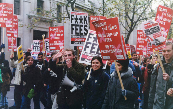 Not only would more students be encouraged to go to college, but they would be encouraged to apply for more costly courses if they were free.
Universities would be encouraged to exaggerate their costs to warrant higher fees charged to the government. The government (federal, state or local) would have to be very careful in auditing courses to ensure costs were genuine. Universities could end up being squeezed for finance as government may try to cut payments by claiming that courses were overpriced.
Even if fees were not abolished, cancelling debts would encourage students to take on larger debt, if that was to be cleared at some point in the future. What is more, students (or their parents) who could afford to pay, would choose to borrow the money instead.
But many countries do have free or highly subsidised higher education. Universities are given grants which are designed to reflect fair costs.
Articles
Videos
Questions
- Assess the arguments for abolishing or substantially reducing student fees.
- Assess the arguments against abolishing or substantially reducing student fees.
- Assess the arguments for writing off or substantially reducing student debt.
- Assess the arguments against writing off or substantially reducing student debt.
- If it were decided to cancel student debt, would it be fair to pay students back for any debt they had already paid off?
- Does tackling the problem of student debt necessarily lead to a redistribution of wealth/income?
- Give some other examples of moral hazard.
- If student fees were abolished, would there be any problem of adverse selection? If so, how could this be overcome?
- Find out what the main UK parties are advocating about student fees and debt in the nations of the UK for home and non-home students. Provide a critique of each of their policies.
 The latest UK house price index reveals that annual house price growth in the UK slowed to just 1.2 per cent in May. This is the lowest rate of growth since January 2013. This is being driven, in part, by the London market where annual house price inflation rates have now been negative for 15 consecutive months. In May the annual rate of house price inflation in London fell to -4.4 per cent, it lowest since August 2009 as the financial crisis was unfolding. However, closer inspection of the figures show that while many other parts of the country continue to experience positive rates of annual house price inflation, once general inflation is accounted for, there is widespread evidence of widespread real house price deflation.
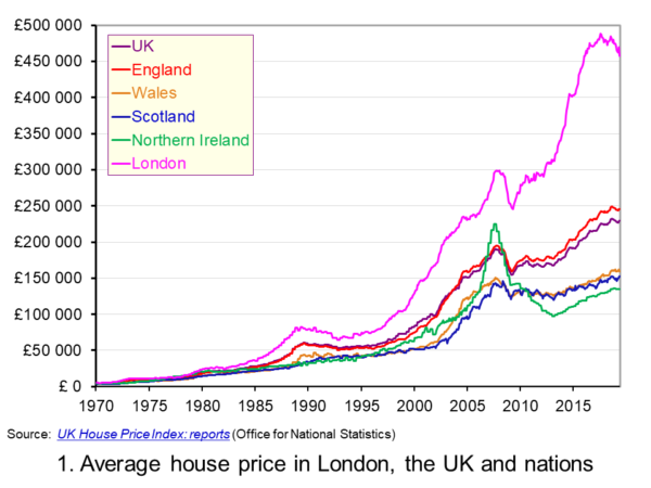 The average UK house price in May 2019 was £229,000. As Chart 1 shows, this masks considerable differences across the UK. In England the average price was £246,000 (an annual increase of 1.0 per cent), in Scotland it was £153,000 (an increase of 2.8 per cent), in Wales £159,000 (an increase of 3.0 per cent) and in Northern Ireland it was £137,000 (an increase of 2.1 per cent). (Click here to download a PowerPoint copy of the chart.)
The London market distorts considerably the English house price figures. In London the average house price in May 2019 was £457,000 (an annual decrease of 4.4 per cent). House prices were lowest in the North East region of England at £128,000. The North East was the only other English region alongside London to witness a negative rate of annual house price inflation, with house prices falling in the year to May 2019 by 0.7 per cent.
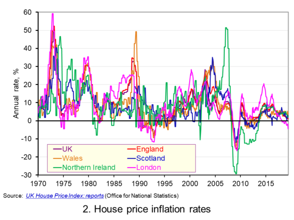 Chart 2 allows us to see more readily the rates of house price growth. It plots the annual rates of house price inflation across London, the UK and its nations. What is readily apparent is the volatility of house price growth. This is evidence of frequent imbalances between the flows of property on to the market to sell (instructions to sell) and the number of people looking to buy (instructions to buy). An increase in instructions to buy relative to those to sell puts upwards pressure on prices whereas an increase in the relative number of instructions to sell puts downward pressure on prices. (Click here to download a PowerPoint copy of the chart.)
Despite the volatility in house prices, the longer-term trend in house prices is positive. The average annual rate of growth in house prices between January 1970 and May 2019 in the UK is 9.1 per cent. For England the figure is 9.4 per cent, for Wales 8.8 per cent, for Scotland 8.5 per cent and for Northern Ireland 8.3 per cent. In London the average rate of growth is 10.4 per cent per annum.
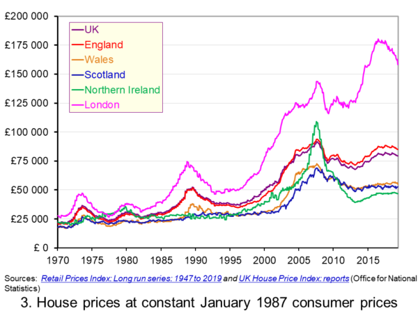 As Chart 3 illustrates, the longer-term growth in actual house prices cannot be fully explained by the growth in consumer prices. It shows house price values as if consumer prices, as measured by the Retail Prices Index (RPI), were fixed at their January 1987 levels. We see real increases in house prices or, expressed differently, in house prices relative to consumer prices. In real terms, UK house prices were 3.6 times higher in May 2019 compared to January 1970. For England the figure is 4.1 times, for Wales 3.1 times, for Scotland 2.9 times and for Northern Ireland 2.1 times. In London inflation-adjusted house prices were 5.7 times higher. (Click here to download a PowerPoint copy of the chart.)
The volatility in house prices continues to be evident when adjusted for changes in consumer prices. The UK’s annual rate of real house price inflation was as high as 40 per in January 1973, yet, on the other hand, in June 1975 inflation-adjusted house prices were 16 per cent lower than a year earlier. Over the period from January 1970 to May 2019, the average annual rate of real house price inflation was 3.2 per cent. Hence house prices have, on average, grown at an annual rate of consumer price inflation plus 3.2 per cent.
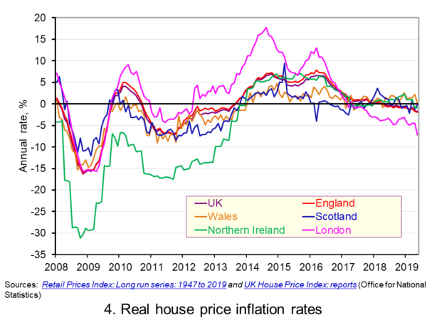 Chart 4 shows annual rates of real house price inflation since 2008 and, hence, from around the time the financial crisis began to unfold. The period is characterised by acute volatility and with real house prices across the UK falling at an annual rate of 16 per cent in 2009 and by as much 29 per cent in Northern Ireland. (Click here to download a PowerPoint copy of the chart.)
The UK saw a rebound in nominal and real house price growth in the period from 2013, driven by a strong surge in prices in London and the South East, and supported by government initiatives such as Help to Buy designed to help people afford to buy property. But house price growth then began to ease from early/mid 2016. Some of the easing may be partly due to any excessive fizz ebbing from the market, especially in London, and the impact on the demand for buy-to-let investments resulting from reductions in tax relief on interest payments on buy-to-let mortgages.
However, the housing market is notoriously sensitive to uncertainty, which is not surprising when you think of the size of the investment people are making when they enter the market. The uncertainty surrounding Brexit and the UK’s future trading relationships will have been a drag on demand and hence on house prices.
Chart 4 shows that by May 2019 all the UK nations were experiencing negative rates of real house price inflation, despite still experiencing positive rates of nominal house price inflation. In Wales the real annual house price inflation rate was -0.1 per cent, in Scotland -0.2 per cent, in Northern Ireland -0.9 per cent and in England -2.0 per cent. Meanwhile in London, where annual house price deflation has been evident for 15 consecutive months, real house prices in May 2019 were falling at an annual rate of 7.2 per cent.
Going forward the OBR’s Fiscal Risks Report predicts that, in the event of a no-deal, no-transition exit of the UK from the European Union, nominal UK house prices would fall by almost 10 per cent between the start of 2019 and mid-2021. This forecast is driven by the assumption that the UK would enter a year-long recession from the final quarter of 2019. It argues that property transactions and prices ‘move disproportionately’ during recessions. (See John’s blog The costs of a no-deal Brexit for a fuller discussion of the economics of a no-deal Brexit). The danger therefore is that the housing market becomes characterised by both nominal and real house price falls.
Articles
Questions
- Explain the difference between a rise in the rate of house price inflation a rise in the level of house prices.
- Explain the difference between nominal and real house prices.
- If nominal house prices rise can real house price fall? Explain your answer.
- What do you understand by the terms instructions to buy and instructions to sell?
- What factors are likely to affect the levels of instructions to buy and instructions to sell?
- How does the balance between instructions to buy and instructions to sell affect house prices?
- How can we differentiate between different housing markets? Illustrate your answer with examples.
 There have been many analyses of the economic effects of Brexit, both before the referendum and at various times since, including analyses of the effects of the deal negotiated by Theresa May’s government and the EU. But with the prospect of a no-deal Brexit on 31 October under the new Boris Johnson government, attention has turned to the effects of leaving the EU without a deal.
There have been two major analyses recently of the likely effects of a no-deal Brexit – one by the International Monetary Fund (IMF) and one by the Office for Budget Responsibility (OBR).
IMF analysis
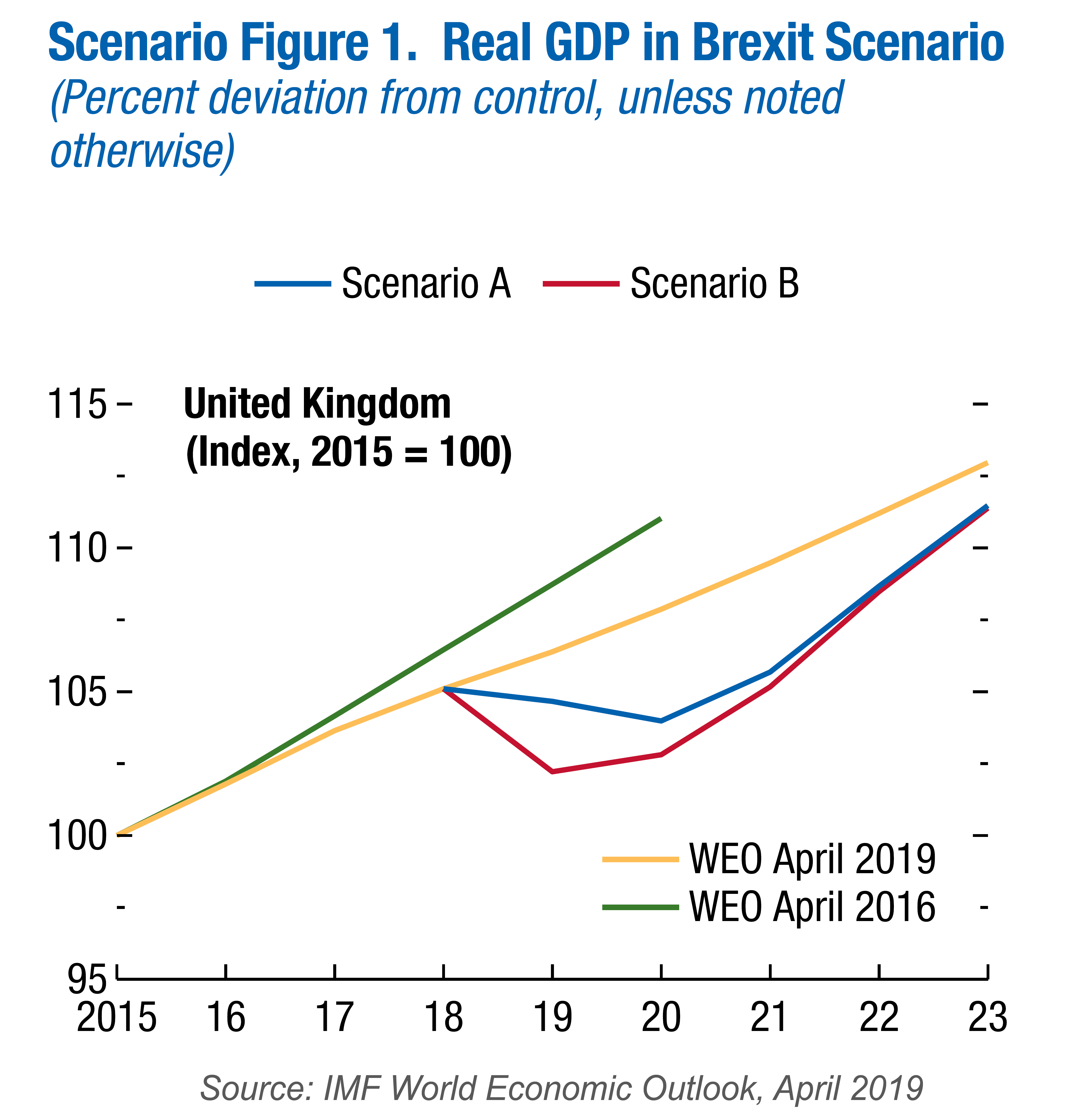
The first was in April by the IMF as part of its 6-monthly World Economic Outlook. In Scenario Box 1.1. ‘A No-Deal Brexit’ on page 28 of Chapter 1, the IMF looked at two possible scenarios.
Scenario A assumes no border disruptions and a relatively small increase in UK sovereign and corporate spreads. Scenario B incorporates significant border disruptions that increase import costs for UK firms and households (and to a lesser extent for the European Union) and a more severe tightening in financial conditions.
 Under both scenarios, UK exports to the EU and UK imports from the EU revert to WTO rules. As a result, tariffs are imposed by mid-2020 or earlier. Non-tariff barriers rise at first but are gradually reduced over time. Most free-trade arrangements between the EU and other countries are initially unavailable to the UK (see the blog EU strikes major trade deals) but both scenarios assume that ‘new trade agreements are secured after two years, and on terms similar to those currently in place.’
Both scenarios also assume a reduction in net immigration from the EU of 25 000 per year until 2030. Both assume a rise in corporate and government bond rates, reflecting greater uncertainty, with the effect being greater in Scenario B. Both assume a relaxing of monetary and fiscal policy in response to downward pressures on the economy.
The IMF analysis shows a negative impact on UK GDP, with the economy falling into recession in late 2019 and in 2020. This is the result of higher trade costs and reduced business investment caused by a poorer economic outlook and increased uncertainty. By 2021, even under Scenario A, GDP is approximately 3.5% lower than it would have been if the UK had left the EU with the negotiated deal. For the rest of the EU, GDP is around 0.5% lower, although the effect varies considerably from country to country.
The IMF analysis makes optimistic assumptions, such as the UK being able to negotiate new trade deals with non-EU countries to replace those lost by leaving. More pessimistic assumptions would lead to greater costs.
OBR analysis
Building on the analysis of the IMF, the Office for Budget Responsibility considered the effect of a no-deal Brexit on the public finances in its biennial Fiscal risks report, published on 17 July 2019. This argues that, under the relatively benign Scenario A assumptions of the IMF, the lower GDP would result in annual public-sector net borrowing (PSNB) rising. By 2021/22, if the UK had left with the deal negotiated with the EU, PSNB would have been around £18bn. A no-deal Brexit would push this up to around £51bn.
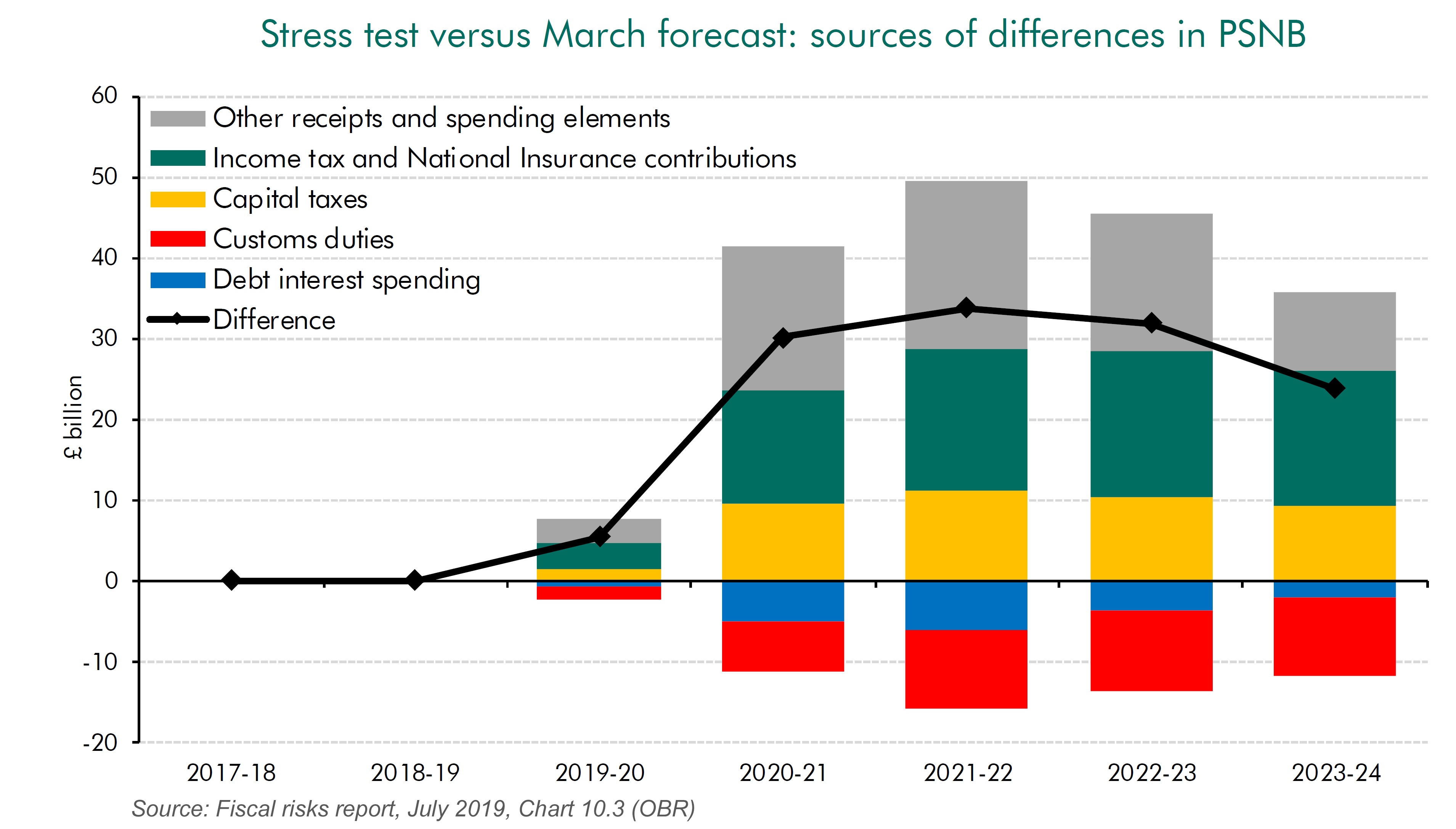
According to the OBR, the contributors to this rise in public-sector net borrowing of around £33bn are:
- A fall in income tax and national insurance receipts of around £16.5bn per year because of lower incomes.
- A fall in corporation tax and expenditure taxes, such as VAT, excise duties and stamp duty of around £22.5bn per year because of lower expenditure.
- A fall in capital taxes, such as inheritance tax and capital gains tax of around £10bn per year because of a fall in asset prices.
- These are offset to a small degree by a rise in customs duties (around £10bn) because of the imposition of tariffs and by lower debt repayments (of around £6bn) because of the Bank of England having to reduce interest rates.
The rise in PSNB would constrain the government’s ability to use fiscal policy to boost the economy and to engage in the large-scale capital projects advocated by Boris Johnson while making the substantial tax cuts he is proposing. A less optimistic set of assumptions would, of course, lead to a bigger rise in PSNB, which would further constrain fiscal policy.
Articles
Video
Reports
Questions
- What are the assumptions of the IMF World Economic Outlook forecasts for the effects of a no-deal Brexit? Do you agree with these assumptions? Explain.
- What are the assumptions of the analysis of a no-deal Brexit on the public finances in the OBR’s Fiscal risks report? Do you agree with these assumptions? Explain.
- What is the difference between forecasts and analyses of outcomes?
- For what reasons might growth over the next few years be higher than in the IMF forecasts under either scenario?
- For what reasons might growth over the next few years be lower than in the IMF forecasts under either scenario?
- For what reasons might public-sector net borrowing (PSNB) over the next few years be lower than in the OBR forecast?
- For what reasons might PSNB over the next few years be higher than in the OBR forecast?
 The EU has recently signed two trade deals after many years of negotiations. The first is with Mercosur, the South American trading and economic co-operation organisation, currently consisting of Brazil, Argentina, Uruguay and Paraguay – a region of over 260m people. The second is with Vietnam, which should result in tariff reductions of 99% of traded goods. This is the first deal of its kind with a developing country in Asia. These deals follow a recent landmark deal with Japan.
At a time when protectionism is on the rise, with the USA involved in trade disputes with a number of countries, such as China and the EU, deals to cut tariffs and other trade restrictions are seen as a positive development by those arguing that freer trade results in a net gain to the participants. The law of comparative advantage suggests that trade allows countries to consume beyond their production possibility curves. What is more, the competition experienced through increased trade can lead to greater efficiency and product development.
It is estimated that the deal with Mercosur could result in a saving of some €4bn per annum in tariffs on EU exports.
 But although there is a net economic gain from greater trade, some sectors will lose as consumers switch to cheaper imports. Thus the agricultural sector in many parts of the EU is worried about cheaper food imports from South America. What is more, increased trade could have detrimental environmental impacts. For example, greater imports of beef from Brazil into the EU could result in more Amazonian forest being cut down to graze cattle.
But provided environmental externalities are internalised within trade deals and provided economies are given time to adjust to changing demand patterns, such large-scale trade deals can be of significant benefit to the participants. In the case of the EU–Mercosur agreement, according to the EU Reporter article, it:
…upholds the highest standards of food safety and consumer protection, as well as the precautionary principle for food safety and environmental rules and contains specific commitments on labour rights and environmental protection, including the implementation of the Paris climate agreement and related enforcement rules.
The size of the EU market and its economic power puts it in a strong position to get the best trade deals for its member states. As EU Trade Commissioner, Cecilia Malmström stated:
Over the past few years the EU has consolidated its position as the global leader in open and sustainable trade. Agreements with 15 countries have entered into force since 2014, notably with Canada and Japan. This agreement adds four more countries to our impressive roster of trade allies.
Outside the EU, the UK will have less power to negotiate similar deals.
Articles
Questions
- Draw a diagram to illustrate the gains for a previously closed economy from engaging in trade by specialising in products in which it has a comparative advantage.
- Distinguish between trade creation and trade diversion from a trade deal with another country or group of countries.
- Which sectors in the EU and which sectors in the Mercosur countries and Vietnam are likely to benefit the most from the respective trade deals?
- Which sectors in the EU and which sectors in the Mercosur countries and Vietnam are likely to lose from the respective trade deals?
- Are the EU–Mercosur and the EU–Vietnam trade deals likely to lead to net trade creation or net trade diversion?
- What are the potential environmental dangers from a trade deal between the EU and Mercosur? To what extent have these dangers been addressed in the recent draft agreement?
- Will the UK benefit from the EU’s trade deals with Mercosur and Vietnam?
 Confidence figures suggest that sentiment weakened across several sectors in June with significant falls recorded in retail and construction. This is consistent with the monthly GDP estimates from the ONS which suggest that output declined in March and April by 0.1 per cent and 0.4 per cent respectively. The confidence data point to further weakness in growth down the line. Furthermore, it poses the risk of fuelling a snowball effect with low growth being amplified and sustained by low confidence.
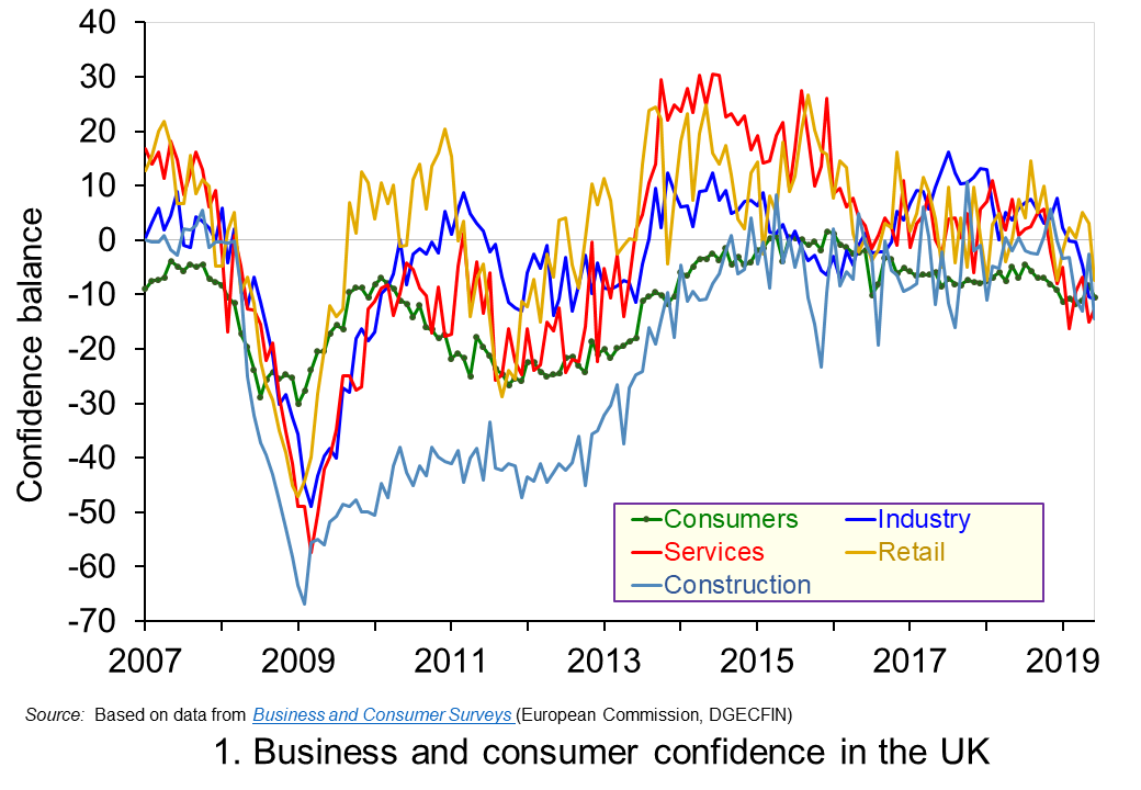 Chart 1 shows the confidence balances reported by the European Commission each month since 2007. It highlights the collapse in confidence across all sectors around the time of the financial crisis before a strong and sustained recovery in the 2010s. However, in recent months confidence indicators have eased significantly, undoubtedly reflecting the heightened uncertainty around Brexit. (Click here to download a PowerPoint copy of the chart.)
Between June 2016 and June 2019, the confidence balances have fallen by at least 8 percentage points. In the case of the construction the fall is 14 points while in the important service sector, which contributes about 80 per cent of the economy’s national income, the fall is as much as 15 points.
Changes in confidence are thought, in part, to reflect levels of economic uncertainty. In particular, they may reflect the confidence around future income streams with greater uncertainty pulling confidence down. This is pertinent because of the uncertainty around the UK’s future trading relationships following the 2016 referendum which saw the UK vote to leave the EU. In simple terms, uncertainty reduces the confidence people and businesses have when forming expectations of what they can expect to earn in the future.
Greater uncertainty and, hence, lower confidence tend to make people and businesses more prudent. The caution that comes from prudence counteracts the inherent tendency of many of us to be impatient. This impatience generates an impulse to spend now. On the other hand, prudence encourages us to take actions to increase net worth, i.e. wealth. This may be through reducing our exposure to debt, perhaps by looking to repay debts or choosing to borrow smaller sums than we may have otherwise done. Another option may be to increase levels of saving. In either case, the effect of greater prudence is the postponement of spending. Therefore, in times of high uncertainty, like those of present, people and businesses would be expected to want to have greater financial resilience because they are less confident about what the future holds.
To this point, the saving ratio – the proportion of disposable income saved by households – has remained historically low. In Q1 2019 the saving ratio was 4.4 per cent, well below its 60-year average of 8.5 per cent. This appears to contradict the idea that households respond to uncertainty by increasing saving. However, at least in part, the squeeze seen over many years following the financial crisis on real earnings, i.e. inflation-adjusted earnings, restricted the ability of many to increase saving. With real earnings having risen again over the past year or so, though still below pre-crisis levels, households may have taken this opportunity to use earnings growth to support spending levels rather than, as we shall see shortly, looking to borrow.
Another way in which the desire for greater financial resilience can affect behaviour is through the appetite to borrow. In the case of consumers, it could reduce borrowing for consumption, while in the case of firms it could reduce borrowing for investment, i.e. spending on capital, such as that on buildings and machinery. The reduced appetite for borrowing may also be mirrored by a tightening of credit conditions by financial institutions if they perceive lending to be riskier or want to increase their own financial capacity to absorb future shocks.
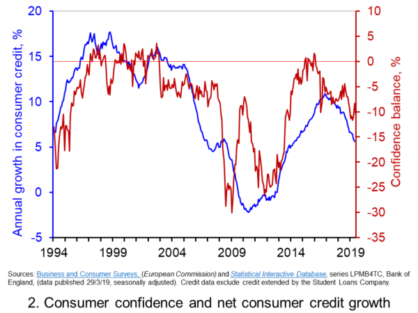 Chart 2 shows consumer confidence alongside the annual rate of growth of consumer credit (net of repayments) to individuals by banks and building societies. Consumer credit is borrowing by individuals to finance current expenditure on goods and services and it comprises borrowing through credit cards, overdraft facilities and other loans and advances, for example those financing the purchase of cars or other large ticket items. (Click here to download a PowerPoint copy of the chart.)
The chart allows us to view the confidence-borrowing relationship for the past 25 years or so. It suggests a fairly close association between consumer confidence and consumer credit growth. Whether changes in confidence occur ahead of changes in borrowing is debatable. However, the easing of confidence following the outcome of the EU referendum vote in June 2016 does appear to have led subsequently to an easing in the annual growth of consumer credit. From its peak of 10.9 per cent in the autumn of 2016, the annual growth rate of consumer credit dropped to 5.6 per cent in May 2019.
The easing of credit growth helps put something of a brake on consumer spending. It is, however, unlikely to affect all categories of spending equally. Indeed, the ONS figures for May on retail sales shows a mixed picture for the retail sector. Across the sector as a whole, the 3 month-on-3 month growth rate for the volume of purchases stood at 1.6 per cent, having fallen as low as 0.1 percent in December of last year. However, the 3 month-on-3 month growth rate for spending volumes in department stores, which might be especially vulnerable to a slowdown in credit, fell for the ninth consecutive month.
Going forward, the falls in confidence might be expected to lead to further efforts by the household sector, as well as by businesses, to ensure their financial resilience. The vulnerability of households, despite the slowdown in credit growth, so soon after the financial crisis poses a risk for a hard landing for the sector. After falls in national output in March and April, the next monthly GDP figures to be released on 10 July will be eagerly anticipated.
Articles
Questions
- Which of the following statements is likely to be more accurate: (a) Confidence drives economic activity or (b) Economic activity drives confidence?
- Explain the difference between confidence as a source of economic volatility as compared to an amplifier of volatility?
- Discuss the links between confidence, economic uncertainty and financial resilience.
- Discuss the ways in which people and businesses could improve their financial resilience to adverse shocks.
- What are the potential dangers to the economy of various sectors being financially distressed or exposed?
 With university fees for home students in England of £9250 per year and with many students receiving maintenance loans of around £9000 per year, many students are graduating with debts in excess of £50 000. Loans are repaid at a marginal rate of 9% on incomes over £25 716.
 Average student debt in England is higher even than in the USA, where the average is $37 000. US university courses are more expensive than in the UK, costing an average of $34 000 per year in tuition alone. But undergraduates can borrow less. They can borrow between $5500 and $12 500 per year in federal loans towards both fees and maintenance, and some private loans are also available. Most students do some paid work during their studies to make up the difference or rely on parents contributing. Parental contributions mean that students from poor families end up owing more. According to a Guardian article:
 Criticisms of the Democrats’ plans are mainly of two types.
 Not only would more students be encouraged to go to college, but they would be encouraged to apply for more costly courses if they were free.
  America’s growing student loan debt crisis
 Bernie Sanders proposes eliminating all student debt
 Bernie Sanders proposes to pay back student loans with tax on Wall Street
 The latest
  The average UK house price in May 2019 was £229,000. As Chart 1 shows, this masks considerable differences across the UK. In England the average price was £246,000 (an annual increase of 1.0 per cent), in Scotland it was £153,000 (an increase of 2.8 per cent), in Wales £159,000 (an increase of 3.0 per cent) and in Northern Ireland it was £137,000 (an increase of 2.1 per cent). (Click
  Chart 2 allows us to see more readily the rates of house price growth. It plots the annual rates of house price inflation across London, the UK and its nations. What is readily apparent is the volatility of house price growth. This is evidence of frequent imbalances between the flows of property on to the market to sell (instructions to sell) and the number of people looking to buy (instructions to buy). An increase in instructions to buy relative to those to sell puts upwards pressure on prices whereas an increase in the relative number of instructions to sell puts downward pressure on prices. (Click
  As Chart 3 illustrates, the longer-term growth in actual house prices cannot be fully explained by the growth in consumer prices. It shows house price values as if consumer prices, as measured by the Retail Prices Index (RPI), were fixed at their January 1987 levels. We see real increases in house prices or, expressed differently, in house prices relative to consumer prices. In real terms, UK house prices were 3.6 times higher in May 2019 compared to January 1970. For England the figure is 4.1 times, for Wales 3.1 times, for Scotland 2.9 times and for Northern Ireland 2.1 times. In London inflation-adjusted house prices were 5.7 times higher. (Click
  Chart 4 shows annual rates of real house price inflation since 2008 and, hence, from around the time the financial crisis began to unfold. The period is characterised by acute volatility and with real house prices across the UK falling at an annual rate of 16 per cent in 2009 and by as much 29 per cent in Northern Ireland. (Click
  There have been many analyses of the
  Under both scenarios, UK exports to the EU and UK imports from the EU revert to WTO rules. As a result, tariffs are imposed by mid-2020 or earlier. Non-tariff barriers rise at first but are gradually reduced over time. Most free-trade arrangements between the EU and other countries are initially unavailable to the UK (see the blog
 The EU has recently signed two trade deals after many years of negotiations. The first is with
  But although there is a net economic gain from greater trade, some sectors will lose as consumers switch to cheaper imports. Thus the agricultural sector in many parts of the EU is worried about cheaper food imports from South America. What is more, increased trade could have detrimental
  Confidence figures suggest that sentiment weakened across several sectors in June with significant falls recorded in retail and construction. This is consistent with the
  Chart 1 shows the confidence balances reported by the
  Chart 2 shows consumer confidence alongside the annual rate of growth of consumer credit (net of repayments) to individuals by banks and building societies. Consumer credit is borrowing by individuals to finance current expenditure on goods and services and it comprises borrowing through credit cards, overdraft facilities and other loans and advances, for example those financing the purchase of cars or other large ticket items. (Click