 Over the past three months oil prices have been falling. From the beginning of September to the end of November Brent Crude has fallen by 30.8%: from $101.2 to a four-year low of $70.0 per barrel (see chart below: click here for a PowerPoint). The fall in price has been the result of changes in demand and supply.
As the eurozone, Japan, South America and other parts of the world have struggled to recover, so the demand for oil has been depressed. But supply has continued to expand as the USA and Canada have increased shale oil production through fracking. 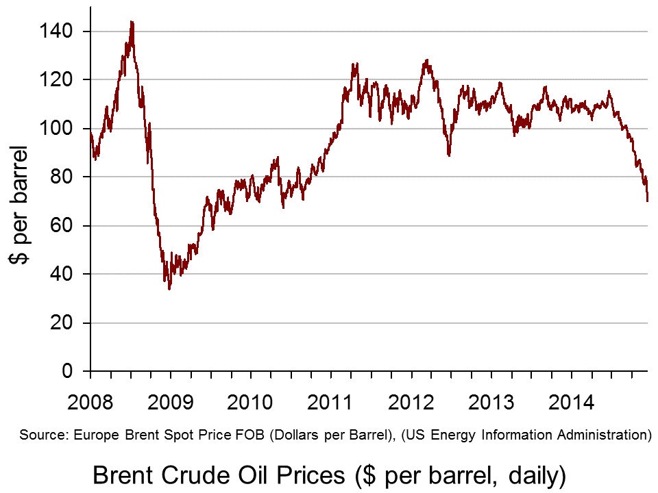 As far as OPEC is concerned, rather than cutting production, it decided at a meeting on 27 November to maintain the current target of 30 million barrels a day.
The videos and articles linked below look at these demand and supply factors and what is likely to happen to oil prices over the coming months.
They also look at the winners and losers. Although falling prices are likely in general to benefit oil importing countries and harm oil exporting ones, it is not as simple as that. The lower prices could help boost recovery and that could help to halt the oil price fall and be of benefit to the oil exporting countries. But if prices stay low for long enough, this could lower inflation and even cause deflation (in the sense of falling prices) in many countries. This, in turn, could dampen demand (see the blog post, Deflation danger). This is a particular problem in Japan and the eurozone. Major oil importing developing countries, such as China and India, however, should see a boost to growth from the lower oil prices.
Some oil exporting countries will be harder hit than others. Russia, in particular, has been badly affected, especially as it is also suffering from the economic sanctions imposed by Western governments in response to the situation in Ukraine. The rouble has fallen by some 32% this year against the US dollar and nearly 23% in the past three months alone.
Then there are the environmental effects. Cheaper oil puts less pressure on companies and governments to invest in renewable sources of energy. And then there are the direct effects on the environment of fracking itself – something increasingly being debated in the UK as well as in the USA and Canada.
Videos
 Oil price at four-year low as Opec meets BBC News, Mark Lobel (27/11/14)
 Opec losing control of oil prices due to US fracking BBC News, Nigel Cassidy (4/12/13)
 How the price of oil is set – video explainer The Telegraph, Oliver Duggan (28/11/14)
 How Oil’s Price Plunge Impacts Wall Street Bloomberg TV, Richard Mallinson (28/11/14)
 Oil Prices Plummet: The Impact on Russia’s Economy Bloomberg TV, Martin Lindstrom (28/11/14)
Articles
Oil prices plunge after Opec meeting BBC News (28/11/14)
Crude oil prices extend losses Financial Times, Dave Shellock (28/11/14)
Oil price plunges after Opec split keeps output steady The Guardian, Terry Macalister and Graeme Wearden (27/11/14)
Falling oil prices: Who are the winners and losers? BBC News, Tim Bowler (17/10/14)Hooray for cheap oil BBC News, Robert Peston (1/12/14)
Russian Recession Risk at Record as Oil Price Saps Economy Bloomberg, Andre Tartar and Anna Andrianova (28/11/14)
Rouble falls as oil price hits five-year low BBC News (1/12/14)
Data
Brent Spot Price US Energy Information Administration (select daily, weekly, monthly or annual: can be downloaded to Excel)
Spot exchange rate of Russian rouble against the dollar Bank of England
Questions
- Use a diagram to illustrate the effects of changes in the demand and supply of oil on oil prices.
- How does the price elasticity of demand and supply of oil affect the magnitude of these price changes?
- Explain whether (a) the demand for and (b) the supply of oil are likely to be relatively elastic or relatively inelastic? How are these elasticities likely to change over time?
- Distinguish between the spot price and forward prices of oil? If the three-month forward price is below the spot price, what are the implications of this?
- Analyse who gains and who loses from the recent price falls.
- What are the effects of a falling rouble on the Russian economy?
- What are likely to be the effects of further falls in oil prices on the eurozone economy?
 Figures for employment and unemployment give an incomplete picture of the state of the labour market. Just because a person is employed, that does not mean that they are working the number of hours they would like.
Some people would like to work more hours, either by working more hours in their current job, or by switching to an alternative job with more hours or by taking on an additional part-time job. Such people are classed as ‘underemployed’. On average, underemployed workers wanted to work an additional 11.3 hours per week in 2014 Q2. Underemployment is a measure of slack in the labour market, but it is not picked up in the unemployment statistics.
Other people would like to work fewer hours (at the same hourly rate), but feel they have no choice – usually because their employer demands that they work long hours. Some, however, would like to change to another job with fewer hours even if it involved less pay. People willing to sacrifice pay in order to work fewer hours are classed as ‘overemployed’.
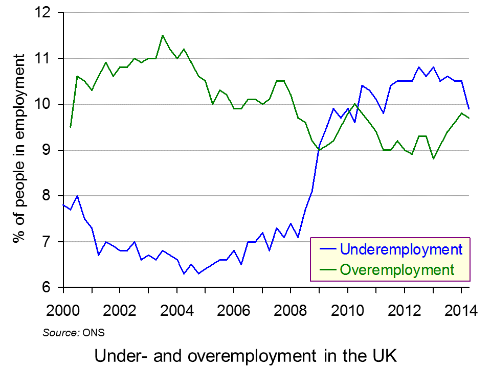
Statistics released by the Office for National Statistics show that, in April to June 2014, 9.9%, or 3.0 million, workers in the UK were underemployed; and 9.7%, or 2.9 million, were overemployed.
The figures for underemployment vary between different groups:
|
|
| • |
11.0% of female workers |
8.9% of male workers |
| • |
19.6% of 16-24 year olds |
9.9% of all workers |
| • |
21.1% of people in elementary occupations (e.g. cleaners, shop assistants and security guards) |
5.4% of people in professional occupations (e.g. doctors, teachers and accountants) |
| • |
11.5% of people in the North East of England (in 2013) |
9.2% of people in the East of England (in 2013) |
| • |
22.1% of part-time workers |
5.4% of full-time workers |
As far as the overemployed are concerned, professional people and older people are more likely want shorter hours
 The ONS data also show how under- and overemployment have changed over time: see chart (click here for a PowerPoint). Before the financial crisis and recession, overemployment exceeded underemployment. After the crisis, the position reversed: underemployment rose from 6.8% in 2007 to a peak of 10.8% in mid-2012; while overemployment fell from 10.5% in 2007 to a trough of 8.8% in early 2013.
More recently, as the economy has grown more strongly, underemployment has fallen back to 9.9% (in 2014 Q2) and overemployment has risen to 9.7%, virtually closing the gap between the two.
The fact that there is still significant underemployment suggests that there is still considerable slack in the labour market and that this may be acting as a brake on wage increases. On the other hand, the large numbers of people who consider themselves overemployed, especially among the professions and older workers, suggests that many people feel that they have not got the right work–life balance and many may be suffering consequent high levels of stress.
Articles
Rise in number of UK workers who want to cut back hours, ONS says The Guardian, Phillip Inman (25/11/14)
Data reveal slack and stretch in UK workforce Financial Times, Sarah O’Connor (25/11/14)
Will you graduate into underemployment? The Guardian, Jade Grassby (30/9/14)
Three million people would take pay cut to work shorter hours: Number who say they feel overworked rises by 10 per cent in one year Mail Online, Louise Eccles (26/11/14)
ONS: Rate of under-employment in Scotland lower than UK average Daily Record, Scott McCulloch (25/11/14)
ONS Release
Underemployment and Overemployment in the UK, 2014 ONS (25/11/14)
Questions
- Distinguish between unemployment (labour force survey (LFS) measure), unemployment (claimant count measure), underemployment (UK measure), underemployment (Eurostat measure) and disguised unemployment.
- Why is underemployment much higher amongst part-time workers than full-time workers?
- How do (a) underemployment and (b) overemployment vary according to the type of occupation? What explanations are there for the differences?
- Is the percentage of underemployment a good indicator of the degree of slack in the economy? Explain.
- How is the rise in zero hours contracts likely to have affected underemployment?
- How could the problem of overemployment be tackled? Would it be a good idea to pass a law setting a maximum number of hours per week that people can be required to do in a job?
- Would flexible working rights be a good idea?
 The retail food industry is an oligopoly – a market dominated by a few big firms, with interdependence between them. This means that each firm considers the reaction of all its competitors when making any decision. Pricing is one of those key decisions and this is one of the reasons why price wars tend to break out in this industry.
For consumers, price wars are usually seen as a good thing, as it means prices in the supermarkets get forced downwards, thus reducing the cost of living. Low prices in this case are one of the key benefits of competition. However, there are costs of such fierce competition for suppliers.  As final prices to customers are pushed down, small competitors are likely to feel the squeeze and may be forced out of the market. The other losers are suppliers. The big supermarkets are likely to pay lower prices to their suppliers, thus adversely affecting their livelihood. Research suggests that throughout 2014, 146 food producers entered insolvency, which is significantly higher than last year.
Accountancy firm, Moore Stephens, has blamed the supermarket price war for this rise in insolvencies in the food production sector. Duncan Swift from this firm said:
“The supermarkets are going through the bloodiest price war in nearly two decades and are using food producers as the cannon fodder…Supermarkets have engaged in questionable buying practices for years, but it’s getting worse and clearly wreaking havoc on the UK food production sector.”
The British Retail Consortium has said that placing the blame in this way was too simplistic. A commentator suggested that many suppliers have long-standing relationships with the supermarkets they deal with, suggesting that relations were good and sustainable. Furthermore, it was suggested that the demise of these producers may be due to many other factors and the data on insolvencies did not show that those firms affected were suppliers to the supermarkets. There is a Groceries Code Adjudicator in place to ensure that the supermarkets do not abuse their power when it comes to dealing with their suppliers, but the power of this person is limited, leaving suggestions remaining that suppliers are vulnerable. The following articles consider both the good and bad of price wars.
Articles
Questions
- What are the characteristics of an oligopoly? Why do price wars tend to break out in oligopolies, such as the supermarket industry?
- Apart from the supply-chain pressure from supermarkets, what other factors could have caused so many small food producers to become insolvent?
- How does the supermarket supply chain work and why have the price wars led to suppliers being squeezed?
- Use a diagram to illustrate the impact of the price war on (a) the supermarkets and (b) the suppliers.
- How important is the Groceries Code Adjudicator and should she be doing more to protect suppliers?
- If supermarkets are cutting prices, is this an indicator of unfair competition or good competition?
 With Christmas approaching, sales will once again begin to rise and cards will be written. Mail services will be at their busiest as we post millions of cards and parcels every day. But, the question is: will they arrive? Workers in the supply chain at Royal Mail have voted to strike over pay.
Since the part privatisation of Royal Mail, many criticisms have emerged, ranging from the price at which shares were sold, the efficiency of the Royal Mail, suggestions of varying prices for delivery depending on location, and now over pay. As with any labour market, there is a demand and a supply of workers and the intersection of these curves creates our equilibrium wage. If the wage is forced up above the equilibrium wage by the actions of trade unions, then there is the potential for unemployment to be created.
The Communications Workers Union (CWU) feels that their pay is insufficient. Dave Ward, Deputy General Secretary of CWU said:
“Thanks entirely to the unreasonable attitude of Post Office management, a pre-Christmas national strike is looking inevitable…The workforce has made a major contribution to the company’s success and have every right to their fair share.”
However, the head of the supply chain at Royal Mail has responded to the threats of strike, referring to the 5% pay rise promised to its workers over the next three years, saying:
“We are undertaking the biggest modernisation programme in UK retail history to ensure we become commercially viable and reduce our reliance on public money…We urge the CWU to reconsider their unrealistic demands and discuss an affordable pay deal rather than call strike action which can only cost our people money.”
The row over pay is not the only way that job losses could emerge. A major criticism levelled at the Royal Mail is its lack of efficiency, especially in terms of cost reductions and work flexibility.  The Royal Mail has become increasingly concerned by competition, especially as its low-cost competitors can choose to whom they deliver. Those living in built up areas receive mail, but for those living in more rural areas, some of Royal Mail’s competitors will not deliver there, because of the higher costs. Royal Mail does not have this luxury and hence must deliver to loss-making places. Royal Mail says that this is creating unfair pressure to its business and is calling for these competitors to be forced to deliver to rural areas and small businesses. However, one such company, Whistl, has said that the figures from Royal Mail suggest that ‘productivity is not a sufficiently high enough management priority.
If the strike does go ahead in the build up to Christmas, then the management priorities of Royal Mail will certainly be under scrutiny. The following articles consider the current situation.
Articles
Questions
- If there is strike action in a labour market, what can we conclude about the market in question in terms of how competitive it is?
- Is strike action completely pointless?
- What actions could workers take, other than strike action, to achieve a resolution of their grievances? Discuss what employers could offer in an attempt to resolve the situation?
- What are the arguments for making Royal Mail’s competitors deliver to all places, just as the Royal Mail must do?
- The efficiency of the Royal Mail has been called into question. If efficiency improved, would this mean that pay rises were more or less feasible?
 The articles linked below look at the dangers of deflation and policies of central banks to counter it.
Deflation in economics has three meanings. The first is falling prices: i.e. negative inflation. The second, more traditional meaning, is a fall in real aggregate demand, resulting in lower output, higher unemployment and lower inflation – and quite possibly an actual fall in the price level. These first two definitions describe what is generally seen as an undesirable situation. The third is a slowing down in the growth of real aggregate demand, perhaps as a result of a deliberate act of fiscal and/or monetary policy. This third meaning could describe a desirable situation, where unsustainable growth is reduced and inflation is reduced from an above-target level.
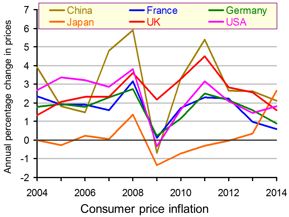
Here we focus on the first definition. The first two articles look at the dangers of a fall in the price level. The chart below shows falling inflation, although not actually deflation, in China, France, Germany and the UK (click here for a PowerPoint). Several European countries, however, are experiencing actual deflation. These include: Greece, Spain, Hungary, Poland and Sweden. Inflation in the eurozone for 2014 is expected to be a mere 0.5%.
The most obvious danger of deflation (or expected deflation) is that people will delay spending on durable goods, such as cars, furniture and equipment, hoping to buy the items cheaper later.  The result could be a fall in aggregate demand and a fall in output and employment.
For retailers, this is all spelling Christmas doom. Already the runup to the most crucial time of the year for shops is being characterised by a game of chicken. Shoppers are wondering how long they can leave their festive buying in the hope of late bargains.
Interest rates may be low, but for people with debts, this is being offset by the fact that inflation is no longer reducing the real value of that debt. For people with credit card debt, personal loans and most mortgages, the interest rate they pay is significantly above the rate of inflation. In other words, the real interest rate on their debt is still significantly positive. This may well discourage people from borrowing and spending, further dampening aggregate demand. And, with a Bank Rate of just 0.5%, there is virtually no scope for lowering the official interest rate further.
At least in the UK, economic growth is now positive – for the time being at any rate. The danger is becoming more serious, however, in many eurozone countries, which are already back in recession or close to being so. The ECB, despite its tentative steps to ease credit conditions, it moving closer to the day when it announces full-blown quantitative easing and buys sovereign bonds of eurozone countries. The Bank of Japan has already announced that it is stepping up it QE programme – a vital ingredient in getting Abenomics back on track and pulling Japan out of its latest recession.
In the USA, by contrast, there is little danger of deflation, as the US economy continues to grow strongly. The downside of this, has been a large rise in consumer debt (but not mortgages) – the ingredients of a possible future bubble and even a new financial crisis.
Forget what central bankers say: deflation is the real monster The Observer, Katie Allen (23/11/14)
Why Deflation Is Such A Big Worry For Europe NPR, Jim Zarroli (31/10/14)
Exclusive: China ready to cut rates again on fears of deflation – sources Reuters, Kevin Yao (23/11/14)
Central Banks in New Push to Prime Pump Wall Street Journal Jon Hilsenrath, Brian Blackstone and Lingling Wei (21/11/14)
Are Central Banks Panicking? Seeking Alpha, Leo Kolivakis (21/11/14)
Questions
- What are (a) the desirable and (b) the undesirable consequences of deflation? Does the answer depend on how deflation is defined?
- What is meant by a ‘deflationary gap’? In what sense is ‘deflationary’ being used in this term?
- Why have oil prices been falling? How desirable are these falls for the global economy?
- Is there an optimal rate of inflation? If so, how would this rate be determined?
- The chart shows that inflation in Japan is likely to have risen in 2014. This in large part is the result to a rise in the sales tax earlier this year. If there is no further rise in the sales tax, which there will probably not be if Mr Abe’s party wins the recently called election, what is likely to be the effect of the 2014 tax rise on inflation in 2015?
- If the Bank Rate is below the rate of inflation, why are people facing a positive real rate of interest? Does this apply equally to borrowers and savers?
- In what sense is there a cultural revolution at the Bank of England?
 Over the past three months oil prices have been falling. From the beginning of September to the end of November Brent Crude has fallen by 30.8%: from $101.2 to a four-year low of $70.0 per barrel (see chart below: click here for a PowerPoint). The fall in price has been the result of changes in demand and supply.
  As far as OPEC is concerned, rather than cutting production, it decided at a meeting on 27 November to maintain the current target of 30 million barrels a day.
 Major oil importing developing countries, such as China and India, however, should see a boost to growth from the lower oil prices.
 Oil price at four-year low as Opec meets BBC News, Mark Lobel (27/11/14)
 Opec losing control of oil prices due to US fracking BBC News, Nigel Cassidy (4/12/13)
 How the price of oil is set – video explainer The Telegraph, Oliver Duggan (28/11/14)
 How Oil’s Price Plunge Impacts Wall Street Bloomberg TV, Richard Mallinson (28/11/14)
 Oil Prices Plummet: The Impact on Russia’s Economy Bloomberg TV, Martin Lindstrom (28/11/14)