 House prices have long been an obsession with the UK media and much of the public; when they rise, homeowners feel rich, when they fall, consumer confidence dives. Following the financial crisis and subsequent recession, there has been a great deal of attention focused on the overall health of the housing market.
But the UK faces a particular problem of a sharp and growing divide in regional house prices. First time buyers in London face having to find high deposits and even then, many are unable to access mortgages. Meanwhile those in the regions can access more affordable housing, but may be reluctant to enter the market when prices are stagnant. What are the implications of this divide for the housing market and for the broader economy?
The housing market demonstrates characteristics which are typical of those for goods that are both consumable and involve capital growth; when prices rise housing is seen as a good ‘investment’ and demand increases, this in turn leads to higher prices. Conversely when values drop, demand falls and the market slumps. Markets like this are described as being prone to price bubbles.
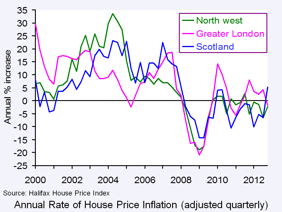 Looking at UK house prices as a whole can, however, mask large variations across the economy; variations which can cause problems for jobseekers, for employers and for the government. Recently one of the UK’s largest mortgage lenders predicted continuing regional variance in house prices. Halifax’s figures looked at the price of housing across a number of UK towns and showed that changes seen during 2012 ranged from a 14.8 per cent rise to an 18.4 per cent fall. The biggest rise seen during the year was in Southend on Sea, in Essex, while the greatest fall was in Craigavon, in Northern Ireland. Of the ten towns with the biggest rises, eight were found in London or the south east, with Durham being the only northern town showing growth. Of the ten towns that the Halifax identified with the biggest falls, four are in Scotland, three are in the north west, one is in the north of England and one is in Northern Ireland.
Martin Ellis, housing economist at the Halifax, said:
We expect continuing broad stability in house prices nationally in 2013. The generalised north/south divide in house price performance seen during 2012 is likely to continue next year. House prices are expected to be strongest in London and the south east as this part of the country performs best in economic terms.
These disparities present a particular problem in a recession. While London and the south east show signs of economic growth, with relatively low unemployment and high levels of inward investment, many regions outside London see house prices falling further as unemployment grows. There are some exceptions – the arrival of the BBC in Salford has resulted in a sharp increase in prices there – but, in general, confidence is low outside the south east.
The articles below consider regional differences in the housing market.
Articles
House prices creep up over 2012 The Guardian, Patrick Collinson (29/1/13)
Which regions of the UK will show the biggest house price rises in the next 5 years? This is Money, Rachel Rickard Straus (17/1/13)
Figures reveal scale of regional house price divide Inside Housing, Tom Lloyd (2/1/13)
Property market gets a budget boost, so are things looking up? This is Money, Simon Lambert (21/3/13)
Help to Buy scheme could drive up house prices, says OBR The Guardian, Josephine Moulds and Jennifer Rankin (26/3/13)
London house prices outstrip 2007 peak with a 2.8% increase The Guardian, Hilary Osborne (28/3/13)
Housing market in southeast is worth £2tn Financial Times, James Pickford and Ed Hammond (1/2/13)
House prices show annual increase Evening Standard (28/3/13)
House price data
Links to house price data The Economics Network
Regional Historical House Price Data Halifax House Price Index (Lloyds Banking Group)
Questions
- Thinking about the market for owner-occupied housing, what are the factors that will determine demand? How might these explain variations in demand across different regions of the UK?
- How does the supply of housing vary across the UK?
- What would you predict about regional variations in rents?
- What is the impact of high house prices in London on first time buyers? Does this matter?
- What are the implications for the labour market of sharp variations in house prices across regions?
- Why might the Chancellor want to put in place policies to boost the housing market?
- Who gains from high house prices? Who loses? You might want to think about this in term of the life-cycle.
 Inflation is measured as the percentage increase in the Consumer Prices Index (CPI) over the previous 12 months. The index is constructed from a basket of goods that is supposed to represent the buying habits of an average UK household. This basket is updated each year as tastes change and as technology moves forward. The basket contains approximately 700 items, with 180,000 individual prices collected each month.
As certain goods become more popular and trends change, the ONS have the responsibility of identifying these changes and updating the basket of goods. The CPI then looks at how the weighted average price of this basket of goods changes from one month to the next. As the CPI gives us the main measure of UK inflation, it is essential that the basket of goods used does represent current consumer demands. If the basket of goods used 20 years ago was still in place, we wouldn’t see thing like mobile phones and ipads being included. This is one sector that has seen significant growth in recent years and the basket of goods has been adapted in response. A new addition to the measure is e-books, which have seen a significant growth in popularity.
 However, just as new products have been added to the CPI measure, other goods have been removed. In the most recent update, we’ve seen the removal of champagne and Freeview boxes from the basket of goods. With rapid changes in technological products, such as the ipad, kindle and e-books, products that were new additions only a few years ago are now old news, being replaced by the latest gadgets. Other changes to the basket of goods are less about reflecting consumer trends and more about making certain categories more representative, such as fruits and hot drinks.
So, can the changes in the basket of goods tell us anything about the impact of the recession on buying habits? One notable exclusion from the basket of goods is champagne sold in restaurants and bars. In an economic downturn, you’d expect luxury products to see a decline in consumption and the trend in champagne consumption certainly seems to support the theory. The trends suggest that consumers have instead switched to cheaper alternatives, with things like white rum bought from shops increasing.
Many people may look at the basket of goods and think that it doesn’t reflect what you buy in your average shop. But, the purpose of the CPI is to try to reflect the average consumer and the different items in the basket are given different weightings to give some indication of the amount spent on each good. The articles below look at the changes in the CPI basket of goods and what, if anything, we can take from it.
Inflation basket: E-books added by ONS BBC News (12/3/13)
Inflation basket – what does it say about you? Channel 4 News (12/3/13)
The fizz has fallen flat – champagne cut from inflation basket Independent, Martin Hickman (13/3/13)
E-books added to inflation basket, as champagne dropped The Telegraph, Philip Aldrick (13/3/13)
UK inflation basket: e-books in, champagne out The Guardian, Marking King (13/3/13)
Champagne tipped out of inflation basket Financial Times, Hannah Kuchler (13/3/13)
Champagne out, ebooks in as inflation basket updated Reuters (13/3/13)
Questions
- What is inflation and why is it such an important variable?
- How is the CPI calculated? Is it different from the RPI?
- What impact has technological change had on the basket of goods used to calculate the CPI?
- Can you identify any other economic or business trends from the products that are in and out of the CPI basket of goods?
- Given the importance of technology and the speed of change, do you think the review of the basket of goods should become more or less frequent?
- Has the economic downturn had any effect on the basket of goods used to calculate the CPI?
 In light of the recent sharp decline in the British pound, this blog is an updated version of Appreciating a depreciating pound which was published in early December 2012. The significance of the depreciation should be seen in the context of the UK as an island-economy which makes trade an important determinant of our economic performance.
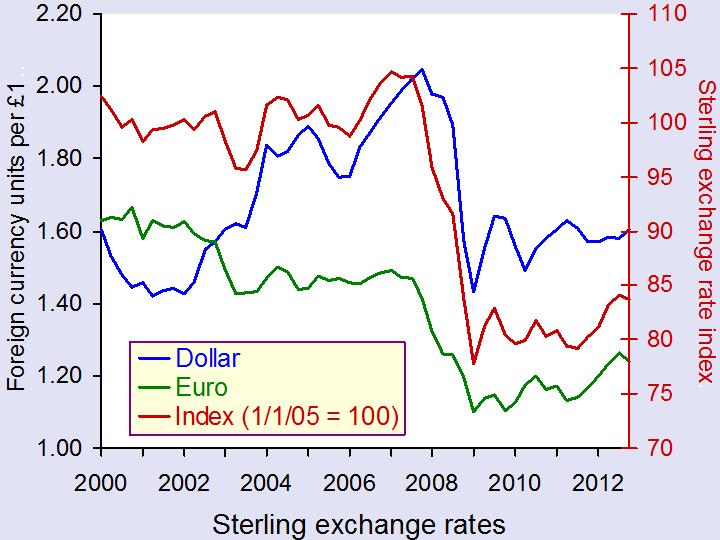
The competitiveness of our exports is, in part, affected by the exchange rate. Floating exchange rates are notoriously volatile. However, since the autumn of 2007 we have observed a significant depreciation of the UK exchange rate – a depreciation that seems to have found new momentum of late. A depreciation helps to make our exports more competitive abroad which might help to compensate for weak demand here in the UK.
Rather than look at the British pound (or any currency) against the many foreign currencies separately we can look at the average exchange rate against a whole bundle of currencies. The average rate is calculated by weighting the individual exchange rates by the amount of trade between Britain and the other countries. This trade-weighted exchange rate is known as the effective exchange rate.

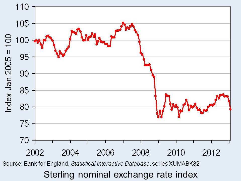
The chart shows the nominal (actual) effective exchange rate for the British pound since 2002. The chart shows clearly how from the autumn of 2007 the effective exchange rate began to fall sharply. Over the period from September 2007 to January 2009, figures from the Bank of England show that the nominal effective exchange rate fell by 25.3 per cent. In simple terms, the British pound depreciated by close to one-quarter. (Click here for a PowerPoint of the chart.)
If we move the clock forward, we observe an appreciation of the British pound between July 2011 (when its value was only 1.6 per cent higher than in January 2009) and September 2012. Over this period, the British pound appreciated by 7.2 per cent. Its value remained relatively stable through much of the remainder of last year. However, we appear to be on another downward path. If we compare the average value in February 2013 with the ‘high’ back in September 2012 we observe a depreciation of 5.4 per cent.
The British pound continues on its roller-coaster ride. Most commentators expect the British pound to fall further. Some see this as an important ingredient for a revival in British economic fortunes. If we compare September 2007 with February 2013, we find that the nominal effective exchange rate for the British pound is 23 per cent lower. This constitutes a major competitive boost for our exporters. However, an important question is whether there is a demand for these goods and services abroad however more attractive the depreciation makes them.
Data
Statistical Interactive Database – interest and exchange rate rates data Bank of England
BIS effective exchange rate indices Bank for International Settlements
Articles
Pound depreciates Vs dollar to lowest level since Aug 16 Bloomberg, Emma Charlton (5/2/13)
Pound advances against euro on Italy speculation; Gilts decline Bloomberg, Lucy Meakin and David Goodman (4/3/13)
Pounding of sterling risks a currency war Scotland on Sunday, Bill Jamieson (17/2/13)
Credit ratings, the pound, currency movements and you BBC News, Kevin Peachey (25/2/13)
The Bank of England can’t just go on doing down the pound Telegraph, Jeremy Warner (21/2/13)
 Sterling will continue to go down BBC News, Jim Rogers (25/2/13)
Questions
- Explain how the foreign demand for goods and assets generates a demand for British pounds. How will this demand be affected by the foreign currency price of the British pound, i.e. the number of foreign currency units per £1?
- Explain how the demand by British residents for foreign goods and assets generates a supply of British pounds. How will this supply be affected by the foreign currency price of the British pound, i.e. the number of foreign currency units per £1?
- What factors are likely to shift the demand and supply curves for British pounds on the foreign exchange markets?
- Illustrate the effect of a decrease in the demand for British goods and assets on the exchange rate (i.e. the foreign currency price of the British pound) using a demand-supply diagram.
- What is the difference between a nominal and a real effective exchange rate? Which of these is a better indicator of the competitiveness of our country’s exports
- What factors are likely to have caused the depreciation of the British pound in 2013?
 Events on the high street continue to grab the headlines. These are incredibly difficult times for retailers as households’ spending power continues to be squeezed and, in conjunction with technological change, households’ spending habits continue to evolve. In this blog we examine what the latest data from Consumer Trends tells us about the composition of household spending.
There are 12 broad categories of household spending. Each tells us something about the amount of expenditure in the UK by both UK and foreign households. In 2012 Q3, the value of household consumption taking place within the UK was £242 billion. During the whole of 2011, spending amounted to £929 billion. In real terms (after adjusting for price changes) spending in the UK fell by 1 per cent in 2011. Evidence of a rebound is limited. In the year to 2012 Q3, the volume of spending was just 0.8 per cent higher. In contrast, from 1998 to 2007 the average real rate of growth was 3.5 per cent.
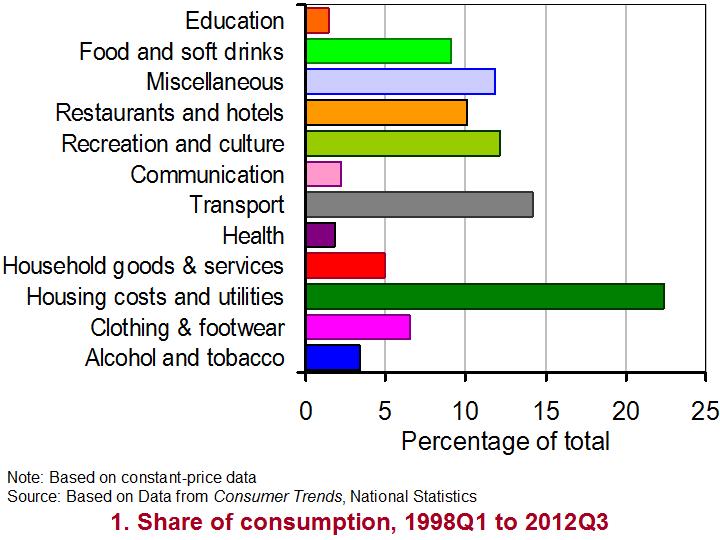
 As Chart 1 shows, the largest component of household spending in the UK is on spending associated with running a home. This component includes rents, expenditures incurred in undertaking routine maintenance and the payments for electricity, gas and water. Since 1997 this component has typically accounted for (after adjusting for price changes) 24 per cent of household consumption in the UK (22 per cent in 2012 Q3). The second largest consumption category is transport. This includes expenditure on purchasing vehicles, fuels, maintenance of vehicles and the costs of rail and air transport. It has typically accounted for about 15 per cent of expenditure (14 per cent in 2012 Q3).
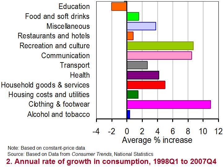
 Chart 2 shows the real annual rate of growth in expenditure of our 12 consumption categories from 1998 Q1 to 2007 Q4 and so before the financial crisis really took hold. It enables us to measure how the volume of purchases changes over a 12-month period. From it, we can see that all categories, except education, contributed to the positive real growth of household spending in the UK. The fastest growing component was clothing and footwear recording real growth of almost 11 per cent per year. The second most rapidly growing component was recreation and culture, which includes items ranging from package holidays, garden plants and musical instruments to sports equipment, cameras and books. This component grew, after adjusting for inflation, by nearly 9 per cent per year.
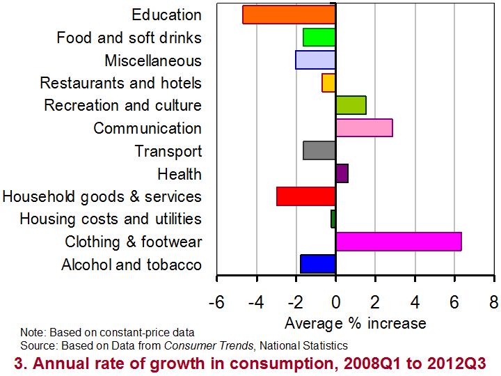
 Chart 3 focuses on the real annual rate of growth since 2008 Q1. It paints a very different picture. Now only four categories have on average recorded positive annual rates of growth. Again, the volume of purchases of clothing and footwear has grown most rapidly by 6.3 per cent per year. While purchases on items associated with recreation and culture continue to grow, the annual rate of growth since 2008 is only 1.5 per cent compared with 9 per cent prior in the previous 10 years or so.
(Click here for a PowerPoint of all three charts.)
One category of spending that has been especially badly affected by events since 2008 has been household goods and services. This includes items such as furniture, major and small household appliances (including electrical appliances), carpets and tools. While the volume of purchases grew by 5 per cent per year from 1998 to 2007, since 2008 they have typically contracted at a rate of 3 per cent per year. This category helps to illustrate the difficult trading environment currently faced by many businesses in the UK.
Data
Consumer Trends, Q3 2012 Statistical Bulletin National Statistics
Consumer Trends Time Series Dataset, Q3 2012 National Statistics
Articles
Surprise UK retail sales drop fuels trip-dip recession fears The Guardian, Larry Elliott (15/2/13)
UK retail sales fall unexpectedly in January BBC News, (15/2/13)
Retail sales: What the economists say The Guardian, Phillip Inman (15/2/13)
Another dark day for the high street as John Lewis cuts jobs The Guardian, Sarah Butler (13/2/13)
Republic chains enters administration BBC News, (15/2/13)
High Street retailers: Who has been hit the hardest? BBC News, (13/2/13)
Questions
- Using Charts 2 and Chart 3 construct a short briefing paper comparing the fortunes of difficult components of consumption before and after 2008.
- What economic factors could explain the contrasting impact of the economic slowdown since 2008 on the components of consumption?
- Can economic factors alone explain the success of failure of businesses? Explain your answer drawing on real-world examples.
- What factors do you think are likely to be important for the growth in consumer spending in the months ahead?
 The exchange rate for sterling is determined in much the same way as the price of goods – by the interaction of demand and supply.
When factors change that cause residents abroad to want to hold more or fewer pounds, the demand curve for sterling will shift. If, instead, factors change that cause UK residents to want to buy more or less foreign currency, then the supply curve of sterling will shift. It is these two curves that determine the equilibrium exchange rate of sterling.
There are concerns at the moment that sterling is about to reach a peak, with expectations that the pound will weaken throughout 2013. But is a weakening exchange rate good or bad for the UK?
 With lower exchange rates, exports become relatively more competitive. This should lead to an increase in the demand for UK products from abroad. As exports are a component of aggregate demand, any increase in exports will lead to the AD curve shifting to the right and thus help to stimulate a growth in national output. Indeed, throughout the financial crisis, the value of the pound did fall (see chart above: click here for a PowerPoint) and this led to the total value of UK exports increasing significantly. However, the volume of UK exports actually fell. This suggests that whilst UK exporters gained in terms of profitability, they have not seen much of an increase in their overall sales and hence their market share.
Therefore, while UK exporters may gain from a low exchange rate, what does it mean for UK consumers? If a low exchange rate cuts the prices of UK goods abroad, it will do the opposite for the prices of imported goods in the UK. Many goods that UK consumers buy are from abroad and, with a weak pound, foreign prices become relatively higher. This means that the living standards of UK consumers will be adversely affected by a weak pound, as any imported goods buy will now cost more.
It’s not just the UK that is facing questions over its exchange rate. Jean-Claude Junker described the euro as being ‘dangerously high’ and suggested that the strength or over-valuation of the exchange rate was holding the eurozone back from economic recovery. So far the ECB hasn’t done anything to steer its currency, despite many other countries, including Japan and Norway having already taken action to bring their currencies down. Mario Draghi, the ECB’s president, however, said that ‘both the real and the effective exchange rate of the euro are at their long-term average’ and thus the current value of the euro is not a major cause for concern.
So, whatever your view about intervening in the market to steer your currency, there will be winners and losers. Now that countries are so interdependent, any changes in the exchange rate will have huge implications for countries across the world. Perhaps this is why forecasting currency fluctuations can be so challenging. The following articles consider changes in the exchange rate and the impact this might have.
A pounding for sterling in 2013? BBC News, Stephanomics, Stephanie Flanders (17/1/13)
UK drawn into global currency wars as slump deepens Telegraph, Ambrose Evans-Pritchard (16/1/13)
Foreign currency exchange rate predictions for GBP EUR, Forecasts for USD and NZD Currency News, Tim Boyer (15/1/13)
Euro still looking for inspiration, Yen firm Reuters (16/1/13)
Daily summary on USD, EUR, JPY, GBP, AUD, CAD and NZD International Business Times, Roger Baettig (16/1/13)
UK inflation bonds surge on Index as pound falls versus euro Bloomberg, Business News, Lucy Meakin (10/1/13)
Questions
- Which factors will cause an increase in the demand for sterling? Which factors will cause a fall in the supply of sterling?
- In the article by Stephanie Flanders from the BBC, loose monetary policy is mentioned as something which is likely to continue. What does this mean and how will this affect the exchange rate?
- Explain the interest- and exchange-rate transmission mechanisms, using diagrams to help your answer.
- If sterling continues to weaken, how might this affect economic growth in the UK? Will there be any multiplier effect?
- What is the difference between the volume and value of exports? How does this relate to profit margins?
- Why are there suggestions that the euro is over-valued? Should European Finance Ministers be concerned?
- Should governments or central banks intervene in foreign exchange markets?
- If all countries seek to weaken their currencies in order to make their exports more competitive, why is this a zero-sum game?
 House prices have long been an obsession with the UK media and much of the public; when they rise, homeowners feel rich, when they fall, consumer confidence dives. Following the financial crisis and subsequent recession, there has been a great deal of attention focused on the overall health of the housing market.
 Looking at UK house prices as a whole can, however, mask large variations across the economy; variations which can cause problems for jobseekers, for employers and for the government. Recently one of the UK’s largest mortgage lenders predicted continuing regional variance in house prices. Halifax’s figures looked at the price of housing across a number of UK towns and showed that changes seen during 2012 ranged from a 14.8 per cent rise to an 18.4 per cent fall. The biggest rise seen during the year was in Southend on Sea, in Essex, while the greatest fall was in Craigavon, in Northern Ireland. Of the ten towns with the biggest rises, eight were found in London or the south east, with Durham being the only northern town showing growth. Of the ten towns that the Halifax identified with the biggest falls, four are in Scotland, three are in the north west, one is in the north of England and one is in Northern Ireland.