 According to the first estimate by the Office for National Statistics, the UK economy shrank by 0.3% in the final three months of 2012. This means that over the whole year growth was flat.
The biggest contributor to the fall in GDP in Q4 was the production industries, which include manufacturing. Output of the production sector fell by 1.8% in Q4. Construction sector output, by contrast, was estimated to have increased by 0.3%. Service sector output was flat. The chart below shows quarterly and annual growth in the UK from 2007 to 2012. (Click here for a PowerPoint.)
Latest estimates by the IMF are that the UK economy will grow by 1.0% in 2013 – well below the long-term growth in potential output (see also the last blog, High hopes in the Alps). But some forecasters are predicting that real GDP will continue to fall for at least one more quarter, which means that the economy would then be in a ‘triple-dip recession’.
 Not surprisingly politicians have interpreted the statistics very differently, as have economists. The government, while recognising that the UK faces a ‘very difficult economic situation’, argues that now is not the time to change course and that by continuing with policies to reduce the deficit the economy will be placed on a firmer footing for sustained long-term growth
The opposition claims that the latest figures prove that the government’s policies are not working and that continuing attempts to bear down on the deficit are depressing aggregate demand and thereby keeping the economy depressed.
The following webcasts, podcasts and articles expand on these arguments. Try to be dispassionate in using economic analysis and evidence to assess the arguments.
Webcasts and podcasts
 Video Summary: Gross Domestic Product Preliminary Estimate, Q4 2012 Media Briefing (Click here for the following Q&A) ONS (25/1/13)
 Triple dip on the menu? Channel 4 News, Siobhan Kennedy and Faisal Islam (25/1/13)
 Getting and spending – the key to recovery Channel 4 News, Cathy Newman (25/1/13)
 UK economy shrinks by 0.3% in the last three months of 2012 BBC News, Hugh Pym (25/1/13)
 Danny Alexander on GDP figures and economic plans BBC Daily Politics (25/1/13)
 Osborne defends government’s deficit reduction plan BBC News (25/1/13)
 Ed Balls: UK economy urgently needs a ‘Plan B’ BBC News (25/1/13)
 UK heads for triple dip as GDP contracts 0.3pc The Telegraph, Philip Aldrick (25/1/13)
 Economist: Government may need to rethink its fiscal policy The Telegraph, Jim O’Neill (25/1/13)
 Has austerity really been tried in Britain? BBC Today Programme, Jonathan Portes and Andrew Lilico (29/1/13)
Articles
UK GDP: Economy shrank at end of 2012 BBC News (25/1/13)
UK GDP shrinks by 0.3% in fourth quarter: what the economists say The Guardian (25/1/13)
New Bank of England head Mark Carney hints at big shift in policy The Guardian (26/1/13)
The Bank of England, the chancellor, and the target BBC News. Stephanie Flanders (29/1/13)
The Entire World Of Economics Is Secretly Thankful To The UK Right Now Business Insider, Joe Weisenthal (26/1/13)
Data
Gross Domestic Product: Preliminary Estimate, Q4 2012 ONS (25/1/13)
 Video Summary: Gross Domestic Product Preliminary Estimate, Q4 2012 ONS (25/1/13)
Preliminary Estimate of GDP – Time Series Dataset 2012 Q4 ONS (25/1/13)
Business and Consumer Surveys DG ECFIN
Questions
- What are the reasons for the decline in GDP in 2012 Q4??
- Examine how likely it is that the UK will experience a triple-dip recession.
- What measures could be adopted to increase consumer and business confidence?
- If there is substantial spare capacity, is expansionary fiscal policy the best means of achieving economic growth?
- What additional monetary policy measures could be adopted to stimulate economic growth?
- Find out what has happened to the UK’s public-sector deficit and debt over the past three years. Explain what has happened.
 Each year world political and business leaders meet at the World Economic Forum in the Swiss resort of Davos. The aim is to assess the progress of the global economy and to look at challenges ahead and what can be done about them.
Cynics claim that the round of presentations, discussions, Champagne receptions and fine dining rarely leads to anything concrete. Those who are less cynical argue that the Forum gives a unique opportunity for considering policy options and helping to shape a global consensus.
This year the mood was more optimistic. Many believe that the worst of the financial crisis is behind us. Stock markets are buoyant; the banking system seems more secure; the eurozone has not collapsed; growth prospects seem a little brighter.
 But perhaps ‘optimistic’ is an overstatement. ‘Less pessimistic’ might be a better description. As Christine Lagarde, head of the IMF, pointed out in her speech:
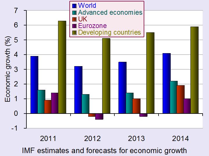
The recovery is still weak, and uncertainty is still high. As the IMF announced just a few hours ago in our World Economic Outlook, we expect global growth of only 3½ percent this year, not much higher than last year. The short-term pressures might have alleviated, but the longer-term pressures are still with us. (Click here for transcript).
In both her speech and her press conference, she went on to outline the policies the IMF feels should be adopted to achieve sustained global growth.
The articles below summarise the outcomes of the Forum and some of the views expressed.
Articles
Too soon for sighs of relief Deutsche Welle, Andreas Becker (27/1/13)
Davos 2013: The icy economic chill begins to thaw The Telegraph, Louise Armitstead (26/1/13)
 IMF Projects Modest Pick-up in Economic Growth in 2013 IMF videos, Olivier Blanchard, IMF Chief Economist (23/1/13)
 Managing Director’s New Year Press Briefing IMF videos, Christine Lagarde, IMF Managing Director
Mark Carney in Davos: what’s up next for the global economy Maclean’s (Canada), Erica Alini (26/1/13)
World Economic Forum ends on warning note over ‘complacency’ The Guardian, Graeme Wearden (26/1/13)
Angela Merkel tells Davos austerity must continue The Guardian, Graeme Wearden and Larry Elliott (24/1/13)
Davos 2013: A ‘sigh of relief’ at the World Economic Forum BBC News, Stephanie Flanders (27/1/13)
Happy talk The Economist (27/1/13)
Davos Man and his defects The Economist, Schumpeter (26/1/13)
Davos: are the captains of capitalism finally paying attention? The Observer (27/1/13)
Official site
The Global Agenda 2013 The World Economic Forum
IMF projections
Modest Growth Pickup in 2013, Projects IMF IMF Survey Magazine: In the News (23/1/13)
World Economic Outlook Update IMF (23/1/13)
Questions
- Why was the mood at the WEF less pessimistic than in 2012?
- What threats remain to sustained global recovery?
- What policies are being recommended by Christine Lagarde of the IMF? Explain the reasoning behind the recommendations.
- What disagreements are there between global leaders on the scope for fiscal and monetary policies to stimulate economic growth?
- In her press conference, Christine Lagarde stated that “the teams here have concluded that the fiscal multipliers were higher in the context of that unbelievable international crisis”. Do you agree with this statement? Explain.
 The housing market is an incredibly fascinating market to monitor and to research. The market was at the centre of the financial crisis with some lenders accused of over-aggressively expanding their mortgage books and relaxing their lending criteria. The UK housing market of today looks very different to the market before the financial crisis. Nationally, house prices are stagnant while transaction numbers are less than half their pre-crisis level. The UK housing market appears almost as ‘cold’ as the recent weather!

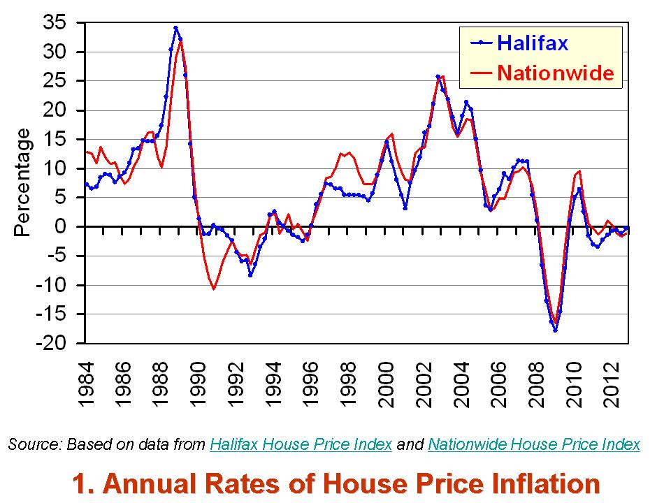
As the first chart shows, the annual rate of house price inflation across the UK has been consistently close to or even below zero over the past couple of years. The latest figures from the Nationwide Building Society point to the average UK house price in the final quarter of 2012 being 1.1 per cent lower than in the final quarter of 2011. The figures from the Halifax concur with their estimate showing UK house prices 0.3 per cent lower year-on-year in the final quarter of 2012. This is a very different picture from that during the 2000s. As recently as 2007, the annual rate of house price inflation was in excess of 10 per cent.
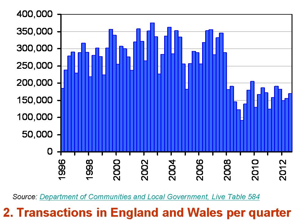
 Another indicator of the changing face of the UK housing market is the level of activity. The second chart shows the number of transactions per quarter across England and Wales since 1996. The figures from the Department of Communities and Local Government show that since the start of 2010 England and Wales has seen an average of 159,000 transactions per quarter. This compares with an average of 294,000 transactions over the period from 1996 to the end of 2007. Hence, the number of purchases today is roughly half the level prior to the financial crisis.
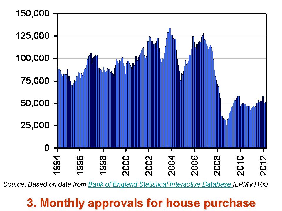
 A further indicator of today’s very different housing market is the numbers of approvals by lenders for mortgages for house purchases. The latest Bank of England figures show that across the UK, the number of approvals each month in the first eleven months of 2012 averaged 51,000. Since 2010, the average monthly number of approvals has been 49,000. However, over the period from 1996 to the end of 2007 there were over 102,000 mortgages being approved each month.
A trawl through some of the key indicators of the UK housing market helps to paint a picture of a market that is markedly different to that before the financial crisis. It would be a big surprise in today’s financial and economic climate if there were to be any significant change in the path of these indicators for some time.
Data
Statistical data set – Property transactions Department of Communities and Local Government
Nationwide house price index Nationwide Building Society
Halifax House Price Index Lloyds Banking Group
Lending to individuals – November 2012 Bank of England
Articles
UK house prices drop 1% Guardian, Hilary Osborne (3/1/13)
House prices on course to pass pre-crisis peak levels Telegraph, Roland Gribben (21/1/13)
House prices rise at highest rate in seven months Independent, Vicky Shaw (15/1/13)
UK mortgage market ‘now more robust’ BBC News, (21/1/13)
Bank of England report flags improving mortgage market Telegraph, Emma Rowley (21/1/13)
Questions
- Draw up a list factors that are likely to have affected each of our 3 indicators of the UK housing market (house price inflation, transactions and mortgage approvals) since the late 2000s.
- Using a demand-supply diagram, illustrate the forces that have affected house prices in the late 2000s and early 2010s.
- Draw up a list of issues surrounding the housing market that would be of interest to a microeconomist. Now repeat the exercise for a macroeconomist.
- Why are house prices so notoriously volatile? Can you think of any other markets where prices are similarly volatile? Do these markets share any common traits?
- If you were a commentator on the UK housing market what would you be forecasting for prices and activity in 2013?
 The exchange rate for sterling is determined in much the same way as the price of goods – by the interaction of demand and supply.
When factors change that cause residents abroad to want to hold more or fewer pounds, the demand curve for sterling will shift. If, instead, factors change that cause UK residents to want to buy more or less foreign currency, then the supply curve of sterling will shift. It is these two curves that determine the equilibrium exchange rate of sterling.
There are concerns at the moment that sterling is about to reach a peak, with expectations that the pound will weaken throughout 2013. But is a weakening exchange rate good or bad for the UK?
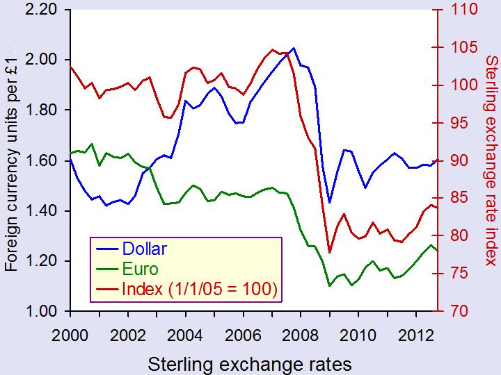
 With lower exchange rates, exports become relatively more competitive. This should lead to an increase in the demand for UK products from abroad. As exports are a component of aggregate demand, any increase in exports will lead to the AD curve shifting to the right and thus help to stimulate a growth in national output. Indeed, throughout the financial crisis, the value of the pound did fall (see chart above: click here for a PowerPoint) and this led to the total value of UK exports increasing significantly. However, the volume of UK exports actually fell. This suggests that whilst UK exporters gained in terms of profitability, they have not seen much of an increase in their overall sales and hence their market share.
Therefore, while UK exporters may gain from a low exchange rate, what does it mean for UK consumers? If a low exchange rate cuts the prices of UK goods abroad, it will do the opposite for the prices of imported goods in the UK. Many goods that UK consumers buy are from abroad and, with a weak pound, foreign prices become relatively higher. This means that the living standards of UK consumers will be adversely affected by a weak pound, as any imported goods buy will now cost more.
It’s not just the UK that is facing questions over its exchange rate. Jean-Claude Junker described the euro as being ‘dangerously high’ and suggested that the strength or over-valuation of the exchange rate was holding the eurozone back from economic recovery. So far the ECB hasn’t done anything to steer its currency, despite many other countries, including Japan and Norway having already taken action to bring their currencies down. Mario Draghi, the ECB’s president, however, said that ‘both the real and the effective exchange rate of the euro are at their long-term average’ and thus the current value of the euro is not a major cause for concern.
So, whatever your view about intervening in the market to steer your currency, there will be winners and losers. Now that countries are so interdependent, any changes in the exchange rate will have huge implications for countries across the world. Perhaps this is why forecasting currency fluctuations can be so challenging. The following articles consider changes in the exchange rate and the impact this might have.
A pounding for sterling in 2013? BBC News, Stephanomics, Stephanie Flanders (17/1/13)
UK drawn into global currency wars as slump deepens Telegraph, Ambrose Evans-Pritchard (16/1/13)
Foreign currency exchange rate predictions for GBP EUR, Forecasts for USD and NZD Currency News, Tim Boyer (15/1/13)
Euro still looking for inspiration, Yen firm Reuters (16/1/13)
Daily summary on USD, EUR, JPY, GBP, AUD, CAD and NZD International Business Times, Roger Baettig (16/1/13)
UK inflation bonds surge on Index as pound falls versus euro Bloomberg, Business News, Lucy Meakin (10/1/13)
Questions
- Which factors will cause an increase in the demand for sterling? Which factors will cause a fall in the supply of sterling?
- In the article by Stephanie Flanders from the BBC, loose monetary policy is mentioned as something which is likely to continue. What does this mean and how will this affect the exchange rate?
- Explain the interest- and exchange-rate transmission mechanisms, using diagrams to help your answer.
- If sterling continues to weaken, how might this affect economic growth in the UK? Will there be any multiplier effect?
- What is the difference between the volume and value of exports? How does this relate to profit margins?
- Why are there suggestions that the euro is over-valued? Should European Finance Ministers be concerned?
- Should governments or central banks intervene in foreign exchange markets?
- If all countries seek to weaken their currencies in order to make their exports more competitive, why is this a zero-sum game?
 Consumer spending is crucial to an economy. In the UK total consumer spending is equivalent to almost two-thirds of the value of country’s GDP. Understanding its determinants is therefore crucial in attempting to forecast the short-term path of the economy. In other words, the growth of the economy in 2013 will depend on our inclination to spend.
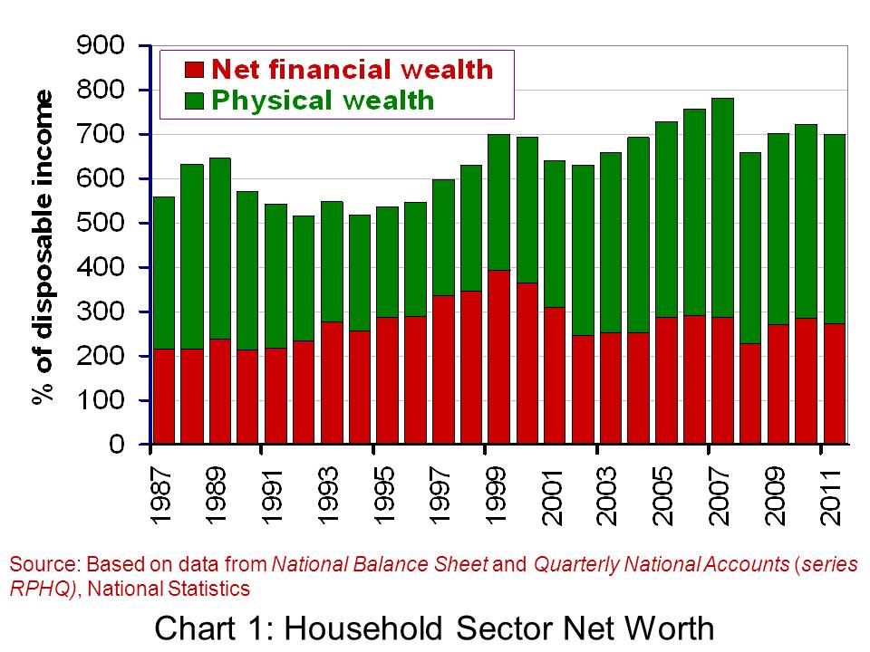
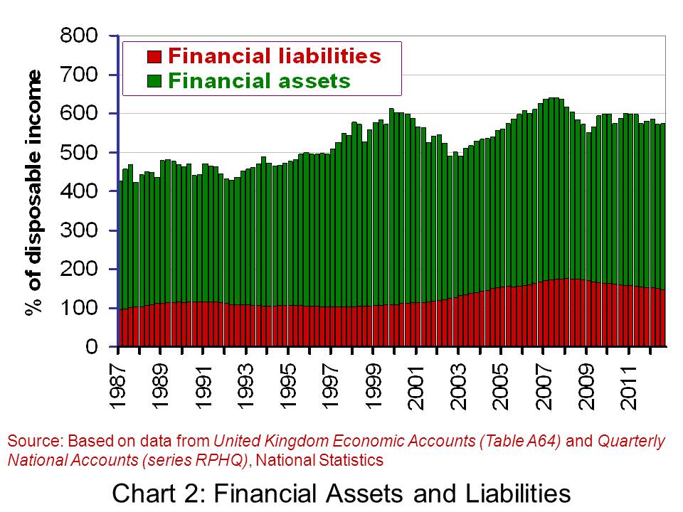
While the amount of disposable income (post-tax income) will be one factor influencing our spending, other factors matter too. Amongst these ‘other factors’ is the stock of wealth of households. Here we look at the latest available figures on the net worth of the UK household sector. Will our stock of wealth help to underpin spending or will it act to constrain spending?
The household sector’s net worth is the sum of its net financial wealth and non-financial (physical) wealth. Net financial wealth is the balance of financial assets over financial liabilities. Financial assets include funds in savings accounts, shares and pension funds. Financial liabilities include debts secured against property, largely residential mortgages, and unsecured debts, such as overdrafts and unpaid balances on credit cards. Non-financial wealth largely includes the value of the sector’s holdings of property and buildings.
The following table summarises the net worth of the UK household sector at the end of 2011 and 2010. The figures are taken from the Office for National Statistics release, National Balance Sheet. They show that at the end of 2011, the household sector had a net worth of £7.04 trillion. This was up just 0.1 per cent up 2010. At the end of 2011, the stock of net worth of the household sector was 7 times the amount of disposable income earned by the sector in 2011.
The Household Sector Balance Sheet
| Component |
2010 (£bn) |
2011 (£bn) |
| Financial assets |
4,302.8 |
4,283.7 |
| Financial liabilities |
1,540.7 |
1,541.3 |
| Net financial wealth |
2,762.1 |
2,742.4 |
| Non-financial (physical) wealth |
4,272.2 |
4,302.1 |
| Net worth |
7,034.3 |
7,044.5 |
 According to the first estimate by the Office for National Statistics, the UK economy shrank by 0.3% in the final three months of 2012. This means that over the whole year growth was flat.
 Not surprisingly politicians have interpreted the statistics very differently, as have economists. The government, while recognising that the UK faces a ‘very difficult economic situation’, argues that now is not the time to change course and that by continuing with policies to reduce the deficit the economy will be placed on a firmer footing for sustained long-term growth
 Video Summary: Gross Domestic Product Preliminary Estimate, Q4 2012 Media Briefing (Click here for the following Q&A) ONS (25/1/13)
 Triple dip on the menu? Channel 4 News, Siobhan Kennedy and Faisal Islam (25/1/13)
 Getting and spending – the key to recovery Channel 4 News, Cathy Newman (25/1/13)
 UK economy shrinks by 0.3% in the last three months of 2012 BBC News, Hugh Pym (25/1/13)
 Danny Alexander on GDP figures and economic plans BBC Daily Politics (25/1/13)
 Osborne defends government’s deficit reduction plan BBC News (25/1/13)
 Ed Balls: UK economy urgently needs a ‘Plan B’ BBC News (25/1/13)
 UK heads for triple dip as GDP contracts 0.3pc The Telegraph, Philip Aldrick (25/1/13)
 Economist: Government may need to rethink its fiscal policy The Telegraph, Jim O’Neill (25/1/13)
 Has austerity really been tried in Britain? BBC Today Programme, Jonathan Portes and Andrew Lilico (29/1/13)
 Video Summary: Gross Domestic Product Preliminary Estimate, Q4 2012 ONS (25/1/13)
