 The rate of inflation in the UK is measured using the Consumer Prices Index (CPI). This is made up of a basket of goods and the ONS updates this ‘basket’ each year to ensure it is representative of what the average UK household buys. The basket contains 703 items, with 110,000 individual prices collected each month.
In past years, items such as lip gloss have been added to the basket of goods, together with tablet computers and teenage fiction. In the recent update by the ONS, e-cigarettes have been added, together with specialist ‘craft’ beers and music streaming. On the other hand, other items have been removed, as the world changes. For example, during the recession, champagne was removed as an item that the representative household was no longer buying. In other cases, items are removed as they become outdated or obsolete with technology changing. This is the case with satellite navigation systems. As people turn to using their smartphones to navigate their way from A to B, satellite navigation systems are no longer seen as an item bought by the representative household.
The UK inflation rate is at an all-time low of 0.3% and there have been concerns that it may become negative, meaning we enter the world of deflation. However, if this does occur, many suggest that it is not bad deflation, as it is being driven by the extremely low oil prices. No matter what the inflation rate, the ONS will always continue to update the basket of goods that calculates inflation. It is therefore essential that these changes are made each year, as consumer buying habits do fluctuate considerably, as income changes, technology changes and general tastes change. The following articles consider what’s in and what’s out.
From craft beer to e-cigarettes, inflation basket reflects Britain’s changing shopping habits The Guardian, Katie Allen (17/3/15)
Inflation-measuring basket of goods adds protein powder, e-cigarettes The Grocer, Andrew Don (17/3/15)
E-cigareets and craft beers in updated inflation basket BBC News (17/3/15)
E-cigs added to inflation basket Mail Online (17/3/15)
Craft beer, e-cigarettes and protein shakes dded to price basket used to calculate inflation Independent, Hazel Sheffield (17/3/15)
U.K. hipsters and gym junkies win approval in new price basket Bloomberg, Tom Beardsworth (17/3/15)
Spotify in and sat navs out: take a look at the new inflation basket The Telegraph, Szu Ping Chan (17/3/15)
E-cigarettes, craft beer and Spotify enter UK inflation basket Reuters, Toby Melville (17/3/15)
Craft beer and e-cigarettes added to CPI basket Financial Times (17/3/15)
Questions
- What is the difference between the CPI and RPI? Which is usually higher? Explain your answer.
- Explain why champagne was removed from the basket of goods during the recession. What is sensible?
- How is the CPI calculated and hence how is inflation measured?
- Why has there been a movement towards chilled pizzas and away from frozen pizzas? Is the change likely to affect their relative price? Use a diagram to support your answer.
- What impact has technological progress had on the basket of goods that the representative household purchases? Do you think that technological progress make it more or less important for the basket of goods to be reviewed annually?
- Do you think products such as the iPad and e-cigarettes should be included in the CPI? Are they truly representative?
- In the BBC News article, you can access a list of the products that are ‘in and out’. Is there anything on there that you think should be in or that should be out? Be sure to justify your answer!
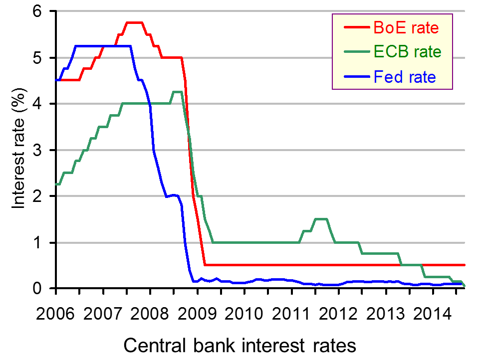
 In March 2009, interest rates in the UK fell to a record low of 0.5%. At the time, it is unlikely that anyone expected that we would still be talking about such low interest rates 6 years later. There has been no movement in the UK rate of interest over the past 6 years and many believe that we are unlikely to see an increase before 2016 or late 2015 at the earliest. With inflation at 0.3%, there is ‘little reason to raise the cost of borrowing’.
The cut in interest rates back in 2009 was in response to the financial crisis and recession. A key instrument of monetary policy, interest rates affect many of the components of aggregate demand. Lower interest rates reduce the cost of borrowing, reduce the return on savings and hence encourage consumption. They can also reduce mortgage repayments and have a role in reducing the exchange rate. All of these factors are crucial for any economic stimulus. As the recovery in the UK took hold, discussions started to focus on when (and not if) interest rates would increase. As the 6 year anniversary occurs, with the MPC keeping rates at 0.5% for March, this question has once again been raised.
Interest rates are used to target inflation and the target in the UK is 2% +/- 1%. With inflation at 0.3% and some predicting that it will turn negative, thanks to such a large fall in oil prices, perhaps the most likely change in interest rates is that they will fall further. A senior Economic Adviser to the EY Item Club commented:
“While the risks of an earlier rate rise have probably increased lately, we still think it most likely that the Bank will wait until February 2016, by which time inflation will be back above 1% and heading towards the 2% target.”

This was echoed by the Chief Economist at the British Chambers of Commerce, who said:
“The strengthening pound against the euro is already posing challenges for many UK exporters and higher interest rates would only make matters worse…Given this background, business confidence will be strengthened if the Monetary Policy Committee (MPC) clearly states that interest rates are likely to stay on hold until at least early 2016.”
Some might question the logic of keeping interest rates so low, given that unemployment is falling and the economy is growing. In such cases, we would normally expect interest rates to increase, especially given how low they are and the fact that it has been 6 years since they went down. However, with oil prices down, inflation has fallen and wage growth does remain relatively weak. Furthermore, there are still some areas within the UK that are still in the recovery process.
The strength of the economy relative to Europe is also putting upward pressure on the pound, which will adversely affect the competitiveness of UK exports. These factors together mean that retaining interest rates at 0.5% received unanimous support amongst the MPC. The only disagreement was on the future direction of interest rates. It is this disagreement that is perhaps what is causing problems, as confirmation of what will happen to interest rates over the rest of 2015 would give greater certainty to an economy. The following articles consider this anniversary.
UK interest rates mark six-year anniversary at record low The Guardian, Angela Monaghan (5/3/15)
UK interest rates mark six years at record low of 0.5% BBC News (5/3/15)
Bank of England keeps interest rates on hold Financial Times, Emily Cadman (5/3/15)
Carney facing seven-year itch as BOE holds rates Bloomberg, Jennifer Ryan (5/3/15)
Bank of England rates have now been on hold six years. Here’s how it has affected you The Telegraph, Szu Ping Chan (5/3/15)
Bank of England keeps rates on hold, six years after crisis cut Reuters (5/3/15)
Bank of England keeps key rate at record low Wall Street Journal, Jason Douglas (5/3/15)
Questions
- By outlining the key components of aggregate demand, explain the mechanisms by which interest rates will affect each component.
- How can inflation rates be affected by interest rates?
- Why is there a debate amongst the MPC as to the future direction of interest rates?
- The Chief Economist at the British Chambers of Commerce has said that the strengthening pound is creating problems in the UK and higher interest rates would make matters worse. Why is this?
- Who would be helped and harmed by a rate rise?
- Consider the main macroeconomic objectives and in each case explain whether economic theory would suggest that interest rates should (a) fall , (b) remain at 0.5% or (c) rise.
 ‘The world is sinking under a sea of debt, private as well as public, and it is increasingly hard to see how this might end, except in some form of mass default.’ So claims the article below by Jeremy Warner. But just how much has debt grown, both public and private? And is it of concern?
The doomsday scenario is that we are heading for another financial crisis as over leveraged banks and governments could not cope with a collapse in confidence. Bank and bond interest rates would soar and debts would be hard to finance. The world could head back into recession as credit became harder and more expensive to obtain. Perhaps, in such a scenario, there would be mass default, by banks and governments alike. This could result in a plunge back into recession.
The more optimistic scenario is that private-sector debt is under control and in many countries is falling (see, for example, chart 1 in the blog Looking once again through Minsky eyes at UK credit numbers for the case of the UK). Even though private-sector debt could rise again as the world economy grows, it would be affordable provided that interest rates remain low and banks continue to build the requisite capital buffers under the Basel III banking regulations.
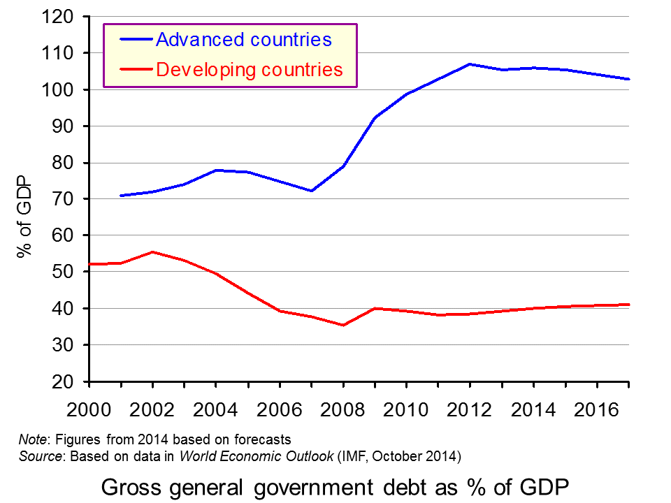
 As far as public-sector debt is concerned, as a percentage of GDP its growth has begun to decline in advanced countries as a whole and, although gently rising in developing and emerging economies as a whole, is relatively low compared with advanced countries (see chart). Of course, there are some countries that still face much larger debts, but in most cases they are manageable and governments have plans to curb them, or at least their growth.
But there have been several warnings from various economists and institutes, as we saw in the blog post, Has the problem of excess global debt been tackled? Not according to latest figures. The question is whether countries can grow their way out of the problem, with a rapidly rising denominator in the debt/GDP ratios.
Only mass default will end the world’s addiction to debt The Telegraph, Jeremy Warner (3/3/15)
Questions
- What would be the impact of several countries defaulting on debt?
- What factors determine the likelihood of sovereign defaults?
- What factors determine the likelihood of bank defaults?
- What is meant by ‘leverage’ in the context of (a) banks; (b) nations?
- What are the Basel III regulations? What impact will they have/are they having on bank leverage?
- Expand on the arguments supporting the doomsday scenario above.
- Expand on the arguments supporting the optimistic scenario above.
- What is the relationship between economic growth and debt?
- Explain how the explosion in global credit might merely be ‘the mirror image of rising output, asset prices and wealth’.
- Is domestic inflation a good answer for a country to the problems of rising debt denominated (a) in the domestic currency; (b) in foreign currencies?
 The first link below is to an excellent article by Noriel Roubini, Professor of Economics at New York University’s Stern School of Business. Roubini was one of the few economists to predict the 2008 financial crisis and subsequent recession. In this article he looks at the current problem of substantial deficiency of demand: in other words, where actual output is well below potential output (a negative output gap). It is no wonder, he argues, that in these circumstances central banks around the world are using unconventional monetary policies, such as virtually zero interest rates and quantitative easing (QE).
He analyses the causes of deficiency of demand, citing banks having to repair their balance sheets, governments seeking to reduce their deficits, attempts by firms to cut costs, effects of previous investment in commodity production and rising inequality.
 The second link is to an article about the prediction by the eminent fund manager, Crispin Odey, that central banks are running out of options and that the problem of over-supply will lead to a global slump and a stock market crash that will be ‘remembered in a hundred years’. Odey, like Roubini, successfully predicted the 2008 financial crisis. Today he argues that the looming ‘down cycle will cause a great deal of damage, precisely because it will happen despite the efforts of central banks to thwart it.’
I’m sorry to post this pessimistic blog and you can find other forecasters who argue that QE by the ECB will be just what is needed to stimulate economic growth in the eurozone and allow it to follow the USA and the UK into recovery. That’s the trouble with economic forecasting. Forecasts can vary enormously depending on assumptions about variables, such as future policy measures, consumer and business confidence, and political events that themselves are extremely hard to predict.
Will central banks continue to deploy QE if the global economy does falter? Will governments heed the advice of the IMF and others to ease up on deficit reduction and engage in a substantial programme of infrastructure investment? Who knows?
An Unconventional Truth Project Syndicate, Nouriel Roubini (1/2/15)
UK fund manager predicts stock market plunge during next recession The Guardian, Julia Kollewe (30/1/15)
Questions
- Explain each of the types of unconventional monetary policy identified by Roubini.
- How has a policy of deleveraging by banks affected the impact of quantitative easing on aggregate demand?
- Assume you predict that global economic growth will increase over the next two years. What reasons might you give for your prediction?
- Why have most commodity prices fallen in recent months? (In the second half of 2014, the IMF all-commodity price index fell by 28%.)
- What is likely to be the impact of falling commodity prices on global demand?
- Some neo-liberal economists had predicted that central bank policies ‘would lead to hyperinflation, the US dollar’s collapse, sky-high gold prices, and the eventual demise of fiat currencies at the hands of digital krypto-currency counterparts’. Why, according to Roubini, did the ‘root of their error lie in their confusion of cause and effect’?
 The eurozone is certainly in trouble and, despite the efforts of world leaders to create confidence, it appears that most announcements are having the opposite effect. The risk of deflation has now emerged to be very true; the powerhouse of Europe ‘needs to do more’ and the euro has fallen following Mario Draghi’s recent comments. So, just how bad are things in the eurozone?
Mario Draghi suggested that as a means of stimulating the eurozone economies, a process of quantitative easing may soon need to begin. However, rather than reassuring investors that action was being taken to improve the economic performance in the region, it appears to have had the opposite effect. Following his comments, the euro fell to its lowest level since the middle of 2010.
Quantitative easing has seen much use in the aftermath of the financial crisis and the aim in the eurozone would be to put a stop to the continuing price decreases. The eurozone has now entered deflation and, while the aim of this economic area has always been low prices, deflation is not good news. The downward pressure on prices has been largely driven by oil prices falling and prices in other areas remaining relatively stable.
Quantitative easing would inject money into the eurozone, thus creating growth (or at least that’s the idea) and pushing up prices. One of Mario Draghi’s comments was:
‘We are making technical preparations to alter the size, pace and composition of our measures in early 2015.’
 So, while it’s not certain that the QE policy will be used, it seems pretty likely, especially as this policy has been floating around for almost a year.
A key question is, will it work? The quantity theory of money does suggest that an increase in the money supply will lead to inflationary pressures, unless its velocity of circulation falls. But will it actually stimulate aggregate demand and economic growth? If there is more money in the banking system and hence more money available for lending then it may well stimulate investment and consumption. However, if consumers and firms are not confident about the effectiveness of the policy or about the future of the economy, then will the fact that more money is available for lending actually encourage them to borrow? In this case will there merely be a fall in the velocity of circulation?
The comments by Mario Draghi have also caused the euro to fall to its lowest level since 2010. The graph included in the CNBC article provides an interesting view of the path of the euro. Marc Chandler, from Brown Brothers Harriman said:
‘I’d say there’s a good chance it [the euro] gets there [parity with the dollar] before the election next November (2016) … We know the Fed’s going to be raising rates sooner or later, and the ECB is going to be easing sooner or later. I just see a steady grind lower.’
The outlook of the euro therefore doesn’t look too good by all accounts. It is now a waiting game to see if the policy of quantitative easing is implemented and whether or not it has the desired effect. The following articles consider this topic.
Eurozone economy slows further BBC News (6/1/15)
Eurozone falls into deflation for first time since October 2009 Financial Times, Claire Jones (7/1/15)
Eurozone officially falls into deflation, piling pressure on ECB The Telegraph, Marion Dakers (7/1/15)
Eurozone consumer prices fall for first time in five years Nasdaq, Brian Blackstone and Paul Hannon (7/1/15)
Draghi comments send euro to lowest level since 2010 BBC News (2/1/15)
Oil slump drags Eurozone into deflation The Guardian, Graeme Wearden (7/1/15)
Eurozone prices fall more than expected in December Reuters (7/1/15)
Eurozone lurches into deflation after oil price crashes Independent, Russell Lynch (7/1/15)
German inflation hits five-year low as Eurozone prepares for QE The Telegraph, Mehreen Khan (5/1/15)
Euro slide could take it to parity with dollar CNBC, Patti Domm (7/1/15)
Questions
- Why is deflation a cause for concern when normally the main problem is inflation that is too high?
- What is the quantity theory of money and how does it suggest an increase in the money supply will affect prices?
- If quantitative easing is implemented, is it likely to have the desired effect? Explain why or why not.
- Why has the euro been affected by Mario Draghi’s comments? Use a diagram to help your explanation.
- How will quantitative easing help to stimulate economic growth across the Eurozone? Are there any other policies that would be effective?
- Oil prices have had a big influence on the deflationary pressures in the Eurozone. If oil prices increased again, would this be sufficient to create inflation?
 The rate of inflation in the UK is measured using the Consumer Prices Index (CPI). This is made up of a basket of goods and the ONS updates this ‘basket’ each year to ensure it is representative of what the average UK household buys. The basket contains 703 items, with 110,000 individual prices collected each month.