 Have you ever woken in the night worrying about your finances? Most of us have. Our overall financial position undoubtedly exerts influence on our spending. Therefore, we would not expect our current spending levels to be entirely determined by our current income level.
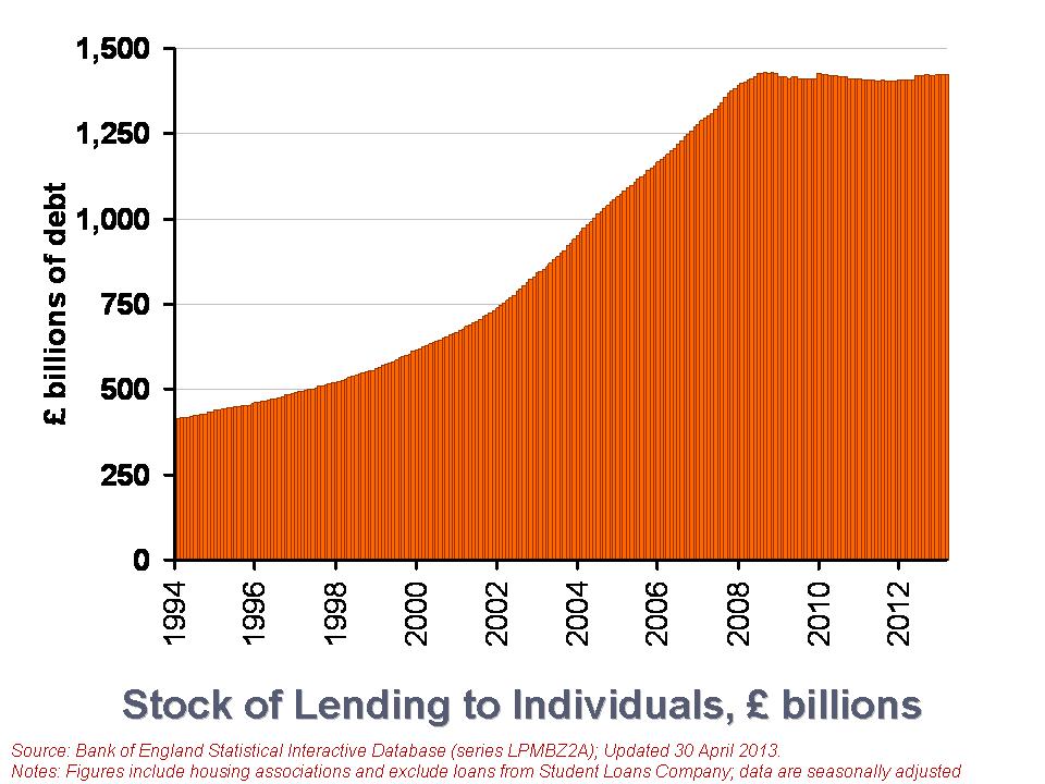
Our financial health, or what economists call our net financial wealth, can be calculated as the difference between our financial assets (savings) and our financial liabilities (debt). Between them, British households have amassed a stock of debt of £1.423 trillion, almost as much as annual GDP, which is around £1.5 trillion (click here to download the PowerPoint.) We look here at recent trends in loans by financial institutions to British households. We consider the effect that the financial crisis and the appetite of individuals for lending is having on the debt numbers.
There are two types of lending to individuals. The first is secured debt and refers to loans against property. In other words, secured debt is just another name for mortgage debt. The second type of lending is referred to as unsecured debt. This covers all other forms of loans involving financial institutions, including overdrafts, outstanding credit card debt and personal loans. The latest figures from the Bank of England’s Money and Credit show that as of 31 March 2013, the stock of debt owed by individuals in the UK (excluding loans involving the Student Loans Company) was £1.423 trillion. Of this, £1.265 trillion was secured debt while the remaining £157.593 billion was unsecured debt. From this, we can the significance of secured debt. It comprises 89 per cent of the stock of outstanding debt to individuals. The remaining 11 per cent is unsecured debt.
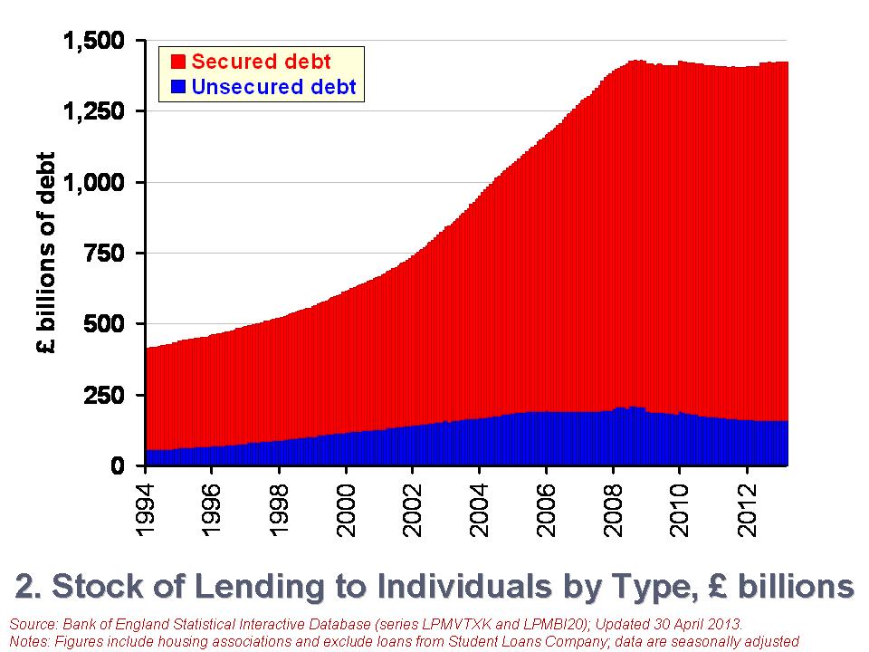 The second chart shows the growth in the stock of debt owed by individuals (click here to download the PowerPoint chart). In January 1994 the stock of secured debt stood at £358.75 billion and the stock of unsecured debt at £53.774 billion. 87 per cent of debt then was secured debt and, hence, little different to today. The total stock of debt has grown by 246 per cent between January 1994 and March 2013. Unsecured debt has grown by 197 per cent while secured debt has grown by 253 per cent.
However, more recently we see a different picture evolving, more especially in unsecured debt. Since October 2008, the monthly series of the stock of unsecured debt has fallen on 47 occasions and risen on only 7 occasions. In contrast, the stock of secured debt has fallen on only 12 occasions and often by very small amounts. Consequently, the stock of unsecured debt has fallen by 23.2 per cent between October 2008 and March 2013. In contrast, the stock of secured debt has risen by 3.5 per cent. The total stock of debt has fallen by 0.4 per cent over this period.
Another way of looking at changes in the stock of debt is to focus on what are known as net lending figures. This is simply the difference between the gross amount lent in a period and the amount repaid. The net lending figures will, of course, mirror changes in the total debt stock closely. For example, a negative net lending figure means that repayments are greater than gross lending. This will translate into a fall in the stock of debt. However, some difference occurs when debts have to be written off and not repaid.
 The third chart shows net lending figures since January 1994 (click here to download the PowerPoint chart). The chart captures the financial crisis very nicely. We can readily see a collapse of net lending by financial institutions to households. It is, of course, difficult to disentangle from the net lending figures those changes driven by changes in the supply of credit by financial institutions and those from changes in the demand for credit by individuals. But, we can be certain that the enormous change in credit levels in 2008 were driven by a massive reduction in the provision of credit.
To further put the net lending figures into context, consider the following numbers. Over the period from January 2000 to December 2007, the average amount of monthly net lending was £8.52 billion. In contrast, since January 2009 the average amount of net lending has been £691 million per month. Consider too the composition of this net lending. The average amount of net secured lending between January 2000 and December 2007 was £7.13 billion per month compared with £1.39 billion for net unsecured lending. Since January 2009, monthly net secured lending has averaged only £756 million while monthly net unsecured lending has averaged -£64.4 million. Therefore, repayments of unsecured lending have outstripped gross unsecured lending.
While further analysis is needed to fully understand the drivers of the net lending figures, it is, nonetheless, clear that the financial system of 2013 is very different to that prior to the financial crisis. This change is affecting the growth of the debt stock of households. This is most obviously the case with unsecured debt. The stock of unsecured debt in March 2013 is 24 per cent smaller than in its peak in September 2008. It is now the job of economists to understand the implications of how the new emerging patterns in household debt will affect our behaviour and overall economic activity.
Data
Money and Credit – March 2013 Bank of England
Statistical Interactive Database Bank of England
Articles
Bank of England extends lending scheme Financial Times, Chris Giles (24/4/13)
Markets insight: Europe and the US lines cross on household debt ratio Financial Times, Gillian Tett (9/5/13)
British families are the deepest in debt Telegraph, James Kirkup (14/5/13)
Total property debt of British households stands as £848bn Guardian, Hilary Osborne (13/5/13)
Household finances reach best level in three years – but are stuck below pre-crisis levels This is Money.co.uk, Matt West (17/5/13)
ONS says Welsh households have lowest debts in Britain BBC News (28/1/13)
Questions
- Outline the ways in which the financial system could impact on the spending behaviour of households.
- Why might the current level of income not always be the main determinant of a household’s spending?
- How might uncertainty affect spending and saving by households?
- Explain what you understand by net lending to individuals. How does net lending to individuals affect stocks of debt?
- Outline the main patterns seen in the stock of household debt over the past decade and discuss what you consider to be the principal reasons for these patterns.
- If you were updating this blog in a year’s time, how different would you expect the charts to look?
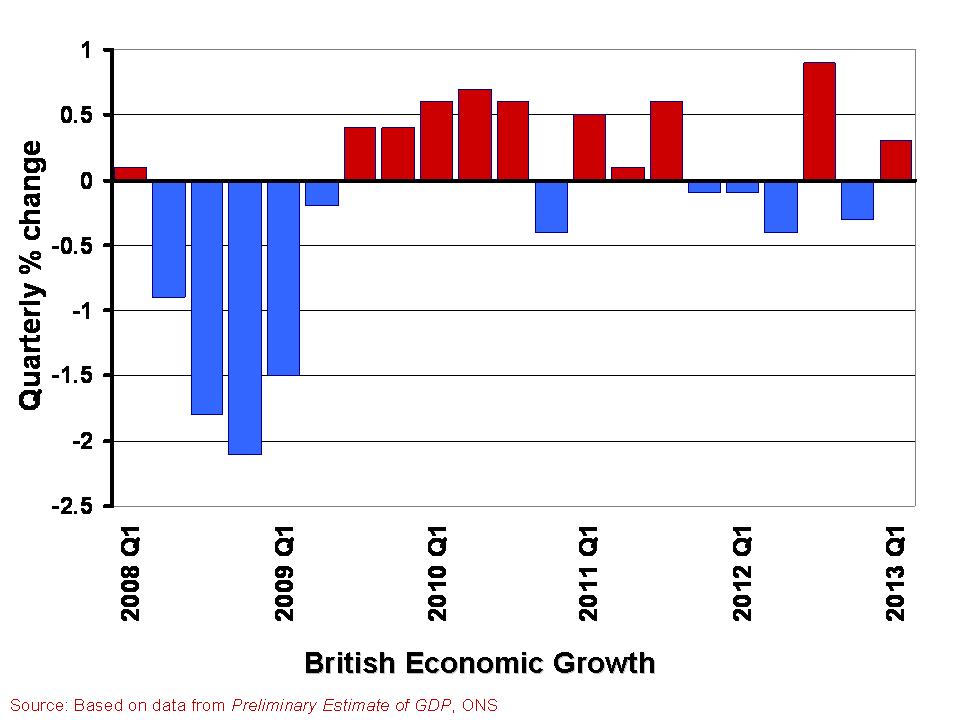
 In The global economy we note the mixed picture contained within the latest British growth numbers. With the first estimate of growth for Q1 of 2013 pointing to an increase in real GDP of 0.3 per cent, the UK economy appears to have missed the ignominy of a triple dip recession. However, the overall economy remains fragile with different sectors of the economy performing quite differently.
A patchy picture is perhaps the fairest assessment. This helps to explain the quite different perceptions amongst economists, business people, journalists and the wider public about the current state of the economy. Here we consider in a little more detail the growth numbers for the UK from the latest preliminary GDP estimates. (Click here for a PowerPoint of the chart).
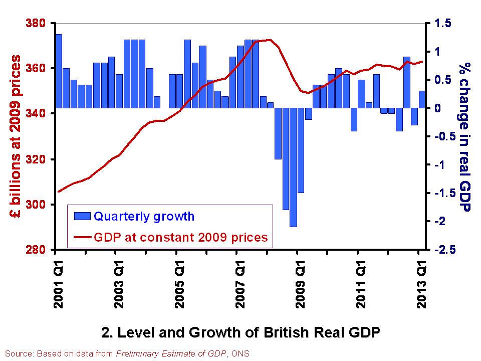
 The British economy is thought to have grown by 0.3 per cent in the first quarter of 2013. This follows a contraction of 0.3 per cent in the final quarter of 2012. Compared with the first quarter of 2012, the output of the British economy was 0.6 per cent higher. However, as Chart 2 helps to show, the British economy has some way to go before it returns to the levels seen prior to the financial crisis. Real GDP peaked in the first quarter of 2008 when GDP at 2009 prices was estimated at £372.7 billion. In the first quarter of 2013, GDP at constant 2009 prices is estimated at £362.9 billion. This means that the economy is still 2.6 per cent smaller than its 2008-peak. Click here for a PowerPoint of the chart.
The patchy nature of British growth is illustrated nicely by the contrasting rates of growth across the different industrial sectors in the first quarter of the year. While service sector output rose by 0.6 per cent, output across the production industries rose by only 0.2 per cent and agricultural output declined by 3.7 per cent. Within the production industries, mining and quarrying output rose by 3.2 per cent, but manufacturing output shrunk by 0.3 per cent and construction output shrunk by 2.5 per cent.
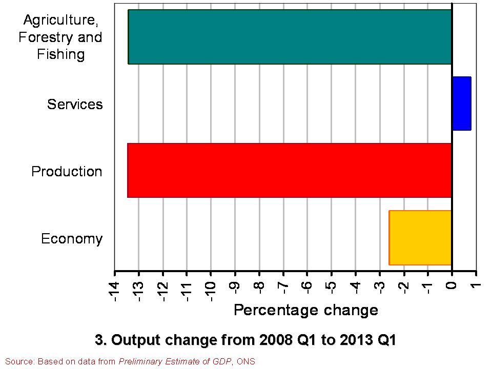
 Chart 3 compares the output of agriculture, the production industries and the service sector between the first quarter of 2008 and the first quarter of 2013. (Click here for a PowerPoint of the Chart). It shows the dramatically different experience of the service sector compared with agriculture and the production industries. While output in the service sector is now 0.8 per cent higher, output across agriculture and the production industries is almost 13.5 per cent lower. Within the production industries, output in mining and quarrying is 38 per cent lower, in the construction sector 19 per cent lower and 10 per cent lower in manufacturing. It is perhaps not surprising then that we get such different messages about the state of the economy. The devil really is in the detail.
Data
Preliminary Estimate of GDP – Time Series Dataset Q1 2013 Office for National Statistics
Statistical Bulletin: Gross Domestic Product Preliminary Estimate Q1 2013 Office for National Statistics
Articles
UK avoids triple-dip recession with better-than-expected 0.3% GDP growth Guardian, Heather Stewart (25/4/13)
UK economy shows 0.3% growth Financial Times, Claire Jones (25/4/13)
UK avoids triple-dip recession with 0.3pc GDP growth Telegraph, Szu Ping Chan (25/4/13)
Osborne claims UK economy is ‘healing’ Financial Times, George Parker and Claire Jones (25/4/13)
UK narrowly escapes triple-dip recession as GDP figures show 0.3% growth in first three months of year Independent, Ben Chu (25/4/13)
UK economy avoids triple-dip recession BBC News (25/4/13)
Questions
- What is the difference between nominal and real GDP? Which of these helps to track changes in economic output?
- How would we identify a recession in either of the first two charts?
- What is a double-dip recession? What is a triple-dip recession?
- The UK economy in Q1 2013 was 2.6 per cent smaller than in Q1 2008. What factors do you think help explain why after 5 years UK real GDP is still lower?
- Why if output in the production and agricultural sectors is 13.5 per cent lower in Q1 2013 compared to Q1 2008 is the economy’s total output only 2.6 per cent lower?
- Economic growth rates fluctuate quite significantly. Can economic theory help to explain why this is the case?
 The UK economy shrank by 0.3 per cent in the final quarter of 2012. A significant factor in the fall was the UK’s balance of trade, which measures the difference between the value of goods and services exported and those imported. The balance of trade deficit rose in 2012 to £36.2 billion or 2.3 per cent of GDP. If we measure only the balance in goods, the deficit was an eye-watering £106.3 billion – a record high for the UK. The balance of trade remains a drag on British growth.
The balance of payments is a record all the flows of money between a country’s residents and the rest of the world. Inflows represent credits on the balance of payments while outflows represent debits. We focus here on perhaps the best-known component of the overall balance of payments: the current account. The current account comprises three separate accounts. First, there is the balance of trade (in goods and services). It records payments for exports (X) and imports (M). Second, there is net income flows. Net income flows are flows of money between countries in the form of wages, profits and interest. Finally, there is current transfers. Current transfers are transfers of money between countries for the purpose of consumption, including, for instance, a transfer payment by the British government to overseas organisations.

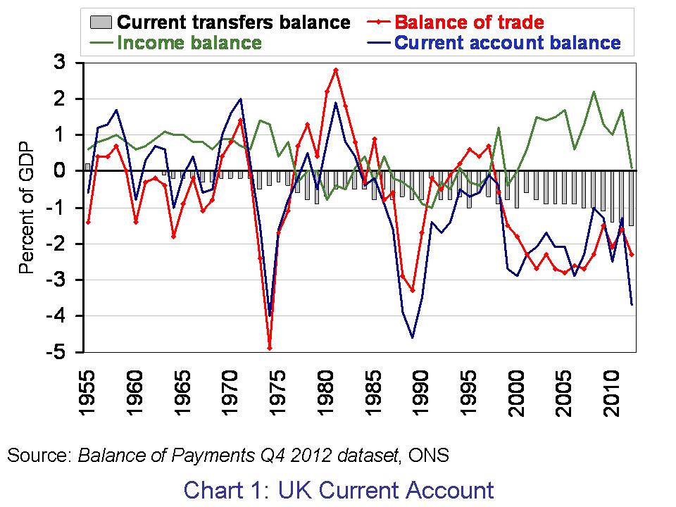
Chart 1 presents the UK’s current account. It is based on data from Balance of Payments Q4 2012 dataset published by the Office for National Statistics. The current account deficit in 2012 was £57.7 billion (up from a deficit of £20.2 billion in 2011). This is the equivalent to 3.7 per cent of GDP (up from a deficit of 1.3 per cent in 2011) and the highest current account deficit since 1989 when it reached 4.6 per cent of GDP. Back in 1989, the UK economy was growing by 2.6 per cent having grown by 5.6 per cent in 1988. In 2012, the UK economy grew by just 0.3 per cent following growth of 1.0 per cent in 2011. The mean average rate growth of the UK economy since 1950 is 2.6 per cent. (Click here for a PowerPoint of the chart.)
The net income balance, which while remaining in surplus, worsened significantly. From a surplus of £25.9 billion (1.7 per cent of GDP) in 2011, it fell to a surplus of just £1.6 billion (0.1 per cent of GDP) in 2012. This is largely attributable to a decline in the surplus of direct investment income and, in particular, the earnings abroad of non-bank private corporations. Meanwhile, the deficit on current transfers in 2012 was £23.1 billion, up from £22.0 billion in 2011. This is the highest on record. The current transfers deficit with EU institutions rose in 2012 to £10.5 billion, up by £1 billion on 2011.

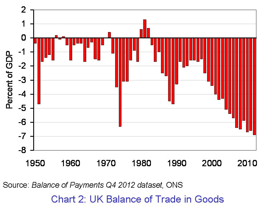
The balance of trade deficit too worsened in 2012. The deficit rose from £24.1 billion in 2011 (1.6 per cent of GDP) to £36.2 billion in 2012 (2.3 per cent of GDP). The persistent balance of trade deficit continues to occur despite a persistent surplus on the trade in services. In 2012, the balance of trade surplus in services was £70 billion (4.6 per cent of GDP). As Chart 2 shows, the UK now has a record deficit in the balance of trade in goods. This was down from £76.1 billion in 2011 (5 per cent of GDP). (Click here for a PowerPoint of the chart.)
The last time the UK ran a surplus on the balance of trade in goods was back in 1982. Since 1983, the average UK balance of trade deficit in goods has been the equivalent of 3.67 per cent of GDP. Over the same period, the UK has run a balance of trade surplus in services of 2.37 per cent. The figures point very clearly to the work to be done if we are to see a rebalancing of the industrial composition of the UK economy.
Data
Statistical Bulletin: Balance of Payments, Q4 2012 ONS, 27 March 2013
Balance of Payments, Q4 2012 dataset ONS, 27 March 2013
Articles
Fasten your seat belts – a balance of payments crisis looms Telegraph, Jeremy Warner 27/3/13)
Britain, the world and the end of the free lunch? BBC News, Stephanie Flanders (27/3/13)
March of the makers? Balance of payments figures make dismal reading Guardian, Larry Elliott (27/3/13)
Britain’s current account deficit at worst level since 1989 Guardian, Phillip Inman (27/3/13)
Pound fears as current account deficit jumps to near 25 per cent high Telegraph, Szu Ping Chan (27/3/13)
Current account deficit highest since 1989 Financial Times, Claire Jones (27/3/13)
Questions
- What does the balance of payments measure?
- In explaining what the current account of the balance of payments measures, distinguish between the three principal accounts comprising the current account.
- Why might we expect the current account to worsen when economic growth is strongest and improve when economic growth is weakest? Is this what we observe in the UK?
- The UK has experienced a persistent current account deficit since the early 1980s. What might be some of the contributory factors to this persistent deficit?
- How might we expect a country’s exchange rate to be affected by movements on the balance of payments?
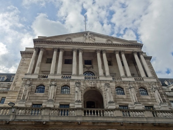
 The Bank of England was granted independence to set interest rates back in 1997. This is known as instrument independence. However, the remit is set by the government and so it does not have goal independence. Amongst the policy announcements on Budget day (Wed 20 March), the government detailed amendments to the Bank’s remit. In particular, the remit now more explicitly acknowledges that, in exceptional circumstances, the Bank might need to pay more attention to output variability.
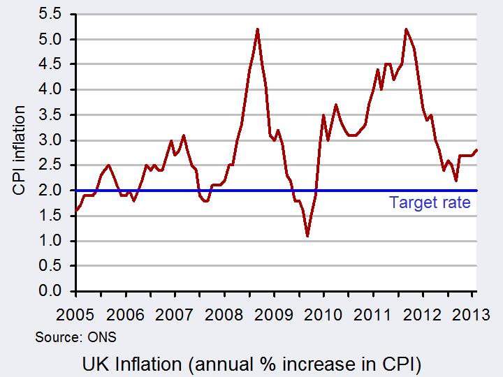
Despite the amendments to its remit, the Bank of England continues to have a forward-looking operational inflation rate target of 2 per cent (with a range of tolerance of up to 1 percentage point). The MPC therefore sets the Bank Rate, i.e. the rate at which it engages in short-term lending to financial institutions, to affect general interest rates in the economy. In turn, the level of interest rates is assumed to affect the level of aggregate demand and, hence, the rate of demand-pull inflation as well as inflation rate expectations.
A key economic benefit of delegating interest rate decisions to the Monetary Policy Committee (MPC) is thought to be lower inflation rate expectations. By granting the Bank of England operational or instrument independence, inflation announcements have a credibility that they would not if monetary policy was under the control of elected politicians. So why change the inflation rate remit?
 The government remains of the view that inflation rate targeting has served the UK well, despite inflation being persistently above target for the past three years (see chart: click here for a PowerPoint). However, it has sought to clarify how the Bank of England might be expected to behave in exceptional circumstances when the economy is buffeted by shocks and disturbances, such as those that it has faced following the financial crisis of the late 2000s. The government argues that in such circumstances the output volatility that could result by ensuring that inflation remains on target could be undesirable. Therefore, the MPC should give consideration to the volatility of output that targeting inflation would cause in such exceptional circumstances.
The amended remit says that in setting monetary policy the MPC should communicate to the public the trade-offs that are inherent in meeting its forward-looking inflation rate target. Therefore, during exceptional times, the Bank may communicate that the volatility of output resulting from returning inflation to target would be so large that it is prepared to keep monetary policy looser than it otherwise would. This could mean indicating a time-frame over which it would be expected to keep interest rates lower than otherwise. By communicating this, it would in effect be looking to affect peoples’ expectations and, importantly, their behaviour. The prospect of prolonged low interest rates, such as those currently being experienced, might encourage greater expenditure, especially as a result of lower borrowing costs – though of course this is not guaranteed!
 The Governor will continue to write an open letter to the Chancellor of the Exchequer if inflation moves away from the target by more than 1 percentage point in either direction. However, in a change to the previous remit, this will be done in conjunction with the minutes of the MPC meeting that follow the publication of the official inflation figures by the Office for National Statistics. By publishing the letter alongside the minutes, it gives the MPC more time to consider its strategy and to give due consideration to the trade-offs in returning inflation to the target. If inflation remains more than 1 percentage point above or below the target the Governor will need to write a further letter after three months. This letter would be alongside the minutes of the third subsequent meeting of the MPC.
Some commentators argue that the amended remit is merely a reflection of the current reality. In other words, the remit is being rewritten in a way which reflects how the MPC is currently making its interest rate decisions. Others are concerned that what was a simple and clear objective is now not the case and that this may have implications for the credibility of monetary policy. Whatever the rights and wrongs, Wednesday’s announcement was an important development in the history of central bank independence in the UK.
Documents
Remit for the Monetary Policy Committee Bank of England, March 2013
Governor Response to the remit for the Monetary Policy Committee Bank of England , March 2013
Articles
Bank of England handed new remit in Osbourne’s budget Guardian, Josephine Moulds (20/3/13)
Budget: Changing the Bank of England Remit Sky News, Ed Conway (20/3/13)
Budget 2013: Bank of England’s monetary policy remit changed Telegraph, Angela Monaghan (20/3/13)
King warns against ‘major change’ to Bank’s remit ITV News (15/3/13)
Chancellor adjusts Bank of England inflation remit Financial Times, Nick Reeve (20/3/13)
Budget 2013: Bank of England gets new orders BBC News (20/3/13)
Questions
- Why would monetary policy be expected to be more credible under an independent central bank?
- How might a lack of credibility over monetary policy affect the economy’s rate of inflation?
- Outline the advantages and disadvantages of the changes to the Bank of England’s remit.
- Central bank independence constrains discretion over monetary policy. Should governments constrain their discretion over fiscal policy? What are the advantages and disadvantages?
- Explain how the MPC tries to affect the rate of inflation through changes in the Bank Rate?
 In light of the recent sharp decline in the British pound, this blog is an updated version of Appreciating a depreciating pound which was published in early December 2012. The significance of the depreciation should be seen in the context of the UK as an island-economy which makes trade an important determinant of our economic performance.
The competitiveness of our exports is, in part, affected by the exchange rate. Floating exchange rates are notoriously volatile. However, since the autumn of 2007 we have observed a significant depreciation of the UK exchange rate – a depreciation that seems to have found new momentum of late. A depreciation helps to make our exports more competitive abroad which might help to compensate for weak demand here in the UK.
Rather than look at the British pound (or any currency) against the many foreign currencies separately we can look at the average exchange rate against a whole bundle of currencies. The average rate is calculated by weighting the individual exchange rates by the amount of trade between Britain and the other countries. This trade-weighted exchange rate is known as the effective exchange rate.

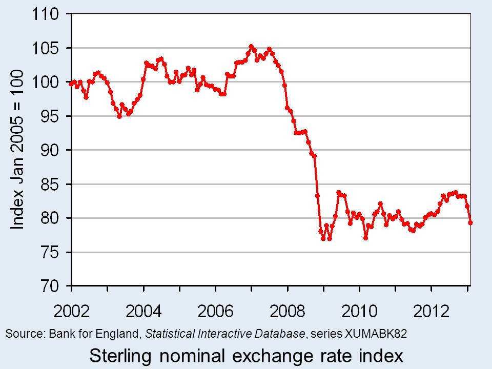
The chart shows the nominal (actual) effective exchange rate for the British pound since 2002. The chart shows clearly how from the autumn of 2007 the effective exchange rate began to fall sharply. Over the period from September 2007 to January 2009, figures from the Bank of England show that the nominal effective exchange rate fell by 25.3 per cent. In simple terms, the British pound depreciated by close to one-quarter. (Click here for a PowerPoint of the chart.)
If we move the clock forward, we observe an appreciation of the British pound between July 2011 (when its value was only 1.6 per cent higher than in January 2009) and September 2012. Over this period, the British pound appreciated by 7.2 per cent. Its value remained relatively stable through much of the remainder of last year. However, we appear to be on another downward path. If we compare the average value in February 2013 with the ‘high’ back in September 2012 we observe a depreciation of 5.4 per cent.
The British pound continues on its roller-coaster ride. Most commentators expect the British pound to fall further. Some see this as an important ingredient for a revival in British economic fortunes. If we compare September 2007 with February 2013, we find that the nominal effective exchange rate for the British pound is 23 per cent lower. This constitutes a major competitive boost for our exporters. However, an important question is whether there is a demand for these goods and services abroad however more attractive the depreciation makes them.
Data
Statistical Interactive Database – interest and exchange rate rates data Bank of England
BIS effective exchange rate indices Bank for International Settlements
Articles
Pound depreciates Vs dollar to lowest level since Aug 16 Bloomberg, Emma Charlton (5/2/13)
Pound advances against euro on Italy speculation; Gilts decline Bloomberg, Lucy Meakin and David Goodman (4/3/13)
Pounding of sterling risks a currency war Scotland on Sunday, Bill Jamieson (17/2/13)
Credit ratings, the pound, currency movements and you BBC News, Kevin Peachey (25/2/13)
The Bank of England can’t just go on doing down the pound Telegraph, Jeremy Warner (21/2/13)
 Sterling will continue to go down BBC News, Jim Rogers (25/2/13)
Questions
- Explain how the foreign demand for goods and assets generates a demand for British pounds. How will this demand be affected by the foreign currency price of the British pound, i.e. the number of foreign currency units per £1?
- Explain how the demand by British residents for foreign goods and assets generates a supply of British pounds. How will this supply be affected by the foreign currency price of the British pound, i.e. the number of foreign currency units per £1?
- What factors are likely to shift the demand and supply curves for British pounds on the foreign exchange markets?
- Illustrate the effect of a decrease in the demand for British goods and assets on the exchange rate (i.e. the foreign currency price of the British pound) using a demand-supply diagram.
- What is the difference between a nominal and a real effective exchange rate? Which of these is a better indicator of the competitiveness of our country’s exports
- What factors are likely to have caused the depreciation of the British pound in 2013?
 Have you ever woken in the night worrying about your finances? Most of us have. Our overall financial position undoubtedly exerts influence on our spending. Therefore, we would not expect our current spending levels to be entirely determined by our current income level.
 The second chart shows the growth in the stock of debt owed by individuals (click here to download the PowerPoint chart). In January 1994 the stock of secured debt stood at £358.75 billion and the stock of unsecured debt at £53.774 billion. 87 per cent of debt then was secured debt and, hence, little different to today. The total stock of debt has grown by 246 per cent between January 1994 and March 2013. Unsecured debt has grown by 197 per cent while secured debt has grown by 253 per cent.
  The third chart shows net lending figures since January 1994 (click here to download the PowerPoint chart). The chart captures the financial crisis very nicely. We can readily see a collapse of net lending by financial institutions to households. It is, of course, difficult to disentangle from the net lending figures those changes driven by changes in the supply of credit by financial institutions and those from changes in the demand for credit by individuals. But, we can be certain that the enormous change in credit levels in 2008 were driven by a massive reduction in the provision of credit.