 How much does the UK spend on welfare? This is a highly charged political question, with some arguing that benefit claimants are putting great demands on ‘hard-working tax payers’. According to information being sent by the government to all 24 million income tax payers in the UK, the figure of £168bn being spent on welfare is around 24.5% of public spending. But what is included in the total? Before you read on, try writing down the categories of government expenditure included under the heading ‘welfare’.
The heading does not include spending on certain parts of the ‘welfare state’, such as health and education. These are services, the production of which contributes to GDP. The category ‘welfare’ does not include expenditure on produced services, but rather transfer payments. The way the government is using the term, it does not include state pensions either, which account for 11.6% of public expenditure. So does the 24.5% largely consist of payments to the unemployed? The answer is no.
The category ‘welfare’ as used by the government includes the following elements. The percentages are of total managed expenditure (i.e. government spending).
| • | Public service pensions, paid to retired public-sector employees, such as teachers, police officers, doctors and nurses | (2.6%) |
| • | Other support for the elderly, including pension credit, winter fuel allowance, bus passes, etc. | (1.5%) |
| • | Sickness and disability benefits, including long-term care for the elderly, sick and disabled | (6.6%) |
| • | Support for families and children, such as child benefit and child tax credits | (3.4%) |
| • | Social exclusion, including income support and housing benefit | (7.8%) |
| • | Unemployment benefits, including Job Seekers Allowance | (0.7%) |
| • | Other | (1.9%) |
Lumping all these together under a single heading ‘welfare’ can be highly misleading, as many people have strongly held preconceptions about who gets welfare. In fact the term is used pejoratively by many who resent their taxes being given to those who do not work.
 But, as you can see from the figures, only a small proportion goes to the unemployed, the majority of whom (around 65%) are unemployed for less than a year as they move between jobs (see). The bulk of benefits goes to children, the retired and the working poor.
Another preconception is that much of welfare spending goes to fraudulent claimants. But, as the article by Professor Hills states:
Just 0.7% of all benefits was over-paid as the result of fraud, less than the amount underpaid as a result of official error. For the main benefit for unemployed people, Jobseeker’s Allowance, estimated fraud was 2.9%, or an annual total of £150million.
It is also important to consider people’s life cycle. The same people receive benefits (via their parents or guardians) as children, pay taxes when they work and receive benefits when they retire or fall sick. Thus you might be a net contributor to public finances at one time and a net beneficiary at another. For example, the majority of pensioners were net contributors when they were younger and are now mainly net beneficiaries. Many unemployed people who rely on benefits now were net contributors when they had a job.
The message is that you should be careful when interpreting statistics, even if these statistics are factually accurate. How figures are grouped together and the labels put on them can give a totally misleading impression. And politicians are always keen to ‘spin’ statistics to their advantage – whether in government or opposition.
Webcast
 Annual Tax Summary: TUC and MPs on spending information BBC Daily Politics, Jo Coburn (3/11/14)
Articles
Osborne’s tax summary dismissed as propaganda by the TU BBC News (3/11/14)
The truth about welfare spending: Facts or propaganda? BBC News, Brian Milligan (4/11/14)
Its Cost Is Just One of the Myths Around ‘Welfare’ Huffington Post, John Hills (12/11/14)
Welfare spending summary criticised Express & Star (4/11/14)
Data and Reports
Public Expenditure: Statistical Analyses (PESA) 2014 HM Treasury (see Table 5.2)
DWP annual report and accounts 2013 to 2014 Department of Work and Pensions (see Table 2)
Welfare trends report – October 2014 Office for Budget Responsibility
What is welfare spending? Institute for Fiscal Studies (4/11/14)
Questions
- What benefits do you receive? How would you expect this to change over your lifetime?
- What are the arguments for (a) reducing and (b) increasing welfare payments. In each case, under which categories of welfare would you decrease or increase the level of benefits?
- Referring to Table 5.2 in the PESA data below (the table used for the government’s calculations), which of the categories would be classified as expenditure on goods and services and which as transfer payments?
- Assess the arguments of the IFS for the reclassification of the categories of ‘welfare’ payments.
- Referring to the pie chart above, also in the BBC video and articles and Table 5.2 in the PESA data, assess the arguments about the size of the UK’s contributions to the EU budget.
 Life expectancy is increasing across the world and the latest set of figures from the Office for National Statistics show that in the UK it has passed 79 for boys born in 2010–12, and 82 for girls born then. In fact the prediction is that over a third of babies born in 2013 will live to more than 100. The data throws up some interesting questions. How well prepared are we for lives that last this long? And how evenly distributed is this increase in life expectancy? Pensions’ minister, Steve Webb, has called for better information on life expectancy to be shared. How would this impact on our decision making?
It seems reasonable to think that increasing life expectancy must be good news. And of course, for individuals it can be. In 1951 the average man retiring at 65, in England and Wales, could expect to live and draw a pension for another 12.1 years. By 2014 this had risen to 22 years.
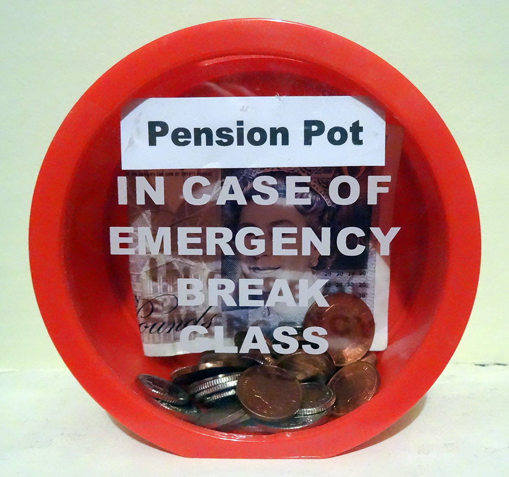 But while we can look forward to longer life, for the government, it presents some challenges The first is that we just don’t save enough for our old age. This seems to be partly because we find it hard to make decisions that will have an impact so far in the future. There are a number of measures that have been put in place to encourage us to save more, including auto-enrolment into company pension schemes. This is being rolled out across businesses over the next three years. In the 2014 Budget, the Chancellor announced that people reaching retirement age will be able to draw all their pension as a cash lump sum, rather than having to take it as a regular income.
Another concern for government is the variations that we find in life expectancy across the UK. The 2014 ONS data identified that life expectancy for men born in Glasgow in 2012 is 72.6, in East Dorset it is 82.9. 25% of those in Glasgow are not expected to live to 65. The gap in years of good health is even greater. This presents governments with a long-term problem. How do they achieve greater equality in this instance? Do they focus resources on the areas that need it most? Do they legislate to address behaviour? Or do they rely on the provision of good advice – on diet, exercise and other factors?
Information has a role to play in both areas identified above. In April 2014, Steve Webb, suggested that in order to make good decisions at the point of retirement, people need to understand more about what lies ahead. He said:
People tend to underestimate how long they’re likely to live, so we’re talking about averages, something very broad-brush. Based on your gender, based on your age, perhaps asking one or two basic questions, like whether you’ve smoked or not, you can tell somebody that they might, on average, live for another 20 years or so.
This suggestion has led to some concerns being expressed at what appears to be an over-simplistic approach. Estimates can only be based on a mix of averages modified by individual information. Would the projections be shared with pension providers? What would you do if you exceeded your forecast life expectancy – by a long way – and had spent all your money? Could you sue someone?
Will your pension pot last as long as you will? The Telegraph, Dan Hyde and Richard Dyson (23/4/2014)
Scientists invent death test that will tell us how long we have to live Metro (11/8/13)
Games host Glasgow has worst life expectancy in the UK The Guardian, Caroline Davies (16/4/2014)
Pensioners could get life expectancy guidance BBC News Politics (17/4/14)
ONS reveals gaps in life expectancy across the UK FT Adviser Pensions, Kevin White (23/4/14)
Health care aid for developing countries boosts life expectancy Health Canal, Ruth Ann Richter (22/4/14)
A third of babies born this year will live to 100 This is Money.co.uk, Adam Uren (11/12/13)
Questions
- Thinking about the UK, what are the factors that might explain variations in life expectancy across different regions? How might the government address these differences? Why would they want to do so?
- Do the same factors explain variations between countries? Who can address these differences? Who would want to do so?
- If you could have a reasonable prediction of your life expectancy at 65, would you want it? How would your behaviour change if you were predicted a longer than average life expectancy? How would it change if you were predicted a shorter than average life expectancy?
- If you could have an accurate prediction of your life expectancy at 18, how would your answers differ? If this were possible, would it present any problems?
 Politicians often make use of economic statistics to promote their point of view. A good example is a claim made by the UK Prime Minister on 23 January 2014. According to the latest statistics, he said, most British workers have seen their take-home pay rise in real terms. The Labour party countered this by arguing that incomes are not keeping up with prices.
So who is right? Studying economics and being familiar with analysing economic data should help you answer this question. Not surprisingly, the answer depends on just how you define the issue and what datasets you use.
The Prime Minister was referring to National Statistics’ Annual Survey of Hours and Earnings (ASHE). This shows that in April 2013 median gross weekly earnings for full-time employees were £517.5, up 2.25% from £506.10 in 2012, and mean gross weekly earnings for full-time employees were £620.30, up 2.06% from £607.80 in 2012 (see Table 1.1a in the dataset). CPI inflation over this period was 2.4%, representing a real fall in median gross weekly earnings of 0.15% and mean gross weekly earnings of 0.34%.
But when adjustments are made for increases in personal income tax allowances, then, according to the government, except for the richest 10% of the working population, people had an average increase in real take-home pay of 1.1%.
But does this paint the complete picture? Critics of the government’s claim that people are ‘better off’, make the following points.
First, the ASHE dataset is for the year ending April 2013. The ONS publishes other datasets that show that real wages have fallen faster since then. The Earnings and Working Hours datasets, published monthly, currently go up to November 2013.  The chart shows real wages from January 2005 to November 2013 (with CPI = 100 in December 2013). You can see that the downward trend resumed after mid 2013. In the year to November 2013, nominal average weekly earnings rose by 0.9%, while CPI inflation was 2.1%. Thus real weekly earnings fell by 1.2% over the period (click here for a PowerPoint of the chart).
Second, there is the question of whether CPI or RPI inflation should be used in calculating real wages. RPI inflation was 2.9% (compared to CPI inflation of 2.4%) in the year to April 2013. The chart shows weekly earnings adjusted for both CPI and RPI.
Third, if, instead of looking at gross real wages, the effect of income tax and national insurance changes are taken into account, then benefit changes ought also to be taken into account. Some benefits, such as tax credits and child benefit were cut in the year to April 2013.
Fourth, looking at just one year (and not even the latest 12 months) gives a very partial picture. It is better to look at a longer period and see what the trends are. The chart shows the period from 2005. Real wages (CPI adjusted) are 8.0% lower than at the peak (at the beginning of 2009) and 5.0% lower than at the time of the election in 2010. The differences are even greater if RPI-adjusted wages are used.
But even if the claim that real incomes are rising is open to a number of objections, it may be that as the recovery begins to gather pace, real incomes will indeed begin to rise. But to assess whether this is so will require a careful analysis of the statistics when they become available.
Articles
UK pay rising in real terms, says coalition BBC News (24/1/14)
Are we really any better off than we were? BBC News, Brian Milligan (24/1/14)
Government take-home pay figures ‘perfectly sensible’ BBC Today Programme, Paul Johnson (24/1/14)
Take-Home Pay ‘Rising Faster Than Prices’ Sky News, Darren McCaffrey (25/1/14)
David Cameron hails the start of ‘recovery for all’ The Telegraph, Peter Dominiczak (23/1/14)
Is take-home pay improving? The answer is anything but simple The Guardian, Phillip Inman and Katie Allen (24/1/14)
Cameron’s ‘good news’ about rising incomes is misleading says Labour The Guardian, Rowena Mason (24/1/14)
The Tories’ claim that living standards have risen is nonsense on stilts New Statesman, George Eaton (24/1/14)
FactCheck: Conservative claims on rising living standards Channel 4 News, Patrick Worrall (25/1/14)
Living standards squeeze continues in UK, says IFS BBC News (31/1/14)
Richest have seen biggest cash income squeeze but poorest have faced higher inflation IFS Press Release (31/1/14)
Data
Average Weekly Earnings dataset ONS (22/1/14)
Annual Survey of Hours and Earnings, 2013 Provisional Results ONS (12/12/13)
Consumer Price Inflation, December 2013 ONS (14/1/14)
Inequality and Poverty Spreadsheet Institute for Fiscal Studies
An Examination of Falling Real Wages, 2010 to 2013 ONS (31/1/14)
Questions
- Why are mean weekly earnings higher than median weekly earnings?
- Explain the difference between RPI and CPI. Which is the more appropriate index for determining changes in real incomes?
- Find out what benefit changes have taken place over the past two years and how they have affected household incomes.
- How have gross weekly earnings changed for the different income groups? (The ASHE gives figures for decile groups.)
- Which is better for assessing changes in incomes: weekly earnings or hourly earnings?
- How would you define a change in living standards? What data would you need to be able to assess whether living standards have increased or decreased?
Economic assessment of real-world issues relies heavily on data. It is the same with economic policy recommendations. Both public- and private-sector organisations gather data, which are then used for analysis, often presented in a report. These reports are then often used as the basis for policy, whether by the government, local authorities or the private sector. Sometimes the data are those collected by national statistical agencies, such as the Office for National Statistics (ONS) in the UK; sometimes they are collected by private agencies; sometimes by individual researchers.
Clearly the analysis and the suitability of any policy recommendations depend on the quality of the data. But how much can we rely on the data? A problem is that people have an interest in gathering and/or selecting data that support their opinions. As a result, the data used for analysis and policy recommendations may be unreliable and incomplete.
This is not to say that the data collected by reputable agencies such as the ONS are wrong. Rather, it is the selective use of them that can be highly misleading. Sometimes, however, the data that some agencies produce may indeed be unreliable, with too small or unrepresentative samples. If they rely on surveys, the survey questions may be poorly framed or lead the respondent into giving a particular answer.
Newspapers make use of data and reports all the time to make a particular case – a case in line with the newspaper’s political stance. The lesson for economic students is that we need to be alert all the time as to just how reliable data are; and to whether the conclusions drawn from them are correct.
The following two articles by Ben Goldacre, from the Guardian’s Bad Science series, look at the misuse of data. The first looks at the case of the Health Service; the second at the possibility of savings by local government in their procurement activities.
Articles
How far should we trust health reporting? Guardian, Ben Goldacre (17/6/11)
Misleading money-saving claims help no one Guardian, Ben Goldacre (24/6/11)
Report
Realising Savings through Procurement Optimisation Opera Solutions
Questions
- According to the first article above, how much newspaper reporting based on the use of data is unreliable?
- What are the reasons for the unreliability of newspaper reporting?
- For what reasons might the ONS and other reputable agencies periodically have to amend time series data?
- “Council incompetence ‘costs every household £452 a year'”. Critically examine this claim by the Daily Mail.
- Why may Opera Solutions be seen as not wholly independent in reporting the possibilities of cost savings by local government?
- In the absence of reliable data, can any economic policy conclusions be drawn from economic models? Explain.