 In the blog post, Global warning, we looked at the use of unconventional macroeconomic policies to deal with the slow pace of economic growth around the world. One of the articles was by Nouriel Roubini. In the linked article below, he argues that slow economic growth may be the new global norm.
At the centre of the problem is a fall in the rate of potential economic growth. This has been caused by a lack of investment, which has slowed the pace of innovation and the growth in labour productivity.
The lack of investment, in turn, has been caused by a lack of spending by both households and governments. What is the point in investing in new capacity, argue firms, if they already have spare capacity?
Low consumer spending is partly the result of a redistribution of income from low- and middle-income households (who have a high marginal propensity to consume) to high-income households and corporations (who have a low mpc). Low spending is also the result of both consumers and governments attempting to reduce their levels of debt by cutting back spending.
Low growth leads to hysteresis – the process whereby low actual growth leads to low potential growth. The reason is that the unemployed become deskilled and the lack of investment by firms reduces the innovation that is necessary to embed new technologies.
Read Roubini’s analysis and consider the policy implications.
Article
Has the global economic growth malaise become the ‘new normal’? The Guardian, Nouriel Roubini (2/5/16)
Questions
- Explain what is meant by ‘hysteresis’ and how the concept is relevant in explaining low global economic growth.
- Why has there been a reduction in the marginal propensity to consume in recent years? What is the implication of this for the multiplier and economic recovery?
- Explain what Roubini means by ‘a painful de-leveraging process’. What are the implications of this process?
- How important are structural reforms and what forms could these take? Why has there been a reluctance for governments to institute such reforms?
- ‘Asymmetric adjustment between debtor and creditor economies has also undermined growth.’ Explain what Roubini means by this.
- Why are governments reluctant to use fiscal policy to boost both actual and potential economic growth?
- What feasible policy measures could be taken to boost actual and potential economic growth?
 As most developed countries continue to experience relatively low rates of economic growth by historical standards, governments and central banks struggle to find means of stimulating aggregate demand.
One explanation of sluggish growth in demand is that people on higher incomes have enough of most things. They have reached ‘peak stuff’. As the Will Hutton article linked below states:
Around the developed world consumers seem to be losing their appetite for more. Even goods for which there once seemed insatiable demand seem to be losing their lustre. Last week, mighty Apple reported that in the last three months of 2015 global sales of the iPhone stagnated, while sales of iPads tumbled from 21m units in 2014 to 16m in the same three months of 2015. In the more prosaic parts of the economy – from cars to home furnishings – there are other warnings that demand is saturated.
People on lower incomes may still want more, but with income inequality growing in most countries, they don’t have the means of buying more. Indeed, a redistribution from rich to poor may be an effective means of increasing aggregate demand and stimulating economic growth.
 It’s important to clarify what is meant by peak demand for such products. It is not being said that people will stop buying them – that future demand will be zero. People will continue to buy such products. In the case of durables, people will buy replacements when products such as furniture, fridges and cars wear out; or upgraded versions as new models of televisions, smartphones or, again, cars come out; or new music tracks or films as they become available for download, or clothing as new fashions appear in shops. In the case of foodstuffs, concerts, football matches and other consumables, they too will continue to be purchased. The point is, in the case of peak demand, the demand per period of time is not going to grow. And the more products there are that reach peak demand, the harder it will be for companies and economies to grow.
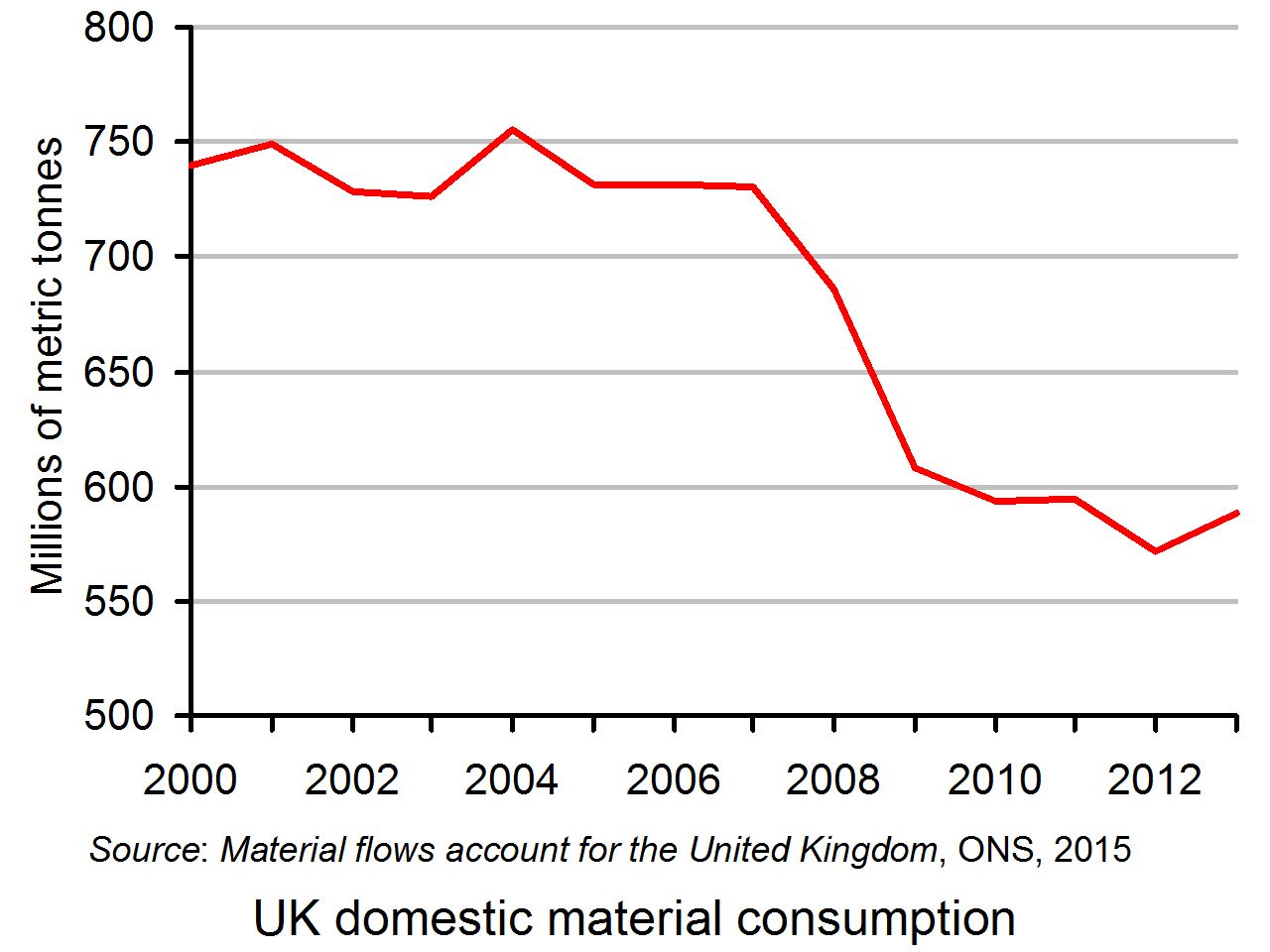
 If peak demand has generally been reached, it is likely that the demand for material resources will also have peaked. Indeed, we could expect the demand for material resources to be declining as (a) there has also been an increase in the efficiency of production, so that a lower volume of material inputs is required to produce any given level of output and (b) there has been a general switch towards services and away from physical goods. The graph shows domestic material consumption in the UK in millions of metric tonnes. Domestic material consumption is defined as domestic extraction of resources minus exports of resources plus imports of resources. As you can see, domestic material consumption peaked in 2004.
But, although peak demand may have been reached in some markets, there are others where there is still the potential for growth. To understand this and identify where such markets may be, it is important to step back from simple notions of consumption to satisfy materialistic demand and focus on the choices people might make to increase their happiness or wellbeing or sense of self worth in society. Thus while we might have reached peak red meat, peak sugar, peak cars, peak furniture and even peak electronic gadgets, we have not reached peak demand for more satisfying experiences. The demand for education, health, social activities, environmental conservation and a range of fulfilling experiences may have considerable potential for growth.
There are business opportunities here, whether in the leisure industry, in building networks of like-minded people or in producing niche goods that satisfy the demands of people with specific interests. But without greater equality there may be many fewer business opportunities in the mass production industries producing standardised goods.
This is not a world in which goods and services are produced at scale as conventionally measured, but a honeycomb economy of niches and information networks whose new dynamics we barely understand, even if we have a better grasp of its values.
Articles
- If having more no longer satisfies us, perhaps we’ve reached ‘peak stuff’
The Guardian, Will Hutton (31/1/16)
- Steve Howard, Ikea Exec, Says The World Has Hit ‘Peak Stuff’
Huffington Post, Zi-Ann Lum (20/1/16)
- We’ve hit peak home furnishings, says Ikea boss
The Guardian, Sean Farrell (18/1/16)
- Peak stuff: the ‘growth’ party is over. So what next?
The Ecologist, Bennet Francis and Rupert Read (22/1/16)
- Have we reached peak ‘stuff’?
The Mancunion, Tristan Parsons (22/2/16)
- Ikea senses room to grow amid ‘peak stuff’
Financial Times, Aliya Ram and Richard Milne (18/1/16)
- Peak Stuff
ifs insights, Janet Hontoir (21/2/16)
- UK retail sales soar as Brits splash their cash on ‘fun stuff’
The Telegraph, Szu Ping Chan (19/2/16)
- How less stuff could make us happier – and fix stagnation
The Guardian, Katie Allen (26/4/16)
Questions
- What are the implications of countries reaching ‘peak stuff’ for (a) the marginal utility of mass produced goods; (b) the marginal propensity to consume and the multiplier?
- Give some examples of goods or services where peak stuff has not been reached.
- If peak stuff has only been reached for certain products, does this mean that there may still be considerable potential for stimulating aggregate demand without a redistribution of income?
- Would it be in the interests of companies such as Asda to make a unilateral decision to pay their workers more? Explain why or why not.
- Why may we be a long way from reaching peak demand for housing, even without a redistribution of income?
- Make out a case for and against tax cuts as a way of stimulating (a) economic growth and (b) a growth in wellbeing? Do your arguments depend on which taxes are cut? Explain.
- The Ecologist article states that “Attaining one-planet living will probably involve in due course achieving degrowth in countries such as ours: building down our economy to a safe level.” Could such an objective be achieved through a mixed market economy? If so, how? If not, why not?
- Does the Telegraph article suggest that peak stuff has not yet been reached as far as most UK consumers are concerned?
 In his 1971 book, Income Distribution, Jan Pen, a Dutch economist, gave a graphic illustration of inequality in the UK. He described a parade of people marching by. They represent the whole population and the parade takes exactly one hour to pass by. The height of each person represents his or her income. People of average height are the people with average incomes – the observer is of average height. The parade starts with the people on the lowest incomes (the dwarfs), and finishes with those on the highest incomes (the giants).
Because income distribution is unequal, there are many tiny people. Indeed, for the first few minutes of the parade, the marchers are so small they can barely be seen. Even after half an hour, when people on median income pass by, they are barely waist high to the observer.
The height is growing with tantalising slowness, and forty-five minutes have gone by before we see people of our own size arriving. To be somewhat more exact: about twelve minutes before the end the average income recipients pass by.
In the final minutes, giants march past and then in the final seconds:
the scene is dominated by colossal figures: people like tower flats. Most of them prove to be businessmen, managers of large firms and holders of many directorships and also film stars and a few members of the Royal Family.
The rear of the parade is brought up by a few participants who are measured in miles. Indeed they are figures whose height we cannot even estimate: their heads disappear into the clouds and probably they themselves do not even know how tall they are.
Pen’s description could be applied to most countries – some with even more dwarfs and even fewer but taller giants. Generally, over the 43 years since the book was published, countries have become less equal: the giants have become taller and the dwarfs have become smaller.
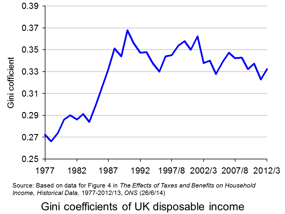
The 2011 Economist article, linked below, uses changes in Gini coefficients to illustrate the rise in income inequality. A Gini coefficient shows the area between the Lorenz curve and the 45° line. The figure will be between 0 and 1 (or 0% and 100%). a figure of 0 shows total equality; a figure of 1 shows a situation of total inequality, where one person earns all the nation’s income. The higher the figure, the greater the inequality.
 The chart opposite shows changes in the Gini coefficient in the UK (see Table 27 in the ONS link below for an Excel file of the chart). As this chart and the blog post Rich and poor in the UK show, inequality rose rapidly during the years of the 1979–91 Thatcher government, and especially in the years 1982–90. This was associated with cuts in the top rate of income tax and business deregulation. It fell in the recession of the early 1990s as the rich were affected more than the poor, but rose with the recovery of the mid- to late 1990s. It fell again in the early 2000s as tax credits helped the poor. It fell again following the financial crisis as, once more, the rich were affected proportionately more than the poor.
 The most up-to-date international data for OECD countries can be found on the OECD’s StatExtracts site (see chart opposite: click here for a PowerPoint). The most unequal developed county is the USA, with a Gini coefficient of 0.389 in 2012 (see The end of the American dream?), and US inequality is rising. Today, the top 1% of the US population earns some 24% of national income. This compares with just 9% of national income in 1976.
Many developing countries are even less equal. Turkey has a Gini coefficient of 0.412 and Mexico of 0.482. The figure for South Africa is over 0.6.
When it comes to wealth, distribution is even less equal. The infographic, linked below, illustrates the position today in the USA. It divides the country into 100 equal-sized groups and shows that the top 1% of the population has over 40% of the nation’s wealth, whereas the bottom 80% has only 7%.
So is this inequality of income and wealth desirable? Differences in wages and salaries provide an incentive for people to work harder or more effectively and to gain better qualifications. The possibility of increased wealth provides an incentive for people to invest.
But are the extreme differences in wealth and income found in many countries today necessary to incentivise people to work, train and invest? Could sufficient incentives exist in more equal societies? Are inequalities in part, or even largely, the result of market imperfections and especially of economic power, where those with power and influence are able to use it to increase their own incomes and wealth?
Could it even be the case that excessive inequality actually reduces growth? Are the huge giants that exist today accumulating too much financial wealth and creating too little productive potential? Are they spending too little and thus dampening aggregate demand? These arguments are considered in some of the articles below. Perhaps, by paying a living wage to the ‘tiny’ people on low incomes, productivity could be improved and demand could be stimulated.
Infographic
 Wealth Inequality in America YouTube, Politizane (20/11/12)
Articles
The rise and rise of the cognitive elite The Economist (20/1/11)
Inequality in America: Gini in the bottle The Economist (26/11/13)
Pen’s Parade: do you realize we’re mostly dwarves? LVTFan’s Blog (21/2/11)
Here Are The Most Unequal Countries In The World Business Insider, Andy Kiersz (8/11/14)
Inequality in the World Dollars & Sense, Arthur MacEwan (Nov/Dec 14)
Britain is scared to face the real issue – it’s all about inequality The Observer, Will Hutton (19/1/14)
The tame inequality debate FundWeb, Daniel Ben-Ami (Nov 14)
Is inequality the enemy of growth? BBC News, Robert Peston (6/10/14)
Data
GINI index World Bank data
List of countries by income equality Wikipedia
The Effects of Taxes and Benefits on Household Income, 2012/13 ONS (see table 27)
Income Distribution and Poverty: Gini (disposale income) OECD StatExtract
Questions
- Distinguish between income and wealth. Is each one a stock or a flow?
- Explain how (a) a Lorenz curve and (b) a Gini coefficient are derived.
- What other means are there of measuring inequality of income and wealth other than using Gini coefficients (and giants and dwarfs!)?
- Why has inequality been rising in many countries over the years?
- How do (a) periods of rapid economic growth and (b) recessions affect income distribution?
- Define ‘efficiency wages’. How might an increase in wages to people on low incomes result in increased productivity?
- What is the relationship between the degree of inequality and household debt? What implications might this have for long-term economic growth and future financial crises? Is inequality the ‘enemy of growth’?
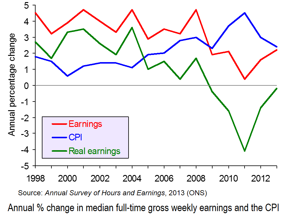
 The ONS has just published two of its major annual publications on income and expenditure in the UK. The first is the Annual Survey of Hours and Earnings (ASHE) and looks at earnings from 1998 to 2013. The second is Family Spending and looks at the level and pattern of household spending each year from 2001 to 2012.
Figures from the two publications show that average real incomes have fallen each year since 2008. This is illustrated in the first chart (click here for a PowerPoint of the chart). They also show that household expenditure in real terms is falling and is at the lowest level since 2006.
Overall picture
In 2012, households’ average weekly disposable income was £597. In 2012 prices, this was down from £621 in 2010 (after the recession) and £659 in 2008 (before the recession).
Household expenditure is at its lowest level in real terms for over a decade. In 2012 households spent on average £489.00 per week. In 2012 prices, this compares with £521.90 in 2001/2 and £533.80 in 2006 (the peak year).
Picture for particular income groups and products
Although average real incomes have fallen, not everyone has been affected the same. For example, not all occupations have seen a fall in incomes (see the table at the end of the BBC article, Earnings rise slower than inflation for fifth year running). Also, as income distribution has become less equal, so those in lower income groups have seen their real incomes fall the fastest. This is partly the result of nominal wages rising less fast for low-paid workers and partly the result of price increases for various essentials, such as food and power being greater than the rate of inflation, and these products constituting a higher proportion of expenditure for poor people than rich people (see Squeezed Britain 2013).
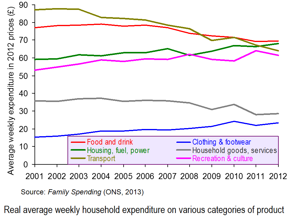
 Likewise expenditure hasn’t fallen on all categories of product. Since 2006, real expenditure on clothing and footwear and on housing, fuel and power has risen. The second chart illustrates expenditure on some of the different categories and how the balance has changed (click here for a PowerPoint). This partly reflects the changes in prices of products, with some items, such as electricity, gas and rent having risen faster than the average, and with the demand for such items being relatively price inelastic.
The changing pattern is also partly the result of different income elasticities of demand for different items. Thus, with falling real incomes, the proportion of income spent on products with a low income elasticity of demand is likely to rise.
 Expenditure also varies by income group. People on higher incomes tend to spend a greater proportion of their income on things such as leisure activities (e.g. eating out and holidays), motoring, and clothing and footwear. Poorer people tend to spend proportionately more on food and drink, and on electricity, gas and rent (even net of housing benefit). These differences are illustrated in the third chart which looks at certain categories of expenditure of three different disposable income groups: the poorest 10% (decile), the richest 10% and the 6th decile (i.e. the 6th group up from the bottom – the group with average or just above average income) (click here for a PowerPoint for the chart). Detailed figures can be found here, which is Table 3.2 from Family Spending.
Just as the time-series data looking at changing income and expenditure over time can illustrate the different income elasticities of demand for different products, so can the cross-sectional data in Tables 3.1 and 3.2 of Family Spending.
Articles
Earnings rise slower than inflation for fifth year running BBC News (12/12/13)
Energy and rent are now the biggest family bills The Telegraph, Steve Hawkes (11/12/13)
Families spend £489 each week – on what? The Guardian, Mona Chalabi (11/12/13)
Cost of energy hits family budgets, says ONS BBC News (11/12/13)
Family spending interactive: how has it changed? The Guardian Datastore, Mona Chalabi (11/12/13)
Data
Annual Survey of Hours and Earnings, 2013 Provisional Results ONS (12/12/13)
Annual Survey of Hours and Earnings, 2013 Provisional Results: Statistical Bulletin ONS (12/12/13)
Family Spending, 2013 Edition ONS (11/12/13)
Family spending in 2012: Infographic ONS (11/12/13)
 Video Summary: Are you an average spender? ONS (11/12/13)
Household expenditure based on COICOP classification, 2001-02 to 2012 at 2012 prices: Table 4.1 of Family Spending ONS (11/12/13)
Detailed household expenditure as a percentage of total expenditure by disposable income decile group, 2012: Table 3.2 of Family Spending ONS (11/12/13)
Questions
- What are the determinants of the price elasticity of demand for a product?
- What are the limitations of using time-series data of prices and expenditure to estimate the price elasticity of demand for particular products?
- What are the determinants of the income elasticity of demand for a product?
- What are the limitations of using time-series data of incomes and expenditure to estimate the income elasticity of demand for particular products?
- What are the limitations of using cross-sectional data of expenditure of different income groups to estimate the income elasticity of demand for particular products?
- How do your answers to the above questions demonstrate the significance of the ceteris paribus (other things being equal) assumption?
- If real earnings are falling, why are people able to spend more in real terms?
- What are the macroeconomic implications of increased consumer spending at a time of falling real incomes?
- How could increased consumer spending help to reverse the fall in real incomes (a) in the short run (b) over a period of a few years? Distinguish between the effects on aggregate demand and aggregate supply.
 A crucial determinant of the economy’s short-term prospects is the appetite of households for spending. This is because household spending makes up roughly two-thirds of the total demand for firms’ goods and services or two-thirds of what economists refer to as aggregate demand. So what are the latest forecasts for consumer spending? We briefly consider the forecasts of the Office for Budget Responsibility for consumer spending and, in doing so, update an earlier bog Gloomy prospects for spending in 2012?
In its March 2012 Economic and Fiscal Outlook the Office for Budget Responsibility presents it forecasts for economic growth and household spending. The following table summarises these forecasts.
OBR Forecasts (annual real percentage change)
|
2012 |
2013 |
2014 |
2015 |
2016 |
| GDP |
0.8 |
2.0 |
2.7 |
3.0 |
3.0 |
| Consumption |
0.5 |
1.3 |
2.3 |
3.0 |
3.0 |
| Disposable income |
–0.2 |
0.5 |
1.9 |
2.4 |
2.5 |
 In the blog post, Global warning, we looked at the use of unconventional macroeconomic policies to deal with the slow pace of economic growth around the world. One of the articles was by Nouriel Roubini. In the linked article below, he argues that slow economic growth may be the new global norm.

