 Each year for the past 60 years, the ONS has published ‘Family Spending’, which ‘gives an insight into the spending habits of UK households, broken down by household characteristics and types of spending’. The latest issue, covering the financial year ending 2017, has just been released.
To mark the 60th anniversary, the ONS has also published a blog, Celebrating 60 years of Family Spending, which compares spending patterns in 2017 with those in 1957. The blog looks at the percentage of the family budget spent on various categories, such as food, clothing, housing, tobacco and alcohol. Some of the percentages have changed dramatically over the years; others have hardly changed at all.
Before you read on, of the six categories mentioned above, which do you think have increased, which fallen and which stayed the same? What is your reasoning?
 Differences in patterns of consumption partly reflect incomes. In 1957, real household income was £381 in today’s prices; today it’s £544 (43% more). You would expect, therefore, that a greater proportion of household incomes today would be spent on more luxurious goods, with a higher income elasticity of demand.
Other changes in consumption patterns reflect changes in tastes and attitudes. Thus there has been a huge fall in the proportion of household income spent on tobacco – down from 6% in 1957 to 1% in 2017.
 Three of the biggest changes over the 60 years have been in housing costs, food and clothing. Housing costs (rent, mortgage interest, council tax, maintenance and home repairs) have doubled from around 9% to around 18% (although they were around 20% before the huge fall in interest rates following the financial crisis of 2007–8). Expenditure on food, by contrast, has fallen – from around 33% to around 16%. Expenditure on clothing has also fallen, from around 10% to around 5%.
Expenditure on alcohol, on the other hand, having risen somewhat in the 1970s and 80s, is roughly the same today as it was 60 years ago, at around 3% of household expenditure.
 Some of the explanations for these changing patterns can be found on the supply side – changing costs of production, new technologies and competition; others can be found on the demand side – changes in tastes and changes in incomes. Some goods and services which we use today, such as computers, mobile phones, many other electrical goods, high-tech gyms and social media were simply not available 60 years ago.
Articles
Celebrating 60 years of Family Spending ONS blog, Joanna Bulman (18/1/18)
How did households budget in 1957? BBC News, Simon Gompertz (18/1/18)
Rising burden of housing costs shown by 60-year UK spending survey Financial Times, Gemma Tetlow (18/1/18)
Data
Family spending in the UK: financial year ending 2017 ONS Statistical Bulletin (18/1/18)
All data related to Family spending in the UK: financial year ending 2017 ONS datasets (18/1/18)
Questions
- Why has expenditure on housing increased so much as a proportion of household expenditure? What underlying factors help to explain this?
- Why has expenditure on food fallen as a proportion of household expenditure? Are the explanations on both the demand and supply sides?
- What has happened to the proportion of expenditure going on leisure goods and services? Explain.
- What factors affect the proportion of expenditure going on motoring?
- Of the broad categories of expenditure considered in this blog, which would you expect to increase, which to decrease and which to stay roughly the same over the coming 10 years? Why?
- If expenditure on a particualar good falls as a percentage of total expenditure as income rises, does this make it an inferior good? Explain.
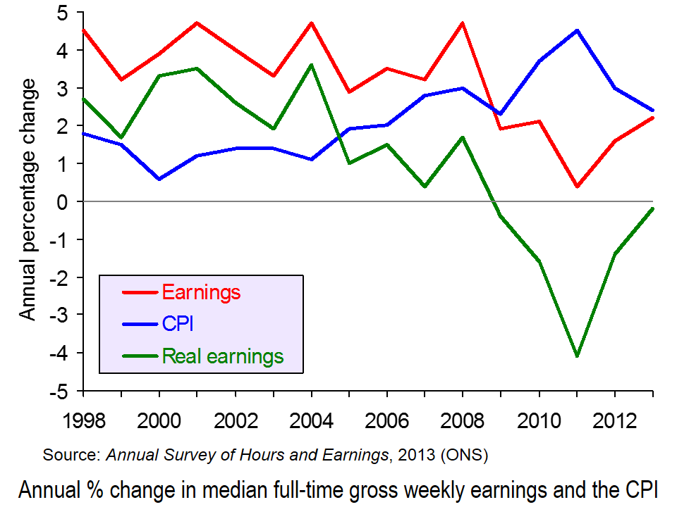
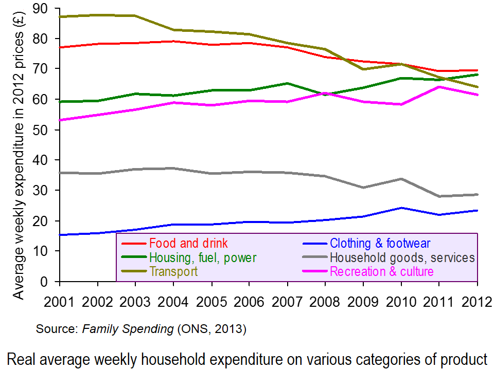
 The ONS has just published two of its major annual publications on income and expenditure in the UK. The first is the Annual Survey of Hours and Earnings (ASHE) and looks at earnings from 1998 to 2013. The second is Family Spending and looks at the level and pattern of household spending each year from 2001 to 2012.
Figures from the two publications show that average real incomes have fallen each year since 2008. This is illustrated in the first chart (click here for a PowerPoint of the chart). They also show that household expenditure in real terms is falling and is at the lowest level since 2006.
Overall picture
In 2012, households’ average weekly disposable income was £597. In 2012 prices, this was down from £621 in 2010 (after the recession) and £659 in 2008 (before the recession).
Household expenditure is at its lowest level in real terms for over a decade. In 2012 households spent on average £489.00 per week. In 2012 prices, this compares with £521.90 in 2001/2 and £533.80 in 2006 (the peak year).
Picture for particular income groups and products
Although average real incomes have fallen, not everyone has been affected the same. For example, not all occupations have seen a fall in incomes (see the table at the end of the BBC article, Earnings rise slower than inflation for fifth year running). Also, as income distribution has become less equal, so those in lower income groups have seen their real incomes fall the fastest. This is partly the result of nominal wages rising less fast for low-paid workers and partly the result of price increases for various essentials, such as food and power being greater than the rate of inflation, and these products constituting a higher proportion of expenditure for poor people than rich people (see Squeezed Britain 2013).
 Likewise expenditure hasn’t fallen on all categories of product. Since 2006, real expenditure on clothing and footwear and on housing, fuel and power has risen. The second chart illustrates expenditure on some of the different categories and how the balance has changed (click here for a PowerPoint). This partly reflects the changes in prices of products, with some items, such as electricity, gas and rent having risen faster than the average, and with the demand for such items being relatively price inelastic.
The changing pattern is also partly the result of different income elasticities of demand for different items. Thus, with falling real incomes, the proportion of income spent on products with a low income elasticity of demand is likely to rise.
 Expenditure also varies by income group. People on higher incomes tend to spend a greater proportion of their income on things such as leisure activities (e.g. eating out and holidays), motoring, and clothing and footwear. Poorer people tend to spend proportionately more on food and drink, and on electricity, gas and rent (even net of housing benefit). These differences are illustrated in the third chart which looks at certain categories of expenditure of three different disposable income groups: the poorest 10% (decile), the richest 10% and the 6th decile (i.e. the 6th group up from the bottom – the group with average or just above average income) (click here for a PowerPoint for the chart). Detailed figures can be found here, which is Table 3.2 from Family Spending.
Just as the time-series data looking at changing income and expenditure over time can illustrate the different income elasticities of demand for different products, so can the cross-sectional data in Tables 3.1 and 3.2 of Family Spending.
Articles
Earnings rise slower than inflation for fifth year running BBC News (12/12/13)
Energy and rent are now the biggest family bills The Telegraph, Steve Hawkes (11/12/13)
Families spend £489 each week – on what? The Guardian, Mona Chalabi (11/12/13)
Cost of energy hits family budgets, says ONS BBC News (11/12/13)
Family spending interactive: how has it changed? The Guardian Datastore, Mona Chalabi (11/12/13)
Data
Annual Survey of Hours and Earnings, 2013 Provisional Results ONS (12/12/13)
Annual Survey of Hours and Earnings, 2013 Provisional Results: Statistical Bulletin ONS (12/12/13)
Family Spending, 2013 Edition ONS (11/12/13)
Family spending in 2012: Infographic ONS (11/12/13)
 Video Summary: Are you an average spender? ONS (11/12/13)
Household expenditure based on COICOP classification, 2001-02 to 2012 at 2012 prices: Table 4.1 of Family Spending ONS (11/12/13)
Detailed household expenditure as a percentage of total expenditure by disposable income decile group, 2012: Table 3.2 of Family Spending ONS (11/12/13)
Questions
- What are the determinants of the price elasticity of demand for a product?
- What are the limitations of using time-series data of prices and expenditure to estimate the price elasticity of demand for particular products?
- What are the determinants of the income elasticity of demand for a product?
- What are the limitations of using time-series data of incomes and expenditure to estimate the income elasticity of demand for particular products?
- What are the limitations of using cross-sectional data of expenditure of different income groups to estimate the income elasticity of demand for particular products?
- How do your answers to the above questions demonstrate the significance of the ceteris paribus (other things being equal) assumption?
- If real earnings are falling, why are people able to spend more in real terms?
- What are the macroeconomic implications of increased consumer spending at a time of falling real incomes?
- How could increased consumer spending help to reverse the fall in real incomes (a) in the short run (b) over a period of a few years? Distinguish between the effects on aggregate demand and aggregate supply.
 Each year for the past 60 years, the ONS has published ‘Family Spending’, which ‘gives an insight into the spending habits of UK households, broken down by household characteristics and types of spending’. The latest issue, covering the financial year ending 2017, has just been released.
 Differences in patterns of consumption partly reflect incomes. In 1957, real household income was £381 in today’s prices; today it’s £544 (43% more). You would expect, therefore, that a greater proportion of household incomes today would be spent on more luxurious goods, with a higher income elasticity of demand.
 Three of the biggest changes over the 60 years have been in housing costs, food and clothing. Housing costs (rent, mortgage interest, council tax, maintenance and home repairs) have doubled from around 9% to around 18% (although they were around 20% before the huge fall in interest rates following the financial crisis of 2007–8). Expenditure on food, by contrast, has fallen – from around 33% to around 16%. Expenditure on clothing has also fallen, from around 10% to around 5%.
 Some of the explanations for these changing patterns can be found on the supply side – changing costs of production, new technologies and competition; others can be found on the demand side – changes in tastes and changes in incomes. Some goods and services which we use today, such as computers, mobile phones, many other electrical goods, high-tech gyms and social media were simply not available 60 years ago.


