 The ‘Classical’ Treasury view of the 1920s and 30s was that extra government spending or tax cuts were not the solution to depression and mass unemployment. Instead, it would crowd out private expenditure if the money supply were not allowed to rise as it would drive up interest rates. But if money supply were allowed to rise, this would be inflationary. The solution was to reduce budget deficits to increase confidence in public finances and to encourage private investment. Greater price and wage flexibility were the answer to markets not clearing.
Keynes countered these arguments by arguing that the economy could settle in a state of mass unemployment, with low confidence leading to lower consumer expenditure, lower investment, lower incomes and lower employment. The situation would be made worse, not better, by cuts in public expenditure or tax rises in an attempt to reduce the budget deficit. The solution was higher public expenditure to stimulate aggregate demand. This could be achieved by fiscal and monetary policies. Monetary policy alone could, however, be made ineffective by the liquidity trap. Extra money might simply be held rather than spent.
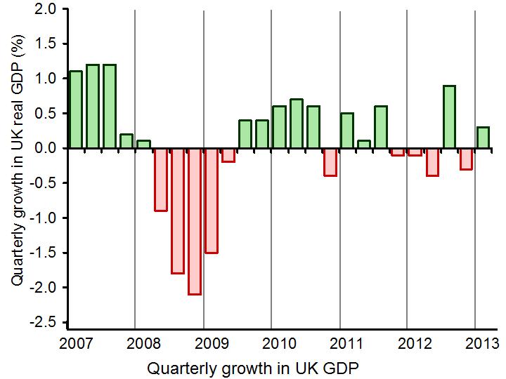
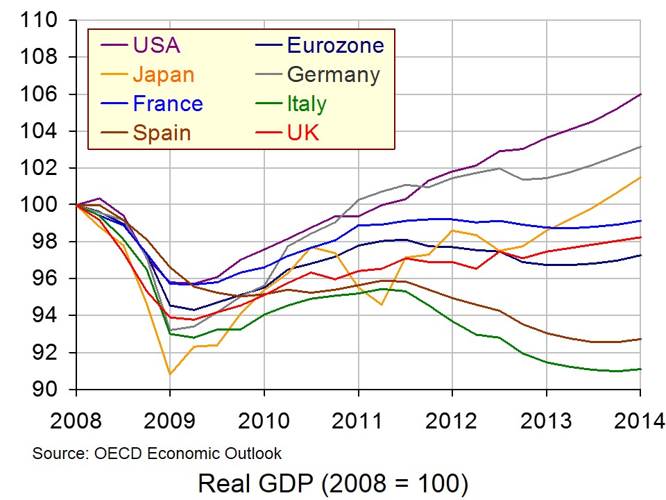 This old debate has been reborn since the financial crisis of 2007/8 and the subsequent deep recession and, more recently, the lack of recovery. (Click here for a PowerPoint of the chart.)
The articles below consider the current situation. Many economists, but certainly not all, take a Keynesian line that austerity policies to reduce public-sector deficits have been counter-productive. By dampening demand, such policies have reduced national income and slowed the recovery in both investment and consumer demand. This has at best slowed the rate of deficit reduction or at worst even increased the deficit, with lower GDP leading to a reduction in tax receipts and higher unemployment leading to higher government social security expenditure.
Although monetary policy has been very loose, measures such as record low interest rates and quantitative easing have been largely ineffective in stimulating demand. Economies are stuck in a liquidity trap, with banks preferring to build their reserves rather than to increase lending. This is the result partly of a lack of confidence and partly of pressure on them to meet Basel II and III requirements of reducing their leverage.
But despite the call from many economists to use fiscal policy and more radical monetary policy to stimulate demand, most governments have been pre-occupied with reducing their deficits and ultimately their debt. Their fear is that rising deficits undermine growth – a fear that was given weight by, amongst others, the work of Reinhart and Rogoff (see the blog posts Reinhart and Rogoff: debt and growth and It could be you and see also Light at the end of the tunnel – or an oncoming train?.
 But there is some movement by governments. The new Japanese government under Shinzo Abe is following an aggressive monetary policy to drive down the exchange rate and boost aggregate demand (see A J-curve for Japan?) and, more recently, the European Commission has agreed to slow the pace of austerity by giving the Netherlands, France, Spain, Poland, Portugal and Slovenia more time to bring their budget deficits below the 3% of GDP target.
Of course, whether or not expansionary fiscal and/or monetary policies should be used to tackle a lack of growth does not alter the argument that supply-side policies are also required in order to increase potential economic growth.
A Keynesian Victory, but Austerity Stands Firm The New York Times, Business Day, Eduardo Porter (21/5/13)
With Austerity Under Fire, Countries Seek a More Balanced Solution Knowledge@Wharton (22/5/13)
Keynes, Say’s Law and the Theory of the Business Cycle History of Economics Review 25.1-2, Steven Kates (1996)
Is Lord Keynes back in Brussels? The Conversation, Fabrizio Carmignani (31/5/13)
Keynes’s Biggest Mistake The New York Times, Business Day, Bruce Bartlett (7/5/13)
Keynes’s Not So Big Mistake The New York Times, The Conscience of a Liberal blog, Paul Krugman (7/5/13)
The Chutzpah Caucus The New York Times, The Conscience of a Liberal blog, Paul Krugman (5/5/13)
Keynes and Keynesianism The New York Times, Business Day, Bruce Bartlett (14/5/13)
Japan Is About To Prove Keynesian Economics Entirely Wrong Forbes, Tim Worstall (11/5/13)
The poverty of austerity exposed Aljazeera, Paul Rosenberg (24/5/13)
Britain is a lab rat for George Osborne’s austerity programme experiment The Guardian, Larry Elliott (26/5/13)
Eurozone retreats from austerity – but only as far as ‘austerity lite’ The Guardian, Larry Elliott (30/5/13)
Europe’s long night of uncertainty Daily Times (Pakistan), S P Seth (29/5/13)
Abenomics vs. bad economics The Japan Times Gregory Clark (29/5/13)
European countries to be allowed to ease austerity BBC News (29/5/13)
U.K. Should Restore Growth, Rebalance Economy IMF Survey (22/5/13)
Now everyone is a Keynesian again – except George Osborne The Observer, William Keegan (2/6/13)
Austerity Versus Growth (III): Fiscal Policy And Debt Sustainability Social Europe Journal, Stefan Collignon (30/5/13)
Questions
- Explain what is meant by Say’s Law and its implication for macroeconomic policy.
- Why have many governments, including the UK government, been reluctant to pursue expansionary fiscal policies?
- What is meant by the liquidity trap? What is the way out of this trap?
- In the first article above, Eduardo Porter argues that ‘moral views are getting in the way of reason’. What does he mean by this?
- Explain what are meant by the ‘paradox of thrift’ and the ‘fallacy of composition’. How are these two concepts relevant to the debate over austerity policies?
- What are the dangers in pursuing aggressive Keynesian policies?
- What are the dangers in not pursuing aggressive Keynesian policies?
 When you are next in town shopping, just keep in mind that consumer spending accounts for a little over 60 per cent of GDP. Therefore, consumption is incredibly important to the economy. How consumers behave is crucial to our short-term economic growth. The second estimate of British growth from the Office for National Statistics shows that the economy expanded by 0.3 per cent in the first three months of 2013. This follows a 0.3 per cent decline in the final quarter of 2012. Real household expenditure rose by just 0.1 per cent in Q1 2013. However, this was the sixth consecutive quarter in which the volume of purchases by households has grown.
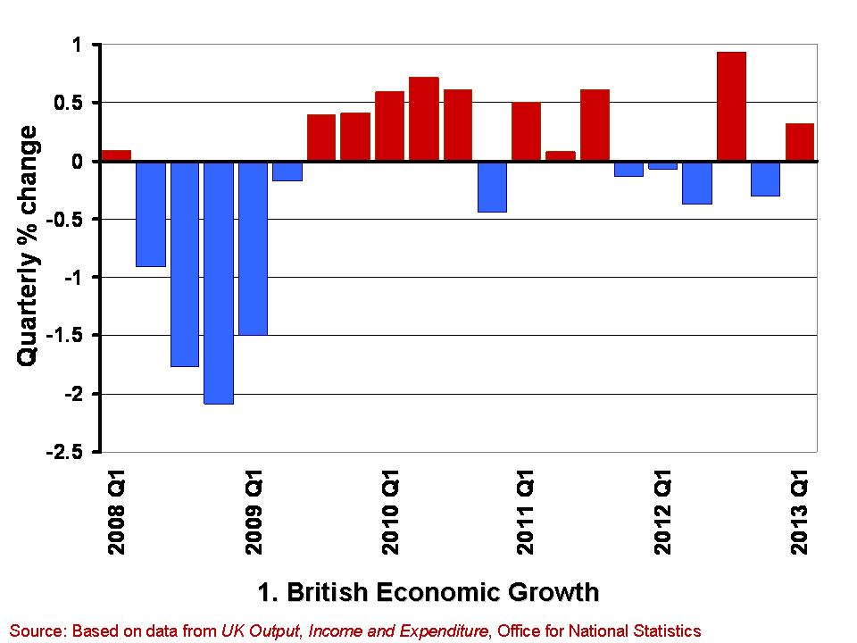
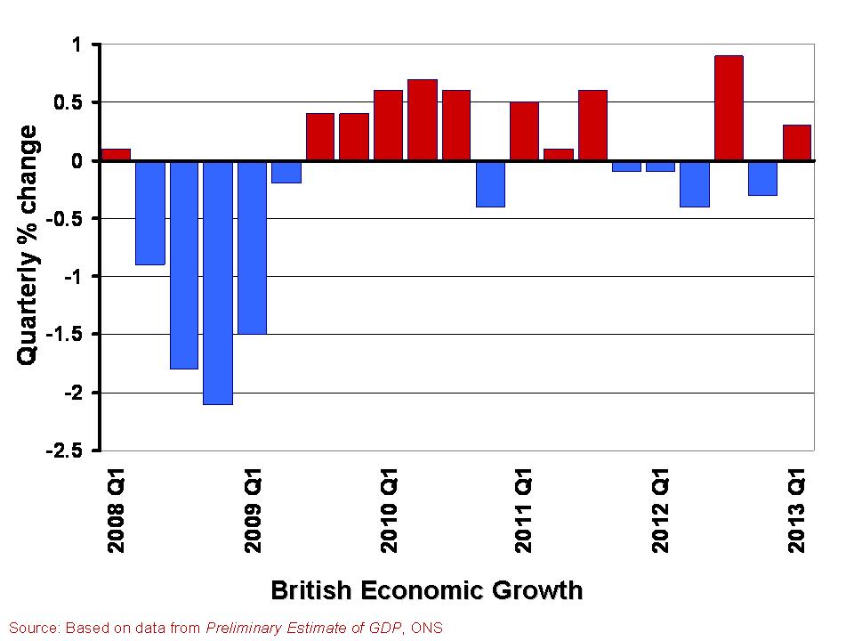
 The growth in the economy is measured by changes in real GDP. Chart 1 shows the quarter-to-quarter change in real GDP since Q1 2008. (Click here to download a PowerPoint of the chart). During this period the economy is thought to have contracted in 10 of the 21 quarters shown. Furthermore, they show a double-dip recession and so two periods in close proximity where output shrank for two or more quarters. While more recent output numbers are frequently revised, which could see the double-dip recession possibly ‘statistically wiped’ from history, the period since 2008 will always been one characterised by anemic growth. The average quarterly growth rate since Q1 2008 has been -0.12 per cent.
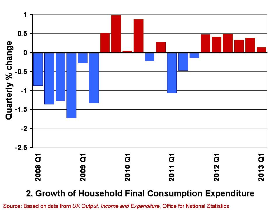
 Chart 2 shows from Q1 2008 the quarterly growth in household expenditure in real terms, i.e. after stripping the effect of consumer price inflation. (Click here for a PowerPoint of the chart). Over the period, the volume of household consumption has typically fallen by 0.18 per cent per quarter. Hence, consumption has feared a little worse than the economy has a whole.
While the annualised rate of growth for the economy since Q1 2008 has averaged -0.47 per cent that for consumer spending has averaged -0.73 per cent. However, these figures disguise a recent improvement in consumer spending growth. This is because the volume of consumption has in fact grown in each of the six quarters since Q4 2011. In contrast, the economy has grown in only 2 of these quarters. It is, of course, much too early to start trumpeting consumption growth has heralding better times, not least because the 0.1 per cent growth in Q1 2013 is the weakest number since positive consumption growth resumed at the back end of 2011. Nonetheless, the figures do deserve some analysis by economists to understand what is going on.
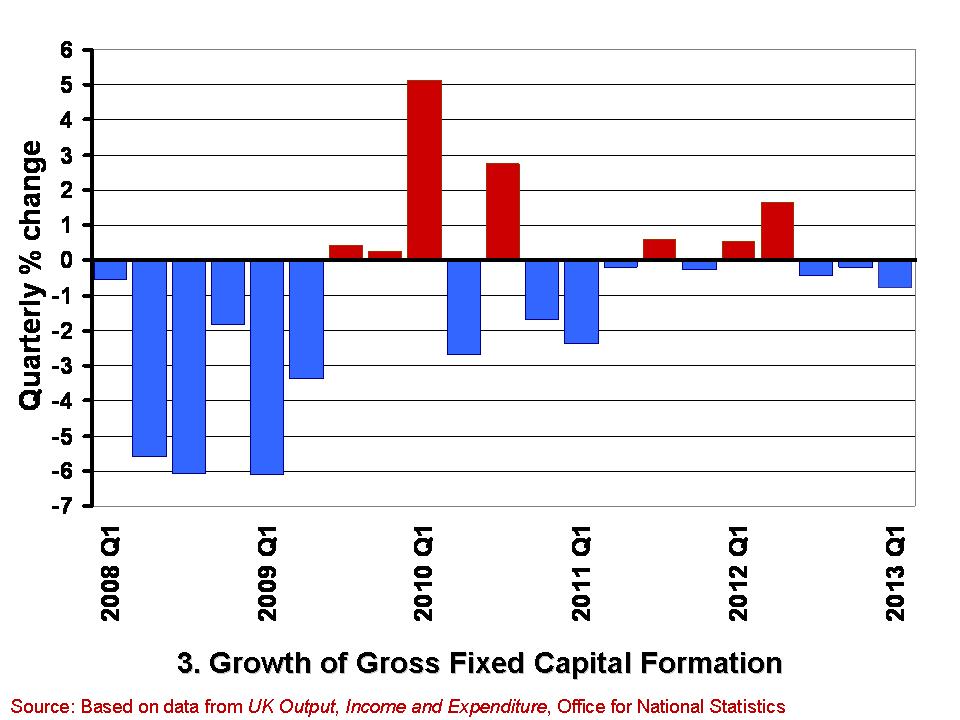
 A slightly less promising note is struck by the gross fixed capital formation (GFCF) numbers. These numbers relate to the volume of investment in non-financial fixed assets, such as machinery, buildings, office space and fixtures and fittings. Chart 3 shows the quarterly growth in the volume of GFCF since Q1 2008. (Click here for a PowerPoint of the chart). The average quarterly rate of growth over this period has been -0.77 per cent. This is equivalent to an annual rate of decline of 3.9 per cent. GFCF has risen in only 7 of these quarters, declining in the remaining 14 quarters.
Worryingly, gross fixed capital formation has decreased in each of the last three quarters. While these figures may reflect continuing difficulties encountered by businesses in obtaining finance, they may also point to lingering concerns within the business community about the prospects for sustained growth. Therefore, it is important for economists to try and understand the drivers of these disappointing investment numbers and, hence, whether it is these or the slightly better consumption numbers that best hint at our short-term economic prospects.
Data
Second estimate of GDP, Q1 2013 Office for National Statistics
Second Estimate of GDP, Q1 2013 Dataset Office for National Statistics
Articles
UK GDP: concerns about underlying economy as 0.3pc growth confirmed Telegraph, Philip Aldrick (23/5/13)
UK investment fall among worst in G8 Guardian, Phillip Inman (23/5/13)
UK first-quarter growth unchanged BBC News (28/5/13)
U.K. Economy Grows 0.3% on Inventories, Consumer Spending Bloomberg, Svenja O’Donnell (23/5/13)
Surge in consumer spending kept UK out of recession The Telegraph (28/5/13)
Boost in service sector activity The Herald, Greig Cameron (28/5/13)
Hopes dashed as household spending rises by just 0.1% The Herald, Ian McConnell (24/5/13)
Questions
- Why do we typically focus on real GDP rather than nominal GDP when analysing economic growth?
- What is meant by aggregate demand? Of what importance is consumer spending to aggregate demand?
- Why might the patterns we observe in consumer spending differ from those in other components of aggregate demand?
- What factors might influence the determination of consumer spending?
- What do you understand by gross fixed capital formation? What factors might help to explain how its level is determined?
- Of what significance is gross fixed capital formation for aggregate demand and for aggregate supply?
- What is a recession? What is a double-dip recession?
- What data would you need to collect to identify a recession?
 In the blog The global economy we considered the economic performance of countries across the globe, including the UK. In the first estimate of UK economic growth for the first quarter of 2013, the economy grew at 0.3%, thus avoiding a triple-dip recession. This first estimate is always subject to change, but in this case, the data was confirmed.
The April 2013 figure provided by the ONS of 0.3% growth has been confirmed, once again indicating the slow recovery of the UK economy. Despite these more positive signs for the economy, the IMF has raised concerns of the weak performance of the UK and has urged the government to invest more in projects to stimulate growth. Although the economy has started to grow, economic growth has continued to remain weak since the onset of the financial crisis and recession. Martin Beck, an economist at Capital Economics said:
With employment and average earnings both dropping in the first quarter on their level in the previous quarter, the foundations for a sustained recovery, even one driven by consumers, still look pretty rickety.
 Initial estimates by the ONS are always updated and there is still time for the 0.3% growth figure to be changed, as more data becomes available. (Click here for a PowerPoint of the chart.) This latest figure, although unchanged, has given a more concrete indication of where the UK economy is continuing to struggle. Consumer spending increased by only 0.1%, investment and exports declined, but in further signs of a weak economy, the building up of stocks by companies was a big contributor to the UK economic growth – a contribution of 0.4 percentage points. The service sector continued to growth with a 0.6 percentage point contribution to GDP.
So, what does the future look like for the UK? Although the estimate of 0.3% figure did prevent a triple-dip recession and the IMF did comment on the ‘improving health’ of the economy, signs of recovery remain weak.
 Crucial to the recovery will be government spending, but more than this, the government spending must be in key growth industries. Data suggests that the UK invests less than other G8 countries as a percentage of GDP and this is perhaps one of the key factors that has prevented the UK recovery from gathering pace. The future of the UK economy remains uncertain and government policy will be crucial in determining this future course. The following articles consider the latest growth data.
Signs of weakness mar UK economic growth Reuters, Olesya Dmitracova and William Schomberg (23/5/13)
UK first quarter growth unchanged BBC News (23/5/13)
Concerns over underlying health of UK economy as 0.3% growth confirmed The Guardian, Philip Inman (23/5/13)
Statisticians confirm 0.3% UK growth for first quarter of 2013 Financial Times, Claire Jones and Sarah O’Connor (23/5/13)
UK GDP: concerns about underlying economy as 0.3pc growth confirmed The Telegraph, Philip Aldrick (23/5/13)
Britsh economy returns to growth in first quarter The Economic Times (23/5/13)
U.K. households not loosening purse strings Wall Street Journal, Ainsley Thomson and Ilona Bllington (23/5/13)
 IMF: UK should push for economic growth BBC News (22/5/13)
Questions
- Why are numerous estimates of GDP made by the ONS?
- How is GDP measured? Is it an accurate measure of economic growth? What about economic development?
- Why does 0.3% growth in the first quarter of GDP not necessarily imply that the UK economy is recovering?
- Why have certain aspects of the UK economy performed better or worse than others?
- What areas should the government invest in, according to the IMF?
- Why would government spending in investment create economic growth? Is this likely to be short term or long term?
 Have you ever woken in the night worrying about your finances? Most of us have. Our overall financial position undoubtedly exerts influence on our spending. Therefore, we would not expect our current spending levels to be entirely determined by our current income level.
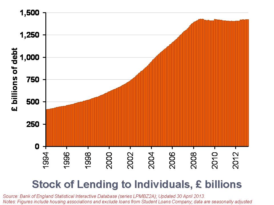
Our financial health, or what economists call our net financial wealth, can be calculated as the difference between our financial assets (savings) and our financial liabilities (debt). Between them, British households have amassed a stock of debt of £1.423 trillion, almost as much as annual GDP, which is around £1.5 trillion (click here to download the PowerPoint.) We look here at recent trends in loans by financial institutions to British households. We consider the effect that the financial crisis and the appetite of individuals for lending is having on the debt numbers.
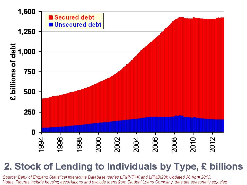
There are two types of lending to individuals. The first is secured debt and refers to loans against property. In other words, secured debt is just another name for mortgage debt. The second type of lending is referred to as unsecured debt. This covers all other forms of loans involving financial institutions, including overdrafts, outstanding credit card debt and personal loans. The latest figures from the Bank of England’s Money and Credit show that as of 31 March 2013, the stock of debt owed by individuals in the UK (excluding loans involving the Student Loans Company) was £1.423 trillion. Of this, £1.265 trillion was secured debt while the remaining £157.593 billion was unsecured debt. From this, we can the significance of secured debt. It comprises 89 per cent of the stock of outstanding debt to individuals. The remaining 11 per cent is unsecured debt.
 The second chart shows the growth in the stock of debt owed by individuals (click here to download the PowerPoint chart). In January 1994 the stock of secured debt stood at £358.75 billion and the stock of unsecured debt at £53.774 billion. 87 per cent of debt then was secured debt and, hence, little different to today. The total stock of debt has grown by 246 per cent between January 1994 and March 2013. Unsecured debt has grown by 197 per cent while secured debt has grown by 253 per cent.
However, more recently we see a different picture evolving, more especially in unsecured debt. Since October 2008, the monthly series of the stock of unsecured debt has fallen on 47 occasions and risen on only 7 occasions. In contrast, the stock of secured debt has fallen on only 12 occasions and often by very small amounts. Consequently, the stock of unsecured debt has fallen by 23.2 per cent between October 2008 and March 2013. In contrast, the stock of secured debt has risen by 3.5 per cent. The total stock of debt has fallen by 0.4 per cent over this period.
Another way of looking at changes in the stock of debt is to focus on what are known as net lending figures. This is simply the difference between the gross amount lent in a period and the amount repaid. The net lending figures will, of course, mirror changes in the total debt stock closely. For example, a negative net lending figure means that repayments are greater than gross lending. This will translate into a fall in the stock of debt. However, some difference occurs when debts have to be written off and not repaid.
 The third chart shows net lending figures since January 1994 (click here to download the PowerPoint chart). The chart captures the financial crisis very nicely. We can readily see a collapse of net lending by financial institutions to households. It is, of course, difficult to disentangle from the net lending figures those changes driven by changes in the supply of credit by financial institutions and those from changes in the demand for credit by individuals. But, we can be certain that the enormous change in credit levels in 2008 were driven by a massive reduction in the provision of credit.
To further put the net lending figures into context, consider the following numbers. Over the period from January 2000 to December 2007, the average amount of monthly net lending was £8.52 billion. In contrast, since January 2009 the average amount of net lending has been £691 million per month. Consider too the composition of this net lending. The average amount of net secured lending between January 2000 and December 2007 was £7.13 billion per month compared with £1.39 billion for net unsecured lending. Since January 2009, monthly net secured lending has averaged only £756 million while monthly net unsecured lending has averaged -£64.4 million. Therefore, repayments of unsecured lending have outstripped gross unsecured lending.
While further analysis is needed to fully understand the drivers of the net lending figures, it is, nonetheless, clear that the financial system of 2013 is very different to that prior to the financial crisis. This change is affecting the growth of the debt stock of households. This is most obviously the case with unsecured debt. The stock of unsecured debt in March 2013 is 24 per cent smaller than in its peak in September 2008. It is now the job of economists to understand the implications of how the new emerging patterns in household debt will affect our behaviour and overall economic activity.
Data
Money and Credit – March 2013 Bank of England
Statistical Interactive Database Bank of England
Articles
Bank of England extends lending scheme Financial Times, Chris Giles (24/4/13)
Markets insight: Europe and the US lines cross on household debt ratio Financial Times, Gillian Tett (9/5/13)
British families are the deepest in debt Telegraph, James Kirkup (14/5/13)
Total property debt of British households stands as £848bn Guardian, Hilary Osborne (13/5/13)
Household finances reach best level in three years – but are stuck below pre-crisis levels This is Money.co.uk, Matt West (17/5/13)
ONS says Welsh households have lowest debts in Britain BBC News (28/1/13)
Questions
- Outline the ways in which the financial system could impact on the spending behaviour of households.
- Why might the current level of income not always be the main determinant of a household’s spending?
- How might uncertainty affect spending and saving by households?
- Explain what you understand by net lending to individuals. How does net lending to individuals affect stocks of debt?
- Outline the main patterns seen in the stock of household debt over the past decade and discuss what you consider to be the principal reasons for these patterns.
- If you were updating this blog in a year’s time, how different would you expect the charts to look?
 In The global economy we note the mixed picture contained within the latest British growth numbers. With the first estimate of growth for Q1 of 2013 pointing to an increase in real GDP of 0.3 per cent, the UK economy appears to have missed the ignominy of a triple dip recession. However, the overall economy remains fragile with different sectors of the economy performing quite differently.
A patchy picture is perhaps the fairest assessment. This helps to explain the quite different perceptions amongst economists, business people, journalists and the wider public about the current state of the economy. Here we consider in a little more detail the growth numbers for the UK from the latest preliminary GDP estimates. (Click here for a PowerPoint of the chart).
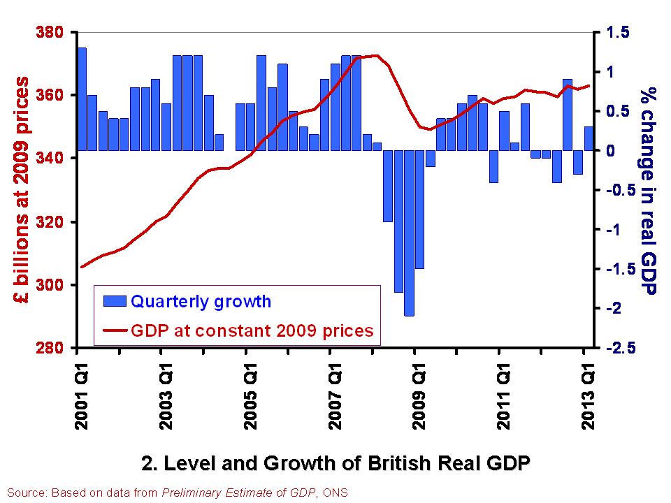
 The British economy is thought to have grown by 0.3 per cent in the first quarter of 2013. This follows a contraction of 0.3 per cent in the final quarter of 2012. Compared with the first quarter of 2012, the output of the British economy was 0.6 per cent higher. However, as Chart 2 helps to show, the British economy has some way to go before it returns to the levels seen prior to the financial crisis. Real GDP peaked in the first quarter of 2008 when GDP at 2009 prices was estimated at £372.7 billion. In the first quarter of 2013, GDP at constant 2009 prices is estimated at £362.9 billion. This means that the economy is still 2.6 per cent smaller than its 2008-peak. Click here for a PowerPoint of the chart.
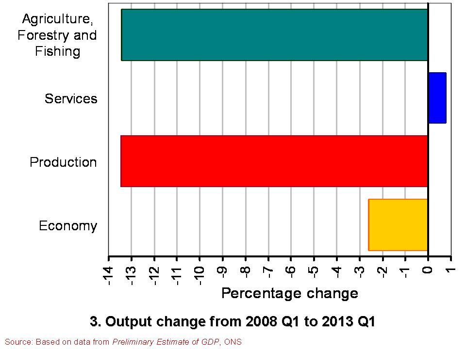
The patchy nature of British growth is illustrated nicely by the contrasting rates of growth across the different industrial sectors in the first quarter of the year. While service sector output rose by 0.6 per cent, output across the production industries rose by only 0.2 per cent and agricultural output declined by 3.7 per cent. Within the production industries, mining and quarrying output rose by 3.2 per cent, but manufacturing output shrunk by 0.3 per cent and construction output shrunk by 2.5 per cent.
 Chart 3 compares the output of agriculture, the production industries and the service sector between the first quarter of 2008 and the first quarter of 2013. (Click here for a PowerPoint of the Chart). It shows the dramatically different experience of the service sector compared with agriculture and the production industries. While output in the service sector is now 0.8 per cent higher, output across agriculture and the production industries is almost 13.5 per cent lower. Within the production industries, output in mining and quarrying is 38 per cent lower, in the construction sector 19 per cent lower and 10 per cent lower in manufacturing. It is perhaps not surprising then that we get such different messages about the state of the economy. The devil really is in the detail.
Data
Preliminary Estimate of GDP – Time Series Dataset Q1 2013 Office for National Statistics
Statistical Bulletin: Gross Domestic Product Preliminary Estimate Q1 2013 Office for National Statistics
Articles
UK avoids triple-dip recession with better-than-expected 0.3% GDP growth Guardian, Heather Stewart (25/4/13)
UK economy shows 0.3% growth Financial Times, Claire Jones (25/4/13)
UK avoids triple-dip recession with 0.3pc GDP growth Telegraph, Szu Ping Chan (25/4/13)
Osborne claims UK economy is ‘healing’ Financial Times, George Parker and Claire Jones (25/4/13)
UK narrowly escapes triple-dip recession as GDP figures show 0.3% growth in first three months of year Independent, Ben Chu (25/4/13)
UK economy avoids triple-dip recession BBC News (25/4/13)
Questions
- What is the difference between nominal and real GDP? Which of these helps to track changes in economic output?
- How would we identify a recession in either of the first two charts?
- What is a double-dip recession? What is a triple-dip recession?
- The UK economy in Q1 2013 was 2.6 per cent smaller than in Q1 2008. What factors do you think help explain why after 5 years UK real GDP is still lower?
- Why if output in the production and agricultural sectors is 13.5 per cent lower in Q1 2013 compared to Q1 2008 is the economy’s total output only 2.6 per cent lower?
- Economic growth rates fluctuate quite significantly. Can economic theory help to explain why this is the case?
 The ‘Classical’ Treasury view of the 1920s and 30s was that extra government spending or tax cuts were not the solution to depression and mass unemployment. Instead, it would crowd out private expenditure if the money supply were not allowed to rise as it would drive up interest rates. But if money supply were allowed to rise, this would be inflationary. The solution was to reduce budget deficits to increase confidence in public finances and to encourage private investment. Greater price and wage flexibility were the answer to markets not clearing.
 This old debate has been reborn since the financial crisis of 2007/8 and the subsequent deep recession and, more recently, the lack of recovery. (Click here for a PowerPoint of the chart.)
 But there is some movement by governments. The new Japanese government under Shinzo Abe is following an aggressive monetary policy to drive down the exchange rate and boost aggregate demand (see A J-curve for Japan?) and, more recently, the European Commission has agreed to slow the pace of austerity by giving the Netherlands, France, Spain, Poland, Portugal and Slovenia more time to bring their budget deficits below the 3% of GDP target.
