 GDP figures are often a poor measure of a country’s economic well-being. By focusing on production, they may not capture the contribution of a range of social and environmental factors to people’s living standards, including the various negative and positive externalities from production and consumption themselves. A case in point is internet innovation: an issue considered in the first linked article below by the eminent economist, Joseph Stiglitz.
The effects of innovations that directly lead to an increase in output are relatively easy to measure. Many innovations, however, may allow those with power to consolidate that power, resulting in less competition and a possible decline in welfare. If, for example, companies such as Amazon, invest in online retailing and gain a first-mover advantage, they may be able to use this power to drive out competitors. In other words, innovations may not simply lower the cost of production and hence prices: they may even lead to an increase in prices.
Then there are innovations, such as faster broadband, that result in higher quality. While higher quality in one sphere may lead to higher output elsewhere, in many cases it is just improving the experience of consumers without being reflected in a way that can be easily measured.
Some innovations may be judged as socially harmful. Thus improved gaming functionality and realism may encourage people to spend more time online. The social and health implications of this may be considered as undesirable and resulting in a reduction in well-being. Of course, many gamers would disagree!
The point is that technological innovations often result in a change in tastes. These changes in tastes may involve negative externalities, themselves very hard to quantify. Consequently,  resulting changes to GDP may be a very poor indicator of changes in social well-being.
The articles below consider some of these issues. The Stiglitz article gives an example of innovation in financial services. Although highly profitable for many working in the sector – at least until the crash of 2008/9 – according to the author, these innovations led to both lower GDP growth and a net contribution to social welfare that was negative.
The benefits of internet innovation are hard to spot in GDP statistics The Guardian, Joseph Stiglitz (10/3/14)
Economist argues for happiness over GDP Yale Daily News, Joyce Guo (19/2/14)
‘GDP: A Brief But Affectionate History’ by Diane Coyle and ‘The Leading Indicators: A Short History of the Numbers That Rule Our World’ by Zachary Karabell Washington Post, Tyler Cowen (21/2/14)
Emerging Markets: Income Returns To Innovation (GDP Per Capita Vs. Innovation Index) Seeking Alphz, Jon Harrison (4/3/14)
Questions
- What does GDP measure?
- What factors affecting the welfare of society are not measured in GDP?
- What alternative indicators are there to GDP as a measure of living standards?
- How would you set about measuring the effects on living standards of a technological revolution, such as the ability to access 4G on the move on laptops and smartphones (e.g. on trains)?
- How should the net benefits of installing more ATMs (cash machines) be calculated?
- Revisit the blog Time to leave GDP behind? and answer question 8.
- Referring to the Jon Harrison article, how would you construct an innovation index? How is innovation related too GDP per capita?
 One of the reasons why it is so hard to forecast economic growth and other macroeconomic indicators is that economies can be affected by economic shocks. Sometimes the effects of shocks are large. The problem with shocks is that, by their very nature, they are unpredictable or hard to predict.
A case in point is the current crisis in Ukraine. First there was the uprising in Kiev, the ousting of President Yanukovich and the formation of a new government. Then there was the seizing of the Crimean parliament by gunmen loyal to Russia. The next day, Saturday March 1, President Putin won parliamentary approval to invade Ukraine and Russian forces took control of the Crimea.
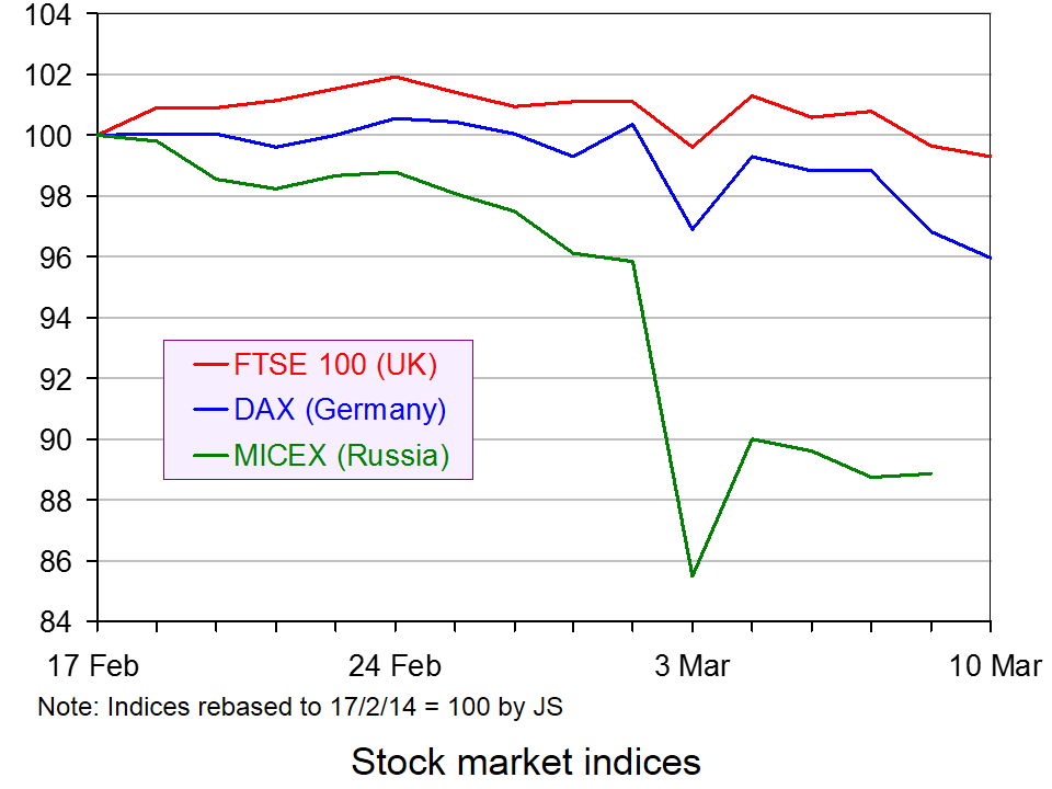
 On Monday 3 March, stock markets fell around the world. The biggest falls were in Russia (see chart). In other stock markets, the size of the falls was directly related to the closeness of trade ties with Russia. The next day, with a degree of calm descending on the Crimea and no imminent invasion by Russia of other eastern parts of Ukraine, stock markets rallied.
What will happen to countries’ economies depends on what happens as the events unfold. There could be a continuing uneasy peace, with the West effectively accepting, despite protests, the Russian control of the Crimea. But what if Russia invades eastern Ukraine and tries to annex it to Russia or promote its being run as a separate country? What if the West reacted strongly by sending in troops? What if the reaction were simply sanctions? That, of course would depend on the nature of those sanctions.
Some of the possibilities could have serious effects on the world economy and especially the Russian economy and the economies of those with strong economic ties to Russia, such as those European countries relying heavily on gas and oil imports from Russia through the pipeline network.
Economists are often criticised for poor forecasts. But when economic shocks can have large effects and when they are hard to predict by anyone, not just economists, then it is hardly surprising that economic forecasts are sometimes highly inaccurate.
What Wall Street is watching in Ukraine crisis USA Today (3/3/14)
Ukraine’s economic shock waves – magnitude uncertain Just Auto, Dave Leggett (7/3/14)
Ukraine: The end of the beginning? The Economist (8/3/14)
Russia will bow to economic pressure over Ukraine, so the EU must impose it The Guardian, Guy Verhofstadt (6/3/14)
Russia paying price for Ukraine crisis CNN Money, Mark Thompson (6/3/14)
Ukraine Crimea: Russia’s economic fears BBC News, Nikolay Petrov (7/3/14)
How Russia’s conflict with Ukraine threatens vital European trade links The Telegraph, Szu Ping Chan (8/3/14)
Will a Russian invasion of Ukraine push the west into an economic war? Channel 4 News, Paul Mason (2/3/14)
Who loses from punishing Russia? BBC News, Robert Peston (4/3/14)
Should Crimea be leased to Russia? BBC News, Robert Peston (7/3/14)
The Ukraine Economic Crisis Counter Punch, Jack Rasmus (7-9/3/14)
UK price rise exposes failure to prepare for food and fuel shocks The Guardian, Phillip Inman (2/3/14)
Questions
- What sanctions could the West realistically impose on Russia?
- How would sanctions against Russia affect (a) the Russian economy and (b) the economies of those applying the sanctions?
- Which industries would be most affected by sanctions against Russia?
- Is Russia likely to bow to economic pressure from the West?
- Should Crimea be leased to Russia?
- Is the behaviour of stock markets a good indication of people’s expectations about the real economy?
- Identify some other economic shocks (positive and negative) and their impact.
- Could the financial crisis of 2007/8 be described as an economic shock? Explain.
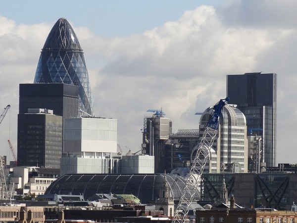
 While much of the UK is struggling to recover from recession, the London economy is growing strongly. This is reflected in strong investment, a growth in jobs and rapidly rising house prices.
There are considerable external economies of scale for businesses locating in London. There is a pool of trained labour and complementary companies providing inputs and services are located in close proximity. Firms create positive externalities to the benefit of other firms in the same industry or allied industries.
London is a magnet for entrepreneurs and highly qualified people. Innovative ideas and business opportunities flow from both business dealings and social interactions. As Boris Johnson says in the podcast, “It’s like a cyclotron on bright people… People who meet each other and spark off each other, and that’s when you get the explosion of innovation.”
 Then there is a regional multiplier effect. As the London economy grows, so people move to London, thereby increasing consumption and stimulating further production and further employment. Firms may choose to relocate to London to take advantage of its buoyant economy. There is also an accelerator effect as a booming London encourages increased investment in the capital, further stimulating economic growth.
But the movement of labour and capital to London can dampen recovery in other parts of the economy and create a growing divide between London and other parts of the UK, such as the north of England.
The podcast examines ‘agglomeration‘ in London and how company success breeds success of other companies. It also looks at some of the downsides.
Podcast
Boris Johnson: London is cyclotron on bright people BBC Today Programme, Evan Davis (3/3/14)
Articles
London will always win over the rest of the UK The Telegraph, Alwyn Turner (2/3/14)
Evan Davis’s Mind The Gap – the view from Manchester The Guardian, Helen Pidd (4/3/14)
London incubating a new economy London Evening Standard, Phil Cooper (Founder of Kippsy.com) (10/2/14)
Reports and data
London Analysis, Small and Large Firms in London, 2001 to 2012 ONS (8/8/13)
Regional Labour Market Statistics, February 2014 ONS (19/2/14)
London Indicators from Labour Market Statistics (11 Excel worksheets) ONS (19/2/14)
Annual Business Survey, 2011 Regional Results ONS (25/7/13)
Economies of agglomeration Wikipedia
Questions
- Distinguish between internal and external economies of scale.
- Why is London such an attractive location for companies?
- Are there any external diseconomies of scale from locating in London?
- In what ways does the expansion of London (a) help and (b) hinder growth in the rest of the UK?
- Examine the labour statistics (in the links above) for London and the rest of the UK and describe and explain the differences.
 Business performance is always affected by the economy and we can always look at the economic theory to explain why profits rise and fall. Some companies prosper during recession, whereas others decline and the key is to understand the economics behind the data. This blog takes a look at the performance of a variety of companies and asks you to think about the economic theory behind it.
The world of betting has grown significantly and the profits of companies in this market, while certainly linked to economic performance, is also dependent on sport results. Paddy Power has announced pre-tax profits of €141m for 2013, an increase from €139.2m, despite sporting results causing profit performance to fall. On the part of football clubs, Liverpool FC saw a loss emerge for the 2012-2013 financial year, whereas Newcastle’s profits rose by 900% to £9.9m. What factors can explain the vastly different performance (off and on the pitch) of these two clubs?
In the USA, Radio Shack has been forced to close 1100 stores. This is, in part, as a response to a change in the way we are shopping. More and more consumers are purchasing goods online and Radio Shack is therefore experiencing growing competition from online retailers. Sales fell by 10% last year and even during the fourth quarter sales continued to decline.
Companies based in the largest economy in Europe have also experienced declines in performance, showing that a strong performing country doesn’t imply the same for companies operating in it. RWE, Germany’s biggest energy provider, has not made a loss since 1949. However, in 2013, this company posted its first annual loss in over 60 years: a loss of £2.28bn. With energy being in constant demand and criticism being levelled at UK energy providers for the high profits they’re making, the economics behind these data is important.
In better news for a company, Thorntons has boasted a significant increase in pre-tax profits, with much of this due to strong trading in the months leading up to Christmas and a sensible business strategy, involving selling more in supermarkets. Thorntons has cut its number of stores, but its profitable position has been saved by a good business strategy and this is going to lead to significant investment by the company.
Another strong performance was recorded by Berkshire Hathaway, an investment firm run by Warren Buffett. The company made a profit of £11.6bn in 2013, a significant increase on its 2012 performance. It is the insurance, rail and energy parts of the business that have contributed to the big increase in profits.
These are just some recent examples of data on business performance and your job is to think about the economic theory that can be used to explain the varying performance of different companies.
Liverpool announce annual loss of £50m in new club accounts Guardian, David Conn (4/3/14)
Thorntons makes biggest manufacturing investment for 25 years Telegraph, Natalie Thomas (3/3/14)
Thorntons cashes in on the snowman Independent, Simon Neville (3/3/14)
Warren Buffett’s Berkshire Hathaway sees record profit BBC News (2/3/14)
Newcastle says ‘player trading’ helped increase profits to £9.9m BBC Sport (25/2/14)
RWE posts first annual net loss for over 60 years BBC News (4/3/14)
UK among RWE woes as it posts first annual loss since 1949 The Telegraph, Denise Roland (4/3/14)
Germany’s RWE slides into €2.8bn net loss for 2013 Financial Times, Jeevan Vasagar (4/3/14)
John Menzies profits hit by drop in magazine sales BBC News (4/3/14)
Fresnillo profits drop as gold prices and production falls The Telegraph, Olivia Goldhill (4/3/14)
Glencore 2013 profit rises 20% as copper production gains Bloomberg, Jesse Riseborough (4/3/14)
Questions
- In each of the cases above, explain the economic theory that can be used to explain the performance of the respective company.
- To what extent is a change in the market structure of an industry a contributing factor to the change in company performance?
- To what extent do you think a company’s performance is dependent on the performance of the economy in which it operates?
- Are the profits of a company a good measure of success? What else could be used?
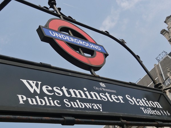
 Getting around London is pretty easy to do. Transport, though often criticized, is very effective in and around London – at least when the Underground is running uninterrupted. However, since 9pm on Tuesday 4th February until the morning of 7th February, the underground will be operating well below full capacity, as strike action affects many workers.
Transport for London has plans to cut many jobs, in particular through the closure of ticket office at all stations. Modernisation to the network is said to be essential, not just to improve the existing system, but also as it is predicted to save £50 million per year. Data suggests that only 3% of transactions involve people using ticket offices and thus the argument is that having offices manned is a waste of money and these workers would be better allocated to manning stations. David Cameron said:
I unreservedly condemn this strike. There is absolutely no justification for a strike. We need a modernised tube line working for the millions of Londoners who use it every day.
Workers on London Underground are naturally concerned about the impact this will have, in particular on their jobs, despite assurances that there will be no compulsory redundancies.
 The impact of these strikes on workers in London is clearly evident by any pictures you look at. Buses were over-crowded, despite more than 100 extra being provided, pavements were packed with pedestrians and the roads were full of cyclists. At least the strike action has led to a little more exercise for many people! The disruption to business in London is likely to be relatively large and the loss in revenue due to the action will also be high, estimated by Business leaders to be tens of millions of pounds. It is perhaps for this reason that there is discussion as to whether the underground should be declared an ‘essential service’ as a means of minimising future disruptions.
Discussions have been ongoing between both sides to try to prevent this action and talks are likely to continue in the future. Boris Johnson has declared the strikes as ‘completely pointless’ and both sides have argued that the other has been unwilling to negotiate and discuss the ticket office closures. Boris Johnson said:
A deal is there to be done. I am more than happy to talk to Bob Crow if he calls off the pointless and unnecessary strike.
 The impact on London and the economy will only be fully known after the strike action is over, but there are plans for further strikes next week. The greater the disruption the bigger the calls for further strikes on key services, such as the tube, to be prevented. In particular, this may mean new powers to curtail the rights of unions in these types of areas, which will require a minimum service to be provided. The following articles consider the strike action on the London Underground.
Articles
Questions
- If there is strike action in a labour market, what can we conclude about the market in question in terms of how competitive it is?
- If only 3% of transactions take place via ticket offices, is it an efficient use of resources to maintain the presence of ticket offices at every station?
- Is industrial action ‘completely pointless’?
- What other solutions are there besides strike action to problems of industrial dispute?
- What is the role of ACAS in negotiations?
- What is the economic impact of the strike on the London Underground? Think about the impact on businesses, revenues, sales and both micro and macro consequences.
- Should the tube be seen as an essential service such that strike action by its workers would be restricted?
 GDP figures are often a poor measure of a country’s economic well-being. By focusing on production, they may not capture the contribution of a range of social and environmental factors to people’s living standards, including the various negative and positive externalities from production and consumption themselves. A case in point is internet innovation: an issue considered in the first linked article below by the eminent economist, Joseph Stiglitz.
 resulting changes to GDP may be a very poor indicator of changes in social well-being.
