 With many countries experiencing low growth some 12 years after the financial crisis and with new worries about the effects of the coronavirus on output in China and other countries, some are turning to a Keynesian fiscal stimulus (see Case Study 16.6 on the student website). This may be in the form of tax cuts, or increased government expenditure or a combination of the two. The stimulus would be financed by increased government borrowing (or a reduced surplus).
The hope is that there will also be a longer-term supply-side effect which will boost potential national income. This could be through tax reductions creating incentives to invest or work more efficiently; or it could be through increased capacity from infrastructure spending, whether on transport, energy, telecommunications, health or education.
In the UK, the former Chancellor, Sajid Javid, had adopted a fiscal rule similar to the Golden Rule adopted by the Labour government from 1997 to 2008. This stated that, over the course of the business cycle, the government should borrow only to invest and not to fund current expenditure. Javid’s rule was that the government would balance its current budget by the middle of this Parliament (i.e. in 2 to 3 years) but that it could borrow to invest, provided that this did not exceed 3% of GDP. Previously this limit had been set at 2% of GDP by the former Chancellor, Philip Hammond. Using his new rule, it was expected that Sajid Javid would increase infrastructure spending by some £20 billion per year. This would still be well below the extra promised by the Labour Party if they had won the election and below what many believe Boris Johnson Would like.
 Sajid Javid resigned at the time of the recent Cabinet reshuffle, citing the reason that he would have been required to sack all his advisors and use the advisors from the Prime Minister’s office. His successor, the former Chief Secretary to the Treasury, Rishi Sunak, is expected to adopt a looser fiscal rule in his Budget on March 11. This would result in bigger infrastructure spending and possibly some significant tax cuts, such as a large increase in the threshold for the 40% income tax rate.
A Keynesian stimulus would almost certainly increase the short-term economic growth rate as inflation is low. However, unemployment is also low, meaning that there is little slack in the labour market, and also the output gap is estimated to be positive (albeit only around 0.2%), meaning that national income is already slightly above the potential level.
 Whether a fiscal stimulus can increase long-term growth depends on whether it can increase capacity. The government hopes that infrastructure expenditure will do just that. However, there is a long time lag between committing the expenditure and the extra capacity coming on stream. For example, planning for HS2 began in 2009. Phase 1 from London to Birmingham is currently expected to be operation not until 2033 and Phase 2, to Leeds and Manchester, not until 2040, assuming no further delays.
Crossrail (the new Elizabeth line in London) has been delayed several times. Approved in 2007, with construction beginning in 2009, it was originally scheduled to open in December 2018. It is now expected to be towards the end of 2021 before it does finally open. Its cost has increased from £14.8 billion to £18.25 billion.
Of course, some infrastructure projects are much quicker, such as opening new bus routes, but most do take several years.
The first five articles look at UK policy. The rest look at Keynesian fiscal policies in other countries, including the EU, Russia, Malaysia, Singapore and the USA. Governments seem to be looking for a short-term boost to aggregate demand that will increase short-term GDP, but also have longer-term supply-side effects that will increase the growth in potential GDP.
Articles
Questions
- Illustrate the effect of an expansionary fiscal policy with a Keynesian Cross (income and expenditure) diagram or an injections and withdrawals diagram.
- What is meant by the term ‘output gap’? What are the implications of a positive output gap for expansionary Keynesian policy?
- Assess the benefits of having a fiscal rule that requires governments to balance the current budget but allows borrowing to invest.
- Would there be a problem following such a rule if there is currently quite a large positive output gap?
- To what extent are the policies being proposed in Russia, the EU, Malaysia and Singapore short-term demand management policies or long-term supply-side policies?
 Elections are times of peak deception. Political parties have several ways in which they can use data to persuade people to vote for them. At one extreme, they can simply make up ‘facts’ – in other words, they can lie. There have been various examples of such lies in the run-up to the UK general election of 12 December 2019. The linked article below gives some examples. But data can be used in other deceptive ways, short of downright lies.
Politicians can use data in two ways. First, statistics can be used to describe, explain and interpret the past. Second, they can be used as the basis of forecasts of the future effects of policies.
In terms of past data, one of the biggest means of deception is the selective use of data. If you are the party currently in power, you highlight the good news and ignore the bad. You do the reverse if you are currently in opposition. The data may be correct, but selective use of data can give a totally false impression of events.
In terms of forecast data, you highlight those forecasts, or elements of them, that are favourable to you and ignore those that are not.
 Politicians rely on people’s willingness to look selectively at data. People want to see ‘evidence’ that reinforces their political views and prejudices. News media know this and happily do the same as politicians, selectively using data favourable to their political leanings. And it’s not just newspapers that do this. There are many online news sites that feed their readers with data supportive of their position. And there are many social media platforms, where people can communicate with people in their political ‘bubble’.
Genuine fact-checking sites can help, as can independent forecasters, such as the Institute for Fiscal Studies. But too many voters would rather only look at evidence, genuine or not, that supports their political point of view.
This can make life hard for economists who seek to explain the world with an open mind, based on a non-biased use of evidence – and hard for economic forecasters, who want to use full and accurate data in their models and to make realistic assumptions, emphasising that their forecasts are only the most likely outcome, not a certainty. As the article states:
Economic forecasts are flawed and their limitations should be acknowledged. But they should not be blindly dismissed as fake facts. And as far as political debate and discourse is concerned, in the long run, the truth may will out.
Article
Questions
- Give some specific examples of ways in which politicians misuse data.
- Give some specific examples of ways in which politicians misuse the analysis of economists.
- Distinguish between positive and normative statements? Should economists make policy recommendations? If so, in what context?
- Why are economic forecasts flawed, but why should they not be dismissed as ‘fake facts’?
- Examine the manifestos of two political parties and provide a critique of their economic analysis.
 Economists are often criticised for making inaccurate forecasts and for making false assumptions. Their analysis is frequently dismissed by politicians when it contradicts their own views.
But is this fair? Have economists responded to the realities of the global economy and to the behaviour of people, firms, institutions and government as they respond to economic circumstances? The answer is a qualified yes.
Behavioural economics is increasingly challenging the simple assumption that people are ‘rational’, in the sense that they maximise their self interest by weighing up the marginal costs and benefits of alternatives open to them. And macroeconomic models are evolving to take account of a range of drivers of global growth and the business cycle.
 The linked article and podcast below look at the views of 2019 Nobel Prize-winning economist Esther Duflo. She has challenged some of the traditional assumptions of economics about the nature of rationality and what motivates people. But her work is still very much in the tradition of economists. She examines evidence and sees how people respond to incentives and then derives policy implications from the analysis.
Take the case of the mobility of labour. She examines why people who lose their jobs may not always move to a new one if it’s in a different town. Partly this is for financial reasons – moving is costly and housing may be more expensive where the new job is located. Partly, however, it is for reasons of identity. Many people are attached to where they currently live. They may be reluctant to leave family and friends and familiar surroundings and hope that a new job will turn up – even if it means a cut in wages. This is not irrational; it just means that people are driven by more than simply wages.
Duflo is doing what economists typically do – examining behaviour in the light of evidence. In her case, she is revisiting the concept of rationality to take account of evidence on what motivates people and the way they behave.
 In the light of workers’ motivation, she considers the implications for the gains from trade. Is free trade policy necessarily desirable if people lose their jobs because of cheap imports from China and other developing countries where labour costs are low?
The answer is not a clear yes or no, as import-competing industries are only part of the story. If protectionist policies are pursued, other countries may retaliate with protectionist policies themselves. In such cases, people working in the export sector may lose their jobs.
She also looks at how people may respond to a rise or cut in tax rates. Again the answer is not clear cut and an examination of empirical evidence is necessary to devise appropriate policy. Not only is there an income and substitution effect from tax changes, but people are motivated to work by factors other than take-home pay. Likewise, firms are encouraged to invest by factors other than the simple post-tax profitability of investment.
Podcast
Article
Questions
- In traditional ‘neoclassical’ economics, what is meant by ‘rationality’ in terms of (a) consumer behaviour; (b) producer behaviour?
- How might the concept of rationality be expanded to take into account a whole range of factors other than the direct costs and benefits of a decision?
- What is meant by bounded rationality?
- What would be the effect on workers’ willingness to work more or fewer hours as a result of a cut in the marginal income tax rate if (a) the income effect was greater than the substitution effect; (b) the substitution effect was greater than the income effect? Would your answers to (a) and (b) be the opposite in the case of a rise in the marginal income tax rate?
- Give some arguments that you consider to be legitimate for imposing controls on imports in (a) the short run; (b) the long run. How might you counter these arguments from a free-trade perspective?
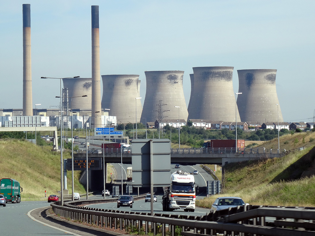 With the growing recognition of the global climate emergency (see also), attention is being increasingly focused on policies to tackle global warming.
In the October version of its journal, Fiscal Monitor, the IMF argues that carbon taxes can play a major part in meeting the goal of achieving net zero carbon emissions by 2050 or earlier.
As the blog accompanying the journal states:
Global warming has become a clear and present threat. Actions and commitments to date have fallen short. The longer we wait, the greater the loss of life and damage to the world economy. Finance ministers must play a central role to champion and implement fiscal policies to curb climate change. To do so, they should reshape the tax system and fiscal policies to discourage carbon emissions from coal and other polluting fossil fuels.
The effect of a carbon tax on production
The argument is that carbon emissions represent a massive negative externality, where the costs are borne largely by people other than the emitters. Taxes can internalise these externalities. The effect would be to raise the price of carbon-emitting activities and reduce the quantity consumed and hence produced.
The diagram illustrates the argument. It takes the case of carbon emissions from coal-fired electricity generation in a large country. To keep the analysis simple, it is assumed that all electricity in the country is generated from coal-fired power stations and that there are many such power stations, making the market perfectly competitive.
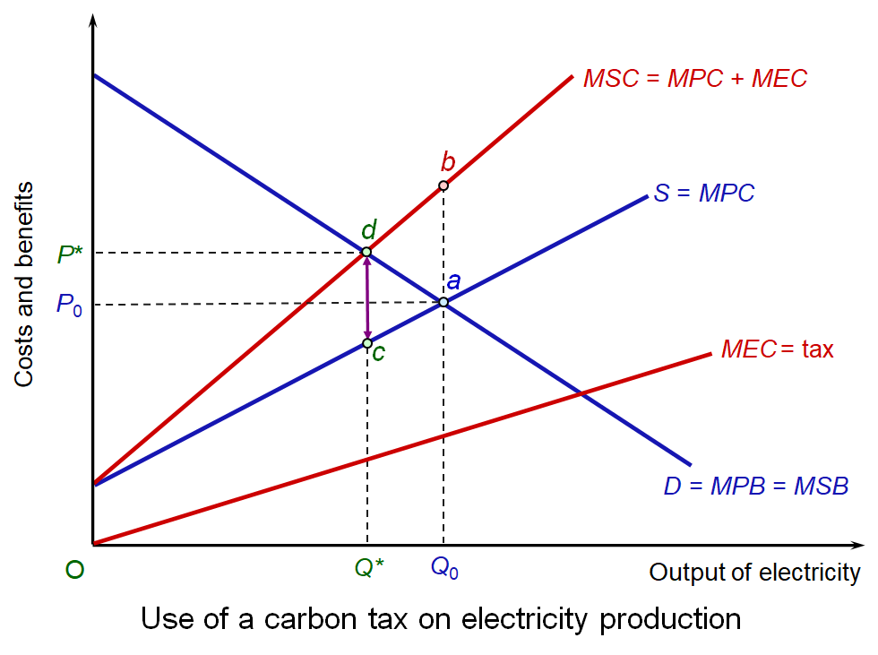 It is assumed that all the benefits from electricity production accrue solely to the consumers of electricity (i.e. there are no external benefits from consumption). Marginal private and marginal social benefits of the production of electricity are thus the same (MPB = MSB). The curve slopes downwards because, with a downward-sloping demand for electricity, higher output results in a lower marginal benefit (diminishing marginal utility).
Competitive market forces, with producers and consumers responding only to private costs and benefits, will result in a market equilibrium at point a in the diagram: i.e. where demand equals supply. The market equilibrium price is P0 while the market equilibrium quantity is Q0. However the presence of external costs in production means that MSC > MPC. In other words, MEC = b – a.
The socially optimal output would be Q* where P = MSB = MSC, achieved at the socially optimal price of P*. This is illustrated at point d and clearly shows how external costs of production in a perfectly competitive market result in overproduction: i.e. Q0 > Q*. From society’s point of view, too much electricity is being produced and consumed.
If a carbon tax of d – c is imposed on the electricity producers, it will now be in producers’ interests to produce at Q*, where their new private marginal costs (including tax) equals their marginal private benefit.
Assessing the benefits of carbon taxes
The diagram shows the direct effect on production of electricity. With widespread carbon taxes, there would be similar direct effects on other industries that emit carbon, and also on consumers, faced with higher fuel prices. In the UK, for example, there are currently higher taxes on high-emissions vehicles than on low-emissions ones.
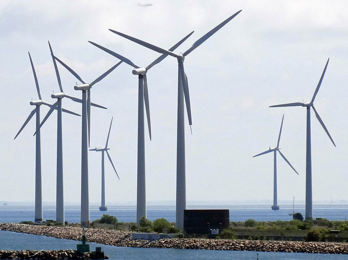 However, there are other effects of carbon taxes which contribute to the reduction in carbon emissions over the longer term. First, firms will have an incentive to invest in green energy production, such as wind, solar and hydro. Second, it will encourage R&D in green energy technology. Third, consumers will have an incentive to use less electricity by investing in more efficient appliances and home insulation and making an effort to turn off lights, the TV, computers and so on.
People may object to paying more for electricity, gas and motor fuel, but the tax revenues could be invested in cheaper clean public transport, home insulation and public services generally, such as health and education. This could be part of a policy of redistribution, with the tax revenues being spent on alleviating poverty. Alternatively, other taxes could be cut.
The IMF estimates that to restrict global warming to 2°C (a target seen as too modest by many environmentalists), large emitting countries ‘should introduce a carbon tax set to rise quickly to $75 a ton in 2030’.
This would mean household electric bills would go up by 43 per cent cumulatively over the next decade on average – more in countries that still rely heavily on coal in electricity generation, less elsewhere. Gasoline would cost 14 percent more on average.
It gives the example of Sweden, which has a carbon tax of $127 per ton. This has resulted in a 25% reduction in emissions since 1995, while the economy has expanded 75% since then.
Limits of carbon taxes
Although carbon taxes can make a significant contribution to combatting global warming, there are problems with their use.
First, it may be politically popular for governments not to impose them, or raise them, with politicians arguing that they are keen to help ‘struggling motorists’ or poor people ‘struggling to keep their homes warm’. In the UK, successive governments year after year have chosen not to raise road fuel taxes, despite a Fuel Price Escalator (replaced in 2011 by a Fuel Duty Stabiliser) designed to raise fuel taxes each year by more than inflation. Also, governments fear that higher energy prices would raise costs for their country’s industries, thereby damaging exports.
Second, it is difficult to measure the marginal external costs of CO2 emissions, which gives ammunition to those arguing to keep taxes low. In such cases it may be prudent, if politically possible, to set carbon taxes quite high.
 Third, they should not be seen as a sufficient policy on their own, but as just part of the solution to global warming. Legislation to prevent high emissions can be another powerful tool to prevent activities that have high carbon emissions. Examples include banning high-emission vehicles; a requirement for coal-fired power stations and carbon emitting factories to install CO2 scrubbers (filters); and tougher planning regulations for factories that emit carbon. Education to encourage people to cut their own personal use of fossil fuels is another powerful means of influencing behaviour.
A cap-and-trade system, such as the European Emissions Trading Scheme would be an alternative means of cutting carbon efficiently. It involves setting quotas for emissions and allowing firms which manage to cut emissions to sell their surplus permits to less efficient firms. This puts a price pressure on firms to be more efficient. But the quotas (the ‘cap’) must be sufficiently tight if emissions are going to be cut to desired levels.
But, despite being just one possible policy, carbon taxes can make a significant contribution to combatting global warming.
Articles
 Fiscal Policies to Curb Climate Change
IMF blog, Vitor Gaspar, Paolo Mauro, Ian Parry and Catherine Pattillo (10/10/19)
- Energy bills will have to rise sharply to avoid climate crisis, says IMF
The Guardian, Larry Elliott (10/10/19)
- Huge global carbon tax hike needed in next 10 years to head off climate disaster, says IMF
Independent, Chris Mooney and Andrew Freedman (11/10/19)
- World urgently needs to quicken steps to reduce global warming – IMF
Reuters, Lindsay Dunsmuir (10/10/19)
- The Case for a Goldilocks Carbon Tax
Forbes, Roger Pielke (13/9/19)
- The world needs a massive carbon tax in just 10 years to limit climate change, IMF says
Washington Post, Chris Mooney and Andrew Freedman (10/10/19)
- People like the idea of a carbon tax – if the money is put to good use
New Scientist, Michael Le Page (18/9/19)
- The IMF thinks carbon taxes will stop the climate crisis. That’s a terrible idea.
The Guardian, Kate Aronoff (12/10/19)
- Firms ignoring climate crisis will go bankrupt, says Mark Carney
The Guardian, Damian Carrington (13/10/19)
- How central banks can tackle climate change
Financial Times, The editorial board (31/10/19)
- World Economic Forum: Climate change action needed to avoid societal ‘collapse’ says minister
The National, UAE, Anna Zacharias (3/11/19)
- Riots and trade wars: Why carbon taxes will not solve climate crisis
Recharge, Leigh Collins (31/10/19) (Part 1)
- The plethora of effective alternatives to carbon pricing
Recharge, Leigh Collins (31/10/19) (Part 2)
- Are these the real reasons why Big Oil wants a carbon tax?
Recharge, Leigh Collins (31/10/19) (Part 3)
- Do we need carbon taxes in an era of cheap renewables?
Recharge, Leigh Collins (31/10/19) (Part 4)
Report
- How to Mitigate Climate Change
IMF Fiscal Monitor, Ian Parry (team leader), Thomas Baunsgaard, William Gbohoui, Raphael Lam, Victor Mylonas, Mehdi Raissi, Alpa Shah and Baoping Shang (October 2019)
Questions
- Draw a diagram to show how subsidies can lead to the optimum output of green energy.
- What are the political problems in introducing or raising carbon taxes? Examine possible solutions to these problems
- Choose two policies for reducing carbon emissions other than using carbon taxes? Compare their effectiveness with carbon taxes.
- How is game theory relevant to getting international agreement on cutting greenhouse gas emissions? Why is there likely to be a prisoners’ dilemma problem in reaching and sticking to such agreements? How might the problem of a prisoners’ dilemma be overcome in such circumstances?
 With university fees for home students in England of £9250 per year and with many students receiving maintenance loans of around £9000 per year, many students are graduating with debts in excess of £50 000. Loans are repaid at a marginal rate of 9% on incomes over £25 716.
Many students also study for a masters degree. The average fee for a taught, classroom-based masters (MA) is £7392 and for a laboratory-based masters (MSc) is £8167 but can be considerably higher at some prestigious universities where demand is high. Government loans of up to £10 906 are available to contribute towards fees and maintenance. These are paid back at a marginal rate of 6% for people earning over £21 000, giving a combined marginal rate of 15% for first and masters degrees.
For high earners on the 40% income tax rate, the combined marginal rate of payment out of income is 40% tax, plus 2% national insurance, plus 15% for those with undergraduate and masters loans. This gives a combined marginal rate of 57%.
 Average student debt in England is higher even than in the USA, where the average is $37 000. US university courses are more expensive than in the UK, costing an average of $34 000 per year in tuition alone. But undergraduates can borrow less. They can borrow between $5500 and $12 500 per year in federal loans towards both fees and maintenance, and some private loans are also available. Most students do some paid work during their studies to make up the difference or rely on parents contributing. Parental contributions mean that students from poor families end up owing more. According to a Guardian article:
Race is a huge factor. Black students owe an average of $7400 more than white students when they graduate, the Brookings Institution found. After graduation, the debt gap continues to widen. Four years after graduation, black graduates owe an average of nearly $53 000 – nearly double that of white graduates.
Student debt looks to become one of the key issues in the 2020 US presidential election.
Pressure to cancel student fees and debt in the USA
Most of the Democratic candidates are promising to address student fees and debt. Student debt, they claim, places an unfair burden on the younger generation and makes it hard for people to buy a house, or car or other major consumer durables. This also has a dampening effect on aggregate demand.
The most radical proposal comes from Bernie Sanders. He has vowed, if elected, to abolish student fees and to cancel all undergraduate and graduate debt of all Americans. Other candidates are promising to cut fees and/or debt.
Although most politicians and commentators agree that the USA has a serious problem of student debt, there is little agreement on what, if anything, to do about it. There are already a number of ways in which student debt can be written off or reduced. For example, if you work in the public sector for more than 10 years, remaining debt will be cancelled. However, none of the existing schemes is as radical as that being proposed by many Democrats.
 Criticisms of the Democrats’ plans are mainly of two types.
The first is the sheer cost. Overall debt is around $1.6tn. What is more, making student tuition free would place a huge ongoing burden on government finances. Bernie Sanders proposes introducing a financial transactions tax on stock trading. This would be similar to a Tobin tax (sometimes dubbed a ‘Robin Hood tax’) and would include a 0.5% tax on stock transactions, a 0.1% tax on bond trades and a 0.005% tax on transactions in derivatives. He argues that the public bailed out the financial sector in 2008 and that it is now the turn of the financial sector to come to the aid of students and graduates.
The other type of criticism concerns the incentive effects of the proposal. The core of the criticism is that loan forgiveness involves moral hazard.
The moral hazard of loan forgiveness
The argument is that cancelling debt, or the promise to do so, encourages people to take on more debt. Generally, moral hazard occurs when people are protected from the consequences of their actions and are thus encouraged to make riskier decisions. For example, if you are ensured against theft, you may be less careful with your belongings. As the Orange County Register article linked below states:
If the taxpayers pay the debts of everyone with outstanding student loans, how will that affect the decisions made by current students thinking about their choices for financing higher education? What’s the message? Borrow as much as you can and wait for the debt to be canceled during the next presidential primary campaign?
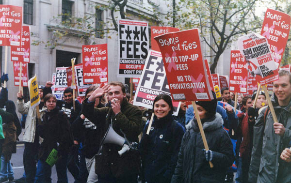 Not only would more students be encouraged to go to college, but they would be encouraged to apply for more costly courses if they were free.
Universities would be encouraged to exaggerate their costs to warrant higher fees charged to the government. The government (federal, state or local) would have to be very careful in auditing courses to ensure costs were genuine. Universities could end up being squeezed for finance as government may try to cut payments by claiming that courses were overpriced.
Even if fees were not abolished, cancelling debts would encourage students to take on larger debt, if that was to be cleared at some point in the future. What is more, students (or their parents) who could afford to pay, would choose to borrow the money instead.
But many countries do have free or highly subsidised higher education. Universities are given grants which are designed to reflect fair costs.
Articles
Videos
Questions
- Assess the arguments for abolishing or substantially reducing student fees.
- Assess the arguments against abolishing or substantially reducing student fees.
- Assess the arguments for writing off or substantially reducing student debt.
- Assess the arguments against writing off or substantially reducing student debt.
- If it were decided to cancel student debt, would it be fair to pay students back for any debt they had already paid off?
- Does tackling the problem of student debt necessarily lead to a redistribution of wealth/income?
- Give some other examples of moral hazard.
- If student fees were abolished, would there be any problem of adverse selection? If so, how could this be overcome?
- Find out what the main UK parties are advocating about student fees and debt in the nations of the UK for home and non-home students. Provide a critique of each of their policies.
 With many countries experiencing low growth some 12 years after the financial crisis and with new worries about the effects of the coronavirus on output in China and other countries, some are turning to a Keynesian fiscal stimulus (see Case Study 16.6 on the student website). This may be in the form of tax cuts, or increased government expenditure or a combination of the two. The stimulus would be financed by increased government borrowing (or a reduced surplus).
  Sajid Javid resigned at the time of the recent Cabinet reshuffle, citing the reason that he would have been required to sack all his advisors and use the advisors from the Prime Minister’s office. His successor, the former Chief Secretary to the Treasury, Rishi Sunak, is expected to adopt a looser fiscal rule in his Budget on March 11. This would result in bigger infrastructure spending and possibly some significant tax cuts, such as a large increase in the threshold for the 40% income tax rate.
 Whether a fiscal stimulus can increase long-term growth depends on whether it can increase capacity. The government hopes that infrastructure expenditure will do just that. However, there is a long time lag between committing the expenditure and the extra capacity coming on stream. For example, planning for HS2 began in 2009. Phase 1 from London to Birmingham is currently expected to be operation not until 2033 and Phase 2, to Leeds and Manchester, not until 2040, assuming no further delays.
  Elections are times of peak deception. Political parties have several ways in which they can use data to persuade people to vote for them. At one extreme, they can simply make up ‘facts’ – in other words, they can lie. There have been various examples of such lies in the run-up to the UK general election of 12 December 2019. The linked article below gives some examples. But data can be used in other deceptive ways, short of downright lies.
  Politicians rely on people’s willingness to look selectively at data. People want to see ‘evidence’ that reinforces their political views and prejudices. News media know this and happily do the same as politicians, selectively using data favourable to their political leanings. And it’s not just newspapers that do this. There are many online news sites that feed their readers with data supportive of their position. And there are many social media platforms, where people can communicate with people in their political ‘bubble’.
 Economists are often criticised for making inaccurate forecasts and for making false assumptions. Their analysis is frequently dismissed by politicians when it contradicts their own views.
  The linked article and podcast below look at the views of 2019
  In the light of workers’ motivation, she considers the implications for the gains from trade. Is free trade policy necessarily desirable if people lose their jobs because of cheap imports from China and other developing countries where labour costs are low?
 With the growing recognition of the
  It is assumed that all the benefits from electricity production accrue solely to the consumers of electricity (i.e. there are no external benefits from consumption). Marginal private and marginal social benefits of the production of electricity are thus the same (MPB = MSB). The curve slopes downwards because, with a downward-sloping demand for electricity, higher output results in a lower marginal benefit (diminishing marginal utility).
 However, there are other effects of carbon taxes which contribute to the reduction in carbon emissions over the longer term. First, firms will have an incentive to invest in green energy production, such as wind, solar and hydro. Second, it will encourage R&D in green energy technology. Third, consumers will have an incentive to use less electricity by investing in more efficient appliances and home insulation and making an effort to turn off lights, the TV, computers and so on.
 Third, they should not be seen as a sufficient policy on their own, but as just part of the solution to global warming. Legislation to prevent high emissions can be another powerful tool to prevent activities that have high carbon emissions. Examples include banning high-emission vehicles; a requirement for coal-fired power stations and carbon emitting factories to install CO2
  With
With  Average student debt in England is higher even than in the USA, where the average is $37 000. US university courses are more expensive than in the UK, costing an average of $34 000 per year in tuition alone. But undergraduates can borrow less. They can borrow between $5500 and $12 500 per year in federal loans towards both fees and maintenance, and some private loans are also available. Most students do some paid work during their studies to make up the difference or rely on parents contributing. Parental contributions mean that students from poor families end up owing more. According to
  Criticisms of the Democrats’ plans are mainly of two types.
 Not only would more students be encouraged to go to college, but they would be encouraged to apply for more costly courses if they were free.