 The latest UK house price index reveals that annual house price growth in the UK slowed to just 1.2 per cent in May. This is the lowest rate of growth since January 2013. This is being driven, in part, by the London market where annual house price inflation rates have now been negative for 15 consecutive months. In May the annual rate of house price inflation in London fell to -4.4 per cent, it lowest since August 2009 as the financial crisis was unfolding. However, closer inspection of the figures show that while many other parts of the country continue to experience positive rates of annual house price inflation, once general inflation is accounted for, there is widespread evidence of widespread real house price deflation.
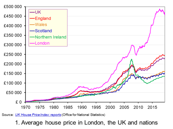 The average UK house price in May 2019 was £229,000. As Chart 1 shows, this masks considerable differences across the UK. In England the average price was £246,000 (an annual increase of 1.0 per cent), in Scotland it was £153,000 (an increase of 2.8 per cent), in Wales £159,000 (an increase of 3.0 per cent) and in Northern Ireland it was £137,000 (an increase of 2.1 per cent). (Click here to download a PowerPoint copy of the chart.)
The London market distorts considerably the English house price figures. In London the average house price in May 2019 was £457,000 (an annual decrease of 4.4 per cent). House prices were lowest in the North East region of England at £128,000. The North East was the only other English region alongside London to witness a negative rate of annual house price inflation, with house prices falling in the year to May 2019 by 0.7 per cent.
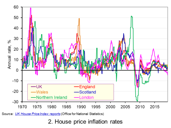 Chart 2 allows us to see more readily the rates of house price growth. It plots the annual rates of house price inflation across London, the UK and its nations. What is readily apparent is the volatility of house price growth. This is evidence of frequent imbalances between the flows of property on to the market to sell (instructions to sell) and the number of people looking to buy (instructions to buy). An increase in instructions to buy relative to those to sell puts upwards pressure on prices whereas an increase in the relative number of instructions to sell puts downward pressure on prices. (Click here to download a PowerPoint copy of the chart.)
Despite the volatility in house prices, the longer-term trend in house prices is positive. The average annual rate of growth in house prices between January 1970 and May 2019 in the UK is 9.1 per cent. For England the figure is 9.4 per cent, for Wales 8.8 per cent, for Scotland 8.5 per cent and for Northern Ireland 8.3 per cent. In London the average rate of growth is 10.4 per cent per annum.
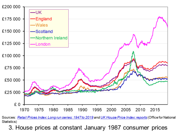 As Chart 3 illustrates, the longer-term growth in actual house prices cannot be fully explained by the growth in consumer prices. It shows house price values as if consumer prices, as measured by the Retail Prices Index (RPI), were fixed at their January 1987 levels. We see real increases in house prices or, expressed differently, in house prices relative to consumer prices. In real terms, UK house prices were 3.6 times higher in May 2019 compared to January 1970. For England the figure is 4.1 times, for Wales 3.1 times, for Scotland 2.9 times and for Northern Ireland 2.1 times. In London inflation-adjusted house prices were 5.7 times higher. (Click here to download a PowerPoint copy of the chart.)
The volatility in house prices continues to be evident when adjusted for changes in consumer prices. The UK’s annual rate of real house price inflation was as high as 40 per in January 1973, yet, on the other hand, in June 1975 inflation-adjusted house prices were 16 per cent lower than a year earlier. Over the period from January 1970 to May 2019, the average annual rate of real house price inflation was 3.2 per cent. Hence house prices have, on average, grown at an annual rate of consumer price inflation plus 3.2 per cent.
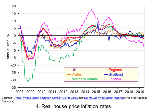 Chart 4 shows annual rates of real house price inflation since 2008 and, hence, from around the time the financial crisis began to unfold. The period is characterised by acute volatility and with real house prices across the UK falling at an annual rate of 16 per cent in 2009 and by as much 29 per cent in Northern Ireland. (Click here to download a PowerPoint copy of the chart.)
The UK saw a rebound in nominal and real house price growth in the period from 2013, driven by a strong surge in prices in London and the South East, and supported by government initiatives such as Help to Buy designed to help people afford to buy property. But house price growth then began to ease from early/mid 2016. Some of the easing may be partly due to any excessive fizz ebbing from the market, especially in London, and the impact on the demand for buy-to-let investments resulting from reductions in tax relief on interest payments on buy-to-let mortgages.
However, the housing market is notoriously sensitive to uncertainty, which is not surprising when you think of the size of the investment people are making when they enter the market. The uncertainty surrounding Brexit and the UK’s future trading relationships will have been a drag on demand and hence on house prices.
Chart 4 shows that by May 2019 all the UK nations were experiencing negative rates of real house price inflation, despite still experiencing positive rates of nominal house price inflation. In Wales the real annual house price inflation rate was -0.1 per cent, in Scotland -0.2 per cent, in Northern Ireland -0.9 per cent and in England -2.0 per cent. Meanwhile in London, where annual house price deflation has been evident for 15 consecutive months, real house prices in May 2019 were falling at an annual rate of 7.2 per cent.
Going forward the OBR’s Fiscal Risks Report predicts that, in the event of a no-deal, no-transition exit of the UK from the European Union, nominal UK house prices would fall by almost 10 per cent between the start of 2019 and mid-2021. This forecast is driven by the assumption that the UK would enter a year-long recession from the final quarter of 2019. It argues that property transactions and prices ‘move disproportionately’ during recessions. (See John’s blog The costs of a no-deal Brexit for a fuller discussion of the economics of a no-deal Brexit). The danger therefore is that the housing market becomes characterised by both nominal and real house price falls.
Articles
Questions
- Explain the difference between a rise in the rate of house price inflation a rise in the level of house prices.
- Explain the difference between nominal and real house prices.
- If nominal house prices rise can real house price fall? Explain your answer.
- What do you understand by the terms instructions to buy and instructions to sell?
- What factors are likely to affect the levels of instructions to buy and instructions to sell?
- How does the balance between instructions to buy and instructions to sell affect house prices?
- How can we differentiate between different housing markets? Illustrate your answer with examples.
 The latest UK house price index continues to show an easing in the rate of house price inflation. In the year to January 2019 the average UK house price rose by 1.7 per cent, the lowest rate since June 2013 when it was 1.5 per cent. This is significantly below the recent peak in house price inflation when in May 2016 house prices were growing at 8.2 per cent year-on-year. In this blog we consider how recent patterns in UK house prices compare with those over the past 50 years and also how the growth of house prices compares to that in consumer prices.
The UK and its nations
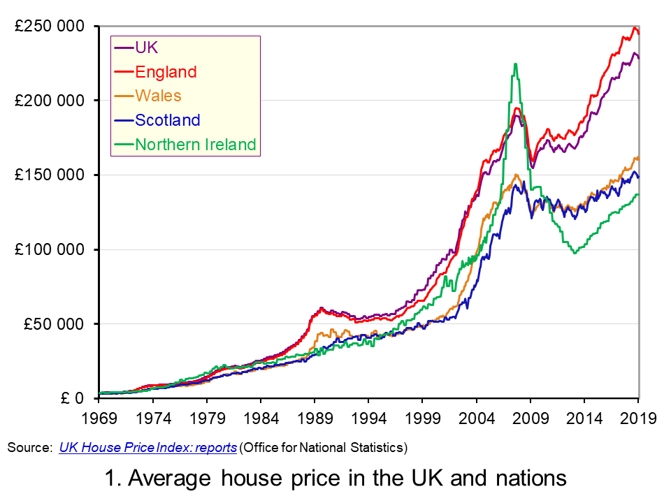 The average UK house price in January 2019 was £228,000. As Chart 1 shows, this masks considerable differences across the UK. In England the average price was £245,000 (an annual increase of 1.5 per cent), while in Scotland it was £149,000 (an increase of 1.3 per cent), Wales £160,000 (an increase of 4.6 per cent) and £137,000 in Northern Ireland (an increase of 5.5 per cent). (Click here to download a PowerPoint copy of the chart.)
Within England there too are considerable differences in house prices, with London massively distorting the English average. In January 2019 the average house price in inner London was recorded at £568,000, a fall of 1.9 per cent on January 2018. In Outer London the average price was £426,000, a fall of 0.2 per cent. Across London as a whole the average price was £472,000, a fall of 1.6 per cent. House prices were lowest in the North East at £125,000, having experienced an annual increase of 0.9 per cent.
The Midlands can be used as a reference point for English house prices outside of the capital. In January 2019 the average house price in the West Midlands was £195,000 while in the East Midlands it was £193,000. While the annual rate of house price inflation in London is now negative, the annual rate of increase in the Midlands was the highest in England. In the West Midlands the annual increase was 4 per cent while in the East Midlands it was 4.4 per cent. These rates of increase are currently on par with those across Wales.
Long-term UK house price trends
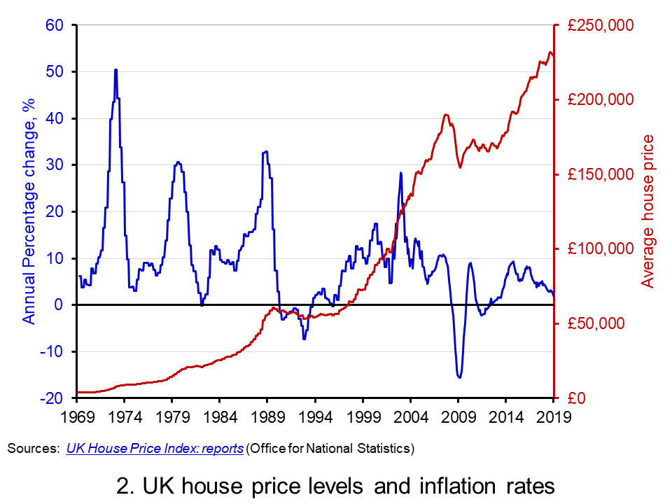 Chart 2 shows the average house price for the UK since 1969 alongside the annual rate of house price inflation, i.e. the annual percentage change in the level of house prices. The average UK house price in January 1969 was £3,750. By January 2019, as we have seen, it had risen to around £228,000. This is an increase of nearly 6,000 per cent. Over this period, the average annual rate of house price inflation was 9 per cent. However, if we measure it to the end of 2007 it was 11 per cent. (Click here to download a PowerPoint copy of the chart.)
The significant effect of the financial crisis on UK house prices is evident from Charts 1 and 2. In February 2009 house prices nationally were 16 per cent lower than a year earlier. Furthermore, it was not until August 2014 that the average UK house rose above the level of September 2007. Indeed, some parts of the UK, such as Northern Ireland and the North East of England, remain below their pre-financial crisis level even today.
Nominal and real UK house prices
But how do house price patterns compare to those in consumer prices? In other words, what has happened to inflation-adjusted or real house prices? One index of general prices is the Retail Prices Index (RPI). This index measures the cost of a representative basket of consumer goods and services. Since January 1969 the RPI has increased by nearly 1,600 per cent. While substantial in its own right, it does mean that house prices have increased considerably more rapidly than consumer prices.
If we eliminate the increase in consumer prices from the actual (nominal) house price figures what is left is the increase in house prices relative to consumer prices. To do this we estimate house prices as if consumer prices had remained at their January 1987 level. This creates a series of average UK house prices at constant January 1987 consumer prices.
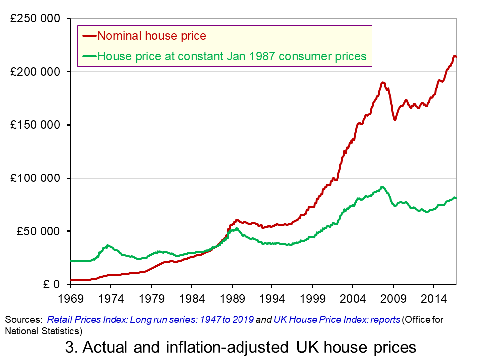 Chart 3 shows the average nominal and real UK house price since 1969. It shows that in real terms the average UK house price increased by around 266 per cent between January 1969 and January 2019. Therefore, the average real UK house price was 3.7 times more expensive in 2019 compared with 1969. This is important because it means that general price inflation cannot explain all the long-term growth seen in average house prices. (Click here to download a PowerPoint copy of the chart.)
Real UK house price cycles
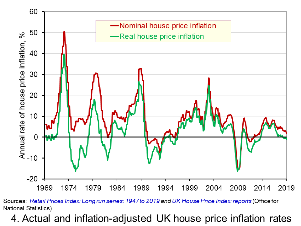 Chart 4 shows that annual rates of nominal and real house price inflation. As we saw earlier, the average nominal house price inflation rate since 1969 has been 9 per cent. The average real rate of increase in house prices has been 3.1 per cent per annum. In other words, house prices have on average each each year increased by the annual rate of RPI inflation plus 3.1 percentage points. (Click here to download a PowerPoint copy of the chart.)
Chart 4 shows how, in addition to the long-term relative increase in house prices, there are also cycles in the relative price of houses. This is evidence of a volatility in house prices that cannot be explained by general prices. This volatility reflects frequent imbalances between the demand and supply of housing, i.e. between instructions to buy and sell property. Increasing levels of housing demand (instructions to buy) relative to housing supply (instructions to supply) will put upward pressure on house prices and vice versa.
In January 2019 the annual real house price inflation across the UK was -0.9 per cent. While the rate was slightly lower in Scotland at -1.2 per cent, the biggest drag on UK house price inflation was the London market where the real house price inflation rate was -4.0 per cent. In contrast, January saw annual real house price inflation rates of 2 per cent in Wales, 2.3 per cent in Northern Ireland and 1.8 per cent in the East Midlands.
Inflation-adjusted inflation rates in London have been negative consistently since June 2017. From their July 2016 peak, following the result of the referendum on UK membership of the EU, to January 2019 inflation-adjusted house prices fell by 7.6 per cent. This reflects, in part, the fact that the London housing market, like that of other European capitals, is a more international market than other parts of the country. Therefore, the current patterns in UK house prices are rather distinctive in that the easing is being led by London and southern England.
Articles
Questions
- What is meant by the annual rate of house price inflation?
- How is a rise in the rate of house price inflation different from a rise in the level of house prices?
- What factors are likely to determine housing demand (instructions to buy)?
- What factors are likely to affect housing supply (instructions to sell)?
- Explain the difference between nominal and real house prices.
- What does a decrease in real house prices mean? Can this occur even if actual house prices have risen?
- How might we explain the recent differences between house price inflation rates in London relative to other parts of the UK, like the Midlands and Wales?
- Why were house prices so affected by the financial crisis?
- Assume that you asked to measure the affordability of housing. What data might you collect?
 One of the most enduring characteristics of the macroeconomic environment since the financial crisis of the late 2000s has been its impact on people’s pay. We apply the distinction between nominal and real values to evidence the adverse impact on the typical purchasing power of workers. While we do not consider here the distributional impact on pay, the aggregate picture nonetheless paints a very stark picture of recent patterns in pay and, in turn, the consequences for living standards and wellbeing.
While the distinction between nominal and real values is perhaps best know in relation to GDP and economic growth (see the need to get real with GDP), the distinction is also applied frequently to analyse the movement of one price relative to prices in general. One example is that of movements in pay (earnings) relative to consumer prices.
Pay reflects the price of labour. The value of our actual pay is our nominal pay. If our pay rises more quickly than consumer prices, then our real pay increases. This means that our purchasing power rises and so the volume of goods and services we can afford increases. On the other hand, if our actual pay rises less quickly than consumer prices then our real pay falls. When real pay falls, purchasing power falls and the volume of goods and services we can afford falls.
Figures from the Office for National Statistics show that in January 2000 regular weekly pay (excluding bonuses and before taxes and other deductions from pay) was £293. By December 2018 this had risen to £495. This is an increase of 69 per cent. Over the same period the consumer prices index known as the CPIH, which, unlike the better-known CPI, includes owner-occupied housing costs and Council Tax, rose by 49 per cent. Therefore, the figures are consistent with a rise both in nominal and real pay between January 2000 to December 2018. However, this masks the fact that in recent times real earnings have fallen.
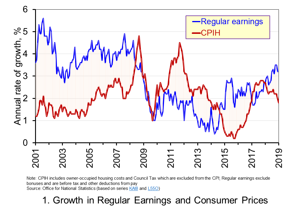 Chart 1 shows the annual percentage changes in actual (nominal) regular weekly pay and the CPIH since January 2001. Each value is simply the percentage change from 12 months earlier. The period up to June 2008 saw the annual growth of weekly pay outstrip the growth of consumer prices – the blue line in the chart is above the red line. Therefore, the real value of pay rose. However, from June 2008 to August 2014 pay growth consistently fell short of the rate of consumer price inflation – the blue line is below the red line. The result was that average real weekly pay fell. (Click here to download a PowerPoint copy of the chart.)
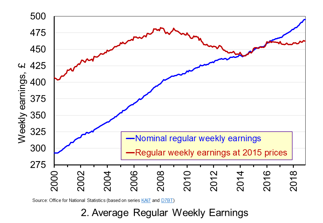 Chart 2 show the average levels of nominal and real weekly pay. The real series is adjusted for inflation. It is calculated by deflating the nominal pay values by the CPIH. Since the CPIH is a price index whose value averages 100 across 2015, the real pay values are at constant 2015 prices. From the chart, we can see that the real value of weekly pay peaked in March 2008 at £482.01 at 2015 prices. The subsequent period saw rates of pay inflation that were lower than rates of consumer price inflation. This meant that by March 2014 the real value of weekly pay had fallen by 8.8 per cent to £439.56 at 2015 prices. (Click here to download a PowerPoint copy of the chart.)
Although real (inflation-adjusted) pay recovered a little during 2015 and 2016, 2017 again saw consumer price inflation rates greater than those of pay inflation (see Chart 1). Consequently, the average level of real weekly pay fell by 1 per cent between January and November 2017. Since then, real regular pay has again increased. In December 2018, average real pay weekly pay was £462.18 at 2015 prices: an increase of 1.1 per cent from November 2017. Nonetheless, inflation-adjusted average weekly pay in December 2018 remained 4.1 per cent below its March 2008 level.
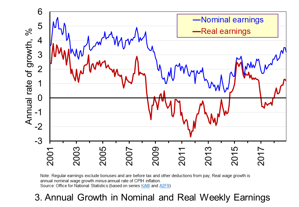 Chart 3 shows very clearly the importance of the distinction between real and nominal when analysing the growth of earnings. The sustained period of real pay deflation (negative rates of pay inflation) that followed the financial crisis can be seen much more clearly by plotting growth rates rather than their levels. Since June 2008 the average annual growth of real regular weekly pay has been −0.2 per cent, despite nominal pay increasing at an annual rate of 2 per cent. In the period from January 2001 to May 2008 real regular weekly pay had grown at an annual rate of 2.1 per cent with nominal pay growing at an annual rate of 4.0 per cent. (Click here to download a PowerPoint copy of the chart.)
The distinction between nominal and real helps us to understand better why some argue that patterns in pay, living standards and well-being have been fundamental in characterising the macroeconomic environment since the financial crisis. Indeed, it is not unreasonable to suggest that these patterns have helped to shape macroeconomic debates and broader conversations around the role of government and of public policy and its priorities.
Articles
Questions
- Using the example of GDP and earnings, explain how the distinction between nominal and real relates to the distinction between values and volumes.
- In what circumstances would an increase in actual pay translate into a reduction in real pay?
- In what circumstances would a decrease in actual pay translate into an increase in real pay?
- What factors might explain the reduction in real rates of pay seen in the UK following the financial crisis?
- Of what importance might the growth in real rates of pay be for consumption and aggregate demand?
- Why is the growth of real pay an indicator of financial well-being? What other indicators might be included in measuring financial well-being?
- Assume that you have been asked to undertake a distributional analysis of real earnings since the financial crisis. What might be the focus of your analysis? What information would you therefore need to collect?
 Economists were generally in favour of the UK remaining in the EU and highly critical of the policy proposals of Donald Trump. And yet the UK voted to leave the EU and Donald Trump was elected.
People rejected the advice of most economists. Many blamed the failure of most economists to predict the 2007/8 financial crisis and to find solutions to the growing gulf between rich and poor, with the majority stuck on low incomes.
So to what extent are economists to blame for the rise in populism – a wave that could lead to electoral upsets in various European countries? The podcast below brings together economists and politicians from across the political spectrum. It is over an hour long and provides an in-depth discussion of many of the issues and the extent to which economists can provide answers.
Podcast
 Should economists share the blame for populism? Guardian Politics Weekly podcast, Heather Stewart, joined by Andrew Lilico, Ann Pettifor, Jonathan Portes, Rachel Reeves and Vince Cable (23/2/17)
Questions
- Why has globalisation become a dirty word?
- Assess the arguments for and against an open policy towards immigration?
- In what positive ways may economists contribute to populism?
- Do economists concentrate too much on growth in GDP rather than on its distribution?
- Give some examples of ways in which various popular interpretations of economic phenomena may confuse correlation with causality.
- Why did the proportions of people who voted for and against Brexit differ considerably from one part of the country to another, from one age group to another and from one social group to another?
- In what ways have economists and the subject of economics contributed towards a growth in human welfare?
- What are the advantages and disadvantages of the trend for undergraduate economics curricula to become more mathematical (at least until relatively recently)?
 Is too much expected of economists? When economic forecasts turn out to be wrong, as they often are, economists are criticised for having inaccurate or unrealistic models. But is this a fair criticism?
The following article by Richard Whittle from Manchester Metropolitan University looks at what economists can and cannot do. The article highlights two key problems for economic forecasting.
The first concerns human behaviour, which is influenced by a whole range of factors and can change very rapidly in response to changing circumstances. Moods of optimism or pessimism can quickly spread in response to a news item, such as measures announced by Donald Trump or latest data on growth or the housing market.
The second concerns the whole range of possible economic shocks. Such shocks, by their very nature, are hard to predict and can quickly make forecasts wrong. They could be a surprise election result, a surprise government policy change, a natural disaster, a war or a series of terrorist attacks. And these shocks, in turn, affect human behaviour. Consumption and investment may rise or fall as the events affect confidence and herd behaviour.
But is it a fair criticism of economics that it cannot foretell the future? Do economists, as the article says, throw up their hands and curse economics as a futile endeavour? Not surprisingly, the answer given is no! The author gives an analogy with medicine.
A doctor cannot definitely prevent illness, but can offer advice on prevention and hopefully offer a cure if you do get ill. This is the same for the work economists do.
Economists can offer advice on preventing crises or slowdowns but cannot definitively prevent them from happening. Economists can also offer robust advice on restoring growth, although when the advice is that the economy has grown too fast and should slow, it is often not welcomed by policy makers.
Helping understanding the various drivers in an economy and how humans are likely to respond to various incentives is a key part of what economists do. But making predictions with 100% certainty is asking too much of economists.
 And just as medical professionals can predict that if you smoke, eat unhealthy food or take no exercise you are likely to be less healthy and die younger, but cannot say precisely when an individual will die, so too economists can predict that certain policy measures are likely to increase or decrease GDP or employment or inflation, but they cannot say precisely how much they will be affected.
As the article says, “the true value of the economist lies not in mystical fortune telling, but in achieving a better understanding of the nature of the economies in which we live and work.”
Article
How to be an economist in 2017 The Conversation, Richard Whittle (24/1/17)
Questions
- For what reasons has economics been ‘in crisis’? What is the solution to this crisis?
- Look at some macroeconomic forecasts for a country of your choice made two years ago for today (see, for example, forecasts made by the IMF, OECD or a central bank). How accurate were they? Explain any inaccuracies.
- To what extent is economic forecasting like weather forecasting?
- What is meant by cumulative causation? Give some examples. Why does cumulative causation make economic forecasting difficult?
- How is the increased usage of contactless card payments likely to affect spending patterns? Explain why.
- Why is it difficult to forecast the effects of Brexit?
- How can economic advisors help governments in designing policy?
- Why do people tend to overweight high probabilities and underweight low ones?
 The latest UK house price index reveals that annual house price growth in the UK slowed to just 1.2 per cent in May. This is the lowest rate of growth since January 2013. This is being driven, in part, by the London market where annual house price inflation rates have now been negative for 15 consecutive months. In May the annual rate of house price inflation in London fell to -4.4 per cent, it lowest since August 2009 as the financial crisis was unfolding. However, closer inspection of the figures show that while many other parts of the country continue to experience positive rates of annual house price inflation, once general inflation is accounted for, there is widespread evidence of widespread real house price deflation.
 The average UK house price in May 2019 was £229,000. As Chart 1 shows, this masks considerable differences across the UK. In England the average price was £246,000 (an annual increase of 1.0 per cent), in Scotland it was £153,000 (an increase of 2.8 per cent), in Wales £159,000 (an increase of 3.0 per cent) and in Northern Ireland it was £137,000 (an increase of 2.1 per cent). (Click here to download a PowerPoint copy of the chart.)
 Chart 2 allows us to see more readily the rates of house price growth. It plots the annual rates of house price inflation across London, the UK and its nations. What is readily apparent is the volatility of house price growth. This is evidence of frequent imbalances between the flows of property on to the market to sell (instructions to sell) and the number of people looking to buy (instructions to buy). An increase in instructions to buy relative to those to sell puts upwards pressure on prices whereas an increase in the relative number of instructions to sell puts downward pressure on prices. (Click here to download a PowerPoint copy of the chart.)
 As Chart 3 illustrates, the longer-term growth in actual house prices cannot be fully explained by the growth in consumer prices. It shows house price values as if consumer prices, as measured by the Retail Prices Index (RPI), were fixed at their January 1987 levels. We see real increases in house prices or, expressed differently, in house prices relative to consumer prices. In real terms, UK house prices were 3.6 times higher in May 2019 compared to January 1970. For England the figure is 4.1 times, for Wales 3.1 times, for Scotland 2.9 times and for Northern Ireland 2.1 times. In London inflation-adjusted house prices were 5.7 times higher. (Click here to download a PowerPoint copy of the chart.)
 Chart 4 shows annual rates of real house price inflation since 2008 and, hence, from around the time the financial crisis began to unfold. The period is characterised by acute volatility and with real house prices across the UK falling at an annual rate of 16 per cent in 2009 and by as much 29 per cent in Northern Ireland. (Click here to download a PowerPoint copy of the chart.)
 The average UK house price in January 2019 was £228,000. As Chart 1 shows, this masks considerable differences across the UK. In England the average price was £245,000 (an annual increase of 1.5 per cent), while in Scotland it was £149,000 (an increase of 1.3 per cent), Wales £160,000 (an increase of 4.6 per cent) and £137,000 in Northern Ireland (an increase of 5.5 per cent). (Click
  Chart 2 shows the average house price for the UK since 1969 alongside the annual rate of house price inflation, i.e. the annual percentage change in the level of house prices. The average UK house price in January 1969 was £3,750. By January 2019, as we have seen, it had risen to around £228,000. This is an increase of nearly 6,000 per cent. Over this period, the average annual rate of house price inflation was 9 per cent. However, if we measure it to the end of 2007 it was 11 per cent. (Click
  Chart 3 shows the average nominal and real UK house price since 1969. It shows that in real terms the average UK house price increased by around 266 per cent between January 1969 and January 2019. Therefore, the average real UK house price was 3.7 times more expensive in 2019 compared with 1969. This is important because it means that general price inflation cannot explain all the long-term growth seen in average house prices. (Click
  Chart 4 shows that annual rates of nominal and real house price inflation. As we saw earlier, the average nominal house price inflation rate since 1969 has been 9 per cent. The average real rate of increase in house prices has been 3.1 per cent per annum. In other words, house prices have on average each each year increased by the annual rate of RPI inflation plus 3.1 percentage points. (Click
  One of the most enduring characteristics of the macroeconomic environment since the financial crisis of the late 2000s has been its impact on people’s pay. We apply the distinction between nominal and real values to evidence the adverse impact on the typical purchasing power of workers. While we do not consider here the distributional impact on pay, the aggregate picture nonetheless paints a very stark picture of recent patterns in pay and, in turn, the consequences for living standards and wellbeing.
 Chart 1 shows the annual percentage changes in actual (nominal) regular weekly pay and the CPIH since January 2001. Each value is simply the percentage change from 12 months earlier. The period up to June 2008 saw the annual growth of weekly pay outstrip the growth of consumer prices – the blue line in the chart is above the red line. Therefore, the real value of pay rose. However, from June 2008 to August 2014 pay growth consistently fell short of the rate of consumer price inflation – the blue line is below the red line. The result was that average real weekly pay fell. (Click
  Chart 2 show the average levels of nominal and real weekly pay. The real series is adjusted for inflation. It is calculated by deflating the nominal pay values by the CPIH. Since the CPIH is a price index whose value averages 100 across 2015, the real pay values are at constant 2015 prices. From the chart, we can see that the real value of weekly pay peaked in March 2008 at £482.01 at 2015 prices. The subsequent period saw rates of pay inflation that were lower than rates of consumer price inflation. This meant that by March 2014 the real value of weekly pay had fallen by 8.8 per cent to £439.56 at 2015 prices. (Click
  Chart 3 shows very clearly the importance of the distinction between real and nominal when analysing the growth of earnings. The sustained period of real pay deflation (negative rates of pay inflation) that followed the financial crisis can be seen much more clearly by plotting growth rates rather than their levels. Since June 2008 the average annual growth of real regular weekly pay has been −0.2 per cent, despite nominal pay increasing at an annual rate of 2 per cent. In the period from January 2001 to May 2008 real regular weekly pay had grown at an annual rate of 2.1 per cent with nominal pay growing at an annual rate of 4.0 per cent. (Click