 The latest preliminary GDP estimates for 2014 Q1 suggest that the economy’s output (real GDP) expanded by 0.8 per cent following on the back of a 0.7 per cent increase in 2013 Q4. Growth was observed in three of the four main industrial sectors: 0.9% in services, 0.8% in production and 0.3% in construction. In contrast, output decreased by 0.7% in agriculture. The total output of the economy is now just 0.6 per cent below its 2008 Q1 peak with the output of the service sector now 2.0 per cent higher.
Data on growth need to be set in the context of the inherent volatility of economies and in this case in the context of 2008/9 recession. Then, output fall by some 7.2 per cent. UK output peaked in 2008 Q1 (£392.786 billion at 2010 prices). There then followed 6 quarters during which output declined.
Output declined again in 2010 Q4 (-0.2% growth), in 2011 Q4 (-0.1% growth), in 2012 Q2 (-0.4%) and in 2012 Q4 (-0.2%). A double-dip recession was only narrowly avoided with growth recorded at zero on 2012 Q1. The latest ONS numbers show the economy grew by 0.8 per cent in 2013 Q2 (to £381.318 billion at 2010 prices), by 0.8 per cent in 2013 Q3 (to £384.533 billion at 2010 prices), by 0.7 per cent in 2013 Q4 (to £387.138 billion at 2010 prices) and by 0.8 per cent in 2014 Q1 (to £390.235 billion at 2010 prices). Compared with 2013 Q1, the output of the UK economy in 2014 Q1 is 3.1 per cent higher.
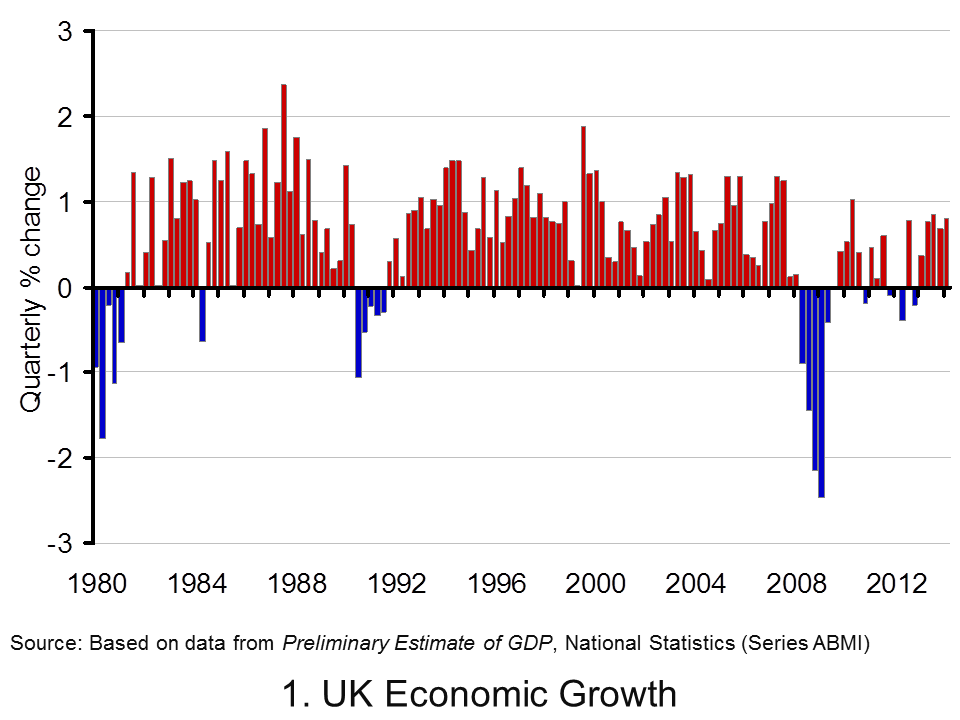 Chart 1 helps to put the recent growth numbers into an historical context. It shows the quarterly change in real GDP since the 1980s. We can see the 5-quarter recession that commenced in 1980 Q1 when output shrunk by 4.6 per cent, the 5-quarter recession that commenced in 1990 Q3 when output shrank by 2.4 per cent and the 6-quarter recession that commenced in 2008 Q2 when output shrank by 7.2 per cent. (Click here to download the chart to PowerPoint.)
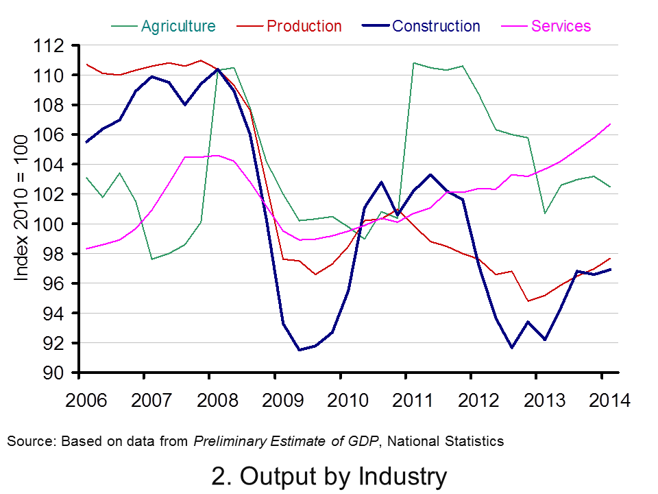 Chart 2 scratches a little below the surface by looking at output by the 4 principal industrial types. The interesting finding is that the output of the service sector has now risen above its 2008 Q1 peak. In 2014 Q1, service sector output was 2.0 per cent higher than 2008 Q1. The fact that total output remains 0.6 per cent lower can be explained by the lop-sided industrial recovery. Output in agriculture, forestry and fisheries remains 7.1 per cent lower, production (including manufacturing) 11.5 per cent lower and construction 12.2 per cent lower. (Click here to dowload the chart to Powerpoint.)
Data
Preliminary Estimate of GDP – Time Series Dataset Q1 2014 Office for National StatisticsGross Domestic Product Preliminary Estimate, Q1 2014 Office for National Statistics
Articles
UK GDP ‘close to pre-crisis level’ says NIESR BBC News (9/5/14)
UK ‘great recession’ almost over, says thinktank Guardian, Katie Allen (9/5/14)
UK economy tops its pre-crash high point, says NIESR Telegraph, Szu Ping Chan (9/5/14)
UK economy grew by 0.8% in first three months of 2014 Guardian, Katie Allen and Angela Monaghan (29/4/14)
Manufacturing is GDP star performer BBC News, Robert Peston (29/4/14).
Questions
- What is the difference between nominal and real GDP? Which of these helps to track changes in economic output?
- Looking at Chart 1 above, summarise the key patterns in real GDP since the 1980s.
- What is a recession? What is a double-dip recession?
- What are some of the problems with the traditional definition of a recession?
- Can a recession occur if nominal GDP is actually rising? Explain your answer.
- What factors lead to economic growth being so variable?
- What factors might explain the very different patterns seen since the late 2000s in the volume of output of the 4 main industrial sectors?
- Produce a short briefing paper exploring the prospects for economic growth in the UK over the next 12 to 18 months.
- Explain the arguments for and against using GDP as a measure of a country’s economic well-being.
- Analyse the role that the financial system might play in contributing to or alleviating the business cycle.
 On my commute to work on the 6th May, I happened to listen to a programme on BBC radio 4, which provided some fascinating discussion on a variety of economic issues. Technological change is constant and unstoppable and the consequences of it are likely to be both good and bad.
In this programme some top economists, including Joseph Stiglitz offer their analysis of the impact of technology and how the future might look, by considering a range of factors, such as youth unemployment, the productivity of labour, education, pensions and inequality. The benefits of new technology can be seen as endless, but the impact on inequality and how the benefits of technology are being distributed is a concern for many people. The best introduction to the programme and its content is simply to reproduce the description provided by BBC radio 4.
The baby boom generation came of age when it was accepted knowledge that innovation and productivity would always lead to higher standards of living. The generations which followed assumed this truth would continue into the future indefinitely. With the crash of 2008 the upward mobility the middle classes assumed was their right evaporated, and it is unlikely to return.
Martin Wolf, chief economics commentator of the Financial Times, asks how the work force of the future will be changed by the advancements of technologies. How should governments respond to a jobs market which is hollowing out opportunities for traditional educated professions and how will rewards for innovation and income for labour be distributed without creating a society plagued by endemic inequality?
We will speak with optimists and pessimists on both sides of the argument to find out how the repercussions of these changes will affect the way we all live now and well into the future.
It is well worth listening to and provides some interesting insights as to what the future might look like, as the inevitable technological change continues. The link for the programme is below.
 The future is not what it used to be BBC Radio 4 (6/5/14)
Questions
- What are the expected costs and benefits of technological change?
- Which factors are discussed as being the main obstacles to upwards mobility? Why have these become more prevalent in recent decades?
- Using a diagram, explain how technology can improve economic growth. To what extent is the multiplier effect important here?
- How is technology expected to affect the labour market? Use a diagram to help your explanation and make sure you consider both sides of the argument.
- What is meant by the idea that the benefits of new technology are likely to be felt in the long run?
- How important is education in creating equal opportunities?
- What is meant by secular stagnation? Is it seen as being a problem?
 When Kraft took over Cadbury, it was seen as a large take-over, but its size pales in comparison to the potential takeover of AstraZeneca by Pfizer. However, having made two offers for the UK drugs firm, the US company has been rejected twice, saying the terms of the offer were ‘inadequate, substantially undervalue AstraZeneca and are not a basis on which to engage with Pfizer.’
Pfizer initially made an offer of £46.61 per share, valuing the company at £58.5bn, but this latest offer increased the share price to around £50 and raised the company value to £63bn. The rejection was relatively swift and the price still too low, though analysts are suggesting that a price closer to £53 may tempt shareholders. At the moment the negotiations between these two giants remain ‘friendly’, but with this second offer being rejected by the Board, there are now concerns that the takeover could become ‘hostile’ with Pfizer going directly to shareholders. Indeed one investor has said:
We were very keen that the two boards actually get around the table and disucss the bid … I’m never very keen when companies just dismiss things and don’t allow shareholders to take a decision on it … The key thing is that these businesses get talking to each other so they can hammer out a deal.
Following the second offer, shares in AstraZeneca rose by 10p, as the debate continued as to whether such a take-over would be good or bad for British jobs.
Cadbury was seen as a jewel in the crown of British industry and the same can be said of AstraZeneca, especially with the growing importance placed on the Science sector in the UK. While Pfizer has now given the British government further assurances about protection for Britain’s science base, there are still concerns about what this take-over would mean for British jobs. Pfizer has said that 20% of the company’s workforce in research and development would work in the UK and the planned R&D base in Cambridge would still go ahead. However, asset-stripping is a phrase that has been thrown around, based on Pfizer’s previous take-overs and, based on this history, many are suggesting that any assurances made by Pfizer will be pointless. In particular, Allan Black from the GMB union said:
Similar undertakings were given by US multinationals before which have proved to be worthless.
This was echoed by Lord Sainsbury who commented that any assurances made by Pfizer would be ‘frankly meaningless’. However, Vince Cable seems more confident about the consequences for British industry and said:
We’ve now received some assurances from the company that they will strengthen the British science base, they will protect British manufacturing … We need to look at that in detail, we need to look at the small print, we need to establish that it is binding, but as far as it goes, on the basis of what we’ve seen so far, it is welcome and encouraging.
We therefore seem to have a tale of two stories. On the one hand, the assurances of a US company that British jobs and its science base will be protected, but on the other hand, suggestions that we should take Pfizer’s assurances with a pinch of salt and that any take-over could be ‘devastating’. The truth of the matter will only be known if and when the take-over goes ahead and perhaps more importantly, whether it remains friendly and co-operative or does indeed go ‘hostile’. The following articles consider this medical take-over between giants.
AstraZeneca rejects Pfizer bid as US Pharma giant courts UK government The Guardian, Julia Kollewe and Sean Farrell (2/5/14)
 AstraZeneca rejects new Pfizer offer BBC News (2/5/14)
AstraZeneca Pfizer: major shareholder urges talks The Telegraph, Denise Roland (2/5/14)
AstraZeneca rejects Pfizer’s raised bid of 63 billion pounds Reuters (2/5/14)
Pfizer-AstraZeneca offer: IoD warns intervention ‘disastrous’ for Britain. The Telegraph, Louise Armitstead (2/5/14)
Pfizer enters takeover discussions with AstraZeneca, sources say Wall Street Journal (2/5/14)
Exclusive: Pfizer insider warns that takeover of AstraZeneca could be ‘devastating’ Independent, Jim Armitage and Chris Green (2/5/14)
The Cadbury deal: how it changed takeovers BBC News, Ben Morris (2/5/14)
Pfizer set to make higher bid for AstraZeneca The Guardian, Julia Kollewe (1/5/14)
The UK’s response to Pfizer’s takeover bid is incoherent and misguided The Guardian, Larry Elliott (4/5/14)
Questions
- What type of take-over would this be classified as? Explain your answer.
- What would occur if the take-over became ‘hostile’?
- Using a demand and supply diagram, explain why share prices in AstraZeneca went up by 10p on the day the second offer was made.
- How would such a take-over affect British jobs?
- Explain how this proposed take-over could (a) boost British R&D in science and (b) harm British R&D in science.
- To what extent might there be concerns from the competition authorities were this take-over to go ahead? How might such a takeover affect Pfizer’s market share and hence its ability to charge a high price?
 Rising inflation: not normally a cause for celebration, but that’s not the case for Japan. Having been subject to the spectre of deflation for many years, the 22-year high for the CPI at 2.7% is a welcome figure, even it is slightly lower than expected. This surge in prices is partly the result of a growth in domestic demand and a sign, therefore, that output will expand in response to the rise in demand.
The Japanese economy has experienced largely stagnant growth for two decades and a key cause has been falling prices. Although consumers like bargains, this has been problematic for this large economy. Deflation creates continuously falling prices and this means consumers hold back from purchasing durable goods, preferring to wait until prices have fallen further.

In the blog, Japan’s recovery, we looked at inflation data showing Japanese consumer prices growing at a faster rate than expected. This ‘positive’ trend has continued.
When it comes to inflation, expectations are crucial. If people think prices will rise in the future, they are more likely to buy now to get the lower price. This can therefore help to stimulate aggregate demand and it is this that has been the target for Japan. Part of the growth in the CPI is down to the sales tax rise from 5% to 8%. This was the first time in 17 years that the sales tax had increased. Further increases in it are expected in 2015. There were concerns about the impact of this rise, based on the depression that followed the last rise back in 1997, but so far the signs seem good.
Monetary easing was a key component in ending the downward trajectory of the Japanese economy and, following the sales tax rise, many believe that another round of monetary easing may be needed to counter the effects and create further growth in the economy and in the CPI. As the Bank of Japan Governor said:
There are various ways to adjust policy. We will decide what among these measures is appropriate depending on economic and price developments at the time … For now, we can say Japan is making steady progress toward achieving 2 per cent inflation.
One of the ‘three arrows‘ of the government’s policy has been to boost government spending, which should directly increase aggregate demand. Furthermore, with signs of the CPI rising, consumers may be encouraged to spend more, giving a much needed boost to consumption. The economy is certainly not out of the woods, but appears to be on the right path. The following articles consider the Japanese economy.
Japan CPI rises less than expected Wall Street Journal, Takashi Nakamichi (25/4/14)
Japan inflation may beat BOJ forecast Reuters, Leika Kihara (22/4/14)
Tokyo consumer price growth at 22-year high BBC News (25/4/14)
Japan inflation quickens to over 5-year high, output rebounds Reuters, Leika Kihara and Stanley White (31/1/14)
Japan’s consumer inflation set to reach five-year high Guardian (18/4/14)
Tokyo inflation hits 22-year high, inching toward BOJ goal Reuters, Tetsushi Kajimoto and Leika Kihara (25/4/14)
Tokyo’s core CPI got 2.7% lift in April from tax hike The Japan Times (25/4/14)
Is Japan winning the war against deflation? CNBC, Ansuya Harjani (25/4/14)
Questions
- Why is deflation a problem?
- Using an AD/AS diagram, illustrate the problem of expectations and how this contributes to stagnant growth.
- Use the same diagram to explain how expectations of rising prices can help to boost AD.
- Why is the sales tax expected to reduce growth?
- Why is another round of monetary easing expected?
- What government policies would you recommend to a government faced with stagnant growth and falling prices?
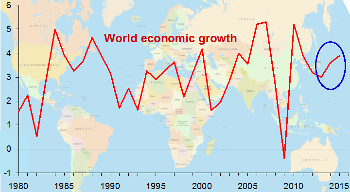
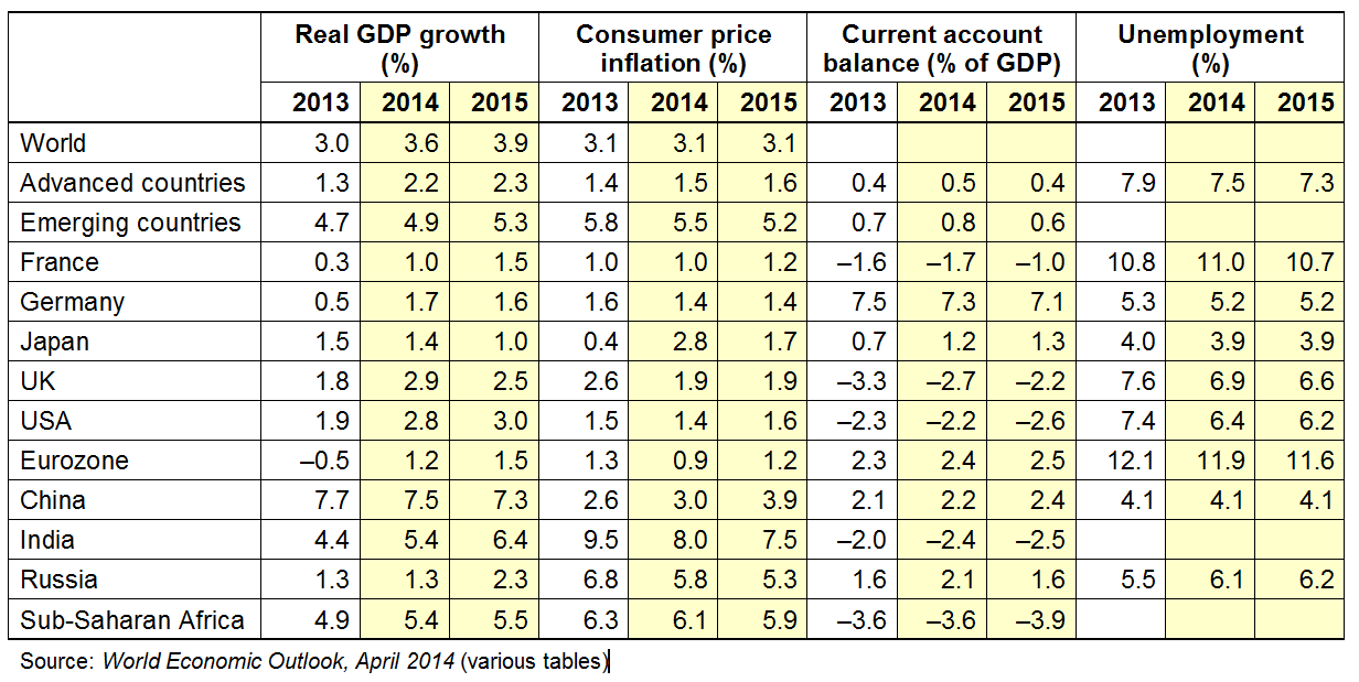
 The IMF has just published its 6-monthly World Economic Outlook report. The report is moderately optimistic, arguing that ‘global activity has broadly strengthened and is expected to improve further in 2014–15’. World growth is expected to rise from 3.0% in 2013 to 3.6% in 2014 and 3.9% in 2015,
Much of the impetus for an acceleration in growth is expected to come from advanced countries. Growth in these countries is expected to average 2¼% in 2014–15, a rise of 1 percentage point compared with 2013. Part of the reason is that these countries still have large output gaps and thus have considerable scope to respond to rises in aggregate demand.
Monetary policy in advanced countries remains accommodative, although the USA has begun to taper off its quantitative easing programme. It is possible, however, that the ECB may make its monetary policy more accommodative, with signs that it might embark on quantitative easing if eurozone growth remains weak and if the risks of deflation rise. If the average price level in the eurozone does fall, this could dampen demand as consumers defer consumption until prices have fallen.

As far as emerging economies are concerned, growth is projected to ‘pick up gradually from 4.7 percent in 2013 to about 5 percent in 2014 and 5¼% in 2015’. Although predicted growth is higher in emerging countries than in advanced countries, its acceleration is less, and much of the predicted growth is dependent on rising export sales to the advanced countries.
Global growth, however, is still fragile. Emerging market economies are vulnerable to a slowing or even reversal of monetary flows from the USA as its quantitative easing programme winds down. Advanced countries are vulnerable to deflationary risks. ‘The result [of deflation] would be higher real interest rates, an increase in private and public debt burdens, and weaker demand and output.’
The UK is predicted to have the strongest growth (2.9%) of the G7 countries in 2014 (see above chart). But the IMF cautions about being too optimistic:
Growth has rebounded more strongly than anticipated in the United Kingdom on easier credit conditions and increased confidence. However, the recovery has been unbalanced, with business investment and exports still disappointing.
Articles
IMF: World economy stronger; recovery uneven USA Today, Paul Davidson (8/4/14)
Emerging markets feel the pressure The Telegraph, Szu Ping Chan (8/4/14)
IMF cuts downturn danger to near zero Financial Times, Chris Giles (8/4/14)
IMF warns eurozone and ECB on deflation threat RTE News (8/4/14)
Recovery strong but risk shifts to emerging markets: IMF CNBC, Kiran Moodley (8/4/14)
IMF: World economy is stronger but faces threats Bloomberg Businessweek, Christopher S. Rugaber (8/4/14)
IMF: UK economic growth to reach 2.9% in 2014 BBC News (8/4/14)
 IMF: UK economic growth to reach 2.9% in 2014 BBC News, Hugh Pym (8/4/14)
Five signs that the global economic recovery may be an illusion The Guardian, Larry Elliott (6/4/14)
Report and data
World Economic Outlook (WEO) International Monetary Fund (8/4/14)
World Economic Outlook Database IMF (8/4/14)
Questions
- Why does the IMF expect the world economy to grow more strongly in 2014 and 2015 than in 2013?
- What are the greatest risks to economic growth for (a) advanced countries; (b) developing countries?
- What geo-political events could negatively affect economic growth in (a) the eurozone; (b) the global economy?
- In what ways is the UK’s economic growth unbalanced?
- How much credence should be given to economic forecasts?
- Should countries’ economic performance be judged primarily by their growth in GDP?
 The latest preliminary GDP estimates for 2014 Q1 suggest that the economy’s output (real GDP) expanded by 0.8 per cent following on the back of a 0.7 per cent increase in 2013 Q4. Growth was observed in three of the four main industrial sectors: 0.9% in services, 0.8% in production and 0.3% in construction. In contrast, output decreased by 0.7% in agriculture. The total output of the economy is now just 0.6 per cent below its 2008 Q1 peak with the output of the service sector now 2.0 per cent higher.
  Chart 1 helps to put the recent growth numbers into an historical context. It shows the quarterly change in real GDP since the 1980s. We can see the 5-quarter recession that commenced in 1980 Q1 when output shrunk by 4.6 per cent, the 5-quarter recession that commenced in 1990 Q3 when output shrank by 2.4 per cent and the 6-quarter recession that commenced in 2008 Q2 when output shrank by 7.2 per cent. (Click here to download the chart to PowerPoint.)
  Chart 2 scratches a little below the surface by looking at output by the 4 principal industrial types. The interesting finding is that the output of the service sector has now risen above its 2008 Q1 peak. In 2014 Q1, service sector output was 2.0 per cent higher than 2008 Q1. The fact that total output remains 0.6 per cent lower can be explained by the lop-sided industrial recovery. Output in agriculture, forestry and fisheries remains 7.1 per cent lower, production (including manufacturing) 11.5 per cent lower and construction 12.2 per cent lower. (Click here to dowload the chart to Powerpoint.)