 Every year thousands of entrepreneurs will have another great idea that is sure to take off and bring in millions of customers. However, most of these great ideas will turn into another business failure. But, in the case of Dropbox, it is multiple business failures that eventually created a huge success, giving hope to millions of budding entrepreneurs.
With 300 million users, the file sharing ‘Dropbox’ is certainly a success, estimated at a value of $10bn. But it didn’t happen immediately and was preceded by a few failures. So, what is the secret to success in this case? The co-founder of Dropbox, Drew Houston, said that it is all about providing something that customers want. In the case of Dropbox, customers are crucial: the more people use it, the easier it becomes for others to use it too, as it allows file sharing on a much larger scale. Perhaps here we have a case of network externalities.
With Dropbox people would tell their friends about it and collaborate. So when you go into work and work on a project with colleagues you recruit them in essence to become Dropbox users because you’re all working on a project together.
No doubt there are many other examples of businesses that have proved a success after several failed attempts. Providing customers with what they want, at the time when they need it is clearly a key ingredient, but so, it appears, is business failure. The following article from BBC News considers the rise of Dropbox.
 Dropbox and the failures behind it BBC News, Richard Taylor (1/7/14)
Questions
- Customers are clearly crucial for any business to succeed. How can a new entrepreneur find out if there is a demand?
- Why was timing so important in the case of Dropbox?
- Given that customers can actually use Dropbox for free, how does this company make so much money?
- What are network externalities? Explain them in the context of Dropbox.
- Drew Houston says that ‘distribution’ is another key ingredient to success. What do you think is meant by this and how will it help create success?
 The most commonly used measure of economic performance is GDP and while there is agreement that it is an important and useful measure, there is also agreement that there are some big problems with it. Does it measure welfare or quality of life? What is and isn’t included? Do some things add to GDP which actually make us worse off?
One criticism often levelled at GDP is that there are many aspects that go unmeasured – often known as the underground economy. Some areas are typical everyday things – DIY, looking after your own children rather than paying someone to do it, or even giving yourself a haircut. But, there are other activities, often illegal, which go unrecorded, such as the selling and distribution of drugs and prostitution. In countries like the Netherlands, their GDP figures get a boost, as some drugs and prostitution are legal. In other countries, such data is not recorded and as such, the contribution of these markets is under-estimated or even completely omitted.
However, this aspect of the calculation of GDP statistics is changing across Europe, which will allow much easier and more meaningful comparisons of relative GDP across countries. This extra production will therefore offer a positive contribution towards our GDP and perhaps suggest to the untrained eye that the British economy is growing, which can only be good news. But, for the trained economist, we are looking at extra data being added, which will boost total output and the question will be does it really indicate that the economy is better off? The following articles consider this change to GDP.
Small data: The way drugs and prostitution boost the economy BBC News (4/4/14)
Small data: Calculating the sex and drugs economy BBC News (2/6/14)
UK economic output to be revised up after ONS updates BBC News, Anthony Reuben (10/6/14)
UK economic output will get near 5 percent boost from data changes Reuters (10/6/14)
Accounting for drugs and prostitution to help push UK economy up by £65bn The Guardian, Katie Allen (10/6/14)
Questions
- What does GDP measure? Is it good at measuring it?
- Explain the pros and cons of using GDP to measure the welfare of an economy.
- Why are there problems using GDP to compare output between countries?
- Is it a good idea to include markets such as sex and drugs in calculating a nation’s output?
- What other measures of welfare do we have?
 At the end of January 2014, we looked at the problem of deflation and in particular at the fortunes of Japan, as its CPI was rising. As the blog explained, the Japanese economy, rather than being plagued by high inflation has been plagued by deflation and many suggest this is even worse.
In December 2013, Japan’s core consumer prices were growing faster than expected. The data gave the economy a much needed boost, following increases in government spending aimed at stimulating aggregate demand. This in turn pushed up prices, such that they achieved their fastest rate of growth in 5 years. Now, more recent date from May 2014 shows that the trend has continued. Prices in Japan have now increase at their fastest rate in 23 years, rising 3.2% and beating the forecasts of 3.1%. This means that prices have no risen in Japan for 11 consecutive months. Numerous policies have contributed towards this impressive trend for an economy plagued by deflation for 2 decades. Boosts in the money supply, increases in government spending, a rise in sales tax are just some of the contributing factors.
 Although the economy is certainly over the problem of deflation, some are now concerned that such price rises may reduce consumer spending. An ironic twist, given that barely a year ago the concern about low consumer spending was due to deflation. The next 12 months will be a key indicator of how consumers will respond to this unusual inflation data – after all inflation and high prices have been pretty uncommon. The following articles consider the update on the Japanese economy.
Japan inflation rate hits 23 year high (including video) BBC News (30/5/14)
Japan April core CPI rises to 23-year high after sales tax rise Reuters (29/5/14)
Japan inflation accelerates Wall Street Journal, Takashi Nakamichi (30/5/14)
Japan’s consumer inflation set to reach five year high The Guardian (18/4/14)
Japan’s inflation at highest rate for 23 years The Telegraph, Rebecca Clancy (30/5/14)
Japan inflation quickens to fastest since 1991 Bloomberg, Toru Fujioka (30/5/14)
Japaense inflation rises at fastest pace in over five years at 1.3% in December 2013 Independent, Russel Lynch (31/1/14)
Questions
- Why is deflation a problem?
- Using an AD/AS diagram, illustrate the problem of expectations and how this contributes to stagnant growth.
- Japanese policies have helped create a rise in the CPI. Which policies have been effective in creating rising prices?
- Explain how the sales tax has contributed towards higher prices.
- With prices rising, there are now concerned that consumer spending may decline. Using a diagram, explain why this may be the case.
- In the previous blog, we analysed the Indian economy and said that high inflation was something that was contributing towards lower growth. How is that low inflation or deflation can also contribute towards low growth?
 The expansion of the BRIC economies has both advantages and disadvantages for Western countries. Their consistently high growth rates have created a much wider market place for Western firms and a much needed additional source of consumer demand, especially in times of recession. Countries such as China have had double digit growth rates, with others like India experiencing growth rates of just under 10%. But are these impressive growth rates now beginning to fall?
For the last 2 years, the growth rate in the Indian economy has been sub-5%, with growth in the 2013-14 financial year at 4.7%. Though some sectors, including agriculture have experienced buoyant growth, it is other sectors that have been holding this economy back. Manufacturing contracted at an annualised rate of 1.4% over the quarter, while mining contracted by 0.4%. With a growth rate of just under 5%, one might think that this was good – after all many Western economies have only recently entered positive growth. However, the Indian economy has a rapidly growing population and it is estimated that 10 million additional jobs each year must be created. It is this figure that requires such a high growth rate – estimated at around 8%. Thus, the sub-5% growth recorded for 2 years is insufficient to sustain the required job creation.

There are many factors that appear to be holding growth back. High inflation has been a problem for some years and the Indian currency has been relatively weak and volatile. Together, these issues have created an environment of uncertainty and if there’s one thing that investors don’t like, it’s uncertainty. This has therefore led to a lack of investment in the economy, which is a key component of aggregate demand and hence a key source of economic growth. Furthermore, interest rates rose last year, thereby pushing up the cost of borrowing and the rate of credit growth has also slowed. These factors collectively have led to lower foreign investment, domestic investment and spending, which have all contributed towards more subdued growth than in the past. Glenn Levine, a senior economist at Moody’s said:
India’s economy continues to grow well below potential as a combination of supply‐side constraints and the adverse effects of an underperforming government weigh on capital expenditure and hiring … It will be a while before the Indian economy is expanding above 6% again.
However, many economists remain optimistic about the prospects of Asia’s third-largest economy. Inflation appears to be under control and the currency has gained strength. Many believe that more investment supporting government policies will be the kick start the economy needs and this will in turn encourage firms to begin investment. It may be the new leader of this country, Narendra Modo, that will jump start the economy. The Prime Minister is expected to back policies to stimulate growth, who will direct more spending at infrastructure, simplify taxes and introduce policies to attract foreign investment. Adi Godrej, Chairman of the Godrej group said:
As soon as investors see the first signals of growth-supportive policies, you will see a definite turnaround on the ground.
The coming months will be crucial in determining how quickly the Indian economy is likely to see a return to near double digit growth. The new government has indeed promised policies to boost the economy, but the annual budget will confirm whether this promise is likely to be kept. Given the dependence of Indian jobs on a fast growth rate and the dependence of the Western world on the continued growth of the BRICs in creating a wider market for our exports, the fortunes of India are extremely important. The following articles consider this economy.
Indian economy grew at 4.7% in 2013-14 The Times of India (30/5/14)
India’s economic growth disappoints BBC News (30/5/14)
India’s GDP grows 4.7% in fiscal year, missing government forecast Wall Street Journal, Anant Vijay Kala (30/5/14)
India’s economy expands 4.7pct in fiscal year 2013/14 Reuters (30/5/14)
India’s economy still underwhelms CNN Money, Charles Riley, Alanna Petroff (30/5/14)
FY14 GDP growth at 4.7%; India sees worst slowdown in 25 years The Economic Times (30/5/14)
India growth below 5% adds pressure on Modi to spur investment Bloomberg, Unni Krishnan (30/5/14)
Jim Armitage: ‘Modinomics’ in India has helped growth, but not for all Independent, Jim Armitage (17/5/14)
Questions
- Using a diagram, explain how economic growth can be created through (a) demand-side measures and (b) supply-side measures.
- Why would higher interest rates reduce growth?
- Why does high inflation create uncertainty and what impact does this have on business investment?
- India has experienced a weak and volatile currency and this has contributed towards a lack of foreign investment and low growth. Using a diagram, explain why this could be the case.
- What sort of government policies would you recommend for the Indian economy if you had become the new Prime Minister and your primary objective was to boost economic growth?
- Why is the expansion of the BRIC economies, of which India is one, so important for Western economies?
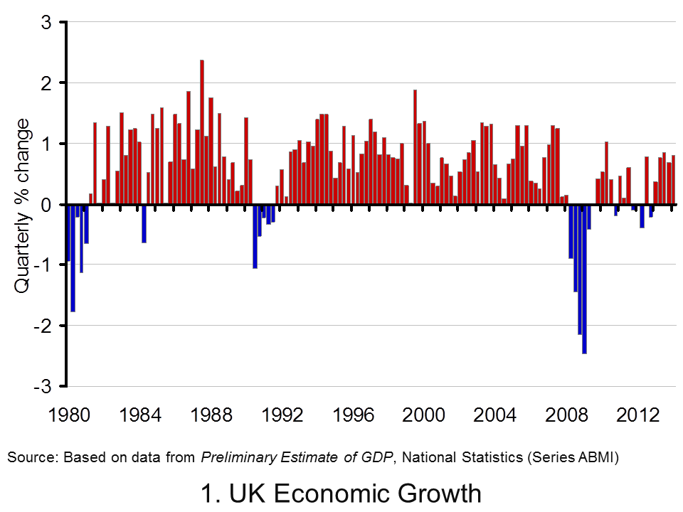
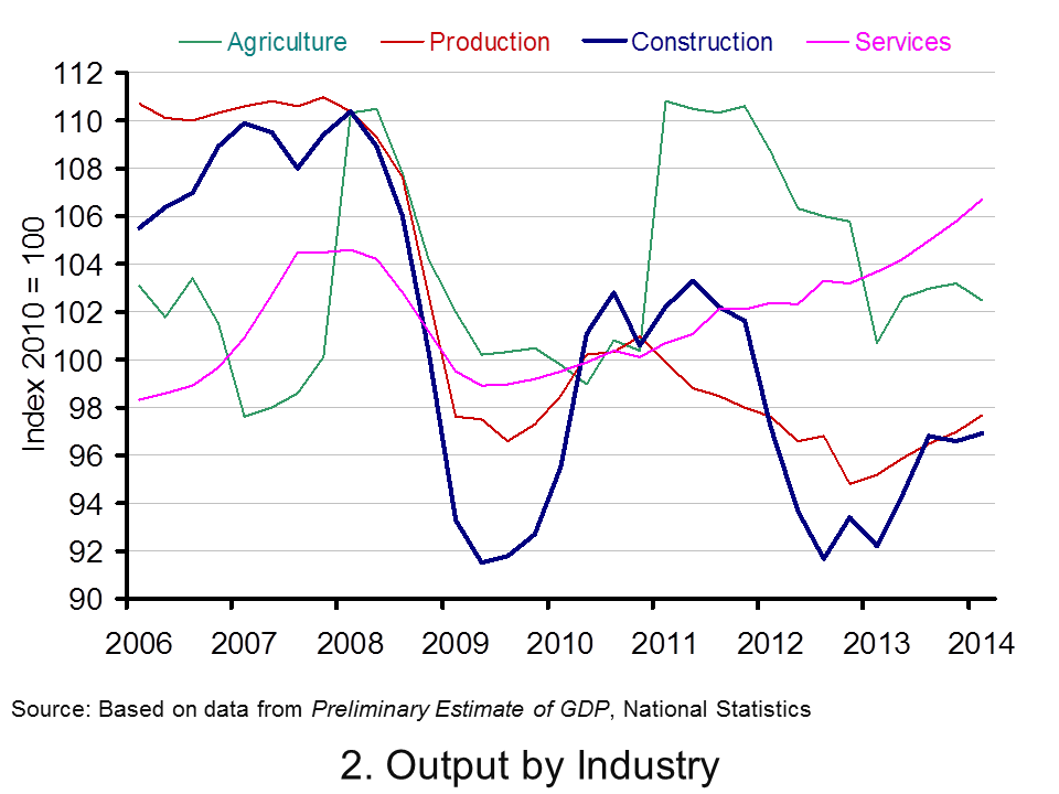
 The latest preliminary GDP estimates for 2014 Q1 suggest that the economy’s output (real GDP) expanded by 0.8 per cent following on the back of a 0.7 per cent increase in 2013 Q4. Growth was observed in three of the four main industrial sectors: 0.9% in services, 0.8% in production and 0.3% in construction. In contrast, output decreased by 0.7% in agriculture. The total output of the economy is now just 0.6 per cent below its 2008 Q1 peak with the output of the service sector now 2.0 per cent higher.
Data on growth need to be set in the context of the inherent volatility of economies and in this case in the context of 2008/9 recession. Then, output fall by some 7.2 per cent. UK output peaked in 2008 Q1 (£392.786 billion at 2010 prices). There then followed 6 quarters during which output declined.
Output declined again in 2010 Q4 (-0.2% growth), in 2011 Q4 (-0.1% growth), in 2012 Q2 (-0.4%) and in 2012 Q4 (-0.2%). A double-dip recession was only narrowly avoided with growth recorded at zero on 2012 Q1. The latest ONS numbers show the economy grew by 0.8 per cent in 2013 Q2 (to £381.318 billion at 2010 prices), by 0.8 per cent in 2013 Q3 (to £384.533 billion at 2010 prices), by 0.7 per cent in 2013 Q4 (to £387.138 billion at 2010 prices) and by 0.8 per cent in 2014 Q1 (to £390.235 billion at 2010 prices). Compared with 2013 Q1, the output of the UK economy in 2014 Q1 is 3.1 per cent higher.
 Chart 1 helps to put the recent growth numbers into an historical context. It shows the quarterly change in real GDP since the 1980s. We can see the 5-quarter recession that commenced in 1980 Q1 when output shrunk by 4.6 per cent, the 5-quarter recession that commenced in 1990 Q3 when output shrank by 2.4 per cent and the 6-quarter recession that commenced in 2008 Q2 when output shrank by 7.2 per cent. (Click here to download the chart to PowerPoint.)
 Chart 2 scratches a little below the surface by looking at output by the 4 principal industrial types. The interesting finding is that the output of the service sector has now risen above its 2008 Q1 peak. In 2014 Q1, service sector output was 2.0 per cent higher than 2008 Q1. The fact that total output remains 0.6 per cent lower can be explained by the lop-sided industrial recovery. Output in agriculture, forestry and fisheries remains 7.1 per cent lower, production (including manufacturing) 11.5 per cent lower and construction 12.2 per cent lower. (Click here to dowload the chart to Powerpoint.)
Data
Preliminary Estimate of GDP – Time Series Dataset Q1 2014 Office for National StatisticsGross Domestic Product Preliminary Estimate, Q1 2014 Office for National Statistics
Articles
UK GDP ‘close to pre-crisis level’ says NIESR BBC News (9/5/14)
UK ‘great recession’ almost over, says thinktank Guardian, Katie Allen (9/5/14)
UK economy tops its pre-crash high point, says NIESR Telegraph, Szu Ping Chan (9/5/14)
UK economy grew by 0.8% in first three months of 2014 Guardian, Katie Allen and Angela Monaghan (29/4/14)
Manufacturing is GDP star performer BBC News, Robert Peston (29/4/14).
Questions
- What is the difference between nominal and real GDP? Which of these helps to track changes in economic output?
- Looking at Chart 1 above, summarise the key patterns in real GDP since the 1980s.
- What is a recession? What is a double-dip recession?
- What are some of the problems with the traditional definition of a recession?
- Can a recession occur if nominal GDP is actually rising? Explain your answer.
- What factors lead to economic growth being so variable?
- What factors might explain the very different patterns seen since the late 2000s in the volume of output of the 4 main industrial sectors?
- Produce a short briefing paper exploring the prospects for economic growth in the UK over the next 12 to 18 months.
- Explain the arguments for and against using GDP as a measure of a country’s economic well-being.
- Analyse the role that the financial system might play in contributing to or alleviating the business cycle.
 Every year thousands of entrepreneurs will have another great idea that is sure to take off and bring in millions of customers. However, most of these great ideas will turn into another business failure. But, in the case of Dropbox, it is multiple business failures that eventually created a huge success, giving hope to millions of budding entrepreneurs.
 Dropbox and the failures behind it BBC News, Richard Taylor (1/7/14)


