 Economists spend a lot of time analysing consumers’ spending intentions. This is unsurprising given that UK household consumption is the equivalent to around two-thirds of Gross Domestic Product. One factor that is argued to affect spending decisions is consumer confidence. Despite a slight easing in recent months, survey data from the European Commission continue to show relatively high confidence levels among UK households. This follows a surge in consumer confidence during 2013 and into 2014.
 Rising consumer confidence is identified frequently by economists as a positive demand-side shock. Therefore, rising confidence would be expected to boost an economy’s output levels as aggregate demand rises. The opposite holds for falling consumer confidence which is an example of a negative demand-side shock.
Given the impact that confidence can have on economies it is important to have measures which might be thought, however imperfectly, to capture consumer confidence. The European Commission’s confidence measure involves a monthly survey of around 2000 individuals in the UK. Across the 28 member states over 41 000 people are surveyed.
In the survey individuals are asked a series of 12 questions which are designed to provide information on spending and saving intentions. These questions include perceptions of financial well-being, the general economic situation, consumer prices, unemployment, saving and the undertaking of major purchases.
 The responses elicit either negative or positive responses. For example, respondents may feel that over the next 12 months the financial situation of their household will improve a little or a lot, stay the same or deteriorate a little or a lot. A weighted balance of positive over negative replies can be calculated. The balance can vary from –100, when all respondents choose the most negative option, to +100, when all respondents choose the most positive option.
The European Commission’s consumer confidence indicator is the average of the balances of four of the twelve questions posed: the financial situation of households, the general economic situation,  unemployment expectations (with inverted sign) and savings, all over the next 12 months. The balances are seasonally adjusted.
Chart 1 shows the consumer confidence indicator for the UK. The long-term average of –8.8 shows that negative responses across the four questions typically outweigh positive responses. However, the current confidence balance is just above zero at +0.8. So, as well as indicating a generally positive disposition across UK households, confidence levels are well above the long-term average. (Click here to download a PowerPoint of the chart.)
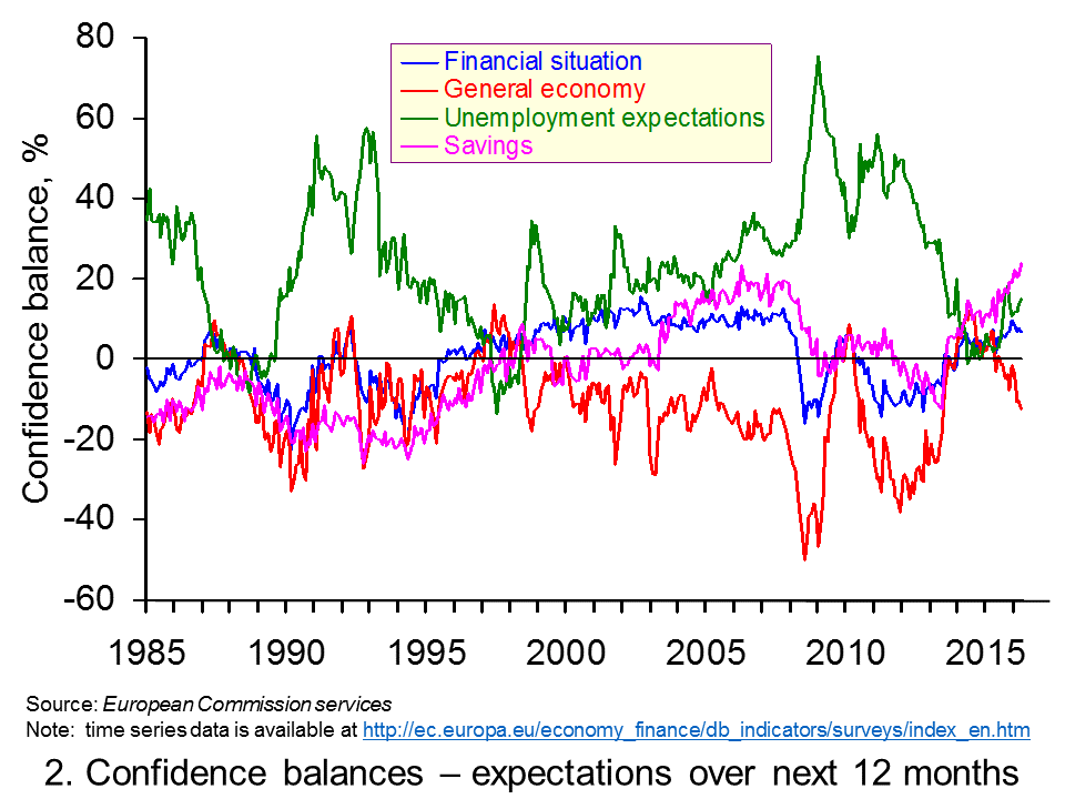 Chart 2 enables us to see what has been driving the European Commission’s confidence indicator for the UK by looking at its four component balances. From it we can see that the boost to confidence in 2013 and 2014 coincided with a dramatic improvement in expectations of the general economic situation in the year ahead and a rapidly falling proportion of respondents expecting unemployment to rise.
The easing in confidence since the turn of the year appears largely to be the result of deteriorating expectations over the general economy. In April the forward-looking general economic situation balance had fallen to –12.5 the lowest balance since June 2013. The deterioration in this balance slightly lags the growing belief that unemployment will rise over the next 12 months, which began to take hold last Autumn. Some commentators argue these trends might reflect the uncertainty caused by the EU referendum to be held in the UK on 23 June. (Click here download a PowerPoint of the chart.)
The monthly survey contains other questions that can help to predict future spending patterns. For example, we might expect the responses to questions relating to perceptions around what the survey called ‘major purchases’ to give us some important insight in households’ financial well-being and spending plans. ‘Major purchases’ are taken to be items such as furniture, electrical goods and electronic devices.
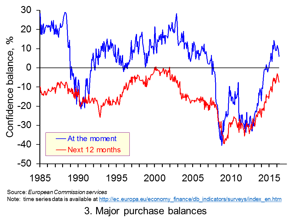 Chart 3 shows the balances to both whether now is the right time to make major purchases and to whether respondents expect to spend more on major purchases in the coming 12 months compared to the past 12 months. We can see a marked improvement in sentiment from around the middle of 2013.(Click here to download a PowerPoint of the chart.)
By the start of 2015 there was a positive balance of individuals feeling that now was the right time to make major purchases. While this balance remained positive in April 2016 at +5.9 this was down from +11.7 back in January. Meanwhile, the forward-looking major purchase balance has fallen slightly in each of the last three months. But, it is still on a par with levels at the end of 2015. Hence, it is perhaps a little too early to talk of any significant easing of forward-looking sentiment around more major purchases having yet become established.
Taking the two major purchase balances together the tentative evidence points to a relatively mild easing in sentiment. This is consistent with the overall consumer confidence indicator.
It would seem that while consumer confidence has eased a touch from the highs of the past couple of years, confidence levels remain strong. Nonetheless, policymakers will be keeping a very keen eye on any signs that this easing in confidence is becoming entrenched with its implications for weaker consumption growth.
Articles
Brexit and euro zone worries weigh on UK consumers Reuters, (31/3/16)
Brexit’s Mixed Messages Depress Consumer Confidence, GfK Says Bloomberg, Fergal O’Brien (29/4/16)
UK consumer confidence stumbles Herald Sun, Dan Cancian (25/4/16)
Consumer ‘depression’ mounts over uncertain economy The Telegraph, Szu Ping Chan (29/4/16)
Consumer confidence at zero as Brexit fears ‘hit home’ The Telegraph, Szu Ping Chan (31/3/16)
Consumer confidence in UK at lowest level in 15 months, survey suggests Guardian, Katie Allen (29/4/16)
Data
Business and Consumer Surveys European Commission
Questions
- Draw up a series of factors that you think might affect consumer confidence.
- Analyse the ways in which consumer confidence might affect economic activity.
- Explain what you understand by a positive and a negative demand-side shock. How might changes in consumer confidence initiate demand shocks?
- Which of the following statements is likely to be more accurate? (a) Consumer confidence drives economic activity. (b) Economic activity drives consumer confidence.
- What macroeconomic indicators would those compiling the consumer confidence indicator hope that the indicator would help to predict?
- In recent times expectations about the path of the economy have been less optimistic. Yet at the same time more people are positive about how their financial situation will develop. What might explain this apparent contradiction?
- What might the long-term average value of the consumer confidence indicator reveal about peoples’ natural perceptions and expectations of their well-being?
 In April we asked how sustainable is the UK’s appetite for credit? Data in the latest Bank of England’s Money and Credit publication suggest that such concerns are likely grow. It shows net lending (lending net of repayments) by monetary financial institutions (MFIs) to individuals in March 2016 was £9.3 billion, the highest monthly total since August 2007. This took net borrowing over the previous 12 months to £58.6 billion, the highest 12-month figure since September 2008.
The latest credit data raise fears about the impact on the financial well-being of individuals. The financial well-being of people, companies, banks and governments can have dramatic effects on economic activity. These were demonstrated vividly in the late 2000s when a downturn resulted from attempts by economic agents to improve their financial well-being. Retrenchment led to recession. Given the understandable concerns about financial distress we revisit our April blog.
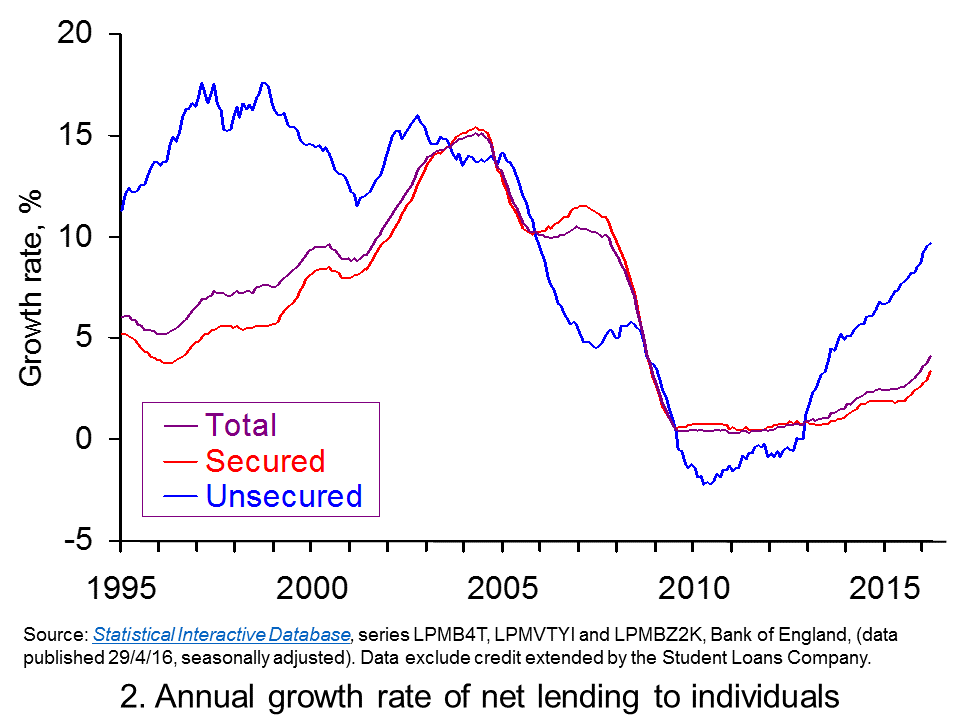
 Chart 1 shows the annual flow of lending extended to individuals, net of repayments. (Click here to download a PowerPoint of Chart 1.) The chart provides evidence of cycles both in secured lending and in consumer credit (unsecured lending).
The growth in net lending during the 2000s was stark as was the subsequent squeeze on lending that followed. During 2004, for example, annual net flows of lending from MFIs to individuals exceeded £130 billion, the equivalent of close on 10.5 per cent of annual GDP. Secured lending was buoyed by strong house price growth with UK house price inflation rising above 14 per cent. Nonetheless, consumer credit was very strong too equivalent to 1.8 per cent of GDP.
Net lending collapsed following the financial crisis. In the 12 months to March 2011 the flow of net lending amounted to just £3.56 billion, a mere 0.2 per cent of annual GDP. Furthermore, net consumer credit was now negative. In other words, repayments were exceeding new sums being extended by MFIs.

Clearly, as Chart 1 shows, net lending to individuals is again on the rise. This partly reflects a rebound in sections of the UK housing market. Net secured lending in March was £7.435 billion, the highest monthly figure since November 2007. Over the past 12 months net secured lending has amounted to £42.1 billion, the highest 12-month figure since October 2008.
Yet the growth of unsecured credit has been even more spectacular. In March net consumer credit was £1.88 billion (excluding debt extended by the Student Loans Company). This is the highest month figure since March 2005. It has taken the amount of net consumer credit extended to individuals over the past 12 months to £16.435 billion, the highest figure since December 2005.
 Chart 2 shows the annual growth rate of both forms of net lending by MFIs. In essence, this mirrors the growth rate in the stocks of debt – though changes in debt stocks can also be affected by the writing off of debts. The chart captures the very strong rates of growth in net unsecured lending from MFIs. We are now witnessing the strongest annual rate of growth in consumer credit since November 2005. (Click here to download a PowerPoint of the chart.)
The growth in household borrowing, especially that in consumer credit, evidences the need for individuals to be mindful of their financial well-being. Given that these patterns are now becoming well-established you can expect to see considerable comment in the months ahead about our appetite for credit. Can such an appetite for borrowing be sustained without triggering a further balance sheet recession as experienced at the end of the 2000s?
Articles
Consumer credit rises at fastest pace for 11 years The Guardian, Hilary Osborne (29/4/16)
Debt bubble fears increase as consumer credit soars to 11-year high The Telegraph, Szu Ping Chan (29/4/16)
Fears of households over-stretching on borrowing as consumer credit grows The Scotsman, (29/4/16)
History repeating? Fears of another financial crisis as borrowing reaches 11-year high Sunday Express, Lana Clements (29/4/16)
The chart that shows we put more on our credit cards in March than in any month in 11 years Independent, Ben Chu (1/4/16)
Britain’s free market economy isn’t working The Guardian (13/1/16)
Data
Money and Credit – March 2016 Bank of England
Bankstats (Monetary and Financial Statistics) – Latest Tables Bank of England
Statistical Interactive Database Bank of England
Questions
- What does it mean if individuals are financially distressed?
- How would we measure the financial well-being of individuals and households?
- What actions might individuals take it they are financially distressed? What might the economic consequences be?
- How might uncertainty affect spending and saving by households?
- What measures can policymakers take to reduce the likelihood that flows of credit become too excessive?
- What is meant by a balance sheet recession?
- Explain the difference between secured debt and unsecured debt.
- Should we be more concerned about the growth of consumer credit than secured debt?
 In the blog post, Global warning, we looked at the use of unconventional macroeconomic policies to deal with the slow pace of economic growth around the world. One of the articles was by Nouriel Roubini. In the linked article below, he argues that slow economic growth may be the new global norm.
At the centre of the problem is a fall in the rate of potential economic growth. This has been caused by a lack of investment, which has slowed the pace of innovation and the growth in labour productivity.
The lack of investment, in turn, has been caused by a lack of spending by both households and governments. What is the point in investing in new capacity, argue firms, if they already have spare capacity?
Low consumer spending is partly the result of a redistribution of income from low- and middle-income households (who have a high marginal propensity to consume) to high-income households and corporations (who have a low mpc). Low spending is also the result of both consumers and governments attempting to reduce their levels of debt by cutting back spending.
Low growth leads to hysteresis – the process whereby low actual growth leads to low potential growth. The reason is that the unemployed become deskilled and the lack of investment by firms reduces the innovation that is necessary to embed new technologies.
Read Roubini’s analysis and consider the policy implications.
Article
Has the global economic growth malaise become the ‘new normal’? The Guardian, Nouriel Roubini (2/5/16)
Questions
- Explain what is meant by ‘hysteresis’ and how the concept is relevant in explaining low global economic growth.
- Why has there been a reduction in the marginal propensity to consume in recent years? What is the implication of this for the multiplier and economic recovery?
- Explain what Roubini means by ‘a painful de-leveraging process’. What are the implications of this process?
- How important are structural reforms and what forms could these take? Why has there been a reluctance for governments to institute such reforms?
- ‘Asymmetric adjustment between debtor and creditor economies has also undermined growth.’ Explain what Roubini means by this.
- Why are governments reluctant to use fiscal policy to boost both actual and potential economic growth?
- What feasible policy measures could be taken to boost actual and potential economic growth?
 In a recent blog Accelerating interest in the interesting case of UK interest rates we compared the level of the official Bank Rate, which has now been at 0.5 per cent for over seven years, with a representative unsecured borrowing rate. In doing so, we found some evidence that credit conditions might be easing following the credit market disturbance of the late 2000s. Here we take the opportunity not only to review that data again one month on, but also to see whether a similar picture is true for the mortgage market.
Theories of the financial accelerator argue that the macroeconomic environment can affect commercial banks’ lending practices. One way in which this can operate is through the difference between banks’ lending rates and the official Bank Rate. We can think of such interest-rate differentials – or spreads – as a credit premium. The size of the premium may be thought to reflect lenders’ perceived risk of default by borrowers. It is argued by some economists that interest-rate differentials will fall when the economy is doing well and increase when the economy is doing less well. This is because the probability of default by borrowers is seen as smaller when the macroeconomic environment improves.
The effect of interest-rate differentials that are contingent on the macroeconomic environment is to amplify the business cycle. For example, a positive demand-side shock, such as a rise in consumer confidence, which causes the economy’s aggregate demand to rise will, in turn, lead to lower borrowing rates relative to the official Bank Rate. This financial effect further stimulates the demand for credit and, as a consequence, aggregate demand and economic activity. It is an example of what economists called the financial accelerator.
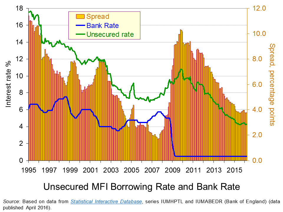
 The chart shows the Bank Rate along with the average unsecured borrowing rate on loans by Monetary Financial Institutions (MFIs) of £10 000. Unlike secured borrowing, which we consider shortly, unsecured borrowing is not secured against property.
As expected, we can see that the unsecured borrowing rate is greater than the Bank Rate. In other words, there is a positive interest-rate differential. However, this differential is seen to vary. It falls sharply in the period up to the financial crisis. In early 2002 it was running at 8 percentage points. By summer 2007 the differential had fallen to only 1.7 percentage points. (Click here to download a PowerPoint of the chart.)
The period from 2002 to 2007 was characterised by consistently robust growth with the UK economy growing by about 2.7 per cent per annum over this period. This may point to economic growth can contributing to an easing of credit conditions as implied by the financial accelerator.
The story from 2008 changes very quickly as the interest-rate differential increases very sharply. In 2009, as the official Bank Rate was cut to 0.5 per cent, the unsecured borrowing rate climbed to close to 10.5 per cent. Consequently, the interest-rate differential rose to 10 percentage points. Inter-bank lending had dried up with banks concerned that banks would default on loans. The increase in interest rates on lending to the non-bank private sector was stark and evidence of a credit market disruption.
The interest-rate differential for unsecured borrowing has steadily declined since its peak at the end of 2009 as the unsecured borrowing rate has fallen. This implies that credit conditions have eased. In March 2016 our interest-rate differential for unsecured borrowing stood at 3.8 percentage points, not dissimilar to levels over the past 12 months. Interestingly, today’s differential on unsecured borrowing is lower than the 6.5 percentage point average over the period from 1997 to 2003, before the differential then went on its pre-crisis fall.
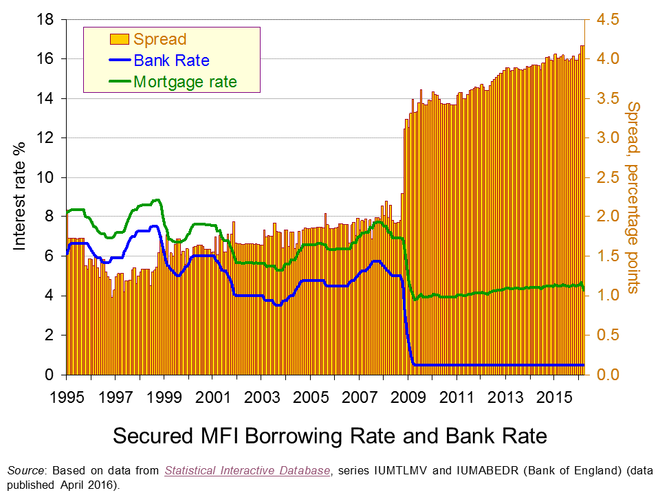
 Our second chart repeats the analysis but this time for mortgages. The representative mortgage rate is the average standard variable mortgage rate.
Unlike that for unsecured borrowing, the interest-rate differential for mortgages is fairly constant up to the financial crisis. The widely report credit easing in the mortgage market appears to have operated more through amounts lent rather than through price, as evidenced by rising mortgage advance-to-income ratios. (Click here to download a PowerPoint of the chart.)
The second chart shows clear evidence of a credit market disruption from 2009. Hence, the markets for secured and unsecured lending saw credit conditions tighten with interest-rate differentials rising markedly. However, it shows that the higher interest-rate differential for secured lending following the credit market disruption remains. So while the differential has fallen sharply for unsecured lending the situation is quite different in the mortgage market. In fact, February and March 2016 saw the mortgage rate spread at 4.17 percentage points which is an historic high.

Our interest rate data show that interest-rate differentials can vary significantly over time. This is important to understand when we are thinking about the relationships between the macroeconomy and the financial system. Significantly, the data suggest that interest rates on different financial instruments can behave differently such that differences emerge in the patterns of spreads over the official Bank Rate.
The evidence on UK mortgage rates suggests that the market remains affected by the financial crisis and the credit market disruption that arose. Although the level of mortgage rates is historically low – which tends to capture many of the headlines – this masks an historically high premium over the official Bank Rate.
Articles
Bank warns EU vote may hit growth as it holds rates BBC News, (14/4/16)
Carney issues a warning as interest rates are held Belfast Telegraph, (15/4/16)
Bank Of England Leaves Interest Rates On Hold Sky News, (14/4/16)
UK banks plan to boost lending to households but not firms – BoE Reuters, (13/4/16)
Mortgage rates reach record lows as threat of Bank Rate rise evaporates Telegraph, Tara Evans (1/4/16)
Data
Bankstats (Monetary and Financial Statistics) – Latest Tables Bank of England
Statistical Interactive Database – interest and exchange rates data Bank of England
Questions
- Why would we expect banks’ borrowing rates to be higher than the official Bank Rate?
- How might banks’ credit criteria change as the macroeconomic environment changes? Explain your answer.
- As well as the macroeconomic environment, what other factors might lead to a change in the interest-rate differential between banks’ borrowing rates and the official Bank Rate?
- How would we expect a credit market disruption to affect the interest-rate differential?
- Explain how the financial accelerator affects the change in the size of the economy following a positive demand shock.
- Explain how the financial accelerator affects the change in the size of the economy following a negative demand shock.
- What is the impact of the financial accelerator of the amplitude of the business cycle?
- How might regulators intervene to minimise the effect of the financial accelerator?
- Why might explain the high interest-rate differential on mortgages that continues to persist following the financial crisis?
- Analyse the ways in which the financial system can stabilise or destabilise economies.
 The latest Bank of England’s Money and Credit release shows net lending (lending net of repayments) by Monetary Financial Institutions (MFIs) to individuals in February was £4.9 billion. Although down on the £5.4 billion in January, it nonetheless means that over the last 12 months the flow of net lending amounted to £52.8 billion. This is the highest 12-month figure since October 2008.
The latest credit data raise concerns about levels of lending and their potential to again impact on the financial well-being of individuals, particularly in light of the falling proportion of income that households are saving. As we saw in UK growth fuelled by consumption as households again lose affection for their piggy banks the saving ratio fell to an historic low of 4.2 per cent for 2015.
An important factor affecting the financial well-being of individuals and households is the extent of their indebtedness. Flows of credit accumulate to become stocks of debt. Stocks of debt affect the extent to which household incomes becomes prey to debt servicing costs. Put simply, more and more income, all other things being equal, is needed for interest payments and capital repayments as debt stocks rise. Rising stocks of debt can also affect the ability of people to further fund borrowing, particularly if debt levels grow more quickly than asset values, such as the value of financial assets accumulated through saving. Consequently, the growth of debt can result in households incurring what is called balance sheet congestion with deteriorating financial well-being or increased financial stretch.
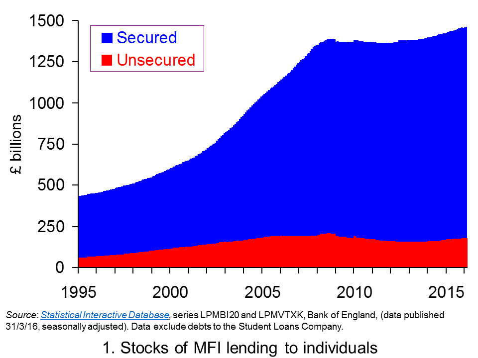
 Chart 1 shows the stocks of debt acquired by individuals from MFIs, i.e. deposit-taking financial institutions. It shows both secured debt stocks (mortgage debt) and unsecured debt stocks (consumer credit). The scale of debt accumulation, particularly from the mid 1990s up to the financial crisis of the late 2000s is stark.
At the start of 1995 UK individuals had debts to MFIs of a little over £430 billion, the equivalent of roughly 55 per cent of annual GDP (Gross Domestic Product). By the autumn of 2008 this had hit £1.39 trillion, the equivalent of roughly 90 per cent of annual GDP. At both points around 85 per cent of the debt was secured debt, though around the start of the decade it had fallen back a little to around 80 per cent. (Click here to download a PowerPoint of Chart 1.)

The path of debt at the start of the 2010s is consistent with a story of consolidation. Both financially-distressed individuals and MFIs took steps to repair their balance sheets following the financial crisis. These steps, it is argued, are what resulted in a balance sheet recession. This saw the demand for and supply of additional credit wane. Consequently, as Chart 1 shows debt accumulation largely ceased.
More recently the indebtedness to MFIs of individuals has started to rise again. At the end of February 2014 the stock of debt was just shy of £1.4 trillion. By the end of February 2016 it had risen to £1.47 trillion (a little under 80 per cent of annual GDP). This is an increase of 4.7 per cent. Interestingly, the rise was largely driven by unsecured debt. It rose by 13.4 per cent from £159.4 billion to £180.7 billion. Despite the renewed buoyancy of the housing market, particularly in South East England, the stock of secured debt has risen by just 3.6 per cent from £1.24 trillion to £1.28 trillion.
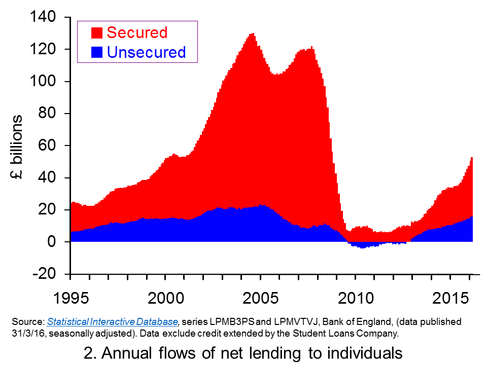
 Chart 2 shows the annual flow of lending extended to individuals, net of repayments. (Click here to download a PowerPoint of Chart 2.) The chart provides evidence of cycles both in secured lending and in consumer credit (unsecured lending).
The growth in net lending during the 2000s was stark as was the subsequent squeeze on lending that followed. During 2004, for example, annual net flows of lending from MFIs to individuals exceeded £130 billion, the equivalent of close on 10.5 per cent of annual GDP. Secured lending was buoyed by strong house price growth with UK house price inflation rising above 14 per cent. Nonetheless, consumer credit was very strong too equivalent to 1.8 per cent of GDP.
Net lending collapsed following the financial crisis. In the 12 months to March 2011 the flow of net lending amounted to just £3.56 billion, a mere 0.2 per cent of annual GDP. Furthermore, net consumer credit was now negative. In other words, repayments were exceeding new sums being extended by MFIs.

Clearly, as Chart 2 shows, we can see that net lending to individuals is again on the rise. As we noted earlier, part of this this reflects a rebound in parts of the UK housing market. It is perhaps worth noting that secured lending helps individuals to purchase housing and thereby acquire physical wealth. While secured lending can find its way to fuelling spending, for example, through the purchase of goods and services when people move into a new home, consumer credit more directly fuels spending and so aggregate demand. Furthermore, consumer credit is not matched on the balance sheets by an asset in the same way that secured credit is.
 Chart 3 shows the annual growth rate of both forms of net lending by MFIs. In essence, this mirrors the growth rate in the stocks of debt though changes in the stocks of debt can also be affected by the writing off of debts. What the chart nicely shows is the strong rates of growth in net unsecured lending from MFIs. In fact, it is the strongest annual rate of growth since January 2006 (Click here to download a PowerPoint of the chart.)
The growth in consumer credit, the fall in the saving ratio and the growth in consumer spending point to a need for individuals to be mindful of their financial well-being. What is for sure, is that you can expect to see considerable comment in the months ahead about consumption, credit and income data. Fundamental to these discussions will be the sustainability of current lending patterns.
Articles
Consumer Lending Growth Highest Since 2005 Sky News, (31/3/16)
Britons raid savings to fund spending as economists warn recovery ‘built on sand’ Telegraph, Szu Ping Chan (31/3/16)
Household debt binge has no end in sight, says OBR Telegraph, Szu Ping Chan (17/3/16)
Surge in borrowing… as savings dwindle: Household savings are at an all-time low as families turn to cheap loans and credit cards Daily Mail, James Burton (1/4/16)
George Osborne banks on household debt time bomb to meet his Budget targets Mirror, Ben Glaze (29/3/16)
Britain’s free market economy isn’t working Guardian (13/1/16)
Data
Bankstats (Monetary and Financial Statistics) – Latest Tables Bank of England
Statistical Interactive Database Bank of England
Questions
- What does it mean if individuals are financially distressed?
- How would we measure the financial well-being of individuals and households?
- What actions might individuals take it they are financially distressed? What might the economic consequences be?
- How might uncertainty affect spending and saving by households?
- What measures can policymakers take to reduce the likelihood that flows of credit become too excessive?
- What is meant by a balance sheet recession?
- Explain the difference between secured debt and unsecured debt.
- Should we be more concerned about the growth of consumer credit than secured debt?
 Economists spend a lot of time analysing consumers’ spending intentions. This is unsurprising given that UK household consumption is the equivalent to around two-thirds of Gross Domestic Product. One factor that is argued to affect spending decisions is consumer confidence. Despite a slight easing in recent months, survey data from the European Commission continue to show relatively high confidence levels among UK households. This follows a surge in consumer confidence during 2013 and into 2014.
 Rising consumer confidence is identified frequently by economists as a positive demand-side shock. Therefore, rising confidence would be expected to boost an economy’s output levels as aggregate demand rises. The opposite holds for falling consumer confidence which is an example of a negative demand-side shock.
 The responses elicit either negative or positive responses. For example, respondents may feel that over the next 12 months the financial situation of their household will improve a little or a lot, stay the same or deteriorate a little or a lot. A weighted balance of positive over negative replies can be calculated. The balance can vary from –100, when all respondents choose the most negative option, to +100, when all respondents choose the most positive option.
 unemployment expectations (with inverted sign) and savings, all over the next 12 months. The balances are seasonally adjusted.
  Chart 2 enables us to see what has been driving the European Commission’s confidence indicator for the UK by looking at its four component balances. From it we can see that the boost to confidence in 2013 and 2014 coincided with a dramatic improvement in expectations of the general economic situation in the year ahead and a rapidly falling proportion of respondents expecting unemployment to rise.
  Chart 3 shows the balances to both whether now is the right time to make major purchases and to whether respondents expect to spend more on major purchases in the coming 12 months compared to the past 12 months. We can see a marked improvement in sentiment from around the middle of 2013.(Click here to download a PowerPoint of the chart.)