 Conservative Party leaders are considering the benefits of an above-inflation rise in the minimum wage. This policy has been advocated by both the Labour Party and the Liberal Democrats as a means of helping the lowest paid workers. From 2008 to 2013, minimum wage rates fell 5.2% in real terms: in other words, nominal increases were less than the increase in both the RPI and CPI (see UK minimum wage: a history in numbers).
Advocates of a real rise in the minimum wage argue that not only would it help low-paid workers, many of whom are in severe financial difficulties, but it would benefit the Treasury. According to Policy Exchange, a free-market think tank closely aligned to the Conservative Party, increasing the minimum wage by 50p would save the Government an estimated £750m a year through higher tax revenues and lower benefit payments.
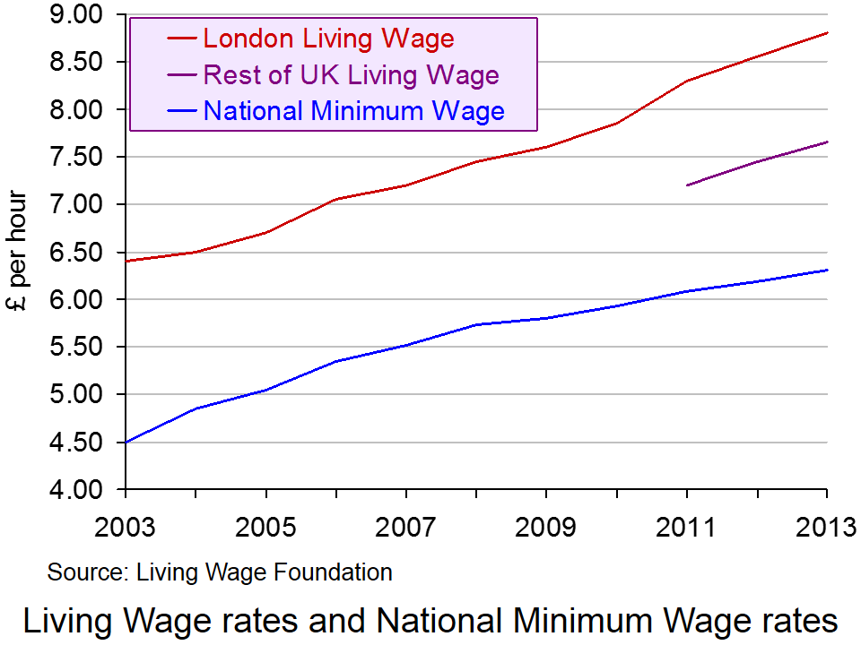 But even such a rise to £6.81 would still leave the minimum wage substantially below the living wage of £8.80 in London and £7.65 in the rest of the UK, as estimated by the Living Wage Foundation (see The cost of a living wage). Although many businesses are now paying at least the living wage, many others, especially small businesses, argue that a rise in the minimum wage above the rate of inflation would force them to consider cutting the number of employees or reducing hours for part-time workers.
Meanwhile, in the USA 13 states have raised their minimum wage rates from the 1st January 2014 (see). Some of the rises, however, were tiny: as little as 15 cents. In a couple of cases, the rise is $1. Currently 21 states and DC have minimum wage rates above the Federal level of $7.25 (approx. £4.40); 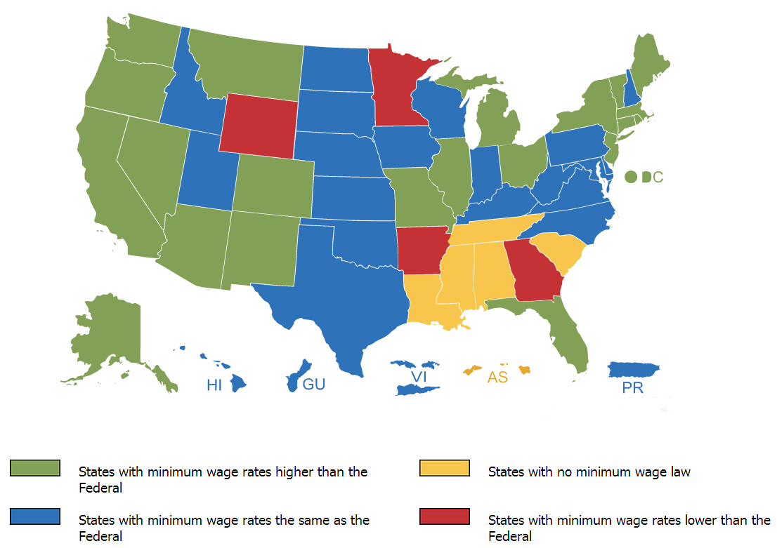 20 states have rates the same as the Federal level; 4 states have rates below the Federal level. At $9.32 per hour, Washington State has the highest state minimum wage; the lowest rates ($5.15) are in Georgia and Wyoming. In 5 states there is no minimum wage at all. As the ABC article below states:
The piecemeal increases at the local level are occurring amidst a national debate over low wages and income inequality. Fast food and retail workers have been staging protests and walking off work for more than a year, calling for better pay and more hours. Currently, fast food workers nationally earn an average of about $9 per hour.
Workers from McDonald’s, Wendy’s, Burger King and other fast food joints are calling for $15 per hour. Wal-Mart workers organizing as part of the union-backed OUR Walmart aren’t asking for a specific dollar amount increase, but they say it’s impossible to live on the wages they currently receive.
President Obama has been throwing his weight behind the issue. Earlier this month, the President said in a speech that it’s “well past the time to raise the minimum wage that in real terms right now is below where it was when Harry Truman was in office.” But such legislation has a bleaker outlook if it reaches the Republican-led House of Representatives. House Speaker John Boehner has said that raising the minimum wage leads to a pullback in hiring.
So what are the costs and benefits of a significant real rise is the minimum wage on either side of the Atlantic? The articles explore the issues.
Articles: UK
Lib Dems accuse Tories of ‘stealing’ their policy as George Osborne prepares to approve above-inflation rise in minimum wage Independent, Andrew Grice (7/1/14)
Lib Dems accuse Tories of ‘nicking’ party’s policy on low wages The Guardian, Nicholas Watt (7/1/14)
Cut housing benefit? A higher minimum wage would help The Guardian, Patrick Collinson (6/1/14)
Miliband prepares to wage war The Scotsman, Andrew Whitaker (8/1/14)
Increasing the minimum wage is only a half answer to poverty New Statesman, Helen Barnard (8/1/14)
Raise the bar: Economically and socially, Britain needs higher wages Independent (7/1/14)
Another Tory says there’s a ‘strong case’ for raising the minimum wage The Spectator, Isabel Hardman (8/1/14)
Fairness and the minimum wage Financial Times (7/1/14)
Osborne wants above-inflation minimum wage rise BBC News (16/1/14)
George Osborne backs minimum wage rise to £7 an hour The Guardian, Nicholas Watt, (16/1/14)
Minimum wage: in his efforts to defeat Labour, Osborne risks mimicking them The Telegraph, Benedict Brogan (16/1/14)
Minimum wage announcement is not just good economics The Guardian, Larry Elliott (16/1/14)
Articles: USA
13 states raising pay for minimum-wage workers USA Today, Paul Davidson (30/12/13)
Minimum wage increase: Wage to rise in 13 states on Jan. 1 ABC15 (30/12/13)
NJ minimum wage sees $1 bump on Jan. 1 Bloomberg Businessweek, Angela Delli Santi (31/12/13)
Minimum wage hike a job killer ctpost, Rick Torres (7/1/14)
A Business Owners Case For Raising The Minimum Wage Grundy Country Herald, David Bolotsky (7/1/14)
Raising the Minimum Wage Isn’t Just Good Politics. It’s Good Economics, Too. New Republic, Noam Scheiber (31/12/13)
Minimum wage rises across 13 US states Financial Times, James Politi (1/1/14)
Information
National Minimum Wage rates GOV.UK
UK minimum wage: a history in numbers Guardian Datablog
List of minimum wages by country Wikipedia
Questions
- Draw two diagrams to demonstrate the direct microeconomic effect of a rise in the minimum wage for two employers, both currently paying the minimum wage, where the first is operating in an otherwise competitive labour market and the other is a monopsonist.
- What is meant by the term ‘efficiency wage rate’? How is the concept relevant to the debate about the effects of raising the minimum wage rate?
- What are the likely macroeconomic effects of raising the minimum wage rate?
- What is the likely impact of raising the minimum wage rate on public finances?
- Is raising the minimum wage rate the best means of tackling poverty? Explain your answer.
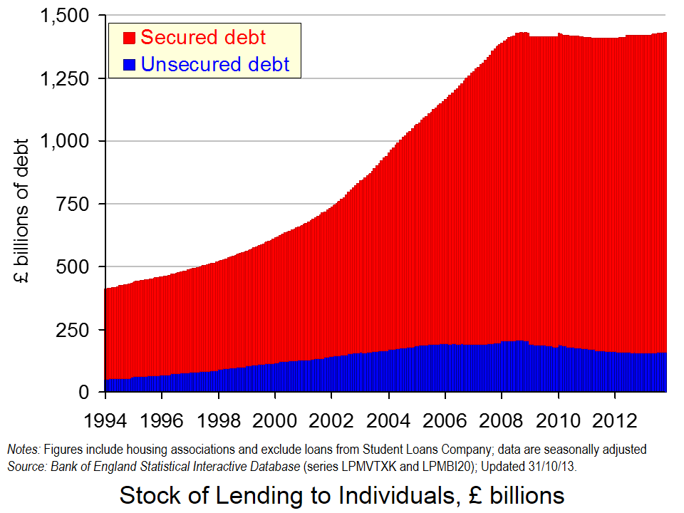
 As of 31 October 2013, British households had a stock of debt close to £1.43 trillion. Economists are increasingly recognising that the financial well-being of economic agents is an important macroeconomic issue. The financial position of households, businesses and governments can be expected to affect behaviour and, hence, economic activity.
We can calculate the net financial wealth of households as the difference between their stock of financial assets (savings) and their financial liabilities (debt). The latest figures from the Bank of England’s Money and Credit show that as of Halloween 2013, British households had amassed a stock of debt of £1.4296 trillion. It is certainly a large figure since it not far short of the expected GDP figure for 2013 of around £1.6 trillion.
The chart above helps to show that of the aggregate household debt, £1.271 trillion is secured debt (debt secured against property). The remaining stock of £158.589 billion is unsecured debt (e.g. overdrafts, outstanding credit card debt and personal loans). In short, 89 per cent of the stock of outstanding household debt is mortgage debt. (Click here to download a PowerPoint of the chart.)
In January 1994 the stock of secured debt stood at £358.75 billion and the stock of unsecured debt at £53.773 billion. 87 per cent of debt then was secured debt and, hence, little different to today. The total stock of debt has grown by 247 per cent between January 1994 and October 2013. Unsecured debt has grown by 199 per cent while secured debt has grown by 254 per cent.
But, consider now the path of debt between the end of October 2008 and October 2013. During this period, the monthly series of the stock of unsecured debt has fallen on 52 occasions and risen on only 9 occasions. In contrast, the stock of secured debt has fallen on only 10 occasions and often by very small amounts. Consequently, the stock of unsecured debt has fallen by 22.8 per cent between the end of October 2008 and October 2013. In contrast, the stock of secured debt has risen by 3.9 per cent. The total stock of debt has risen by 0.1 per cent over this period and, therefore, it is essentially unchanged.
The amount of debt accumulated by households is example of the increasing importance of the financial system in our everyday lives. The term financialisation helps to capture this. Financialisation means that economists need to think much more about how financial institutions and the financial well-being of people, businesses and governments affect economic activity. There is little doubt that the financial position or financial health of economic agents, such as households, affects their behaviour. We would expect in the case of households for their financial well-being to exert an influence on their propensities to spending or save. But, just how is an area in need of much, much more research.
Articles
UK household debt hits record high BBC News (29/11/13)
Average household debt ‘doubled in last decade’ Telegraph, Edward Malnick (20/11/13)
£1,430,000,000,000 (that’s £1.43 trillion): Britain’s personal debt timebomb Independent, Andrew Grice (20/11/13)
Data
Money and Credit – October 2013 Bank of England
Statistical Interactive Database Bank of England
Questions
- Outline the ways in which the financial system could impact on the spending behaviour of households.
- Why might the current level of income not always be the main determinant of a household’s spending?
- How might uncertainty affect spending and saving by households?
- Explain what you understand by net lending to individuals. How does net lending to individuals affect stocks of debt?
- Outline the main patterns seen in the stock of household debt over the past decade and discuss what you consider to be the principal reasons for these patterns.
- What factors might explain the rather different pattern seen in the growth of debt since October 2008 compared with that in earlier part of the 2000s?
- What do you understand by the term financialisation? Of what importance is this phenomenon to economic behaviour?
 ‘Deflation could be replacing debt as the main problem – and there’s nothing to suggest the ECB is up to the job.’ So begins the linked article below by Barry Eichengreen, Professor of Economics and Political Science at the University of California, Berkeley.
The good news in this is that worries about debt in eurozone countries are gradually receding. Indeed, this week Ireland officially ended its reliance on a bailout (of €67.5 billion) from the EU and IMF and regained financial sovereignty (see also).
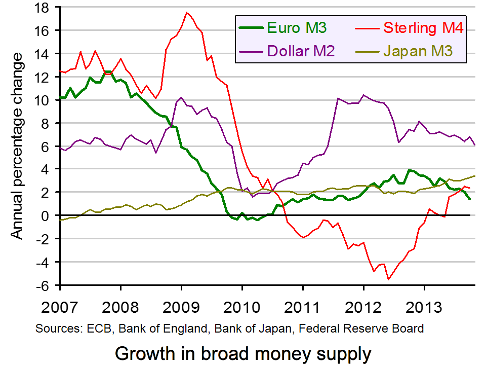
The bad news is that this does not mark the end of austerity. Indeed, many eurozone countries could get stuck in a deflationary trap, with austerity policies continuing to depress aggregate demand. Eurozone inflation is less than 1% and falling. Broad money supply growth is now below that of the US dollar, the yen and sterling (see chart: click here for a PowerPoint).
The ECB has been far more cautious than central banks in other countries in acting to prevent recession and deflation. Unlike the USA, Japan and the UK, which have all engaged in extensive quantitative easing, the ECB had been reluctant to do so for fear of upsetting German opinion and taking the pressure off southern European countries to reform.
But as Eichengreen points out, the dangers of inaction could be much greater. What is more, quantitative easing is not the only option. The ECB could copy the UK approach of ‘funding for lending’ – not for housing, but for business.
Europe’s economic crisis could be mutating again The Guardian, Barry Eichengreen (10/12/13)
Questions
- What problems are created by falling prices?
- What effect would deflation have on debt and the difficulties in repaying that debt?
- What measures have already been adopted by the ECB to stimulate the eurozone economy? (Search previous articles on this site.)
- Why have such measures proved inadequate?
- What alternative policies are open to the ECB?
- What are the arguments for the ECB being given a higher inflation target (such as 3 or 4%)?
- What are the arguments for and against relaxing fiscal austerity in the eurozone at the current time?
 The ONS has just published two of its major annual publications on income and expenditure in the UK. The first is the Annual Survey of Hours and Earnings (ASHE) and looks at earnings from 1998 to 2013. The second is Family Spending and looks at the level and pattern of household spending each year from 2001 to 2012.
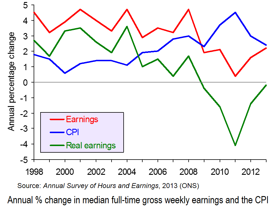
Figures from the two publications show that average real incomes have fallen each year since 2008. This is illustrated in the first chart (click here for a PowerPoint of the chart). They also show that household expenditure in real terms is falling and is at the lowest level since 2006.
Overall picture
In 2012, households’ average weekly disposable income was £597. In 2012 prices, this was down from £621 in 2010 (after the recession) and £659 in 2008 (before the recession).
Household expenditure is at its lowest level in real terms for over a decade. In 2012 households spent on average £489.00 per week. In 2012 prices, this compares with £521.90 in 2001/2 and £533.80 in 2006 (the peak year).
Picture for particular income groups and products
Although average real incomes have fallen, not everyone has been affected the same. For example, not all occupations have seen a fall in incomes (see the table at the end of the BBC article, Earnings rise slower than inflation for fifth year running). Also, as income distribution has become less equal, so those in lower income groups have seen their real incomes fall the fastest. This is partly the result of nominal wages rising less fast for low-paid workers and partly the result of price increases for various essentials, such as food and power being greater than the rate of inflation, and these products constituting a higher proportion of expenditure for poor people than rich people (see Squeezed Britain 2013).
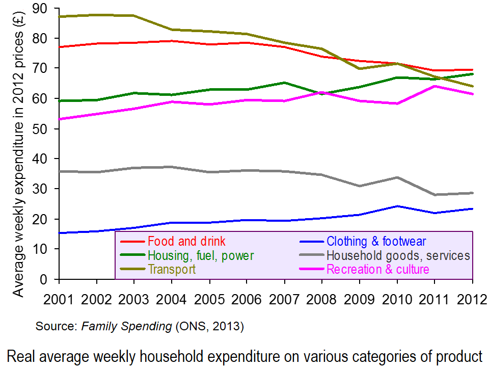
 Likewise expenditure hasn’t fallen on all categories of product. Since 2006, real expenditure on clothing and footwear and on housing, fuel and power has risen. The second chart illustrates expenditure on some of the different categories and how the balance has changed (click here for a PowerPoint). This partly reflects the changes in prices of products, with some items, such as electricity, gas and rent having risen faster than the average, and with the demand for such items being relatively price inelastic.
The changing pattern is also partly the result of different income elasticities of demand for different items. Thus, with falling real incomes, the proportion of income spent on products with a low income elasticity of demand is likely to rise.
 Expenditure also varies by income group. People on higher incomes tend to spend a greater proportion of their income on things such as leisure activities (e.g. eating out and holidays), motoring, and clothing and footwear. Poorer people tend to spend proportionately more on food and drink, and on electricity, gas and rent (even net of housing benefit). These differences are illustrated in the third chart which looks at certain categories of expenditure of three different disposable income groups: the poorest 10% (decile), the richest 10% and the 6th decile (i.e. the 6th group up from the bottom – the group with average or just above average income) (click here for a PowerPoint for the chart). Detailed figures can be found here, which is Table 3.2 from Family Spending.
Just as the time-series data looking at changing income and expenditure over time can illustrate the different income elasticities of demand for different products, so can the cross-sectional data in Tables 3.1 and 3.2 of Family Spending.
Articles
Earnings rise slower than inflation for fifth year running BBC News (12/12/13)
Energy and rent are now the biggest family bills The Telegraph, Steve Hawkes (11/12/13)
Families spend £489 each week – on what? The Guardian, Mona Chalabi (11/12/13)
Cost of energy hits family budgets, says ONS BBC News (11/12/13)
Family spending interactive: how has it changed? The Guardian Datastore, Mona Chalabi (11/12/13)
Data
Annual Survey of Hours and Earnings, 2013 Provisional Results ONS (12/12/13)
Annual Survey of Hours and Earnings, 2013 Provisional Results: Statistical Bulletin ONS (12/12/13)
Family Spending, 2013 Edition ONS (11/12/13)
Family spending in 2012: Infographic ONS (11/12/13)
 Video Summary: Are you an average spender? ONS (11/12/13)
Household expenditure based on COICOP classification, 2001-02 to 2012 at 2012 prices: Table 4.1 of Family Spending ONS (11/12/13)
Detailed household expenditure as a percentage of total expenditure by disposable income decile group, 2012: Table 3.2 of Family Spending ONS (11/12/13)
Questions
- What are the determinants of the price elasticity of demand for a product?
- What are the limitations of using time-series data of prices and expenditure to estimate the price elasticity of demand for particular products?
- What are the determinants of the income elasticity of demand for a product?
- What are the limitations of using time-series data of incomes and expenditure to estimate the income elasticity of demand for particular products?
- What are the limitations of using cross-sectional data of expenditure of different income groups to estimate the income elasticity of demand for particular products?
- How do your answers to the above questions demonstrate the significance of the ceteris paribus (other things being equal) assumption?
- If real earnings are falling, why are people able to spend more in real terms?
- What are the macroeconomic implications of increased consumer spending at a time of falling real incomes?
- How could increased consumer spending help to reverse the fall in real incomes (a) in the short run (b) over a period of a few years? Distinguish between the effects on aggregate demand and aggregate supply.
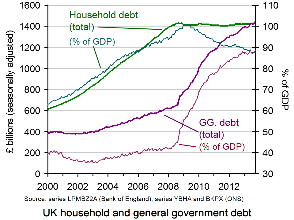
 Household debt in the UK has reached a record level. Individuals now owe £1430 billion. This compares with the UK’s general government debt of £1443 billion – also at a record level. These figures are illustrated in the chart (click here for a PowerPoint).
But these figures are nominal. If you look at the real figures (i.e. corrected for inflation), household debt has been falling. In today’s prices, household debt peaked at £1668 billion in March 2008. Also, if you look at household debt as a proportion of GDP, it fell from a peak of 100.96% in May 2009 to 87.43% in July 2013 (see chart). However, since then it has begun rising again, standing at 87.65% in October 2013.
So has household debt become less of a problem? In aggregate terms, the answer is probably yes. However, it is too early to know whether a continuing recovery in the economy will be fuelled by real debt rising again and whether the recovery will encourage people to take on higher levels of debt?
For many people, however, debt has become more and more of a problem. In other words, the aggregate figures conceal what has happened in terms of the distribution of debt. According to a Centre for Social Justice (CSJ) study:
Indebted households in the poorest 10 per cent of the country have average debts more than four times their annual income. Average debt repayments within this group amounted to nearly half their gross monthly income.

And the poorest families, often with very poor credit ratings, are frequently forced to turn to payday lenders, charging sky-high interest rates (see Capping interest rates on payday loans: a government U-turn?).
As mainstream banks reduced access to credit following the financial crash, the market for short-term high-cost credit (payday lenders, pawnbrokers, rent-to-buy and doorstop lenders) increased dramatically and is now worth £4.8 billion a year.
Payday lenders have increased business from £900 million in 2008/09 to just over £2 billion (or around 8 million loans) in 2011/12. Around half of payday loan customers reported taking out the money because it was the only form of credit they could get. The number of people going to loan sharks is also said to have increased – the most recent estimate puts it at 310,000 people.
With rising energy and food bills hitting the poorest hardest, this section of the population could find debt levels continuing to rise, especially if interest rates rise. As Chris Pond, who chaired the CJS study, stated:
The costs to those affected, in stress and mental disorders, relationship breakdown and hardship is immense. But so too is the cost to the nation, measured in lost employment and productivity and in an increased burden on public services.
Articles
£1,430,000,000,000 (that’s £1.43 trillion): Britain’s personal debt timebomb Independent, Andrew Grice (20/11/13)
Average household debt ‘doubled in last decade’ The Telegraph, Edward Malnick (20/11/13)
UK household debt hits record high BBC News (29/11/13)
UK debt crisis: poorest face ‘perfect storm’ Channel 4 News (20/11/13)
One in five struggle with serious debt The Telegraph, Nicole Blackmore (27/11/13)
It doesn’t matter what we do with Wonga: personal debt is about to rocket The Telegraph, Tim Wigmore (26/11/13)
Poorest families ‘need more help over debt’ BBC News (20/11/13)
Report
More than 5,000 people a year ‘homeless’ as household debt crisis deepens, CSJ warns Centre for Social Justice Press Release (20/11/13)
Data
Monthly amounts outstanding of total (excluding the Student Loans Company) sterling net lending to individuals and housing associations (in sterling millions) seasonally adjusted Bank of England
Public Sector Finances First Release – Public Sector Consolidated Gross Debt ONS
Household debt (Economics Indicators update) House of Commons Library (29/11/13)
Questions
- What are the macroeconomic implications of rising levels of household debt?
- Why may an economy which has high levels of household debt be more subject to cyclical fluctuations in real GDP?
- What are the problems of having a recovery driven largely by increased consumer expenditure?
- Why have many people in the poorest sectors of society found their debt levels rising the fastest?
- Why may rising levels of debt of the most vulnerable people make it harder for the Bank of England to use conventional monetary policy if recovery becomes established?
- What policies could be pursued to try to reduce the debts of the poorest people?
- Discuss the effectiveness of these various policies.
 Conservative Party leaders are considering the benefits of an above-inflation rise in the minimum wage. This policy has been advocated by both the Labour Party and the Liberal Democrats as a means of helping the lowest paid workers. From 2008 to 2013, minimum wage rates fell 5.2% in real terms: in other words, nominal increases were less than the increase in both the RPI and CPI (see UK minimum wage: a history in numbers).
 But even such a rise to £6.81 would still leave the minimum wage substantially below the living wage of £8.80 in London and £7.65 in the rest of the UK, as estimated by the Living Wage Foundation (see The cost of a living wage). Although many businesses are now paying at least the living wage, many others, especially small businesses, argue that a rise in the minimum wage above the rate of inflation would force them to consider cutting the number of employees or reducing hours for part-time workers.
 20 states have rates the same as the Federal level; 4 states have rates below the Federal level. At $9.32 per hour, Washington State has the highest state minimum wage; the lowest rates ($5.15) are in Georgia and Wyoming. In 5 states there is no minimum wage at all. As the ABC article below states: