 The latest growth data for the UK is somewhat difficult to interpret. It’s positive, but not that positive. The Conservatives say it shows that the economy is moving in the right direction. Labour suggests it is evidence that the Coalition’s policies are not working. With a return to positive growth, the UK has avoided the triple dip recession and here we take a closer look at the economic performance of other key nations.
In the final quarter of 2012, the US economy grew at 0.4%, but in the 3 months to March 2013, economic growth in America picked up to 2.5%. Consumer spending significantly increased, growing at an annualized rate of 3.2%, according to the Commerce Department. This figure helped boost the growth rate of the US economy, as consumer spending accounts for around two thirds of economic activity.
 However, the growth figure was lower than expected, in part due to lower government spending. Furthermore, there are suggestions that the positive consumer spending figures are merely a positive blip and spending will fall as the US economy moves through 2013.
If this does prove to be the case in the USA, it will do little to further boost UK economic growth, which was recorded at 0.3% for the first 3 months of 2013. The Chancellor has said that the growth figures are encouraging and are evidence that the government’s policies are working.
Today’s figures are an encouraging sign the economy is healing … Despite a tough economic backdrop, we are making progress. We all know there are no easy answers to problems built up over many years, and I can’t promise the road ahead will always be smooth, but by continuing to confront our problems head on, Britain is recovering and we are building an economy fit for the future.
While the USA and UK have recorded positive growth, expectations of growth throughout Europe remain uncertain. Spain has revised its forecasts downwards for 2013, expecting the economy to shrink by over 1%. Even after 2013, growth is expected to remain very weak, forecast to be 0.5% in 2014 and 0.9% in 2015. To make matters worse, Spain’s unemployment continues to move in the wrong direction, with data for the first 3 months of 2013, recording an unemployment rate of 27.2% – the highest on record.
However, it’s not just Spanish unemployment that is on the rise. Figures for March show that in France, 3.2 million people were out of work, a 1.2 % rise compared to February. In the UK, 2.56 million people were recorded as unemployed, representing just under 8% of the working population. The German economy continues to outperform its European partners, but eurozone growth continues to look weak for the rest of 2013.
Despite much bad news in Europe, growth in other parts of the world remains buoyant. South Korea has recorded economic growth that is at its highest level in 2 years. Economic growth was just under 1%, but construction and investment both increased, perhaps a sign of an economy starting its recovery.
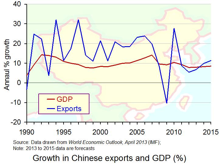 The Chinese economy has seemed relatively unaffected by the economic downturn, yet its economic growth has slowed. Averaging over 10% per annum for the last decade, the growth for January – March 2013 was only 7.7%. This is a decline on the previous 3 months and is lower than expected. If the Chinese economy does begin to slow (relatively speaking), this could present the global economic recovery with an unwelcome obstacle.
Many Western economies are reliant on exports to boost their growth figures and with such high demand in China, this is a key export market for many countries. If the Chinese economy continues to slow, consumer spending may even fall and this could mean a reduction in Chinese imports: that is, a reduction in other countries’ exports to China. However, for China’s competitors, the news is better, as with China’s move from a low to middle-income country, other countries will now see an opportunity to grasp a competitive advantage in the production of cheaper products. David Rees from Capital Economics said:
Trade data show that Chinese imports of commodities, and industrial metals in particular, have been falling in recent months … That is bad news for those emerging markets in Latin America, the Middle East, and Africa that predominately export commodities to China. It is not all bad news … To the extent that China’s structural slowdown reflects its transition from low to middle-income status, opportunities will present themselves for other EMs as China moves up the value chain. We are particularly upbeat on the manufacturing-based economies of South East Asia, along with Mexico, Poland, and Turkey.
News is better in Japan, where growth forecasts have been raised to 2.9% over the same period and the economy is expected to grow by 1.5% throughout both 2013 and 2014. Furthermore, suggestions that inflation may also reach 0.7% have boosted confidence. This might be the end of Japan’s troubles with deflation.
So, we have something of a mixed picture across the world, although the IMF predicts a global rate of growth of 3.5% for 2013, which would be an improvement on 2012 figures. The following articles consider the global situation.
Spain slashes economic growth forecast Sky News (26/4/13)
UK avoids triple-dip recession with better than expected 0.3% GDP growth The Guardian, Heather Stewart (26/4/13)
US economy grows 2.5% on buoyant consumer spending BBC News (26/4/13)
Poor French and Spanish jobs data but UK economy returns to growth – as it happened The Guardian, Graeme Wearden and Nick Fletcher (25/4/13)
UK economy avoids tiple-dip recession with 0.3pc GDP growth The Telegraph, Szu Ping Chan (25/4/13)
South Korea economic growth hits two year high BBC News (25/4/13)
S. Korea economy grows at the fastest pace in two years Bloomberg, Eunkyung Seo (25/4/13)
Spain revises down its economic forecast BBC News (26/4/13)
US economy sees broad growth Financial Times, Robin Harding (25/4/13)
Germany’s private sector shrinks as Eurozone decline continues – as it happened The Guardian, Graeme Wearden and Nick Fletcher (23/4/13)
China economic growth lower than forecast BBC News (15/4/13)
China’s slowing economy: what you need to know Bloomberg Business Week, Dexter Roberts (25/4/13)
Modest Growth Pickup in 2013, Projects IMF International Monetary Fund (23/1/13)
Questions
- How is economic growth measured?
- What is meant by a triple-dip recession?
- What has caused the small increase in growth in the UK? Do you think this signifies the start of the economic recovery?
- In the USA, what has caused the growth rate to reach 2.5% and why is it lower than expected?
- Why are growth rates in countries across the world relevant for UK forecasts of economic growth?
- Which factors have allowed the Chinese economy to achieve average growth rates above 10% for the past decade?
- Using an AD/AS diagram, illustrate the desired impact of the Coalition’s policies to boost economic growth.
- With unemployment rising in countries like Spain and France, how might Eurozone growth be affected in the coming months?
- Japanese growth is looking positive and inflation is expected to reach about 0.7%. Why is it that Japan has suffered from deflation for so many years and why is this a problem?
 Unemployment is a key macroeconomic objective for governments across the world. The unemployment rate for the UK now stands at 7.9% according to the ONS, which recorded 2.56 million people out of work. But why is unemployment of such importance? What are the costs?
The economy is already in a vulnerable state and with unemployment rising by 70,000 people between December and February 2013, the state of the economic recovery has been questioned. Indeed, following the news of the worsening unemployment data, the pound fell significantly against the dollar, suggesting a lack of confidence in the British economy.
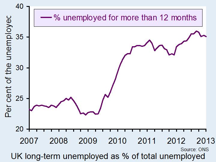
 Although the increase in the number of people out of work is concerning, perhaps of more concern should be the number of long-term unemployed. The ONS suggests that more than 900,000 have now been out of work for more than a year. Not only does this pose costs for the individual in terms of lost earnings and skills, but it also imposes costs on friends and family and the wider economy. (Click here for a PowerPoint of the first chart, which shows the percentage of unemployed people out for work longer than 12 months.)
The chief executive of the Prince’s Trust focused on the costs of youth unemployment in particular, saying:
Thousands of these young people are long-term unemployed, often facing further challenges such as poverty and homelessness. We must act now to support these young people into work and give them the chance of a better future.
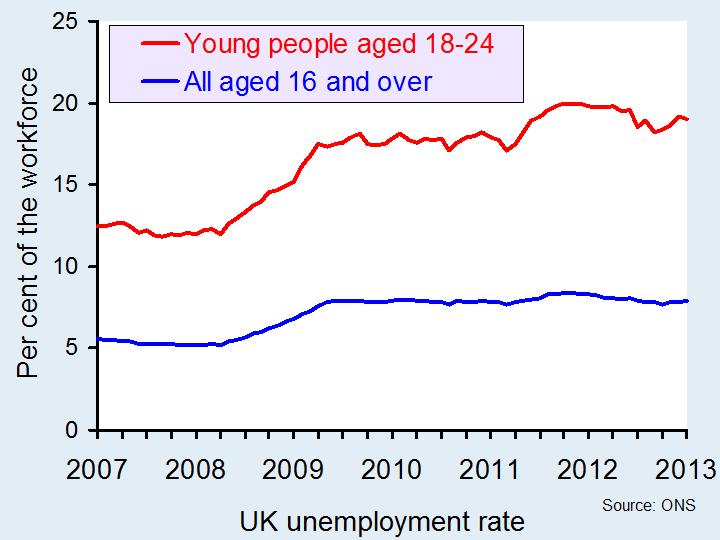
(Click here for a PowerPoint of the second chart, which shows how much higher the unemployment rate is for young people aged 18 to 24 than it is for the working age population as a whole.)
 Furthermore, with so many people unemployed, we are operating below full-employment and thus below our potential output. Furthermore, the longer people are out of work, the more likely it is that they will lose their skills and thus require re-training in the future or find that there are now fewer jobs available to them based on their lower skill level.
In addition to this there are monetary costs for the government through lower tax receipts, in terms of income tax, national insurance contributions and even VAT receipts. With more people unemployed, the numbers claiming various unemployment-related benefits will rise, thus imposing a further cost on the government and the taxpayer. Another cost to the government of this latest data is likely to be the expectations of the future course of the economy. Numerous factors affect business confidence and unemployment data is certainly one of them. The concern is that business confidence affects many other variables as well and until we receive more positive data, the economy recovery is likely to remain uncertain. The following articles consider this topic.
UK unemployment rise adds to pressure on Osborne’s austerity strategy The Guardian, Phillip Inman (18/4/13)
Unemployment figures are ‘worrying’, David Cameron’s spokesman says The Telegraph, Peter Dominiczak (17/4/13)
UK unemployment rises to 2.56 million BBC News (17/4/13)
Unemployment jumps to 7.9% as rise in the number of young people out of work takes figure ‘dangerously’ close to a million Mail Online, Leon Watson (17/4/13)
Unemployment up as stay-at-home mothers head back to the job-centre Independent, Ben Chu (17/4/13)
Jobs data points to finely balanced market Financial Times, Brian Groom (18/4/13)
 Hugh’s review: making sense of the stats BBC News (19/4/13)
Questions
- How is unemployment measured?
- What are the costs to the individual of being unemployed?
- What are the wider non-monetary costs to society?
- Explain the main financial costs to the wider economy of a rising unemployment rate.
- Illustrate the problem of unemployment by using a production possibility frontier.
- Could there be a negative multiplier effect from a rise in unemployment?
 When you hear about China, it’s often regarding their huge population, their strong growth or their dominance in exports. But, when it comes to baby milk, China is certainly an importer – and a big one at that. For many new parents, getting the ‘real thing’ when it comes to baby formula is absolutely essential.
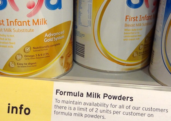
Chinese baby formula is feared by many new parents, due to the potential for it to contain hormones and dangerous chemicals. This has led them to go to great lengths to ensure they have sufficient supplies of imported baby formula, often only trusting it if it has been hand carried from overseas. However, such is the demand for this safe version of baby milk that the global response has been to place restrictions on it. Essentially, we are seeing a system of rationing emerging.

Hong Kong was the first government to limit the amount bought to two cans of formula per day, with the potential for a fine of over $64,000 and up to two years in prison for those who do not abide by the rules. The UK has now also responded with restrictions on the quantity that can be purchased and other countries may follow suit if the excess demand continues.
According to Sainsburys:
As a short-term measure, retailers including Sainsbury’s are limiting the amount of baby milk powder that people can buy. In this way we aim to ensure a constant supply for our customers and we therefore hope they won’t be inconvenienced.
The Chinese government has reacted to this and is aiming to restore confidence in the food industry, but as yet there has been little positive effect and until there are 100% guarantees of food safety the surge in demand for baby formula from abroad is likely to continue.
This policy of rationing is clearly not only going to affect Chinese parents looking to import baby formula, but is already having an impact on domestic residents. Parents living in the UK are feeling the rationing effects and are also being restricted in terms of how many cans of formula they can buy per day. For many families this isn’t a problem, but for those with multiple children and for whom a trip to the supermarket is not a simple task, the restrictions on baby milk purchases is likely to become a problem. The following articles consider this topic.
Baby milk rationing: Chinese fears spark global restrictions BBC News, Celia Hatton (10/4/13)
Stop rationing information about baby formula milk The Telegraph, Rosie Murray-West (9/4/13)
Baby milk rationed in UK over China export fear BBC News (8/4/13)
Baby Formula rationed in UK over China demand Sky News (9/4/13)
Supermarkets limit sales of baby milk to stop bulk buying to feed China market Independent, Emma Bamford (8/4/13)
Cahinese thirst for formula spurs rationing Financial Times, Amie Tsang and Louise Lucas (7/4/13)
Entrepreneurs milk Chinese thirst for formula Financial Times, Amie Tsang and Louise Lucas (7/4/13)
Baby milk powder rationing introduced by supermarkets The Guardian, Rebecca Smithers (8/4/13)
Questions
- Using a diagram of demand and supply, illustrate how a shortage for a product can emerge. How does the price mechanism usually work to eliminate a shortage?
- What actions can be taken to deal with a shortage?
- How will more stringent regulations by the Chinese government help to restore confidence in Chinese baby milk formula?
- What impact will the imports of baby milk formula into China have on China’s exchange rate and its balance of payments?
- How could this situation be taken advantage of by entrepreneurs? Could it be used as a viable business opportunity?
 In the blog No accounting for trade, the rise in the UK’s balance of trade deficit was discussed. Many factors have contributed to this weakening position and no one market is to blame. But, by analysing one product and thinking about the factors that have caused its export volumes to decline, we can begin to create a picture not just of the UK economy (or more particularly Scotland!), but of the wider global economy.
Scotch whisky may not have been the drink of choice for many British adults, but look outside Great Britain and the volume consumed is quite staggering. For example, French consumers drink more Scotch whisky in one month than they drink cognac in one year. The volume of Scotch whisky exported from our shores was £4.23 billion for 2011, accounting for 90% of all sales and making its way into 200 markets. However, one problem with this product is that it is highly susceptible to the business cycle. Add to this the time required to produce the perfect Scotch (in particular the fact that it must be left to mature) and we have a market where forecasting is a nightmare.
Producers typically look to forecast demand some 10 years ahead and so getting it right is not always easy, especially when the global economy declines following a financial crisis! So what has been the impact on exports of this luxurious drink? In the past few years, it has been as key growth market for UK exports rising by 190% in value over the past decade. But in 2012 the volume of Scotch whisky exports fell by 5% to 1.19 billion bottles. What explains the decline in sales?
The biggest importer of Scotch whisky is France and its volumes were down by 25%. Part of this decline is undoubtedly the economic situation. When incomes decline, demand for normal goods also falls. Many would suggest Scotch whisky is a luxury and thus we would expect to see a relatively large decline following any given fall in income. However, another factor adding to this decline in 2012 is the increased whisky tax imposed by the French government. Rising by 15% in 2012, commentators suggest that this caused imports of Scotch whisky to rise in 2011 to avoid this tax, thus imports in 2012 took a dive. Spain is another key export market and its economic troubles are clearly a crucial factor in explaining their 20% drop in volume of Scotch whisky imported.
But, it’s not all bad news: sales to Western Europe may be down, but Eastern Europe and other growth countries/continents, such as the BRICs and Africa have developed a taste for this iconic product. Latvia and Estonia’s value of Scotch whisky imports were up by 48% and 28% respectively, as Russian demand rises and China, still growing, is another key market. Gavin Hewitt, chief executive of the Scotch Whisky Association said:
A combination of successful trade negotations, excellent marketing by producers, growing demand from mature markets, particularly the USA, and the growing middle class in emerging economies helped exports hit a record £4.3bn last year.
Furthermore, while the volume of exports worldwide did fall, the value of these exports rose to £4.27 billion, a growth of 1%. This suggests that although we are exporting fewer bottles, the bottles that we are exporting are more expensive ones. Clearly some people have not felt the impact of the recession. For Scotland and the wider UK, these declining figures are concerning, but given the cyclical nature of the demand, as the world economy slowly begins to recover, sales are likely to follow suit. Gavin Hewitt continued his comments above, saying:
We are contributing massively to the Government’s wish for an export-led recovery. There is confidence in the future of the industry, illustrated by the £2bn capital investment that Scotch whisky producers have committed over the next three to four years.
The following articles consider the rise and fall of this drink and its role as a key export market across the world.
 Scottish whisky industry puts export hope in new market BBC News (2/4/13)
Scotch whisky sales on the slide The Guardian, Simon Neville (2/4/13)
Growth stalls for Scotch whisky exports BBC News (2/4/13)
Scotch whisky accounts for 25pc of UK’s food and drink exports The Telegraph, Auslan Cramb (2/4/13)
Whisky sales fall but value of exports hits new high Herald Scotland (3/4/13)
Scotch whisky exports rise to record value The Telegraph, Auslan Cramb (2/4/13)
Scotch whisky exports hit by falling demand in France The Grocer, Vince Bamford (2/4/13)
New markets save Scotch from impact of austerity Independent, Tom Bawden (2/4/13)
Scotch exports hit by falling demand Financial Times, Hannah Kichler (2/4/13)
Questions
- Which is the better measure of an industry’s performance: the value or the volume of goods sold?
- Why would you expect volumes of Scotch sold to decline during an economic downturn?
- When a higher tax was imposed on Scotch whisky in France, why did volumes fall? Use a demand and supply diagram to illustrate the impact of the tax.
- What type of figure would you expect Scotch whisky to have for income elasticity of demand? Does it vary for different people?
- Why is forecasting demand for Scotch so difficult? What techniques might be used?
- Why does demand for Scotch whisky remain high and even rising in many emerging markets?
- Is the market for Scotch whisky exports a good indication of the interdependence of countries across the world?
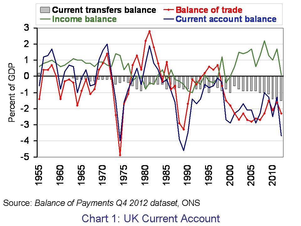
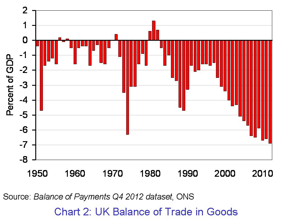
 The UK economy shrank by 0.3 per cent in the final quarter of 2012. A significant factor in the fall was the UK’s balance of trade, which measures the difference between the value of goods and services exported and those imported. The balance of trade deficit rose in 2012 to £36.2 billion or 2.3 per cent of GDP. If we measure only the balance in goods, the deficit was an eye-watering £106.3 billion – a record high for the UK. The balance of trade remains a drag on British growth.
The balance of payments is a record all the flows of money between a country’s residents and the rest of the world. Inflows represent credits on the balance of payments while outflows represent debits. We focus here on perhaps the best-known component of the overall balance of payments: the current account. The current account comprises three separate accounts. First, there is the balance of trade (in goods and services). It records payments for exports (X) and imports (M). Second, there is net income flows. Net income flows are flows of money between countries in the form of wages, profits and interest. Finally, there is current transfers. Current transfers are transfers of money between countries for the purpose of consumption, including, for instance, a transfer payment by the British government to overseas organisations.

Chart 1 presents the UK’s current account. It is based on data from Balance of Payments Q4 2012 dataset published by the Office for National Statistics. The current account deficit in 2012 was £57.7 billion (up from a deficit of £20.2 billion in 2011). This is the equivalent to 3.7 per cent of GDP (up from a deficit of 1.3 per cent in 2011) and the highest current account deficit since 1989 when it reached 4.6 per cent of GDP. Back in 1989, the UK economy was growing by 2.6 per cent having grown by 5.6 per cent in 1988. In 2012, the UK economy grew by just 0.3 per cent following growth of 1.0 per cent in 2011. The mean average rate growth of the UK economy since 1950 is 2.6 per cent. (Click here for a PowerPoint of the chart.)
The net income balance, which while remaining in surplus, worsened significantly. From a surplus of £25.9 billion (1.7 per cent of GDP) in 2011, it fell to a surplus of just £1.6 billion (0.1 per cent of GDP) in 2012. This is largely attributable to a decline in the surplus of direct investment income and, in particular, the earnings abroad of non-bank private corporations. Meanwhile, the deficit on current transfers in 2012 was £23.1 billion, up from £22.0 billion in 2011. This is the highest on record. The current transfers deficit with EU institutions rose in 2012 to £10.5 billion, up by £1 billion on 2011.

The balance of trade deficit too worsened in 2012. The deficit rose from £24.1 billion in 2011 (1.6 per cent of GDP) to £36.2 billion in 2012 (2.3 per cent of GDP). The persistent balance of trade deficit continues to occur despite a persistent surplus on the trade in services. In 2012, the balance of trade surplus in services was £70 billion (4.6 per cent of GDP). As Chart 2 shows, the UK now has a record deficit in the balance of trade in goods. This was down from £76.1 billion in 2011 (5 per cent of GDP). (Click here for a PowerPoint of the chart.)
The last time the UK ran a surplus on the balance of trade in goods was back in 1982. Since 1983, the average UK balance of trade deficit in goods has been the equivalent of 3.67 per cent of GDP. Over the same period, the UK has run a balance of trade surplus in services of 2.37 per cent. The figures point very clearly to the work to be done if we are to see a rebalancing of the industrial composition of the UK economy.
Data
Statistical Bulletin: Balance of Payments, Q4 2012 ONS, 27 March 2013
Balance of Payments, Q4 2012 dataset ONS, 27 March 2013
Articles
Fasten your seat belts – a balance of payments crisis looms Telegraph, Jeremy Warner 27/3/13)
Britain, the world and the end of the free lunch? BBC News, Stephanie Flanders (27/3/13)
March of the makers? Balance of payments figures make dismal reading Guardian, Larry Elliott (27/3/13)
Britain’s current account deficit at worst level since 1989 Guardian, Phillip Inman (27/3/13)
Pound fears as current account deficit jumps to near 25 per cent high Telegraph, Szu Ping Chan (27/3/13)
Current account deficit highest since 1989 Financial Times, Claire Jones (27/3/13)
Questions
- What does the balance of payments measure?
- In explaining what the current account of the balance of payments measures, distinguish between the three principal accounts comprising the current account.
- Why might we expect the current account to worsen when economic growth is strongest and improve when economic growth is weakest? Is this what we observe in the UK?
- The UK has experienced a persistent current account deficit since the early 1980s. What might be some of the contributory factors to this persistent deficit?
- How might we expect a country’s exchange rate to be affected by movements on the balance of payments?
 The latest growth data for the UK is somewhat difficult to interpret. It’s positive, but not that positive. The Conservatives say it shows that the economy is moving in the right direction. Labour suggests it is evidence that the Coalition’s policies are not working. With a return to positive growth, the UK has avoided the triple dip recession and here we take a closer look at the economic performance of other key nations.
 However, the growth figure was lower than expected, in part due to lower government spending. Furthermore, there are suggestions that the positive consumer spending figures are merely a positive blip and spending will fall as the US economy moves through 2013.
 The Chinese economy has seemed relatively unaffected by the economic downturn, yet its economic growth has slowed. Averaging over 10% per annum for the last decade, the growth for January – March 2013 was only 7.7%. This is a decline on the previous 3 months and is lower than expected. If the Chinese economy does begin to slow (relatively speaking), this could present the global economic recovery with an unwelcome obstacle.