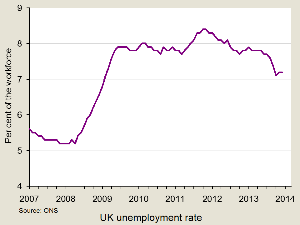
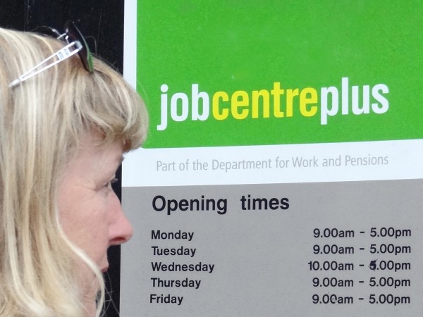
 Unemployment and employment are concepts that are often talked about in the media. Indeed, the 7% unemployment target referred to by the Governor of the Bank of England has been a constant feature of recent headlines. However, rather than targeting an unemployment rate of 7%, George Osborne has now called for ‘full employment’ and believes that tax and welfare changes are key to meeting this objective.
Reducing the unemployment rate is a key macroeconomic objective and the costs of unemployment are well-documented. There are obviously big costs to the individual and his/her family, including lower income, dependency, stress and potential health effects. There are also costs to the government: lower income tax revenues, potentially lower revenues from VAT through reduced consumer expenditure and the possibility of higher benefit payments. There are other more ‘economic’ costs, namely an inefficient use of resources. Unemployment represents a cost to the economy, as we are operating below full capacity and we therefore see a waste of resources. It is for this reason that ‘full employment’ is being targeted.
Traditional economic theory suggests that there is a trade-off between unemployment and inflation, illustrated by the well-known Phillips curve. In the past, governments have been willing to sacrifice unemployment for the purpose of reducing inflation. There have also been attempts to boost the economy and create jobs through increased borrowing. However, George Osborne has said:
Unemployment is never a price worth paying, but artificial jobs paid for with borrowed money doesn’t work either.
A figure representing full employment hasn’t been mentioned, so it remains unclear what level of unemployment would be acceptable, as despite the name ‘full employment’, this doesn’t mean that everyone has a job. There are several definitions of full employment, in both an economic and political context. In the period of reconstruction after the Second World War, William Beveridge, architect of the welfare state, defined full employment as where 3% of people would be unemployed.
In more recent times, other definitions have been given. In the era of monetarism in the 1970s, the term ‘natural rate of unemployment’ was used to define the unemployment rate to which economies tend in the long run – after inflationary expectations have adjusted. Keynesians use the term the ‘non-accelerating-inflation rate of unemployment (NAIRU)’, where unemployment is confined to equilibrium unemployment and where there is no excess or deficiency of aggregate demand. Both the natural rate and the NAIRU relate to the rate of unemployment at which the long-run Phillips curve is vertical.

In its Economic and Fiscal Outlook of March 2013, the Office for Budget Responsibility estimated the UK’s NAIRU to be 5.4%. George Osborne has not specified a particular rate. Rather, his speech refers to creating the ‘highest employment rate of any of the world’s leading economies’. He said the ambition was to make the UK:
…the best place in the world to create a job; to get a job; to keep a job; to be helped to look for another job if you lose one…A modern approach to full employment means backing business. It means cutting the tax on jobs and reforming welfare.
Therefore, while it appears that there is no target figure for unemployment, it seems that a new Conservative objective will be to focus on sustainable job creation and eliminate disequilibrium unemployment. This represents a move very much into Labour territory. Meeting the objective will be no easy task, given the past few years and such high levels of youth unemployment, as Labour were quick to point out, but the unemployment figures are certainly moving in the right direction. The following articles consider the objective of full employment.
Articles
Britain’s Osborne changes tone on economy with “full employment” target Reuters, William James (31/3/14)
George Osborne commits to ‘fight for full employment’ BBC News (including video) (1/4/14)
What does full employment mean? The Guardian (1/4/14)
What is full employment? The Telegraph, Peter Dominiczak (31/3/14)
’Jobs matter’, says George Osborne as he aims for full employment Independent, Andrew Grice (31/3/14)
Liam Bynre: Labour would aim for ‘full employment’ BBC News (17/5/13)
Osborne pledges full employment for UK Sky News (31/3/14)
Osborne commits to full employment as election looms Bloomberg, Svenja O’Donnell (31/3/14)
Whatever happened to full employment? BBC News, Tom de Castella and Caroline McClatchey (13/10/11)
Questions
- What is meant by full employment?
- Is it a good idea to target zero unemployment?
- Using a diagram, illustrate the difference between disequilibrium and equilibrium unemployment?
- How can full employment be achieved?
- What are the costs of unemployment?
- Use a diagram to illustrate the natural rate of unemployment and explain what it means in terms of the relationship between unemployment and inflation.
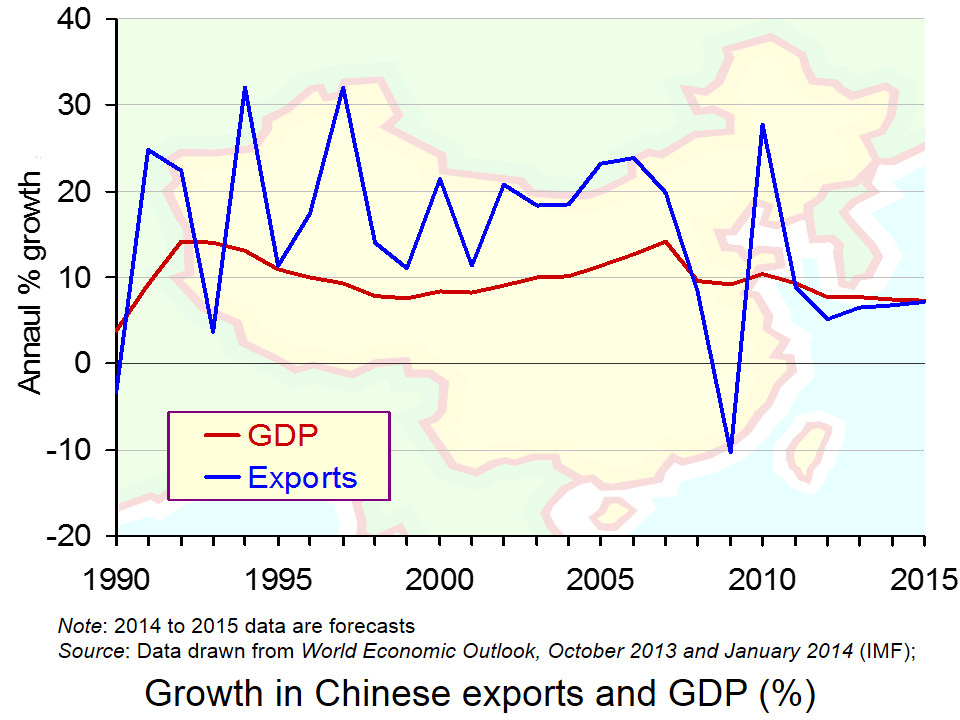
 The growth of China over the past decade has been quite phenomenal, with figures recorded in double-digits. However, in the aftermath of the recession, growth has declined to around 7% – much higher than Western economies are used to, but significantly below the ‘norm’ for China. (Click here for a PowerPoint of the chart.)
The growth target for this year is 7.5%, but there appear to be some concerns about China’s ability to reach this figure and this has been emphasised by a recent Chinese policy.
A mini-stimulus package has been put in place, with the objective of meeting the 7.5% growth target. Government expenditure is a key component of aggregate demand and when other components of AD are lower than expected, boosting ‘G’ can be a solution. However, it’s not something that the Chinese government has had to do in recent years and the fact that this stimulus package has been put in place has brought doubts over China’s economic performance to the forefront , but has confirmed its commitment to growth. Mizuho economist, Shen Jianguang, said:
It’s very obvious that the leaders feel the need to stabilise growth…Overall, the 7.5 per cent growth target means that the government still cares a lot about economic growth.
Data suggest that growth in China is relatively weak and there are concerns that the growth target will be missed, hence the stimulus package. In the aftermath of the 2008 financial crisis, there was a large stimulus package in place in China. This latest investment by the government is in no way comparable to the size of the 2008 package, but instead will be on a smaller and more specific scale. Mark Williams of Capital Economics said:
It’s a bit of a rerun of what we saw last year – something less than a stimulus package and more of piecemeal measures to ensure they reach their growth target.
It is the construction of public housing and railways that will be the main areas of investment this time round. A sum of $120–180bn per year will be available for railway construction and $161bn for social housing, and tax breaks are being extended for small businesses.
The 2008 stimulus package saw debt increase to some 200% of GDP, which did cause growing concerns about the reliance on debt. However, this latest package will be financed through the issue of bonds, which is much more similar to how market economies finance spending.
The fact that the government has had to intervene with such a stimulus package is, however, causing growing concerns about the level of debt and the future of this fast growing economy, though the new method of financing is certainly seen as progress.

It should be noted that a decline in growth for China is not only concerning for China itself, but is also likely to have adverse consequences other countries. In the increasingly interdependent world that we live in, Western countries rely on foreign consumers purchasing their exports, and in recent years it has been Chinese consumers that have been a key component of demand. However, a decline in growth may also create some benefits – resources may not be used up as quickly and prices of raw materials and oil in particular may remain lower.
It is certainly too early for alarm bells, but the future of China’s growth is less certain than it was a decade ago. The following articles consider this issue.
China’s new mini-stimulus offers signs of worry and progress BBC News, Linda Yueh (3/4/14)
China puts railways and houses at hear of new stimulus measures The Guardian (3/4/14)
China unveils mini stimulus to to boost slowing economy The Telegraph (3/4/14)
China stimulus puts new focus on growth target Wall Street Journal, Bob Davis and Michael Arnold (3/4/14)
China embarks on ‘mini’ stimulus programme to kick-start economy Independent, Russell Lynch (3/4/14)
China takes first step to steady economic growth Reuters (2/4/14)
China unveils fresh stimulus The Autstralian (3/4/14)
China’s reformers can triumph again, if they follow the right route The Guardian, Joseph Stiglitz (2/4/14)
Questions
- How has Chinese growth reached double-digits? Which factors are responsible for such high growth?
- The BBC News article suggests that the stimulus package is cause for concerns but also shows progress. How can it do both?
- Using a diagram, illustrate how a stimulus package can boost economic growth.
- What are the advantages and disadvantages of high rates of growth for (a) China and (b) Western economies?
- Why does the method of financing growth matter?
- Railway and housing construction have been targeted to receive additional finance. Why do you think these sectors have been targeted?
 It is rising inflation that typically causes problems for countries, whether it is demand-pull or cost-push. However, one country that has not been subject to problems of rising prices is Japan. Instead, this economy has been suffering from the gloom of deflation for many years and many argue that this is worse than high inflation.
Falling prices are popular among consumers. If you see a product whose price has fallen from one day to the next, you can use your income to buy more goods. What’s the problem with this? The Japanese economy has experienced largely stagnant growth for two decades and a key cause has been falling prices. When the prices of goods begin to fall over and over again, people start to form expectations about the future direction of prices. If I expect the price of a good to fall next week, then why would I buy now, if I can buy the same good next week at a lower price?  But, when next week arrives and the price has fallen as expected, why would I purchase the product, if I think that the price fall is set to continue? The problem of deflation is that with continuously falling prices, consumers stop spending. Aggregate demand therefore declines and economic growth all but disappears. This is the problem that the Japanese economy has been faced with for more than 20 years.
However, the latest data from Japan shows core consumer prices growing faster than expected in December 2013, compared to the previous year. This figure was above market forecasts and was the fastest rate of growth in the past 5 years. These data, together with those on unemployment have given the economy a much needed boost.
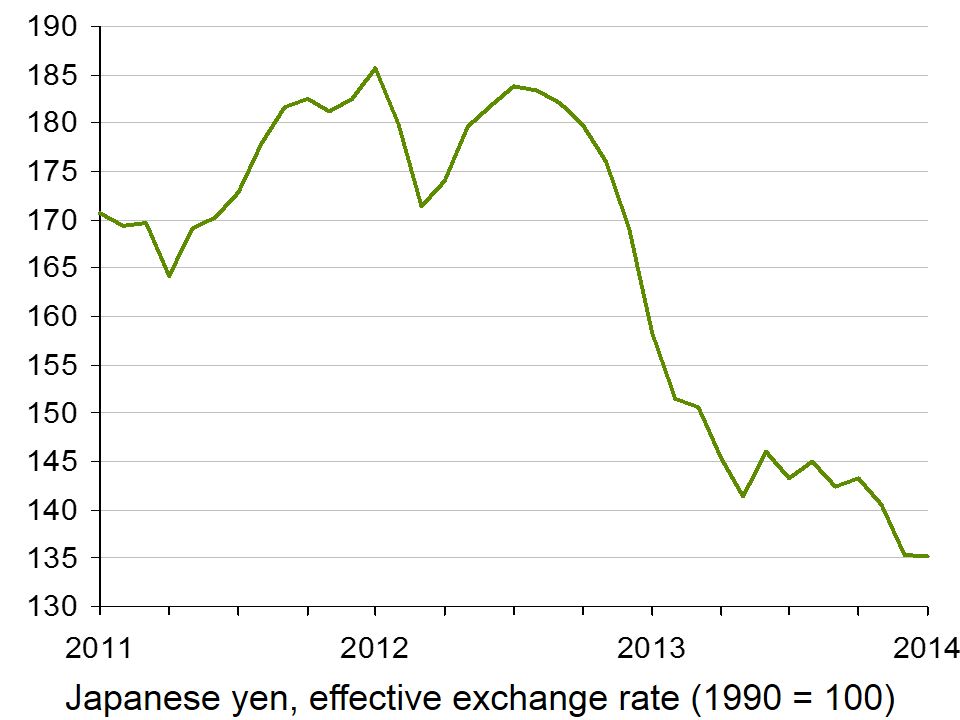
 Recent government policy has been focused on boosts in government spending, with an aim of reducing the value of the currency (click here for a PowerPoint of the chart). Such policies will directly target aggregate demand and this in turn should help to generate an increase in national output and push up prices. If the price trend does begin to reverse, consumers will start to spend and again aggregate demand will be stimulated.
The future of the economy remains uncertain, though the same can be said of many Western economies. However, the signs are good for Japan and if the recovery of other economies continues and gathers pace, Japan’s export market will be a big contributor to recovery. The following articles consider the Japanese economy.
Japan inflation rises at fastest pace in over five years BBC News (31/1/14)
Benchmark Japan inflation rate hits 1.3% Financial Times, Jonathan Soble (31/1/14)
Japan’s inflation accelerates as Abe seeks wage gains Bloomberg, Chikako Mogi, Masahiro Hidaka and James Mayger (31/1/14)
Japan inflation quickens to over 5-year high, output rebounds Reuters, Leika Kihara and Stanley White (31/1/14)
Japaense inflation rises at fastest pace in over five years at 1.3% in December 2013 Independent, Russel Lynch (31/1/14)
 Why Abenomics holds lessons for the West BBC News, Linda Yueh (18/12/13)
Questions
- Why is deflation a problem?
- Using an AD/AS diagram, illustrate the problem of expectations and how this contributes to stagnant growth.
- How will a lower currency help Japan?
- What is the likely effect of a sales tax being imposed?
- Does the fact that unemployment has declined support the fact that consumer prices are beginning to rise?
- What government policies would you recommend to a government faced with stagnant growth and falling prices?
- How important are expectations in creating the problem of deflation?
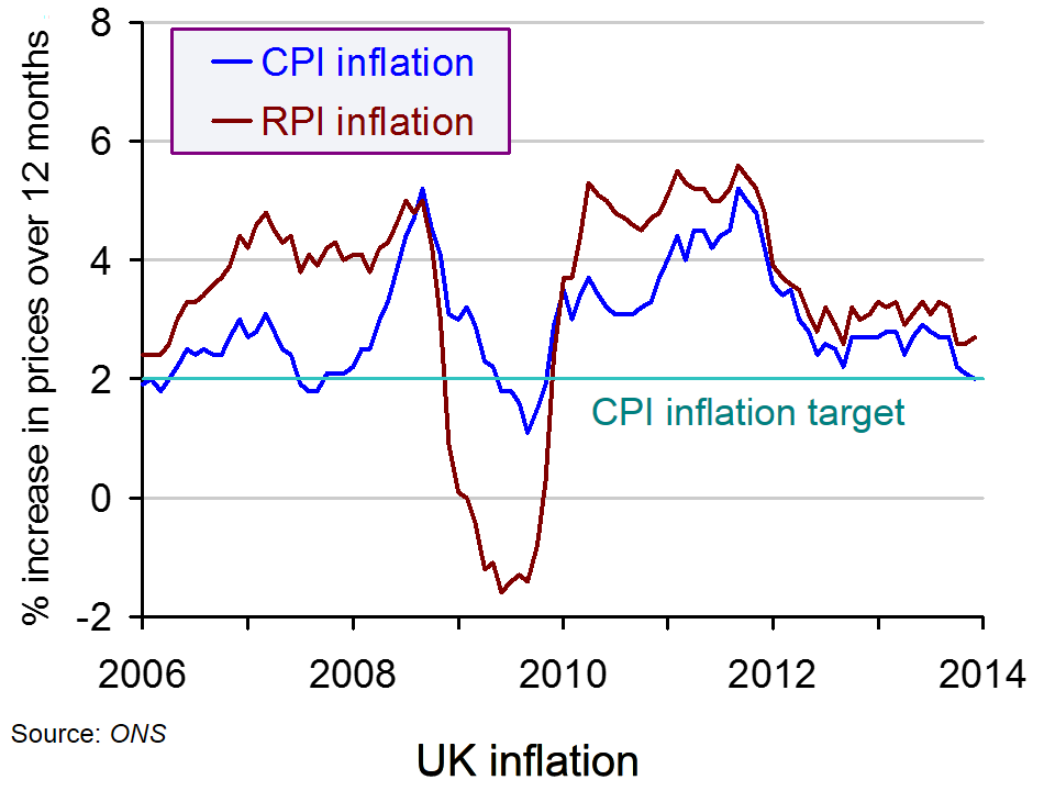
 A recession is typically characterised by high unemployment, low or negative growth and low inflation, due to a lack of aggregate demand. However, since 2009, inflation levels in the UK have only added to the pressures facing the government and the Bank of England. Not only had there been a problem of lack of demand, but the inflation target was no longer being met.
Inflation had increased to above 5% – a figure we had not been accustomed to for many years. With interest rates at record lows with the aim of boosting aggregate demand, demand-pull inflation only added to cost-push pressures. However, data released by the ONS shows that inflation, as measured by the CPI, has now fallen back to its 2% target. Having been at 2.1% in November 2013, the figure for December 2013 fell by 0.1 percentage points.
 The data for December include some of the energy price rises from the big six, but do not include the full extent of price decreases and discounting initiated by retailers in the lead up to Christmas. The key factors that have helped to keep prices down include some of the discounting throughout December and falling food prices, in particular bananas, grapes and meat.
With inflation back on target, pressures have been removed from the Bank of England to push up interest rates. Mark Carney has said that interest rates will remain at 0.5% until unemployment falls to 7%.  With unemployment fast approaching this target, there has been speculation that interest rates would rise, but with inflation falling back on target, these pressures have been reduced. (Click here for a PowerPoint of the chart.) Referring to this, Jeremy Cook, the chief economist at World First said:
The lack of inflation will help stay their hand especially if the pace of job creation seen in the second half of last year also shows.
These thoughts were echoed by Rob Wood, the chief UK economist at Berenberg Bank:
Inflation is the BoE’s ‘get out of jail free’ card for this year … The lack of inflation pressure gives them room to delay a first hike until next year.
Many economists now believe that the CPI rate of inflation is likely to remain at or below the target, in particular if productivity growth improves. This belief is further enhanced by the fact that tax rates are stable, the pound is relatively strong and the previous upward pressure on commodity prices from China is now declining. Some economists believe that CPI inflation could fall to 1.5% this year and the Treasury has said that it is ‘another sign that the Government’s long-term economic plan is working’. The following articles consider this latest macroeconomic data.
UK inflation falls to Bank of England’s 2pc target in December The Telegraph, Szu Ping Chan (14/1/14)
UK inflation falls to 2% target rate in December BBC News (14/1/14)
Carney’s lucky streak continues as UK inflation slows to 2% Financial Times, Claire Jones (14/1/14)
UK inflation fall gives Bank of England a lift Wall Street Journal, Richard Barley(14/1/14)
Inflation falls to Bank of England target Reuters, William Schomberg and Ana Nicolaci da Costa (14/1/14)
Inflation hits Bank of England’s target of 2% in December Independent, John Paul Ford Rojas (14/1/14)
Questions
- What is the relationship between interest rates and aggregate demand?
- Which factors have led to the reduction in the rate of inflation?
- Why have the latest data on inflation rates reduced the pressure on the Bank of England to increase interest rates?
- Why do stable tax rates, a strong pound and reduced pressure from China on commodity prices suggest that the CPI measures of inflation is likely to remain at similarly low levels?
- Why has the RPI increased while the CPI has fallen?
 As the old year gives way to the new, papers have been full of economic forecasts for the coming year. This year is no exception. The authors of the articles below give their predictions of what is to come for the global economy and, for the most part, their forecasts are relatively optimistic – but not entirely so. Despite a sunny outlook, there are various dark clouds on the horizon.
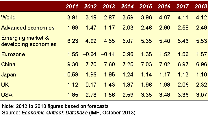
Most forecasters predict a higher rate of global economic growth in 2014 than in 2013 – and higher still in 2015. The IMF, in its October forecasts, predicted global growth of 3.6% in 2014 (up from 2.9% in 2013) and 4.0% in 2015.
Some countries will do much better than others, however. The USA, the UK, Germany and certain developing countries are forecast to grow more strongly. The eurozone as a whole, however, is likely to see little in the way of growth, as countries such as Greece, Spain, Portugal and Italy continue with austerity policies in an attempt to reduce their debt.  Chinese growth has slowed, as the government seeks to rebalance the economy away from exports and investment in manufacturing towards consumption, and services in particular. It is still forecast to be 7.3% in 2014, however – well above the global average. Japanese growth has picked up in response to the three arrows of fiscal, monetary and supply-side policy. But this could well fade somewhat as the stimulus slows. The table shows IMF growth forecasts for selected countries and groups of countries to 2018.
Much will depend on what happens to monetary policy around the world. How quickly will monetary stimulus taper in the USA and in Japan? Will the ECB introduce more aggressively expansionary monetary policy? When will the Bank of England start raising interest rates?
Growth within countries is generally favouring those on higher incomes, with the gap between rich and poor set to continue widening over the coming years. The pay of top earners has continued to rise considerably faster than prices, while increasingly flexible labour markets and squeezed welfare budgets have seen a fall in living standards of many on low incomes. According to a Which? survey (reported in the Independent article below), in the UK:
Only three in ten expect their family’s situation to improve in the new year, while 60% said they are already dreading the arrival of their winter energy bill. The Which? survey also found that 13 million people could afford to pay for Christmas only by borrowing, with more than four in ten using credit cards, loans or overdrafts to fund their festive spending. A third of people (34%) also dipped into their savings, taking an average of £450 from their accounts.
If recovery is based on borrowing, with real incomes falling, or rising only very slowly, household debt levels are likely to increase. This has been stoked in the UK by the ‘Help to Buy‘ scheme, which has encouraged people to take on more debt and has fuelled the current house price boom. This could prove damaging in the long term, as any decline in confidence could lead to a fall in consumer expenditure once more as people seek to reduce their debts.
 And what of the global banking system? Is it now sufficiently robust to weather a new crisis. Is borrowing growing too rapidly? Is bank lending becoming more reckless again? Are banks still too big to fail? Is China’s banking system sufficiently robust? These are questions considered in the articles below and, in particular, in the New York Times article by Gordon Brown, the former Prime Minister and Chancellor of the Exchequer.
Articles
Global economy: hopes and fears for 2014The Observer, Heather Stewart and Larry Elliott (29/12/13)
Looking ahead to 2014 BBC News, Linda Yueh (20/12/13)
Low hopes for a happy new financial year in 2014 Independent, Paul Gallagher (29/12/13)
Brisk UK economic growth seen in 2014 fuelled by spending – Reuters poll Reuters, Andy Bruce (12/12/13)
GLobal Economy: 2014 promises faster growth, but no leap forward Reuters, Andy Bruce (29/12/13)
My 2014 Economic Briefing Huffington Post, Tony Dolphin (27/12/13)
Three UK Economy Stories that will Dominate in 2014 International Business Times, Shane Croucher (27/12/13)
Who You Calling a BRIC? Bloomberg, Jim O’Neill (12/11/13)
Hope and Hurdles in 2014 Project Syndicate, Pingfan Hong (27/12/13)
On top of the world again The Economist (18/11/13)
Digging deeper The Economist (31/10/13)
BCC Economic Forecast: growth is gathering momentum, but recovery is not secure British Chambers of Commerce (12/13)
Eight predictions for 2014 Market Watch, David Marsh (30/12/13)
Stumbling Toward the Next Crash New York Times, Gordon Brown (18/12/13)
Central banks must show leadership to rejuvenate global economy The Guardian, Larry Elliott (1/1/14)
Global economy set to grow faster in 2014, with less risk of sudden shocks The Guardian, Nouriel Roubini (31/12/13)
A dismal new year for the global economy The Guardian, Joseph Stiglitz (8/1/14)
Forecasts and reports
World Economic Outlook (WEO) IMF (October 2013)
Economic Outlook OECD (November 2013)
Output, prices and jobs The Economist
Bank of England Inflation Report: Overview Bank of England (November 2013)
Questions
- What reasons are there to be cheerful about the global economic prospects for 2014 and 2015?
- Who will gain the most from economic growth in the UK and why?
- Why is the eurozone likely to grow so slowly, if at all?
- Are we stumbling towards another banking crisis, and if so, which can be done about it?
- Why has unemployment fallen in the UK despite falling living standards for most people?
- What is meant by ‘hysteresis’ in the context of unemployment? Is there a problem of hysteresis at the current time and, if so, what can be done about it?
- Explain whether the MINT economies are likely to be a major source of global economic growth in the coming year?
- Why is it so difficult to forecast the rate of economic growth over the next 12 months, let alone over a longer time period?
 Unemployment and employment are concepts that are often talked about in the media. Indeed, the 7% unemployment target referred to by the Governor of the Bank of England has been a constant feature of recent headlines. However, rather than targeting an unemployment rate of 7%, George Osborne has now called for ‘full employment’ and believes that tax and welfare changes are key to meeting this objective.