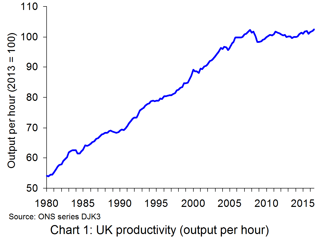
 UK productivity growth remains well below levels recorded before the financial crisis, as Chart 1 illustrates. In fact, output per hour worked in 2016 Q3 was virtually the same as in 2007 Q4. What is more, as can be seen from Chart 2, UK productivity lags well behind its major competitors (except for Japan).
But why does UK productivity lag behind other countries 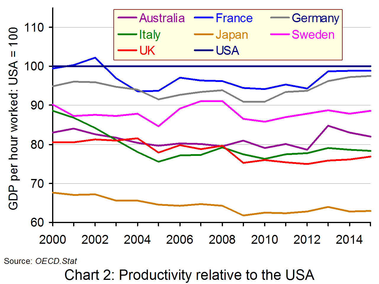 and why has it grown so slowly since the financial crisis? In its July 2015 analysis, the ONS addressed this ‘productivity puzzle’.
Among the many reasons suggested are low levels of investment, the impact of the financial crisis on bank’s willingness to lend to new businesses, higher numbers of people working beyond normal retirement age as a result of population and pensions changes, and firms’ ability to retain staff because of low pay growth. While these and other factors may be relevant, they do not provide a complete explanation for the weakness in productivity.
The lack of investment in technology and lack of infrastructure investment have been key reasons for the sluggish growth in productivity. Many companies are prepared to continue using relatively labour-intensive techniques because wage growth has been so low and this reduces the incentive to invest in labour-saving technology.
Another factor has been long hours and, for many office workers, being constantly connected to their work, checking and responding to emails and messages away from the office. The Telegraph article below reports Ann Francke, chief executive of the Chartered Management Institute, as saying:
“This is having a deleterious effect on the health of managers, which has a direct impact on productivity. UK workers already have the longest hours in Europe and yet we’re less productive.”
Another problem has been ultra low interest rates, which have reduced the burden of debt for poor performing companies and has allowed them to survive. It may also have prevented finance from being reallocated to more dynamic companies which would like to develop new products and processes.

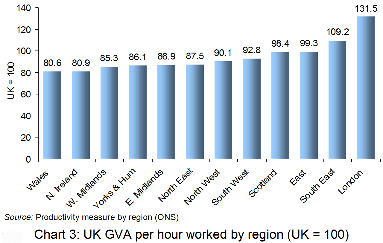
Another feature of UK productivity is the large differences between regions. This is illustrated in Chart 3. Productivity in London in 2015 (the latest full year for data) was 31.5% above the UK average, while that in Wales was 19.4% below.
This again reflects investment patterns and also the concentration of industries in particular locations. Thus London’s financial sector, a major part of London’s economy, has experienced relatively large increases in productivity and this has helped to push productivity growth in the capital well above other parts of the country.
Another factor, which again has a regional dimension, is the poor productivity performance of family-owned businesses, where ownership and management is passed down the generations within the family without bringing in external managerial expertise.
The government is very aware of the UK’s weak productivity performance. Its recently launched industrial policy is designed to address the problem. We look at that in a separate post.
Articles
UK productivity edges up but growth still flounders below pre-crisis levels The Telegraph, Julia Bradshaw (6/1/17)
Weak UK productivity spurs warnings of living standards squeeze The Guardian, Katie Allen (6/1/17)
Productivity gap yawns across the UK BBC News, Jonty Bloom (6/1/17)
The UK productivity puzzle Fund Strategy. John Redwood (26/1/17)
Productivity puzzle remains for economists despite UK growth in third quarter of 2016 City A.M., Jasper Jolly (6/1/17)
Portal site
Solve the Productivity Puzzle Unipart
Report
Productivity: no puzzle about it TUC (Feb 2015)
Data
Labour Productivity: Tables 1 to 10 and R1 ONS (6/1/17)
International comparisons of UK productivity (ICP) ONS (6/10/16)
Gross capital formation (% of GDP) The World Bank
Questions
- In measuring productivity, the ONS uses three indicators: output per worker, output per hour and output per job. Compare the relative usefulness of these three measures of productivity.
- How would you explain the marked difference in productivity between regions and cities within the UK?
- How do flexible labour markets impact on productivity?
- Why is investment as a percentage of GDP so low in the UK compared to that in most other developed countries (see)?
- Give some examples of industrial policy measures that could be adopted to increase productivity growth.
- Examine the extent to which very low interest rates and quantitative easing encourage productivity-enhancing investment.
 Many or us make New Year’s resolutions: going on a diet, doing exercise, spending more time studying. But few people stick to them, even though they say they would like to. So how can people be motivated to keep to their resolutions? Well, the experiments of behavioural economists provide a number of insights into the problem. They also suggest various incentives that can be used to motivate people to stick to their plans.
Central to the problem is that people have ‘time inconsistency’. They put a higher weight on the benefits of things that are good for them in the future and less weight on these benefits when they have to act now. You might strongly believe that going to the gym is good for you and plan to go next Monday. But when Monday comes, you can’t face it.
Another part of the time inconsistency problem is the relatively high weighting given to short-term gratification – eating chocolates, watching TV, spending time on social media, staying in bed.  When thinking about whether you would like to do these things in, say, a couple of days’ time, you put a low weight on the pleasures. But thinking about doing them right now, you put a much higher weight on them. As the well-known saying goes, ‘Hard work often pays off after time, but laziness pays off now’.
So how can people be motivated to stick to their resolutions? Behavioural economists have studied various systems of incentives to see what works. Some of the findings are as follows:
|
|
| • |
People are generally loss averse. To get us to stick to New Year’s resolutions, we could devise a system of penalties for breaking them, such as paying 20p each time you swear! |
| • |
Given people’s time inconsistency, devising a system whereby you get treats after doing something you feel is good for you: e.g. watching TV for 30 minutes after you’ve done an hour’s revision. Rewards should follow effort, not precede them. |
| • |
Having simple clear goals. Thus rather than merely saying ‘I’ll eat less’, you devise a meal plan with menus that meet calorie and other dietary goals. Rather than saying, ‘I’ll exercise more’, you commit to going to the gym at specific times each week and doing a specific amount of each exercise. |
| • |
Ritualising. This is where you devise a regime that is feasible to stick to. For example, you could always write a shopping list to meet your dietary goals and then only buy what’s on that list; or you and your flatmates could have a rota for household chores. |
| • |
Social reinforcement. This is where people have a joint plan and help each other stick to it, such as going to the gym at specific times with a friend or group of friends, or joining a support group (e.g. to lose weight, or give up drinking or smoking). |
| • |
Avoiding temptation. For example, if you want to give up chocolate, don’t have any in the house. |
| • |
Using praise rather than criticism. People generally respond better to positive incentives than negative ones. |
Behavioural economists test these different incentive mechanisms to see what works best and then to see how they can be refined. The testing could be done experimentally, with volunteers being given different incentives and seeing how they respond. Alternatively, data could be collected on the effects of different incentive mechanisms that people have actually used, whether at home or at work.
 The advertising and marketing industry analyses consumer trends and how people respond to pricing, quality, display, packaging, advertising, etc. They want to understand human behaviour so that they can ‘direct’ it in their favour of their clients. Governments too are keen to find ways of encouraging people to do more of things that are good for them and less of things that are bad.
The UK government’s Behavioural Insights Team looks at ways people can be ‘nudged’ into changing their behaviour, see the blog A nudge in the right direction?
But back to New Year’s resolutions, have you made any? And, if so, have you thought about how you might stick to them? Have you thought about the incentives?
Podcast
 Dan Ariely talks “Payoff” WUNC 91.5: North Carolina Public Radio, Dan Ariely talks to Frank Stasio (3/1/17)
Articles and blogs
50 New Year’s Resolution Ideas and how to Achieve Each of Them Lifehack, Ivan Dimitrijevic (31/12/16)
5 New Year’s Resolutions You Can Keep (With The Help Of Behavioral Science Research) Forbes, Carmen Nobel (3/1/17)
The science behind keeping your New Year’s resolutions BT, SNAP PA (30/12/15)
The Guardian view on New Year resolutions: fitter, happier, more productive The Guardian, Editorial (3/1/17)
The Behavioral Economics of Your New Year’s Resolutions The Daily Beast, Uri Gneezy (5/1/14)
The psychology of New Year’s resolution The Conversation, Mark Griffiths (1/1/16)
Apply Behavioral Economics for a Better New Year Wharton Blog Network, William Hartje (16/1/14)
The Kardashians Can Help Your New Year’s Resolutions Huffington Post, John Beeby (29/12/16)
Using economics to score with New Year resolutions The Hindu, Venky Vembu (4/1/17)
Be It Resolved The New York Times, John Tierney (5/1/12)
Goal-setting site
stickK ‘Set your goals and achieve them!’
Questions
- Explain what is meant by time inconsistent behaviour. Is this the same as giving future costs and benefits a lower weighting than present ones (and hence having to discount future costs and benefits)?
- Give some examples of ways in which your own behaviour exhibits time inconsistency. Would it be accurate to describe this as ‘present bias’?
- Would you describe not sticking to New Year’s resolutions as ‘irrational behaviour’?
- Have you made any New Year’s resolutions, or do you have any plans to achieve goals? Could you alter your own personal incentives and, if so, how, to make it more likely that you will stick to your resolutions/goals?
- Give some examples of ways in which the government could ‘nudge’ us to behave in ways that were more in our own individual interests or those of society or the environment?
- Do you think it’s desirable that the advertising industry should employ psychologists and behavioural economists to help it achieve its goals?
 Can behavioural economics be applied to the case of Sweden? The Swedish government is trying this out by changing government policy in a way that may encourage its residents to change their behaviour.
People in many countries in the world live in what is often called a ‘throwaway society’. If something breaks, it’s often easier and cheaper simply to get rid of it and buy a new one. But with changes in government policy, including VAT cuts on repairs to white goods, the objective is to encourage consumers to repair their goods, rather than buying new ones. This is also contributing towards the wider objective of sustainable consumption, which is being promoted by the Swedish government.
Per Bolund, who is one of Sweden’s six Green Ministers, spoke about this policy commenting that:
“Consumers are quite active in changing both what they buy and how they buy in Sweden … We believe that getting lower costs for labour is a big part in making it more rational to repair rather than just to buy cheap and throw away …If we don’t change the economic incentives the change will never come.”
Whether or not this policy works will take some time to see, but it’s certainly an interesting test of how changing incentives affect consumer behaviour. You can read about other examples of nudging in the following blog A nudge in the right direction?.
Articles
Waste not want not: Sweden to give tax breaks for repairs The Guardian, Richard Orange (19/9/16)
Can Sweden tackle the throwaway society? BBC News (20/9/16)
Trendy now, trash tomorrow Huffington Post, Kirsten Brodde (29/9/16)
Hong Kong needs a strategy quickly for dealing with waste South China Morning Post (27/9/16)
Questions
- If VAT on repairs falls, how will this affect consumer behaviour?
- Do you think there would be an income and a substitution effect from this change in government policy? What would they be?
- How is the Swedish government using incentives to change consumer behaviour?
- If it is cheaper to buy a new white good, then is it rational to buy a new one rather than repair an existing one?
- How effective do you think this policy would be in encouraging consumers to change their behaviour?
- Find some other examples of how people might be nudged to behave in ways that are in their own interest or that of society.
 In this post we focus on three aspects of poverty around the world. The first is the definition of poverty. Is it an absolute or a relative concept? Does its definition change as the world develops. The second is the extent of poverty. Is the problem getting worse as inequality deepens, or are the numbers (absolutely or proportionately) getting smaller despite increased inequality? The third is policy to tackle the problem. What can be done and is being done? What answers are being given by policymakers in different parts of the world?
As far as the measurement of poverty is concerned, the simplest distinction is between absolute and relative poverty. Absolute poverty could be measured as income below a certain real level deemed necessary to achieve a particular standard of living. This could be specified in terms of sufficient income to have adequate food, shelter, clothing and leisure time, and adequate access to healthcare, clean water, sanitation, education, etc. An obvious problem here is what is considered ‘adequate’, as this is partly culturally determined and will also depend on physical and geographical features, such as climate.
The World Bank defines extreme absolute poverty as living on under $1.90 per day in purchasing-power parity terms. However, even after adjusting for purchasing power, what is considered the poverty threshold differs enormously from country to country. As the Wikipedia entry states:
Each nation has its own threshold for absolute poverty line; in the United States, for example, the absolute poverty line was US$15.15 per day in 2010 (US$22,000 per year for a family of four), while in India it was US$1.0 per day and in China the absolute poverty line was US$0.55 per day, each on PPP basis in 2010.
Relative poverty is normally taken to mean when a person’s income falls below a certain percentage of the mean or median. Thus in richer countries, for a given percentage, the poverty threshold would be at a higher absolute income.  In the EU, people in relative poverty are defined as those with disposable income (after monetary benefits) less than 60% of the median.
Both approaches focus on consumption. Other approaches include social and cultural exclusion as dimensions of poverty.
What is clear is that poverty has a number of definitions. One problem with this is that politicians can focus on whatever definition suits them. Thus in the UK, with relatively high levels of employment, but often at low wages and only part-time employment, the Conservative government has redefined poverty as where no-one in a family is in work. Yet many working families have very low levels of income, considerably below 60% of the median.
The second aspect of poverty is its extent and whether it is growing. According to the United Nations, globally ‘extreme poverty rates have been cut by more than half since 1990. While this is a remarkable achievement, one in five people in developing regions still live on less than $1.25 a day, and there are millions more who make little more than this daily amount, plus many people risk slipping back into poverty.’
 Despite this progress, in many countries extreme poverty is increasing. And in others, although the number in extreme poverty may be declining, it is still high and inequality is increasing so that more people are living only just above the extreme poverty line. The articles look at dimensions of poverty in different countries.
For example, the first The Conversation article argues that the financial crisis of 2008–09 led to a substantial increase in poverty across the European continent.
The impoverishment of Greece, Italy, Cyprus, Spain and Portugal has been so severe that these southern European countries, taken together, had higher levels of poverty and deprivation than many of the former Communist nations that joined the European Union in 2004.
The third aspect is how to tackle the problem of poverty. There are three broad policy approaches.
The first is the use of cash transfers, such as unemployment benefits. The second is providing free or subsidised goods and services, such as healthcare or education. The ability of a country to support the poor in either of these ways depends on its tax base. Also, clearly, it depends on its priorities. There is also the issue of incentives. Do benefits encourage or discourage the recipients from seeking work? This depends on the design of the system. For example, if childcare is subsidised, this may both aid poor parents and also encourage parents responsible for looking after young children to seek work.
 The third is to attempt to improve the earning power of the poor. This may in part be by the second approach of improving education, training and health. But it may also involve removing restrictions to employment, say by making various forms of discrimination illegal. It may also involve increasing land rights. In many developing countries land is very unequally distributed; redistribution to the poor can make a substantial contribution to relieving poverty. Another approach is to encourage agencies which supply microfinance for poor people wishing to set up their own small business.
The articles below look at a number of dimensions of poverty: its measurement, its extent and its alleviation. They look at the problem from the perspective of different countries. It is interesting to see to what extent the problems and solutions they identify are country-specific or general.
Articles
Extreme poverty affects 1 in 8 globally Buenos Aires Herald (20/7/16)
How poverty has radically shifted across Europe in the last decade The Conversation, Rod Hick (20/7/16)
The economics of poverty The Tribune of India, S Subramanian (22/7/16)
Poverty Chains and Global Capitalism. Towards a Global Process of Impoverishment Global Research (Canada), Benjamin Selwyn (20/7/16)
Asia’s cost of prosperity The Nation, Karl Wilson (24/7/16)
Private rental sector is the ‘new home of poverty’ in the UK The Guardian, Brian Robson (20/7/16)
Challenges in maintaining progress against global poverty Vox, Martin Ravallion (23/12/15)
California, sixth largest economy in the world, has highest poverty rate in US wsws.org, Marc Wells (22/7/16)
How gross inequality and crushed hopes have fed the rise of Donald Trump The Conversation, Nick Fischer (21/7/16)
Information
Sustainable Development Goals – Goal 1: End poverty in all its forms everywhere United Nations
Children of the Recession: Innocenti Report Card 12 UNICEF, Gonzalo Fanjul (September 2014)
Listings on Poverty Joseph Rowntree Foundation
Poverty The World Bank
Hunger and World Poverty Poverty.com
Questions
- Distinguish between absolute and relative poverty. Give examples of specific measures of each and the extent to which they capture the complex nature of the problem.
- Discuss the appropriateness of the seven measures of poverty used in the first The Conversation article.
- How did the financial crisis affect the proportion of people living in poverty? Explain.
- What is the relationship between poverty and inequality? Does a more unequal society imply that there will be a greater proportion of people living in poverty?
- How has international poverty changed in recent years? What explanations can you give?
- What are the advantages and disadvantages of using income per head as a measure of poverty, whether absolute or relative?
- Why is poverty so high in (a) the USA as a whole; (b) California specifically?
- How does globalisation affect poverty?
- Are adverse environmental consequences an inevitable result of reducing poverty in developing countries?
- Is freer trade likely to increase or decrease poverty? Explain
 It is now some seven years since the financial crisis and nearly seven years since interest rates in the USA, the eurozone, the UK and elsewhere have been close to zero. But have these record low interest rates and the bouts of quantitative easing that have accompanied them resulted in higher or lower investment than would otherwise have been the case? There has been a big argument about that recently.
According to conventional economic theory, investment is inversely related to the rate of interest: the lower the rate of interest, the higher the level of investment. In other words, the demand-for-investment curve is downward sloping with respect to the rate of interest. It is true that in recent years investment has been low, but that, according to traditional theory, is the result of a leftward shift in demand thanks to low confidence, not to quantitative easing and low interest rates.
In a recent article, however, Michael Spence (of New York University and a 2001 Nobel Laureate) and Kevin Warsh (of Stanford University and a former Fed governor) challenge this conventional wisdom.  According to them, QE and the accompanying low interest rates led to a rise in asset prices, including shares and property, rather than to investment in the real economy. The reasons, they argue, are that investors have seen good short-term returns on financial assets but much greater uncertainty over investment in physical capital. Returns to investment in physical capital tend to be much longer term; and in the post-financial crisis era, the long term is much less certain, especially if the Fed and other central banks start to raise interest rates again.
“We believe that QE has redirected capital from the real domestic economy to financial assets at home and abroad. In this environment, it is hard to criticize companies that choose ‘shareholder friendly’ share buybacks over investment in a new factory. But public policy shouldn’t bias investments to paper assets over investments in the real economy.”
This analysis has been challenged by several eminent economists, including Larry Summers, Harvard Economics professor and former Treasury Secretary. He criticises them for confusing correlation (low investment coinciding with low interest rates) with causation. As Summers states:
“This is a little like discovering a positive correlation between oncologists and cancer and asserting that this proves oncologists cause cancer. One would expect in a weak recovery that investment would be weak and monetary policy easy. Correlation does not prove causation. …If, as Spence and Warsh assert, QE has raised stock prices, this should tilt the balance toward real investment.”
 Not surprisingly Spence and Warsh have an answer to this criticism. They maintain that their critique is less of low interest rates but rather of the form that QE has taken, which has directed new money into the purchase of financial assets. This then has driven further asset purchases, much of it by companies, despite high price/earnings ratios (i.e. high share prices relative to dividends). As they say:
“Economic theory might have something to learn from recent empirical data, and from promising new thinking in behavioral economics.”
Study the arguments of both sides and try to assess their validity, both theoretically and in the light of evidence.
Articles
The Fed Has Hurt Business Investment The Wall Street Journal, Michael Spence and Kevin Warsh (26/10/15) [Note: if you can’t see the full article, try clearing cookies (Ctrl+Shift+Delete)]
I just read the ‘most confused’ critique of the Fed this yea Washington Past, Lawrence H. Summers (28/10/15)
A Little Humility, Please, Mr. Summers The Wall Street Journal, Michael Spence and Kevin Warsh (4/11/15) [Note: if you can’t see the full article, try clearing cookies (Ctrl+Shift+Delete)]
Do ultra-low interest rates really damage growth? The Economist (12/11/15)
It’s the Zero Bound Yield Curve, Stupid! Janus Capital, William H Gross (3/11/15)
Is QE Bad for Business Investment? No Way! RealTime Economic Issues Watch, Joseph E. Gagnon (28/10/15)
Department of “Huh!?!?”: QE Has Retarded Business Investment!? Washington Center for Equitable Growth, Brad DeLong (27/10/15)
LARRY SUMMERS: The Wall Street Journal published the ‘single most confused analysis’ of the Fed I’ve read this year Business Insider, Myles Udland (29/10/15)
The Fed’s Loose Money, Financial Markets and Business Investment SBE Council, Raymond J. Keating (29/10/15)
How the QE trillions missed their mark AFR Weekend, Maximilian Walsh (4/11/15)
Financial Markets In The Era Of Bubble Finance – Irreversibly Broken And Dysfunctional David Stockman’s Contra Corner, Doug Noland (8/11/15)
Questions
- Go through the arguments of Spence and Warsh and explain them.
- Explain what are meant by the ‘yield curve’ and ‘zero bound yield curve’.
- What criticisms of their arguments are made by Summers and others?
- Apart from the effects of QE, why else have long-term interest rates been low?
- In the light of the arguments on both sides, how effective do you feel that QE has been?
- How could QE have been made more effective?
- What is likely to happen to financial markets over the coming months? What effect is this likely to have on the real economy?
 UK productivity growth remains well below levels recorded before the financial crisis, as Chart 1 illustrates. In fact, output per hour worked in 2016 Q3 was virtually the same as in 2007 Q4. What is more, as can be seen from Chart 2, UK productivity lags well behind its major competitors (except for Japan).
  and why has it grown so slowly since the financial crisis? In its July 2015 analysis, the ONS addressed this ‘productivity puzzle’.