 Workers in the UK and USA work much longer hours per year than those in France and Germany. This has partly to do with the number of days paid holiday per year, partly with the number of hours worked per day and partly with the number of days worked per week.
According to the latest OECD figures, in 2017 average hours worked per year ranged from 2257 in Mexico (the OECD’s highest) to 1780 in the USA, 1710 in Japan, 1681 in the UK, 1514 in France, 1408 in Denmark and 1356 in Germany (the OECD’s lowest). 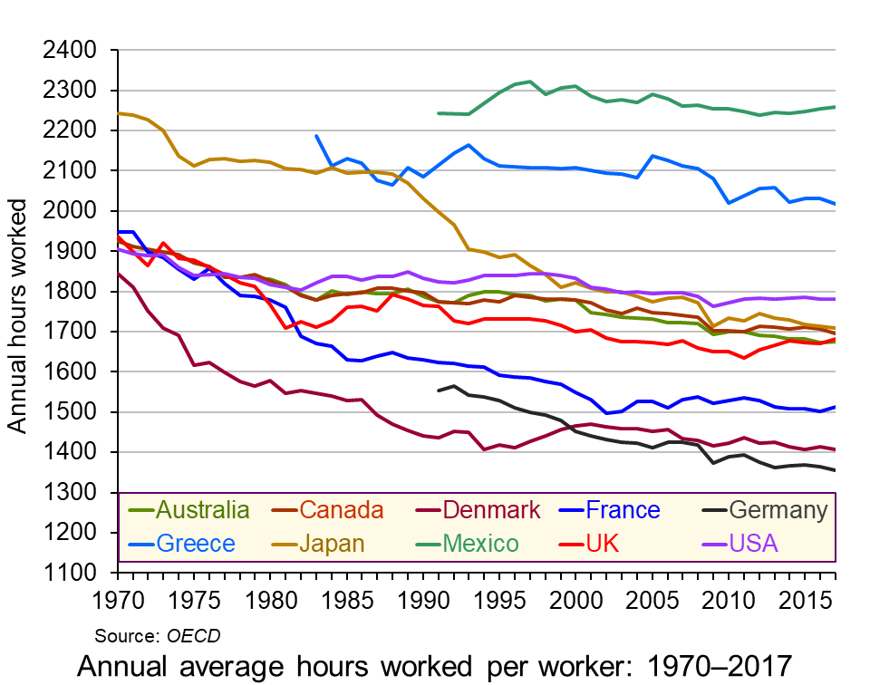 Annual working hours have been falling in most countries across the decades, as the chart shows. However, in most countries the process has slowed in recent years and in the UK, the USA and France working hours have begun to rise. (Click here for a PowerPoint of the chart.)
But why do working hours differ so much from country to country? How do they relate to productivity? How do they relate to human happiness and welfare more generally?
Causes of the differences
There are various reasons for the differences in hours worked between countries.
In a situation where individual workers can choose how many hours to work, they have to decide the best trade off for them between income and leisure. As wages rise over time, there will be substitution and income effects of these extra hourly wages. Higher wages make work more valuable in terms of what people can buy from an extra hour’s work. There is thus an incentive to substitute work for leisure and hence work longer. This is the substitution effect. On the other hand, higher wages allow people to work fewer hours for a given income. This is the income effect.
As incomes rise, generally the substitution effect will tend to decline relative to the income effect. This is because of the diminishing marginal utility of income. Richer people will tend to value a given rise in income less than poorer people and therefore will value the income from extra work less than poorer people. Richer people will prefer to work fewer hours than poorer people. Generally workers in richer OECD countries work fewer hours than those in poorer OECD countries.
But this does not explain why people in the USA, Canada, Japan and the UK work longer hours than people in Germany, Denmark, Norway, The Netherlands and France.
One possible explanation for these differences is the role of trade unions. These tend to be stronger in countries with lower working hours. Reducing the working week or obtaining longer holidays is one of the key objectives of unions.
Another is income distribution. The USA, despite its high average (mean) income, has a relatively unequal distribution of income compared with Germany or France. The post-tax-and-benefits Gini coefficient in the USA is around 0.39, whereas in Germany it is 0.29, meaning that Germany has a more equal distribution of disposable income than the USA. In fact, rises in real incomes in the USA over the past 10 years have gone almost exclusively to the top 10 per cent of earners, leaving the median income little changed. In fact median household income only rose above its 2007 (pre-recession) level in 2016.
 Social and cultural explanations may also be important. People in countries with higher working hours relative to hourly wages may put a greater store on consumption relative to leisure. The desire to shop may be very strong. The ‘Anglo-Saxon’ economic model pursued by right-of-centre governments in English-speaking countries, such as the USA, Canada, Australia and the UK puts emphasis on low taxes, low regulation, low public expenditure and self-advancement. Such a model encourages a more individualistic approach to work, with more emphasis on earning money.
Then there is the attitude to hours worked generally. There is a saying that in the UK the last one to leave the office is seen as the hardest working, whereas in Germany the last one to leave is seen as the least efficient. Social pressures, from colleagues, family, friends and society more generally can have a major effect on people’s choices between work and leisure.
Productivity
Productivity, in terms of output per hour worked, tends to decline as workers work longer hours. People get tired and possibly bored and demotivated towards the end of a long day or week. If workers are paid by the output they produce and if productivity declines towards the end of the day, then the hourly wage would fall as the day progresses. This would act as a disincentive to work long hours. In practice, most workers are normally paid a constant rate per hour for normal-time working. For overtime, they may even be paid a higher rate, despite their likely lower productivity. This encourages them to work longer hours than if they were paid according to their marginal productivity.
Linking pay more closely to productivity could encourage people to opt for fewer hours (if they had the choice). Indeed some companies are now encouraging workers to choose their hours – which may mean fewer hours as people seek a better work–life balance. (See the BBC article below about PwC’s employment strategy.) 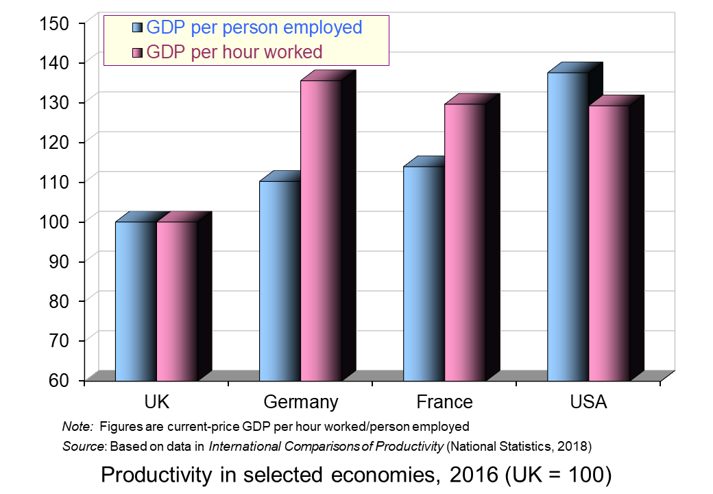 Alternatively, some other employers adopt the system of giving workers a set amount of work to do and then they can leave work when it is finished. This acts as an incentive to work more efficiently.
It is interesting that countries where workers work more hours per year tend to have a lower output per hour worked relative to output per worker than countries where workers work fewer hours. This is illustrated in the chart opposite. The USA, with its longer working hours, has higher output per person employed than France and Germany but very similar output per hour worked.
Hours and happiness
So are people who choose to work longer hours and take home more money likely to be happier than those who choose to work fewer hours and take home less money? If people were rational and had perfect knowledge, then they would choose the balance between work and leisure that best suited them.
In practice, labour markets are highly imperfect. People often do not have choices about the amount they work; they work the hours they are told. Even if they do have a choice, they are unlikely to have perfect knowledge about the impact of long hours on their health and happiness over their lifetime. They may not even be good judges of the shorter-term effects of more work and more pay. They may believe that more money will buy them more happiness only to find soon afterwards that they are wrong.
Articles
Data
Questions
- What factors are likely to encourage workers to work longer hours?
- Give some examples of jobs where workers have flexibility in the amount of hours they work per week and jobs where the working week is of a fixed length.
- For what reasons are annual working hours longer in the USA than in Germany?
- Would it be in employers’ interests if the government legislated so as to reduce the maximum permitted working week? Explain.
- What is meant by ‘efficiency wages’? How relevant is the concept to the issue of the average number of hours worked per year from country to country?
- Explain why people in poorer countries tend to work more hours per year than people in richer countries.
- If workers’ wages equalled their marginal revenue product, why might some workers choose to work more and others choose to work less (assuming they had a choice)?
- Are jobs in the gig economy and zero-hour contract jobs in the interests of workers?
- Is South Korea wise to cut its work limit from 68 hours a week to 52?
 In his 1971 book, Income Distribution, Jan Pen, a Dutch economist, gave a graphic illustration of inequality in the UK. He described a parade of people marching by. They represent the whole population and the parade takes exactly one hour to pass by. The height of each person represents his or her income. People of average height are the people with average incomes – the observer is of average height. The parade starts with the people on the lowest incomes (the dwarfs), and finishes with those on the highest incomes (the giants).
Because income distribution is unequal, there are many tiny people. Indeed, for the first few minutes of the parade, the marchers are so small they can barely be seen. Even after half an hour, when people on median income pass by, they are barely waist high to the observer.
The height is growing with tantalising slowness, and forty-five minutes have gone by before we see people of our own size arriving. To be somewhat more exact: about twelve minutes before the end the average income recipients pass by.
In the final minutes, giants march past and then in the final seconds:
the scene is dominated by colossal figures: people like tower flats. Most of them prove to be businessmen, managers of large firms and holders of many directorships and also film stars and a few members of the Royal Family.
The rear of the parade is brought up by a few participants who are measured in miles. Indeed they are figures whose height we cannot even estimate: their heads disappear into the clouds and probably they themselves do not even know how tall they are.
Pen’s description could be applied to most countries – some with even more dwarfs and even fewer but taller giants. Generally, over the 43 years since the book was published, countries have become less equal: the giants have become taller and the dwarfs have become smaller.
The 2011 Economist article, linked below, uses changes in Gini coefficients to illustrate the rise in income inequality. A Gini coefficient shows the area between the Lorenz curve and the 45° line. The figure will be between 0 and 1 (or 0% and 100%). a figure of 0 shows total equality; a figure of 1 shows a situation of total inequality, where one person earns all the nation’s income. The higher the figure, the greater the inequality.
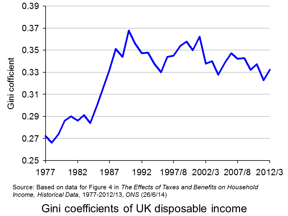
 The chart opposite shows changes in the Gini coefficient in the UK (see Table 27 in the ONS link below for an Excel file of the chart). As this chart and the blog post Rich and poor in the UK show, inequality rose rapidly during the years of the 1979–91 Thatcher government, and especially in the years 1982–90. This was associated with cuts in the top rate of income tax and business deregulation. It fell in the recession of the early 1990s as the rich were affected more than the poor, but rose with the recovery of the mid- to late 1990s. It fell again in the early 2000s as tax credits helped the poor. It fell again following the financial crisis as, once more, the rich were affected proportionately more than the poor.
 The most up-to-date international data for OECD countries can be found on the OECD’s StatExtracts site (see chart opposite: click here for a PowerPoint). The most unequal developed county is the USA, with a Gini coefficient of 0.389 in 2012 (see The end of the American dream?), and US inequality is rising. Today, the top 1% of the US population earns some 24% of national income. This compares with just 9% of national income in 1976.
Many developing countries are even less equal. Turkey has a Gini coefficient of 0.412 and Mexico of 0.482. The figure for South Africa is over 0.6.
When it comes to wealth, distribution is even less equal. The infographic, linked below, illustrates the position today in the USA. It divides the country into 100 equal-sized groups and shows that the top 1% of the population has over 40% of the nation’s wealth, whereas the bottom 80% has only 7%.
So is this inequality of income and wealth desirable? Differences in wages and salaries provide an incentive for people to work harder or more effectively and to gain better qualifications. The possibility of increased wealth provides an incentive for people to invest.
But are the extreme differences in wealth and income found in many countries today necessary to incentivise people to work, train and invest? Could sufficient incentives exist in more equal societies? Are inequalities in part, or even largely, the result of market imperfections and especially of economic power, where those with power and influence are able to use it to increase their own incomes and wealth?
Could it even be the case that excessive inequality actually reduces growth? Are the huge giants that exist today accumulating too much financial wealth and creating too little productive potential? Are they spending too little and thus dampening aggregate demand? These arguments are considered in some of the articles below. Perhaps, by paying a living wage to the ‘tiny’ people on low incomes, productivity could be improved and demand could be stimulated.
Infographic
 Wealth Inequality in America YouTube, Politizane (20/11/12)
Articles
The rise and rise of the cognitive elite The Economist (20/1/11)
Inequality in America: Gini in the bottle The Economist (26/11/13)
Pen’s Parade: do you realize we’re mostly dwarves? LVTFan’s Blog (21/2/11)
Here Are The Most Unequal Countries In The World Business Insider, Andy Kiersz (8/11/14)
Inequality in the World Dollars & Sense, Arthur MacEwan (Nov/Dec 14)
Britain is scared to face the real issue – it’s all about inequality The Observer, Will Hutton (19/1/14)
The tame inequality debate FundWeb, Daniel Ben-Ami (Nov 14)
Is inequality the enemy of growth? BBC News, Robert Peston (6/10/14)
Data
GINI index World Bank data
List of countries by income equality Wikipedia
The Effects of Taxes and Benefits on Household Income, 2012/13 ONS (see table 27)
Income Distribution and Poverty: Gini (disposale income) OECD StatExtract
Questions
- Distinguish between income and wealth. Is each one a stock or a flow?
- Explain how (a) a Lorenz curve and (b) a Gini coefficient are derived.
- What other means are there of measuring inequality of income and wealth other than using Gini coefficients (and giants and dwarfs!)?
- Why has inequality been rising in many countries over the years?
- How do (a) periods of rapid economic growth and (b) recessions affect income distribution?
- Define ‘efficiency wages’. How might an increase in wages to people on low incomes result in increased productivity?
- What is the relationship between the degree of inequality and household debt? What implications might this have for long-term economic growth and future financial crises? Is inequality the ‘enemy of growth’?
 Each year in November, the Living Wage Foundation publishes figures for the hourly living wage that is necessary for people to meet basic bills. The rate for London is calculated by the Greater London Authority and for the rest of the UK by the Centre for Research in Social Policy at Loughborough University.
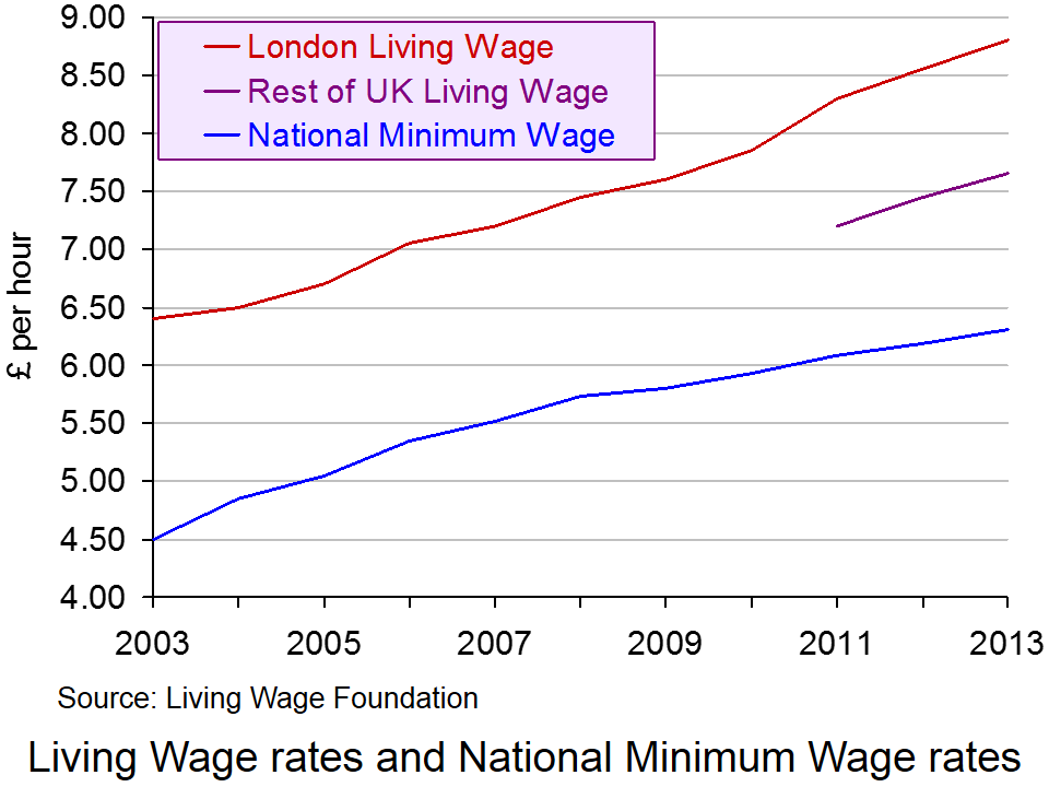
The 2013 update was published on 4 November. The Living Wage was estimated to be £8.80 in London and £7.65 in the rest of the UK.
Two things need to be noted about the Living Wage rate. The first is that the figure is an average and thus does not take into account the circumstances of an individual household. Clearly households differ in terms of their size, the number of wage earners and dependants, the local costs of living, etc. Second, the figures have been reduced from what is regarded as the ‘reference’ living wage, which is estimated to be £9.08 outside London. The reason for this is that people earning higher incomes have seen their living standards squeezed since 2009, with prices rising faster than average post-tax-and-benefit wages. Thus, the Living Wage is capped to reflect the overall decline in living standards. As the Working Paper on rates outside London explains:
From 2012 onwards, two kinds of limit have been put on the amount that the Living Wage as applied can rise in any one year. The first limits the increase in the net income (after taxes and benefits) requirement for each household on which the living wage calculation is based, relative to the rise in net income that would be achieved by someone on average earnings. The second limits the increase in the living wage itself (representing gross income) relative to the increase in average earnings.
 Nevertheless, despite this capping of the living wage, it is still significantly higher than the UK National Minimum Wage, which currently stands at £6.31 for those aged 21 and over. This can be seen from the chart (click here for a PowerPoint).
Paying the Living Wage is voluntary for employers, but as The Guardian reports:
A total of 432 employers are now signed up to the campaign, up from 78 this time last year, including Legal & General, KPMG, Barclays, Oxfam, Pearson, the National Portrait Gallery and First Transpennine Express, as well as many smaller businesses, charities and town halls. Together they employ more than 250,000 workers and also commit to roll out the living wage in their supply chain.
But as The Observer reports:
The number of people who are paid less than a ‘living wage’ has leapt by more than 400,000 in a year to over 5.2 million, amid mounting evidence that the economic recovery is failing to help millions of working families.
A report for the international tax and auditing firm KPMG also shows that nearly three-quarters of 18-to-21-year-olds now earn below this level – a voluntary rate of pay regarded as the minimum to meet the cost of living in the UK. The KPMG findings highlight difficulties for ministers as they try to beat back Labour’s claims of a “cost of living crisis”.
According to the report, women are disproportionately stuck on pay below the living wage rate, currently £8.55 in London and £7.45 elsewhere. Some 27% of women are not paid the living wage, compared with 16% of men. Part-time workers are also far more likely to receive low pay than full-time workers, with 43% paid below living-wage rates compared with 12% of full-timers.
But although paying a living wage may be desirable in terms of equity, many firms, especially in the leisure and retailing sectors, claim that they simply cannot afford to pay the living wage and, if they were forced to, would have to lay off workers.
The point they are making is that it is not economical to pay workers more than their marginal revenue product. But this raises the question of whether a higher wage would encourage people to work more efficiently. If it did, an efficiency wage may be above current rates for many firms. It also raises the question of whether productivity gains could be negotiated in exchange for paying workers a living wage
These arguments are discussed in the following podcast.
Podcast
 Higher ‘productivity’ will increase living wage BBC Today Programme, Priya Kothari and Steve Davies (4/11/13)
Articles
UK living wage rises to £7.65 an hour The Guardian (4/11/13)
More than 5 million people in the UK are paid less than the living wage The Observer, Toby Helm (2/11/13)
Increasing numbers of Scots are paid less than living wage Herald Scotland (2/11/13)
Labour would give tax rebates to firms that pay living wage Independent, Jane Merrick (3/11/13)
Employers praise Ed Miliband’s living wage proposal Independent, Andy McSmith (3/11/13)
Miliband’s living wage tax break will raise prices, warns CBI chief The Telegraph, Tim Ross (3/11/13)
Living Wage rise provides a boost for low paid workers BBC News (4/11/13)
Information and Reports
What is the Living Wage? Living Wage Foundation
The Living Wage Centre for Research in Social Policy, Loughborough University
Living wage Mayor of London
One in five UK workers paid less than the Living Wage KPMG News Release (3/11/13)
Number of workers paid less than the Living Wage passes 5 million KPMG News Release (3/11/13)
Living Wage Research for KPMG Markit (October 2012)
Questions
- How is the Living Wage calculated?
- What are the reasons for announcing a Living Wage figure that is lower than a reference living wage? Assess these reasons.
- If there are two separate figures for the Living Wage for London and the rest of the UK, would it be better to work out a living wage for each part, or even location, of the UK?
- Why might it be in employers’ interests to pay at least the Living Wage? Does this explain why more and more employers are volunteering to pay it?
- Assess the Labour Party’s pledge, if they win the next election, that ‘firms which sign up to the living wage will receive a tax rebate of up to £1000 for every low-paid worker who gets a pay rise, funded by tax and national insurance revenue from the higher wages’.
- Which is fairer: to pay everyone at least the Living Wage or to use tax credits to redistribute incomes to low-income households?
 Workers in the UK and USA work much longer hours per year than those in France and Germany. This has partly to do with the number of days paid holiday per year, partly with the number of hours worked per day and partly with the number of days worked per week.
 Annual working hours have been falling in most countries across the decades, as the chart shows. However, in most countries the process has slowed in recent years and in the UK, the USA and France working hours have begun to rise. (Click here for a PowerPoint of the chart.)
 Social and cultural explanations may also be important. People in countries with higher working hours relative to hourly wages may put a greater store on consumption relative to leisure. The desire to shop may be very strong. The ‘Anglo-Saxon’ economic model pursued by right-of-centre governments in English-speaking countries, such as the USA, Canada, Australia and the UK puts emphasis on low taxes, low regulation, low public expenditure and self-advancement. Such a model encourages a more individualistic approach to work, with more emphasis on earning money.
 Alternatively, some other employers adopt the system of giving workers a set amount of work to do and then they can leave work when it is finished. This acts as an incentive to work more efficiently.
 South Korea cuts its work limit from 68 hours a week to 52
