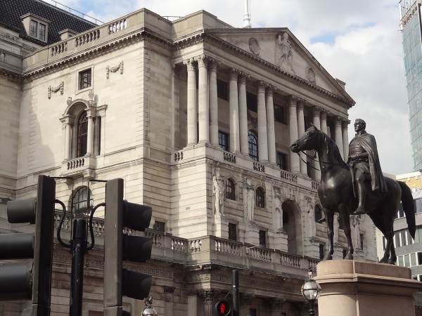
 Interest rates are the main tool of monetary policy and crucially affect investment. There has been much discussion since the end of the financial crisis concerning when UK interest rates would eventually rise. Uncertainty over just when, and by how much, interest rates will rise affects business confidence and hence investment. Businesses therefore listen carefully to what the Bank of England says about future movements in Bank Rate. But Mark Carney has now spoken about another cause of uncertainty and its impct on investment. This is the uncertainty over the outcome of the referendum on whether the UK should leave the EU.
By 2017, the Prime Minister has promised a referendum on staying in the EU, but Mark Carney has urged for this to be held ‘as soon as possible’. Whether or not the UK remains in the EU will have a big effect on businesses and with the uncertainty surrounding the UK’s future, this may soon turn to a lack of investment.  As yet, businesses have not responded to this uncertainty, but the longer the delay for the referendum, the more inclined firms will be to postpone investment. As Mark Carney said:
“We talk to a lot of bosses and there has been an awareness of some of this political uncertainty – whether because of the election or because of the referendum … What they’ve been telling us, and we see it in the statistics, is they have not yet acted on that uncertainty – or to put it another way, they are continuing to invest, they are continuing to hire.”
Leaving the EU will have big effects on consumers and businesses, given that the EU is the UK’s largest market, trading partner and investor. With a referendum sooner rather than later, uncertainty will be more limited and any reaction by businesses will take place over a shorter time period. There are many other factors that affect business investment, some of which are related to the UK’s relationship with the EU and the following articles consider these issues.
EU referendum should be held ‘as soon as necessary’, says Mark Carney BBC News (14/5/15)
Business want an early EU referendum, Mark Carney indicates The Telegraph, Ben Riley-Smith (14/5/15)
EU poll should take place ‘as soon as necessary’, says Bank of England Chief The Guardian, Angela Monaghan (14/5/15)
Threat of business leaving the EU is fuelling business ‘uncertainty’, says Bank of England governor Mark Carney Mail Online, Matt Chorley (14/5/15)
Bank of England’s Mark Carney urges speedy EU referendum Financial Times, George Parker (14/5/15)
Questions
- Why is the EU important to the UK’s economic performance?
- If the UK were to leave the EU, what impact would this have on UK consumers?
- What would be the impact on UK firms if the UK were to leave the EU?
- Consider an AD/AS diagram and use this to explain the potential impact on the macroeconomic variables if the UK were to leave the EU.
- Why is uncertainty over the UK’s referendum likely to have an adverse effect on investment?
 Insolvencies in England and Wales have fallen to their lowest level since 2005, official records show. The Insolvency Service indicates that bankruptcy, individual voluntary arrangements and debt relief orders have fallen, with the largest and worst form of bankruptcy falling by 22.5 per cent compared to the same period in 2014. There has also been a fall in corporate insolvencies back to pre-crisis levels.
The British economy is recovering and despite an increase in consumer borrowing of £1.2 billion from February to March, which is the biggest since the onset of the credit crunch, the number of people in financial difficulty and living beyond their means has fallen. However, there are also suggestions that the number could begin to creep up in the future and we are still seeing a divide between the north and south of England in terms of the number of insolvencies.
There are many factors that could explain such a decline in insolvencies. Perhaps it is the growth in wages, in part due the recovery of the economy, which has enabled more people to forgo borrowing or enabled them to repay any loan more comfortably. Lower inflation has helped to reduce the cost of living, thereby increasing the available income to repay any loans. Interest rates have also remained low, thus cutting the cost of borrowing and the repayments due.
But, another factor may simply be that lending is now more closely regulated. Prior to the financial crisis, huge amounts of money were being lent out, often to those who had no chance of making the repayments. More stringent affordability checks by lenders may have a large part to play in reducing the number of insolvencies. President of R3, the insolvency practitioner body, Phillip Sykes said:
“It may be too early to draw conclusions but demand could be falling as a result of low interest rates, low inflation and tighter regulation. This trend is worth watching.”
Mark Sands, from Baker Tilly added to this, noting that fewer people were now in financial difficulty.
“As well as this, we are seeing lower levels of personal debt and fewer people borrowing outside of their means due to more stringent affordability checks by creditors.”
Whatever the main reason behind the data, it is certainly a positive indicator, perhaps of economic recovery, or that at least some have learned the lessons of the financial crisis. The following articles consider this topic.
Personal insolvencies fall to 10-year low Financial Times, James Pickford (1/5/15)
Personal insolvencies at lowest level since 2005 BBC News (29/4/15)
Personal insolvencies drop to lowest level in a decade The Guardian, Press Association (29/4/15)
Corporate insolvencies at lowest level since 2007 The Telegraph, Elizabeth Anderson (30/4/15)
Interview: R3 President Phillip Sykes Accountancy Age, Richard Crump (1/5/15)
North-South gap widens in personal insolvencies Independent, Ben Chu (27/4/15)
Insolvency rates show ‘stark’ north-south divide Financial Times, James Pickford (27/4/15)
Questions
- What is meant by insolvency?
- There are many factors that might explain why the number of insolvencies has fallen. Explain the economic theory behind a lower inflation rate and why this might have contributed to fewer insolvencies.
- How might lower interest rates affect both the number of personal and corporate insolvencies?
- Why has there been a growth in the north-south divide in terms of the number of insolvencies?
- Do you think this data does suggest that lessons have been learned from the Credit Crunch?
 A new group of economies, known as MINT, are seen as strong current and future emerging markets. We’ve had the BRICS (Brazil, Russia, India, China and South Africa) and now we have the MINTs (Mexico, Indonesia, Nigeria and Turkey).
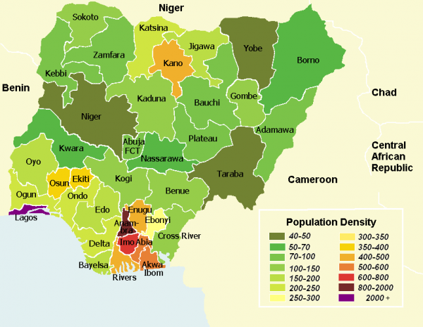
In 2014, Nigeria became Africa’s fastest growing nation. A large part of Nigeria’s success has to do with growth in some of its key industries.
Nigerian’s reliance on the oil and gas industry created an attractive economy for further development and it now has high growth in a diverse range of sectors, including mobile phones, champagne, private jets and ‘Nollywood’. Despite the uncertainty and political unrest caused by Boko Haram, Nigeria is attracting a significant amount of Foreign Direct Investment (FDI) in a range of sectors, indicating its growing diversity and attractiveness to some of the world’s largest multinational companies.
Boko Haram has certainly had a dampening effect on Nigeria’s growth, as has the lower oil price, but this may create opportunities for further diversification. Furthermore there are concerns about how the wealth of the nation is concentrated, given that poverty is still prevalent across the country. However, Nigeria is certainly emerging as a success story of Africa and surely the question that will be asked is will other African nations follow suit?
The following article from BBC News considers the Nigerian economy.
Nigeria’s ‘champagne’ economy bucks Boko Haram effect BBC News, Vishala Sri-Pathma (27/3/15)
Questions
- Is a falling oil price necessarily bad for the Nigerian economy?
- Explain why Boko Haram is likely to have a dampening effect on economic growth in Nigeria.
- Do you think other African nations will be able to replicate the success of Nigeria? Which factors may prevent this?
- If the number of millionaires is increasing significantly, but poverty is persisting, does this tell us anything about what is happening to inequality in Nigeria?
- Is is possible to reduce inequality in Nigeria while maintaining economic growth? Might it even be posible for greater equality to be a driver of economic growth?
- The Nigerian currency is weakening. What has caused this and why may this be a cause for concern?
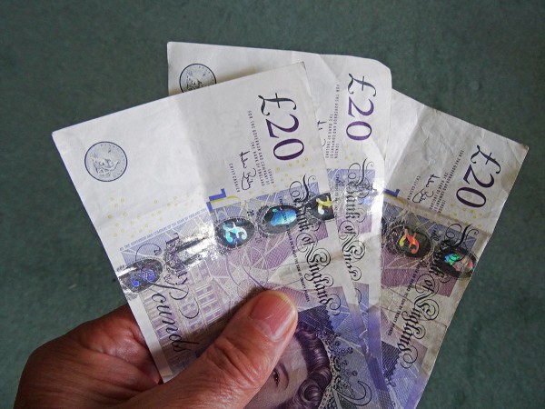
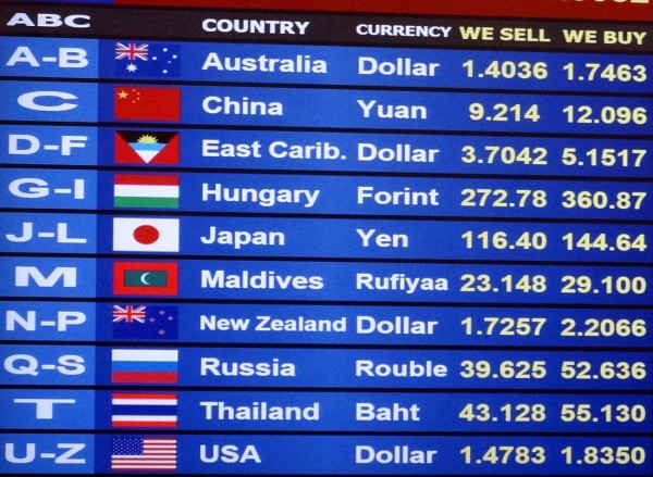
 With an election approaching in the UK, uncertainty is a term we will hear frequently over the next few weeks. Until we know which party or parties will be in power and hence which policies will be implemented, planning anything is difficult. This is just one of the factors that has caused the British pound sterling to fall last week by 2% to an almost five year low against the dollar.
In the last election, uncertainty also prevailed and continued even after the election before the Coalition was formed. Given how close this election appears to be at present, another Coalition may have to be formed and this is adding to the current election uncertainty. A currency strategist at Standard Bank said:
“A $1.40 level for sterling/dollar is certainly not out of reach if the election aftermath turns ugly”
With such uncertainty, investors are refraining from putting their money into the UK and this has contributed towards the deprecation of the British pound against the dollar.
Another factor adding to this downward pressure on the pound is the latest data on industrial output. Although economic growth figures for the UK in 2014 were very positive, there are some suggestions that 2015 will not be as good as expected, though still a strong performance. The first quarter data will not be available until just before the election, but data from the ONS on industrial output shows very minimal growth at just 0.1% from January to February. Chris Williams at Markit said:
“Clearly this all bodes ill for economic growth in the opening quarter of the year. It’s now looking like the economy slowed, and possibly quite markedly, compared to the 0.6% expansion seen in the closing quarter of 2014 … The trend should improve in March, however, according to survey data.”
These two factors have combined to push the pound down, with investors preferring to hold their money in dollars, despite the weak US unemployment data. However, it is not only against the dollar that we must consider sterling’s performance. Against the euro, it has performed better, rising by 1.5%. Whether this is positive for the UK or very negative for the Eurozone is another question. The following articles consider the performance of the British pound.
Sterling falls to five-year low Financial Times, Neil Dennis (10/4/15)
Sterling plummets to five year low as economic slowdown looms The Telegraph, Mehreen Khan (10/4/15)
Pound at five-year low against dollar on weak output BBC News (10/4/15)
Sterling falls after Bank of England’s Haldane says even chances of rate cut or rise Reuters (10/4/15)
Pound falls to five-year low as volatility jumps before election Bloomberg, Anooja Debnath and David Goodman (11/4/15)
Pound falls to a five-year low against the dollar as polls suggest election will create economic uncertainty Mail Online, Matt Chorley (10/4/15)
Questions
- Draw a diagram illustrating the way in which the $/£ exchange rate is determined.
- Explain why the election is causing economic uncertainty in the UK.
- How would uncertainty affect the demand and supply of sterling and hence the exchange rate?
- US job data is worse than expected. Shouldn’t this have caused the dollar to depreciate against the pound and not appreciate?
- Industrial output data for the UK economy is lower than expected. What has caused this?
- Why does slower growth in industrial output cause the exchange rate to depreciate?
- In order to keep the UK’s inflation rate on target, Haldane has said that we could expect a cut or rise in interest rates and policy should be prepared for both. How has this affected the exchange rate?
- Are there any advantages of having a lower pound?
 The UK general election is on May 7. In the campaign during the run-up to the election the economy will be a major issue. All parties will use economic data to claim that the economy has performed well or badly and that the prospects are good or bad. As economics students you will, no doubt, be asked to comment on these claims by your friends. So where can you get analysis of the data that is not biased towards one party or another?
One source is the Institute for Fiscal Studies. It is respected by politicians of all parties as an impartial presenter and analyser of economic data. In fact, it is fiercely independent. But at election time, when often quite dramatic claims are made by politicians, the IFS often comments on whether the data support such claims.
An example occurred when David Cameron claimed that if Labour were elected, working families would face a £3028 tax rise to fund the party’s spending commitments. The IFS said that the claim was misleading as, even on the Conservatives’ assumptions, it was was based on the cumulative increase over five years, not the annual increase, and was not per household but only per working household. The IFS also said that the Conservatives’ assumptions were wrong and not in accordance with the Charter for Budget Responsibility, with which the Labour party agreed.
Expect the IFS to criticise more claims as the election campaign progresses: not just by the Conservative party but by the other parties too. After all, the IFS is not partisan and is prepared to challenge false economic claims from whatever party. Expect also that the political parties will cherry pick whatever statements by the IFS seen to favour them or criticise their opponents.
You can also expect political bias in the newspapers that report the campaigns. Even when they present facts, how they present them and which facts they choose to include and which to ignore will be a reflection of their political bias. So even newspaper reporting of what the IFS says is likely to be selective and nuanced!
Why IFS boss Paul Johnson counts in this tightest of general elections The Guardian, Larry Elliott (30/3/15)
David Cameron’s claim that Labour would raise taxes by £3,000 is ‘not sensible’, says the IFS Independent, Jon Stone (30/3/15)
‘tax rise’ is shot down by IFS The Guardian, Patrick Wintour (30/3/15)
We will borrow more if we win the election, Labour admits The Telegraph, Christopher Hope (29/3/15)
Chancellor accused of U-turn on austerity: Top economist says £20bn fiscal boost lurking in Budget is ‘remarkable reversal’ This is Money, Hugo Duncan (19/3/15)
Questions
- Distinguish between positive and normative statements. How might politicians blur the distinction in their claims and counter-claims?
- Identify three series of macroeconomic data from at least two independent organisations. For what reasons might the data be (a) unreliable; (b) used by political parties to mislead the electorate?
- In what ways can political parties use economic data to their own advantage without falsifying the data?
- How may public-sector deficit and debt statistics be interpreted in ways to suit (a) the current government’s case that the public finances have been well managed; (b) the opposition case that the public finances have been badly managed?
- Use data to analyse an economic claim by each of at least three political parties and the extent to which the claims are accurate.
- The above links are to articles from four UK national newspapers: The Guardian, the Independent, The Telegraph and the Daily Mail (This is Money). Identify political bias in the reporting in each of the articles.
 Interest rates are the main tool of monetary policy and crucially affect investment. There has been much discussion since the end of the financial crisis concerning when UK interest rates would eventually rise. Uncertainty over just when, and by how much, interest rates will rise affects business confidence and hence investment. Businesses therefore listen carefully to what the Bank of England says about future movements in Bank Rate. But Mark Carney has now spoken about another cause of uncertainty and its impct on investment. This is the uncertainty over the outcome of the referendum on whether the UK should leave the EU.
 As yet, businesses have not responded to this uncertainty, but the longer the delay for the referendum, the more inclined firms will be to postpone investment. As Mark Carney said: