 It is one year since the election of Shinzo Abe in Japan. He immediately embarked on a radical economic policy to stimulate the Japanese economy, which had suffered from years of stagnation. There have been three parts (or three arrows) to his policy: fiscal policy and monetary policy to stimulate aggregate demand and supply-side policy to increase productivity.
As the previous post explains:
 “The first arrow is monetary policy. The Bank of Japan has engaged in extensive quantitative easing through bond purchases in order to drive down the exchange rate (see A J-curve for Japan?), stimulate expenditure and increase the rate of inflation. A target inflation rate of 2% has been set by the Bank of Japan. Part of the problem for the Japanese economy over the years has been stagnant or falling prices. Japanese consumers have got used to waiting to spend in the hope of being able to buy at lower prices. Similarly, Japanese businesses have often delayed stock purchase. By committing to bond purchases of whatever amount is necessary to achieve the 2% inflation target, the central bank hopes to break this cycle and encourage people to buy now rather than later.
 The second arrow is fiscal policy. Despite having the highest debt to GDP ratio in the developed world, Japan is embarking on a large-scale programme of infrastructure investment and other public works. The package is worth over $100bn. The expansionary fiscal policy is accompanied by a longer-term plan for fiscal consolidation as economic growth picks up. In the short term, Japan should have no difficulty in financing the higher deficit, given that most of the borrowing is internal and denominated in yen.
 The third arrow is supply-side policy. On 5 June, Shinzo Abe unveiled a series of goals his government would like to achieve in order to boost capacity and productivity. These include increasing private-sector investment (both domestic and inward), infrastructure expenditure (both private and public), increasing farmland, encouraging more women to work by improving day-care facilities for children, and deregulation of both goods, capital and labour markets. The prime minister, however, did not give details of the measures that would be introduced to achieve these objectives. More details will be announced in mid-June.”
In the webcast and article below, Linda Yueh, the BBC’s Chief Business Correspondent, considers how effective the policies are proving and the challenges that remain.
Webcast
 Has Abenomics fixed Japan’s economic fortunes? BBC News, Linda Yueh (16/12/13)
Articles
Why Abenomics holds lessons for the West BBC News, Linda Yueh (13/12/13)
Japanese business confidence hits six-year high, Tankan survey shows The Guardian (16/12/13)
Data
World Economic Outlook Database IMF (Oct 2013)
Bank of Japan Statistics Bank of Japan
Economic Outlook Annex Tables OECD
Country statistical profile: Japan 2013 OECD (15/11/13)
Questions
- Demonstrate on (a) an aggregate demand and supply diagram and (b) a Keynesian 45° line diagram the effects of the three arrows (assuming they are successful) in meeting their objectives.
- Why has Japan found it so hard to achieve economic growth over the past 20 years?
- How has the Japanese economy performed over the past 12 months?
- What lessons can be learnt by the UK and eurozone countries from Japan’s three arrows?
- Why is the second arrow problematic, given the size of Japan’s general government debt? Does the proportion of Japanese debt owed overseas affect the argument?
- In what ways do the three arrows (a) support each other; (b) conflict with each other?
- Why is the structure of the labour market in Japan acting as a break on economic growth? What policies are being, or could be, pursued to tackle these structural problems?
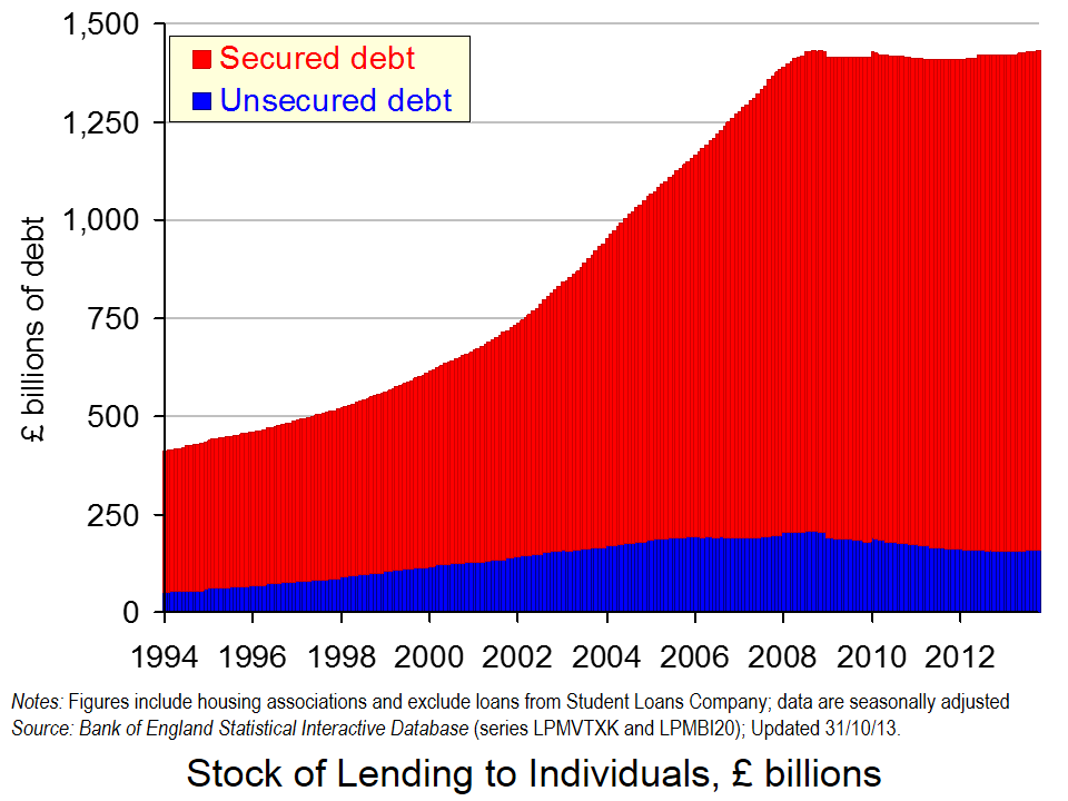
 As of 31 October 2013, British households had a stock of debt close to £1.43 trillion. Economists are increasingly recognising that the financial well-being of economic agents is an important macroeconomic issue. The financial position of households, businesses and governments can be expected to affect behaviour and, hence, economic activity.
We can calculate the net financial wealth of households as the difference between their stock of financial assets (savings) and their financial liabilities (debt). The latest figures from the Bank of England’s Money and Credit show that as of Halloween 2013, British households had amassed a stock of debt of £1.4296 trillion. It is certainly a large figure since it not far short of the expected GDP figure for 2013 of around £1.6 trillion.
The chart above helps to show that of the aggregate household debt, £1.271 trillion is secured debt (debt secured against property). The remaining stock of £158.589 billion is unsecured debt (e.g. overdrafts, outstanding credit card debt and personal loans). In short, 89 per cent of the stock of outstanding household debt is mortgage debt. (Click here to download a PowerPoint of the chart.)
In January 1994 the stock of secured debt stood at £358.75 billion and the stock of unsecured debt at £53.773 billion. 87 per cent of debt then was secured debt and, hence, little different to today. The total stock of debt has grown by 247 per cent between January 1994 and October 2013. Unsecured debt has grown by 199 per cent while secured debt has grown by 254 per cent.
But, consider now the path of debt between the end of October 2008 and October 2013. During this period, the monthly series of the stock of unsecured debt has fallen on 52 occasions and risen on only 9 occasions. In contrast, the stock of secured debt has fallen on only 10 occasions and often by very small amounts. Consequently, the stock of unsecured debt has fallen by 22.8 per cent between the end of October 2008 and October 2013. In contrast, the stock of secured debt has risen by 3.9 per cent. The total stock of debt has risen by 0.1 per cent over this period and, therefore, it is essentially unchanged.
The amount of debt accumulated by households is example of the increasing importance of the financial system in our everyday lives. The term financialisation helps to capture this. Financialisation means that economists need to think much more about how financial institutions and the financial well-being of people, businesses and governments affect economic activity. There is little doubt that the financial position or financial health of economic agents, such as households, affects their behaviour. We would expect in the case of households for their financial well-being to exert an influence on their propensities to spending or save. But, just how is an area in need of much, much more research.
Articles
UK household debt hits record high BBC News (29/11/13)
Average household debt ‘doubled in last decade’ Telegraph, Edward Malnick (20/11/13)
£1,430,000,000,000 (that’s £1.43 trillion): Britain’s personal debt timebomb Independent, Andrew Grice (20/11/13)
Data
Money and Credit – October 2013 Bank of England
Statistical Interactive Database Bank of England
Questions
- Outline the ways in which the financial system could impact on the spending behaviour of households.
- Why might the current level of income not always be the main determinant of a household’s spending?
- How might uncertainty affect spending and saving by households?
- Explain what you understand by net lending to individuals. How does net lending to individuals affect stocks of debt?
- Outline the main patterns seen in the stock of household debt over the past decade and discuss what you consider to be the principal reasons for these patterns.
- What factors might explain the rather different pattern seen in the growth of debt since October 2008 compared with that in earlier part of the 2000s?
- What do you understand by the term financialisation? Of what importance is this phenomenon to economic behaviour?
 ‘Deflation could be replacing debt as the main problem – and there’s nothing to suggest the ECB is up to the job.’ So begins the linked article below by Barry Eichengreen, Professor of Economics and Political Science at the University of California, Berkeley.
The good news in this is that worries about debt in eurozone countries are gradually receding. Indeed, this week Ireland officially ended its reliance on a bailout (of €67.5 billion) from the EU and IMF and regained financial sovereignty (see also).
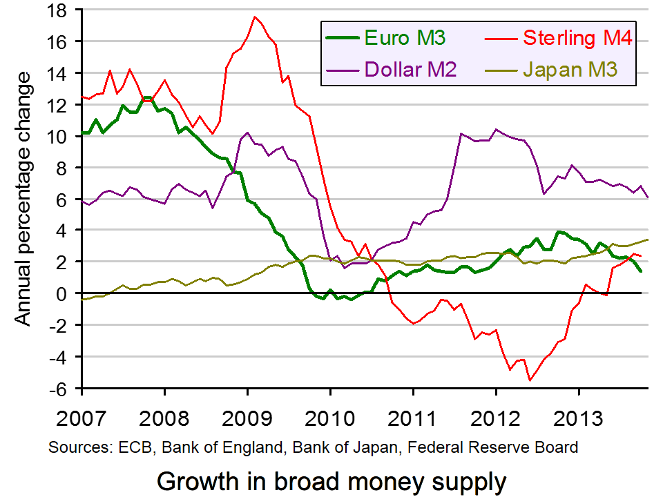
The bad news is that this does not mark the end of austerity. Indeed, many eurozone countries could get stuck in a deflationary trap, with austerity policies continuing to depress aggregate demand. Eurozone inflation is less than 1% and falling. Broad money supply growth is now below that of the US dollar, the yen and sterling (see chart: click here for a PowerPoint).
The ECB has been far more cautious than central banks in other countries in acting to prevent recession and deflation. Unlike the USA, Japan and the UK, which have all engaged in extensive quantitative easing, the ECB had been reluctant to do so for fear of upsetting German opinion and taking the pressure off southern European countries to reform.
But as Eichengreen points out, the dangers of inaction could be much greater. What is more, quantitative easing is not the only option. The ECB could copy the UK approach of ‘funding for lending’ – not for housing, but for business.
Europe’s economic crisis could be mutating again The Guardian, Barry Eichengreen (10/12/13)
Questions
- What problems are created by falling prices?
- What effect would deflation have on debt and the difficulties in repaying that debt?
- What measures have already been adopted by the ECB to stimulate the eurozone economy? (Search previous articles on this site.)
- Why have such measures proved inadequate?
- What alternative policies are open to the ECB?
- What are the arguments for the ECB being given a higher inflation target (such as 3 or 4%)?
- What are the arguments for and against relaxing fiscal austerity in the eurozone at the current time?
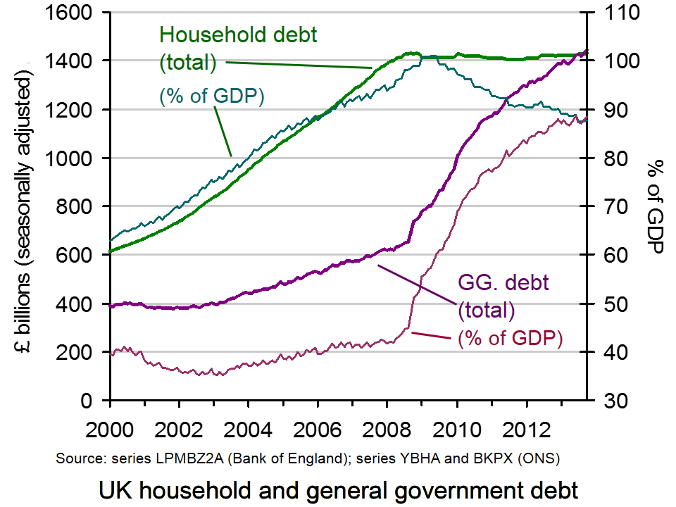
 Household debt in the UK has reached a record level. Individuals now owe £1430 billion. This compares with the UK’s general government debt of £1443 billion – also at a record level. These figures are illustrated in the chart (click here for a PowerPoint).
But these figures are nominal. If you look at the real figures (i.e. corrected for inflation), household debt has been falling. In today’s prices, household debt peaked at £1668 billion in March 2008. Also, if you look at household debt as a proportion of GDP, it fell from a peak of 100.96% in May 2009 to 87.43% in July 2013 (see chart). However, since then it has begun rising again, standing at 87.65% in October 2013.
So has household debt become less of a problem? In aggregate terms, the answer is probably yes. However, it is too early to know whether a continuing recovery in the economy will be fuelled by real debt rising again and whether the recovery will encourage people to take on higher levels of debt?
For many people, however, debt has become more and more of a problem. In other words, the aggregate figures conceal what has happened in terms of the distribution of debt. According to a Centre for Social Justice (CSJ) study:
Indebted households in the poorest 10 per cent of the country have average debts more than four times their annual income. Average debt repayments within this group amounted to nearly half their gross monthly income.

And the poorest families, often with very poor credit ratings, are frequently forced to turn to payday lenders, charging sky-high interest rates (see Capping interest rates on payday loans: a government U-turn?).
As mainstream banks reduced access to credit following the financial crash, the market for short-term high-cost credit (payday lenders, pawnbrokers, rent-to-buy and doorstop lenders) increased dramatically and is now worth £4.8 billion a year.
Payday lenders have increased business from £900 million in 2008/09 to just over £2 billion (or around 8 million loans) in 2011/12. Around half of payday loan customers reported taking out the money because it was the only form of credit they could get. The number of people going to loan sharks is also said to have increased – the most recent estimate puts it at 310,000 people.
With rising energy and food bills hitting the poorest hardest, this section of the population could find debt levels continuing to rise, especially if interest rates rise. As Chris Pond, who chaired the CJS study, stated:
The costs to those affected, in stress and mental disorders, relationship breakdown and hardship is immense. But so too is the cost to the nation, measured in lost employment and productivity and in an increased burden on public services.
Articles
£1,430,000,000,000 (that’s £1.43 trillion): Britain’s personal debt timebomb Independent, Andrew Grice (20/11/13)
Average household debt ‘doubled in last decade’ The Telegraph, Edward Malnick (20/11/13)
UK household debt hits record high BBC News (29/11/13)
UK debt crisis: poorest face ‘perfect storm’ Channel 4 News (20/11/13)
One in five struggle with serious debt The Telegraph, Nicole Blackmore (27/11/13)
It doesn’t matter what we do with Wonga: personal debt is about to rocket The Telegraph, Tim Wigmore (26/11/13)
Poorest families ‘need more help over debt’ BBC News (20/11/13)
Report
More than 5,000 people a year ‘homeless’ as household debt crisis deepens, CSJ warns Centre for Social Justice Press Release (20/11/13)
Data
Monthly amounts outstanding of total (excluding the Student Loans Company) sterling net lending to individuals and housing associations (in sterling millions) seasonally adjusted Bank of England
Public Sector Finances First Release – Public Sector Consolidated Gross Debt ONS
Household debt (Economics Indicators update) House of Commons Library (29/11/13)
Questions
- What are the macroeconomic implications of rising levels of household debt?
- Why may an economy which has high levels of household debt be more subject to cyclical fluctuations in real GDP?
- What are the problems of having a recovery driven largely by increased consumer expenditure?
- Why have many people in the poorest sectors of society found their debt levels rising the fastest?
- Why may rising levels of debt of the most vulnerable people make it harder for the Bank of England to use conventional monetary policy if recovery becomes established?
- What policies could be pursued to try to reduce the debts of the poorest people?
- Discuss the effectiveness of these various policies.
 A constant feature of the UK economy (and of many other Western economies) has been record low interest rates. Since March 2009, Bank Rate has stood at 0.5%. Interest rates have traditionally been used to keep inflation on target, but more recently their objective has been to stimulate growth. However, have these low interest rates had a negative effect on the business environment?
Interest rates are a powerful tool of monetary policy and by affecting many of the components of aggregate demand, economic growth can be stimulated. This low-interest rate environment is an effective tool to stimulate consumer spending, as it keeps borrowing costs low and in particular can keep mortgage repayments down. However, this policy has been criticised for the harm it has been doing to savers – after all, money in the bank will not earn an individual any money with interest rates at 0.5%! Furthermore, there is now a concern that such low interest rates have led to ‘zombie companies’ and they are restricting the growth potential and recovery of the economy.
A report by the Adam Smith Institute suggests that these ‘zombie companies’ have emerged in part by the low-interest environment and are continuing to absorb resources, which could otherwise be re-allocated to companies with more potential, productivity and a greater contribution to the economic recovery. During a recession, there will undoubtedly be many business closures, as aggregate demand falls, sales and profits decline until eventually the business becomes unviable and loans cannot be repaid. Given the depth and duration of the recent recessionary period, the number of business closures should have been very large. However, the total number appears to be relatively low – around 2% or 100,000 and the report suggests that the low interest rates have helped to ‘protect’ them.
Low interest rates have enabled businesses to meet their debt repayments more easily and with some banks being unwilling to admit to ‘bad loans’, businesses have benefited from loans being extended or ‘rolled over’. This has enabled them to survive for longer and as the report suggests, may be preventing a full recovery. The report’s author, Tom Papworth said:
Low interest rates and bank forbearance represent a vast and badly targeted attempt to avoid dealing with the recession. Rather than solving our current crisis, they risk dooming the UK to a decade of stagnation … We tend to see zombies as slow-moving and faintly laughable works of fiction. Economically, zombies are quite real and hugely damaging, and governments and entrepreneurs cannot simply walk away.
The problem they create is that resources are invested into these companies – labour, capital, innovation. This creates an opportunity cost – the resources may be more productive if invested into new companies, with greater productive potential. The criticism is that the competitiveness of the economy is being undermined by the continued presence of such companies and that this in turn is holding the UK economy back. Perhaps the interest rate rise that may happen this time next year may be what is needed to encourage the re-allocation of capital. However, a 0.5 percentage point rise in interest rates would hardly be the end of the world for some of these companies. Perhaps a more focused approach looking at restructuring is the key to their survival and the allocation of resources to their most productive use. The following articles and the report itself consider the case of the trading dead.
Report
The Trading Dead The Adam Smith Institute, Tom Papworth November 2013
Articles
Zombie firms threaten UK’s economic recovery, says thinktank The Guardian, Gyyn Topam (18/11/13)
 Zombie companies ‘probably have no long term future’ BBC News (18/11/13)
Rate rise set to put stake through heart of zombie companies Financial Times, Brian Groom (14/11/13)
Why we can still save the zombie firms hindering the UK economic rival City A.M., Henry Jackson (18/11/13)
Breathing new life into zombies The Telegraph, Rachel Bridge (9/11/13)
Questions
- Which components of aggregate demand are affected (and how) by low interest rates?
- Why do low interest rates offer ‘protection’ to vulnerable businesses?
- How is the reallocation of resources relevant in the case of zombie companies?
- If interest rates were to increase, how would this affect the debts of vulnerable businesses? Would a small rate irse be sufficient and effective?
- What suggestions does the report give for zombie companies to survive and become more productive?
- Is there evidence of zombie companies in other parts of the world?
 It is one year since the election of Shinzo Abe in Japan. He immediately embarked on a radical economic policy to stimulate the Japanese economy, which had suffered from years of stagnation. There have been three parts (or three arrows) to his policy: fiscal policy and monetary policy to stimulate aggregate demand and supply-side policy to increase productivity.
 “The first arrow is monetary policy. The Bank of Japan has engaged in extensive quantitative easing through bond purchases in order to drive down the exchange rate (see A J-curve for Japan?), stimulate expenditure and increase the rate of inflation. A target inflation rate of 2% has been set by the Bank of Japan. Part of the problem for the Japanese economy over the years has been stagnant or falling prices. Japanese consumers have got used to waiting to spend in the hope of being able to buy at lower prices. Similarly, Japanese businesses have often delayed stock purchase. By committing to bond purchases of whatever amount is necessary to achieve the 2% inflation target, the central bank hopes to break this cycle and encourage people to buy now rather than later.
 The second arrow is fiscal policy. Despite having the highest debt to GDP ratio in the developed world, Japan is embarking on a large-scale programme of infrastructure investment and other public works. The package is worth over $100bn. The expansionary fiscal policy is accompanied by a longer-term plan for fiscal consolidation as economic growth picks up. In the short term, Japan should have no difficulty in financing the higher deficit, given that most of the borrowing is internal and denominated in yen.
 The third arrow is supply-side policy. On 5 June, Shinzo Abe unveiled a series of goals his government would like to achieve in order to boost capacity and productivity. These include increasing private-sector investment (both domestic and inward), infrastructure expenditure (both private and public), increasing farmland, encouraging more women to work by improving day-care facilities for children, and deregulation of both goods, capital and labour markets. The prime minister, however, did not give details of the measures that would be introduced to achieve these objectives. More details will be announced in mid-June.”
 Has Abenomics fixed Japan’s economic fortunes? BBC News, Linda Yueh (16/12/13)