 In our blog How sustainable is UK consumer spending? we considered concerns of some commentators that consumer spending was growing unduly quickly given the absence of any sustained growth in disposable income. The Second Estimate of GDP, Q2 2013 reports that the economy grew by 0.7 per cent in the second quarter of the year, with household expenditure growing by 0.4 per cent.
Because household spending makes up about two-thirds of aggregate demand in the UK it is important to keep an eye on it. The latest figures show that the real value of consumer spending by British households has risen in each quarter since 2011 Q4. In other words, the volume of household purchases has risen for seven consecutive quarters. Over the period, the growth in real consumer spending has averaged 0.4 per cent per quarter.
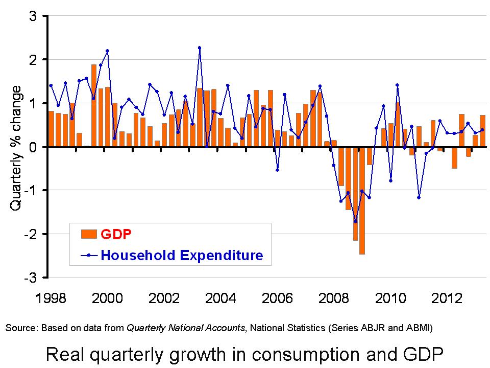 The chart helps to demonstrate the stark turnaround in the growth in consumer spending. Over the period from 2008 Q1 to 2011 Q3, real consumer spending typically fell by 0.4 per cent each quarter. As we noted in our previous blog, this was a period when the global financial system was in distress, with the availability of credit severely dampened, but also a period when households were concerned about their own financial balances and the future prospects for growth. Over the same period, real GDP typically fell by a little under 0.3 per cent each quarter. (Click here to download a PowerPoint of the chart.)
The real value of consumer spending has yet to return to its 2007 Q4 peak (£242 billion at 2010 prices). In 2013 Q2 the real value of consumer spending is estimated still to be 3 per cent below this level (£235 billion at 2010 prices). These figures are mirrored by the economy at large. Real GDP peaked in 2008 Q1 (£393 billion at 2010 prices). Despite the back-to-back quarterly increases in real GDP of 0.3 per cent in Q1 and 0.7 per cent in Q2, output in 2013 Q2 (£380 billion at 2010 prices) remains 3.2 per cent below the 2008 Q1 peak.
While real consumption values are below their 2007 Q4 peak, the concern is whether current rates of growth in consumer spending are sustainable. In particular, should this growth cause the household sector financial distress there would be real pain for the economy further down the line. Some commentators argue that the latest GDP figures are consistent with a more balanced recovery. In Q2 economic growth was supported too by other parts of the economy. For instance, we saw a 3.6 per cent rise in export volumes and a 1.7 per cent rise in gross fixed capital formation (i.e. investment expenditure).
Nonetheless, it is the protracted period over which consumer spending has been growing robustly that concerns some economists. Hence, we will need to continue to monitor the growth in all components of aggregate demand and, in particular, changes in household consumption, income, saving and borrowing.
Data
Second Estimate of GDP, Q2 2013 Dataset Office for National Statistics
Articles
New articles
UK economic growth revised up to 0.7% BBC News, (23/8/13)
UK GDP revised up to 0.7pc in second quarter: reaction Telegraph, (23/8/13)
UK rallying faster than thought as exports leap boosts GDP Independent, Russell Lynch and Ben Chu (24/8/13)
UK economy expanding faster than first thought, GDP revision shows Guardian, Heather Stewart (23/8/13)
Growth upgrade points to ‘sustainable’ recovery Telegraph, Philip Aldrick (23/8/13)
Previous articles
UK wages decline among worst in Europe BBC News, (11/8/13)
Squeezing the hourglass The Economist, (10/8/13)
UK first-quarter growth unchanged BBC News, (28/5/13)
Summer heatwave triggers shopping spree in ‘Wongaland’ economy Telegraph, Steve Hawkes and Steven Swinford (15/8/13)
Retail sales data better than expected as UK economy enjoys summer bounce Guardian, Heather Stewart (15/8/13)
Mark Carney is banking on you to keep spending Telegraph, Philip Aldrick (10/8/13)
NIESR upgrades UK economy but warns on consumer spending Telegraph, Philip Aldrick (2/8/13)
Consumers ‘expect better economy’ Belfast Telegraph, (4/8/13)
Questions
- Explain what you understand by a ‘sustainable’ economic recovery.
- What are the expenditure components that make up Aggregate Demand?
- Explain what you understand by consumption smoothing.
- Why would we would typically expect consumption growth to be less variable than that in disposable income?
- Would we expect consumption growth to always be less variable than that in disposable income? Explain your answer.
- What impact do you think the financial crisis has had on consumer behaviour?
- To what extent do you think the current growth in consumer spending is sustainable?
- How important are expectations in determining consumer behaviour?
 Household spending makes up about two-thirds of aggregate demand in the UK. Understanding its determinants is therefore important to understanding short-term economic growth. The real value of consumer spending by British households has risen in each quarter since 2011 Q4. Over the same period real disposable income has flat-lined. This suggests that the British household sector has stepped up attempts to smooth their longer-term spending profile despite the current absence of growth in their real incomes.
When viewed over many years, disposable income and consumer spending grow at very similar rates. After stripping out inflation we find that over the past 50 years both have grown at about 2½ per cent per annum. However, if we measure growth from one quarter of the year to the next we tend to find that consumption growth is less variable than disposable income. This is known as consumption smoothing.
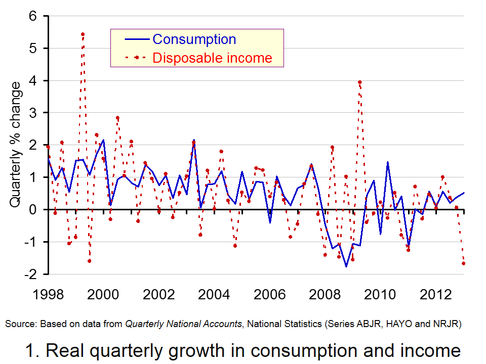
 Chart 1 shows the quarterly percentage change in consumption and disposable income since 1998. (Click here to download a PowerPoint of the chart).The variability in the disposable income series is generally greater than that in consumption so helping to illustrate consumption smoothing.
Consumption smoothing is facilitated by the financial system enabling us to either borrow to supplement our spending or to save to enjoy more spending in the future. The financial system can help households to avoid large variations in their spending over short periods.
Consumption smoothing does not prohibit falls in consumption nor periods when it is more variable than income. Over the period from 2008 Q1 to 2011 Q3, real consumption typically fell by 0.4 per cent each quarter while disposable income was flat. This was a period when the global financial system was in distress. Sharp contractions in credit meant that the financial system was no longer able to support economic activity as it had previously. Furthermore, households too looked to repair their balance sheets with economic uncertainty acting as an incentive to do so.
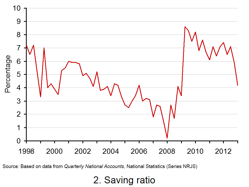
What is interesting is the extent to which British households are spending again. Since 2011 Q4 the real value of spending has typically expanded by 0.4 per cent each quarter while income growth remains largely absent. One might argue that this just demonstrates a willingness for households to engage in consumption smoothing. With credit conditions still tight, the growth in spending has been aided by a decline in the saving ratio.  This can be seen from Chart 2.
In 2009 Q2 the proportion of income saved hit 8.6 per cent having been as low as 0.2 per cent in 2008 Q1. In 2013 Q1 the saving ratio had fallen back to 4.2 per cent. (Click here to download a PowerPoint of the chart.)
It is of course all too easy to over-interpret data. Nonetheless, there be will concern if households look to maintain consumption growth at rates substantially greater than those in disposable income for too long a period of time. Consumption smoothing could become a real problem for future economic activity if it was to result in a financially distressed household sector. Hence, an important question is the extent to which current rates of consumption growth are sustainable. Future consumption and income trends will therefore be analysed with enormous interest.
Data
Quarterly National Accounts, Q1 2013 Dataset Office for National Statistics
Articles
UK wages decline among worst in Europe BBC News, (11/8/13)
Squeezing the hourglass The Economist, (10/8/13)
UK first-quarter growth unchanged BBC News, (28/5/13)
Summer heatwave triggers shopping spree in ‘Wongaland’ economy Telegraph, Steve Hawkes and Steven Swinford (15/8/13)
Retail sales data better than expected as UK economy enjoys summer bounce Guardian, Heather Stewart (15/8/13)
Mark Carney is banking on you to keep spending Telegraph, Philip Aldrick (10/8/13)
NIESR upgrades UK economy but warns on consumer spending Telegraph, Philip Aldrick (2/8/13)
Consumers ‘expect better economy’ Belfast Telegraph, (4/8/13)
Questions
- Explain what you understand by consumption smoothing.
- Why would we would typically expect consumption growth to be less variable than that in disposable income?
- Would we expect consumption growth to always be less variable than that in disposable income? Explain your answer.
- What impact do you think the financial crisis has had on consumer behaviour?
- To what extent do you think the current growth in consumer spending is sustainable?
- How important are expectations in determining consumer behaviour?
 One very important characteristic of economic growth is its short-term volatility. Economic activity is notoriously volatile. It is such a fundamental idea that economists refer to it as one of their threshold concepts. The volatility of growth sees occasional recessions. The traditional definition is where real GDP (output) declines for 2 or more consecutive quarters. The latest figures from the Quarterly National Accounts call into question whether the UK technically experienced a recession at the start of 2012 with output broadly flat in 2012 Q1 following a contraction of 0.1 per cent in 2011 Q4.
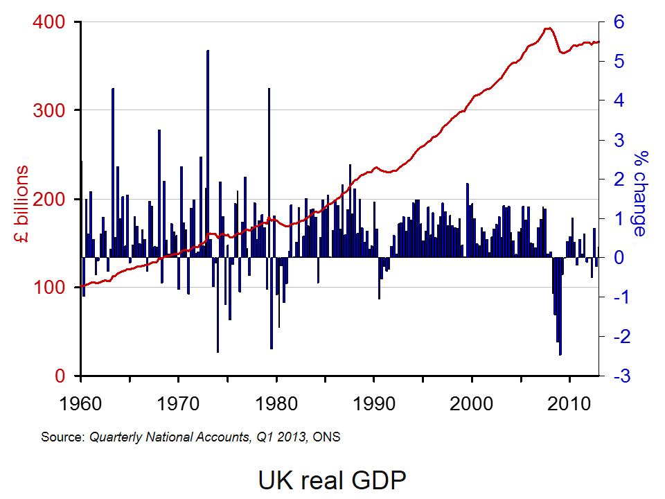
The ONS’s latest output numbers raise some interesting questions around our understanding of what constitutes a recession. These figures show that the 2008/9 recession was deeper than first thought with output declining by 7.2 per cent. They show that UK output peaked in 2008Q1 (£392.786 billion at 2010 prices). There then followed 6 quarters where output declined.
Output declined again in 2010 Q4 (–0.2% growth) and again in 2011 Q4 (–0.1% growth). But then interpretations of the data become more controversial. Not least, we get in the debates concerning the accuracy with which we can expect to measure the size of the economy and so to how many decimal places one should realistically measure a rise or fall. In terms of the raw real GDP numbers output fell in 2012 Q1. In 2011 Q4 GDP is estimated at £376,462 billion (at 2010 prices) ‘falling’ to £376,436 billion (at 2010 prices) in 2012 Q1. But, this is a percentage fall only when measured to the third decimal place (–0.007% growth).
In its publication Impact of changes in the National Accounts and economic commentary for Q1 2013 the ONS argue that:
While some commentators may attempt to read some significance into this revision, particularly in the context of whether the UK experienced a “double-dip” recession, it is clearly absurd to imagine that it is possible to measure the size of the economy to this degree of accuracy. The best interpretation of the Blue Book figures is that the economy was flat in the first quarter of 2012, and 0.6% larger than in the same quarter of 2011.
It is however understandable that those with vested interests – including economists, policy-makers and politicians – will take a slightly different view and will read more into the figures than perhaps an objective, sober view might demand. What appears more certain is that output did again fall in 2012 Q2 (–0.5 per cent growth) and in 2012 Q4 (–0.2 per cent growth). Despite estimated growth of 0.3 per cent in 2013 Q1, output remains 3.9 per cent lower than at its 2008 Q1 peak.
Perhaps the ‘absurdity’ or not around the debate of a double-dip recessions strengthens the argument for a more holistic and considered view of what constitutes a recession. In the USA the wonderfully-named Business Cycle Dating Committee takes a less fixed view of economic activity and, hence, of recessions. Its website argues:
It (the Committee) examines and compares the behavior of various measures of broad activity: real GDP measured on the product and income sides, economy-wide employment, and real income. The Committee also may consider indicators that do not cover the entire economy, such as real sales and the Federal Reserve’s index of industrial production (IP).
Of course, the advantage of focusing on real GDP alone in measuring activity and in determining recessions is that it is usually very straightforward to interpret. Regardless of whether the UK has experienced or not two recessions in close proximity, our chart helps to put the recent growth numbers into an historical context . It shows both the quarter-to-quarter changes in real GDP (left-hand axis) and the level of output as measured by GDP at constant 2010 prices (right-hand axis). Click here to download the chart to PowerPoint.
The chart captures nicely the twin characteristics of growth. Since 1960, the average rate of growth per quarter has been 0.63 per cent. This is equivalent to an average rate of growth of 2.55 per cent per year. Since 2008 Q2, quarterly growth has averaged –0.19 per cent which is equivalent to an annual rate of growth of –0.78 per cent! In any language these are extraordinary numbers. Indeed, one could argue that focusing any policy debate around whether or not the UK experienced a double-dip recession rather misses the more general point concerning the absense of any sustained economic growth since 2008.
Data
Quarterly National Accounts Time Series Dataset Q1 2013 Office for National StatisticsStatistical Bulletin: Quarterly National Accounts Q1 2013 Office for National Statistics
Articles
UK avoided double-dip recession in 2011, revised official data shows Guardian, Phillip Inman (27/6/13)
Britain’s double dip recession revised away, but picture still grim Reuters, David Milliken and William Schomberg (27/6/13)
UK double-dip recession revised away BBC News (27/6/13)
IMF raises UK economic growth forecast BBC News (9/7/13)
IMF raises UK economic growth forecast to 0.9% but cuts prediction for global growth Independent, Holly Williams (9/7/13)
IMF Upgrades UK Growth Forecast For 2013 Sky News (9/7/13)
Questions
- What is the difference between nominal and real GDP? Which of these helps to track changes in economic output?
- Looking at the chart above, summarise the key patterns in real GDP since the 1960s.
- What is a recession? What is a double-dip recession?
- What are some of the problems with the traditional definition of a recession?
- Explain the arguments for and against the proposition that the UK has recently experienced a double-dip recession.
- Can a recession occur if nominal GDP is actually rising? Explain your answer.
- What factors might result in economic growth being so variable?
- Produce a short briefing paper exploring the prospects for economic growth in the UK over the next 12 to 18 months.
 There’s some good news and some bad news about the UK economy. The good news is that there are signs that the recovery is gathering momentum; the ‘green shoots’ are growing bigger. The bad news is that it’s the ‘wrong type of growth’!
One of the main underlying problems of the 2008 financial crisis was that household debt had been increasing to unsustainable levels, egged on by banks only too willing to lend, whether as personal loans, on credit cards or through mortgages. When the recession hit, many people sought to reduce their debts by cutting back on spending. This further fuelled the recession.
What the government and most economists hoped was that there would be some rebalancing of the economy, with less reliance on consumer spending to drive economic growth. Instead it was hoped that growth would be driven by a rise in investment and exports. Indeed, the 25% depreciation of sterling exchange between 2007 and 2009 was seen as a major advantage as this would boost the demand for exports and encourage firms to invest in the export sector.
But things haven’t turned out the way people hoped. The recession (or lack of growth) has been much deeper and more prolonged than previous downturns in the economy. Today, real GDP per head is more than 7% below the level in 2007 and many people have seen much bigger declines in their living standards.
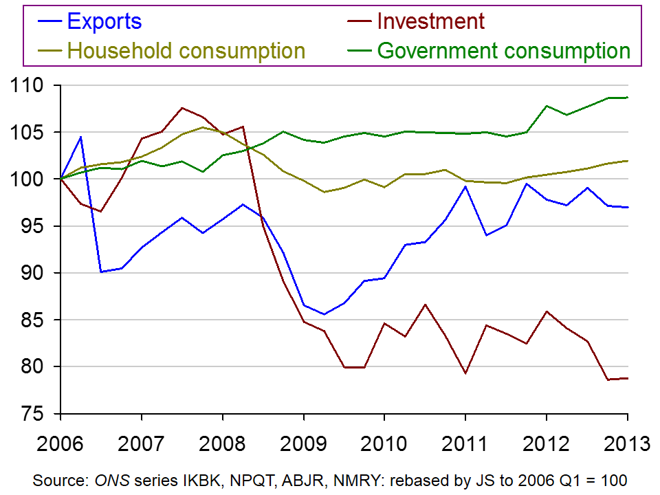
 But also, despite the austerity policies, the economy has not been ‘rebalanced’ towards exports and investment. Exports are 3% lower than in 2006 (although they did grow between 2009 Q2 and 2011 Q1, but have since stagnated). And investment is 27% lower than in 2006. Household consumption, however, has grown by about 2% and general government consumption by around 9% since 2006. The chart shows the figures, based on 2006 Q1 = 100.
(Click here for a PowerPoint of the chart.)
And recent evidence is that consumption is beginning to grow faster – not because of rising household incomes, but because of falling saving rates. In 2008, the household saving ratio had fallen to nearly 0% (i.e. households were on average saving about the same as they were borrowing). Then the saving ratio rose dramatically as people reined in their spending. Between 2009 and 2012, the ratio hovered around 7%. But in the first quarter of 2013, it had fallen to 4.2%
So the good news is that aggregate demand is rising, boosting economic growth. But the bad news is that, at least for the time being, this growth is being driven by a rise in household borrowing and a fall in household saving. The videos and articles consider whether this is, however, still good news on balance.
Webcasts
 Britain’s imbalanced economy The Economist, Zanny Minton Beddoes and Richard Davies (4/7/13)
 Britain’s Export Drought: an enduring disappointment The Economist, Andrew Palmer and Richard Davies (9/2/13)
 ‘Green shoots’ of economic recovery in Rugby BBC News, Paul Mason (12/6/13)
Articles
Is the UK economy seeing the ‘wrong kind’ of green shoots? BBC News, Stephanie Flanders (3/7/13)
The export drought: Better out than in The Economist (9/2/13)
Exports and the economy: Made in Britain The Economist (21/1/12)
The economy: On a wing and a credit card The Economist (6/7/13)
Unbalanced and unsustainable – this is the wrong kind of growth The Telegraph, Jeremy Warner (8/7/13)
The UK economy’s looking up – but no one’s told manufacturers The Guardian, Heather Stewart (10/7/13)
Data
Quarterly National Accounts, Q1 2013 (27/6/13)
Forecasts for the UK economy: a comparison of independent forecasts HM Treasury (June 2013)
ISM Manufacturing Report on Business® PMI History Institute for Supply Management
Questions
- What are forecasters expecting to happen to economic growth in the coming months? Why?
- What factors determine investment? Why has it fallen so substantially in the UK?
- Explain what is meant by the ‘accelerator’. Is the rise in consumption likely to lead to an accelerator effect and, if so, what will determine the size of this effect?
- Why have exports not grown more rapidly despite the depreciation of sterling after 2007?
- What will determine the rate of potential economic growth in the UK economy? How will a rise in real GDP driven by a rise in consumption impact on potential GDP and potential economic growth?
- What supply-side policies would you recommend, and why, in order to increase potential economic growth?
 In the blogs The capital adequacy of UK banks and A co-operative or a plc? we focus on how British banks continue to look to repair their balance sheets. To do so, banks need to ‘re-balance’ their balance sheets. This may involve them holding more reserves and equity capital and/or a less risky and more liquid profile of assets. The objective is to make banks more resilient to shocks and less susceptible to financial distress.
This will take time and even then the behaviour of banks ought to look like quite different from that before the financial crisis. All of this means that we will need to learn to live with new banking norms which could have fundamental consequences for economic behaviour and activity.
The increasing importance of financial institutions to economic activity is known as financialisation. It is not perhaps the nicest word, but, in one way or another, we all experience it. I am writing this blog in a coffee shop in Leicester having paid for my coffee and croissant by a debit card. I take it for granted that I can use electronic money in this way. Later I am going shopping and I will perhaps use my credit card. I take this short term credit for granted too. On walking down from Leicester railway station to the coffee shop I walked past several estate agents advertising properties for sale. The potential buyers are likely to need a mortgage. In town, there are several construction sites as Leicester’s regeneration continues. These projects need financing and such projects often depend on loans secured from financial institutions.
 We should not perhaps expect economic relationships to look as they did before the financial crisis. The chart shows how levels of net lending by financial institutions to households have dramatically fallen since the financial crisis. (Click here for PowerPoint of chart.)
Net lending measures the amount of lending by financial institutions after deducting repayments. These dramatically smaller flows of credit do matter for the economy and they do affect important macroeconomic relationships.
Consider the consumption function. The consumption function is a model of the determinants of consumer spending. It is conventional wisdom that if we measure the growth of consumer spending over any reasonably long period of time it will basically reflect the growth in disposable income. This is less true in the short run and this is largely because of the financial system. We use the financial system to borrow and to save. It allow us to smooth our consumption profile making spending rather less variable. We can save during periods when income growth is strong and borrow when income growth is weak or income levels are actually falling. All of this means that in the short term consumption is less sensitive to changes in disposable income that it would otherwise be.
 The financial crisis means new norms for the banking system and, hence, for the economy. One manifestation of this is that credit is much harder to come by. In terms of our consumption function this might mean consumption being more sensitive to income changes that it would otherwise be. In other words, consumption is potentially more volatile as a result of the financial crisis. But, the point is more general. All spending activity, whether by households or firms, is likely to be more sensitive to economic and financial conditions than before. For example, firms’ capital spending will be more sensitive to their current financial health and crucially to their flows of profits.
We can expect particular markets and sectors to be especially affected by new financial norms. An obvious example is the housing market which is very closely tied to the mortgage market. But, any market or sector that traditionally is dependent on financial institutions for finance will be affected. This may include, for example, small and medium-sized enterprises or perhaps organsiations that invest heavily in R&D. It is my view that economists are still struggling to understand what the financial crisis means for the economy, for particular sectors of the economy and for the determination of key economic relationships, such as consumer spending and capital spending. What is for sure, is that these are incredibly exciting times to study economics and to be an economist.
Data
Statistical Interactive Database Bank of England
Articles
Cut in net lending to non-financial firms raises credit worries Herald Scotland, Mark Williamson (25/5/13)
Loans to business continue to shrink despite Funding for Lending Scheme Wales Online, Chris Kelsey (3/6/13)
Factbox – Capital shortfalls for five UK banks, mutuals Standard Chartered News (20/6/13)
UK banks ordered to plug £27.1bn capital shortfall The Guardian, Jill Treanor (20/6/13)
Barclays, Co-op, Nationwide, RBS and Lloyds responsible for higher-than-expected capital shortfall of £27.1bn The Telegraph, Harry Wilson (20/6/13)
UK banks need to plug £27bn capital hole, says PRA BBC News (20/6/13)
Barclays and Nationwide forced to strengthen BBC News, Robert Peston (20/6/13)
Five Banks Must Raise $21 Billion in Fresh Capital: BOE Bloomberg, Ben Moshinsky (20/6/13)
Co-operative Bank to list on stock market in rescue deal The Guardian, Jill Treanor (17/6/13)
Troubled Co-operative Bank unveils rescue plan to plug £1.5bn hole in balance sheet Independent, Nick Goodway (17/6/13)
Co-op Bank announces plan to plug £1.5bn hole Which?(17/6/13)
The Co-operative Bank and the challenge of finding co-op capital The Guardian, Andrew Bibby (13/6/13)
Co-op Bank seeks to fill £1.5bn capital hole Sky News (17/6/13)
Central banks told to head for exit Financial Times, Claire Jones (23/6/13)
Stimulating growth threatens stability, central banks warn The Guardian (23/6/13)
BIS Press Release and Report
Making the most of borrowed time: repair and reform the only way to growth, says BIS in 83rd Annual Report BIS Press Release (23/6/13)
83rd BIS Annual Report 2012/2013 Bank for International Settlements (23/6/13)
Questions
- What is meant by equity capital?
- How can banks increase the liquidity of their assets?
- Explain how Basel III is intended to increase the financial resilence of banks.
- What do you understand by the term ‘financialisation’? Use examples to illustrate this concept.
- How might we expect the financial crisis to affect the detemination of spending by economic agents?
- Using an appropriate diagram, explain how a reduction in capital spending could affect economic activity? Would this be just a short-term effect?
- What does it mean if we describe households as consumption-smoothers? How can households smooth their spending?
 In our blog How sustainable is UK consumer spending? we considered concerns of some commentators that consumer spending was growing unduly quickly given the absence of any sustained growth in disposable income. The Second Estimate of GDP, Q2 2013 reports that the economy grew by 0.7 per cent in the second quarter of the year, with household expenditure growing by 0.4 per cent.
  The chart helps to demonstrate the stark turnaround in the growth in consumer spending. Over the period from 2008 Q1 to 2011 Q3, real consumer spending typically fell by 0.4 per cent each quarter. As we noted in our previous blog, this was a period when the global financial system was in distress, with the availability of credit severely dampened, but also a period when households were concerned about their own financial balances and the future prospects for growth. Over the same period, real GDP typically fell by a little under 0.3 per cent each quarter. (Click here to download a PowerPoint of the chart.)