 What have been, and will be, the monetary and fiscal responses to the Brexit vote in the referendum of 23 June 2016? This question has been addressed in speeches by Mark Carney, Governor of the Bank of England, and by George Osborne, Chancellor the Exchequer. Both recognise that the vote will cause a negative shock to the economy, which will require some stimulus to aggregate demand to avoid a recession, or at least minimise its depth.
Mark Carney stated that:
The Bank of England stands ready to provide more than £250bn of additional funds through its normal facilities. The Bank of England is also able to provide substantial liquidity in foreign currency, if required.
In the coming weeks, the Bank will assess economic conditions and will consider any additional policy responses.
This could mean that at its the next meeting, scheduled for 13/14 July, the Monetary Policy Committee will consider reducing Bank Rate from its current level of 0.5% and introducing further quantitative easing.
In a speech on 30 June, he went further:
I can assure you that in the coming months the Bank can be expected to take whatever action is needed to support growth subject to inflation being projected to return to the target over an appropriate horizon, and inflation expectations remaining well anchored.
Then in a speech on 5 July, introducing the latest Financial Stability Report, he said that the Bank of England’s Financial Policy Committee is lowering the required capital ratio of banks, thereby freeing up capital for lending to customers. The part being lowered is the ‘countercyclical capital buffer’ – the element that can be varied according to the state of the economy. Mark Carney said:
The FPC is today reducing the countercyclical capital buffer on banks’ UK exposures from 0.5% to 0% with immediate effect. This is a major change. It means that three quarters of UK banks, accounting for 90% of the stock of UK lending, will immediately have greater flexibility to supply credit to UK households and firms.
Specifically, the FPC’s action immediately reduces regulatory capital buffers by £5.7 billion and therefore raises banks’ capacity to lend to UK businesses and households by up to £150 billion. For comparison, last year with a fully functioning banking system and one of the fastest growing economies in the G7, total net lending in the UK was £60 billion.
Thus although there may be changes to interest rates and narrow money in response to economic reactions to the Brexit vote, the monetary policy framework remains unchanged. This is to achieve a target rate of CPI inflation of 2% at the 24-month time horizon.
 But what of fiscal policy?
In its Charter for Budget Responsibility, updated in the Summer 2015 Budget, the government states its Fiscal Mandate:
3.2 In normal times, once a headline surplus has been achieved, the Treasury’s mandate for fiscal policy is:
• a target for a surplus on public-sector net borrowing in each subsequent year.
3.3 For the period outside normal times from 2015-16, the Treasury’s mandate for fiscal policy is:
• a target for a surplus on public-sector net borrowing by the end of 2019-20.
3.4 For this period until 2019-20, the Treasury’s mandate for fiscal policy is supplemented by:
• a target for public-sector net debt as a percentage of GDP to be falling in each year.
The target of a PSNB surplus by 2019-20 has been the cornerstone of recent fiscal policy. In order to stick to it, the Chancellor warned before the referendum that a slowdown in the economy as a result of a Brexit vote would force him to introduce an emergency Budget, which would involve cuts in government expenditure and increases in taxes.
 However, since the vote he is now saying that the slowdown would force him to extend the time for reaching a surplus beyond 2019-20 to avoid dampening the economy further. But does this mean he is abandoning his fiscal target and resorting to discretionary expansionary fiscal policy?
George Osborne’s answer to this question is no. He argues that extending the deadline for a surplus is consistent with paragraph 3.5 of the Charter, which reads:
3.5 These targets apply unless and until the Office for Budget Responsibility (OBR) assess, as part of their economic and fiscal forecast, that there is a significant negative shock to the UK. A significant negative shock is defined as real GDP growth of less than 1% on a rolling 4 quarter-on-4 quarter basis. If the OBR assess that a significant negative shock:
|
|
| • |
occurred in the most recent 4 quarter period; |
| • |
is occurring at the time the assessment is being made; or |
| • |
will occur during the forecast period |
then:
|
|
| • |
if the normal times surplus rule in 3.2 is in force, the target for a surplus each year is suspended (regardless of future data revisions). The Treasury must set out a plan to return to surplus. This plan must include appropriate fiscal targets, which will be assessed by the OBR. The plan, including fiscal targets, must be presented by the Chancellor of the Exchequer to Parliament at or before the first financial report after the shock. The new fiscal targets must be approved by a vote in the House of Commons. |
| • |
if the shock occurs outside normal times, the Treasury will review the appropriateness of its fiscal targets for the period until the public finances return to surplus. Any changes to the targets must be approved by a vote in the House of Commons. |
| • |
once the budget is in surplus, the target set out in 3.2 above applies. |
In other words, if the OBR forecasts that the Brexit vote will result in GDP growing by less than 1%, the Chancellor can delay reaching the surplus and thus not have to introduce tougher austerity measures. This, in effect, is what he is now saying and maintaining that, because of paragraph 3.5, it does not break the Fiscal Mandate. The nature of the next Budget, probably in the autumn, will depend on OBR forecasts.
A few days later, George Osborne announced that he plans to cut corporation tax from the current 20% to less than 15% – below the rate of 17% previously scheduled for 2019-20. His aim is not just to stimulate the economy, but to attract inward investment, as the rate would below that of any major economy and close the rate of 12.5% in Ireland. His hope would also be to halt the outflow of investment as companies seek to relocate in the EU.
Videos and podcasts
 Statement from the Governor of the Bank of England following the EU referendum result Bank of England (24/6/16)
 Uncertainty, the economy and policy – speech by Mark Carney Bank of England (30/6/16)
 Introduction to Financial Stability Report, July 2016 Bank of England (5/7/16)
 Osborne: Life will not be ‘economically rosy’ outside EU BBC News (28/6/16)
 Osborne takes ‘realistic’ view over surplus target BBC News (1/7/16)
 Why has George Osborne abandoned a key economic target? BBC News (1/7/16)
Articles
Mark Carney says Bank of England ready to inject £250bn into economy to keep UK afloat after EU referendum Independent, Zlata Rodionova (24/6/16)
Carney Signals Rate Cuts as Brexit Chaos Engulfs Political Class Bloomberg, Scott Hamilton (30/6/16)
Bank of England hints at UK interest rate cuts over coming months to ease Brexit woes International Business Times, Gaurav Sharma (30/6/16)
Carney prepares for ‘economic post-traumatic stress’ Financial Times, Emily Cadman (30/6/16)
Bank of England warns Brexit risks beginning to crystallise BBC News (5/7/16)
Bank of England tells banks to cut buffer to boost lending Financial Times, Caroline Binham and Chris Giles (5/7/16)
George Osborne puts corporation tax cut at heart of Brexit recovery plan Financial Times (3/7/16)
George Osborne corporation tax cut is the wrong way to start EU negotiations, former WTO boss says Independent, Hazel Sheffield (5/7/16)
George Osborne abandons 2020 UK surplus target Financial Times, Emily Cadman and Gemma Tetlow (1/7/16)
George Osborne scraps 2020 budget surplus plan The Guardian, Jill Treanor and Katie Allen (1/7/16)
Osborne abandons 2020 budget surplus target BBC News (1/7/16)
Brexit and the easing of austerity BBC News, Kamal Ahmed (1/7/16)
Osborne Follows Carney in Signaling Stimulus After Brexit Bloomberg, Simon Kennedy (1/7/16)
Questions
- Explain the measures taken by the Bank of England directly after the Brexit vote.
- What will determine whether the Bank of England engages in further quantitative easing beyond the current £385bn of asset purchases?
- How does monetary policy easing (or the expectation of it) affect the exchange rate? Explain.
- How effective is monetary policy for expanding aggregate demand? Is it more or less effective than using monetary policy to reduce aggregate demand?
- Explain what is meant by (a) capital adequacy ratios (tier 1 and tier 2); (b) countercyclical buffers. (See, for example, Economics 9th edition, page 533–7 and Figure 16.2))
- To what extent does increasing the supply of credit result in that credit being taken up by businesses and consumers?
- Distinguish between rules-based and discretionary fiscal policy. How would you describe paragraph 3.5 in the Charter for Budget Responsibility?
- Would you describe George Osborne’s proposed fiscal measures as expansionary or merely as less contractionary?
- Why is the WTO unhappy with George Osborne’s proposals about corporation tax?
- What is the Nash equilibrium of countries seeking to undercut each other’s corporation tax rates?
 In the blog post, Global warning, we looked at the use of unconventional macroeconomic policies to deal with the slow pace of economic growth around the world. One of the articles was by Nouriel Roubini. In the linked article below, he argues that slow economic growth may be the new global norm.
At the centre of the problem is a fall in the rate of potential economic growth. This has been caused by a lack of investment, which has slowed the pace of innovation and the growth in labour productivity.
The lack of investment, in turn, has been caused by a lack of spending by both households and governments. What is the point in investing in new capacity, argue firms, if they already have spare capacity?
Low consumer spending is partly the result of a redistribution of income from low- and middle-income households (who have a high marginal propensity to consume) to high-income households and corporations (who have a low mpc). Low spending is also the result of both consumers and governments attempting to reduce their levels of debt by cutting back spending.
Low growth leads to hysteresis – the process whereby low actual growth leads to low potential growth. The reason is that the unemployed become deskilled and the lack of investment by firms reduces the innovation that is necessary to embed new technologies.
Read Roubini’s analysis and consider the policy implications.
Article
Has the global economic growth malaise become the ‘new normal’? The Guardian, Nouriel Roubini (2/5/16)
Questions
- Explain what is meant by ‘hysteresis’ and how the concept is relevant in explaining low global economic growth.
- Why has there been a reduction in the marginal propensity to consume in recent years? What is the implication of this for the multiplier and economic recovery?
- Explain what Roubini means by ‘a painful de-leveraging process’. What are the implications of this process?
- How important are structural reforms and what forms could these take? Why has there been a reluctance for governments to institute such reforms?
- ‘Asymmetric adjustment between debtor and creditor economies has also undermined growth.’ Explain what Roubini means by this.
- Why are governments reluctant to use fiscal policy to boost both actual and potential economic growth?
- What feasible policy measures could be taken to boost actual and potential economic growth?
 In a recent post, Global Warning, we looked at concerns about the global economy. One of these was about the ineffectiveness of monetary policy to stimulate aggregate demand and to restore growth rates. Despite the use of unconventional monetary policies, such as quantitative easing and negative interest rates, and despite the fact that these policies have become the new convention, they have failed to do enough to bring sustained recovery.
The two articles below argue that the failure has been due to a flawed model of monetary policy: one that takes too little account of the behaviour of banks and the drivers of consumption and of physical investment. Negative interest rates on banks’ holdings of reserves in central banks are hardly likely to push down lending rates to businesses sufficiently to stimulate investment in new plant and machinery if firms already have overcapacity. And consumers are unlikely to borrow more for consumption if their wages are barely rising and they already have debts that they fear will be difficulty to pay off.
As Joseph Stiglitz points out:
As real interest rates have fallen, business investment has stagnated. According to the OECD, the percentage of GDP invested in a category that is mostly plant and equipment has fallen in both Europe and the US in recent years. (In the US, it fell from 8.4% in 2000 to 6.8% in 2014; in the EU, it fell from 7.5% to 5.7% over the same period.) Other data provide a similar picture.
And the unwillingness of many firms and individuals to borrow is matched by banks’ caution about lending in an uncertain economic environment. Many are more concerned about building their capital and liquidity ratios to protect themselves. In these circumstances, negative interest rates have little effect on stimulating bank lending and, by hurting their balance sheets through lower earnings on the money markets, may even encourage them to lend less
What central banks should be doing, argue both Stiglitz and Elliott, is finding ways of directly stimulating consumption and investment. Perhaps this will involve central banks “focusing on the flow of credit, which means restoring and maintaining local banks’ ability and willingness to lend to SMEs.” Perhaps it will mean using helicopter money, as we examined in the previous blog. As Larry Elliott points out:
The fact that economists at Deutsche Bank published a helpful cut-out-and-keep guide to helicopter  money last week is a straw in the wind.
As the Deutsche research makes clear, the most basic variant of helicopter money involves a central bank creating money so that it can be handed to the finance ministry to spend on tax cuts or higher public spending. There are two differences with QE. The cash goes directly to firms and individuals rather than being channelled through banks, and there is no intention of the central bank ever getting it back.
So if the model of monetary policy is indeed flawed, prepare for more unconventional measures
Articles
What’s Wrong With Negative Rates?, Project Syndicate, Joseph Stiglitz (13/4/16)
The bad smell hovering over the global economy The Guardian, Larry Elliott (17/4/16)
Questions
- What arguments does Stiglitz use to support his claim that the model of monetary policy currently being used is flawed?
- In what ways has monetary policy hurt older people and what has been the effect on their spending and on aggregate demand in general?
- Why has monetary policy encouraged investors to shift their portfolios toward riskier assets?
- Examine the argument that ultra-low interest rates may result in a rise in unemployment in the long term by affecting the relative prices of capital and labour.
- What forms might helicopter money take?
- Would the use of helicopter money necessarily result in an increase in aggregate demand? What would determine the size of any such increase?
 In a recent blog Accelerating interest in the interesting case of UK interest rates we compared the level of the official Bank Rate, which has now been at 0.5 per cent for over seven years, with a representative unsecured borrowing rate. In doing so, we found some evidence that credit conditions might be easing following the credit market disturbance of the late 2000s. Here we take the opportunity not only to review that data again one month on, but also to see whether a similar picture is true for the mortgage market.
Theories of the financial accelerator argue that the macroeconomic environment can affect commercial banks’ lending practices. One way in which this can operate is through the difference between banks’ lending rates and the official Bank Rate. We can think of such interest-rate differentials – or spreads – as a credit premium. The size of the premium may be thought to reflect lenders’ perceived risk of default by borrowers. It is argued by some economists that interest-rate differentials will fall when the economy is doing well and increase when the economy is doing less well. This is because the probability of default by borrowers is seen as smaller when the macroeconomic environment improves.
The effect of interest-rate differentials that are contingent on the macroeconomic environment is to amplify the business cycle. For example, a positive demand-side shock, such as a rise in consumer confidence, which causes the economy’s aggregate demand to rise will, in turn, lead to lower borrowing rates relative to the official Bank Rate. This financial effect further stimulates the demand for credit and, as a consequence, aggregate demand and economic activity. It is an example of what economists called the financial accelerator.
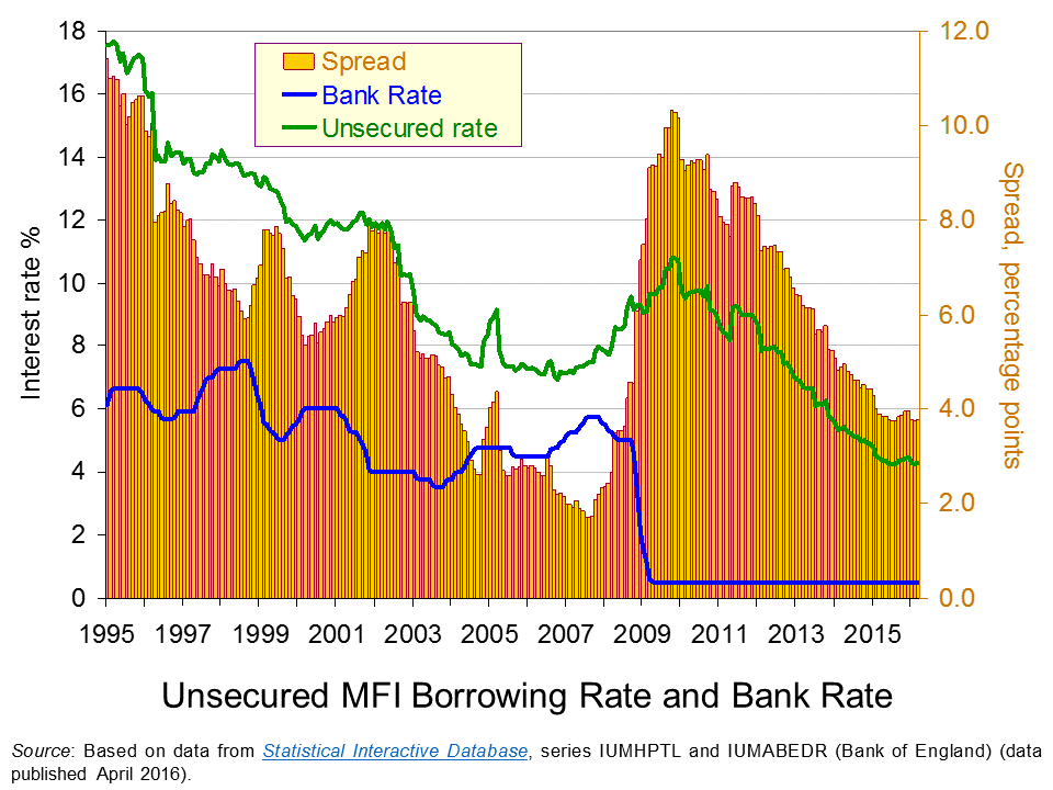
 The chart shows the Bank Rate along with the average unsecured borrowing rate on loans by Monetary Financial Institutions (MFIs) of £10 000. Unlike secured borrowing, which we consider shortly, unsecured borrowing is not secured against property.
As expected, we can see that the unsecured borrowing rate is greater than the Bank Rate. In other words, there is a positive interest-rate differential. However, this differential is seen to vary. It falls sharply in the period up to the financial crisis. In early 2002 it was running at 8 percentage points. By summer 2007 the differential had fallen to only 1.7 percentage points. (Click here to download a PowerPoint of the chart.)
The period from 2002 to 2007 was characterised by consistently robust growth with the UK economy growing by about 2.7 per cent per annum over this period. This may point to economic growth can contributing to an easing of credit conditions as implied by the financial accelerator.
The story from 2008 changes very quickly as the interest-rate differential increases very sharply. In 2009, as the official Bank Rate was cut to 0.5 per cent, the unsecured borrowing rate climbed to close to 10.5 per cent. Consequently, the interest-rate differential rose to 10 percentage points. Inter-bank lending had dried up with banks concerned that banks would default on loans. The increase in interest rates on lending to the non-bank private sector was stark and evidence of a credit market disruption.
The interest-rate differential for unsecured borrowing has steadily declined since its peak at the end of 2009 as the unsecured borrowing rate has fallen. This implies that credit conditions have eased. In March 2016 our interest-rate differential for unsecured borrowing stood at 3.8 percentage points, not dissimilar to levels over the past 12 months. Interestingly, today’s differential on unsecured borrowing is lower than the 6.5 percentage point average over the period from 1997 to 2003, before the differential then went on its pre-crisis fall.
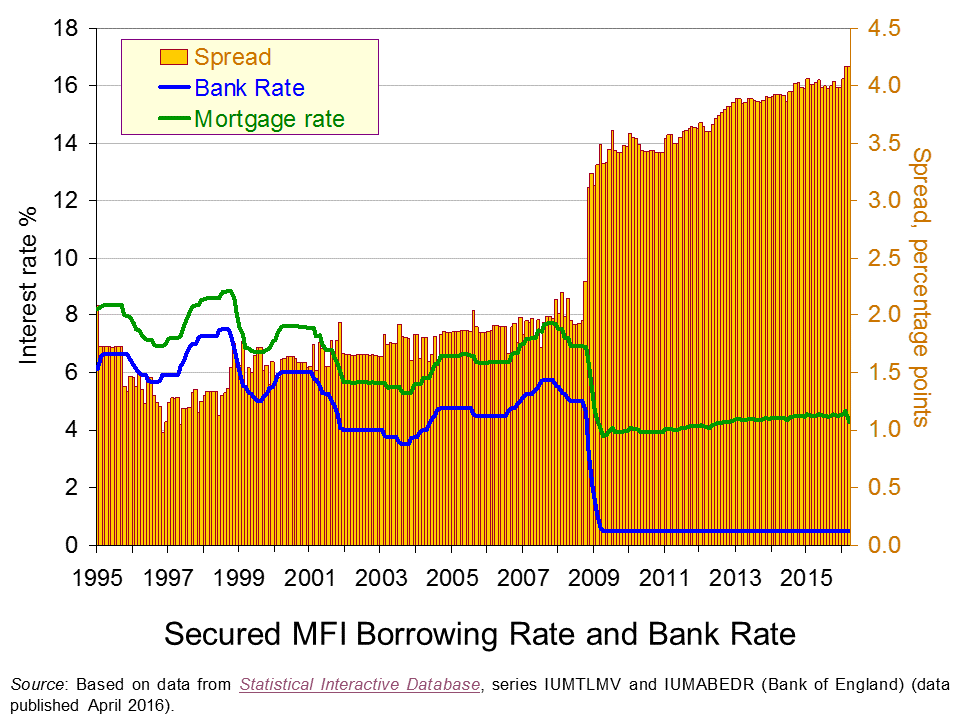
 Our second chart repeats the analysis but this time for mortgages. The representative mortgage rate is the average standard variable mortgage rate.
Unlike that for unsecured borrowing, the interest-rate differential for mortgages is fairly constant up to the financial crisis. The widely report credit easing in the mortgage market appears to have operated more through amounts lent rather than through price, as evidenced by rising mortgage advance-to-income ratios. (Click here to download a PowerPoint of the chart.)
The second chart shows clear evidence of a credit market disruption from 2009. Hence, the markets for secured and unsecured lending saw credit conditions tighten with interest-rate differentials rising markedly. However, it shows that the higher interest-rate differential for secured lending following the credit market disruption remains. So while the differential has fallen sharply for unsecured lending the situation is quite different in the mortgage market. In fact, February and March 2016 saw the mortgage rate spread at 4.17 percentage points which is an historic high.

Our interest rate data show that interest-rate differentials can vary significantly over time. This is important to understand when we are thinking about the relationships between the macroeconomy and the financial system. Significantly, the data suggest that interest rates on different financial instruments can behave differently such that differences emerge in the patterns of spreads over the official Bank Rate.
The evidence on UK mortgage rates suggests that the market remains affected by the financial crisis and the credit market disruption that arose. Although the level of mortgage rates is historically low – which tends to capture many of the headlines – this masks an historically high premium over the official Bank Rate.
Articles
Bank warns EU vote may hit growth as it holds rates BBC News, (14/4/16)
Carney issues a warning as interest rates are held Belfast Telegraph, (15/4/16)
Bank Of England Leaves Interest Rates On Hold Sky News, (14/4/16)
UK banks plan to boost lending to households but not firms – BoE Reuters, (13/4/16)
Mortgage rates reach record lows as threat of Bank Rate rise evaporates Telegraph, Tara Evans (1/4/16)
Data
Bankstats (Monetary and Financial Statistics) – Latest Tables Bank of England
Statistical Interactive Database – interest and exchange rates data Bank of England
Questions
- Why would we expect banks’ borrowing rates to be higher than the official Bank Rate?
- How might banks’ credit criteria change as the macroeconomic environment changes? Explain your answer.
- As well as the macroeconomic environment, what other factors might lead to a change in the interest-rate differential between banks’ borrowing rates and the official Bank Rate?
- How would we expect a credit market disruption to affect the interest-rate differential?
- Explain how the financial accelerator affects the change in the size of the economy following a positive demand shock.
- Explain how the financial accelerator affects the change in the size of the economy following a negative demand shock.
- What is the impact of the financial accelerator of the amplitude of the business cycle?
- How might regulators intervene to minimise the effect of the financial accelerator?
- Why might explain the high interest-rate differential on mortgages that continues to persist following the financial crisis?
- Analyse the ways in which the financial system can stabilise or destabilise economies.
 Project Syndicate is an organisation which produces articles on a range of economic, political and social topics written by eminent scholars, political and business leaders, policymakers and civic activists. It then makes these available to news media in more than 150 countries. Here we look at four such articles which assess the outlook for the European and global economies and even that of capitalism itself.
The general tone is one of pessimism. Despite unconventional monetary policies, such as quantitative easing (QE) and negative nominal interest rates, the global recovery is anaemic. As the Nouriel Roubini articles states:
Unconventional monetary policies – entrenched now for almost a decade – have themselves become conventional. And, in view of persistent lacklustre growth and deflation risk in most advanced economies, monetary policymakers will have to continue their lonely fight with a new set of ‘unconventional unconventional’ monetary policies.
Perhaps this will involve supplying additional money directly to consumers and/or business in a so-called ‘helicopter drop’ of money. Perhaps it will be supplying money directly to governments to finance infrastructure projects – a policy dubbed ‘people’s quantitative easing‘. Perhaps it will involve taxing the holding of cash by banks to encourage them to lend.
 The Hans-Werner Sinn article looks at some of the consequences of the huge amount of money created through QE and continuing to be created in the eurozone. Although it has not boosted consumption and investment nearly as much as desired, it has caused bubbles in various asset markets. For example, the property market has soared in many countries:
Property markets in Austria, Germany, and Luxembourg have practically exploded throughout the crisis, as a result of banks chasing borrowers with offers of loans at near-zero interest rates, regardless of their creditworthiness.
The German property boom could be reined in with an appropriate jump in interest rates. But, given the ECB’s apparent determination to head in the opposite direction, the bubble will only grow. If it bursts, the effects could be dire for the euro.
The Jean Pisani-Ferry article widens the analysis of the eurozone’s problems. Like Roubini, he considers the possibility of a helicopter drop of money, which “would be functionally equivalent to a direct government transfer to households, financed by central banks’ permanent issuance of money”.
 Without such drastic measures he sees consumer and business pessimism (see chart) undermining recovery and making the eurozone vulnerable to global shocks, such as further weakening in China. (Click here for a PowerPoint of the chart.)
Finally, Anatole Kaletsky takes a broad historical view. He starts by saying that “All over the world today, there is a sense of the end of an era, a deep foreboding about the disintegration of previously stable societies.” He argues that the era of ‘leaving things to the market’ is coming to an end. This was an era inspired by the monetarist and supply-side revolutions of the 1960s and 1970s that led to the privatisation and deregulation policies of Reagan, Thatcher and other world leaders.
But if the market cannot cope with the complexities of today’s world, neither can governments.
If the world is too complex and unpredictable for either markets or governments to achieve social objectives, then new systems of checks and balances must be designed so that political decision-making can constrain economic incentives and vice versa. If the world is characterized by ambiguity and unpredictability, then the economic theories of the pre-crisis period – rational expectations, efficient markets, and the neutrality of money – must be revised.
… It is obvious that new technology and the integration of billions of additional workers into global markets have created opportunities that should mean greater prosperity in the decades ahead than before the crisis. Yet ‘responsible’ politicians everywhere warn citizens about a ‘new normal’ of stagnant growth. No wonder voters are up in arms.
His solution has much in common with that of Roubini and Pisani-Ferry. “Money could be printed and distributed directly to citizens. Minimum wages could be raised to reduce inequality. Governments could invest much more in infrastructure and innovation at zero cost. Bank regulation could encourage lending, instead of restricting it.”
So will there be a new era of even more unconventional monetary policy and greater regulation that encourages rather than restricts investment? Read the articles and try answering the questions.
Articles
Unconventional Monetary Policy on Stilts Project Syndicate, Nouriel Roubini (1/4/16)
Europe’s Emerging Bubbles Project Syndicate, Hans-Werner Sinn (28/3/16)
Preparing for Europe’s Next Recession Project Syndicate, Jean Pisani-Ferry (31/3/16)
When Things Fall Apart Project Syndicate, Anatole Kaletsky (31/3/16)
Questions
- Explain how a ‘helicopter drop’ of money would work in practice.
- Why has growth in the eurozone been so anaemic since the recession of 2009/10?
- What is the relationship between tightening the regulations about capital and liquidity requirements of banks and bank lending?
- Explain the policies of the different eras identified by Anatole Kaletsky.
- Would it be fair to describe the proposals for more unconventional monetary policies as ‘Keynesian’?
- If quantitative easing was used to finance government infrastructure investment, what would be the effect on the public-sector deficit and debt?
- If the inflation of asset prices is a bubble, what could cause the bubble to burst and what would be the effect on the wider economy?
 What have been, and will be, the monetary and fiscal responses to the Brexit vote in the referendum of 23 June 2016? This question has been addressed in speeches by Mark Carney, Governor of the Bank of England, and by George Osborne, Chancellor the Exchequer. Both recognise that the vote will cause a negative shock to the economy, which will require some stimulus to aggregate demand to avoid a recession, or at least minimise its depth.
 However, since the vote he is now saying that the slowdown would force him to extend the time for reaching a surplus beyond 2019-20 to avoid dampening the economy further. But does this mean he is abandoning his fiscal target and resorting to discretionary expansionary fiscal policy?
 Statement from the Governor of the Bank of England following the EU referendum result Bank of England (24/6/16)
 Uncertainty, the economy and policy – speech by Mark Carney Bank of England (30/6/16)
 Introduction to Financial Stability Report, July 2016 Bank of England (5/7/16)
 Osborne: Life will not be ‘economically rosy’ outside EU BBC News (28/6/16)
 Osborne takes ‘realistic’ view over surplus target BBC News (1/7/16)
 Why has George Osborne abandoned a key economic target? BBC News (1/7/16)