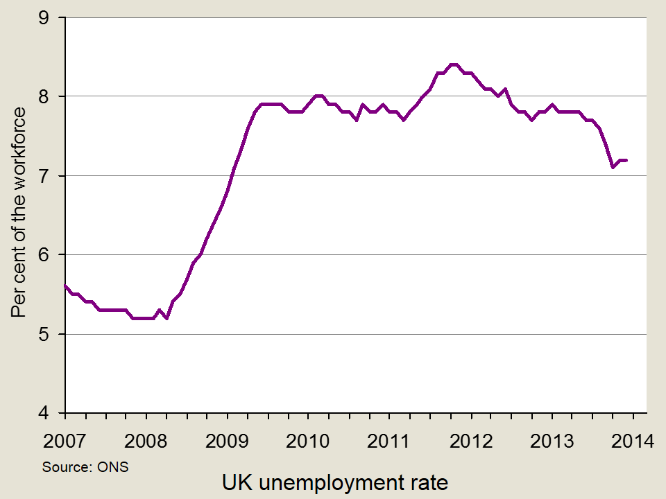
 Unemployment and employment are concepts that are often talked about in the media. Indeed, the 7% unemployment target referred to by the Governor of the Bank of England has been a constant feature of recent headlines. However, rather than targeting an unemployment rate of 7%, George Osborne has now called for ‘full employment’ and believes that tax and welfare changes are key to meeting this objective.
Reducing the unemployment rate is a key macroeconomic objective and the costs of unemployment are well-documented. There are obviously big costs to the individual and his/her family, including lower income, dependency, stress and potential health effects. There are also costs to the government: lower income tax revenues, potentially lower revenues from VAT through reduced consumer expenditure and the possibility of higher benefit payments. There are other more ‘economic’ costs, namely an inefficient use of resources. Unemployment represents a cost to the economy, as we are operating below full capacity and we therefore see a waste of resources. It is for this reason that ‘full employment’ is being targeted.
Traditional economic theory suggests that there is a trade-off between unemployment and inflation, illustrated by the well-known Phillips curve. In the past, governments have been willing to sacrifice unemployment for the purpose of reducing inflation. There have also been attempts to boost the economy and create jobs through increased borrowing. However, George Osborne has said:
Unemployment is never a price worth paying, but artificial jobs paid for with borrowed money doesn’t work either.
A figure representing full employment hasn’t been mentioned, so it remains unclear what level of unemployment would be acceptable, as despite the name ‘full employment’, this doesn’t mean that everyone has a job. There are several definitions of full employment, in both an economic and political context. In the period of reconstruction after the Second World War, William Beveridge, architect of the welfare state, defined full employment as where 3% of people would be unemployed.
In more recent times, other definitions have been given. In the era of monetarism in the 1970s, the term ‘natural rate of unemployment’ was used to define the unemployment rate to which economies tend in the long run – after inflationary expectations have adjusted. Keynesians use the term the ‘non-accelerating-inflation rate of unemployment (NAIRU)’, where unemployment is confined to equilibrium unemployment and where there is no excess or deficiency of aggregate demand. Both the natural rate and the NAIRU relate to the rate of unemployment at which the long-run Phillips curve is vertical.

In its Economic and Fiscal Outlook of March 2013, the Office for Budget Responsibility estimated the UK’s NAIRU to be 5.4%. George Osborne has not specified a particular rate. Rather, his speech refers to creating the ‘highest employment rate of any of the world’s leading economies’. He said the ambition was to make the UK:
…the best place in the world to create a job; to get a job; to keep a job; to be helped to look for another job if you lose one…A modern approach to full employment means backing business. It means cutting the tax on jobs and reforming welfare.
Therefore, while it appears that there is no target figure for unemployment, it seems that a new Conservative objective will be to focus on sustainable job creation and eliminate disequilibrium unemployment. This represents a move very much into Labour territory. Meeting the objective will be no easy task, given the past few years and such high levels of youth unemployment, as Labour were quick to point out, but the unemployment figures are certainly moving in the right direction. The following articles consider the objective of full employment.
Articles
Britain’s Osborne changes tone on economy with “full employment” target Reuters, William James (31/3/14)
George Osborne commits to ‘fight for full employment’ BBC News (including video) (1/4/14)
What does full employment mean? The Guardian (1/4/14)
What is full employment? The Telegraph, Peter Dominiczak (31/3/14)
’Jobs matter’, says George Osborne as he aims for full employment Independent, Andrew Grice (31/3/14)
Liam Bynre: Labour would aim for ‘full employment’ BBC News (17/5/13)
Osborne pledges full employment for UK Sky News (31/3/14)
Osborne commits to full employment as election looms Bloomberg, Svenja O’Donnell (31/3/14)
Whatever happened to full employment? BBC News, Tom de Castella and Caroline McClatchey (13/10/11)
Questions
- What is meant by full employment?
- Is it a good idea to target zero unemployment?
- Using a diagram, illustrate the difference between disequilibrium and equilibrium unemployment?
- How can full employment be achieved?
- What are the costs of unemployment?
- Use a diagram to illustrate the natural rate of unemployment and explain what it means in terms of the relationship between unemployment and inflation.
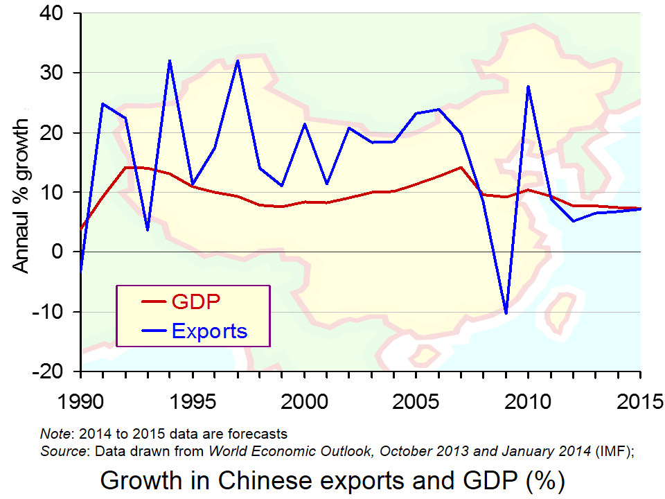
 The growth of China over the past decade has been quite phenomenal, with figures recorded in double-digits. However, in the aftermath of the recession, growth has declined to around 7% – much higher than Western economies are used to, but significantly below the ‘norm’ for China. (Click here for a PowerPoint of the chart.)
The growth target for this year is 7.5%, but there appear to be some concerns about China’s ability to reach this figure and this has been emphasised by a recent Chinese policy.
A mini-stimulus package has been put in place, with the objective of meeting the 7.5% growth target. Government expenditure is a key component of aggregate demand and when other components of AD are lower than expected, boosting ‘G’ can be a solution. However, it’s not something that the Chinese government has had to do in recent years and the fact that this stimulus package has been put in place has brought doubts over China’s economic performance to the forefront , but has confirmed its commitment to growth. Mizuho economist, Shen Jianguang, said:
It’s very obvious that the leaders feel the need to stabilise growth…Overall, the 7.5 per cent growth target means that the government still cares a lot about economic growth.
Data suggest that growth in China is relatively weak and there are concerns that the growth target will be missed, hence the stimulus package. In the aftermath of the 2008 financial crisis, there was a large stimulus package in place in China. This latest investment by the government is in no way comparable to the size of the 2008 package, but instead will be on a smaller and more specific scale. Mark Williams of Capital Economics said:
It’s a bit of a rerun of what we saw last year – something less than a stimulus package and more of piecemeal measures to ensure they reach their growth target.
It is the construction of public housing and railways that will be the main areas of investment this time round. A sum of $120–180bn per year will be available for railway construction and $161bn for social housing, and tax breaks are being extended for small businesses.
The 2008 stimulus package saw debt increase to some 200% of GDP, which did cause growing concerns about the reliance on debt. However, this latest package will be financed through the issue of bonds, which is much more similar to how market economies finance spending.
The fact that the government has had to intervene with such a stimulus package is, however, causing growing concerns about the level of debt and the future of this fast growing economy, though the new method of financing is certainly seen as progress.

It should be noted that a decline in growth for China is not only concerning for China itself, but is also likely to have adverse consequences other countries. In the increasingly interdependent world that we live in, Western countries rely on foreign consumers purchasing their exports, and in recent years it has been Chinese consumers that have been a key component of demand. However, a decline in growth may also create some benefits – resources may not be used up as quickly and prices of raw materials and oil in particular may remain lower.
It is certainly too early for alarm bells, but the future of China’s growth is less certain than it was a decade ago. The following articles consider this issue.
China’s new mini-stimulus offers signs of worry and progress BBC News, Linda Yueh (3/4/14)
China puts railways and houses at hear of new stimulus measures The Guardian (3/4/14)
China unveils mini stimulus to to boost slowing economy The Telegraph (3/4/14)
China stimulus puts new focus on growth target Wall Street Journal, Bob Davis and Michael Arnold (3/4/14)
China embarks on ‘mini’ stimulus programme to kick-start economy Independent, Russell Lynch (3/4/14)
China takes first step to steady economic growth Reuters (2/4/14)
China unveils fresh stimulus The Autstralian (3/4/14)
China’s reformers can triumph again, if they follow the right route The Guardian, Joseph Stiglitz (2/4/14)
Questions
- How has Chinese growth reached double-digits? Which factors are responsible for such high growth?
- The BBC News article suggests that the stimulus package is cause for concerns but also shows progress. How can it do both?
- Using a diagram, illustrate how a stimulus package can boost economic growth.
- What are the advantages and disadvantages of high rates of growth for (a) China and (b) Western economies?
- Why does the method of financing growth matter?
- Railway and housing construction have been targeted to receive additional finance. Why do you think these sectors have been targeted?
 GDP figures are often a poor measure of a country’s economic well-being. By focusing on production, they may not capture the contribution of a range of social and environmental factors to people’s living standards, including the various negative and positive externalities from production and consumption themselves. A case in point is internet innovation: an issue considered in the first linked article below by the eminent economist, Joseph Stiglitz.
The effects of innovations that directly lead to an increase in output are relatively easy to measure. Many innovations, however, may allow those with power to consolidate that power, resulting in less competition and a possible decline in welfare. If, for example, companies such as Amazon, invest in online retailing and gain a first-mover advantage, they may be able to use this power to drive out competitors. In other words, innovations may not simply lower the cost of production and hence prices: they may even lead to an increase in prices.
Then there are innovations, such as faster broadband, that result in higher quality. While higher quality in one sphere may lead to higher output elsewhere, in many cases it is just improving the experience of consumers without being reflected in a way that can be easily measured.
Some innovations may be judged as socially harmful. Thus improved gaming functionality and realism may encourage people to spend more time online. The social and health implications of this may be considered as undesirable and resulting in a reduction in well-being. Of course, many gamers would disagree!
The point is that technological innovations often result in a change in tastes. These changes in tastes may involve negative externalities, themselves very hard to quantify. Consequently,  resulting changes to GDP may be a very poor indicator of changes in social well-being.
The articles below consider some of these issues. The Stiglitz article gives an example of innovation in financial services. Although highly profitable for many working in the sector – at least until the crash of 2008/9 – according to the author, these innovations led to both lower GDP growth and a net contribution to social welfare that was negative.
The benefits of internet innovation are hard to spot in GDP statistics The Guardian, Joseph Stiglitz (10/3/14)
Economist argues for happiness over GDP Yale Daily News, Joyce Guo (19/2/14)
‘GDP: A Brief But Affectionate History’ by Diane Coyle and ‘The Leading Indicators: A Short History of the Numbers That Rule Our World’ by Zachary Karabell Washington Post, Tyler Cowen (21/2/14)
Emerging Markets: Income Returns To Innovation (GDP Per Capita Vs. Innovation Index) Seeking Alphz, Jon Harrison (4/3/14)
Questions
- What does GDP measure?
- What factors affecting the welfare of society are not measured in GDP?
- What alternative indicators are there to GDP as a measure of living standards?
- How would you set about measuring the effects on living standards of a technological revolution, such as the ability to access 4G on the move on laptops and smartphones (e.g. on trains)?
- How should the net benefits of installing more ATMs (cash machines) be calculated?
- Revisit the blog Time to leave GDP behind? and answer question 8.
- Referring to the Jon Harrison article, how would you construct an innovation index? How is innovation related too GDP per capita?
 One of the reasons why it is so hard to forecast economic growth and other macroeconomic indicators is that economies can be affected by economic shocks. Sometimes the effects of shocks are large. The problem with shocks is that, by their very nature, they are unpredictable or hard to predict.
A case in point is the current crisis in Ukraine. First there was the uprising in Kiev, the ousting of President Yanukovich and the formation of a new government. Then there was the seizing of the Crimean parliament by gunmen loyal to Russia. The next day, Saturday March 1, President Putin won parliamentary approval to invade Ukraine and Russian forces took control of the Crimea.
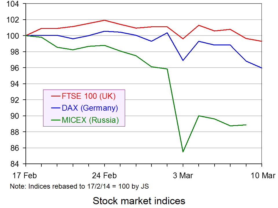
 On Monday 3 March, stock markets fell around the world. The biggest falls were in Russia (see chart). In other stock markets, the size of the falls was directly related to the closeness of trade ties with Russia. The next day, with a degree of calm descending on the Crimea and no imminent invasion by Russia of other eastern parts of Ukraine, stock markets rallied.
What will happen to countries’ economies depends on what happens as the events unfold. There could be a continuing uneasy peace, with the West effectively accepting, despite protests, the Russian control of the Crimea. But what if Russia invades eastern Ukraine and tries to annex it to Russia or promote its being run as a separate country? What if the West reacted strongly by sending in troops? What if the reaction were simply sanctions? That, of course would depend on the nature of those sanctions.
Some of the possibilities could have serious effects on the world economy and especially the Russian economy and the economies of those with strong economic ties to Russia, such as those European countries relying heavily on gas and oil imports from Russia through the pipeline network.
Economists are often criticised for poor forecasts. But when economic shocks can have large effects and when they are hard to predict by anyone, not just economists, then it is hardly surprising that economic forecasts are sometimes highly inaccurate.
What Wall Street is watching in Ukraine crisis USA Today (3/3/14)
Ukraine’s economic shock waves – magnitude uncertain Just Auto, Dave Leggett (7/3/14)
Ukraine: The end of the beginning? The Economist (8/3/14)
Russia will bow to economic pressure over Ukraine, so the EU must impose it The Guardian, Guy Verhofstadt (6/3/14)
Russia paying price for Ukraine crisis CNN Money, Mark Thompson (6/3/14)
Ukraine Crimea: Russia’s economic fears BBC News, Nikolay Petrov (7/3/14)
How Russia’s conflict with Ukraine threatens vital European trade links The Telegraph, Szu Ping Chan (8/3/14)
Will a Russian invasion of Ukraine push the west into an economic war? Channel 4 News, Paul Mason (2/3/14)
Who loses from punishing Russia? BBC News, Robert Peston (4/3/14)
Should Crimea be leased to Russia? BBC News, Robert Peston (7/3/14)
The Ukraine Economic Crisis Counter Punch, Jack Rasmus (7-9/3/14)
UK price rise exposes failure to prepare for food and fuel shocks The Guardian, Phillip Inman (2/3/14)
Questions
- What sanctions could the West realistically impose on Russia?
- How would sanctions against Russia affect (a) the Russian economy and (b) the economies of those applying the sanctions?
- Which industries would be most affected by sanctions against Russia?
- Is Russia likely to bow to economic pressure from the West?
- Should Crimea be leased to Russia?
- Is the behaviour of stock markets a good indication of people’s expectations about the real economy?
- Identify some other economic shocks (positive and negative) and their impact.
- Could the financial crisis of 2007/8 be described as an economic shock? Explain.
 Business performance is always affected by the economy and we can always look at the economic theory to explain why profits rise and fall. Some companies prosper during recession, whereas others decline and the key is to understand the economics behind the data. This blog takes a look at the performance of a variety of companies and asks you to think about the economic theory behind it.
The world of betting has grown significantly and the profits of companies in this market, while certainly linked to economic performance, is also dependent on sport results. Paddy Power has announced pre-tax profits of €141m for 2013, an increase from €139.2m, despite sporting results causing profit performance to fall. On the part of football clubs, Liverpool FC saw a loss emerge for the 2012-2013 financial year, whereas Newcastle’s profits rose by 900% to £9.9m. What factors can explain the vastly different performance (off and on the pitch) of these two clubs?
In the USA, Radio Shack has been forced to close 1100 stores. This is, in part, as a response to a change in the way we are shopping. More and more consumers are purchasing goods online and Radio Shack is therefore experiencing growing competition from online retailers. Sales fell by 10% last year and even during the fourth quarter sales continued to decline.
Companies based in the largest economy in Europe have also experienced declines in performance, showing that a strong performing country doesn’t imply the same for companies operating in it. RWE, Germany’s biggest energy provider, has not made a loss since 1949. However, in 2013, this company posted its first annual loss in over 60 years: a loss of £2.28bn. With energy being in constant demand and criticism being levelled at UK energy providers for the high profits they’re making, the economics behind these data is important.
In better news for a company, Thorntons has boasted a significant increase in pre-tax profits, with much of this due to strong trading in the months leading up to Christmas and a sensible business strategy, involving selling more in supermarkets. Thorntons has cut its number of stores, but its profitable position has been saved by a good business strategy and this is going to lead to significant investment by the company.
Another strong performance was recorded by Berkshire Hathaway, an investment firm run by Warren Buffett. The company made a profit of £11.6bn in 2013, a significant increase on its 2012 performance. It is the insurance, rail and energy parts of the business that have contributed to the big increase in profits.
These are just some recent examples of data on business performance and your job is to think about the economic theory that can be used to explain the varying performance of different companies.
Liverpool announce annual loss of £50m in new club accounts Guardian, David Conn (4/3/14)
Thorntons makes biggest manufacturing investment for 25 years Telegraph, Natalie Thomas (3/3/14)
Thorntons cashes in on the snowman Independent, Simon Neville (3/3/14)
Warren Buffett’s Berkshire Hathaway sees record profit BBC News (2/3/14)
Newcastle says ‘player trading’ helped increase profits to £9.9m BBC Sport (25/2/14)
RWE posts first annual net loss for over 60 years BBC News (4/3/14)
UK among RWE woes as it posts first annual loss since 1949 The Telegraph, Denise Roland (4/3/14)
Germany’s RWE slides into €2.8bn net loss for 2013 Financial Times, Jeevan Vasagar (4/3/14)
John Menzies profits hit by drop in magazine sales BBC News (4/3/14)
Fresnillo profits drop as gold prices and production falls The Telegraph, Olivia Goldhill (4/3/14)
Glencore 2013 profit rises 20% as copper production gains Bloomberg, Jesse Riseborough (4/3/14)
Questions
- In each of the cases above, explain the economic theory that can be used to explain the performance of the respective company.
- To what extent is a change in the market structure of an industry a contributing factor to the change in company performance?
- To what extent do you think a company’s performance is dependent on the performance of the economy in which it operates?
- Are the profits of a company a good measure of success? What else could be used?
 Unemployment and employment are concepts that are often talked about in the media. Indeed, the 7% unemployment target referred to by the Governor of the Bank of England has been a constant feature of recent headlines. However, rather than targeting an unemployment rate of 7%, George Osborne has now called for ‘full employment’ and believes that tax and welfare changes are key to meeting this objective.