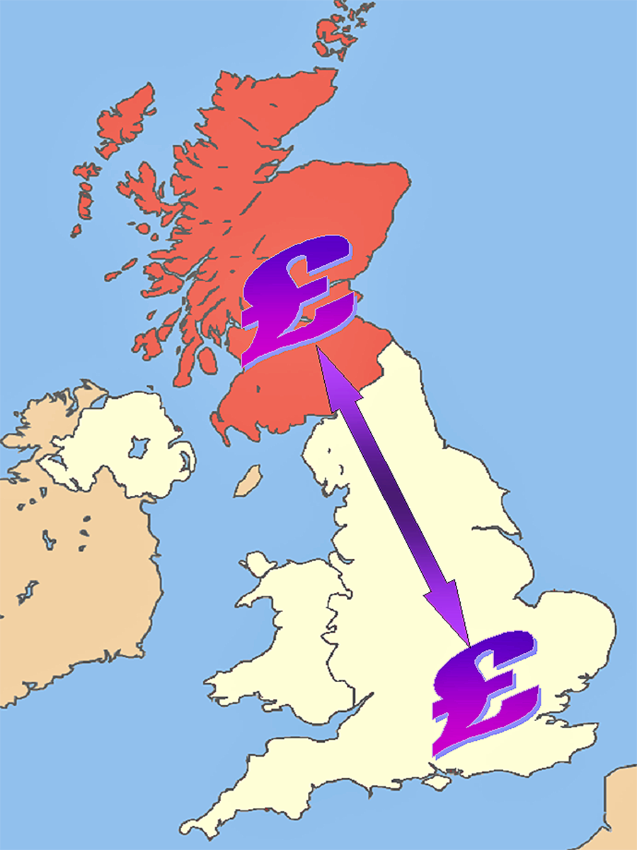
 Scottish voters will be crucial in the upcoming election, with the SNP poised to take many of Labour’s seats north of the border. The future of Scotland will depend on which party comes to power and what decisions are made with regards to its finances.
Nicola Sturgeon wants government spending and taxation powers transferred to the Scottish Parliament, but would this mean spending cuts and tax rises for the Scottish people? Ed Miliband, Labour’s leader has been vocal in pointing out what this might mean, with cuts to pensions or raising taxes. However, given that it is Labour that is facing the biggest threat from the SNP, it is perhaps hardly surprising.
However, as the first video below shows, there would be an estimated £7.6bn deficit in Scotland, according to the IFS if spending and taxing was to be transferred here. This is because the tax revenues raised in Scotland are lower per person and spending per person is higher than across the whole of the UK. Oil prices are extremely low at present and hence this is reducing tax revenues. When the oil price does rise, revenues will increase and so if the split in finances was to occur this would reduce that deficit somewhat, but it would still leave a rather large hole in Scotland’s finances. The following videos and articles consider the SNP’s plans.
Videos
 SNP fiscal autonomy plan: What would it do to Scotland’s finances? BBC News, Robert Peston (10/4/15)
 Labour attacks SNP’s ‘devastating’ economic plans BBC News (10/4/15)
Articles
Ed Miliband attacks SNP plan for Scottish fiscal autonomy The Guardian, Severin Carrell (10/4/15)
Ed Miliband wars pensions will be cut under SNP plans The Telegraph, Auslan Cramb (10/4/15)
SNP fails to account for billions in welfare and pensions pledge, says IFS The Guardian, Severin Carrell (10/4/15)
Questions
- What is a budget deficit?
- What does fiscal autonomy for Scotland actually mean?
- The IFS suggests that there will be a large deficit in Scottish finances if they gain autonomy. How could this gap be reduced?
- Why has Labour claimed that tax rises would occur under the SNP’s plans? What could this mean for Scottish growth?
- Why do lower oil prices reduce tax revenues for Scotland?
- If Scotland had control over its finances, it could influence where government spending goes. Which industries would you invest in if you were in charge?
 Ever been to the cinema and found it almost empty? And then wondered why you paid the full price? Perhaps you’ve taken advantage of Orange Wednesday or only go if there’s a particularly good film on? Often it might be cheaper to wait until the film is out on DVD!
Going to the cinema can be an expensive outing. The ticket, the popcorm, a drink, ice cream – it all adds up! Orange Wednesday has recently disappeared and this will definitely have an impact on consumption of movies at your local Odeon, Vue or Showcase. The impact will be on how many seats are left empty.
However, a new app could be set to generate revenues for the cinema and provide cheaper entertainment for your everyday consumer. This new app will allow cinemas to send out alerts to people in the local area advising them that a screening will have many empty seats. What’s the incentive? Perhaps a discount, or some food. But, why would they do such a thing?
If a movie is being shown at a cinema, there will be a large fixed cost. However, what happens as each additional consumer enters the theatre? Does the cost to the cinema rise? Perhaps there is a small cost with more cleaning required, but the additional cost of actually showing the film if there 11 rather than 10 people is almost (if not equal to) zero. That is, the marginal cost of an extra user is zero. Therefore, if there is a screening with many empty seats, wouldn’t the cinema be better to offer the seats for half price. After all, if you can earn £5 from selling a ticket and the additional cost is almost zero, then it’s better to sell it for £5 than not sell it for £10! The following article and video from BBC News considers this new app and other strategies to maximise cinema usage!
 Apps in pockets, bums on cinema seats BBC News, Dave Lee (27/2/15)
Questions
- What would the budget constraint look like for a cinema where a discount was offered if you purchased two cinema tickets and then received the third ticket for half price?
- Why is the marginal cost of an extra user at the cinema almost zero?
- If the MC = 0, does this mean that a cinema is a public good?
- How will this new app allow a cinema to increase total revenue and profit?
- If it is cheaper to buy a DVD rather than go to a cinema, why do people still go to the cinema?
 In the UK, we take it for granted that if you need to see a doctor, you go and give little, if any thought, to the cost. It may be petrol costs, time off work or the cost of a prescription, but beyond that, receiving treatment is free at the point of use. Funded through a progressive tax system, the NHS is seen as being one of the more equitable health care systems.
When a mother gives birth, the main thing she will have to worry about is the labour – and not whether to have certain painkillers or stay an extra night, because of the cost.
The International Federation of Health Plans (IFHP) looked at data on the cost of giving birth, based on insurance company payments. For someone living in the UK, the figures make for quite astonishing reading. In the USA, a normal delivery will cost $10,000, while a caesarean totals $15,000, meaning that giving birth in the USA is the most expensive place in the world. The article linked below takes the case of Mari Roberts, whose total delivery bill came to over $100,000. The insurance did cover it, but that’s not always the case. Medical bills in the United States are one of the leading reasons for bankruptcy and with these types of figures, perhaps it’s hardly surprising.
Other countries also see high costs for delivery, where expectant mothers really do need to give consideration to the length of their stay in hospital and perhaps even whether they are willing to forgo a pain-relieving drug and save some money. There is often said to be an efficiency–equity trade-off in the area of healthcare, with countries offering a free at the point of use service delivering an equitable system, but with a lack of responsiveness to the demands of the patients. In the UK, you don’t pay to see a doctor but, with a ‘free’ service, demand is understandably very high, thus creating a shortage and waiting lists. In countries, such as the USA, a higher price for treatment does limit demand, creating more inequity but a responsive system.
There are certainly lessons that can be learned from all health care systems and living in a developed country, we should certainly consider ourselves lucky. There are many countries where access to even the most basic health care is a luxury that most cannot afford. So, where does have the best health care system? I’ll leave that to you.
Video and article
 How much do women around the world pay to give birth? BBC News, Mariko Oi (13/2/15)
Report
Research for Universal Health Coverage, World Health Report 2013 World Health Organisation August 2013
Health Systems Financing: The Path to Universal Coverage, World Health Report 2010 World Health Organisation August 2010
Questions
- Using a demand and supply diagram, explain why there may be a trade-off between efficiency and equity.
- If there is over-consumption of a service such as health care, does this suggest that the market fails?
- What are the main market failures that exist in health care?
- Is the concept of opportunity cost relevant to mothers in labour? Think about the country in question.
- How would you go about ranking health care systems if you worked for an organisation such as the OECD or WHO?
- Pick a country whose health care system you are familiar with. What changes have occurred to the way in which health care is organised and financed in this country? How has it affected the key objectives that formed part of your answer to question 5?
 Many important economic changes have occurred over the past two years and many have occurred in the past two months. Almost all economic events create winners and losers and that is no different for the Russian economy and the Russian population.
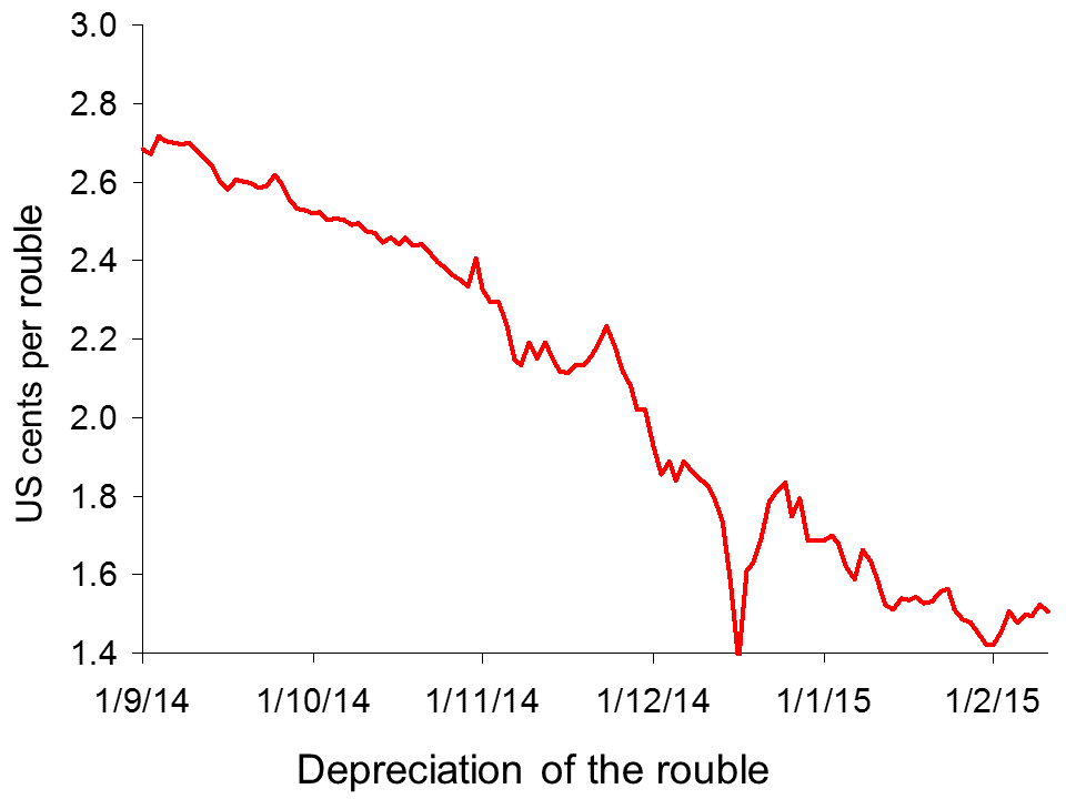
There is an interesting article plus videos on the BBC News website (see link below), which consider some of the economic events that, directly or indirectly, have had an impact on Russia: the fall in oil prices; the conflict between Russia and the Ukraine; the fall in the value of the rouble (see chart); the sanctions imposed by the West.
Clearly there are some very large links between events, but an interesting question concerns the impact they have had on the everyday Russian consumer and business. Economic growth in  Russia has been adversely affected and estimates suggest that the economy will shrink further over the coming year. Oil and gas prices have declined significantly and while this is good news for many consumers across the world, it brings much sadder tidings for an economy, such as Russia, that is so dependent on oil exports.
However, is there a bright side to the sanctions or the falling currency? The BBC News article considers the winners and losers in Russia, including families struggling to feed their families following spending cuts and businesses benefiting from less competition.
 Russia’s economic turmoil: nightmare or opportunity? BBC News, Olga Ivshina and Oleg Bodyrev (5/2/15)
Questions
- Why has the rouble fallen in value? Use a demand and supply diagram to illustrate this.
- What does a cheap rouble mean for exporters and importers within Russia and within countries such as the UK or US?
- One of the businesses described in the article explain how the sanctions have helped. What is the explanation and can the effects be seen as being in the consumer’s interest?
- Oil prices have fallen significantly over the past few months. Why is this so detrimental to Russia?
- What is the link between the exchange rate and inflation?
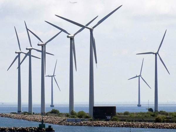
 When an industry produces positive externalities, there is an argument for granting subsidies. To achieve the socially efficient output in an otherwise competitive market, the marginal subsidy should be equal to the marginal externality. This is the main argument for subsidising wind power. It helps in the switch to renewable energy away from fossil fuels. There is also the secondary argument that subsidies help encourage the development of technologies that would be too uncertain to fund at market rates.
If subsidies are to be granted, it is important that they are carefully designed. Not only does their rate need to reflect the size of the positive externalities, but also they should not entail any perverse incentive effects. But this is the claim about subsidies given to wind turbines: that they create an undesirable side effect.
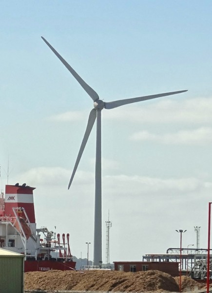
Small-scale operators are encouraged to build small turbines by offering them a higher subsidy per kilowatt generated (through higher ‘feed-in’ tariffs). But according to a report by the Institute for Public Policy Research (IPPR), this is encouraging builders and operators of large turbines to ‘derate’ them. This involves operating them below capacity in order to get the higher tariff. As the IPPR overview states:
The scheme is designed to support small-scale providers, but the practice of under-reporting or ‘derating’ turbines’ generating capacity to earn a higher subsidy is costing the taxpayer dearly and undermining the competitiveness of Britain’s clean energy sector.
The loophole sees developers installing ‘derated’ turbines – that is, turbines which are ‘capped’ so that they generate less energy. Turbines are derated in this way so that developers and investors are able to qualify for the more generous subsidy offered to lower-capacity turbines, generating 100–500kW.  By installing derated turbines, developers are making larger profits off a feature of the scheme that was designed to support small-scale projects. Currently, the rating of a turbine is declared by the manufacturer and installer, resulting in a lack of external scrutiny of the system.
The subsidies are funded by consumers through higher electricity prices. As much as £400 million could be paid in excess subsidies. The lack of scrutiny means that operators could be receiving as much as £100 000 per year per turbine in excess subsidies.
However, as the articles below make clear, the facts are disputed by the wind industry body, RenewableUK. Nevertheless, the report is likely to stimulate debate and hopefully a closing of the loophole.
Video
 Turbine power: the cost of wind power to taxpayers Channel 4 News, Tom Clarke (10/2/15)
Articles
Wind subsidy loophole boosts spread of bigger turbines Financial Times, Pilita Clark (10/2/15)
Call to Close Wind Power ‘Loophole’ Herald Scotland, Emily Beament (10/2/15)
Wind farm developers hit back at ‘excessive subsidy’ claims Business Green, Will Nichols (10/2/15)
The £400million feed-in frenzy: Green energy firms accused of making wind turbines LESS efficient so they appear weak enough to win small business fund Mail Online, Ben Spencer (10/2/15)
Wind power subsidy ‘loophole’ identified by new report Engineering Technology Magazine, Jonathan Wilson (11/2/15)
Report
Feed-in Frenzy Institute for Public Policy Research, Joss Garman and Charles Ogilvie (February 2015)
Questions
- Draw a diagram to demonstrate the optimum marginal rate of a subsidy and the effect of the subsidy on output.
- Who should pay for subsidies: consumers, the government (i.e. taxpayers generally), electricity companies through taxes on profits made from electricity generation using fossil fuels, some other source? Explain your thinking.
- What is the argument for giving a higher subsidy to operators of small wind turbines?
- If wind power is to be subsidised, is it better to subsidise each unit of output of electricity, or the construction of wind turbines or both? Explain.
- What could Ofgem do (or the government require Ofgem to do) to improve the regulation of the wind turbine industry?
 Scottish voters will be crucial in the upcoming election, with the SNP poised to take many of Labour’s seats north of the border. The future of Scotland will depend on which party comes to power and what decisions are made with regards to its finances.
 SNP fiscal autonomy plan: What would it do to Scotland’s finances? BBC News, Robert Peston (10/4/15)
 Labour attacks SNP’s ‘devastating’ economic plans BBC News (10/4/15)
