 Economists are often criticised for making inaccurate forecasts and for making false assumptions. Their analysis is frequently dismissed by politicians when it contradicts their own views.
But is this fair? Have economists responded to the realities of the global economy and to the behaviour of people, firms, institutions and government as they respond to economic circumstances? The answer is a qualified yes.
Behavioural economics is increasingly challenging the simple assumption that people are ‘rational’, in the sense that they maximise their self interest by weighing up the marginal costs and benefits of alternatives open to them. And macroeconomic models are evolving to take account of a range of drivers of global growth and the business cycle.
 The linked article and podcast below look at the views of 2019 Nobel Prize-winning economist Esther Duflo. She has challenged some of the traditional assumptions of economics about the nature of rationality and what motivates people. But her work is still very much in the tradition of economists. She examines evidence and sees how people respond to incentives and then derives policy implications from the analysis.
Take the case of the mobility of labour. She examines why people who lose their jobs may not always move to a new one if it’s in a different town. Partly this is for financial reasons – moving is costly and housing may be more expensive where the new job is located. Partly, however, it is for reasons of identity. Many people are attached to where they currently live. They may be reluctant to leave family and friends and familiar surroundings and hope that a new job will turn up – even if it means a cut in wages. This is not irrational; it just means that people are driven by more than simply wages.
Duflo is doing what economists typically do – examining behaviour in the light of evidence. In her case, she is revisiting the concept of rationality to take account of evidence on what motivates people and the way they behave.
 In the light of workers’ motivation, she considers the implications for the gains from trade. Is free trade policy necessarily desirable if people lose their jobs because of cheap imports from China and other developing countries where labour costs are low?
The answer is not a clear yes or no, as import-competing industries are only part of the story. If protectionist policies are pursued, other countries may retaliate with protectionist policies themselves. In such cases, people working in the export sector may lose their jobs.
She also looks at how people may respond to a rise or cut in tax rates. Again the answer is not clear cut and an examination of empirical evidence is necessary to devise appropriate policy. Not only is there an income and substitution effect from tax changes, but people are motivated to work by factors other than take-home pay. Likewise, firms are encouraged to invest by factors other than the simple post-tax profitability of investment.
Podcast
Article
Questions
- In traditional ‘neoclassical’ economics, what is meant by ‘rationality’ in terms of (a) consumer behaviour; (b) producer behaviour?
- How might the concept of rationality be expanded to take into account a whole range of factors other than the direct costs and benefits of a decision?
- What is meant by bounded rationality?
- What would be the effect on workers’ willingness to work more or fewer hours as a result of a cut in the marginal income tax rate if (a) the income effect was greater than the substitution effect; (b) the substitution effect was greater than the income effect? Would your answers to (a) and (b) be the opposite in the case of a rise in the marginal income tax rate?
- Give some arguments that you consider to be legitimate for imposing controls on imports in (a) the short run; (b) the long run. How might you counter these arguments from a free-trade perspective?
 The USA has seen many horizontal mergers in recent years. This has turned industries that were once relatively competitive into oligopolies, resulting in lower output and higher prices for consumers.
In Europe, by contrast, many markets are becoming more competitive. The result is that in industries such as mobile phone services, airlines and broadband provision, prices are considerably lower in most European countries than in the USA. As the French economist, Thomas Philippon, states in a Guardian article:
When I landed in Boston in 1999, the United States was the land of free markets. Many goods and services were cheaper than in Europe. Twenty years later, American free markets are becoming a myth.
According to Asher Schechter (see linked article below):
Nearly every American industry has experienced an increase in concentration in the last two decades, to the point where … sectors dominated by two or three firms are not the exception, but the rule.
The result has been an increase in deadweight loss, which, according to research by Bruno Pelligrino, now amounts to some 13.3 per cent of total potential surplus.
Philippon in his research estimates that monopolies and oligopolies “cost the median American household about $300 a month” and  deprive “American workers of about $1.25tn of labour income every year”.
One industry considered by the final two linked articles below is housebuilding. Since the US housing and financial crash of 2007–8 many US housebuilders have gone out of business. This has meant that the surviving companies have greater market power. According to Andrew van Dam in the linked Washington Post article below:
They have since built on that advantage, consolidating until many markets are controlled by just a few builders. Their power has exacerbated the country’s affordable-housing crisis, some economists say.
According to research by Luis Quintero and Jacob Cosman:
… this dwindling competition has cost the country approximately 150 000 additional homes a year – all else being equal. With fewer competitors, builders are under less pressure to beat out rival projects, and can time their efforts so that they produce fewer homes while charging higher prices.
Thanks to lobbying of regulators and politicians by businesses and various unfair, but just about legal, practices to exclude rivals, competition policy in the USA has been weak.
In the EU, by contrast, the competition authorities have been more active and tougher. For example, in the airline industry, EU regulators have “encouraged the entry of low-cost competitors by making sure they could get access to takeoff and landing slots.” Politicians from individual EU countries have generally favoured tough EU-wide competition policy to prevent companies from other member states getting an unfair advantage over their own country’s companies.
Articles
Questions
- What are the possible advantages and disadvantages of oligopoly compared with markets with many competitors?
- How can concentration in an industry be measured?
- Why have US markets become more concentrated?
- Why have markets in the EU generally become more competitive?
- Find out what has happened to levels of concentration in the UK housebuilding market.
- What are the possible effects of Brexit on concentration and competition policy in the UK?
 The latest UK house price index reveals that annual house price growth in the UK slowed to just 1.2 per cent in May. This is the lowest rate of growth since January 2013. This is being driven, in part, by the London market where annual house price inflation rates have now been negative for 15 consecutive months. In May the annual rate of house price inflation in London fell to -4.4 per cent, it lowest since August 2009 as the financial crisis was unfolding. However, closer inspection of the figures show that while many other parts of the country continue to experience positive rates of annual house price inflation, once general inflation is accounted for, there is widespread evidence of widespread real house price deflation.
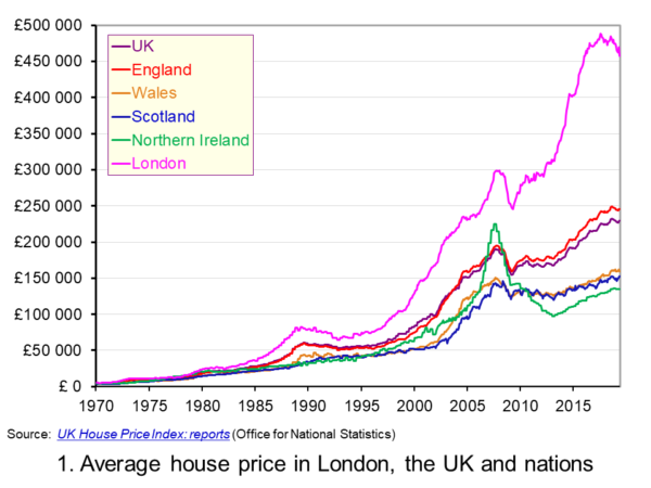 The average UK house price in May 2019 was £229,000. As Chart 1 shows, this masks considerable differences across the UK. In England the average price was £246,000 (an annual increase of 1.0 per cent), in Scotland it was £153,000 (an increase of 2.8 per cent), in Wales £159,000 (an increase of 3.0 per cent) and in Northern Ireland it was £137,000 (an increase of 2.1 per cent). (Click here to download a PowerPoint copy of the chart.)
The London market distorts considerably the English house price figures. In London the average house price in May 2019 was £457,000 (an annual decrease of 4.4 per cent). House prices were lowest in the North East region of England at £128,000. The North East was the only other English region alongside London to witness a negative rate of annual house price inflation, with house prices falling in the year to May 2019 by 0.7 per cent.
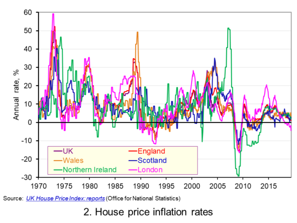 Chart 2 allows us to see more readily the rates of house price growth. It plots the annual rates of house price inflation across London, the UK and its nations. What is readily apparent is the volatility of house price growth. This is evidence of frequent imbalances between the flows of property on to the market to sell (instructions to sell) and the number of people looking to buy (instructions to buy). An increase in instructions to buy relative to those to sell puts upwards pressure on prices whereas an increase in the relative number of instructions to sell puts downward pressure on prices. (Click here to download a PowerPoint copy of the chart.)
Despite the volatility in house prices, the longer-term trend in house prices is positive. The average annual rate of growth in house prices between January 1970 and May 2019 in the UK is 9.1 per cent. For England the figure is 9.4 per cent, for Wales 8.8 per cent, for Scotland 8.5 per cent and for Northern Ireland 8.3 per cent. In London the average rate of growth is 10.4 per cent per annum.
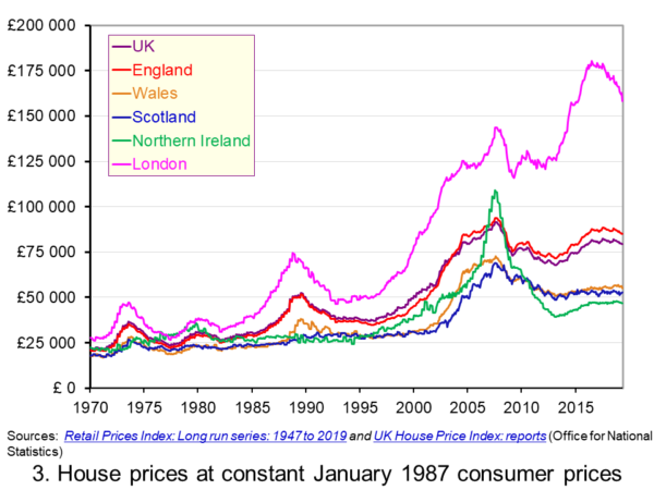 As Chart 3 illustrates, the longer-term growth in actual house prices cannot be fully explained by the growth in consumer prices. It shows house price values as if consumer prices, as measured by the Retail Prices Index (RPI), were fixed at their January 1987 levels. We see real increases in house prices or, expressed differently, in house prices relative to consumer prices. In real terms, UK house prices were 3.6 times higher in May 2019 compared to January 1970. For England the figure is 4.1 times, for Wales 3.1 times, for Scotland 2.9 times and for Northern Ireland 2.1 times. In London inflation-adjusted house prices were 5.7 times higher. (Click here to download a PowerPoint copy of the chart.)
The volatility in house prices continues to be evident when adjusted for changes in consumer prices. The UK’s annual rate of real house price inflation was as high as 40 per in January 1973, yet, on the other hand, in June 1975 inflation-adjusted house prices were 16 per cent lower than a year earlier. Over the period from January 1970 to May 2019, the average annual rate of real house price inflation was 3.2 per cent. Hence house prices have, on average, grown at an annual rate of consumer price inflation plus 3.2 per cent.
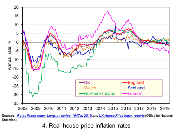 Chart 4 shows annual rates of real house price inflation since 2008 and, hence, from around the time the financial crisis began to unfold. The period is characterised by acute volatility and with real house prices across the UK falling at an annual rate of 16 per cent in 2009 and by as much 29 per cent in Northern Ireland. (Click here to download a PowerPoint copy of the chart.)
The UK saw a rebound in nominal and real house price growth in the period from 2013, driven by a strong surge in prices in London and the South East, and supported by government initiatives such as Help to Buy designed to help people afford to buy property. But house price growth then began to ease from early/mid 2016. Some of the easing may be partly due to any excessive fizz ebbing from the market, especially in London, and the impact on the demand for buy-to-let investments resulting from reductions in tax relief on interest payments on buy-to-let mortgages.
However, the housing market is notoriously sensitive to uncertainty, which is not surprising when you think of the size of the investment people are making when they enter the market. The uncertainty surrounding Brexit and the UK’s future trading relationships will have been a drag on demand and hence on house prices.
Chart 4 shows that by May 2019 all the UK nations were experiencing negative rates of real house price inflation, despite still experiencing positive rates of nominal house price inflation. In Wales the real annual house price inflation rate was -0.1 per cent, in Scotland -0.2 per cent, in Northern Ireland -0.9 per cent and in England -2.0 per cent. Meanwhile in London, where annual house price deflation has been evident for 15 consecutive months, real house prices in May 2019 were falling at an annual rate of 7.2 per cent.
Going forward the OBR’s Fiscal Risks Report predicts that, in the event of a no-deal, no-transition exit of the UK from the European Union, nominal UK house prices would fall by almost 10 per cent between the start of 2019 and mid-2021. This forecast is driven by the assumption that the UK would enter a year-long recession from the final quarter of 2019. It argues that property transactions and prices ‘move disproportionately’ during recessions. (See John’s blog The costs of a no-deal Brexit for a fuller discussion of the economics of a no-deal Brexit). The danger therefore is that the housing market becomes characterised by both nominal and real house price falls.
Articles
Questions
- Explain the difference between a rise in the rate of house price inflation a rise in the level of house prices.
- Explain the difference between nominal and real house prices.
- If nominal house prices rise can real house price fall? Explain your answer.
- What do you understand by the terms instructions to buy and instructions to sell?
- What factors are likely to affect the levels of instructions to buy and instructions to sell?
- How does the balance between instructions to buy and instructions to sell affect house prices?
- How can we differentiate between different housing markets? Illustrate your answer with examples.
 The latest UK house price index continues to show an easing in the rate of house price inflation. In the year to January 2019 the average UK house price rose by 1.7 per cent, the lowest rate since June 2013 when it was 1.5 per cent. This is significantly below the recent peak in house price inflation when in May 2016 house prices were growing at 8.2 per cent year-on-year. In this blog we consider how recent patterns in UK house prices compare with those over the past 50 years and also how the growth of house prices compares to that in consumer prices.
The UK and its nations
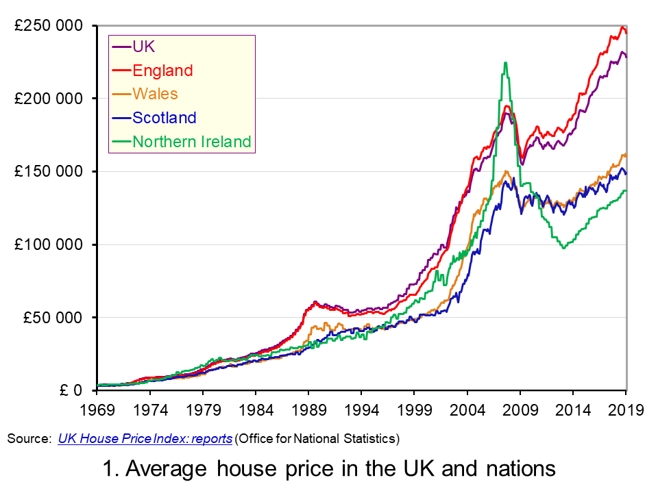 The average UK house price in January 2019 was £228,000. As Chart 1 shows, this masks considerable differences across the UK. In England the average price was £245,000 (an annual increase of 1.5 per cent), while in Scotland it was £149,000 (an increase of 1.3 per cent), Wales £160,000 (an increase of 4.6 per cent) and £137,000 in Northern Ireland (an increase of 5.5 per cent). (Click here to download a PowerPoint copy of the chart.)
Within England there too are considerable differences in house prices, with London massively distorting the English average. In January 2019 the average house price in inner London was recorded at £568,000, a fall of 1.9 per cent on January 2018. In Outer London the average price was £426,000, a fall of 0.2 per cent. Across London as a whole the average price was £472,000, a fall of 1.6 per cent. House prices were lowest in the North East at £125,000, having experienced an annual increase of 0.9 per cent.
The Midlands can be used as a reference point for English house prices outside of the capital. In January 2019 the average house price in the West Midlands was £195,000 while in the East Midlands it was £193,000. While the annual rate of house price inflation in London is now negative, the annual rate of increase in the Midlands was the highest in England. In the West Midlands the annual increase was 4 per cent while in the East Midlands it was 4.4 per cent. These rates of increase are currently on par with those across Wales.
Long-term UK house price trends
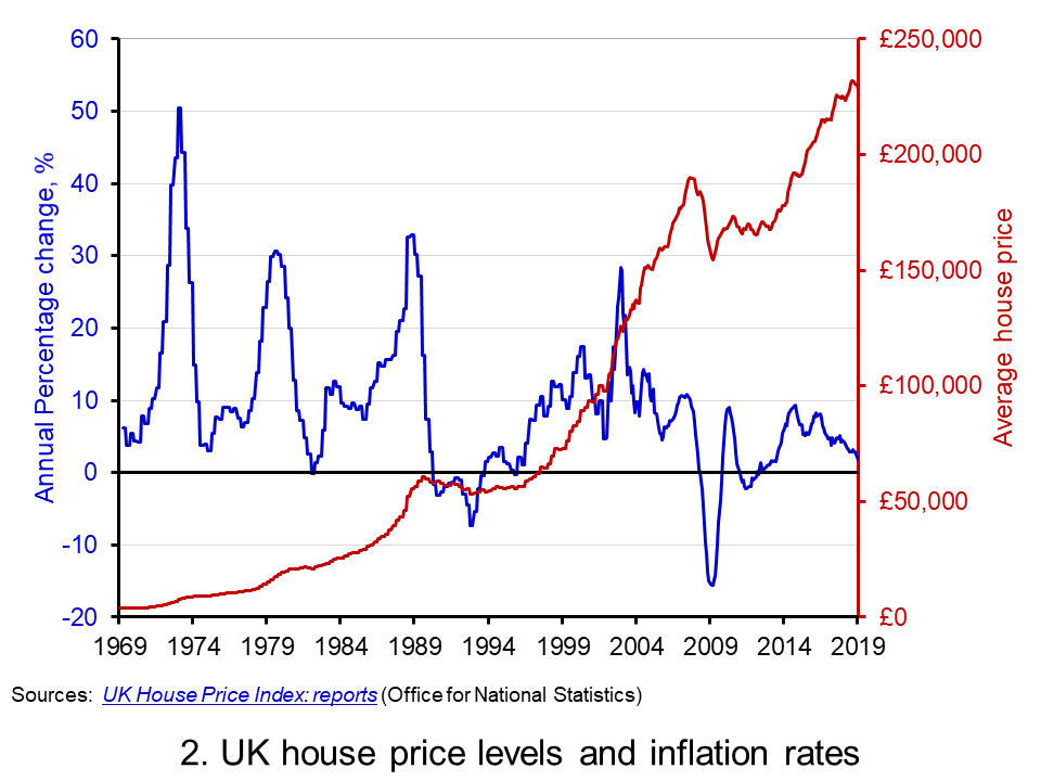 Chart 2 shows the average house price for the UK since 1969 alongside the annual rate of house price inflation, i.e. the annual percentage change in the level of house prices. The average UK house price in January 1969 was £3,750. By January 2019, as we have seen, it had risen to around £228,000. This is an increase of nearly 6,000 per cent. Over this period, the average annual rate of house price inflation was 9 per cent. However, if we measure it to the end of 2007 it was 11 per cent. (Click here to download a PowerPoint copy of the chart.)
The significant effect of the financial crisis on UK house prices is evident from Charts 1 and 2. In February 2009 house prices nationally were 16 per cent lower than a year earlier. Furthermore, it was not until August 2014 that the average UK house rose above the level of September 2007. Indeed, some parts of the UK, such as Northern Ireland and the North East of England, remain below their pre-financial crisis level even today.
Nominal and real UK house prices
But how do house price patterns compare to those in consumer prices? In other words, what has happened to inflation-adjusted or real house prices? One index of general prices is the Retail Prices Index (RPI). This index measures the cost of a representative basket of consumer goods and services. Since January 1969 the RPI has increased by nearly 1,600 per cent. While substantial in its own right, it does mean that house prices have increased considerably more rapidly than consumer prices.
If we eliminate the increase in consumer prices from the actual (nominal) house price figures what is left is the increase in house prices relative to consumer prices. To do this we estimate house prices as if consumer prices had remained at their January 1987 level. This creates a series of average UK house prices at constant January 1987 consumer prices.
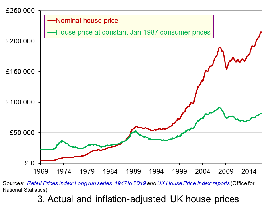 Chart 3 shows the average nominal and real UK house price since 1969. It shows that in real terms the average UK house price increased by around 266 per cent between January 1969 and January 2019. Therefore, the average real UK house price was 3.7 times more expensive in 2019 compared with 1969. This is important because it means that general price inflation cannot explain all the long-term growth seen in average house prices. (Click here to download a PowerPoint copy of the chart.)
Real UK house price cycles
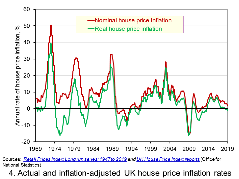 Chart 4 shows that annual rates of nominal and real house price inflation. As we saw earlier, the average nominal house price inflation rate since 1969 has been 9 per cent. The average real rate of increase in house prices has been 3.1 per cent per annum. In other words, house prices have on average each each year increased by the annual rate of RPI inflation plus 3.1 percentage points. (Click here to download a PowerPoint copy of the chart.)
Chart 4 shows how, in addition to the long-term relative increase in house prices, there are also cycles in the relative price of houses. This is evidence of a volatility in house prices that cannot be explained by general prices. This volatility reflects frequent imbalances between the demand and supply of housing, i.e. between instructions to buy and sell property. Increasing levels of housing demand (instructions to buy) relative to housing supply (instructions to supply) will put upward pressure on house prices and vice versa.
In January 2019 the annual real house price inflation across the UK was -0.9 per cent. While the rate was slightly lower in Scotland at -1.2 per cent, the biggest drag on UK house price inflation was the London market where the real house price inflation rate was -4.0 per cent. In contrast, January saw annual real house price inflation rates of 2 per cent in Wales, 2.3 per cent in Northern Ireland and 1.8 per cent in the East Midlands.
Inflation-adjusted inflation rates in London have been negative consistently since June 2017. From their July 2016 peak, following the result of the referendum on UK membership of the EU, to January 2019 inflation-adjusted house prices fell by 7.6 per cent. This reflects, in part, the fact that the London housing market, like that of other European capitals, is a more international market than other parts of the country. Therefore, the current patterns in UK house prices are rather distinctive in that the easing is being led by London and southern England.
Articles
Questions
- What is meant by the annual rate of house price inflation?
- How is a rise in the rate of house price inflation different from a rise in the level of house prices?
- What factors are likely to determine housing demand (instructions to buy)?
- What factors are likely to affect housing supply (instructions to sell)?
- Explain the difference between nominal and real house prices.
- What does a decrease in real house prices mean? Can this occur even if actual house prices have risen?
- How might we explain the recent differences between house price inflation rates in London relative to other parts of the UK, like the Midlands and Wales?
- Why were house prices so affected by the financial crisis?
- Assume that you asked to measure the affordability of housing. What data might you collect?
 Today’s title is inspired from the British Special Air Service (SAS) famous catchphrase, ‘Who Dares Wins’ – similar variations of which have been adopted by several elite army units around the world. The motto is often credited to the founder of the SAS, Sir David Stirling (although similar phrases can be traced back to ancient Rome – including ‘qui audet adipiscitur’, which is Latin for ‘who dares wins’). The motto was used to inspire and remind soldiers that to successfully accomplish difficult missions, one has to take risks (Geraghty, 1980).
In the world of economics and finance, the concept of risk is endemic to investments and to making decisions in an uncertain world. The ‘no free lunch’ principle in finance, for instance, asserts that it is not possible to achieve exceptional returns over the long term without accepting substantial risk (Schachermayer, 2008).
 Undoubtedly, one of the riskiest investment instruments you can currently get your hands on is cryptocurrencies. The most well-known of them is Bitcoin (BTC), and its price has varied spectacularly over the past ten years – more than any other asset I have laid my eyes on in my lifetime.
The first published exchange rate of BTC against the US dollar dates back to 5 October 2009 and it shows $1 to be exchangeable for 1309.03 BTC. On 15 December 2017, 1 BTC was traded for $17,900. But then, a year later the exchange rate was down to just over $1 = $3,500. Now, if this is not volatility I don’t know what is!
In such a market, wouldn’t it be wonderful if you could somehow predict changes in market sentiment and volatility trends? In a hot-off-the press article, Shen et al (2019) assert that it may be possible to predict changes in trading volumes and realised volatility of BTC by using the number of BTC-related tweets as a measure of attention. The authors source Twitter data on Bitcoin from BitInfoCharts.com and tick data from Bitstamp, one of the most popular and liquid BTC exchanges, over the period 4/9/2014 to 31/8/2018.
According to the authors:
This measure of investor attention should be more informed than that of Google Trends and therefore may reflect the attention Bitcoin is receiving from more informed investors. We find that the volume of tweets are significant drivers of realised [price] volatility (RV) and trading volume, which is supported by linear and nonlinear Granger causality tests.
They find that, according to Granger causality tests, for the period from 4/9/2014 to 8/10/2017, past days’ tweeting activity influences (or at least forecasts) trading volume. While from 9/10/2017 to 31/8/2018, previous tweets are significant drivers/forecasters of not only trading volume but also realised price volatility.
And before you reach out for your smartphone, let me clarify that, although previous days’ tweets are found in this paper to be good predictors of realised price volatility and trading volume, they have no significant effect on the returns of Bitcoin.
Article
References
Questions
- Explain how the number of tweets can be used to gauge investors’ intentions and how it can be linked to changes in trading volume.
- Using Google Scholar, make a list of articles that have used Twitter and Google Trends to predict returns, volatility and trading volume in financial markets. Present and discuss your findings.
- Would you invest in Bitcoin? Why yes? Why no?
 Economists are often criticised for making inaccurate forecasts and for making false assumptions. Their analysis is frequently dismissed by politicians when it contradicts their own views.
  The linked article and podcast below look at the views of 2019 Nobel Prize-winning economist Esther Duflo. She has challenged some of the traditional assumptions of economics about the nature of rationality and what motivates people. But her work is still very much in the tradition of economists. She examines evidence and sees how people respond to incentives and then derives policy implications from the analysis.
 In the light of workers’ motivation, she considers the implications for the gains from trade. Is free trade policy necessarily desirable if people lose their jobs because of cheap imports from China and other developing countries where labour costs are low?
  Trade may not lift a lot of new people out of poverty
 The USA has seen many horizontal mergers in recent years. This has turned industries that were once relatively competitive into oligopolies, resulting in lower output and higher prices for consumers.
  deprive “American workers of about $1.25tn of labour income every year”.
 The latest
  The average UK house price in May 2019 was £229,000. As Chart 1 shows, this masks considerable differences across the UK. In England the average price was £246,000 (an annual increase of 1.0 per cent), in Scotland it was £153,000 (an increase of 2.8 per cent), in Wales £159,000 (an increase of 3.0 per cent) and in Northern Ireland it was £137,000 (an increase of 2.1 per cent). (Click
  Chart 2 allows us to see more readily the rates of house price growth. It plots the annual rates of house price inflation across London, the UK and its nations. What is readily apparent is the volatility of house price growth. This is evidence of frequent imbalances between the flows of property on to the market to sell (instructions to sell) and the number of people looking to buy (instructions to buy). An increase in instructions to buy relative to those to sell puts upwards pressure on prices whereas an increase in the relative number of instructions to sell puts downward pressure on prices. (Click
  As Chart 3 illustrates, the longer-term growth in actual house prices cannot be fully explained by the growth in consumer prices. It shows house price values as if consumer prices, as measured by the Retail Prices Index (RPI), were fixed at their January 1987 levels. We see real increases in house prices or, expressed differently, in house prices relative to consumer prices. In real terms, UK house prices were 3.6 times higher in May 2019 compared to January 1970. For England the figure is 4.1 times, for Wales 3.1 times, for Scotland 2.9 times and for Northern Ireland 2.1 times. In London inflation-adjusted house prices were 5.7 times higher. (Click
  Chart 4 shows annual rates of real house price inflation since 2008 and, hence, from around the time the financial crisis began to unfold. The period is characterised by acute volatility and with real house prices across the UK falling at an annual rate of 16 per cent in 2009 and by as much 29 per cent in Northern Ireland. (Click
  The average UK house price in January 2019 was £228,000. As Chart 1 shows, this masks considerable differences across the UK. In England the average price was £245,000 (an annual increase of 1.5 per cent), while in Scotland it was £149,000 (an increase of 1.3 per cent), Wales £160,000 (an increase of 4.6 per cent) and £137,000 in Northern Ireland (an increase of 5.5 per cent). (Click
  Chart 2 shows the average house price for the UK since 1969 alongside the annual rate of house price inflation, i.e. the annual percentage change in the level of house prices. The average UK house price in January 1969 was £3,750. By January 2019, as we have seen, it had risen to around £228,000. This is an increase of nearly 6,000 per cent. Over this period, the average annual rate of house price inflation was 9 per cent. However, if we measure it to the end of 2007 it was 11 per cent. (Click
  Chart 3 shows the average nominal and real UK house price since 1969. It shows that in real terms the average UK house price increased by around 266 per cent between January 1969 and January 2019. Therefore, the average real UK house price was 3.7 times more expensive in 2019 compared with 1969. This is important because it means that general price inflation cannot explain all the long-term growth seen in average house prices. (Click
  Chart 4 shows that annual rates of nominal and real house price inflation. As we saw earlier, the average nominal house price inflation rate since 1969 has been 9 per cent. The average real rate of increase in house prices has been 3.1 per cent per annum. In other words, house prices have on average each each year increased by the annual rate of RPI inflation plus 3.1 percentage points. (Click
  Today’s title is inspired from the British Special Air Service (SAS) famous catchphrase, ‘Who Dares Wins’ – similar variations of which have been adopted by several elite army units around the world. The motto is often credited to the founder of the SAS, Sir David Stirling (although similar phrases can be traced back to ancient Rome – including ‘qui audet adipiscitur’, which is Latin for ‘who dares wins’). The motto was used to inspire and remind soldiers that to successfully accomplish difficult missions, one has to take risks (Geraghty, 1980).
 Undoubtedly, one of the riskiest investment instruments you can currently get your hands on is cryptocurrencies. The most well-known of them is Bitcoin (BTC), and its price has varied spectacularly over the past ten years – more than any other asset I have laid my eyes on in my lifetime.