On my commute to work on the 6th May, I happened to listen to a programme on BBC radio 4, which provided some fascinating discussion on a variety of economic issues. Technological change is constant and unstoppable and the consequences of it are likely to be both good and bad.
In this programme some top economists, including Joseph Stiglitz offer their analysis of the impact of technology and how the future might look, by considering a range of factors, such as youth unemployment, the productivity of labour, education, pensions and inequality. The benefits of new technology can be seen as endless, but the impact on inequality and how the benefits of technology are being distributed is a concern for many people. The best introduction to the programme and its content is simply to reproduce the description provided by BBC radio 4.
The baby boom generation came of age when it was accepted knowledge that innovation and productivity would always lead to higher standards of living. The generations which followed assumed this truth would continue into the future indefinitely. With the crash of 2008 the upward mobility the middle classes assumed was their right evaporated, and it is unlikely to return.
Martin Wolf, chief economics commentator of the Financial Times, asks how the work force of the future will be changed by the advancements of technologies. How should governments respond to a jobs market which is hollowing out opportunities for traditional educated professions and how will rewards for innovation and income for labour be distributed without creating a society plagued by endemic inequality?
We will speak with optimists and pessimists on both sides of the argument to find out how the repercussions of these changes will affect the way we all live now and well into the future.
It is well worth listening to and provides some interesting insights as to what the future might look like, as the inevitable technological change continues. The link for the programme is below.
 The future is not what it used to be BBC Radio 4 (6/5/14)
Questions
- What are the expected costs and benefits of technological change?
- Which factors are discussed as being the main obstacles to upwards mobility? Why have these become more prevalent in recent decades?
- Using a diagram, explain how technology can improve economic growth. To what extent is the multiplier effect important here?
- How is technology expected to affect the labour market? Use a diagram to help your explanation and make sure you consider both sides of the argument.
- What is meant by the idea that the benefits of new technology are likely to be felt in the long run?
- How important is education in creating equal opportunities?
- What is meant by secular stagnation? Is it seen as being a problem?
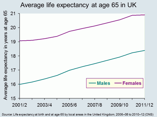 Life expectancy is increasing across the world and the latest set of figures from the Office for National Statistics show that in the UK it has passed 79 for boys born in 2010–12, and 82 for girls born then. In fact the prediction is that over a third of babies born in 2013 will live to more than 100. The data throws up some interesting questions. How well prepared are we for lives that last this long? And how evenly distributed is this increase in life expectancy? Pensions’ minister, Steve Webb, has called for better information on life expectancy to be shared. How would this impact on our decision making?
It seems reasonable to think that increasing life expectancy must be good news. And of course, for individuals it can be. In 1951 the average man retiring at 65, in England and Wales, could expect to live and draw a pension for another 12.1 years. By 2014 this had risen to 22 years.
 But while we can look forward to longer life, for the government, it presents some challenges The first is that we just don’t save enough for our old age. This seems to be partly because we find it hard to make decisions that will have an impact so far in the future. There are a number of measures that have been put in place to encourage us to save more, including auto-enrolment into company pension schemes. This is being rolled out across businesses over the next three years. In the 2014 Budget, the Chancellor announced that people reaching retirement age will be able to draw all their pension as a cash lump sum, rather than having to take it as a regular income.
Another concern for government is the variations that we find in life expectancy across the UK. The 2014 ONS data identified that life expectancy for men born in Glasgow in 2012 is 72.6, in East Dorset it is 82.9. 25% of those in Glasgow are not expected to live to 65. The gap in years of good health is even greater. This presents governments with a long-term problem. How do they achieve greater equality in this instance? Do they focus resources on the areas that need it most? Do they legislate to address behaviour? Or do they rely on the provision of good advice – on diet, exercise and other factors?
Information has a role to play in both areas identified above. In April 2014, Steve Webb, suggested that in order to make good decisions at the point of retirement, people need to understand more about what lies ahead. He said:
People tend to underestimate how long they’re likely to live, so we’re talking about averages, something very broad-brush. Based on your gender, based on your age, perhaps asking one or two basic questions, like whether you’ve smoked or not, you can tell somebody that they might, on average, live for another 20 years or so.
This suggestion has led to some concerns being expressed at what appears to be an over-simplistic approach. Estimates can only be based on a mix of averages modified by individual information. Would the projections be shared with pension providers? What would you do if you exceeded your forecast life expectancy – by a long way – and had spent all your money? Could you sue someone?
Will your pension pot last as long as you will? The Telegraph, Dan Hyde and Richard Dyson (23/4/2014)
Scientists invent death test that will tell us how long we have to live Metro (11/8/13)
Games host Glasgow has worst life expectancy in the UK The Guardian, Caroline Davies (16/4/2014)
Pensioners could get life expectancy guidance BBC News Politics (17/4/14)
ONS reveals gaps in life expectancy across the UK FT Adviser Pensions, Kevin White (23/4/14)
Health care aid for developing countries boosts life expectancy Health Canal, Ruth Ann Richter (22/4/14)
A third of babies born this year will live to 100 This is Money.co.uk, Adam Uren (11/12/13)
Questions
- Thinking about the UK, what are the factors that might explain variations in life expectancy across different regions? How might the government address these differences? Why would they want to do so?
- Do the same factors explain variations between countries? Who can address these differences? Who would want to do so?
- If you could have a reasonable prediction of your life expectancy at 65, would you want it? How would your behaviour change if you were predicted a longer than average life expectancy? How would it change if you were predicted a shorter than average life expectancy?
- If you could have an accurate prediction of your life expectancy at 18, how would your answers differ? If this were possible, would it present any problems?
In his Budget on March 19, the Chancellor of the Exchequer, George Osborne, announced fundamental changes to the way people access their pensions. Previously, many people with pension savings were forced to buy an annuity. These pay a set amount of income per month from retirement for the remainder of a person’s life.
But, with annuity rates (along with other interest rates) being at historically low levels, many pensioners have struggled to make ends meet. Even those whose pension pots did not require them to buy an annuity were limited in the amount they could withdraw each year unless they had other guaranteed income of over £20,000.
Now pensioners will no longer be required to buy an annuity and they will have much greater flexibility in accessing their pensions. As the Treasury website states:
This means that people can choose how they access their defined contribution pension savings; for example they could take all their pension savings as a lump sum, draw them down over time, or buy an annuity.
While many have greeted the news as a liberation of the pensions market, there is also the worry that this has created a moral hazard.  When people retire, will they be tempted to blow their savings on foreign travel, a new car or other luxuries? And then, when their pension pot has dwindled and their health is failing, will they then be forced to rely on the state to fund their care?
But even if pensioners resist the urge to go on an immediate spending spree, there are still large risks in giving people the freedom to spend their pension savings as they choose. As the Scotsman article below states:
The risks are all too obvious. Behaviour will change. People who no longer have to buy an annuity will not do so but will then be left with a pile of cash. What to do with it? Spend it? Invest it? There are many new risky choices. But the biggest of all can be summed up in one fact: when we retire our life expectancy continues to grow. For every day we live after 65 it increases by six and a half hours. That’s right – an extra two-and-a-half years every decade.
The glory of an annuity is it pays you an income for every year you live – no matter how long. The problem with cash is that it runs out. Already the respected Institute for Fiscal Studies (IFS) has said that the reform ‘depends on highly uncertain behavioural assumptions about when people take the money’. And that ‘there is a market failure here. There will be losers from this policy’.
We do not have perfect knowledge about how long we will live or even how long we can be expected to live given our circumstances. Many people are likely to suffer from a form of myopia that makes them blind to the future: “We’re likely to be dead before the money has run out”; or “Let’s enjoy ourselves now while we still can”; or “We’ll worry about the future when it comes”.
The point is that there are various market failings in the market for pensions and savings. Will the decisions of the Chancellor have made them better or worse?
Articles
Pension shakeup in budget leaves £14bn annuities industry reeling The Guardian, Patrick Collinson (20/3/14)
Chancellor vows to scrap compulsory annuities in pensions overhaul The Guardian, Patrick Collinson and Harriet Meyer (19/3/14)
Labour backs principle of George Osborne’s pension shakeup The Guardian, Rowena Mason (23/3/14)
Osborne’s pensions overhaul may mean there is little left for future rainy days The Guardian, Phillip Inman (24/3/14)
Let’s celebrate the Chancellor’s bravery on pensions – now perhaps the Government can tackle other mighty vested interests Independent on Sunday, Mary Dejevsky (23/3/14)
A vote-buying Budget The Scotsman, John McTernan (21/3/14)
L&G warns on mis-selling risks of pension changes The Telegraph, Alistair Osborne (26/3/14)
Budget 2014: Pension firms stabilise after £5 billion sell off Interactive Investor, Ceri Jones (20/3/14)
Budget publications
Budget 2014: pensions and saving policies Institute for Fiscal Studies, Carl Emmerson (20/3/14)
Budget 2014: documents HM Treasury (March 2014)
Freedom and choice in pensions HM Treasury (March 2014)
Questions
- What market failures are there in the market for pensions?
- To what extent will the new measures help to tackle the existing market failures in the pension industry?
- Explain the concept of moral hazard. To what extent will the new pension arrangements create a moral hazard?
- Who will be the losers from the new arrangements?
- Assume that you have a choice of how much to pay into a pension scheme. What is likely to determine how much you will choose to pay?
 Many people are attracted to work in the private sector, with expectations of greater opportunities for promotion, more variation in work and higher salaries. However, according to the Office for National Statistics, it may be that the oft-talked-of pay differential is actually in the opposite direction. Data from the ONS suggests that public sector workers are paid 14.5% more on average than those working in the private sector.
As is the case with the price of a good, the price of labour (that is, the wage rate) is determined by the forces of demand and supply. Many factors influence the wages that individuals are paid and traditional theory leads us to expect higher wages in sectors where there are many firms competing for labour. With the government acting as a monopsony employer, it has the power to force down wages below what we would expect to see in a perfectly competitive labour market. However, the ONS data suggests the opposite. What factors can explain this wage differential?
Jobs in the public sector, on average, require a higher degree of skills. There tend to be entry qualifications, such as possessing a university degree. While this is the case for many private-sector jobs as well, on average it is a greater requirement in the public sector. The skills required therefore help to push up the wages that public-sector workers can demand. Another explanation could be the size of public-sector employers, which allows them to offer higher wages. When the skills, location, job specifications etc. were taken into account, the 14.5% average hourly earnings differential declined to between just 2.2% and 3.1%, still in favour of public-sector workers. It then reversed to give private-sector workers the pay edge, once the size of the employer was taken out.
Further analysis of the data also showed that, while it may pay to be in the public sector when you’re starting out on your career, it pays to be in the private sector as you move up the career ladder. Workers in the bottom 5% of earners will do better in the public sector, while those in the top 5% of earners benefit from private-sector employment. The ONS said:
Looking at the top 5%, in the public sector earnings are greater than £31.49 per hour, while in the private sector, the top 5% earn more than £33.63 per hour… The top 1% of earners in the private sector, at more than £60.21 per hour, earns considerably more than the top 1% of earners in the public sector, at more than £49.65 per hour.
The data from the ONS thus suggest a reversal in the trend of average public-sector pay being higher than private sector pay, once all the relevant factors are taken into account.
This will naturally add to debates about living standards, which are likely to take on a stronger political slant as the next election approaches. It is obviously partly down to the public-sector pay freeze that we saw in 2010 and also to a reversal, at least in part, of the previous trend from 2008, where public-sector pay  had been growing faster than private-sector pay. However, depending on the paper you read or the person you listen to, they will offer very different views as to who gets paid more. All you need to do in this case is look at the titles of the newspaper articles written by the Independent and The Telegraph! Whatever the explanation, these new data provide a wealth of information about relative prospects for pay for everyone.
Data
Public and Private Sector Earnings Office for National Statistics (March 2014)
Annual Survey of Hours and Earnings, 2013 Provisional Results Office for National Statistics (December 2013)
Articles
Austerity bites as private sector pay rises above the public sector for the first time since 2010 Independent, Ben Chu (10/3/14)
Public sector workers still better paid despite the cuts The Telegraph, John Bingham (10/3/14)
Public sector hourly pay outstrips private sector pay BBC News (10/3/14)
Public sector workers are biggest losers in UK’s post-recession earnings squeeze The Guardian, Larry Elliott (11/3/14)
New figures go against right-wing claims that public sector workers are grossly overpaid Independent, Ben Chu (10/3/14)
Public sector pay sees biggest shrink on 2010, figures suggest LocalGov, Thomas Bridge (11/3/14)
Public sector staff £2.12 an hour better off The Scotsman, David Maddox (11/3/14)
Questions
- Illustrate the way in which wages are determined in a perfectly competitive labour market.
- Why does monopsony power tend to push wages down?
- Why does working for a large company suggest that you will earn a higher wage on average?
- Using the concept of marginal revenue product of labour, explain the way in which higher skills help to push up wages.
- How significant are public-sector pay freezes in explaining the differential between public- and private-sector pay?
- Why is there a difference between the bottom and top 5% of earners? How does this impact on whether it is more profitable to work in the public or private sector?
 The UK Shadow Chancellor, Ed Balls, has announced that, if Labour is returned to power in the next election, it will bring back the 50% top rate of income tax (see also). This will apply to incomes over £150,000.
But will this raise more tax revenue? The question here concerns incentive effects. Will the higher rate of income tax discourage work by those earning £150,000 or encourage tax avoidance or tax evasion, so that the total tax take is reduced? The Conservatives say the answer is yes. The Labour party says no, claiming that there will still be an increase in tax revenue.
 The possible effects are summed up in the Laffer curve (see The 50p income tax rate and the Laffer curve). As the previous post stated:
These arguments were put forward in the 1980s by Art Laffer, an adviser to President Reagan. His famous ‘Laffer curve’ (see Economics (8th edition) Box 10.3) illustrated that tax revenues are maximised at a particular tax rate. The idea behind the Laffer curve is very simple. At a tax rate of 0%, tax revenue will be zero – but so too at a rate of 100%, since no-one would work if they had to pay all their income in taxes. As the tax rate rises from 0%, so tax revenue would rise. And so too, as the tax rate falls from 100%, the tax rate would rise. It follows that there will be some tax rate between 0% and 100% that maximises tax revenue.
As Labour is claiming that re-introducing the 50% top rate of income tax will increase tax revenue, the implication is that the economy is to the left of the top of the Laffer curve: that, at current level of income, the curve is still rising.
Work by HMRC, and published in the document The Exchequer effect of the 50 per cent additional rate of income tax, suggested that the previous cut in the top rate from 50% to 45% would cut revenue by around £3.5 billion if there were no incentive effect, but with the extra work that would be generated, the cut would be a mere £100 million. This implies, other things being equal, that a rise in the rate from 45% to 50% would raise only a tiny bit of extra taxes.
However, the HMRC analysis has been criticised and especially its assumptions about the incentive effects on work. Then there is the question of whether a rise in the rate from 45% to 50% would have exactly the reverse effect of a cut from 50% to 45%. And then there is the question of how much HMRC could reduce tax evasion and avoidance.
The following article from the Institute for Fiscal Studies examines the effects. However, the authors conclude that:
… at the moment, the best evidence we have still suggests that raising the top rate of tax would raise little revenue and make, at best, a marginal contribution to reducing the budget deficit an incoming government would face after the next election.
But there is also the question of equity. Putting aside the question of how much revenue would be raised, is it fair to raise the top rate of tax for those on high incomes? Would it make an important contribution to reducing inequality? This normative question lies at the heart of the different views of the world between left and right and is not a question that can be answered by economic analysis.
Article
50p tax – strolling across the summit of the Laffer curve? Institute for Fiscal Studies, Paul Johnson and David Phillips (Jan 2014)
Questions
- Distinguish between tax evasion and tax avoidance.
- How would it be possible for a rise in tax rates to generated less tax revenue?
- Could policies shift the Laffer curve as opposed to merely resulting in a move along the curve?
- What is meant by ‘taxable income elasticity (TIE)’? What are its determinants?
- Is the taxable income elasticity at the top of the Laffer curve equal to, above or below zero? Explain.
- Why did the Office for Budget Responsibility chairman, Robert Chote, conclude that, whatever the precise answer, we were ‘strolling across the summit of the Laffer curve’?
- Explain why ‘there is little additional evidence to suggest that a 50p rate would raise more than was estimated by HMRC back in 2012’.
- What contribution can economists make to the debate on the desirability of reducing inequality?