 ‘Employment has been strong, but productivity and real wages have been flat.’ This is one of the key observations in a new OECD report on the state of the UK economy. If real incomes for the majority of people are to be raised, then labour productivity must rise.
For many years, the UK has had a lower productivity (in terms of output per hour worked) than most other developed countries, with the exception of Japan. But from 1980 to the mid 2000s, the gap was gradually narrowing. Since then, however, the gap has been widening again. This is illustrated in Chart 1, which shows countries’ productivity relative to the UK’s (with the UK set at 100). (Click here for a PowerPoint.)
Compared with the UK, GDP per hour worked in 2013 (the latest data available) was 28% higher in France, 29% higher in Germany and 30% higher in the USA. What is more, GDP per hour worked  and GDP per capita in the UK fell by 3.8% and 6.1% respectively after the financial crisis of 2007/8 (see the green and grey lines in Chart 2). And while both indicators began rising after 2009, they were still both below their 2007 levels in 2013. Average real wages also fell after 2007 but, unlike the other two indicators, kept on falling and by 2013 were 4% below their 2007 levels, as the red line in Chart 2 shows. (Click here for a PowerPoint.)
Although productivity and even real wages are rising again, the rate of increase is slow. If productivity is to rise, there must be investment. 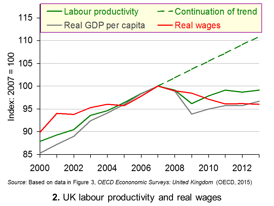 This could be in physical capital, human capital or, preferably, both. But for many years the UK has had a lower rate of investment than other countries, as Chart 3 shows. (Click here for a PowerPoint.) This chart measures investment in fixed capital as a percentage of GDP.
So how can investment be encouraged? Faster growth will encourage greater investment through the accelerator effect, but such an effect could well be short-lived as firms seek to re-equip but may be cautious about committing to increasing capacity. What is crucial here is maintaining 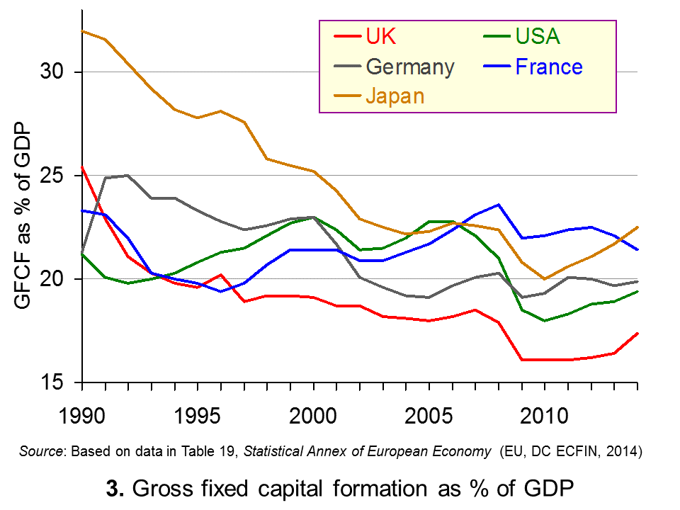 high degrees of business confidence over an extended period of time.
More fundamentally, there are structural problems that need tackling. One is the poor state of infrastructure. This is a problem not just in the UK, but in many developed countries, which cut back on public and private investment in transport, communications and energy infrastructure in an attempt to reduce government deficits after the financial crisis. Another is the low level of skills of many workers. Greater investment in training and apprenticeships would help here.
Then there is the question of access to finance. Although interest rates are very low, banks are cautious about granting long-term loans to business. Since the financial crisis banks have become much more risk averse and long-term loans, by their nature, are relatively risky. Government initiatives to provide finance to private companies may help here. For example the government has just announced a Help to Grow scheme which will provide support for 500 small firms each year through the new British Business Bank, which will provide investment loans and also grants on a match funding basis for new investment.
Articles
OECD: UK must fix productivity Economia, Oliver Griffin (25/2/15)
The UK’s productivity puzzle BBC News, Lina Yueh (24/2/15)
OECD warns UK must fix productivity problem to raise living standards The Guardian, Katie Allen (24/2/15)
Britain must boost productivity to complete post-crisis recovery, says OECD International Business Times, Ian Silvera (24/2/15)
OECD urges UK to loosen immigration controls on skilled workers Financial Times, Emily Cadman and Helen Warrell (24/2/15)
Report
OECD Economic Surveys, United Kingdom: Overview OECD (February 2015)
OECD Economic Surveys, United Kingdom: Full report OECD (February 2015)
Questions
- In what ways can productivity be measured? What are the relative merits of using the different measures?
- Why has the UK’s productivity lagged behind other industrialised countries?
- What is the relationship between income inequality and labour productivity?
- Why has UK investment been lower than in other industrialised countries?
- What are zombie firms? How does the problem of zombie firms in the UK compare with that in other countries? Explain the differences.
- What policies can be pursued to increased labour productivity?
- What difficulties are there in introducing effective policies to tackle low productivity?
- Should immigration controls be lifted to tackle the problem of a shortage of skilled workers?
 In a post last August we looked at the rising number of workers employed on ‘zero-hours’ contracts. These are contracts where there are no guaranteed minimum hours. Such contracts give employers the flexibility to employ workers as much or as little as suits the business. Sometimes it benefits workers, who might be given the flexibility to request the hours that suit them, but usually workers simply have to take the hours on offer.
Latest figures published by the Office for National Statistics show that zero-hours contracts are on the increase. In 2014 quarter 4, 697,000 workers were recorded as being on zero-hours contracts.  This represents 2.3% of people in employment. Ten years ago (2004, Q4) the figures were 108,000 or 0.4%: see chart. (Click here for a PowerPoint of the chart.)
Around one third of the 697,000 people on zero-hours contracts wanted more work if they could get it and most wanted it in their current job rather than having to move jobs. These people wanting more work can be classed as underemployed. They also include those not on a zero-hours contract who would like to work more if they could.
According to the ONS:
‘People on zero-hours contracts are more likely to be women, in full-time education or in young or older age groups when compared with other people in employment. On average, someone on a zero-hours contract usually works 25 hours a week.’ (See section 4 of the report for more details.)
As we saw in the earlier post, many public- and private-sector employers use such contracts, including many small and medium-sized enterprises and many well-known large companies, such as Sports Direct, Amazon, JD Wetherspoon and Cineworld. It gives them the flexibility to adjust the hours they employ people. It allows them to keep people in employment when demand is low. It also makes them more willing to take on staff when demand rises, as it removes the fear of being over-staffed if demand then falls back.
 As we also saw, zero-hours contracts are not the only form of flexible working. Other examples include: ‘self-employed’ workers, contracted separately for each job they do for a company; people paid largely or wholly on commission; on-call working; part-time working, where the hours are specified in advance, but where these are periodically re-negotiated; overtime; people producing a product or service for a company (perhaps at home), where the company varies the amount paid per unit according to market conditions.
The extent of zero-hours contracts varies dramatically from one sector of the economy to another. Only 0.6% of workers in the Information, Finance and Professional sectors were on zero-hours contracts in 2014 Q4, whereas 10% in the Accommodation and Food sectors were.
The flexibility that such contracts give employers may make them more willing to keep on workers when demand is low – they can reduce workers’ hours rather than laying them off. It also may make them more willing to take on workers (or increase their hours) when demand is expanding, not having to worry about being over staffed later on.
However, many workers on such contracts find it hard to budget when their hours are not guaranteed and can vary significantly from week to week.
Articles
lmost 700,000 people in UK have zero-hours contract as main job The Guardian, Phillip Inman (25/2/15)
UK firms use 1.8m zero-hours contracts, says ONS BBC News (25/1/15)
Zero-hours contracts jump in UK Financial Times, Emily Cadman (25/2/15)
Zero-hours contracts ‘disturbingly’ hit 1.8 million in 2014 International Business Times, Ian Silvera (25/2/15)
Zero-hours contracts a reality for almost 700,000 UK workers, ONS figures show Independent, Antonia Molloy (25/1/15)
Data
Contracts with No Guaranteed Hours, Zero Hour Contracts, 2014 ONS Release (25/1/15)
Supplementary LFS data on zero hours contracts – October to December 2014 ONS dataset (25/2/15)
Analysis of Employee Contracts that do not Guarantee a Minimum Number of Hours ONS Report (25/1/15)
Questions
- Distinguish between open unemployment, disguised unemployment and underemployment?
- Distinguish between functional, numerical and financial flexibility? Which type or types of flexibility do zero-hours contracts give the firm?
- In a ‘flexible’ labour market, what forms can that flexibility take?
- Why does the Accommodation and Food sector have a relatively high proportion of people employed on zero-hours contracts?
- What are the benefits and costs to employers of using zero-hours contracts?
- If a company introduces a system of zero-hours contracts, is this in accordance with the marginal productivity theory of profit maximisation from employment?
- What are the benefits and costs to employees of working on zero-hours contracts?
- Why has the use of zero-hours contracts risen so rapidly?
- Using the ONS data, find out how the use of zero-hours contracts varies by occupation and explain why.
- Identify what forms of flexible contracts are used for staff in your university or educational establishment. Do they benefit (a) staff; (b) students?
- Consider the arguments for and against (a) banning and (b) regulating zero-hours contracts.
 An article in the February 2015 issue of the Economic Journal, ‘Intergenerational Wealth Mobility in England, 1858–2012: Surnames and Social Mobility’ by Gregory Clark and Neil Cummins, looks at the persistence of wealth within British families across the generations. The article shows, ‘using rare surnames to track families, that wealth is much more persistent than standard one-generation estimates would suggest. There is still a significant correlation between the wealth of families five generations apart’.
It concludes that down the generations the main determinant of wealth is inheritance, despite all efforts to improve social mobility. The intergenerational elasticity of wealth inheritance is found to be 0.70–0.75 throughout the years 1858–2012. In other words, people’s wealth on average will be between 70% and 75% of that of their parents. Thus a large proportion of each person’s wealth depends on the wealth of their parents and a relatively small amount depends on other factors. As Clark and Cummins conclude:
The implications of this model are that wealth will be surprisingly persistent in families across multiple generations. This is what allows rich rare surnames to still remain rich on average even four generations later. It also implies that wealth differences between racial, religious and ethnic groups will also be highly persistent across generations.
So it is just inherited wealth in terms of money or property that gets passed from generation to generation? Or are their other factors, such as education, social class and social contacts, that cause  people’s wealth to depend heavily on that of their parents? Clark and Cummins consider this question.
What is the latent variable that underlies the inheritance of wealth? Evidence in other work we have done on the inheritance of education status in England suggests that families can be conceived of as having an underlying social competence, which is highly persistent across generations. This social competence generates their outcomes on all dimensions of social status but with random components on each one. In this case, social mobility between generations measured on any single aspect of status will be much greater than mobility on a more general ranking of families’ overall social status, that averages earnings, wealth, occupation, education, health and longevity.
So does this mean that attempts to create greater social mobility and greater equality are futile? The authors maintain that although it is difficult to achieve greater social mobility, income and wealth can nevertheless be redistributed through the tax and benefits system.
News articles
Inheritance: how Britain’s wealthy still keep it in the family The Observer, Jamie Doward (1/2/15)
How the rich stay rich: social status is more inheritable than height ZME Science (25/11/14)
This is the proof that the 1% have been running the show for 800 years Quartz (23/11/14)
Journal article
Intergenerational Wealth Mobility in England, 1858–2012: Surnames and Social Mobility The Economic Journal, Gregory Clark and Neil Cummins (February 2015) (To read this article you will need to log in via Shibboleth using your university username and password.)
Questions
- What would be the implication of an intergenerational wealth elasticity (a) of 1; (b) of 0; (c) >1; (d) <0?
- For what reasons might there be a high intergenerational wealth elasticity?
- What is the likely relationship between the intergenerational distribution of wealth and the intergenerational distribution of income?
- What difficulties are there is using rare surnames as a means of establishing the intergenerational distribution of wealth?
- Discuss the advantages and disadvantages of (a) a much higher rate of inheritance tax (in the UK it’s currently 40% on the value of a person’s estate above £325,000 when they die); (b) capping the amount that can be left to any individual from an estate, with anything above this taxed at 100%; (c) capping the total amount that can be left (other than to charity), with the rest taxed at 100%.
- What measures could be adopted to increase social mobility?
- What problems would arise from using the tax and benefit system to reduce inequality? (In 2012/13 the gini coefficient of original income was 0.52 and that of both gross income (i.e. income after benefits but before tax) and post-tax-and-benefit income in the UK was 0.37: see Table 27 of The Effects of Taxes and Benefits on Household Income, 2012/13.)

The World Economic Forum has been holding its annual meeting in the up-market Swiss ski resort of Davos. Many of the world’s richest and most powerful people attend these meetings, including political leaders, business leaders and representatives of various interest groups.
This year, one of the major topics has been the growth in inequality across the globe and how to reverse it. According to a report by Oxfam, Wealth: Having it all and wanting more:
The richest 1 per cent have seen their share of global wealth increase from 44 per cent in 2009 to 48 per cent in 2014 and at this rate will be more than 50 per cent in 2016. Members of this global elite had an average wealth of $2.7m per adult in 2014.
Of the remaining 52 per cent of global wealth, almost all (46 per cent) is owned by the rest of the richest fifth of the world’s population. The other 80 per cent share just 5.5 per cent and had an average wealth of $3851 per adult – that’s 1/700th of the average wealth of the 1 per cent.
Currently, the richest 85 people in the world have the same amount of wealth as the poorest 50% of the world’s population. It might seem odd that those with the wealth are talking about the problem of inequality.  Indeed, some of those 85 richest people were at the conference: a conference that boasts extremely luxurious conditions. What is more, many delegates flew into the conference in private jets (at least 850 jets) to discuss not just poverty but also climate change!
Yet if the problem of global inequality is to be tackled, much of the power to do so lies in the hands of these rich and powerful people. They are largely the ones who will have to implement policies that will help to raise living standards of the poor.
But why should they want to? Part of the reason is a genuine concern to address the issues of increasingly divided societies. But part is the growing evidence that greater inequality reduces economic growth by reducing the development of skills of the lower income groups and reducing social mobility. We discussed this topic in the blog, Inequality and economic growth.
So what policies could be adopted to tackle the problem. Oxfam identifies a seven-point plan:
|
|
| • |
Clamp down on tax dodging by corporations and rich individuals; |
| • |
Invest in universal, free public services such as health and education; |
| • |
Share the tax burden fairly, shifting taxation from labour and consumption towards capital and wealth; |
| • |
Introduce minimum wages and move towards a living wage for all workers; |
| • |
Ensure adequate safety-nets for the poorest, including a minimum income guarantee; |
| • |
Introduce equal pay legislation and promote economic policies to give women a fair deal; |
| • |
Agree a global goal to tackle inequality. |
But how realistic are these policies? Is it really in the interests of governments to reduce inequality? Indeed, some of the policies that have been adopted since 2008, such as bailing out the banks and quantitative easing, have had the effect of worsening inequality. QE drives up asset prices, particularly bond, share and property prices. This has provided a windfall to the rich: the more of such assets you own, the greater the absolute gain.
The following videos and articles look at the problem of growing inequality and how realistic it is to expect leaders to do anything significant about it.
Videos and podcasts
 Income inequality is ‘brake on growth’, Oxfam chief warns Davos France 24, Winnie Byanyima (22/1/15)
 Davos dilemma: Can the 1% cure income inequality? Yahoo Finance, Lizzie O’Leary and Shawna Ohm (21/1/15)
 Richest 1% ‘Will Own Half The World’s Wealth By 2016’ ITN on YouTube, Sarah Kerr (19/1/15)
 The Price of Inequality BBC Radio 4, Robert Peston (3/2/15 and 10/2/15)
Articles
Richest 1% will own more than all the rest by 2016 Oxfam blogs, Jon Slater (19/1/15)
Global tax system can cut inequality The Scotsman, Jamie Livingstone (23/1/15)
A new framework for a new age Financial Times, Tony Elumelu (23/1/15)
The global elite in Davos must give the world a pay rise New Statesman, Frances O’Grady (22/1/15)
New Oxfam report says half of global wealth held by the 1% The Guardian, Larry Elliott and Ed Pilkington (19/1/15)
Davos is starting to get it – inequality is the root cause of stagnation The Guardian, Larry Elliott (25/1/15)
Inequality isn’t inevitable, it’s engineered. That’s how the 1% have taken over The Guardian, Suzanne Moore (19/1/15)
Why extreme inequality hurts the rich BBC News, Robert Peston (19/1/15)
Eurozone stimulus ‘reinforces inequality’, warns Soros BBC News, Joe Miller (22/1/15)
Hot topic for the 1 percent at Davos: Inequality CNBC, Lawrence Delevingne (21/1/15)
Global inequality: The wrong yardstick The Economist (24/1/15)
A Richer World (a compendium of articles) BBC News (27/1/15)
Data
OECD Income Distribution Database: Gini, poverty, income, Methods and Concepts OECD
The effects of taxes and benefits on household income ONS
Questions
- Why has inequality increased in most countries in recent years?
- For what reasons might it be difficult to measure the distribution of wealth?
- Which gives a better indication of differences in living standards: the distribution of wealth or the distribution of income?
- Discuss the benefits and costs of using the tax system to redistribute (a) income and (b) wealth from rich to poor
- Go through each of the seven policies advocated by Oxfam and consider how practical they are and what possible objections to them might be raised by political leaders.
- Why is tax avoidance/tax evasion by multinational companies difficult to tackle?
- Does universal access to education provide the key to reducing income inequality within and between countries?
 What is the relationship between the degree of inequality in a country and the rate of economic growth? The traditional answer is that there is a trade off between the two. Increasing the rewards to those who are more productive or who invest encourages a growth in productivity and capital investment, which, in turn, leads to faster economic growth. Redistribution from the rich to the poor, by contrast, is argued to reduce incentives by reducing the rewards from harder work, education, training and investment. Risk taking, it is claimed, is discouraged.
Recent evidence from the OECD and the IMF, however, suggests that when income inequality rises, economic growth falls. Inequality has grown massively in many countries, with average incomes at the top of the distribution seeing particular gains, while many at the bottom have experienced actual declines in real incomes or, at best, little or no growth.  This growth in inequality can be seen in a rise in countries’ Gini coefficients. The OECD average Gini coefficient rose from 0.29 in the mid-1980s to 0.32 in 2011/12. This, claims the OECD, has led to a loss in economic growth of around 0.35 percentage points per year.
But why should a rise in inequality lead to lower economic growth? According to the OECD, the main reason is that inequality reduces the development of skills of the lower income groups and reduces social mobility.
By hindering human capital accumulation, income inequality undermines education opportunities for disadvantaged individuals, lowering social mobility and hampering skills development.
The lower educational attainment applies both to the length and quality of education: people from poorer backgrounds on average leave school or college earlier and with lower qualifications.
But if greater inequality generally results in lower economic growth, will a redistribution from rich to poor necessarily result in faster economic growth? According to the OECD:
Anti-poverty programmes will not be enough. Not only cash transfers but also increasing access to public services, such as high-quality education, training and healthcare, constitute long-term social investment to create greater equality of opportunities in the long run.
Thus redistribution policies need to be well designed and implemented and focus on raising incomes of the poor through increased opportunities to increase their productivity. Simple transfers from rich to poor via the tax and benefits system may, in fact, undermine economic growth. According to the IMF:
That equality seems to drive higher and more sustainable growth does not in itself support efforts to redistribute. In particular, inequality may impede growth at least in part because it calls forth efforts to redistribute that themselves undercut growth. In such a situation, even if inequality is bad for growth, taxes and transfers may be precisely the wrong remedy.
Articles
Inequality ‘significantly’ curbs economic growth – OECD BBC News (9/12/14)
Is inequality the enemy of growth? BBC News, Robert Peston (6/10/14)
Income inequality damages growth, OECD warns Financial Times, Chris Giles (8/10/14)
OECD finds increasing inequality lowers growth Deutsche Welle, Jasper Sky (10/12/14)
Revealed: how the wealth gap holds back economic growth The Guardian, Larry Elliott (9/12/14)
Inequality Seriously Damages Growth, IMF Seminar Hears IMF Survey Magazine (12/4/14)
Warning! Inequality May Be Hazardous to Your Growth iMFdirect, Andrew G. Berg and Jonathan D. Ostry (8/4/11)
Economic growth more likely when wealth distributed to poor instead of rich The Guardian, Stephen Koukoulas (4/6/15)
So much for trickle down: only bold reforms will tackle inequality The Guardian, Larry Elliott (21/6/15)
Videos
Record inequality between rich and poor OECD on YouTube (5/12/11)
The Price of Inequality The News School on YouTube, Joseph Stiglitz (5/10/12)
Reports and papers
FOCUS on Inequality and Growth OECD, Directorate for Employment, Labour and Social Affairs (December 2014)
Trends in Income Inequality and its Impact on Economic Growth OECD Social, Employment and Migration Working Papers, Federico Cingano (9/12/14)
An Overview of Growing Income Inequalities in OECD Countries: Main Findings OCED (2011)
Redistribution, Inequality, and Growth IMF Staff Discussion Note, Jonathan D. Ostry, Andrew Berg, and Charalambos G. Tsangarides (February 2014)
Measure to Measure Finance and Development, IMF, Jonathan D. Ostry and Andrew G. Berg (Vol. 51, No. 3, September 2014)
Data
OECD Income Distribution Database: Gini, poverty, income, Methods and Concepts OECD
The effects of taxes and benefits on household income ONS
Questions
- Explain what are meant by a Lorenz curve and a Gini coefficient? What is the relationship between the two?
- The Gini coefficient is one way of measuring inequality. What other methods are there? How suitable are they?
- Assume that the government raises taxes to finance higher benefits to the poor. Identify the income and substitution effects of the tax increases and whether the effects are to encourage or discourage work (or investment).
- Distinguish between (a) progressive, (b) regressive and (c) proportional taxes?
- How will the balance of income and substitution effects vary in each of the following cases: (a) a cut in the tax-free allowance; (b) a rise in the basic rate of income tax; (c) a rise in the top rate of income tax? How does the relative size of the two effects depend, in each case, on a person’s current income?
- Identify policy measures that would increase both equality and economic growth.
- Would a shift from direct to indirect taxes tend to increase or decrease inequality? Explain.
- By examining Tables 3, 26 and 27 in The Effects of Taxes and Benefits on Household Income, 2012/13, (a) explain the difference between original income, gross income, disposable income and post-tax income; (b) explain the differences between the Gini coefficients for each of these four categories of income in the UK.
 ‘Employment has been strong, but productivity and real wages have been flat.’ This is one of the key observations in a new OECD report on the state of the UK economy. If real incomes for the majority of people are to be raised, then labour productivity must rise.
 and GDP per capita in the UK fell by 3.8% and 6.1% respectively after the financial crisis of 2007/8 (see the green and grey lines in Chart 2). And while both indicators began rising after 2009, they were still both below their 2007 levels in 2013. Average real wages also fell after 2007 but, unlike the other two indicators, kept on falling and by 2013 were 4% below their 2007 levels, as the red line in Chart 2 shows. (Click here for a PowerPoint.)
 This could be in physical capital, human capital or, preferably, both. But for many years the UK has had a lower rate of investment than other countries, as Chart 3 shows. (Click here for a PowerPoint.) This chart measures investment in fixed capital as a percentage of GDP.
 high degrees of business confidence over an extended period of time.

