The latest UK house price index continues to show an easing in the rate of house price inflation. In the year to January 2019 the average UK house price rose by 1.7 per cent, the lowest rate since June 2013 when it was 1.5 per cent. This is significantly below the recent peak in house price inflation when in May 2016 house prices were growing at 8.2 per cent year-on-year. In this blog we consider how recent patterns in UK house prices compare with those over the past 50 years and also how the growth of house prices compares to that in consumer prices.
The UK and its nations
The average UK house price in January 2019 was £228,000. As Chart 1 shows, this masks considerable differences across the UK. In England the average price was £245,000 (an annual increase of 1.5 per cent), while in Scotland it was £149,000 (an increase of 1.3 per cent), Wales £160,000 (an increase of 4.6 per cent) and £137,000 in Northern Ireland (an increase of 5.5 per cent). (Click here to download a PowerPoint copy of the chart.)
Within England there too are considerable differences in house prices, with London massively distorting the English average. In January 2019 the average house price in inner London was recorded at £568,000, a fall of 1.9 per cent on January 2018. In Outer London the average price was £426,000, a fall of 0.2 per cent. Across London as a whole the average price was £472,000, a fall of 1.6 per cent. House prices were lowest in the North East at £125,000, having experienced an annual increase of 0.9 per cent.
The Midlands can be used as a reference point for English house prices outside of the capital. In January 2019 the average house price in the West Midlands was £195,000 while in the East Midlands it was £193,000. While the annual rate of house price inflation in London is now negative, the annual rate of increase in the Midlands was the highest in England. In the West Midlands the annual increase was 4 per cent while in the East Midlands it was 4.4 per cent. These rates of increase are currently on par with those across Wales.
Long-term UK house price trends
Chart 2 shows the average house price for the UK since 1969 alongside the annual rate of house price inflation, i.e. the annual percentage change in the level of house prices. The average UK house price in January 1969 was £3,750. By January 2019, as we have seen, it had risen to around £228,000. This is an increase of nearly 6,000 per cent. Over this period, the average annual rate of house price inflation was 9 per cent. However, if we measure it to the end of 2007 it was 11 per cent. (Click here to download a PowerPoint copy of the chart.)
The significant effect of the financial crisis on UK house prices is evident from Charts 1 and 2. In February 2009 house prices nationally were 16 per cent lower than a year earlier. Furthermore, it was not until August 2014 that the average UK house rose above the level of September 2007. Indeed, some parts of the UK, such as Northern Ireland and the North East of England, remain below their pre-financial crisis level even today.
Nominal and real UK house prices
But how do house price patterns compare to those in consumer prices? In other words, what has happened to inflation-adjusted or real house prices? One index of general prices is the Retail Prices Index (RPI). This index measures the cost of a representative basket of consumer goods and services. Since January 1969 the RPI has increased by nearly 1,600 per cent. While substantial in its own right, it does mean that house prices have increased considerably more rapidly than consumer prices.
If we eliminate the increase in consumer prices from the actual (nominal) house price figures what is left is the increase in house prices relative to consumer prices. To do this we estimate house prices as if consumer prices had remained at their January 1987 level. This creates a series of average UK house prices at constant January 1987 consumer prices.
Chart 3 shows the average nominal and real UK house price since 1969. It shows that in real terms the average UK house price increased by around 266 per cent between January 1969 and January 2019. Therefore, the average real UK house price was 3.7 times more expensive in 2019 compared with 1969. This is important because it means that general price inflation cannot explain all the long-term growth seen in average house prices. (Click here to download a PowerPoint copy of the chart.)
Real UK house price cycles
Chart 4 shows that annual rates of nominal and real house price inflation. As we saw earlier, the average nominal house price inflation rate since 1969 has been 9 per cent. The average real rate of increase in house prices has been 3.1 per cent per annum. In other words, house prices have on average each each year increased by the annual rate of RPI inflation plus 3.1 percentage points. (Click here to download a PowerPoint copy of the chart.)
Chart 4 shows how, in addition to the long-term relative increase in house prices, there are also cycles in the relative price of houses. This is evidence of a volatility in house prices that cannot be explained by general prices. This volatility reflects frequent imbalances between the demand and supply of housing, i.e. between instructions to buy and sell property. Increasing levels of housing demand (instructions to buy) relative to housing supply (instructions to supply) will put upward pressure on house prices and vice versa.
In January 2019 the annual real house price inflation across the UK was -0.9 per cent. While the rate was slightly lower in Scotland at -1.2 per cent, the biggest drag on UK house price inflation was the London market where the real house price inflation rate was -4.0 per cent. In contrast, January saw annual real house price inflation rates of 2 per cent in Wales, 2.3 per cent in Northern Ireland and 1.8 per cent in the East Midlands.
Inflation-adjusted inflation rates in London have been negative consistently since June 2017. From their July 2016 peak, following the result of the referendum on UK membership of the EU, to January 2019 inflation-adjusted house prices fell by 7.6 per cent. This reflects, in part, the fact that the London housing market, like that of other European capitals, is a more international market than other parts of the country. Therefore, the current patterns in UK house prices are rather distinctive in that the easing is being led by London and southern England.
What is meant by the annual rate of house price inflation?
How is a rise in the rate of house price inflation different from a rise in the level of house prices?
What factors are likely to determine housing demand (instructions to buy)?
What factors are likely to affect housing supply (instructions to sell)?
Explain the difference between nominal and real house prices.
What does a decrease in real house prices mean? Can this occur even if actual house prices have risen?
How might we explain the recent differences between house price inflation rates in London relative to other parts of the UK, like the Midlands and Wales?
Why were house prices so affected by the financial crisis?
Assume that you asked to measure the affordability of housing. What data might you collect?
Today’s title is inspired from the British Special Air Service (SAS) famous catchphrase, ‘Who Dares Wins’ – similar variations of which have been adopted by several elite army units around the world. The motto is often credited to the founder of the SAS, Sir David Stirling (although similar phrases can be traced back to ancient Rome – including ‘qui audet adipiscitur’, which is Latin for ‘who dares wins’). The motto was used to inspire and remind soldiers that to successfully accomplish difficult missions, one has to take risks (Geraghty, 1980).
In the world of economics and finance, the concept of risk is endemic to investments and to making decisions in an uncertain world. The ‘no free lunch’ principle in finance, for instance, asserts that it is not possible to achieve exceptional returns over the long term without accepting substantial risk (Schachermayer, 2008).
Undoubtedly, one of the riskiest investment instruments you can currently get your hands on is cryptocurrencies. The most well-known of them is Bitcoin (BTC), and its price has varied spectacularly over the past ten years – more than any other asset I have laid my eyes on in my lifetime.
The first published exchange rate of BTC against the US dollar dates back to 5 October 2009 and it shows $1 to be exchangeable for 1309.03 BTC. On 15 December 2017, 1 BTC was traded for $17,900. But then, a year later the exchange rate was down to just over $1 = $3,500. Now, if this is not volatility I don’t know what is!
In such a market, wouldn’t it be wonderful if you could somehow predict changes in market sentiment and volatility trends? In a hot-off-the press article, Shen et al (2019) assert that it may be possible to predict changes in trading volumes and realised volatility of BTC by using the number of BTC-related tweets as a measure of attention. The authors source Twitter data on Bitcoin from BitInfoCharts.com and tick data from Bitstamp, one of the most popular and liquid BTC exchanges, over the period 4/9/2014 to 31/8/2018.
According to the authors:
This measure of investor attention should be more informed than that of Google Trends and therefore may reflect the attention Bitcoin is receiving from more informed investors. We find that the volume of tweets are significant drivers of realised [price] volatility (RV) and trading volume, which is supported by linear and nonlinear Granger causality tests.
They find that, according to Granger causality tests, for the period from 4/9/2014 to 8/10/2017, past days’ tweeting activity influences (or at least forecasts) trading volume. While from 9/10/2017 to 31/8/2018, previous tweets are significant drivers/forecasters of not only trading volume but also realised price volatility.
And before you reach out for your smartphone, let me clarify that, although previous days’ tweets are found in this paper to be good predictors of realised price volatility and trading volume, they have no significant effect on the returns of Bitcoin.
Journal of Economic Perspectives, Hal R. Varian (Vol. 1, No. 2, Fall 1987)
Questions
Explain how the number of tweets can be used to gauge investors’ intentions and how it can be linked to changes in trading volume.
Using Google Scholar, make a list of articles that have used Twitter and Google Trends to predict returns, volatility and trading volume in financial markets. Present and discuss your findings.
Back in October, we examined the rise in oil prices. We said that, ‘With Brent crude currently at around $85 per barrel, some commentators are predicting the price could reach $100. At the beginning of the year, the price was $67 per barrel; in June last year it was $44. In January 2016, it reached a low of $26.’ In that blog we looked at the causes on both the demand and supply sides of the oil market. On the demand side, the world economy had been growing relatively strongly. On the supply side there had been increasing constraints, such as sanctions on Iran, the turmoil in Venezuela and the failure of shale oil output to expand as much as had been anticipated.
But what a difference a few weeks can make!
Brent crude prices have fallen from $86 per barrel in early October to just over $50 by the end of the year – a fall of 41 per cent. (Click here for a PowerPoint of the chart.) Explanations can again be found on both the demand and supply sides.
On the demand side, global growth is falling and there is concern about a possible recession (see the blog: Is the USA heading for recession?). The Bloomberg article below reports that all three main agencies concerned with the oil market – the U.S. Energy Information Administration, the Paris-based International Energy Agency and OPEC – have trimmed their oil demand growth forecasts for 2019. With lower expected demand, oil companies are beginning to run down stocks and thus require to purchase less crude oil. Fracking (Source: US Bureau of Land Management Environmental Assessment, public domain image)
On the supply side, US shale output has grown rapidly in recent weeks and US output has now reached a record level of 11.7 million barrels per day (mbpd), up from 10.0 mbpd in January 2018, 8.8 mbpd in January 2017 and 5.4 mbpd in January 2010. The USA is now the world’s biggest oil producer, with Russia producing around 11.4 mpbd and Saudi Arabia around 11.1 mpbd.
Total world supply by the end of 2018 of around 102 mbpd is some 2.5 mbpd higher than expected at the beginning of 2018 and around 0.5 mbpd greater than consumption at current prices (the remainder going into storage).
So will oil prices continue to fall? Most analysts expect them to rise somewhat in the near future. Markets may have overcorrected to the gloomy news about global growth. On the supply side, global oil production fell in December by 0.53 mbpd. In addition OPEC and Russia have signed an accord to reduce their joint production by 1.2 mbpd starting this month (January). What is more, US sanctions on Iran have continued to curb its oil exports.
But whatever happens to global growth and oil production, the future price will continue to reflect demand and supply. The difficulty for forecasters is in predicting just what the levels of demand and supply will be in these uncertain times.
Oil prices have been rising in recent weeks. With Brent crude currently at around $85 per barrel, some commentators are predicting the price could reach $100. At the beginning of the year, the price was $67 per barrel; in June last year it was $44. In January 2016, it reached a low of $26. But what has caused the price to increase?
On the demand side, the world economy has been growing relatively strongly. Over the past three years, global growth has averaged 3.5%. This has helped to offset the effects of more energy efficient technologies and the gradual shift away from oil to alternative sources of energy.
On the supply side, there have been growing constraints.
The predicted resurgence of shale oil production, after falls in both output and investment when oil prices were low in 2016, has failed to materialise as much as expected. The reason is that pipeline capacity is limited and there is very little scope for transporting more oil from the major US producing area – the Permian basin in West Texas and SE New Mexico. There are similar pipeline capacity constraints from Canadian shale fields. The problem is compounded by shortages of labour and various inputs.
But perhaps the most serious supply-side issue is the renewed sanctions on Iranian oil exports imposed by the Trump administration, due to come into force on 4 November. The USA is also putting pressure on other countries not to buy Iranian oil. Iran is the world’s third largest oil exporter.
Also, there has been continuing turmoil in the Venezuelan economy, where inflation is currently around 500 000 per cent and is expected to reach 1 million per cent by the end of the year. Consequently, the country’s oil output is down. Production has fallen by more than a third since 2016. Venezuela was the world’s third largest oil producer.
Winners and losers from high oil prices
The main gainers from high oil prices are the oil producing countries, such as Russia and Saudi Arabia. It will also encourage investment in oil exploration and new oil wells, and could help countries, such as Colombia, with potential that is considered underexploited. However, given that the main problem is a lack of supply, rather than a surge in demand, the gains will be more limited for those countries, such as the USA and Canada, suffering from supply constraints. Clearly there will be no gain for Iran.
In terms of losers, higher oil prices are likely to dampen global growth. If the oil price reaches $100 per barrel, global growth could be around 0.2 percentage points lower than had previously been forecast. In its latest World Economic Outlook, published on 8 October, the IMF has already downgraded its forecast growth for 2018 and 2019 to 3.7% from the 3.9% it forecast six months ago – and this forecast is based on the assumption that oil prices will be $69.38 a barrel in 2018 and $68.76 a barrel in 2019.
Clearly, the negative effect will be greater, the larger a country’s imports are as a percentage of its GDP. Countries that are particularly vulnerable to higher oil prices are the eurozone, Japan, China, India and most other Asian economies. Lower growth in these countries could have significant knock-on effects on other countries.
Consumers in advanced oil-importing countries would face higher fuel costs, accounting for an additional 0.3 per cent of household spending. Inflation could rise by as much as 1 percentage point.
The size of the effects depends on just how much oil prices rise and for how long. This depends on various demand- and supply-side factors, not least of which in the short term is speculation. Crucially, global political events, and especially US policies, will be the major driving factor in what happens.
Draw a supply and demand diagram to illustrate what has been happening to oil prices in the past few weeks and what is likely to happen in the coming weeks.
What is the significance of the price elasticity of demand and supply in determining the size of oil price increase?
What determines (a) the price elasticity of demand for oil; (b) the income elasticity of demand for oil; (c) the price elasticity of supply of oil?
Why might oil prices overshoot the equilibrium price that reflects changed demand and supply conditions?
Use demand and supply diagrams to illustrate (a) the destabilising effects that speculation could have on oil prices; (b) a stabilising effect.
What industries might gain from higher oil prices and why?
What would OPEC’s best policy be in the current circumstances? Explain.
So here we are, summer is over (or almost over if you’re an optimist) and we are sitting in front of our screens reminiscing about hot sunny days (at least I do)! There is no doubt, however: a lot happened in the world of politics and economics in the past three months. The escalation of the US-China trade war, the run on the Turkish lira, the (successful?) conclusion of the Greek bailout – these are all examples of major economic developments that took place during the summer months, and which we will be sure to discuss in some detail in future blogs. Today, however, I will introduce a topic that I am very interested in as a researcher: the liberalisation of energy markets in developing countries and, in particular, Mexico.
Why Mexico? Well, because it is a great example of a large developing economy that has been attempting to liberalise its energy market and reverse price setting and monopolistic practices that go back several decades. Until very recently, the price of petrol in Mexico was set and controlled by Pemex, a state monopolist. This put Pemex under pressure since, as a sole operator, it was responsible for balancing growing demand and costs, even to the detriment of its own finances.
The petrol (or ‘gasoline’) price liberalisation started in May 2017 and took place in stages – starting in the North part of Mexico and ending in November of the same year in the central and southern regions of the country. The main objective was to address the notable decrease in domestic oil production that put at risk the ability of the country to meet demand; as well as Mexico’s increasing dependency on foreign markets affected by the surge of the international oil price. The government has spent the past five years trying to create a stronger regulatory framework, while easing the financial burden on the state and halting the decline in oil reserves and production. Unsurprisingly, opening up a monopolistic market turns out to be a complex and bumpy process.
Source: Author’s calculations using data from the Energy Information Bank, Ministry of Energy, Mexico
Despite all the reforms, retail petrol prices have kept rising. Although part of this price rise is demand-driven, an increasing number of researchers highlight the significance of the distribution of oil-related infrastructure in determining price outcomes at the federal and regional (state) level. Saturation and scarcity of both distribution and storage infrastructure are probably the two most significant impediments to opening the sector up to competition (Mexico Institute, 2018). You see, the original design of these networks and the deployment of the infrastructure was not aimed at maximising efficiency of distribution – the price was set by the monopolist and, in a way that was compliant with government policy (Mexico Institute, 2018). Economic efficiency was not always part of this equation. As a result, consumers located in better-deployed areas were subsidising the inherent logistics costs of less ‘well endowed’ regions by facing an artificially higher price than they would have in a competitive market.
But what about now? Do such differences in the allocation of infrastructure between regions lead to location-related differences in the price of petrol? If so, by how much? And, what policies should the government pursue to address such imbalances? These are all questions that I explore in one of my recent working papers titled ‘Widening the Gap: Lessons from the aftermath of the energy market reform in Mexico’ (with Hugo Vallarta) and I will be sharing some of the answers with you in a future blog.
 The latest UK house price index continues to show an easing in the rate of house price inflation. In the year to January 2019 the average UK house price rose by 1.7 per cent, the lowest rate since June 2013 when it was 1.5 per cent. This is significantly below the recent peak in house price inflation when in May 2016 house prices were growing at 8.2 per cent year-on-year. In this blog we consider how recent patterns in UK house prices compare with those over the past 50 years and also how the growth of house prices compares to that in consumer prices.
 The average UK house price in January 2019 was £228,000. As Chart 1 shows, this masks considerable differences across the UK. In England the average price was £245,000 (an annual increase of 1.5 per cent), while in Scotland it was £149,000 (an increase of 1.3 per cent), Wales £160,000 (an increase of 4.6 per cent) and £137,000 in Northern Ireland (an increase of 5.5 per cent). (Click here to download a PowerPoint copy of the chart.)
 Chart 2 shows the average house price for the UK since 1969 alongside the annual rate of house price inflation, i.e. the annual percentage change in the level of house prices. The average UK house price in January 1969 was £3,750. By January 2019, as we have seen, it had risen to around £228,000. This is an increase of nearly 6,000 per cent. Over this period, the average annual rate of house price inflation was 9 per cent. However, if we measure it to the end of 2007 it was 11 per cent. (Click here to download a PowerPoint copy of the chart.)
 Chart 3 shows the average nominal and real UK house price since 1969. It shows that in real terms the average UK house price increased by around 266 per cent between January 1969 and January 2019. Therefore, the average real UK house price was 3.7 times more expensive in 2019 compared with 1969. This is important because it means that general price inflation cannot explain all the long-term growth seen in average house prices. (Click here to download a PowerPoint copy of the chart.)
 Chart 4 shows that annual rates of nominal and real house price inflation. As we saw earlier, the average nominal house price inflation rate since 1969 has been 9 per cent. The average real rate of increase in house prices has been 3.1 per cent per annum. In other words, house prices have on average each each year increased by the annual rate of RPI inflation plus 3.1 percentage points. (Click here to download a PowerPoint copy of the chart.)
 Today’s title is inspired from the British Special Air Service (SAS) famous catchphrase, ‘Who Dares Wins’ – similar variations of which have been adopted by several elite army units around the world. The motto is often credited to the founder of the SAS, Sir David Stirling (although similar phrases can be traced back to ancient Rome – including ‘qui audet adipiscitur’, which is Latin for ‘who dares wins’). The motto was used to inspire and remind soldiers that to successfully accomplish difficult missions, one has to take risks (Geraghty, 1980).
") Undoubtedly, one of the riskiest investment instruments you can currently get your hands on is cryptocurrencies. The most well-known of them is Bitcoin (BTC), and its price has varied spectacularly over the past ten years – more than any other asset I have laid my eyes on in my lifetime.
Undoubtedly, one of the riskiest investment instruments you can currently get your hands on is cryptocurrencies. The most well-known of them is Bitcoin (BTC), and its price has varied spectacularly over the past ten years – more than any other asset I have laid my eyes on in my lifetime.  Back in October, we examined the
  Brent crude prices have fallen from $86 per barrel in early October to just over $50 by the end of the year – a fall of 41 per cent. (Click
 Oil prices have been rising in recent weeks. With Brent crude currently at around $85 per barrel, some commentators are predicting the price could reach $100. At the beginning of the year, the price was $67 per barrel; in June last year it was $44. In January 2016, it reached a low of $26. But what has caused the price to increase?
 scope for transporting more oil from the major US producing area – the
  In terms of losers, higher oil prices are likely to dampen global growth. If the oil price reaches $100 per barrel, global growth could be around 0.2 percentage points lower than had previously been forecast. In its
  So here we are, summer is over (or almost over if you’re an optimist) and we are sitting in front of our screens reminiscing about hot sunny days (at least I do)! There is no doubt, however: a lot happened in the world of politics and economics in the past three months. The escalation of the US-China trade war, the run on the Turkish lira, the (successful?) conclusion of the Greek bailout – these are all examples of major economic developments that took place during the summer months, and which we will be sure to discuss in some detail in future blogs. Today, however, I will introduce a topic that I am very interested in as a researcher: the liberalisation of energy markets in developing countries and, in particular, Mexico.
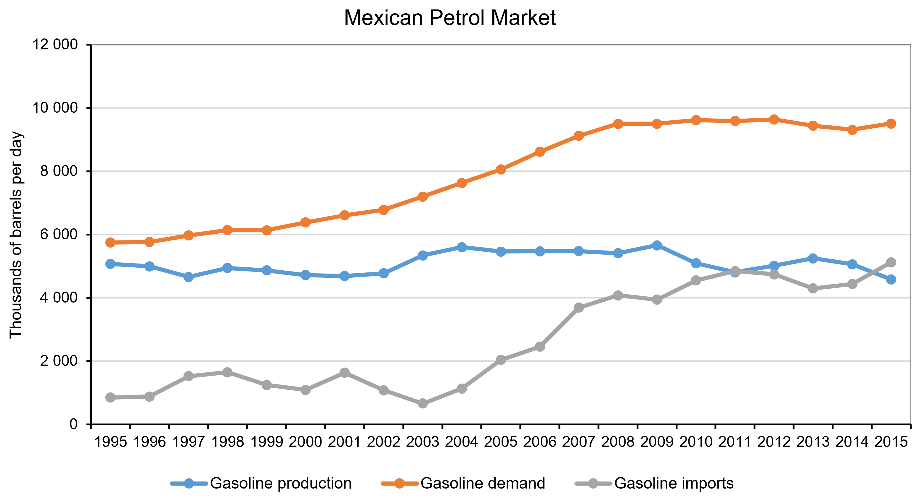 Source: Author’s calculations using data from the Energy Information Bank, Ministry of Energy, Mexico