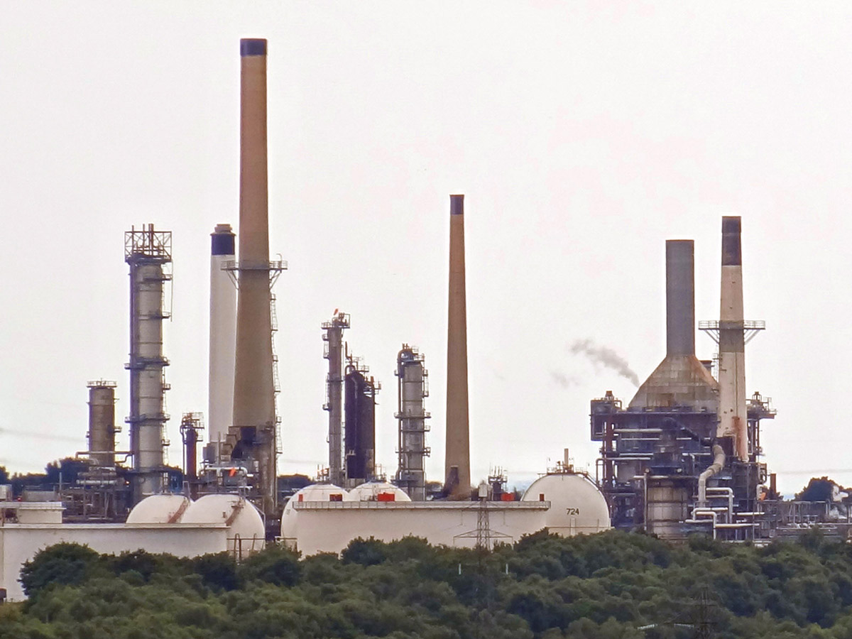
 Global oil prices (Brent crude) reached $128 per barrel on 9 March, a level not seen for 10 years and surpassed only in the run up to the financial crisis in 2008. Oil prices are determined by global demand and supply, and the current surge in prices is no exception.
A rise in demand and/or a fall in supply will lead to a rise in the price. Given that both demand and supply are relatively price inelastic, such shifts can cause large rises in oil prices. Similarly, a fall in demand or rise in supply can lead to a large fall in oil prices.
These changes are then amplified by speculation. Traders try to get ahead of price changes. If people anticipate that oil prices will rise, they will buy now, or make a contract to buy more in the future at prices quoted today by buying on the oil futures market. This then pushes up both spot (current) prices and futures prices. If demand or supply conditions change, speculation will amplify the reaction to such a change.
What has happened since 2019?
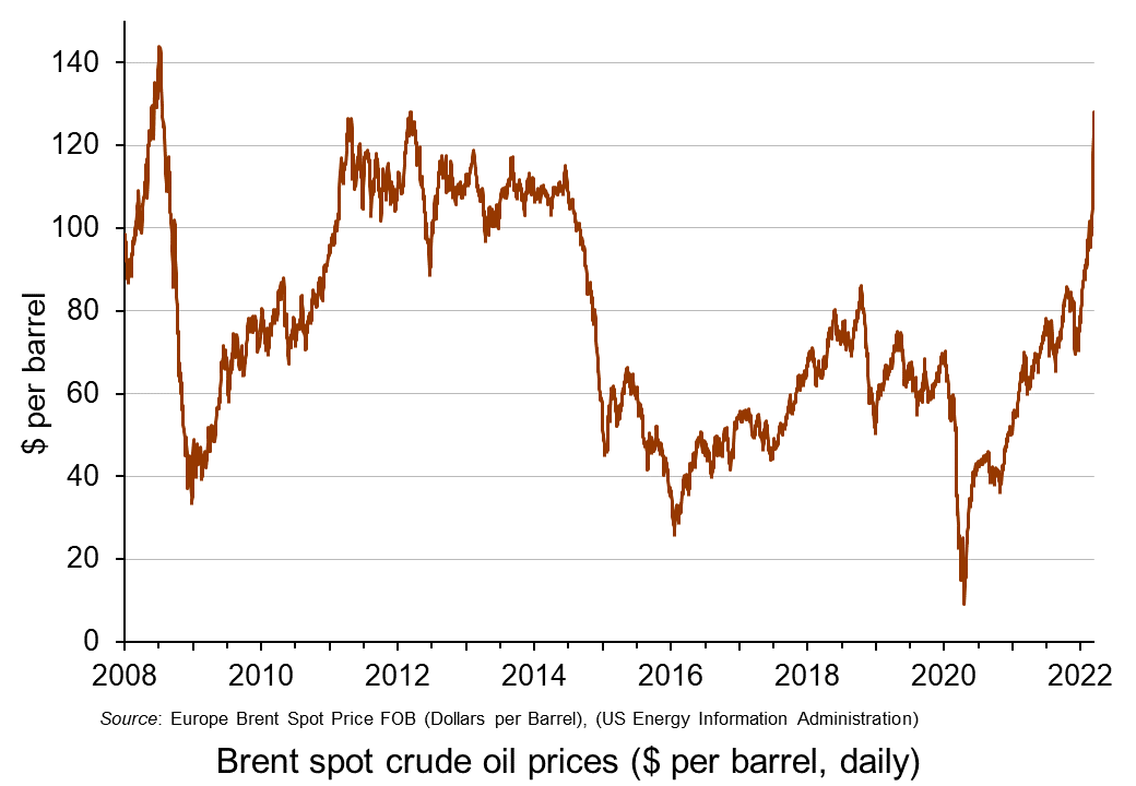 In 2019, oil was typically trading at around $60 to $70 per barrel. It then fell dramatically in early 2020 as the onset of COVID-19 led to a collapse in demand, for both transport and industry. The price fell below $20 in late April (see charts: click here for a PowerPoint).
Oil prices then rose rapidly as demand recovered somewhat but supply chains, especially shipping, were suffering disruptions. By mid-2021, oil was once more trading at around $60 to $70 per barrel. But then demand grew more strongly as economic recovery from COVID accelerated. But supply could not grow so quickly. By January 2022, Brent crude had risen above $80 per barrel.
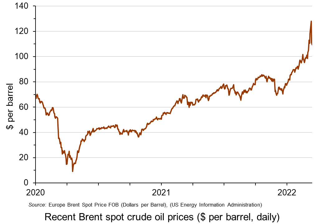 Then worries began to grow about Russian intentions over Ukraine as Russia embarked on large-scale military exercises close to the border with Ukraine. People increasingly disbelieved Russia’s declarations that it had no intention to invade. Russia is the world’s second biggest producer of oil and people feared that deliberate disruptions to supply by Russia or other countries banning imports of Russian oil would cause supply shortages. Speculation thus drove up the oil price. By 23 February, the day before the Russian invasion of Ukraine, Brent crude had risen to $95.
With the Russian invasion, moves were made by the EU the USA and other countries to ban or limit the purchase of Russian oil. This increased the demand for non-Russian oil.
 On 8 March, the USA announced that it was banning the import of Russian oil with immediate effect. The same day, the UK announced that it would phase out the import of Russian oil and oil products by the end of 2022.
The EU is much more dependent on Russian oil imports, which account for around 27% of EU oil consumption and 2/3 of extra-EU oil imports. Nevertheless, it announced that it would accelerate the move away from Russian oil and gas and towards green alternatives. By 8 March, Brent crude had risen to $128 per barrel.
The question was then whether other sources of supply would help to fill the gap. Initially it seemed that OPEC+ (excluding Russia) would not increase production beyond the quotas previously agreed by the cartel to meet recovery in world demand. But then, on 9 March, the UAE Ambassador to Washington announced that the county favoured production increases and would encourage other OPEC members to follow suit. With the announcement, the oil price fell by 11% to £111. But the next day, it rose again somewhat as the UAE seemed to backtrack, but then fell back slightly as OPEC said there was no shortage of oil.
This is obviously an unfolding story with the suffering of the Ukrainian people at its heart. But the concepts of supply and demand and their price elasticity and the role of speculation are central to understanding what will happen to oil prices in the coming months with all the consequences for poverty and economic hardship.
Articles
Data
Questions
- Use a demand and supply diagram to illustrate what has happened to oil prices over the past two years. How has the size of the effects been dependent on the price elasticity of demand for oil and the price elasticity of supply of oil?
- Use a demand and supply diagram to show what has been happening to the price of natural gas over the past two years. Are the determinants similar to those in the oil market? How do they differ (if at all)?
- What policy options are open to governments to deal with soaring energy prices?
- What are the distributional consequences of the rise in energy prices? (see the blog: Rise in the cost of living.)
- Under what circumstances are oil prices over the next six months likely (a) fall; (b) continue rising?
 As we saw in Part 1, households are seeing a rise in the cost of living, which is set to accelerate. Inflation in the year to January 2022, as measured by the Consumer Prices Index (CPI), was 5.5%, the highest rate for over 30 years, and it is expected to reach more than 7 per cent by April. This has put great pressure on household budgets, with wage rises for most people being below the rate of price inflation. The poor especially have been hard hit, with many struggling to meet soaring energy, food and transport prices and higher rents.
In Part 2 we look at the UK government’s response to the situation, a similar response to that in many other countries.
Effects on government finances
 The Chancellor, Rishi Sunak, has stated that the government understands the pressures families are facing with the cost of living. However, rising interest rates mean that it will cost the Treasury considerably more to service the UK’s national debt of more than £2tn.
Interest payments on index-linked debt are calculated using an alternative measure of inflation, the retail prices index (RPI), which is running at 7.8%, considerably higher than anticipated in last October’s Budget. It is now projected that central government spending on debt interest this financial year will come in at around £69bn, some £11bn higher than the £58bn forecast in the October 2021 Budget and £27bn above the £42bn forecast in the March 2021 Budget.
In addition, it is expected that the latest rise in CPI will increase the chances of the Bank of England raising interest rates and thereby further increasing the costs of servicing national debt. If this is the outcome when its Monetary Policy Committee meets next month, then it would be the third successive time interest rates have been raised.
There is also concern that this, in addition to the direct effects of higher costs, will push more firms towards insolvency. It is argued that if government wanted to prevent this, it would need to cut business taxes in order to boost investment and productivity and to allow businesses to provide annual wage rises that are affordable.
Monetary policy
 The Bank of England’s traditional response to rising inflation is to raise interest rates, which it has done this twice in the past few months. This means that people who have borrowed money could see their monthly payments go up, especially on mortgages tied to Bank Rate.
An aim of this policy is to make borrowing more expensive resulting in people spending less. As a result, they will buy fewer things, and prices will stop rising as fast. However, when inflation is caused by external forces, this might have a limited effect on prices and would put a further squeeze on household budgets.
Fiscal policy
Alternatively, the government might choose to cut taxes for consumers on items whose prices are rising quickly. It is taking some measures to reduce the impact of energy price rises. For example, the Treasury has announced that it would provide millions of households with up to £350 to help with their rising energy bills and in April the lowest-paid will see the National Living Wage rise by 6.6%, which is higher than the current inflation rate.
The chief economist of the British Chambers of Commerce has said that tightening monetary policy too quickly risks undermining confidence and the wider recovery, arguing that more needs to be done to limit the unprecedented rise in costs facing businesses, including financial support for those struggling with soaring energy bills and delaying April’s national insurance rise.
Conclusion
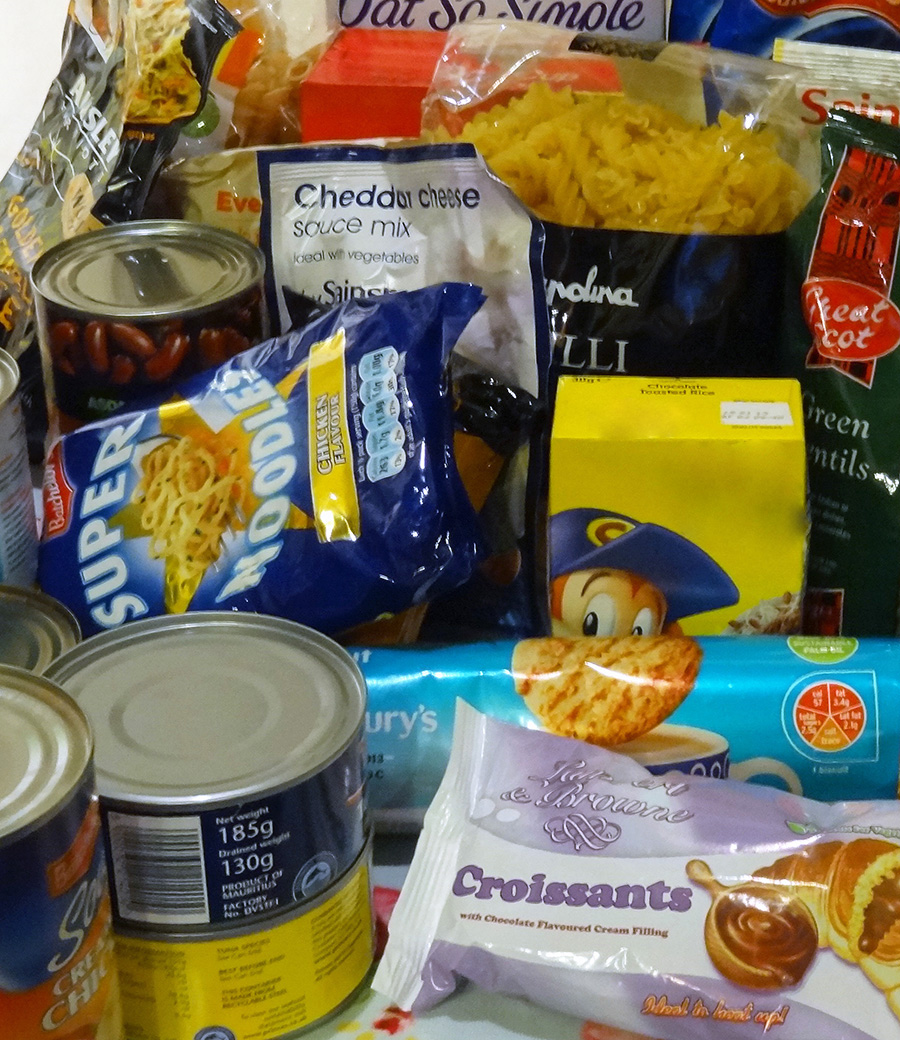 Rising inflation affects all our living standards. It a global issue with causes beyond government control.
Rising prices together with planned tax increases mean that real average take-home pay is likely to fall over the coming year. The extra energy costs and tax rises will force families to make savings elsewhere, meaning business revenues may fall, and the economic recovery could be negatively impacted.
However, it is those on low incomes that tend to find it hardest to cope with the rising cost of living. Those impacted the most will be faced with difficult decisions over the coming months as they try to cope with falling real incomes. With food price inflation expected to rise further, a likely rise in interest rates and a further increase in the energy price cap in October, these tough decisions are set to get harder for poorest households in the economy.
Articles
See articles in Part 1
Podcast
Questions
These questions are based on the podcast.
- What elements are there in household energy prices? Which element has gone up most?
- What are the arguments for and against the government delaying the rise in the rate of national insurance by 1.25 percentage points?
- What can be done to help people on modest earnings who earn just too much to receive benefits?
- Are government loans to help people with higher bills a good idea?
- What are the advantages and disadvantages of removing VAT on domestic energy?
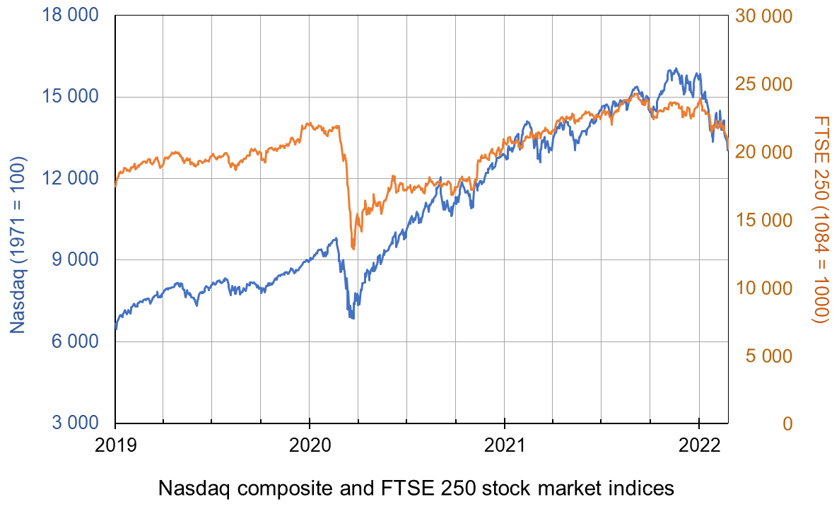
 With the onset of the pandemic in early 2020, stock markets around the world fell dramatically, with many indices falling by 30% or more. In the USA, the Dow Jones fell by 37% and the Nasdaq fell by 30%. In the UK, the FTSE 100 fell by 33% and the FTSE 250 by 41%.
But with a combination of large-scale government support for their economies, quantitative easing by central banks and returning confidence of investors, stock markets then made a sustained recovery and have continued to grow strongly since – until recently, that is.
With inflation well above target levels, central banks have ended quantitative easing (QE) or have indicated that they soon will. Interest rates are set to rise, if only slowly. The Bank of England raised Bank Rate from its historic low of 0.1% to 0.25% on 16 December 2021 and ceased QE, having reached its target of £895 billion of asset purchases. On 4 February 2022, it raised Bank Rate to 0.5%. The Fed has announced that it will gradually raise interest rates and will end QE in March 2022, and later in the year could begin selling some of the assets it has purchased (quantitative tightening). The ECB is not ending QE or raising interest rates for the time being, but is likely to do so later in the year.
At the same time economic growth is slowing, leading to fears of stagflation. Governments are likely to dampen growth further by tightening fiscal policy. In the UK, national insurance is set to rise by 1.25 percentage points in April.
The slowdown in growth may discourage central banks from tightening monetary policy more than very slightly. Indeed, in the light of its slowing economy, the Chinese central bank cut interest rates on 20 January 2022. Nevertheless, it is likely that the global trend will be towards tighter monetary policy.
The fears of slowing growth and tighter monetary and fiscal policy have led many stock market investors to predict an end to the rise in stock market prices – an end to the ‘bull run’. This belief was reinforced by growing tensions between Russia and NATO countries and fears (later proved right) that Russia might invade Ukraine with all the turmoil in the global economy that this would entail. Stock market prices have thus fallen.
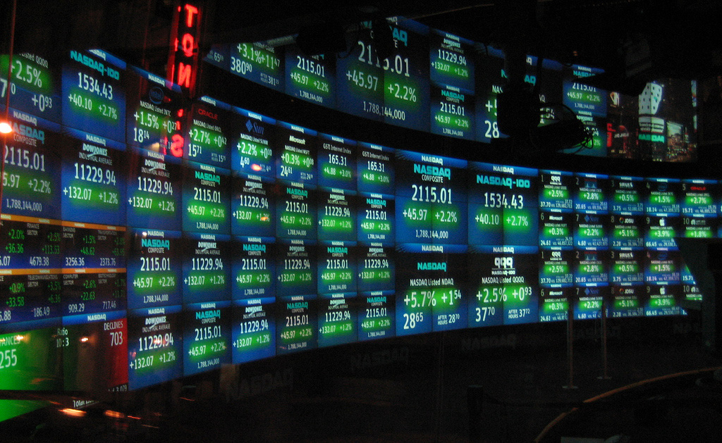 The key question is what will investors believe. If they believe that share prices will continue to fall they are likely to sell. This has happened since early January, especially in the USA and especially with stocks in the high-tech sector – such stocks being heavily represented in the Nasdaq composite, a broad-based index that includes over 2500 of the equities listed on the Nasdaq stock exchange. From 3 January to 18 February the index fell from 15 833 to 13 548, a fall of 14.4%. But will this fall be seen as enough to reflect the current economic and financial climate. If so, it could fluctuate around this sort of level.
However, some may speculate that the fall has further to go – that indices are still too high to reflect the earning potential of companies – that the price–earnings ratio is still too high for most shares. If this is the majority view, share prices will indeed fall.
Others may feel that 14.4% is an overcorrection and that the economic climate is not as bleak as first thought and that the Omicron coronavirus variant, being relatively mild for most people, especially if ‘triple jabbed’, may do less economic damage than first feared. In this scenario, especially if the tensions over Ukraine are diffused, people are likely to buy shares while they are temporarily low.
 But a lot of this is second-guessing what other people will do – known as a Keynesian beauty contest situation. If people believe others will buy, they will too and this will push share prices up. If they think others will sell, they will too and this will push share prices down. They will all desperately wish they had a crystal ball as they speculate how people will interpret what central banks, governments and other investors will do.
Articles
Questions
- What changes in real-world factors would drive investors to (a) buy (b) sell shares at the current time?
- How does quantitative easing affect share prices?
- What is meant by the price-earnings ratio of a share? Is it a good indicator as to the likely movement of that share’s price? Explain.
- What is meant by a Keynesian beauty contest? How is it relevant to the stock market?
- Distinguish between stabilising and destabilising speculation and illustrate each with a demand and supply diagram. Explain the concept of overshooting in this context.
- Which is more volatile, the FTSE 100 or the FTSE 250? Explain.
- Read the final article linked above. Were the article’s predictions about the Fed meeting on 26 January borne out? Comment.
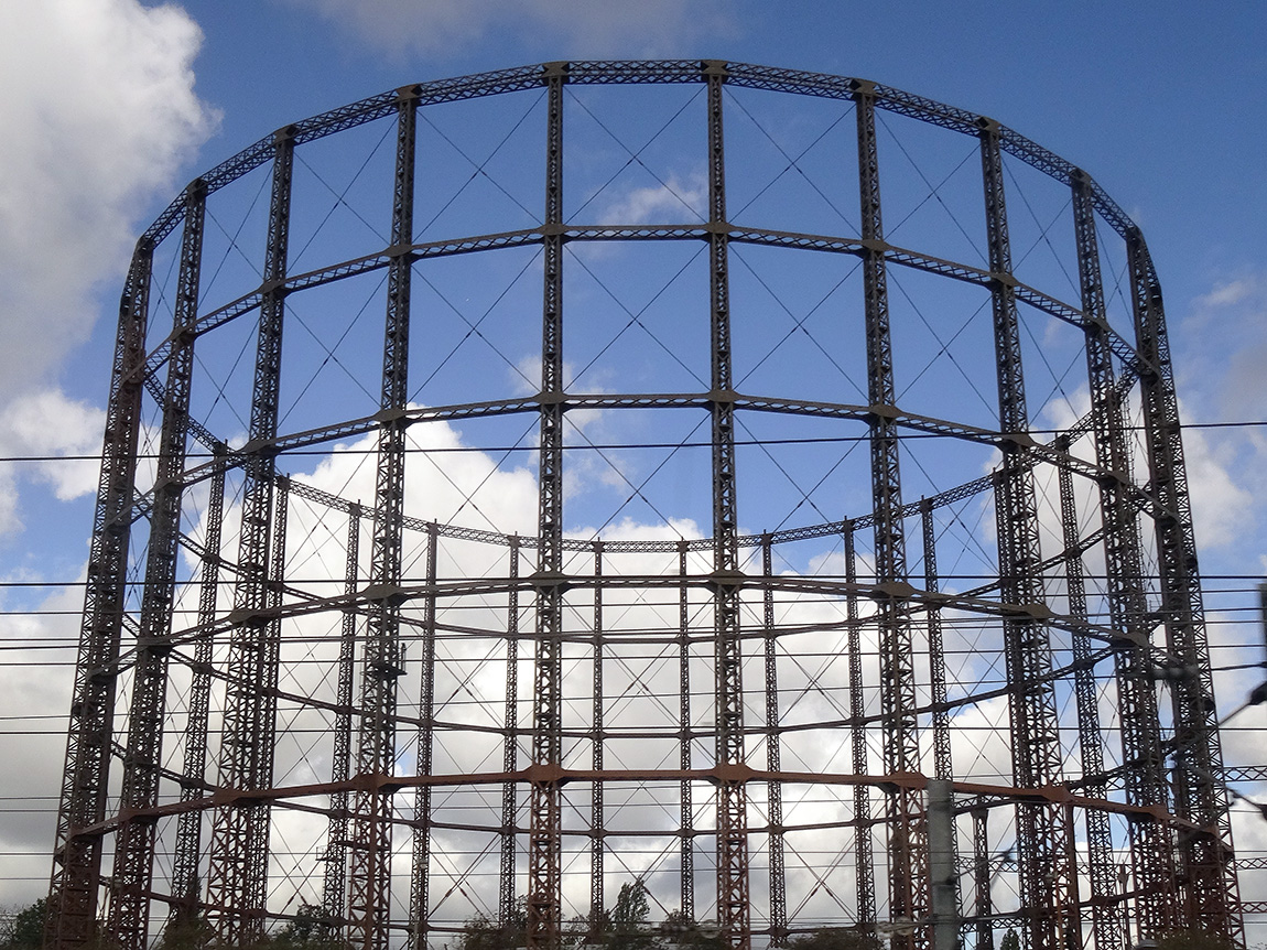 The global battle for fuel is expected to peak this winter. The combination of rising demand and a tightening of supply has sparked concerns of shortages in the market. Some people are worried about another ‘winter of discontent’. Gas prices have risen fivefold in Europe as a whole.
In the UK, consumers are likely to find that the natural gas needed to heat their homes this October will cost at least five times more than it did a year ago. This surge in wholesale gas prices has seen several UK energy suppliers stop trading as they are unable to make a profit. This is because of an energy price cap for some consumers and various fixed price deals they had signed with their customers.
There are thus fears of an energy crisis in the UK, especially if there is a cold winter. There are even warnings that during a cold snap, gas supply to various energy-intensive firms may be cut off. This comes at a time when some of these industries are struggling to make a profit.
Demand and supply
The current situation is a combination of long- and short-term factors. In spring 2020, the demand for gas actually decreased due to the pandemic. This resulted in low gas prices, reduced UK production and delayed maintenance work and investment along global supply chains. However, since early 2021, consumer demand for gas has soared. First, there was an increased demand due to the Artic weather conditions last winter. This was then followed by heatwaves in the USA and Europe over the summer, which saw an increase in the use of air conditioning units. With the increased demand combined with calm weather conditions, wind turbines couldn’t supply enough power to meet demand.
 There has also been a longer-term impact on demand throughout the industry due to the move to cleaner energy. The transitioning to wind and solar has seen a medium-term increase in the demand for gas. There is also a long-term impact of the target for net zero economies in the UK and Europe. This has hindered investors’ willingness to invest in developing supplies of fossil fuels due the fact they could become obsolete over the next few decades.
Nations have also been unable to build up enough supplies for winter. This is partly due to Europe’s domestic gas stocks having declined by 30% per cent in the past decade. This heightened situation is leading to concerns that there will be black-outs or cut-offs in gas this winter.
Importation of gas
 A concern for the UK is that it has scant storage facilities with no long-term storage. The UK currently has very modest amounts of storage – less than 6% of annual demand and some five times less than the average in the rest of Europe. It has been increasingly operating a ‘just-in-time model’, which is more affected by short-term price fluctuations in the wholesale gas market. With wind power generation remaining lower than average during summer 2021, more gas than usual has been used to generate electricity, leaving less gas to go into storage.
However, some argue that the problem is not just the UK’s physical supply of gas but demand for gas from elsewhere. Around half of the UK’s supply comes from its own production sites, while the rest is piped in from Europe or shipped in as liquefied natural gas (LNG) from the USA, Qatar and Russia. In 2019, the UK imported almost 20% of its gas through LNG shipments. However, Asian gas demand has grown rapidly, expanding by 50% over the past decade. This has meant that LNG has now become much harder to secure.
The issue is the price the UK has to pay to continue receiving these supplies. Some in the gas industry believe the price surge is only temporary, caused by economic disruptions, while many others say it highlights a structural weakness in a continent that has become too reliant on imported gas. It can be argued that the gas crisis has highlighted the lack of a coherent strategy to manage the gas industry as the UK transitions to a net zero economy. The lack of any industry investment in new capacity suggests that there is currently no business case for new long-term storage in the UK, especially as gas demand is expected to continue falling over the longer term.
Impact on consumers and industry
 Gas prices for suppliers have increased fivefold over the past year. Therefore, many companies face a considerable rise in their bills. MSome may need to reduce or pause production – or even cease trading – which could cause job losses. Alternatively, they could pass on their increased costs to customers by charging them higher prices. Although energy-intensive industries are particularly exposed, every company that has to pay energy bills will be affected. Due to the growing concerns about the security of winter gas supplies those industries reliant on gas, such as the fertiliser industry, are restricting production, threatening various supply chains.
Most big domestic gas suppliers buy their gas months in advance, meaning they will most likely pass on the higher price rises they have experienced in the past few months. The increased demand and decreased supply has already meant meant that customers have faced higher prices for their energy. The UK has been badly hit because it’s one of Europe’s biggest users of natural gas – 85% of homes use gas central heating – and it also generates a third of the country’s electricity.
The rising bills are particularly an issue for those customers on a variable tariff. About 15 million households have seen their energy bills rise by 12% since the beginning of October due to the rise in the government’s energy price cap calculated by the regulator, Ofgem. A major concern is that this increase in bills comes at a time when the need to use more heating and lighting is approaching. It also coincides with other price rises hitting family budgets and the withdrawal of COVID support schemes.
Government intervention – maximum pricing
If the government feels that the equilibrium price in a particular market is too high, it can intervene in the market and set a maximum price. When the government intervenes in this way, it sets a price ceiling on certain basic goods or services and does not permit the price to go above that set limit. A maximum price is normally set for reasons of fairness and to benefit consumers on low incomes. Examples include energy price caps to order to control fuel bills, rent controls in order to improve affordability of housing, a cap on mobile roaming charges within the EU and price capping for regional monopoly water companies.
The energy price cap
 Even without the prospect of a colder than normal winter, bills are still increasing. October’s increase in the fuel cap means that many annual household fuel bills will rise by £135 or more. The price cap sets the maximum price that suppliers in England, Wales and Scotland can charge domestic customers on a standard, or default tariff. The cap has come under the spotlight owing to the crisis among suppliers, which has seen eleven firms fold, with more expected.
The regulator Ofgem sets a price cap for domestic energy twice a year. The latest level came into place on 1 October. It is a cap on the price of energy that suppliers can charge. The price cap is based on a broad estimate of how much it costs a supplier to provide gas and electricity services to a customer. The calculation is mainly made up of wholesale energy costs, network costs such as maintaining pipes and wires, policy costs including Government social and environmental schemes, operating costs such as billing and metering services and VAT. Therefore, suppliers can only pass on legitimate costs of supplying energy and cannot charge more than the level of the price cap, although they can charge less. A household’s total bill is still determined by how much gas and electricity is used.
- Those on standard tariffs, with typical household levels of energy use, will see an increase of £139.
- People with prepayment meters, with average energy use, will see an annual increase of £153.
- Households on fixed tariffs will be unaffected. However, those coming to the end of a contract are automatically moved to a default tariff set at the new level.
Ordinarily, customers are able to shop around for cheaper deals, but currently, the high wholesale prices of gas means that cheaper deals are not available.
Despite the cap limiting how much providers can raise prices, the current increase is the biggest (and to the highest amount) since the cap was introduced in January 2019. As providers are scarcely making a profit on gas, there are concerns that a further increase in wholesale prices will cause more suppliers to be forced out of business. Ofgem said that the cap is likely to go up again in April, the next time it is reviewed.
Conclusion
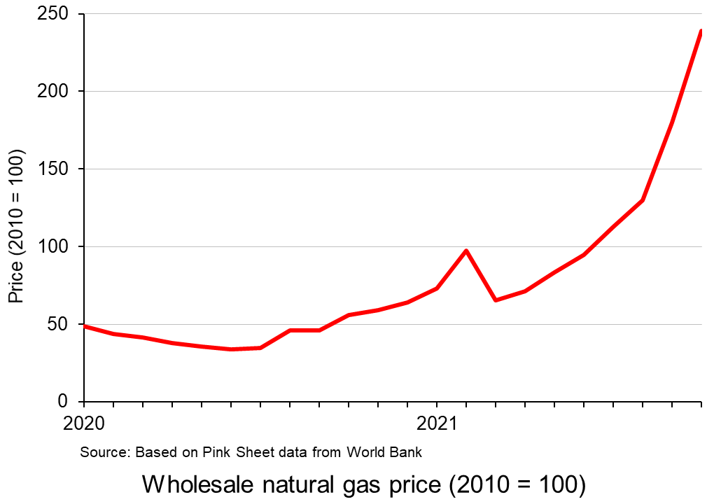 The record prices being paid by suppliers and deficits in gas supply across the world have stoked fears that the energy crisis will get worse. It comes at a time when households are already facing rising bills, while some energy-intensive industries have started to slow production. This has started to dent optimism around the post-pandemic economic recovery.
Historically, UK governments have trusted market mechanisms to deliver UK gas security. However, consumers are having to pay the cost of such an approach. The price cap has meant the UK’s gas bills have until now been typically lower than the EU average. However, the rise in prices comes on top of other economic problems such as labour shortages and increasing food prices, adding up to an unwelcome rise in the cost of living.
Video
Articles
UK government/Ofgem
Questions
- Using a supply and demand diagram, illustrate what has happened in the energy market over the past year.
- What are the advantages and disadvantages of government intervention in a free market?
- Explain why it is necessary for the regulator to intervene in the energy market.
- Using the concept of maximum pricing, illustrate how the price cap works.
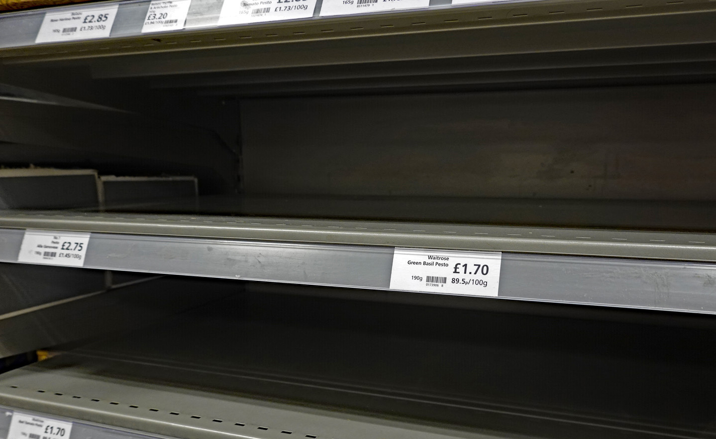
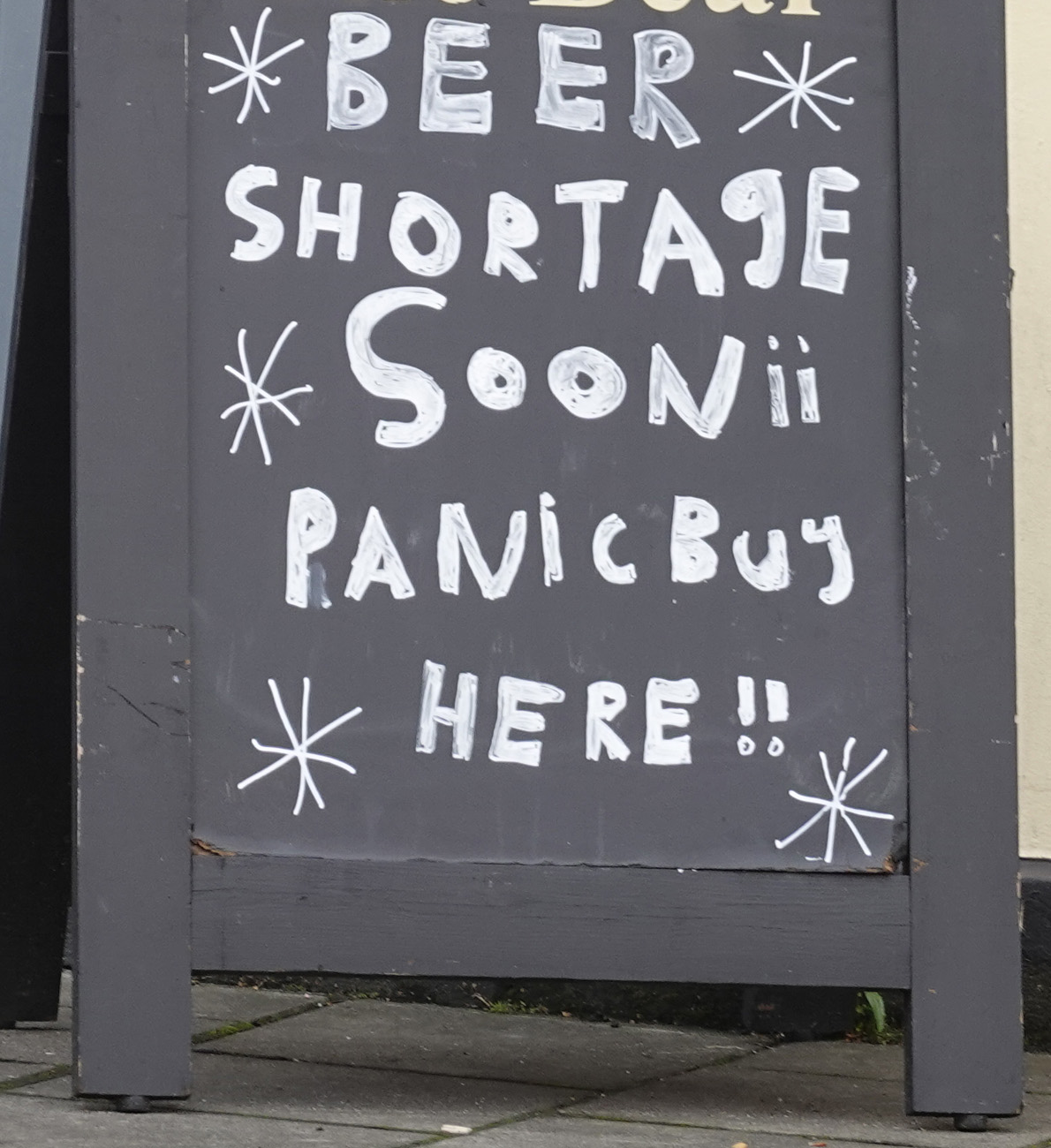
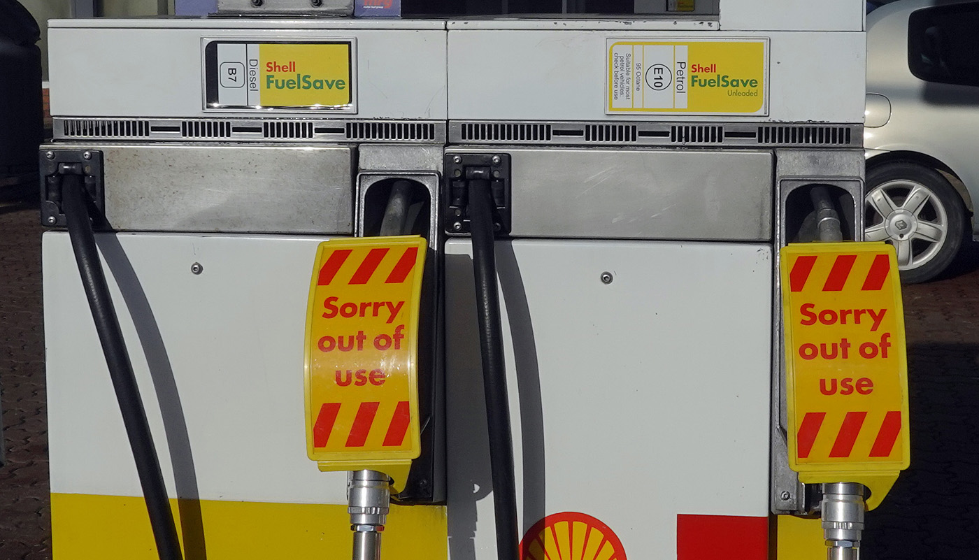 Long queues at petrol pumps, with many filling stations running out of fuel; fears of shortages of food and various other items in supermarkets; orders by shops and warehouses unfilled or delayed. These have been some of the headlines in the UK in recent days.
The immediate problem is a shortage of over 100 000 lorry drivers, with thousands of drivers from EU countries, who were previously living and working in the UK, having returned to their home countries. Their numbers have not been replaced by British drivers, a problem exacerbated by a decline in HGV tests during the pandemic. Thus the supply of lorry drivers has fallen.
At the same time, as the economy recovers from the COVID-19 pandemic, aggregate demand has risen and with it the demand for lorry drivers.
The shortage is pushing up wages somewhat, but not enough to eliminate the shortage. What is more, the supply of lorry drivers is relatively wage inelastic: a higher wage does not attract many more drivers into the market. Also the demand is also relatively wage inelastic: a higher wage does not do much to dampen the demand for drivers.
But why has this happened? Why has the supply of drivers fallen and why is it inelastic? And what will happen in the coming months? The three main causes are Brexit, COVID-19 and working conditions.
Brexit
 With Brexit, many EU workers left the UK, finding life and working conditions more conducive in the EU. Many EU drivers had faced discrimination and felt that they were not welcome in the UK. It has been difficult finding replacement drivers from the EU as the UK’s immigration system, which now applies to the EU as well as other countries, prioritises workers who are classified as high-skilled, and these do not include lorry drivers.
Those EU drivers who do want to stay as UK residents are finding that settled status or visas are not easy to achieve and involve filling in various documents, which can be an onerous and time-consuming process. As the writer of the first linked bog below, who is a Polish worker in the transport industry, states, ‘Would you rather come to Britain and jump through all the hoops, or choose any of the well-paying EU countries, for example, Germany that, if you live in Western Poland, is just a short drive across (virtually non-existent thanks to Schengen) border?’ Another problem is that with EU driving licences: it is harder for potential employers to check on their status and thus they may prefer to employ UK drivers. This, again, puts off EU drivers from seeking to stay in the UK.
Even in the case of EU drivers living in the EU but delivering to the UK there are problems. First there are the dangers for drivers of boarding ferries in France, where people from migrant camps seek to board lorries to get passage to the UK, often threatening drivers. If illegal migrants do succeed in boarding a trailer unseen by the driver, the driver can then be arrested in the UK. According to the Polish blogger, it’s ‘no surprise that I hear more and more drivers who, when taking on new jobs, demand guarantees from their employers that they won’t be sent to the UK’.
 Then there is a decline in the system known as ‘cabotage’. This is where an EU driver delivers from the EU to destination A in the UK and takes back a load to the EU from destination B in the UK. To avoid having to travel empty between the two UK destinations, the driver could pick up a load to take from A to B. With a fall in imports and exports from and to the EU following Brexit, there are fewer EU lorries on UK roads. This means that there is now less capacity for transporting loads within the UK.
There has also been a large rise in ‘red tape’ associated with post-Brexit customs checks and border controls. This means that lorries can be held up at ports. This makes it much less attractive for EU haulage companies to export to the UK rather than to other EU countries, where paperwork is minimal. In addition, m many drivers are paid by the length of the journey rather than by the time spent, so delays result in them earning less per hour. Full checks have not been introduced yet. When they are, in January and July next year, the problem will be worse.
Tax changes make it more difficult for drivers to avoid taxes by claiming that they are self employed when they are in reality employees. This too is discouraging drivers from the EU from moving to or staying in the UK since many would now (since April 2021) be paying more tax.
COVID-19
Another contributing factor to the shortage of drivers has been COVID-19 and the government’s response to it. COVID rates are considerably higher in the UK than in most EU countries and, not surprisingly, many EU drivers are afraid to come to the UK.
 The pandemic led to fewer HGV driver tests, with 25 000 fewer candidates passing their test in 2020 than in 2019. It takes time to train new drivers and then to test them. However, even if there had been no reduction in HGV drivers passing their tests, there would still be a significant shortage of qualified drivers.
A further problem with the effects of COVID-19 on the economy has been the initial recession and then the bounce back. The sheer size of the bounce back has exacerbated the problem of driver shortages, which otherwise would have been slower to develop, giving the market more time to respond. Real GDP grew by 5.5% from 2021 Q1 to 2021 Q2, giving an annual growth rate of 23.6%. Nevertheless, GDP was still some 3.3% below its 2019 Q3 level.
Pay and working conditions
Working conditions are very poor for many drivers. The following are common complaints:
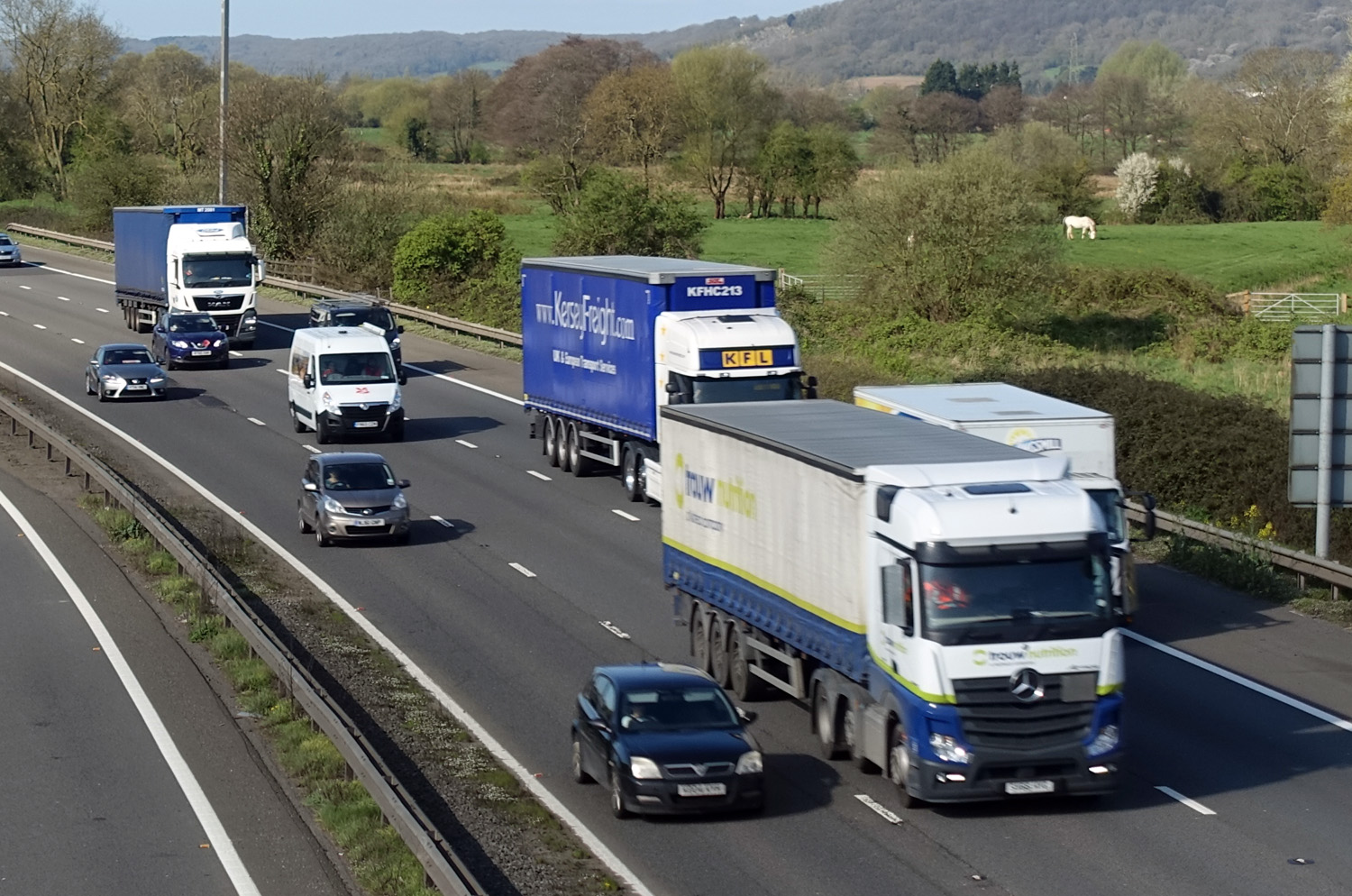 Driving jobs are often very tightly controlled, with computer monitoring and little freedom for the driver. Some cabs have cameras aimed at the drivers so that they can be constantly monitored.
- Drivers are subject to very stringent health and safety regulations, such as not being allowed to drive longer than a certain time, even when they are queuing in congested traffic. Whilst many of these regulations are desirable to protect both the public’s and the driver’s safety, they can discourage drivers from entering or staying in the industry. And some regulations are hard to justify on safety grounds (see second linked article below, point 13).
- Just-in-time deliveries at supermarkets, regional distribution centres (warehouses) or factories make timing very important and add considerable stress to drivers who may face abuse if they are late, even though it was not their fault, with their employer perhaps facing a fine. And yet on other occasions they might have to wait a long time to offload if drivers before them have been delayed, and often the conditions in waiting areas are poor with few if any facilities.
- Drivers often feel a lack of respect from employers, trainers and the general public.
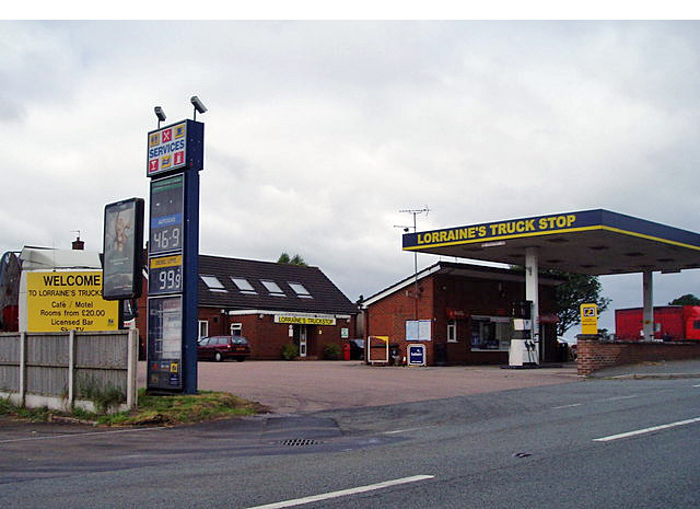 Rest and refreshment facilities are often very poor in the UK and generally much worse than in the EU. In the EU, motorway service areas have better parking, toilets, showers and shops. Restaurants are better and cheaper. Dedicated truck stops have supermarkets, laundrettes, showers or even open-air gyms dedicated to making drivers’ lives easier and more pleasant. The UK by contrast often has very poor facilities. Unlike in most EU motorway services, drivers have to pay to park and are faced with poor toilet and eating facilities. ‘Meanwhile, a typical British truck stop is some dusty yard full of potholes on the side of some industrial estate with a portaloo and a “greasy spoon” burger van parked next to it.’
- Hours are long. Even though driving hours are restricted to 10 hours per day (recently extended to 11 hours), the average working day may be much longer as drivers have to wait at distribution centres, fill in increasing amounts of paperwork and help load or unload their vehicle. Also drivers may have to work variable shifts, which leads to disturbed sleeping patterns.
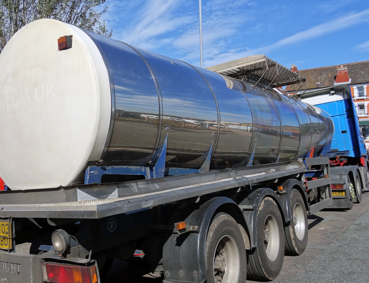 The work is often physically demanding, especially when a large part of the job involves loading and unloading and moving items from the lorry to where the customer wants them.
- Many vehicles are hard and unpleasant to drive, with leased vehicles often low-spec, dirty, uncomfortable and poorly maintained.
- Many of the jobs are agency jobs that do not offer stable employment.
Although pay is higher than in some parts of the labour market where there are shortages, such as social care and hospitality, pay per hour is still relatively poor when compared with many industries which have better conditions of employment.
The future
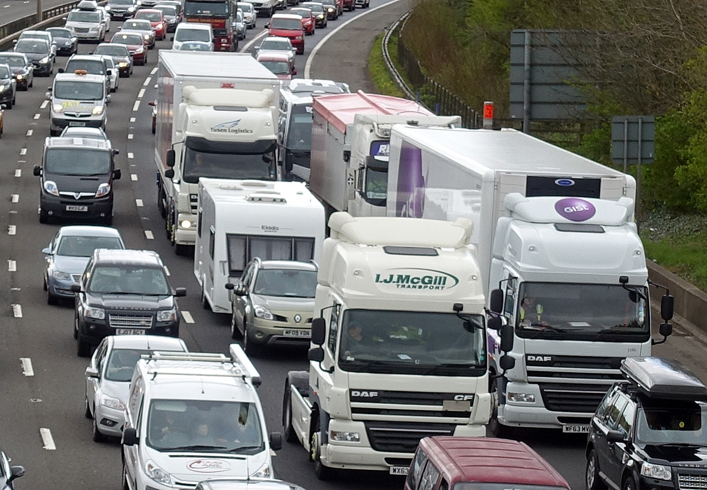 The government is allowing more foreign workers into the UK from this month (October); more training places will be offered for potential drivers and the number of driving tests will increase; the government is also encouraging retired drivers or those who have left driving for other jobs to return to the industry.
However, there are shortages of drivers in other EU countries and so it will be difficult to attract additional drivers to the UK from the EU. What is more, with wages and working conditions remaining poor and the labour market remaining tight in other sectors, it might be hard to fill new training places and encourage workers to return to driving. Also, with the average age of drivers being 55, it is likely that the outflow of workers from driving jobs could be large in the coming years.
Articles
- Twenty reasons why there is an HGV driver shortage – part one: 1-10
West Country Bylines, Tomasz Oryński (21/9/21)
- Twenty reasons why there is an HGV driver shortage – part 2: reasons 11-20
West Country Bylines, Tomasz Oryński (23/9/21)
- Gas Shortages Awaken Britain to Some Crucial Workers: Truck Drivers
New York Times, Eshe Nelson and Megan Specia (29/9/21)
- Time running out to save UK industry from worker shortages, say business leaders
CNN, Walé Azeez (1/10/21)
- Boris Johnson’s Brexit choices are making Britain’s fuel and food shortages worse
CNN, Hanna Ziady (29/9/21)
- How serious is the shortage of lorry drivers?
BBC News, Reality Check Team (28/9/21)
- Petrol shortage: Is the fuel crisis improving?
BBC News (1/10/21)
- UK visa plan will not fix lorry driver shortage, says boss
BBC News (28/9/21)
- The empty shelves crisis isn’t just down to Covid and Brexit – it’s been decades in the making
The Guardian, Felicity Lawrence (17/9/21)
- Emergency visa scheme extended in major U-turn by Boris Johnson
The Guardian, Rajeev Syal (1/10/21)
- Truck driver shortage won’t be solved by quick fix visas – here are three ways forward
The Conversation, Temidayo Akenroye (27/9/21)
- UK lorry driver shortage a stark example of a wider European problem
Euronews, Luke Hurst and Shona Murray (29/9/21)
- Emergency visas won’t tempt European lorry drivers to UK, say haulage chiefs
The Observer, Jon Henley, Michael Savage and James Tapper (25/9/21)
- Labour shortage threatens to cancel out any Brexit dividend
British Meat Processors Association, Industry News, Peter Hardwick (28/9/21)
- How to control a consumer panic
BBC News. Faisal Islam (28/9/21)
Questions
- Why are the supply of and demand for lorry drivers relatively wage inelastic?
- Use a marginal productivity diagram to explain the current situation in the market for lorry drivers.
- What policy measures could be adopted to increase the supply of lorry drivers? How successful would these be?
- Is it ‘rational’ for consumers to ‘panic buy’ fuel and other products in short supply?
- Find out why there is a shortage of lorry drivers in the EU. Are any of the explanations similar to those in the UK?
- What are the macroeconomic implications of a shortage of lorry drivers and other key workers?
 Global oil prices (Brent crude) reached $128 per barrel on 9 March, a level not seen for 10 years and surpassed only in the run up to the financial crisis in 2008. Oil prices are determined by global demand and supply, and the current surge in prices is no exception.
 In 2019, oil was typically trading at around $60 to $70 per barrel. It then fell dramatically in early 2020 as the onset of COVID-19 led to a collapse in demand, for both transport and industry. The price fell below $20 in late April (see charts: click here for a PowerPoint).
 Then worries began to grow about Russian intentions over Ukraine as Russia embarked on large-scale military exercises close to the border with Ukraine. People increasingly disbelieved Russia’s declarations that it had no intention to invade. Russia is the world’s second biggest producer of oil and people feared that deliberate disruptions to supply by Russia or other countries banning imports of Russian oil would cause supply shortages. Speculation thus drove up the oil price. By 23 February, the day before the Russian invasion of Ukraine, Brent crude had risen to $95.
 On 8 March, the USA announced that it was banning the import of Russian oil with immediate effect. The same day, the UK announced that it would phase out the import of Russian oil and oil products by the end of 2022.
  As we saw in Part 1, households are seeing a rise in the cost of living, which is set to accelerate. Inflation in the year to January 2022, as measured by the Consumer Prices Index (CPI), was 5.5%, the highest rate for over 30 years, and it is expected to reach more than 7 per cent by April. This has put great pressure on household budgets, with wage rises for most people being below the rate of price inflation. The poor especially have been hard hit, with many struggling to meet soaring energy, food and transport prices and higher rents.
 The Chancellor, Rishi Sunak, has stated that the government understands the pressures families are facing with the cost of living. However, rising interest rates mean that it will cost the Treasury considerably more to service the UK’s national debt of more than £2tn.
 The Bank of England’s traditional response to rising inflation is to raise interest rates, which it has done this twice in the past few months. This means that people who have borrowed money could see their monthly payments go up, especially on mortgages tied to Bank Rate.
 Rising inflation affects all our living standards. It a global issue with causes beyond government control.
 With the onset of the pandemic in early 2020, stock markets around the world fell dramatically, with many indices falling by 30% or more. In the USA, the Dow Jones fell by 37% and the Nasdaq fell by 30%. In the UK, the FTSE 100 fell by 33% and the FTSE 250 by 41%.
 The key question is what will investors believe. If they believe that share prices will continue to fall they are likely to sell. This has happened since early January, especially in the USA and especially with stocks in the high-tech sector – such stocks being heavily represented in the Nasdaq composite, a broad-based index that includes over 2500 of the equities listed on the Nasdaq stock exchange. From 3 January to 18 February the index fell from 15 833 to 13 548, a fall of 14.4%. But will this fall be seen as enough to reflect the current economic and financial climate. If so, it could fluctuate around this sort of level.
 But a lot of this is second-guessing what other people will do – known as a
  The global battle for fuel is expected to peak this winter. The combination of rising demand and a tightening of supply has sparked concerns of shortages in the market. Some people are worried about another ‘winter of discontent’. Gas prices have risen fivefold in Europe as a whole.
  There has also been a longer-term impact on demand throughout the industry due to the move to cleaner energy. The transitioning to wind and solar has seen a medium-term increase in the demand for gas. There is also a long-term impact of the target for net zero economies in the UK and Europe. This has hindered investors’ willingness to invest in developing supplies of fossil fuels due the fact they could become obsolete over the next few decades.
  A concern for the UK is that it has scant storage facilities with no long-term storage. The UK currently has very modest amounts of storage – less than 6% of annual demand and some five times less than the average in the rest of Europe. It has been increasingly operating a ‘
 Gas prices for suppliers have increased fivefold over the past year. Therefore, many companies face a considerable rise in their bills. MSome may need to reduce or pause production – or even cease trading – which could cause job losses. Alternatively, they could pass on their increased costs to customers by charging them higher prices. Although energy-intensive industries are particularly exposed, every company that has to pay energy bills will be affected. Due to the growing concerns about the security of winter gas supplies those industries reliant on gas, such as the fertiliser industry, are restricting production, threatening various supply chains.
  Even without the prospect of a colder than normal winter, bills are still increasing. October’s increase in the fuel cap means that many annual household fuel bills will rise by £135 or more. The price cap sets the maximum price that suppliers in England, Wales and Scotland can charge domestic customers on a standard, or default tariff. The cap has come under the spotlight owing to the crisis among suppliers, which has seen eleven firms fold, with more expected.
 The record prices being paid by suppliers and deficits in gas supply across the world have stoked fears that the energy crisis will get worse. It comes at a time when households are already facing rising bills, while some energy-intensive industries have started to slow production. This has started to dent optimism around the post-pandemic economic recovery.
  Long queues at petrol pumps, with many filling stations running out of fuel; fears of shortages of food and various other items in supermarkets; orders by shops and warehouses unfilled or delayed. These have been some of the headlines in the UK in recent days.
  With Brexit, many EU workers left the UK, finding life and working conditions more conducive in the EU. Many EU drivers had faced discrimination and felt that they were not welcome in the UK. It has been difficult finding replacement drivers from the EU as the UK’s immigration system, which now applies to the EU as well as other countries, prioritises workers who are classified as high-skilled, and these do not include lorry drivers.
 Then there is a decline in the system known as ‘cabotage’. This is where an EU driver delivers from the EU to destination A in the UK and takes back a load to the EU from destination B in the UK. To avoid having to travel empty between the two UK destinations, the driver could pick up a load to take from A to B. With a fall in imports and exports from and to the EU following Brexit, there are fewer EU lorries on UK roads. This means that there is now less capacity for transporting loads within the UK.
 The pandemic led to fewer HGV driver tests, with 25 000 fewer candidates passing their test in 2020 than in 2019. It takes time to train new drivers and then to test them. However, even if there had been no reduction in HGV drivers passing their tests, there would still be a significant shortage of qualified drivers.
 Driving jobs are often very tightly controlled, with computer monitoring and little freedom for the driver. Some cabs have cameras aimed at the drivers so that they can be constantly monitored.
 Rest and refreshment facilities are often very poor in the UK and generally much worse than in the EU. In the EU, motorway service areas have better parking, toilets, showers and shops. Restaurants are better and cheaper. Dedicated truck stops have supermarkets, laundrettes, showers or even open-air gyms dedicated to making drivers’ lives easier and more pleasant. The UK by contrast often has very poor facilities. Unlike in most EU motorway services, drivers have to pay to park and are faced with poor toilet and eating facilities. ‘Meanwhile, a typical British truck stop is some dusty yard full of potholes on the side of some industrial estate with a portaloo and a “greasy spoon” burger van parked next to it.’
 The work is often physically demanding, especially when a large part of the job involves loading and unloading and moving items from the lorry to where the customer wants them.
 The government is allowing more foreign workers into the UK from this month (October); more training places will be offered for potential drivers and the number of driving tests will increase; the government is also encouraging retired drivers or those who have left driving for other jobs to return to the industry.