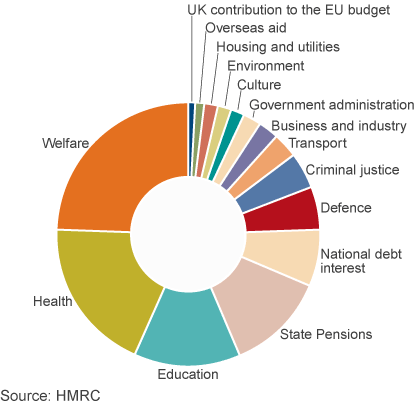
How much does the UK spend on welfare? This is a highly charged political question, with some arguing that benefit claimants are putting great demands on ‘hard-working tax payers’. According to information being sent by the government to all 24 million income tax payers in the UK, the figure of £168bn being spent on welfare is around 24.5% of public spending. But what is included in the total? Before you read on, try writing down the categories of government expenditure included under the heading ‘welfare’.
The heading does not include spending on certain parts of the ‘welfare state’, such as health and education. These are services, the production of which contributes to GDP. The category ‘welfare’ does not include expenditure on produced services, but rather transfer payments. The way the government is using the term, it does not include state pensions either, which account for 11.6% of public expenditure. So does the 24.5% largely consist of payments to the unemployed? The answer is no.
The category ‘welfare’ as used by the government includes the following elements. The percentages are of total managed expenditure (i.e. government spending).
• | Public service pensions, paid to retired public-sector employees, such as teachers, police officers, doctors and nurses | (2.6%) |
• | Other support for the elderly, including pension credit, winter fuel allowance, bus passes, etc. | (1.5%) |
• | Sickness and disability benefits, including long-term care for the elderly, sick and disabled | (6.6%) |
• | Support for families and children, such as child benefit and child tax credits | (3.4%) |
• | Social exclusion, including income support and housing benefit | (7.8%) |
• | Unemployment benefits, including Job Seekers Allowance | (0.7%) |
• | Other | (1.9%) |
Lumping all these together under a single heading ‘welfare’ can be highly misleading, as many people have strongly held preconceptions about who gets welfare. In fact the term is used pejoratively by many who resent their taxes being given to those who do not work.
But, as you can see from the figures, only a small proportion goes to the unemployed, the majority of whom (around 65%) are unemployed for less than a year as they move between jobs (see). The bulk of benefits goes to children, the retired and the working poor.
Another preconception is that much of welfare spending goes to fraudulent claimants. But, as the article by Professor Hills states:
Just 0.7% of all benefits was over-paid as the result of fraud, less than the amount underpaid as a result of official error. For the main benefit for unemployed people, Jobseeker’s Allowance, estimated fraud was 2.9%, or an annual total of £150million.
It is also important to consider people’s life cycle. The same people receive benefits (via their parents or guardians) as children, pay taxes when they work and receive benefits when they retire or fall sick. Thus you might be a net contributor to public finances at one time and a net beneficiary at another. For example, the majority of pensioners were net contributors when they were younger and are now mainly net beneficiaries. Many unemployed people who rely on benefits now were net contributors when they had a job.
The message is that you should be careful when interpreting statistics, even if these statistics are factually accurate. How figures are grouped together and the labels put on them can give a totally misleading impression. And politicians are always keen to ‘spin’ statistics to their advantage – whether in government or opposition.
Webcast
Annual Tax Summary: TUC and MPs on spending information BBC Daily Politics, Jo Coburn (3/11/14)
Articles
Osborne’s tax summary dismissed as propaganda by the TU BBC News (3/11/14)
The truth about welfare spending: Facts or propaganda? BBC News, Brian Milligan (4/11/14)
Its Cost Is Just One of the Myths Around ‘Welfare’ Huffington Post, John Hills (12/11/14)
Welfare spending summary criticised Express & Star (4/11/14)
Data and Reports
Public Expenditure: Statistical Analyses (PESA) 2014 HM Treasury (see Table 5.2)
DWP annual report and accounts 2013 to 2014 Department of Work and Pensions (see Table 2)
Welfare trends report – October 2014 Office for Budget Responsibility
What is welfare spending? Institute for Fiscal Studies (4/11/14)
Questions
- What benefits do you receive? How would you expect this to change over your lifetime?
- What are the arguments for (a) reducing and (b) increasing welfare payments. In each case, under which categories of welfare would you decrease or increase the level of benefits?
- Referring to Table 5.2 in the PESA data below (the table used for the government’s calculations), which of the categories would be classified as expenditure on goods and services and which as transfer payments?
- Assess the arguments of the IFS for the reclassification of the categories of ‘welfare’ payments.
- Referring to the pie chart above, also in the BBC video and articles and Table 5.2 in the PESA data, assess the arguments about the size of the UK’s contributions to the EU budget.
In his 1971 book, Income Distribution, Jan Pen, a Dutch economist, gave a graphic illustration of inequality in the UK. He described a parade of people marching by. They represent the whole population and the parade takes exactly one hour to pass by. The height of each person represents his or her income. People of average height are the people with average incomes – the observer is of average height. The parade starts with the people on the lowest incomes (the dwarfs), and finishes with those on the highest incomes (the giants).
Because income distribution is unequal, there are many tiny people. Indeed, for the first few minutes of the parade, the marchers are so small they can barely be seen. Even after half an hour, when people on median income pass by, they are barely waist high to the observer.
The height is growing with tantalising slowness, and forty-five minutes have gone by before we see people of our own size arriving. To be somewhat more exact: about twelve minutes before the end the average income recipients pass by.
In the final minutes, giants march past and then in the final seconds:
the scene is dominated by colossal figures: people like tower flats. Most of them prove to be businessmen, managers of large firms and holders of many directorships and also film stars and a few members of the Royal Family.
The rear of the parade is brought up by a few participants who are measured in miles. Indeed they are figures whose height we cannot even estimate: their heads disappear into the clouds and probably they themselves do not even know how tall they are.
Pen’s description could be applied to most countries – some with even more dwarfs and even fewer but taller giants. Generally, over the 43 years since the book was published, countries have become less equal: the giants have become taller and the dwarfs have become smaller.
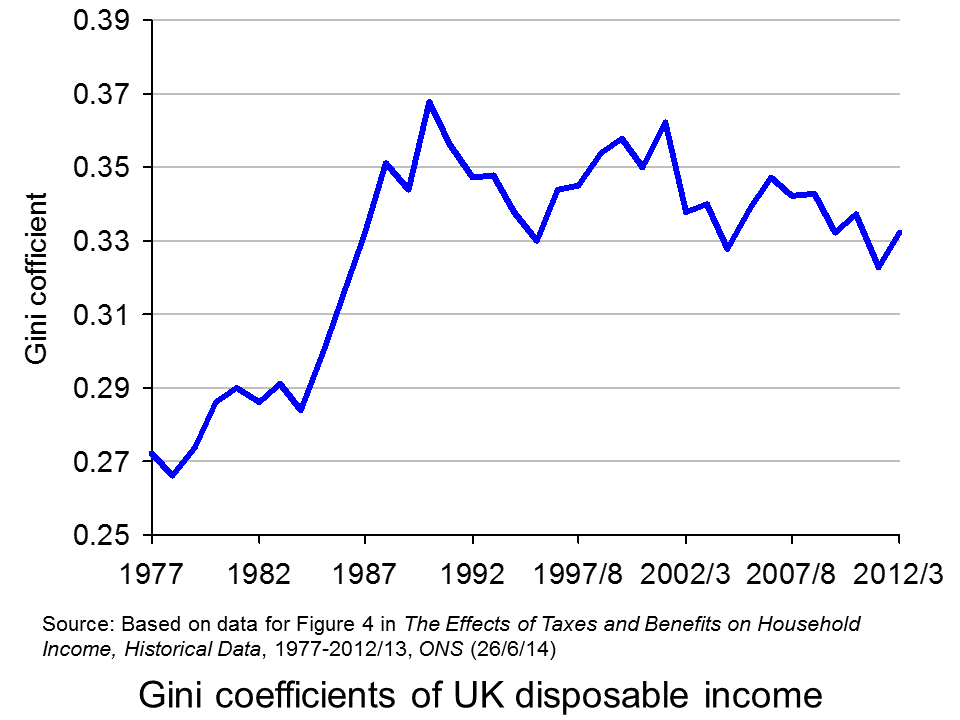
The 2011 Economist article, linked below, uses changes in Gini coefficients to illustrate the rise in income inequality. A Gini coefficient shows the area between the Lorenz curve and the 45° line. The figure will be between 0 and 1 (or 0% and 100%). a figure of 0 shows total equality; a figure of 1 shows a situation of total inequality, where one person earns all the nation’s income. The higher the figure, the greater the inequality.
The chart opposite shows changes in the Gini coefficient in the UK (see Table 27 in the ONS link below for an Excel file of the chart). As this chart and the blog post Rich and poor in the UK show, inequality rose rapidly during the years of the 1979–91 Thatcher government, and especially in the years 1982–90. This was associated with cuts in the top rate of income tax and business deregulation. It fell in the recession of the early 1990s as the rich were affected more than the poor, but rose with the recovery of the mid- to late 1990s. It fell again in the early 2000s as tax credits helped the poor. It fell again following the financial crisis as, once more, the rich were affected proportionately more than the poor.
The most up-to-date international data for OECD countries can be found on the OECD’s StatExtracts site (see chart opposite: click here for a PowerPoint). The most unequal developed county is the USA, with a Gini coefficient of 0.389 in 2012 (see The end of the American dream?), and US inequality is rising. Today, the top 1% of the US population earns some 24% of national income. This compares with just 9% of national income in 1976.
Many developing countries are even less equal. Turkey has a Gini coefficient of 0.412 and Mexico of 0.482. The figure for South Africa is over 0.6.
When it comes to wealth, distribution is even less equal. The infographic, linked below, illustrates the position today in the USA. It divides the country into 100 equal-sized groups and shows that the top 1% of the population has over 40% of the nation’s wealth, whereas the bottom 80% has only 7%.
So is this inequality of income and wealth desirable? Differences in wages and salaries provide an incentive for people to work harder or more effectively and to gain better qualifications. The possibility of increased wealth provides an incentive for people to invest.
But are the extreme differences in wealth and income found in many countries today necessary to incentivise people to work, train and invest? Could sufficient incentives exist in more equal societies? Are inequalities in part, or even largely, the result of market imperfections and especially of economic power, where those with power and influence are able to use it to increase their own incomes and wealth?
Could it even be the case that excessive inequality actually reduces growth? Are the huge giants that exist today accumulating too much financial wealth and creating too little productive potential? Are they spending too little and thus dampening aggregate demand? These arguments are considered in some of the articles below. Perhaps, by paying a living wage to the ‘tiny’ people on low incomes, productivity could be improved and demand could be stimulated.
Infographic
Wealth Inequality in America YouTube, Politizane (20/11/12)
Articles
The rise and rise of the cognitive elite The Economist (20/1/11)
Inequality in America: Gini in the bottle The Economist (26/11/13)
Pen’s Parade: do you realize we’re mostly dwarves? LVTFan’s Blog (21/2/11)
Here Are The Most Unequal Countries In The World Business Insider, Andy Kiersz (8/11/14)
Inequality in the World Dollars & Sense, Arthur MacEwan (Nov/Dec 14)
Britain is scared to face the real issue – it’s all about inequality The Observer, Will Hutton (19/1/14)
The tame inequality debate FundWeb, Daniel Ben-Ami (Nov 14)
Is inequality the enemy of growth? BBC News, Robert Peston (6/10/14)
Data
GINI index World Bank data
List of countries by income equality Wikipedia
The Effects of Taxes and Benefits on Household Income, 2012/13 ONS (see table 27)
Income Distribution and Poverty: Gini (disposale income) OECD StatExtract
Questions
- Distinguish between income and wealth. Is each one a stock or a flow?
- Explain how (a) a Lorenz curve and (b) a Gini coefficient are derived.
- What other means are there of measuring inequality of income and wealth other than using Gini coefficients (and giants and dwarfs!)?
- Why has inequality been rising in many countries over the years?
- How do (a) periods of rapid economic growth and (b) recessions affect income distribution?
- Define ‘efficiency wages’. How might an increase in wages to people on low incomes result in increased productivity?
- What is the relationship between the degree of inequality and household debt? What implications might this have for long-term economic growth and future financial crises? Is inequality the ‘enemy of growth’?
The housing market and what to do about bubbles, second homes and first time buyers is likely to be one of many battle grounds at the next election. For many years, the idea of a mansion tax has been debated and the Shadow Chancellor, Ed Balls, has outlined plans for a mansion tax under a Labour government.
The policy would see houses valued at between £2 and £3 million pay £250 a month as a mansion tax. Those owning a home worth tens of millions and those with second homes would pay more under the mansion tax, which would be based on a progressive system. Concerns have been raised about the impact of this tax on home-owners in areas like London, where average house prices are considerably higher than the UK average. Ed Balls has sought to reassure homeowners that payment of the mansion tax could be deferred if earnings do not reach the £42,000 threshold. However, critics have suggested that this policy will only make things worse for middle income households who will not be able to defer such a payment if their income is £43,000. Labour’s MP for Greenwich, Nick Raynsford said, ‘What it does is create a cliff edge. It will still hit people who are asset rich but cash poor.” Writing in the Evening Standard, Ed Balls said:
“Long-standing residents who now find themselves living in high-value homes but do not have an income high enough to pay the higher or top rate of income tax — in other words earn less than £42,000 a year — will be guaranteed the right to defer the charge until the property changes hands.
So a tax on the highest value properties will be done fairly and carefully to help fund our NHS for the future.
Ordinary Londoners should be protected and wealthy foreign investors must finally make a proper tax contribution in this country.”
Although similar in its objective to the Liberal Democrat’s mansion tax, the amount of the tax as a percentage of the value of the home under Labour is significantly lower. It is likely to be between 0.1% and 0.15% of the home’s valued, compared to the 1% levy proposed by the Liberal Democrats.
One debate now surrounds the amount that this tax is expected to raise, especially given the revenue has been ear-marked to finance the NHS. The number of homes whose value is estimated to fall between £2m and £3m varies considerably and hence so would the revenues raised from such a tax. However, the income generated by even the most generous estimates will not come close to raising the ear-marked figure of £1.2bn. As such, there are suggestions that the tax levied on houses worth more than £3m; on foreign owners of residences in the UK and second homes will need to be significant to make up the short fall. A spokesperson for the Conservatives said:
“Serious questions have now been raised about how much revenue Labour would be able to raise from the tax …This is a further unravelling of the policy, which faced fierce criticism after it was revealed that no money would be raised until halfway through the next parliament, and the proposals for mass valuations of family homes was widely slammed as unworkable.”
The UK residential research director of Savills estate agency, Lucian Cook, added:
“Given Labour’s stated ambition to raise £1.2bn, that would leave at least £1.08bn to be raised from the remaining 57,000 properties, possibly more to account for tax leakage elsewhere in the system.”
The impact of the mansion tax will depend on exactly how it is imposed and the thresholds, together with how the threshold changes with the housing market. In the UK, we have seen some houses increase in value by huge amounts in just a few months and with a mansion tax, any such increase in price could move more home-owners into the new progressive tax system. Some argue that it is a tax on Londoners. The following articles consider the proposed policy by Labour.
Ed Balls seeks to reassure London home owners over mansion tax plans The Guardian, Patrick Wintour (20/10/14)
Ed Balls: Mansion tax would start at £250 a month BBC News (20/10/14)
‘Mansion tax’ will mean bill of £250 a month, says Ed Balls Financial Times, Emily Cadman, Kate Allen, Vanessa Houlder and George Parker (20/10/14)
Mansion tax can be deferred in you earn less than £42,000, Ed Balls insists as he reveals details of levy on £2million homes Mail Online, Matt Chorley (20/10/14)
Ed Balls: Mansion tax will cost homeowners £250 a month London Evening Standard (20/10/14)
Middle-class families hit by Labour’s mansion tax The Telegraph, Steven Swinford (20/10/14)
Balls says mansion-tax threshold to rise with home values Bloomberg, Svenja O’Donnell (20/10/14)
Questions
- How does a progressive tax system work?/li>
- Why are some critics arguing that this mansion tax would just be a tax on Londoners?
- What objective is the £42,000 income threshold trying to achieve? Do you think that critics are correct in their assertion that it penalises middle income households?
- Fiscal drag is mentioned in the BBC News article as a potential problem with the mansion tax proposed by Labour and that houses may move into the taxable threshold. What is fiscal drag and why is it a potential concern?
- How might such a policy affect the incentives of foreigners to invest in the UK housing market? Would this be a good or a bad thing and for who?
- The revenues generated from houses between £2 and £3m will not be sufficient to generate £1.2bn. What are the implications for how progressive the mansion tax would need to be and how this might affect homeowners?
At least once a year The Economist publishes its ‘hamburger standard’ exchange rates for currencies. It is a light-hearted attempt to see if currencies are exchanging at their purchasing-power parity rates. The test is the price at which a ‘Big Mac’ McDonald’s hamburger sells in different countries!
According to this simplified version of the purchasing-power parity theory, exchange rates should adjust so that a Big Mac costs the same in dollars everywhere (see Economics 8th edition Box 25.4).
These Big Mac exchange rates can be used to compare various prices and incomes between countries. The article linked below from The Guardian compares minimum wages between European countries in Big Mac terms.
There are 25 countries across Europe which have minimum wages. A clear pattern of minimum wage rates can be seen: although actual exchange rates understate the purchasing power of incomes in poorer European countries compared to richer ones, minimum wages, even in purchasing-power standard terms, are still higher in the richer countries.
Luxembourg’s minimum wage buys you just about three Big Macs in an hour, while most of northern Europe (and France) between 2–2.5 Big Macs. Moving south, the minimum wage nets about one Big Mac an hour. As we progress east, it begins to cost more than an hour of work on the minimum wage in order to afford a Big Mac.
Of course, there are other factors determining the dollar price of a Big Mac other than the failure of exchange rates to reflect purchasing-power parities. Nevertheless, using the Big Mac index in this way does give a useful preliminary snap shot of differences in what minimum wages can buy in different countries.
Articles
Comparing the minimum wage across Europe using the price of a Big Mac The Guardian datablog, Alberto Nardelli (25/9/14)
Minimum wage statistics Eurostat (Sept/14)
Data
Earnings Database Eurostat
Questions
- What is meant by ‘purchasing-power parity exchange rates’?
- Why may actual exchange rates not accurately reflect the purchasing power of currencies within countries?
- Using the link to Eurostat article above, compare Big Mac minimum wages with (a) actual minimum wages and (b) minimum wages expressed in purchasing-power standard terms.
- Using the links to the Eurostat article and Eurostat data, describe how the proportion of employees earning minimum wages varies across European countries. What factors determine this proportion?
- Using the same links, describe how the monthly minimum wage as a proportion of average monthly earnings varies across European countries. Explain these differences.
The linked article below from The Guardian paints a disturbing picture of the long-term problem of servicing both private-sector and public-sector debts.
With interest rates at historical lows, the problem has been masked for the time being. But with interest rates set to rise within a few months, and significantly over the coming years, the burden of debt servicing is likely to become severe. This could have profound effects both on long-term economic growth and on the distribution of income.
As the author, Phillip Inman states:
The funding gap is growing and with deficits on so many fronts, it is hard to see how promises to pensioners and health service users can be met without a dash for growth that is unsustainable, a switch to dramatic cost-cutting in other areas or higher taxes on those who came through the recession relatively unscathed.
You are probably facing the problem of growing debt yourself. How long, if ever, will it take you to repay your student loans? What impact will this have on your ability to spend and to have a ‘decent’ standard of living? Will you be able to afford a mortgage large enough to buy a reasonable house or flat? Will you be able to afford to do a masters degree or PhD without support from your parents or relatives or without a scholarship? And even if you manage to secure a well-paid job, will you be able to afford a reasonable pension for when you eventually retire?
The article looks at the nature of the problem and its causes. It concludes by saying:
Britain has become expert at putting off decisions and hoping for something to turn up. Without a return to ultra-cheap commodities, another technological/productivity revolution, or a return to more modest living and delayed gratification, it’s a plan that is running out of time.
Article
Trouble in store: the grave future of British public and private debt The Guardian, Phillip Inman (20/7/14)
Report
Fiscal sustainability report Office for Budget Responsibility (10/7/14)
Fiscal sustainability report – Executive summary Office for Budget Responsibility (10/7/14)
Fiscal sustainability report – Supplementary data series Office for Budget Responsibility (10/7/14)
Questions
- Why is public-sector debt likely to continue rising significantly over the coming years unless there is a concerted policy to make cuts in public expenditure?
- What factors are likely to lead to a rise in private-sector debt over the coming years?
- What factors have caused a redistribution from the younger to the older generation?
- How have ultra low interest rates affected the distribution of income?
- What is likely to happen to the gap in wages between ‘graduate’ jobs and ‘non-graduate’ jobs? Identify the factors likely to influence this gap?
- What is meant by ‘hire purchase’? Are leasing schemes for car purchase a form of ‘hire purchase? Are there similar schemes in the housing market?
- Does it matter if a country’s debts rise (either public or private) if the creditors are in the same country? Explain.